80% More Clicks: UX Audit & Redesign for a Realtor
Petra Smolčić
Realtor Website UX Audit & Redesign
Project Goals
Increase website conversions
Resolve technical issues left by the previous agency
Simplify website management so Christina could update and maintain it confidently
Provide clear explanations and guidance so she understood the value of each change
Story of Our Collaboration
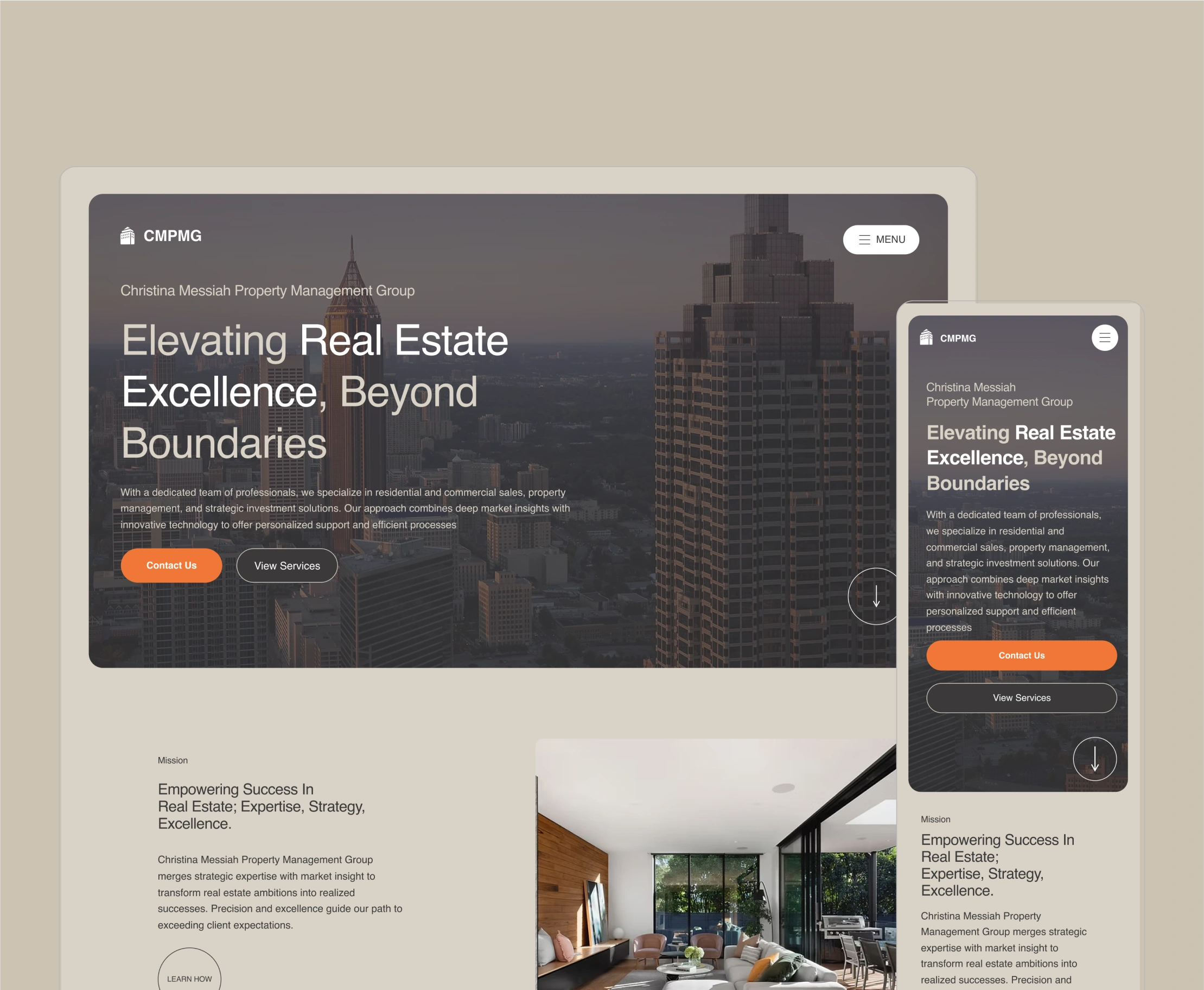
When Christina reached out, she was feeling hopless as she couldn't get the website up. Her website looked fine on the surface, but it wasn’t bringing any traffic and the one that landed, left right away.
The agency she previously worked with had left her with technical issues and a site she didn’t fully understand how to manage. They used a template (even left few template pages on her site) so we needed to clean it up and customize it to her needs and goals.
She needed someone she could trust to fix the foundation, explain things clearly, and help her website generate actual leads.
UX Audit & Strategy
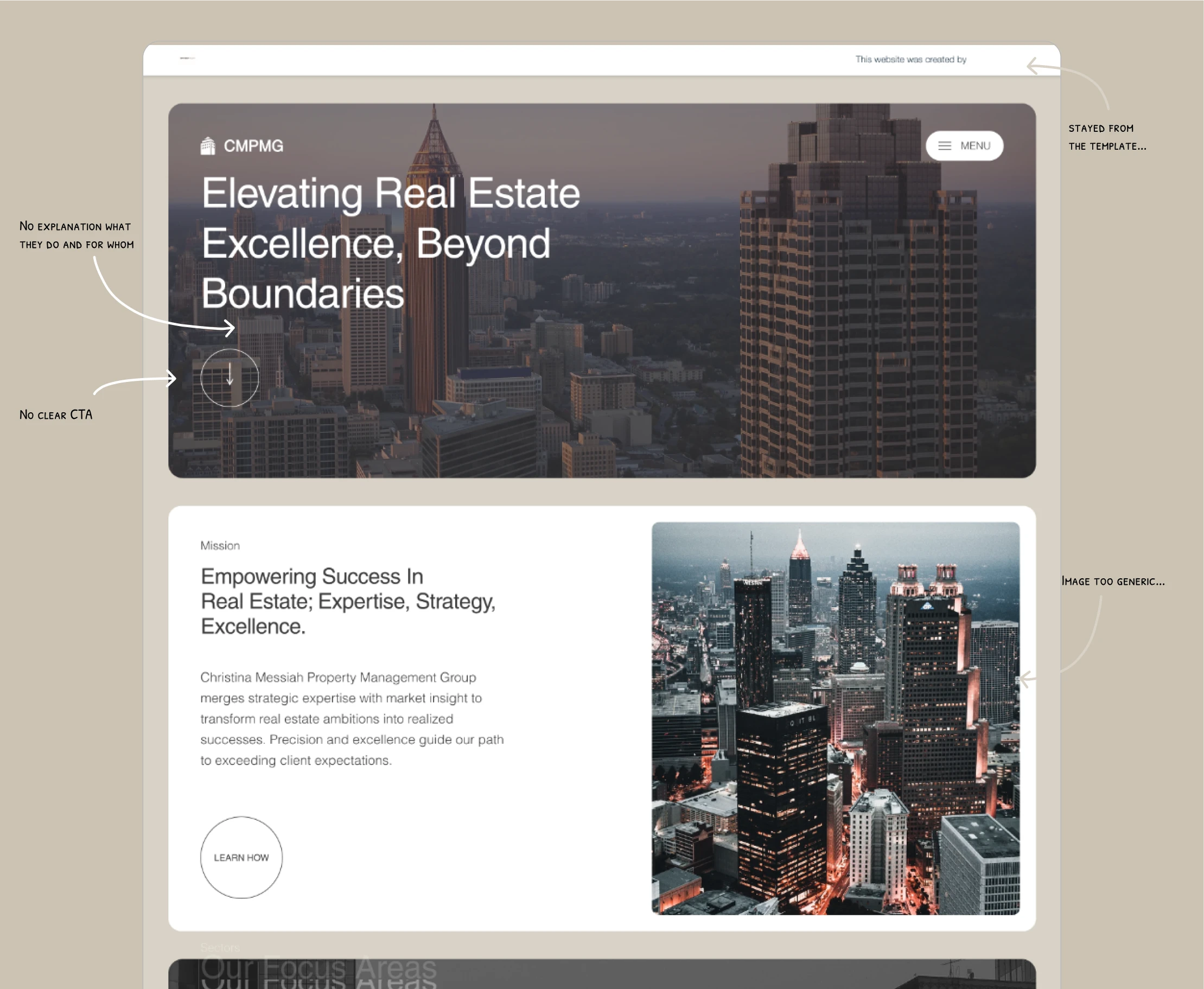
Few UX problems I saw right away.
I started with a full UX audit to identify the friction points blocking conversions. Some key issues were:
Hamburger menu too small to tap → making navigation harder, especially on mobile
No explanation of what they do and for who → resulting in huge dropoffs
Footer links poorly grouped → confusing structure and missed opportunities
Christina loved the suggestions and gave me a green light to do all the changes I think will benefit her site.
I wanted to focus on high-impact fixes first so I did:
Expanded the hamburger tap area to 44px on mobile
Restyled the main CTA in a strong brand-consistent orange
Rewrote the hero section adding clear headline, CTAs and subheading explaining exactly what they do and what the user can do on the site.
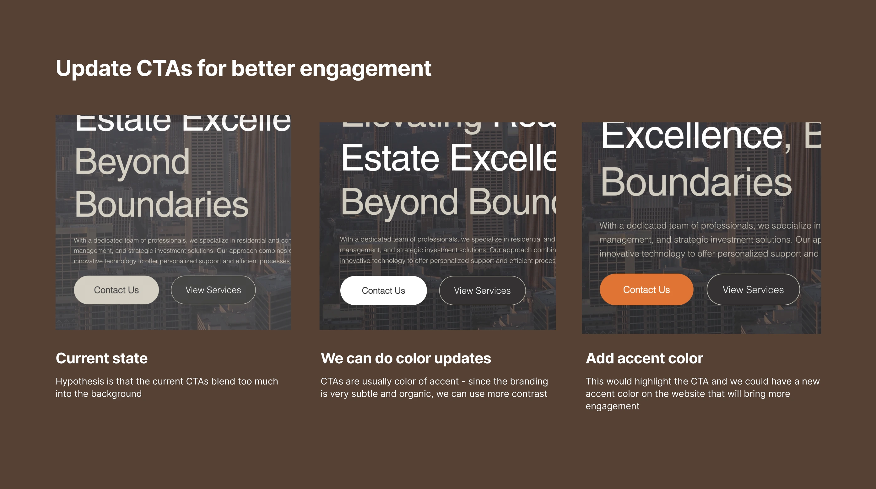
Screenshot from the iteration of the UX audit we did after tracking the first version. We decided to go with the orange one and it received 66% more clicks. than the previous state.
Business Results
These targeted changes quickly showed measurable impact:
80% increase in hamburger menu clicks
66% more clicks on the main “Contact” CTA
10% conversion rate on the contact page within the first 2 months (previously almost no inquiries)
Designer's tales
Everyone can build a website, but without a foundation in usability and UX principles, even the best-looking sites can fail to convert.
By combining technical fixes with UX strategy, Christina’s site is now easier to manage, aligned with her business goals, and most importantly bringing in new client inquiries!
If you have a similar site and you want to get results fast, feel free to reach out! We can jump on a quick 15-min call to see together what would be the best approach.
Here is the link to my calendar!
Like this project
Posted Sep 9, 2025
Actionable UX audit that helped us identify problems of conversion and areas of improvement resulted in a redesign that increased click-rate by 80%.
Likes
1
Views
14