Scalable SaaS Analytics Dashboard Design
Mcnove Pineda
VEC — SaaS Analytics Dashboard System (Webflow + UI/UX + Product Architecture)
VEC is a scalable SaaS analytics dashboard system designed and structured in Webflow, focused on transforming complex data into a clean, modular, and highly usable interface.
The project was built as a complete product-level system rather than a static UI, combining UX design, Webflow development thinking, and SaaS architecture principles to simulate a real-world analytics platform.
The goal was to create a dashboard experience that feels like a live operational system — where data is structured, readable, and visually communicates real-time intelligence.
Project Goal
The main objective of VEC was to design a scalable SaaS dashboard system that can support:
analytics and KPI tracking
system-level data visualization
admin and control panel workflows
future feature expansion without redesign
The focus was on building a system that is not only visually clean, but also structurally scalable.
My Role
I was responsible for the full design-to-system approach:
SaaS dashboard UI/UX design
Webflow structure planning (component-based system)
Information architecture and data hierarchy
Visual system and design consistency
Responsive layout strategy (desktop, tablet, mobile)
Product-level UX logic and flow design
What I Built
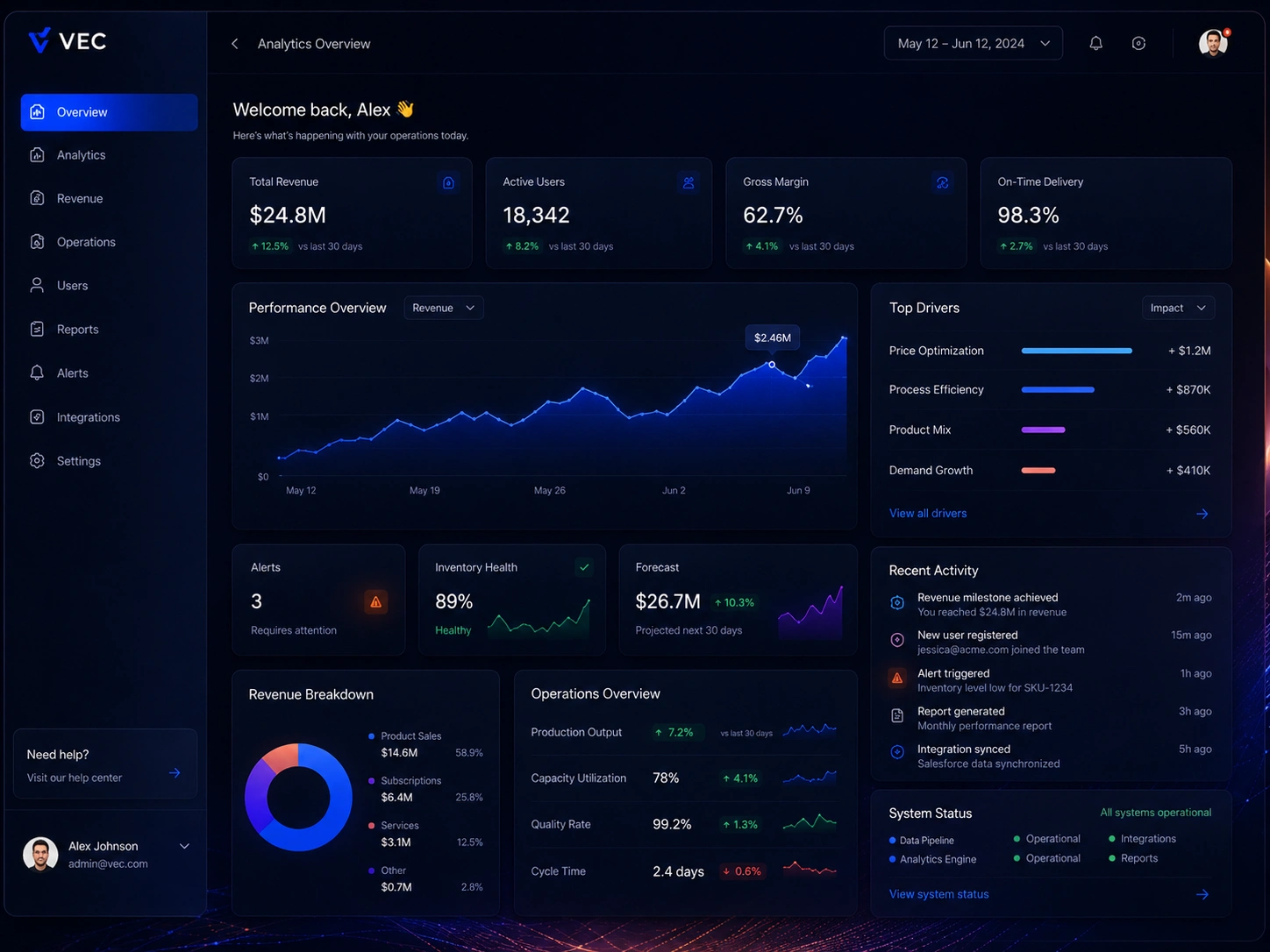
1. SaaS Dashboard Interface
Structured analytics dashboard layout
KPI cards and performance metrics system
Data visualization components (charts, graphs, tables)
Clean hierarchy for fast decision-making
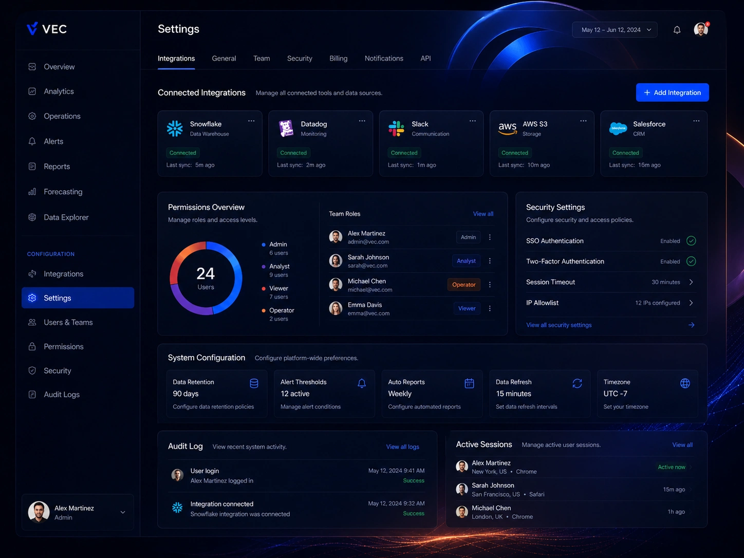
2. Admin & System Structure
Sidebar navigation system for SaaS workflows
Modular dashboard sections for scalability
Organized layout for analytics, reporting, and control functions
3. Scalable UI System (Webflow-ready)
Component-based layout structure
Reusable UI blocks for future expansion
Consistent spacing and typography system
Clean class structure for maintainability
UX Approach
The system is designed around three core principles:
1. Clarity First
All data is structured for fast readability and decision-making.
2. System Thinking
Each UI component is designed as a modular building block.
3. Passive Intelligence
The interface communicates activity through subtle visual hierarchy and live-system behavior.
Motion Concept (Optional Enhancement)
The dashboard is designed to support subtle “live system” motion effects such as:
soft light scan across the interface
gentle highlight activation on metrics
ambient background breathing
minimal real-time data feel
This reinforces the idea of a live SaaS analytics system without changing the structure of the UI.
Webflow Development Approach
The project follows a Webflow-first architecture approach:
Client-first style class system
Fully responsive structure across breakpoints
Modular component-based design system
CMS-ready structure for scalable content
Clean layout logic for long-term maintainability
Outcome
VEC demonstrates the ability to design and structure a real SaaS-level dashboard system, combining UI/UX design, Webflow architecture, and product thinking.
The result is a scalable analytics interface that feels like a real product — not a static design — but a functional system ready for SaaS-level use cases.
Like this project
Posted Jun 29, 2026
A SaaS analytics dashboard designed for clarity at scale, with real-time data visualization, modular components, and a clean, actionable interface.
Likes
2
Views
4
Timeline
May 4, 2026 - May 15, 2026
Clients
VEC