Designing Promobile Platform for Campaign Management
Ivan Kalkaev
Promobile is a large-scale platform for mobile app publishers who need to manage advertising campaigns and track app store performance — keyword rankings, review volumes, search term positions, trend analytics — all from one dashboard. I designed the entire product from scratch.
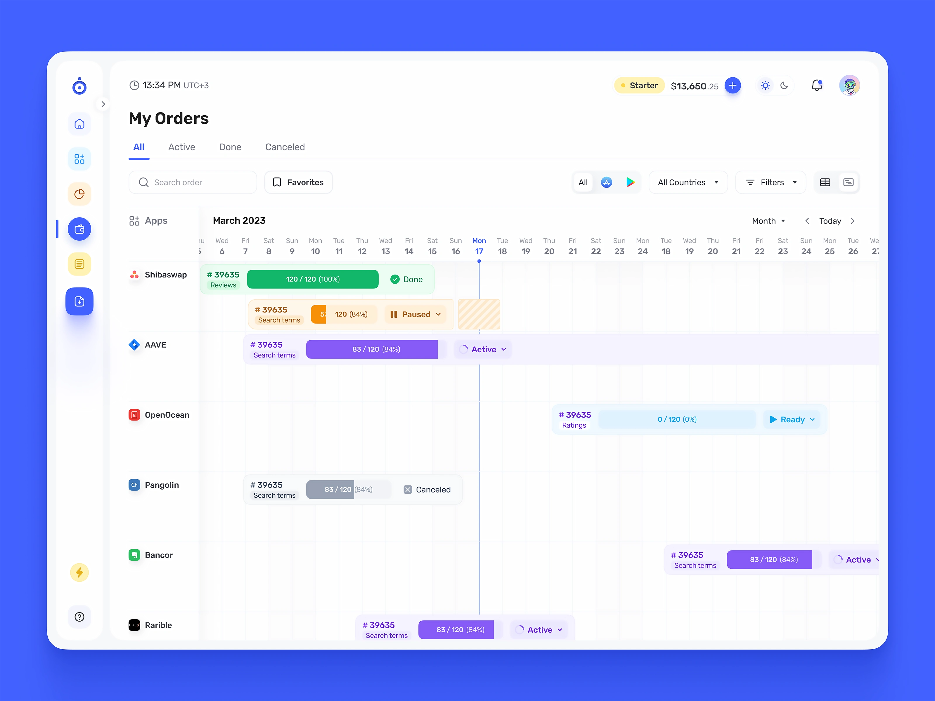
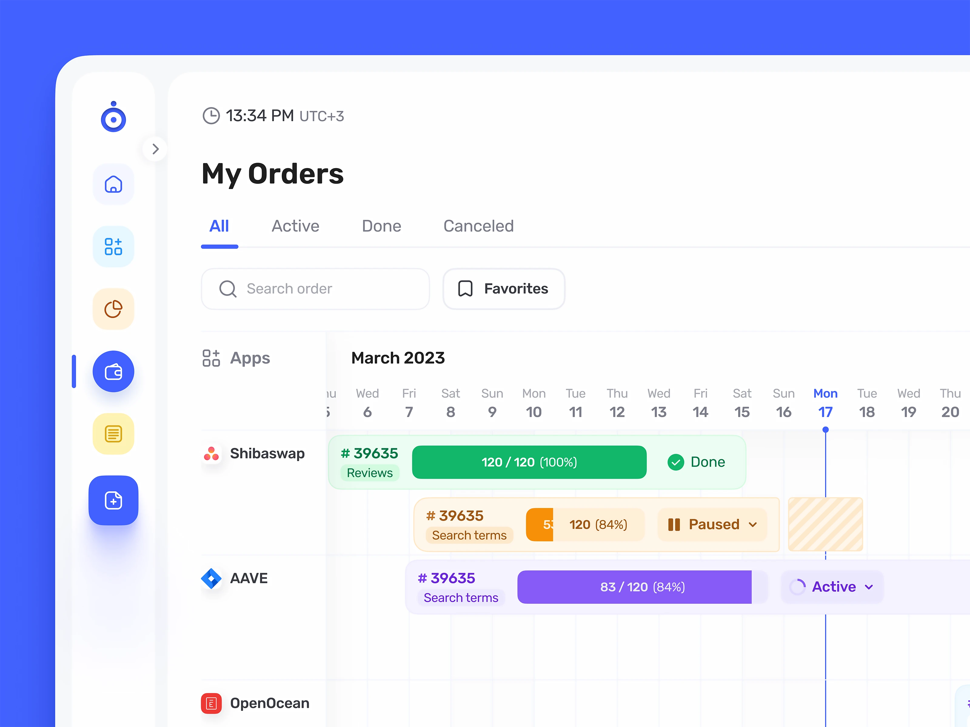
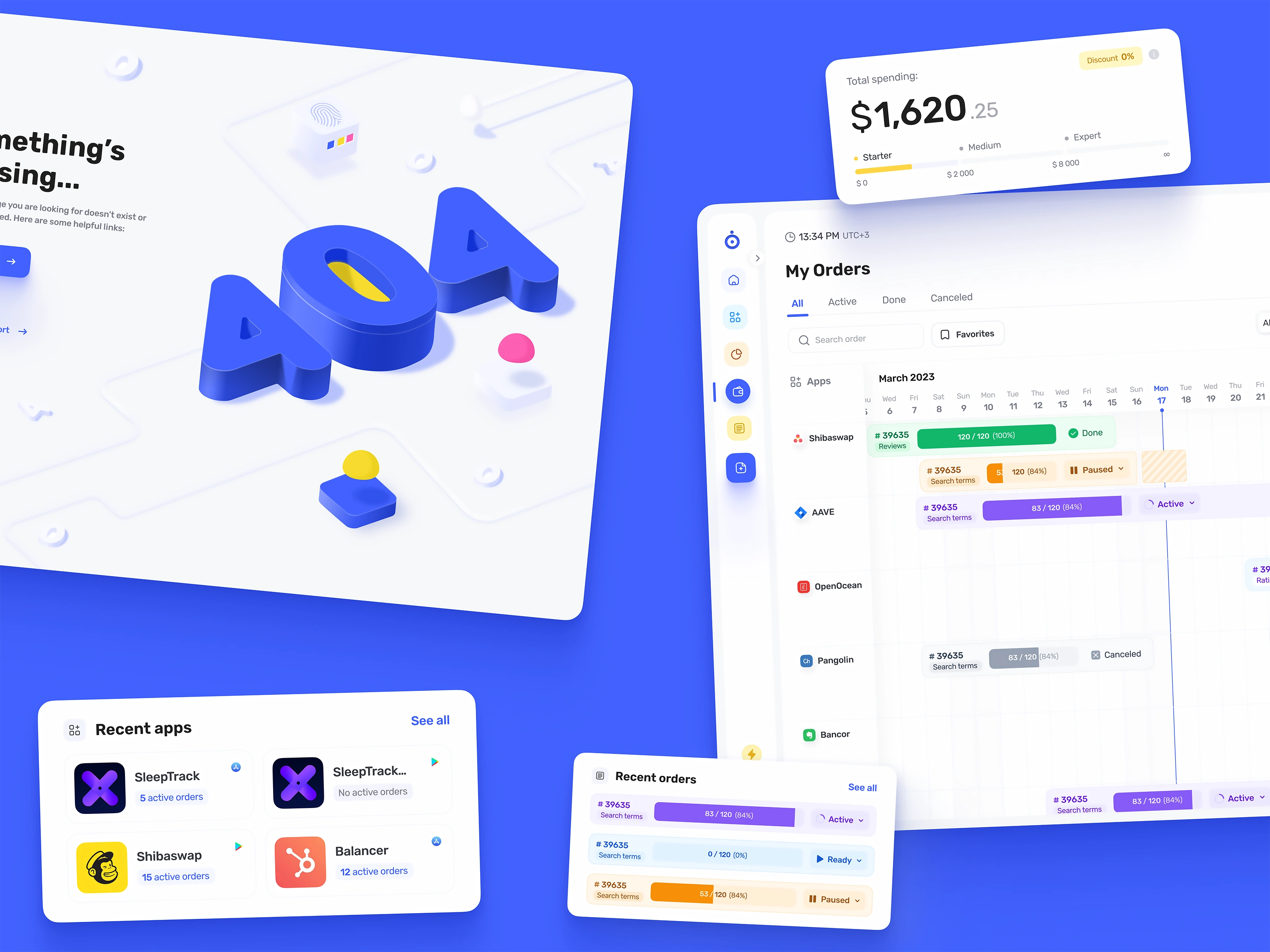
The core challenge was information density. Campaign managers juggle dozens of active orders across multiple apps simultaneously, each with its own timeline, status, budget, and progress metrics. The timeline view — a Gantt-style interface mapping orders against calendar dates with real-time progress bars and status controls — became the centerpiece. It lets users see at a glance which campaigns overlap, which are stalled, and where budget is being spent, without drilling into individual orders.
The keyword optimization module tracks rank positions, search volumes, and trends per keyword per app, with historical charts and comparative views. This is the part of the product where data density is at its highest — tables with live rank changes, volume indicators, trend arrows, grouped by keyword sets — and the design work was about making all of it scannable without flattening it into a generic data table.
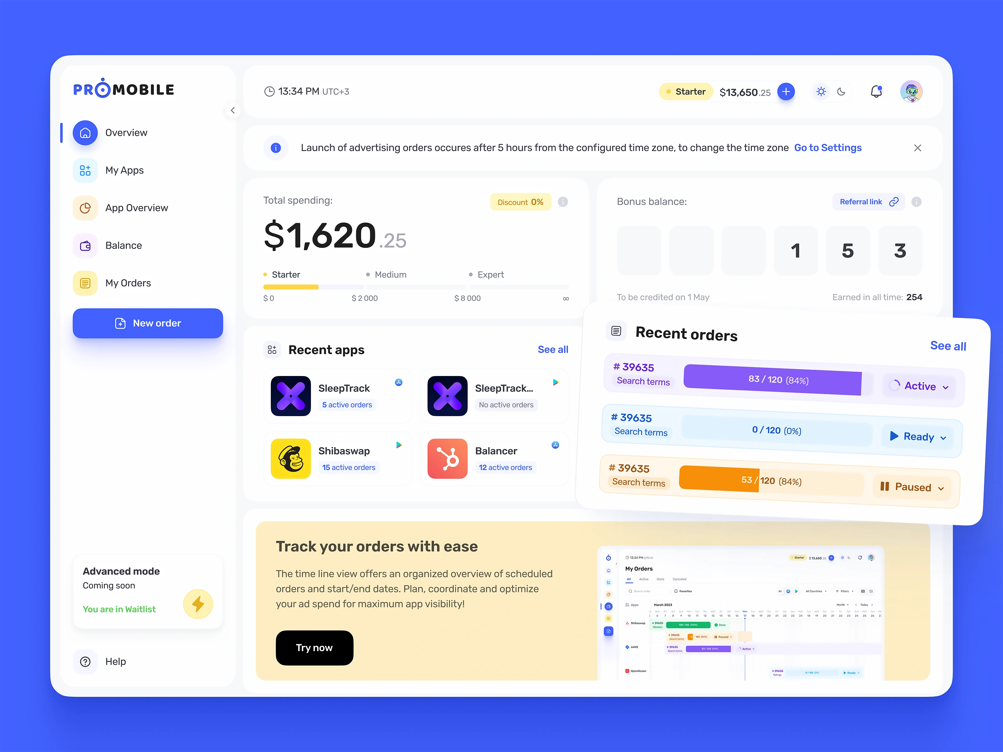
I built the design system to support both light and dark themes from day one — not as an afterthought toggle, but as a parallel visual language where every component, every shadow, every status color was designed twice. The system scales across hundreds of screens: order creation, app onboarding, payment and billing, referral mechanics, keyword management, notifications, settings, empty states, error pages.
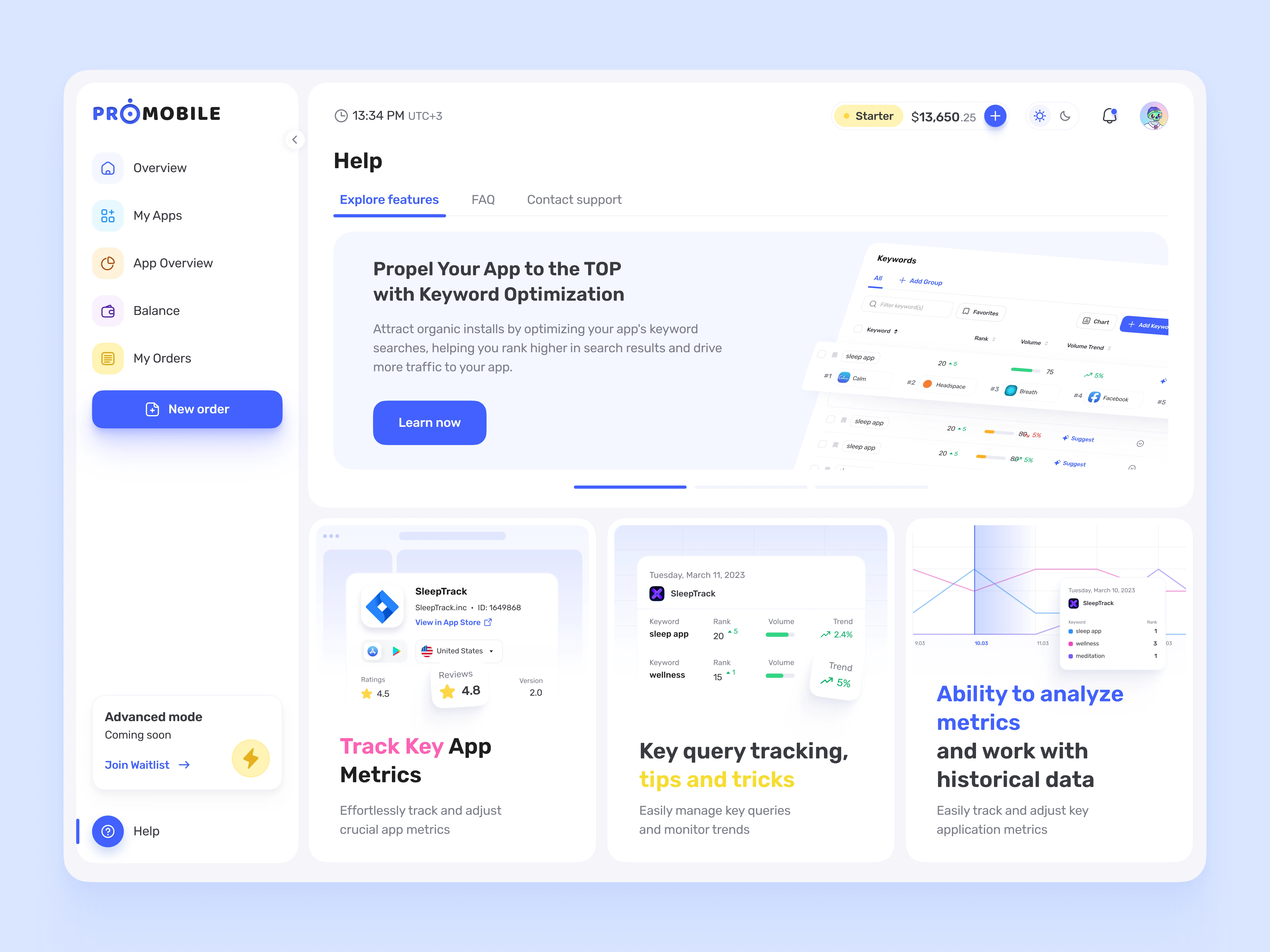
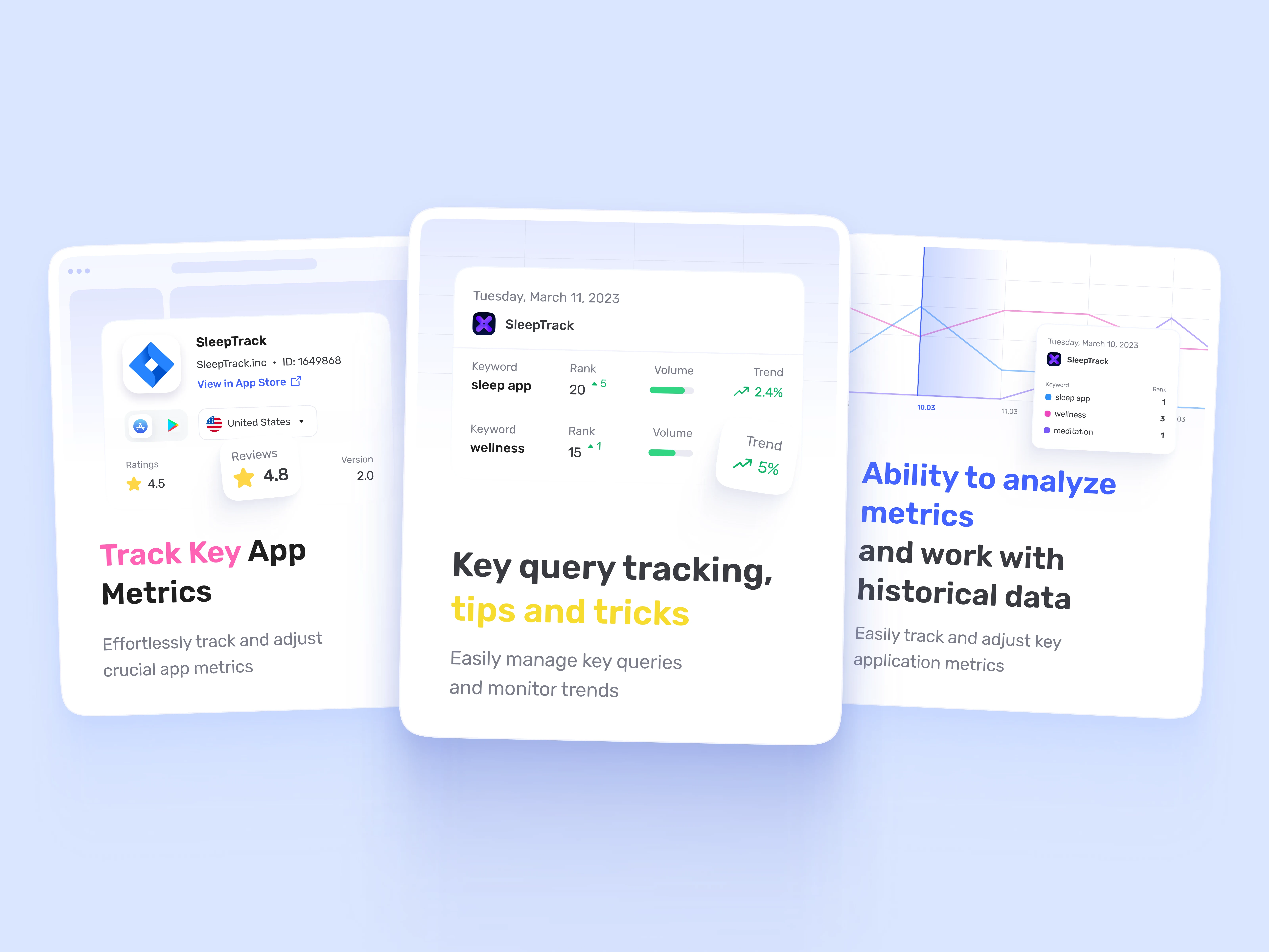
The in-app education system works through contextual feature cards rather than tutorial overlays — the Help section walks users through keyword optimization, app metrics tracking, and historical analysis with preview screenshots of the actual UI they'll encounter. You learn the product by looking at the product, not by reading about it.
The tier-based pricing (Starter → Medium → Expert) is woven into the dashboard — users see their current spend, their tier, and what unlocks next without leaving the overview. Same principle I use across most of my fintech work: make the upsell feel like information, not a pitch.
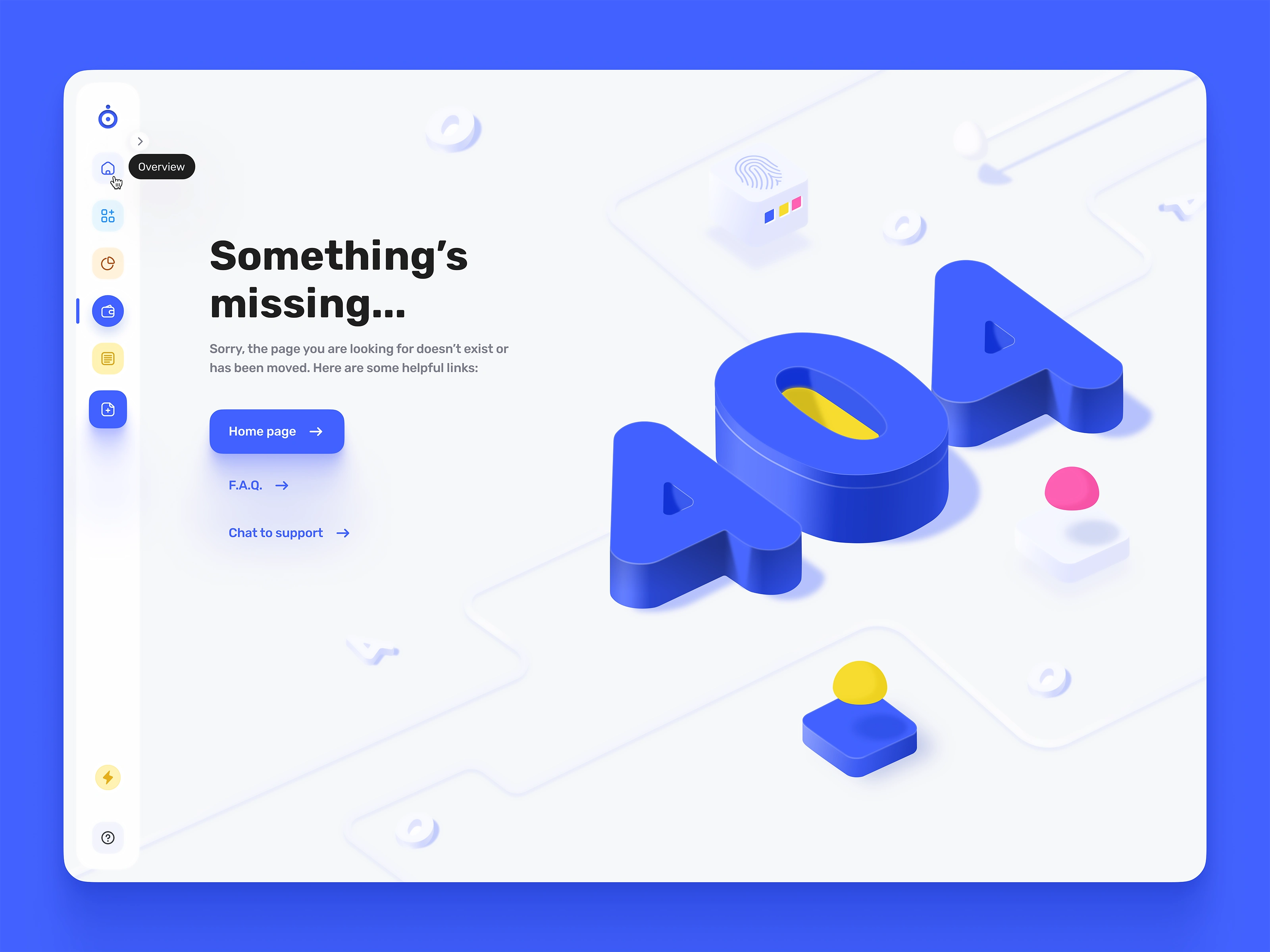
The 404 page uses custom 3D illustration — isometric lettering with the same rounded, toy-like quality that carries through the brand's icon system. Small detail, but it signals that even the dead ends were designed with intention.
Like this project
Posted Mar 8, 2026
Designed Promobile's platform for mobile app campaign management.
Likes
0
Views
11