PTS Consulting | Branding

Rebranding
PTS Consulting
The Vision
Every rebrand begins with a question: how do you evolve without losing what made you who you are?
PTS Consulting wanted a refreshed global identity that reflected growth, innovation, and confidence while staying true to the company’s heritage.
Rebranding a global organisation is never just about changing a logo. It is about capturing what the brand stands for and creating a visual system that feels both timeless and forward-looking.
The Process
The process began with research. We looked closely at the company’s values, mission, and global audience to understand what PTS represented and where it wanted to go next.
Through workshops and visual exploration, we found that the existing colour palette of black and copper still spoke to PTS’s professional and established image. These tones became the foundation of the new identity, giving the brand a sense of strength and refinement.
The new logo was designed as an evolution rather than a replacement. It carries the DNA of the old mark but introduces modern geometry and balance to represent progress and change.


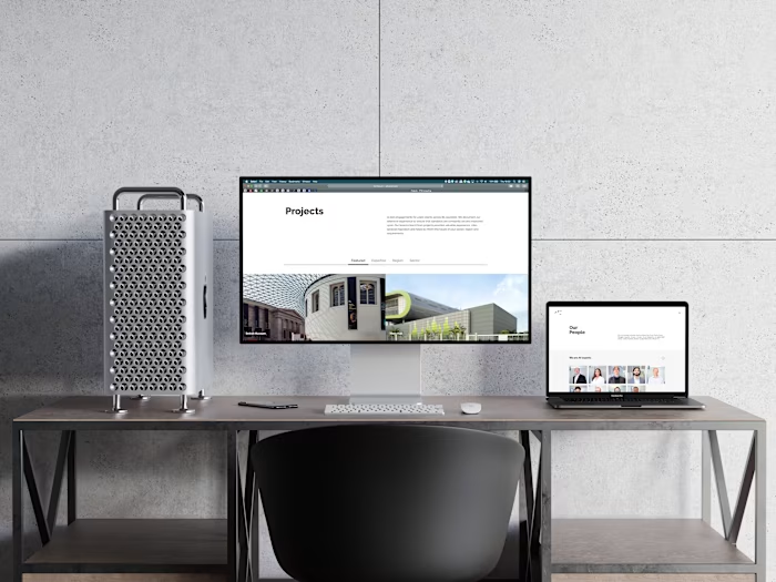
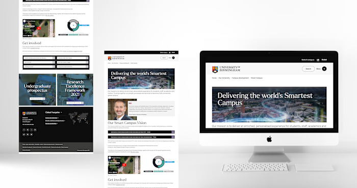
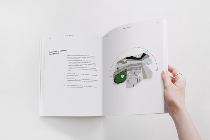
Once the core identity was defined, I created mockups to show how the rebrand could live in the real world.
The system was applied across packaging, stationery, signage, and digital environments to demonstrate consistency and cohesion at every touchpoint.
The Outcome
The rebrand positioned PTS Consulting as a company that honours its legacy while embracing the future.
The visual system feels modern, minimal, and confident, reflecting the expertise and precision that define the brand.
This project proved that great branding is not about starting over.
It is about revealing the essence of who you already are, in a clearer and more powerful way.


Like this project
Posted Jan 7, 2026
Led PTS Consulting’s global brand, refining its identity to reflect growth and innovation while preserving its heritage through a modernised visual system
Likes
0
Views
0


