PTS - Global Rebrand
Jessica Stephenson
Rebrand Project
PTS
The Vision
PTS Consulting set out to redefine how it presents itself to the world. The goal was to move away from the language of traditional consulting and express a more confident, digitally focused identity. The company wanted a brand that reflected how it transforms environments, engages users, and improves operations through technology.
Working closely with Nick Tate, Head of Marketing, and Saiesha Pitroda, Marketing Executive, I led the creative direction for the new global identity. Together we developed a system that communicates progress, clarity, and connection.
The Design
The decision to shorten the name to PTS signified growth and flexibility. The new identity builds on that idea, creating a visual language that is simple, modern, and adaptable.
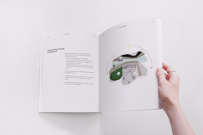
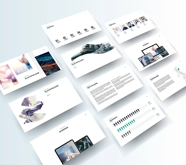
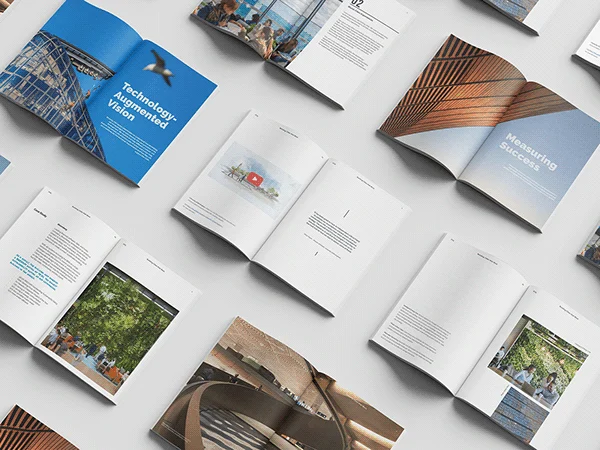
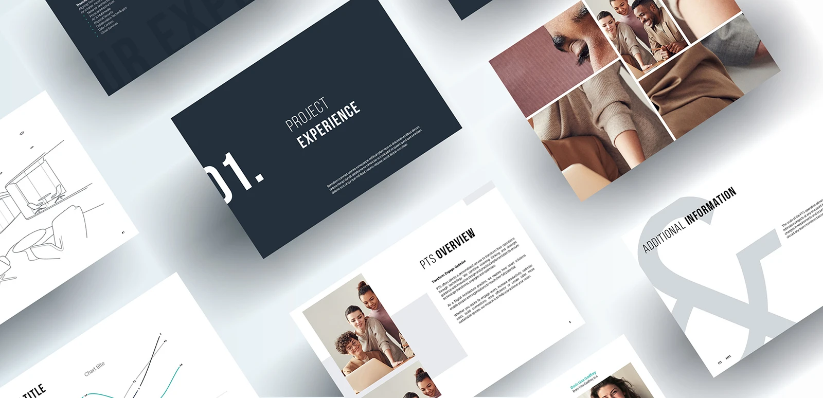
Every detail was designed for clarity and consistency. Presentation templates, bid documents, social media assets, and marketing materials were rebuilt from the ground up to work as part of one coherent system.
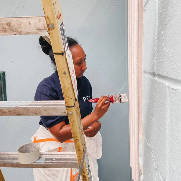
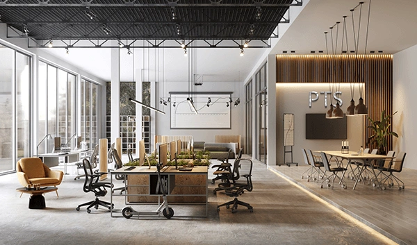
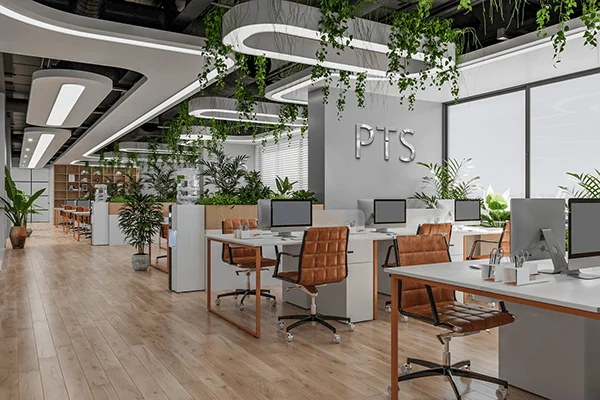
In the physical environment, the new brand extended into office spaces. Frosted glass patterns, wall graphics, and signage were introduced to create a calm, unified atmosphere that reflected the brand’s visual tone.
A detailed brand playbook was created to ensure that every team, across every region, could use the new identity confidently and consistently.
The Implementation
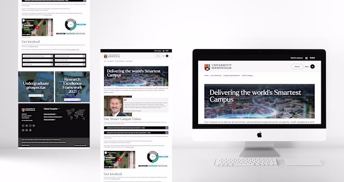
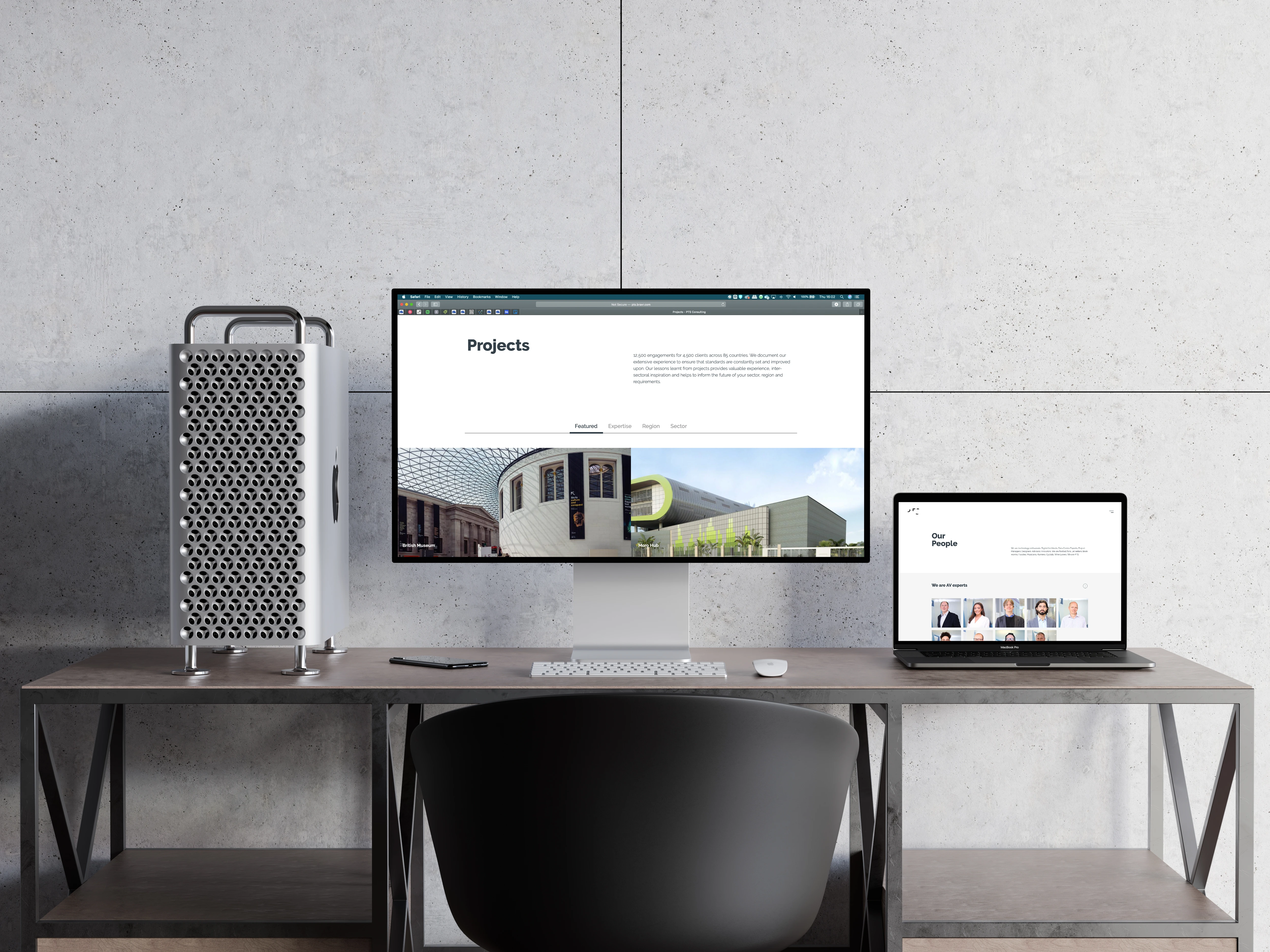
The rollout was carefully planned to include both internal and external communication. Employees were trained on how to use the new materials, and partners and clients were informed about the change and the story behind it. The updated website, internal documents, and social platforms all launched together to introduce the new identity.
The Outcome
The rebrand brought a sense of unity to a global organisation. It gave PTS a visual identity that matched its ambition and created a single voice across regions, disciplines, and teams.
This project showed that a successful rebrand is not only about a new logo or colour palette. It is about helping an organisation see itself more clearly and communicate with greater purpose.

Social Media
On social platforms, the refreshed identity translated into clear, flexible layouts that highlight people, projects, and ideas. The design system’s typography and colour palette provided instant recognition while allowing space for content to take the lead. Each post became an opportunity to communicate the brand’s values with clarity and restraint.
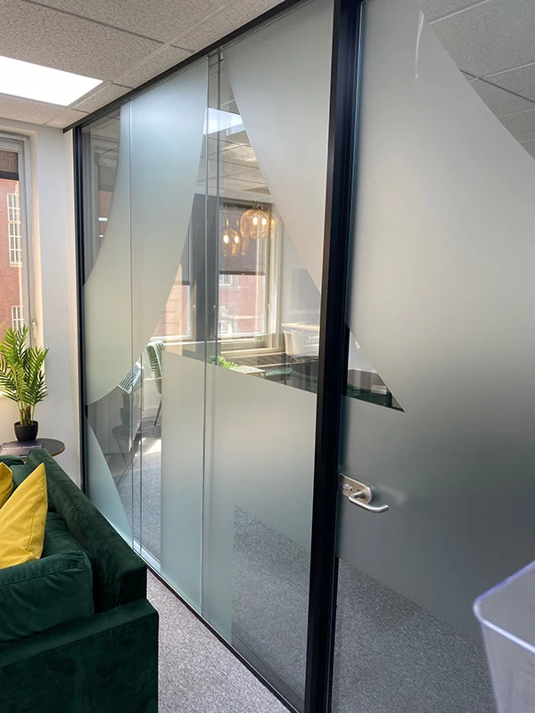
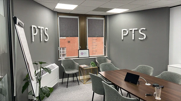
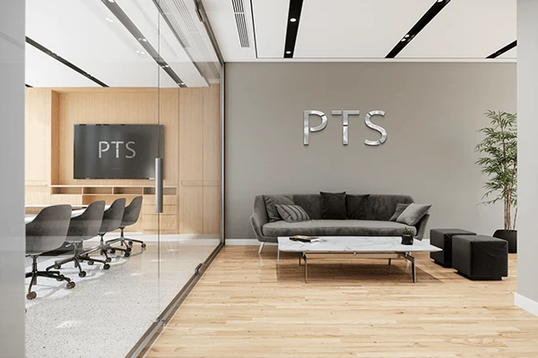
Office Design: Logo and Frosted Glass
The new identity extended into the built environment. The logo was applied to interior walls to create a focal point within shared spaces, giving the brand a sense of presence without dominating the architecture. Frosted glass patterns were introduced throughout meeting rooms to balance privacy with light. These subtle interventions turned the workplace into a calm expression of the brand, where the visual language and physical environment support one another.
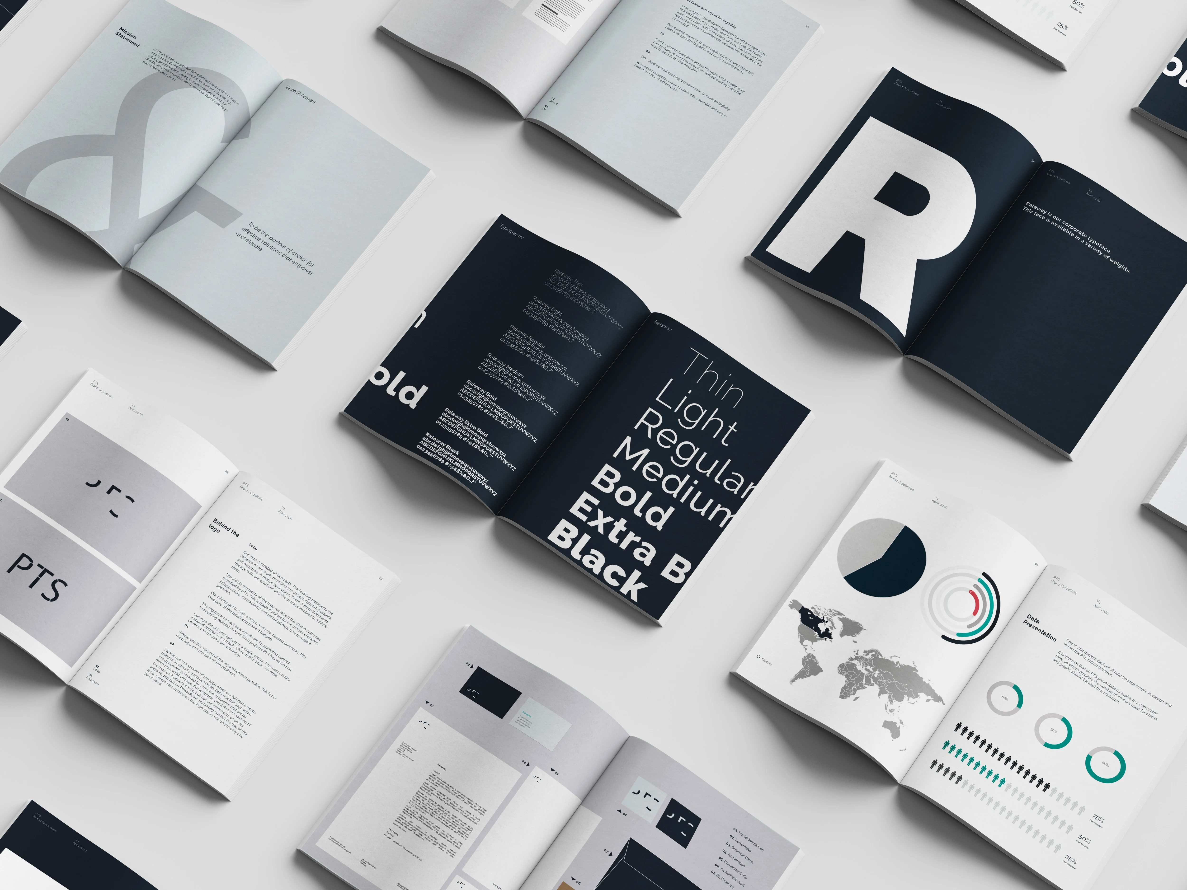
Brand Guidelines
The brand guidelines became the foundation of the new identity. They document every visual and verbal element of the system, from typography and colour to tone of voice and composition. The guide ensures that every team member, regardless of region or role, can communicate with the same clarity and precision.
Teams Backgrounds
A suite of digital backgrounds was created to bring the brand into everyday communication. These assets gave remote meetings a consistent and professional presence, reinforcing the new identity in a subtle but constant way.
Logo Animation and Screensaver
The animated logo introduced motion to the brand system. It was used in presentations, events, and digital channels to express energy and transition. The same sequence was later adapted into an internal screensaver, becoming a daily reminder of the company’s shared identity and direction.
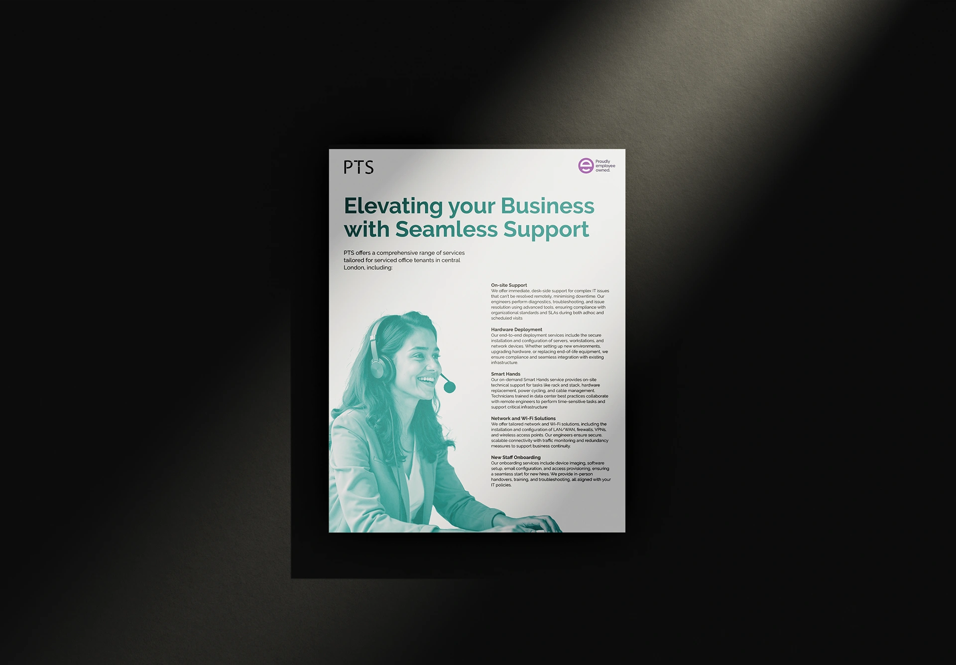
Service Flyer
To support external marketing, a series of flyers was developed to highlight individual PTS services. Each piece followed the new design system, using simple hierarchy, clear messaging, and confident typography to communicate complex offerings with ease.
Like this project
Posted Jan 7, 2026
Led the global rebrand of PTS Consulting, creating a modern, digitally focused identity rolled out consistently across all platforms and regions.
Likes
0
Views
2