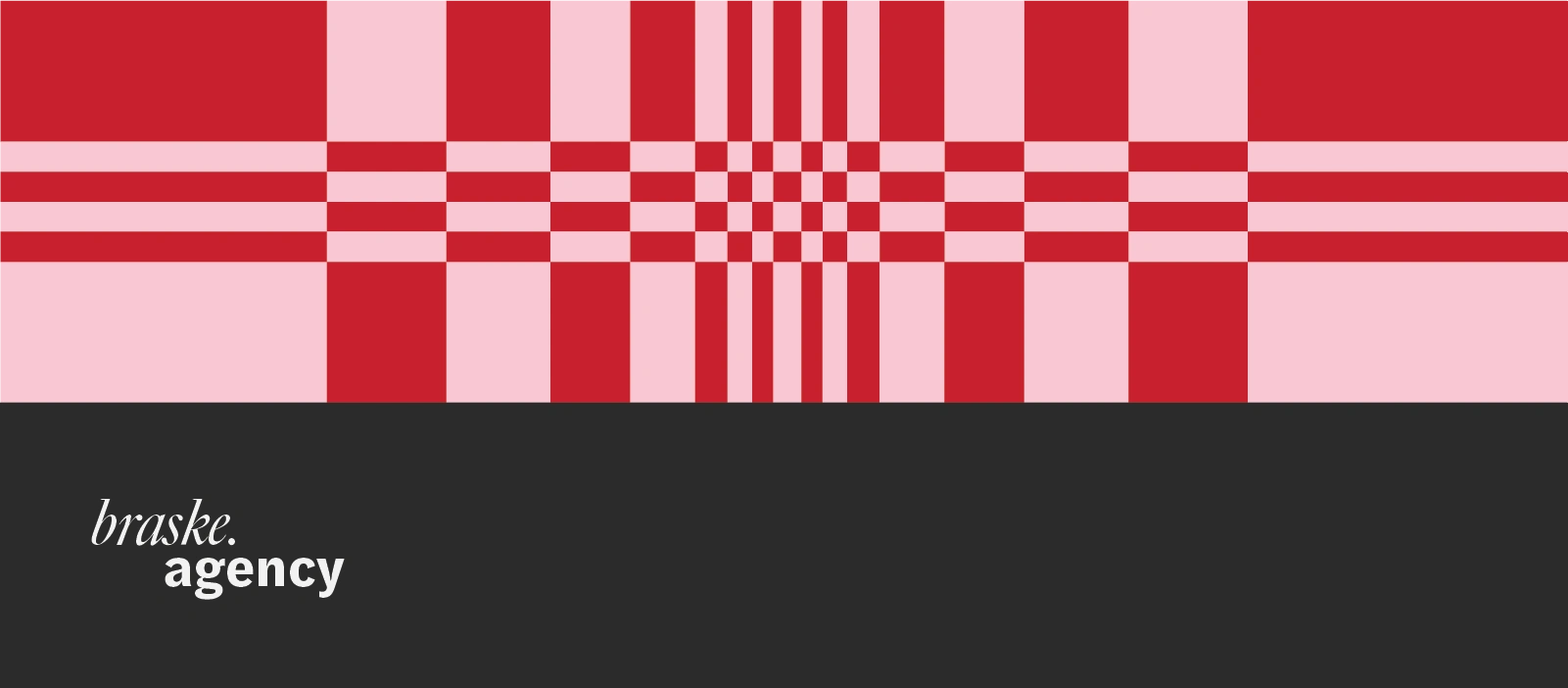
braske.agency / Brand Identity
Neringa Nina
braske.agency is a creative development agency with a sharp edge and a sense of humor — a team that thrives on unexpected ideas, strong visuals, and work that leaves a mark. They were looking for a brand identity that could capture their full presence across digital, print, and physical space. It needed to feel bold but considered, full of energy but never loud for the sake of it.
At the core of their ask was a desire for a visual world that was entirely their own — led by a distinctive palette of carmine red, bubble gum pink, and off-black. The goal: an identity system that’s confident, character-rich, and unmistakably Braske — striking the balance between irreverent and refined, human and sharp.
Realness Over Polish

This direction dials up personality without losing clarity. It expands on Braske’s off-black, pink, and red palette, bringing it to life through warm, character-driven photography with a grainy, film-inspired aesthetic. It’s bold but grounded, textured with a woven motif that gives rhythm to every touchpoint — from screens to print to physical space. There’s a pulse here: playful, self-aware, and unmistakably human. As a full brand identity, this isn’t just digital or print — it’s Braske in motion, vivid and cohesive across every medium. It’s confident, slightly mischievous, and full of spark.
This is Braske as a living presence: magnetic, memorable, and built to stand out.
A Wordmark That Speaks Volumes
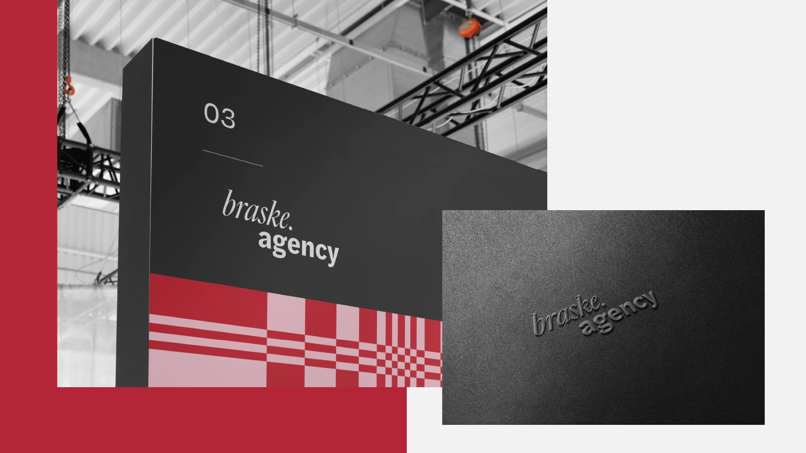
braske.agency's logo in pratictal use.
Braske’s logotype is a refined wordmark that blends minimalism with subtle expression. Crafted from two distinct typefaces, it strikes a balance between bold and elegant — quiet enough to let the identity breathe, but confident enough to stand on its own. The result is a typographic signature that complements the brand’s visual rhythm while adding a touch of unexpected personality.
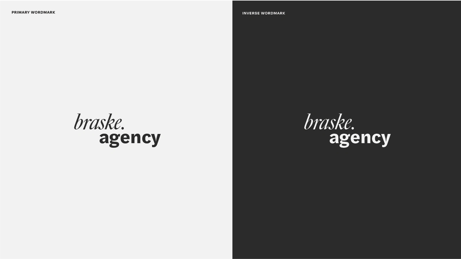
A close view of braske's logotype.
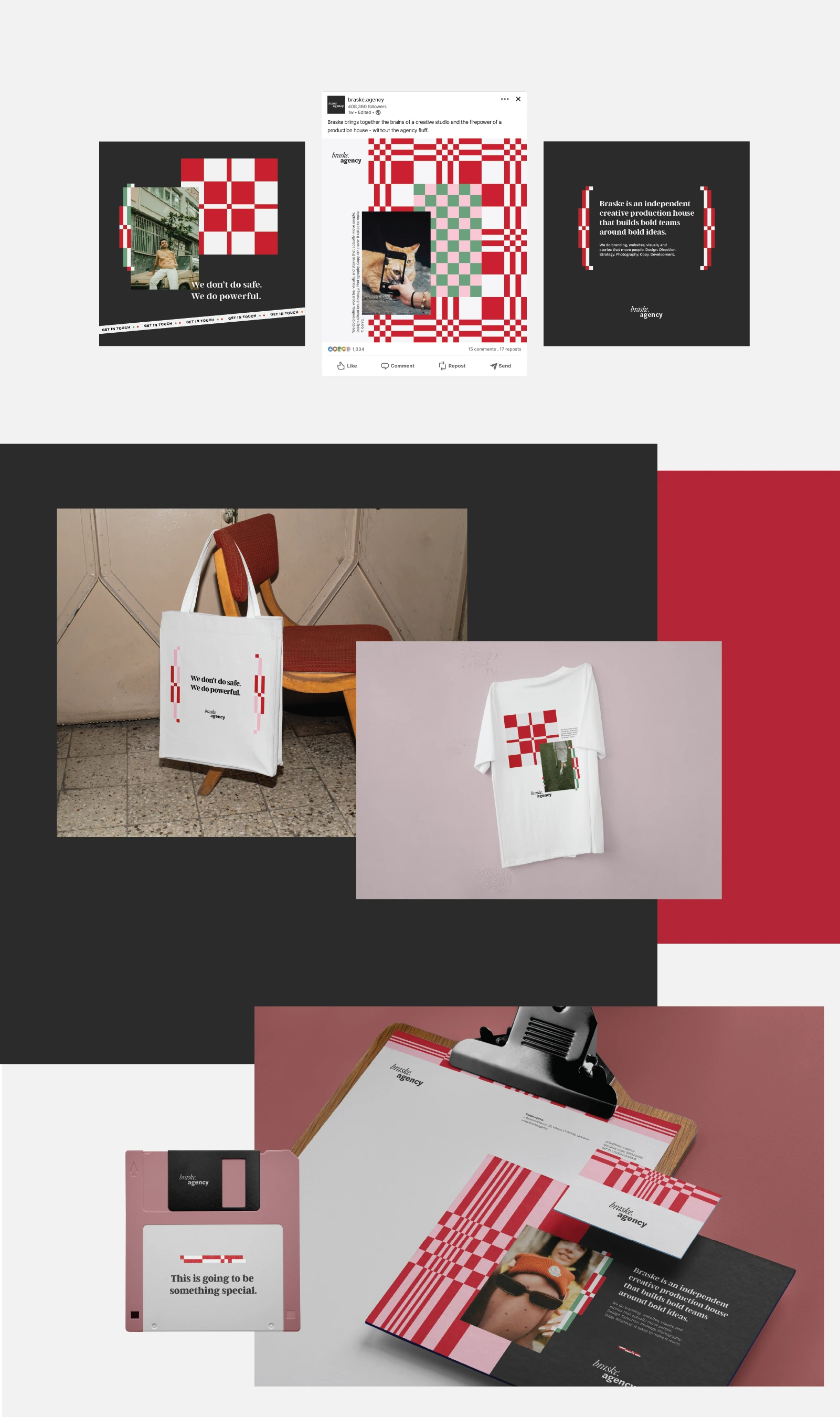
A Memorable Presence
In both social and print, Braske’s look comes together through its woven patterns, signature colors, and grainy, film-like imagery. It feels lived-in, a bit cheeky, and unmistakably theirs — a brand that doesn’t try too hard but still stands out.
Like this project
Posted Jun 11, 2025
A bold, human identity for braske.agency — blending rich color, expressive type, woven patterns, and film-style imagery with a touch of irreverence.
Likes
20
Views
199
Clients
braske.agency