Fresh perspective for online banks: A Gen Z-Centric Approach
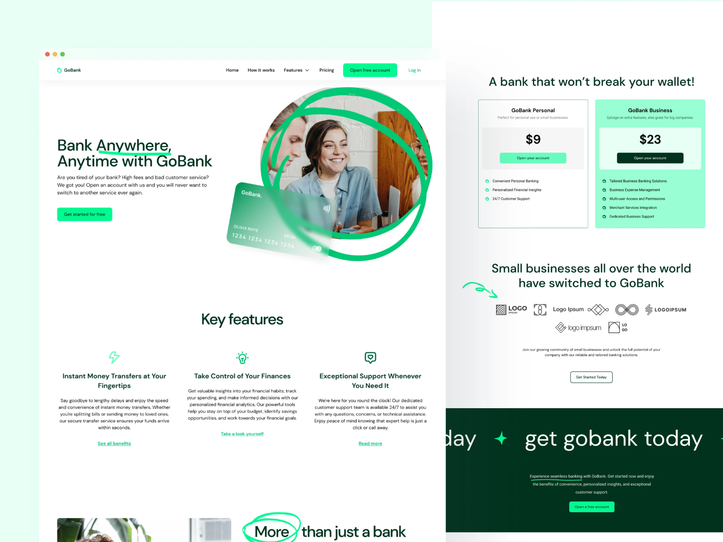
Classic bank websites often fall short in appealing to younger generations, such as Gen Z. Traditionally, bank websites tend to have dull and conservative designs, failing to resonate with this younger and tech-savvy demographic. Embracing a modern and vibrant design, I aimed to break away from traditional banking norms when it comes to design, in order to appeal to the younger generations.
GoBank, a modern online banking platform, seeks to appeal to the Gen Z demographic, a generation characterized by their tech-savviness, digital-first mindset, and preference for seamless user experiences.

02 Process and solution
Taking insiration & crafting a style guide
I started my design process with creating a mood board, which later helped me to create the look and feel of the website. As a main color I picked neon green- a vibrant color that captures attention and evokes a sense of excitement. Paired it with other green hues and lots of white.
Wireframing
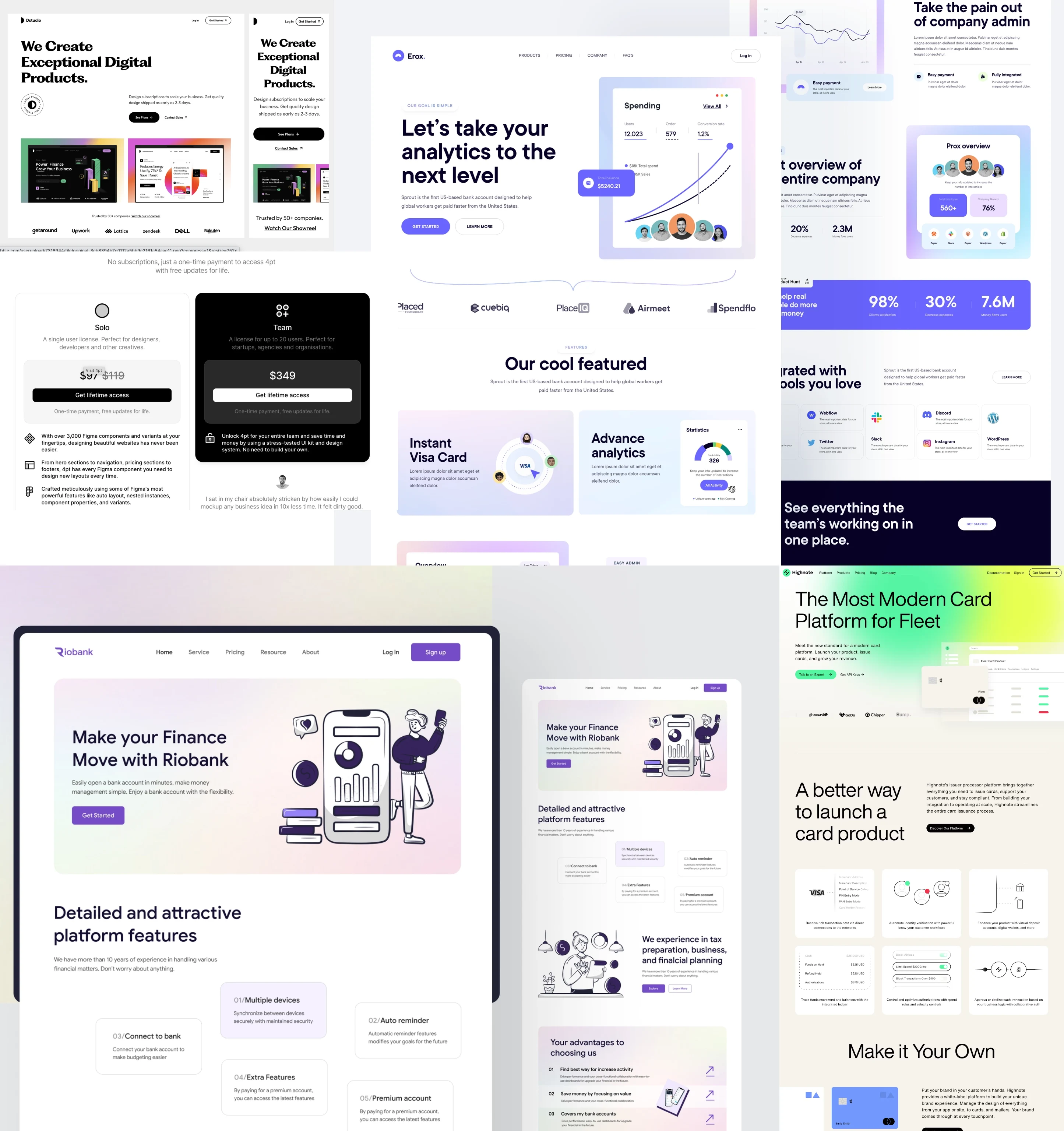
As a next step, I used my iPad to create digital wireframes of the homepage. Low-fidelity wireframes are best at this stage, as I like concentrating on the structure of the website and not get lost in details.
Creating the design in Figma
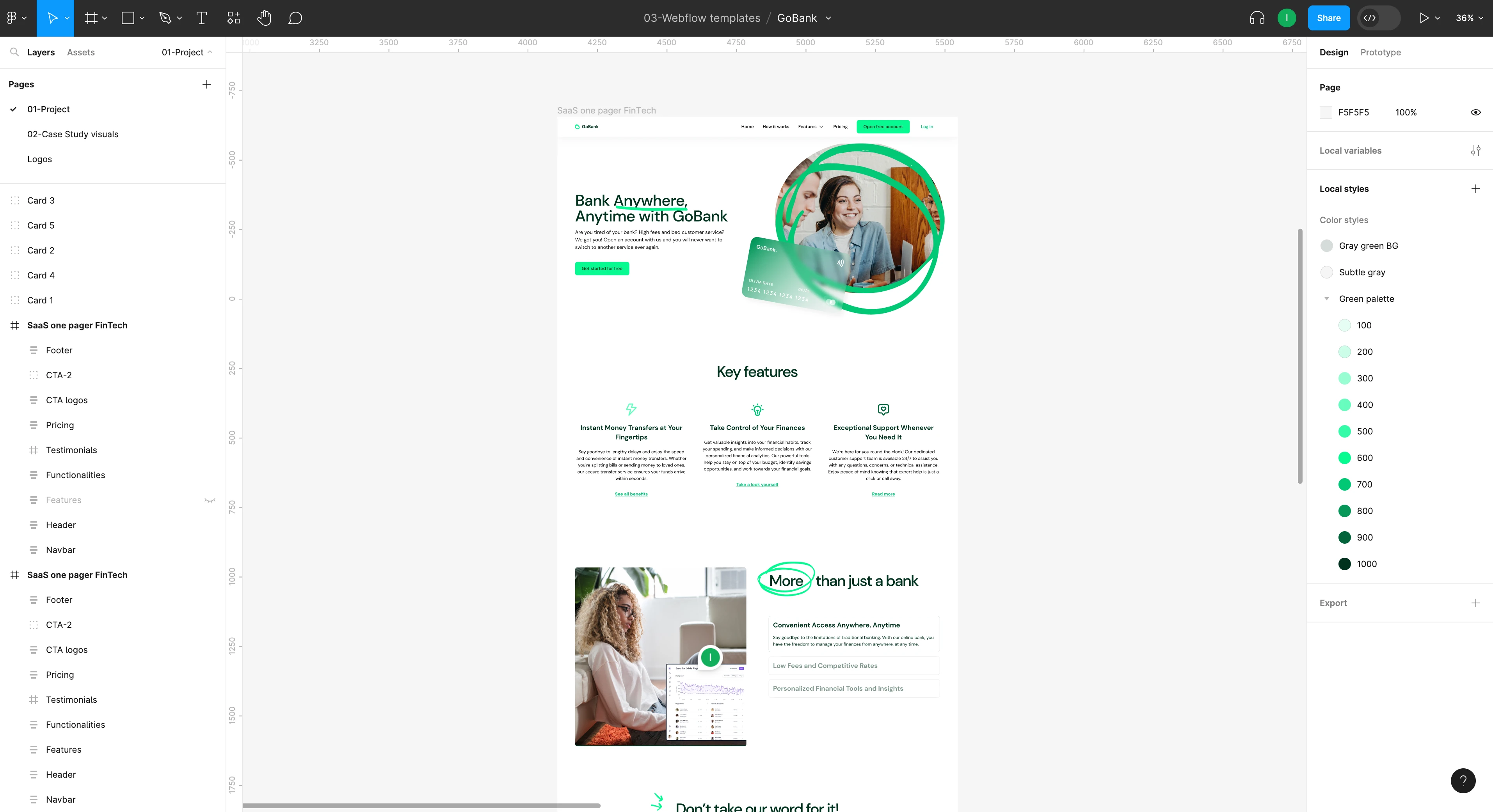
I designed the main page incorporating the vibrant color palette and using some design elements?? to add authenticity and personality to the website. I focused on showcasing the bank's unique value proposition, key services, and a clear call-to-action for lead capture.
Building a Style Guide inside Webflow
Once the UI design in Figma was done, I started implementing it in Webflow.
To me, it’s very important to have a style guide incorporated into the Webflow build. Only this way you can ensure consistency throughout the entire website. For example, I always set website-wide colors, styles and of course the typography hierarchy.
Make site responsive
Gen Z is a mobile-first generation, relying heavily on smartphones for online activities, especially making purchases. A responsive website ensures that the user experience remains seamless and consistent across various screen sizes, including smartphones and tablets.
Once I finished implementing the design on the base desktop breakpoint (1100 px), I made the necessary adjustments to maintain usability across various screen sizes.
Adding animations
Last but not least, I added some animations in order to capture users' attention and create an engaging and interactive experience. This gives the website a well-rounded look and helps differentiate it it from the rest of the competitors in the online banking space.
Showing the testimonials one by one
Less is more- by displaying testimonials one by one with this subtle scroll-triggered animations, the user is fully engaged.
Using bold big text animation to highlight the main CTA
Implementing a bold big text animation to highlight the main call-to-action creates a sense of urgency and draws immediate attention to the desired action.
The Backend - class naming
For the online bank website project, I adopted Finsweet's class-naming convention called "Client First" to streamline the backend organisation and ensure a clean and efficient structure. Here’s a sneak peek of how the backend of the template looks like.
03 Outcome
A Webflow website for online banks that embraces a modern and vibrant design, with a clear call-to-action for lead capture.
GoBank can help any online bank to establish a strong online presence, gain a competitive advantage, and position itself as a preferred banking solution for the younger demographic- the Gen Z.
Like this project
Posted Oct 9, 2023
A vibrant, modern, one page web design for an online bank, encouraging new leads to engage with the website, explore the bank's offerings, and ultimately, sign…
Likes
0
Views
4

