Miso Brand Design
Drice Roland
Verified
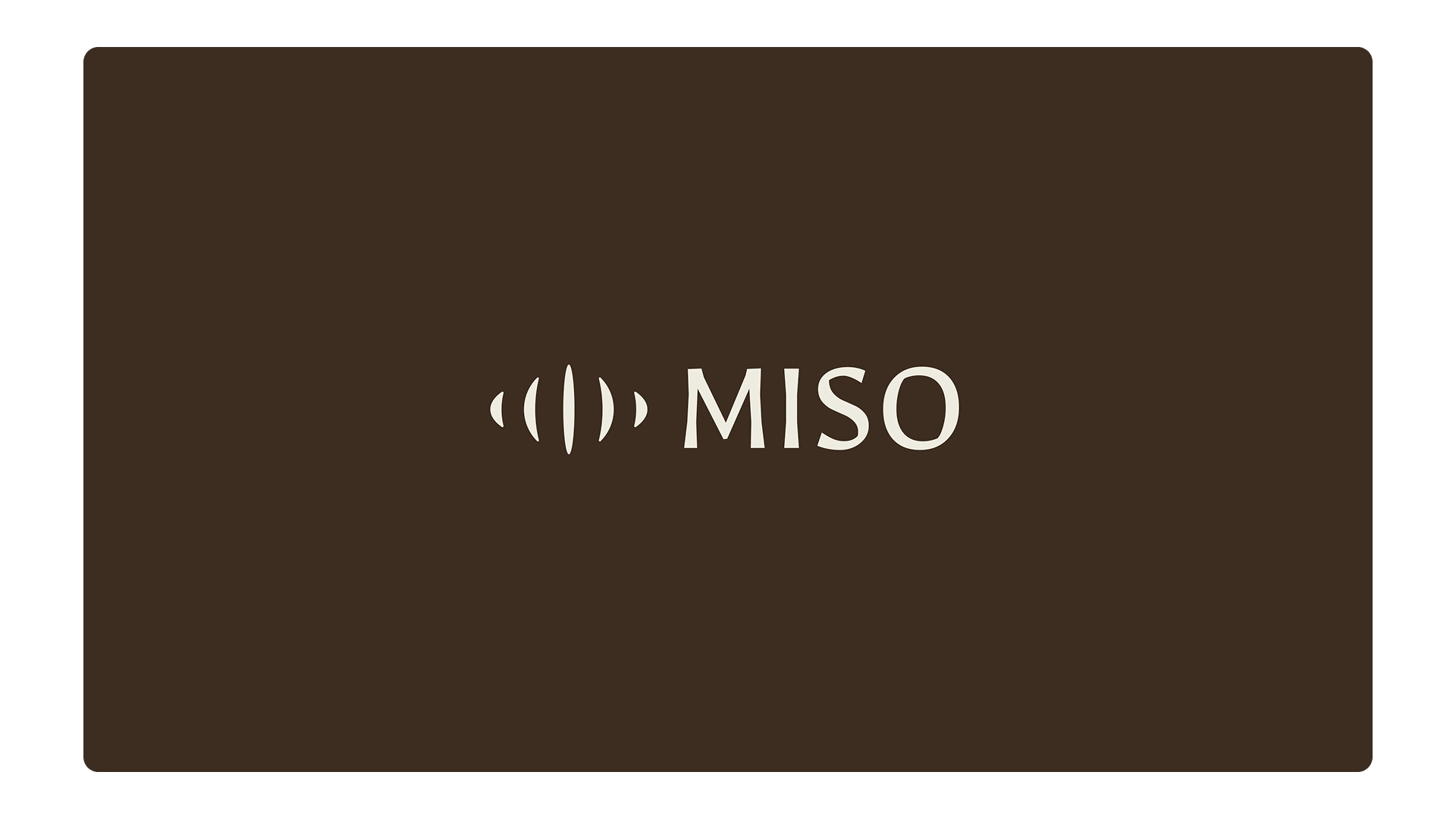
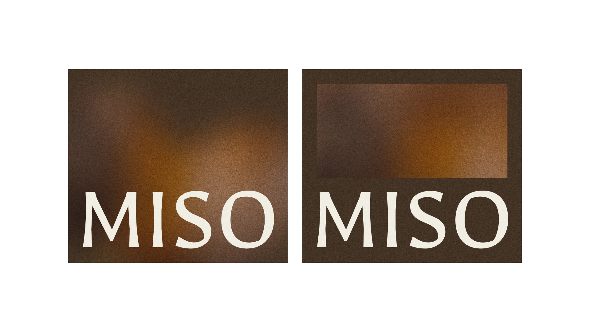
For Miso, we wanted an identity that feels warm and tasteful, just like the name suggests. The idea was to keep things simple but premium, mixing clarity with a touch of personality.
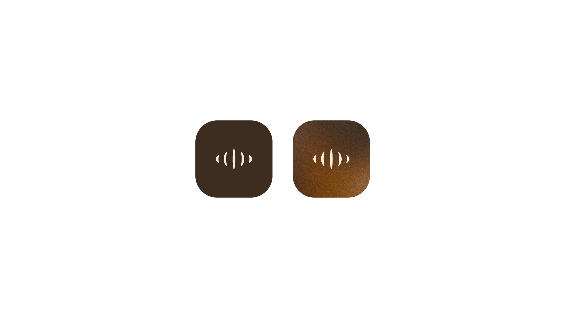
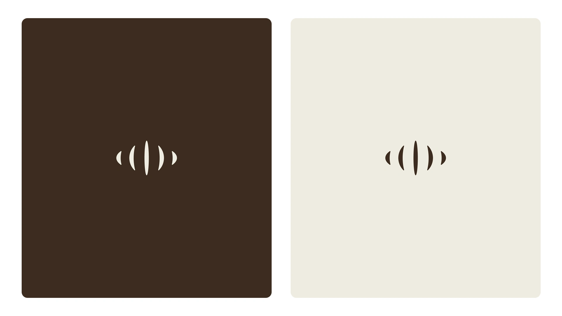
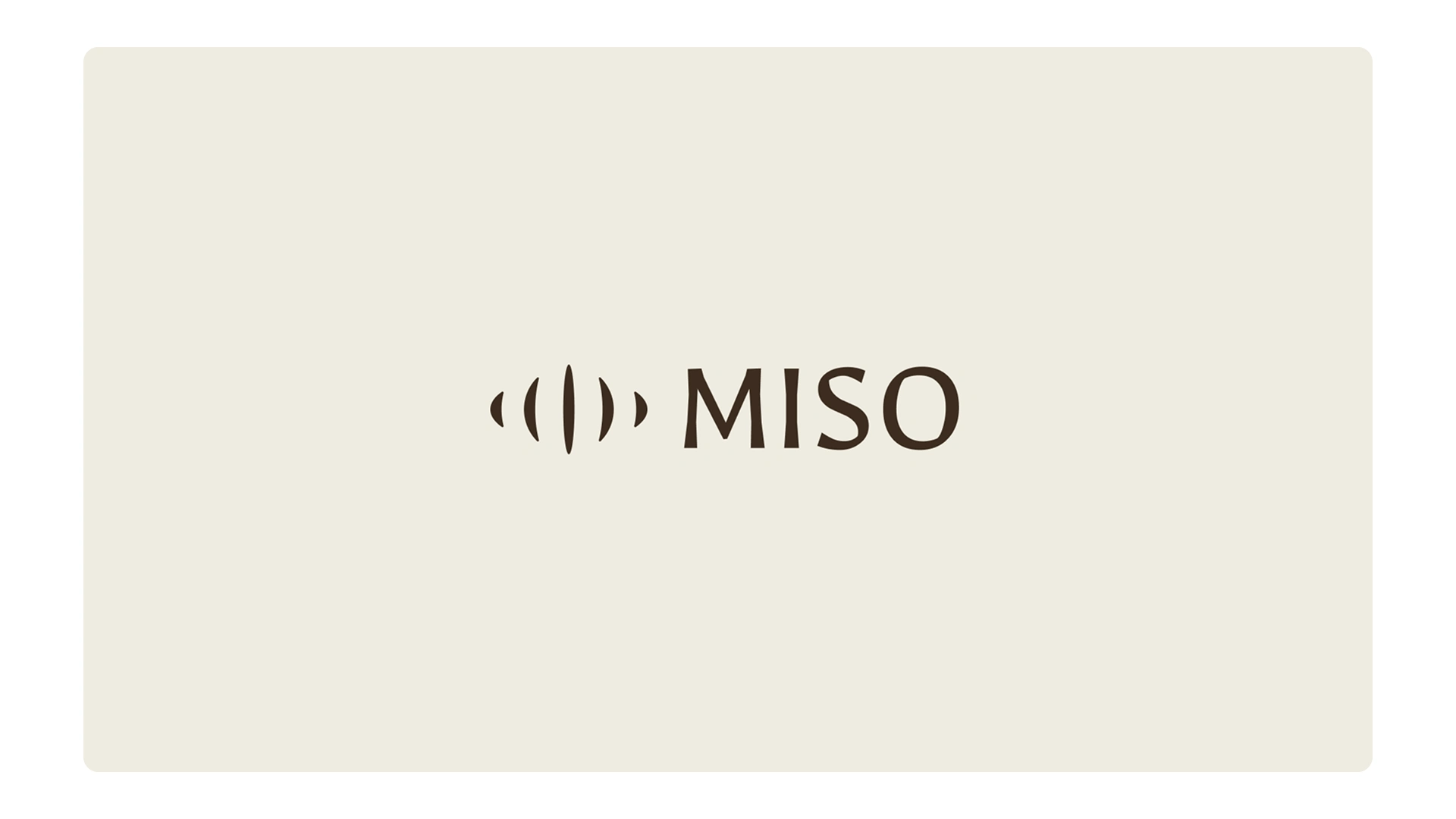
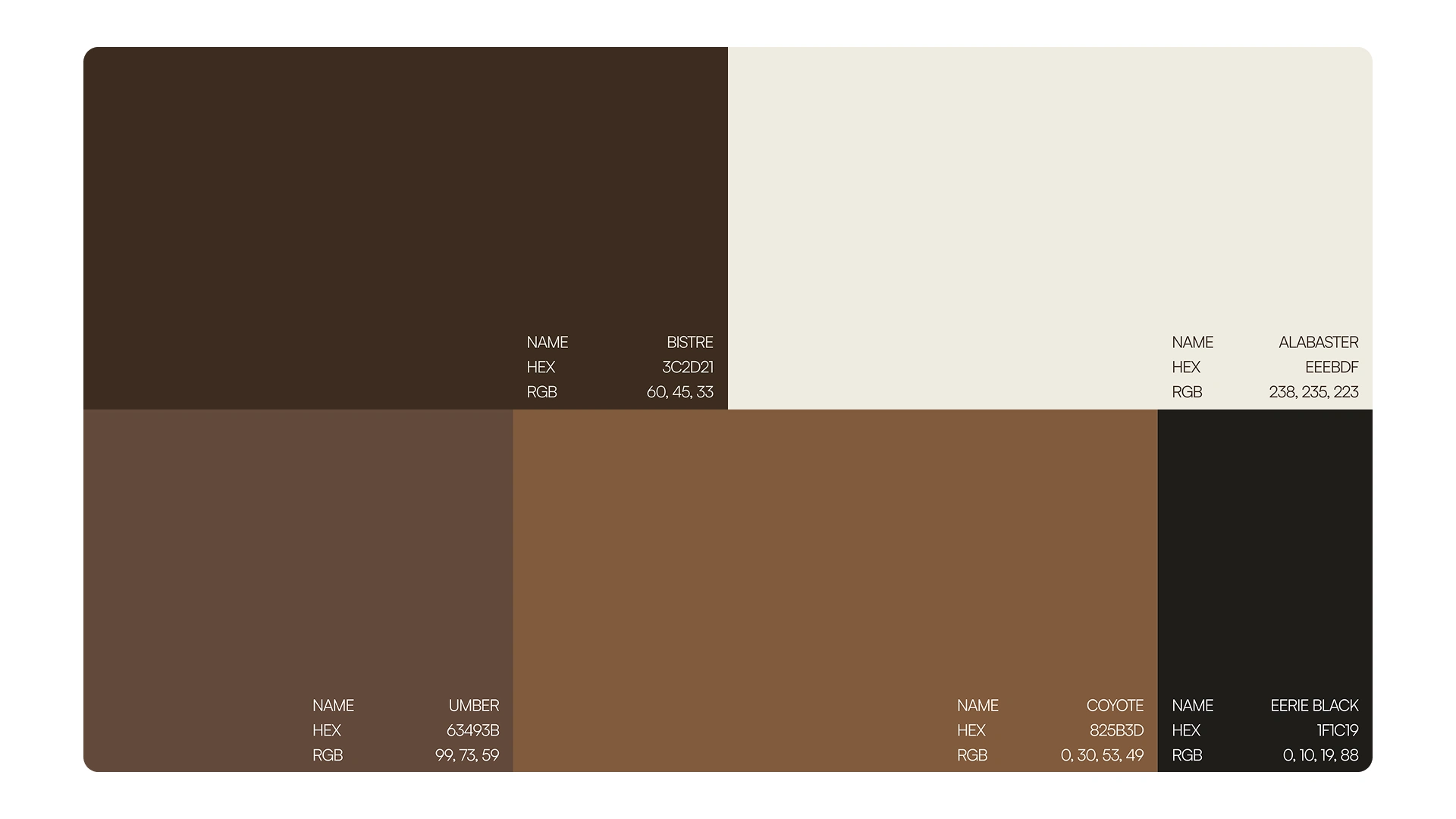
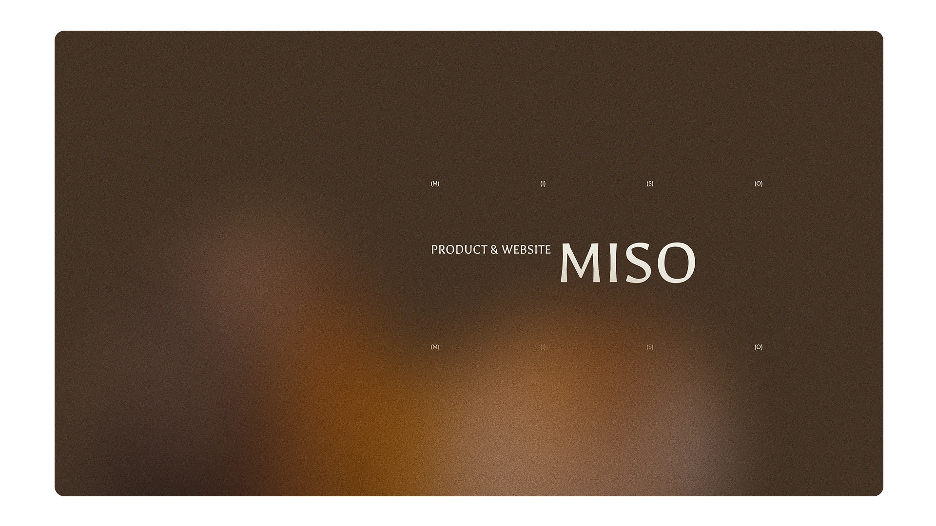
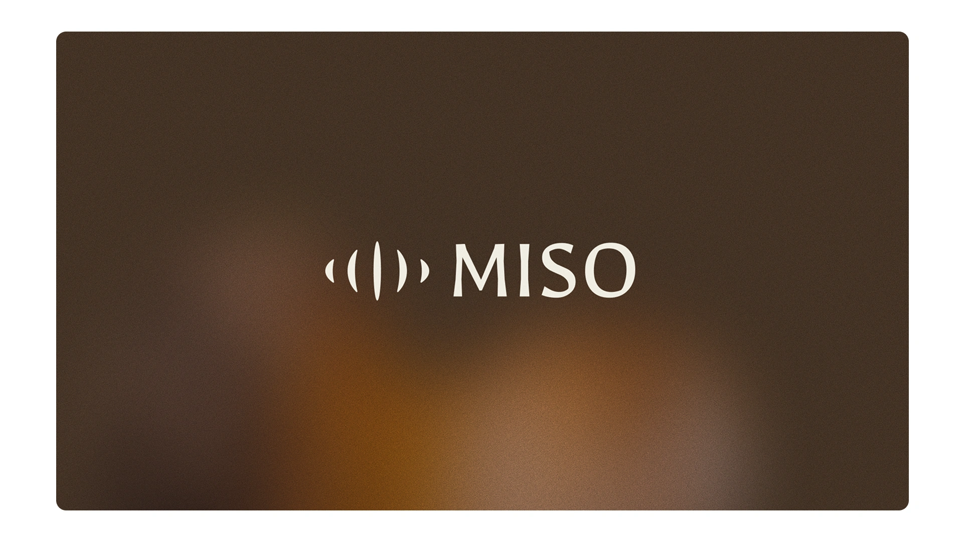
The logo uses a soft, wave-like icon next to clean type. It feels like flow—digital, but also human. The color palette is built around rich browns and warm tones, with gradients and a bit of texture to make it feel more alive and less flat.
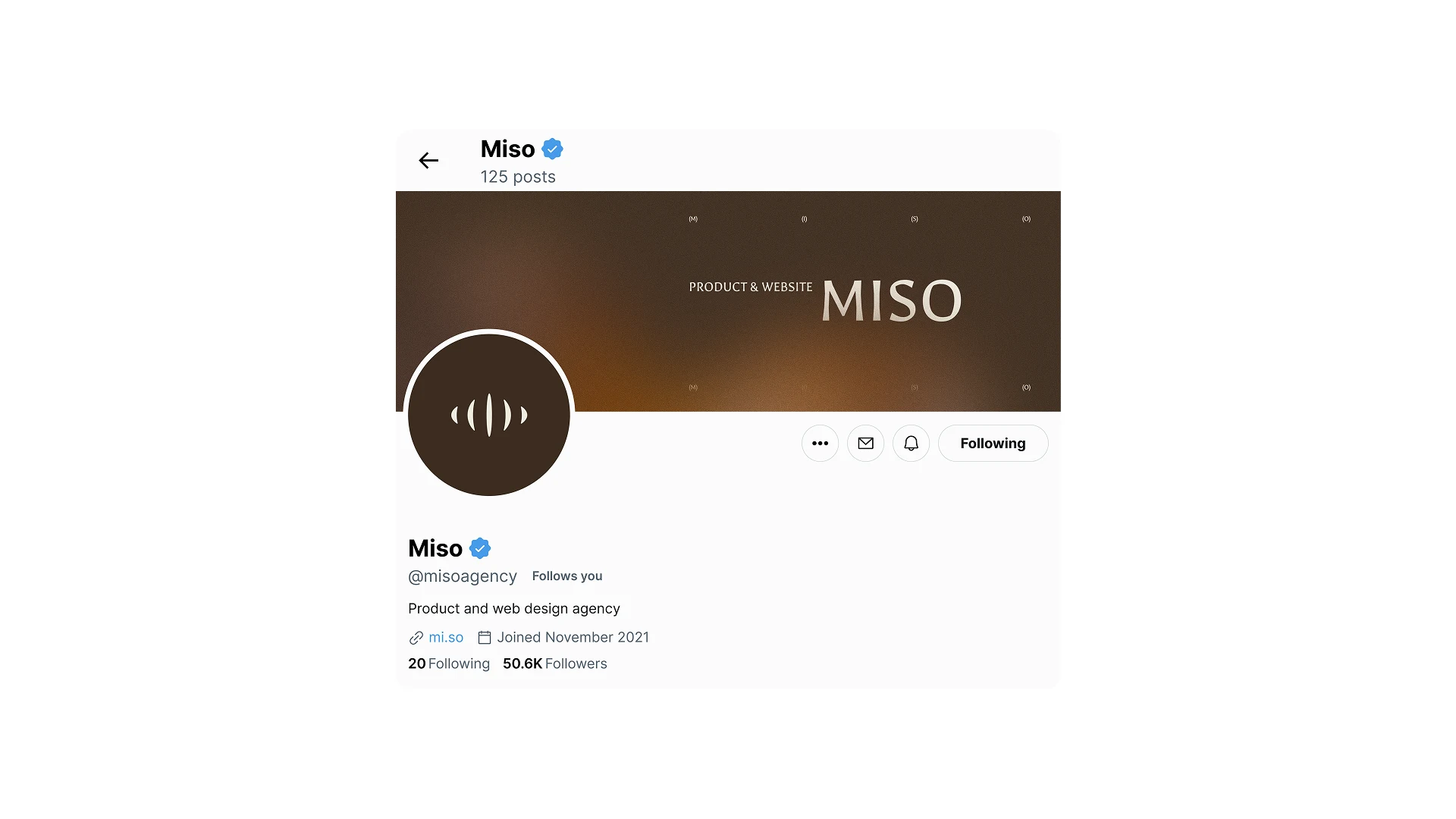
What we love about this identity is how flexible it is. It works just as well on a website as it does on social media or other touchpoints, always keeping the same balance: thoughtful design that feels refined, but never too serious.

Like this project
What the client had to say
Legend & creates absolute magic! Fast turnaround and takes on feedback so well.
Victoria Bakos
Sep 15, 2025, Client
Posted Sep 15, 2025
Miso’s identity is warm, simple, and refined, soft shapes, rich tones, and textures that balance premium design with a human touch.
Likes
19
Views
775
Timeline
Sep 10, 2025 - Sep 15, 2025
Clients
Miso