A few weeks ago, a
Daniel Igbokwe
A few weeks ago, a client reached out to me right here on LinkedIn with a clear but challenging brief: build an onboarding experience for Sonara, an AI-driven language learning platform that cuts through the noise of traditional memorization.
The goal wasn't just to make it look "premium." The goal was to solve for intent.
In language learning, the biggest drop-off happens in the first 60 seconds. If the user feels like they are just filling out another form, you’ve lost them. I approached the Sonara design with three specific psychological levers:
1. Visualizing the Complex 🧠
The hero illustration isn't just decoration. It’s a literal map of the "AI Tutor" engine—showing how perception data, language models, and personalized feedback stack up. By making the tech tangible, we build immediate authority before the user even types their name.
2. The "Intent-First" UX 🎯
Instead of a generic signup, I designed the "My goal is..." selector. By forcing the user to identify their "Why"—whether it’s career opportunities or relocation—we create a micro-commitment. When a user tells the app their goal, they are more likely to stick with the habit.
3. Reducing Cognitive Friction ⚡
Notice the "Get Started" anchor. It uses a high-contrast purple pill against a soft cream background. This creates a clear physical focal point on mobile. If a user has to think about where to click next, the design has failed.
Whether I am designing for Healthcare or EdTech, my philosophy remains the same: Design for the user’s emotional state.
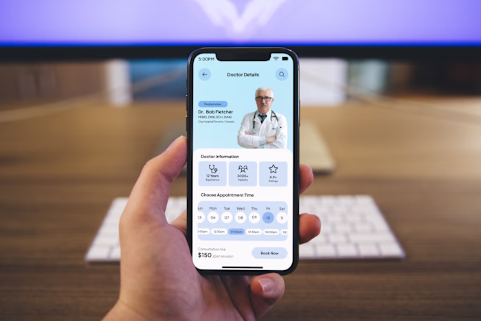
In Healthcare, we design for Certainty.
In EdTech, we design for Momentum.
To the founders and product leads in my network: When you’re building your onboarding flow, are you focusing on collecting data, or are you focusing on building excitement?
Let’s talk in the comments! 👇
hashtag#UIUX hashtag#ProductDesign hashtag#EdTech hashtag#AILearning hashtag#Figma hashtag#UserOnboarding hashtag#DesignStrategy
Like this project
Posted Apr 27, 2026
A few weeks ago, a client reached out to me right here on LinkedIn with a clear but challenging brief: build an onboarding experience for Sonara, an AI-drive...
Likes
0
Views
0