Built with Jitter
Iggy Agency Logo & Showreel
Approve request to show earnings
View
Alex Prokhorov
Verified
Iggy Agency Logo & Showreel
Shopify Development Studio
We kicked off the logo process with a quick team association game, gathering one-word impressions from the client to guide our visual direction. This helped align on tone and style early on.
From there, we moved into an open inspiration phase—collecting raw ideas, sketches, and references from both our team and the client. The goal was to explore without filters, identifying patterns and promising directions collaboratively.
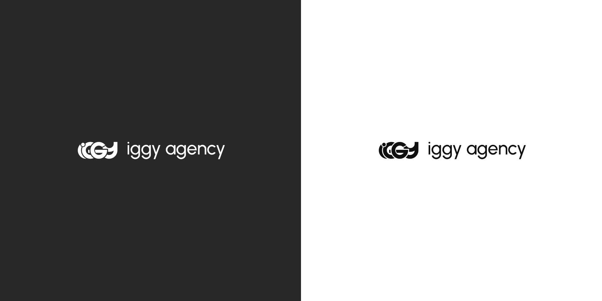
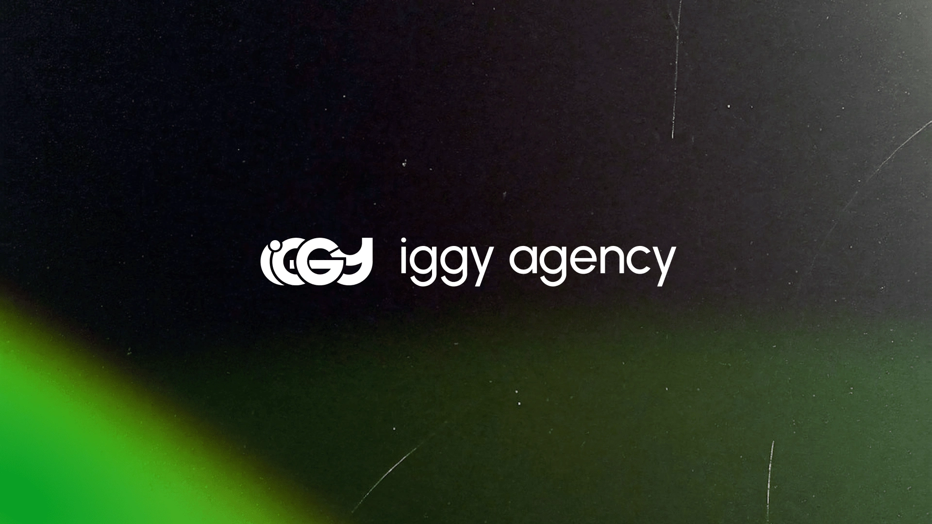
Based on the feedback, we developed and presented three distinct logo concepts. The client gravitated toward a minimalist, rounded wordmark that evolves in form from letter to letter—mirroring the growth of ideas. We refined the design to improve legibility, especially around the “G” and “Y,” and created variations with and without the full name.
The final direction balances clarity with personality, using just the “iggy” wordmark supported by a flexible favicon system.

Iggy Agency Showreel
We started the showreel with a high-level storyboard to align on narrative and pacing before moving into motion. This early visioning step helped us anchor the visual rhythm and tone from the start.
After the storyboard was approved, we moved into animation—building out rough drafts to test transitions, typography, and flow. Through a couple of tight feedback loops, we refined the timing, polish, and energy of the piece to align with Iggy’s brand voice: clean, confident, and dynamic.
The final result is a sleek, minimal showreel that introduces the agency with momentum and style.
Like this project
Posted Apr 7, 2025
Refined a clean, rounded wordmark for Iggy, balancing clarity and personality with flexible favicon use and a collaborative feedback-driven process.
Likes
22
Views
260
Timeline
Mar 24, 2025 - Jul 4, 2025