Graceful Studio Brand Identity Development

Overview
After several years working independently as a freelancer, I noticed a consistent pattern: many of my clients were requesting services that extended beyond what I could deliver on my own. To continue growing and offering a wider range of creative solutions, I decided to establish Graceful Studio, a collaborative design studio focused on strategic branding and design.
The goal was to build a visual identity that communicates both professionalism and creativity. The new brand reflects a balance between structure and imagination, a team that delivers polished, thoughtful design while keeping creativity and purpose at its core.
The Challenge
The challenge was to create a brand identity that feels confident and professional enough to attract business clients while still expressing the heart of creativity and collaboration that defines our work.
The studio needed to:
• Represent the transition from a solo designer to a full creative team.
• Convey both strategy and artistry in a simple, recognizable way.
• Align with values rooted in faith, integrity, and purposeful creativity.
The Process
The design process began with extensive reflection on the studio’s mission and long-term vision. I wanted to ensure that every visual element, from the logo to the color palette, communicated our belief that creativity is guided by purpose and intention.
1. Concept Development
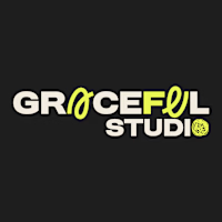
The name Graceful Studio was retained to honor my personal design journey and to express the elegance and intentionality behind every project. I explored how to make the word “Graceful” feel bold yet free, balancing confidence with creativity.
2. Logo Design
The final logo combines strong typographic structure with subtle, handmade details.
• The A and U in Graceful were custom drawn to symbolize creativity, adaptability, and intentional design.
• The O is illustrated as a continuous, circular doodle, a reminder that every creative process begins with a sketch and evolves into refined concepts.
• The bold weight of the typography contrasts with the organic details, visually representing both the strategic and creative sides of the studio.
3. Color Palette
The primary palette includes charcoal gray, vibrant lemon green, and a soft neutral cream.
• The dark tone conveys professionalism and reliability.
• The bright green brings energy and innovation.
• The soft neutral balances the composition, adding warmth and approachability.
Secondary accent colours were also defined to provide flexibility across different media and applications.
4. Typography and Visual Language
I selected a bold, confident typeface for “Graceful Studio,” supported by a clean, modern sans serif for complementary text.
The visual system includes dynamic graphic doodles and curved lines that serve as creative accents, connecting back to the logo’s continuous “O” and reinforcing the idea of evolution and collaboration.
5. Brand Applications
The identity was expanded into social media templates, digital assets, and merchandise for early client engagement. Each piece was designed to project the studio’s dual nature: strategic clarity and creative flow.
Values and Messaging
Graceful Studio is guided by biblical principles that shape our creative and ethical foundation. These values are subtly woven into our communications through carefully chosen scriptures that inspire our message:
• Matthew 5:14 – “Where creativity meets clarity.”
• Proverbs 3:5 – “Turning visions into visuals gracefully.”
• Psalm 37:4 – “We make brands irresistible.”
While we collaborate with clients from all backgrounds and industries, our approach remains grounded in these values of honesty, excellence, and purpose.
Result
The final brand identity successfully represents the evolution from a solo practice to a full creative studio. It conveys confidence, unity, and creativity — reflecting a studio that approaches every project strategically, yet always leaves space for artistic exploration.
With this foundation, Graceful Studio is ready to offer clients a broader range of creative services, stronger collaborations, and visually meaningful brand experiences. The website launch will follow soon, completing the next chapter of this journey.
Like this project
Posted Oct 21, 2025
Created a brand identity for Graceful Studio, balancing professionalism and creativity.
