Pocket — Landing Page for a Savings App

Moch Virgiawan Caesar Ridollohi


Pocket — Landing Page for a Savings App
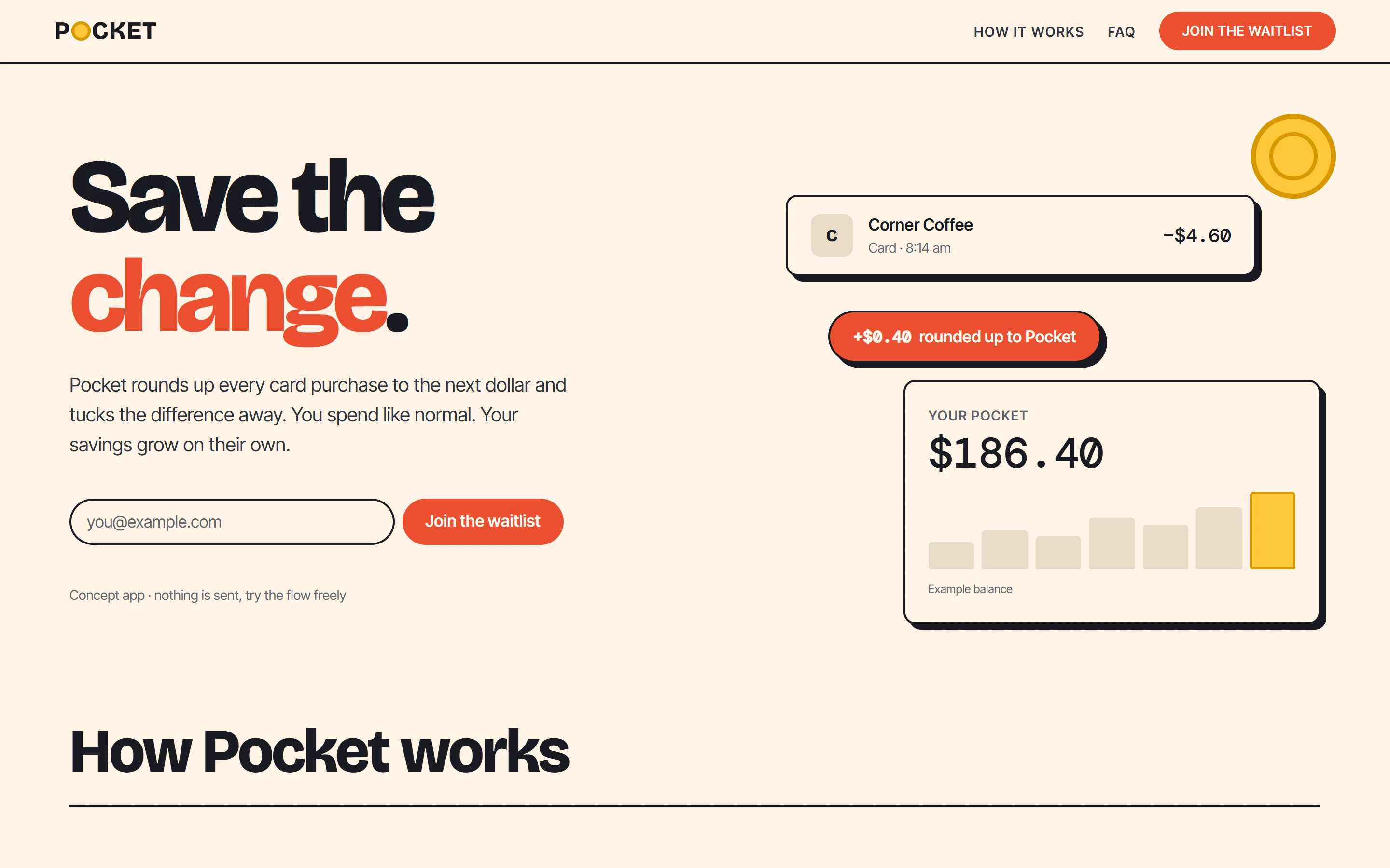
The hero: one promise, one form, and the product explaining itself on the right.
The brief
Pocket is a concept savings app that rounds up every card purchase and saves the difference. The landing page had one job: make the idea click in five seconds and get people onto the waitlist.
The idea
Instead of stock photos of people holding phones, the page shows the product itself. A coffee purchase, the 40¢ round-up and a growing balance sit right next to the headline, so visitors understand how it works before they read a word.
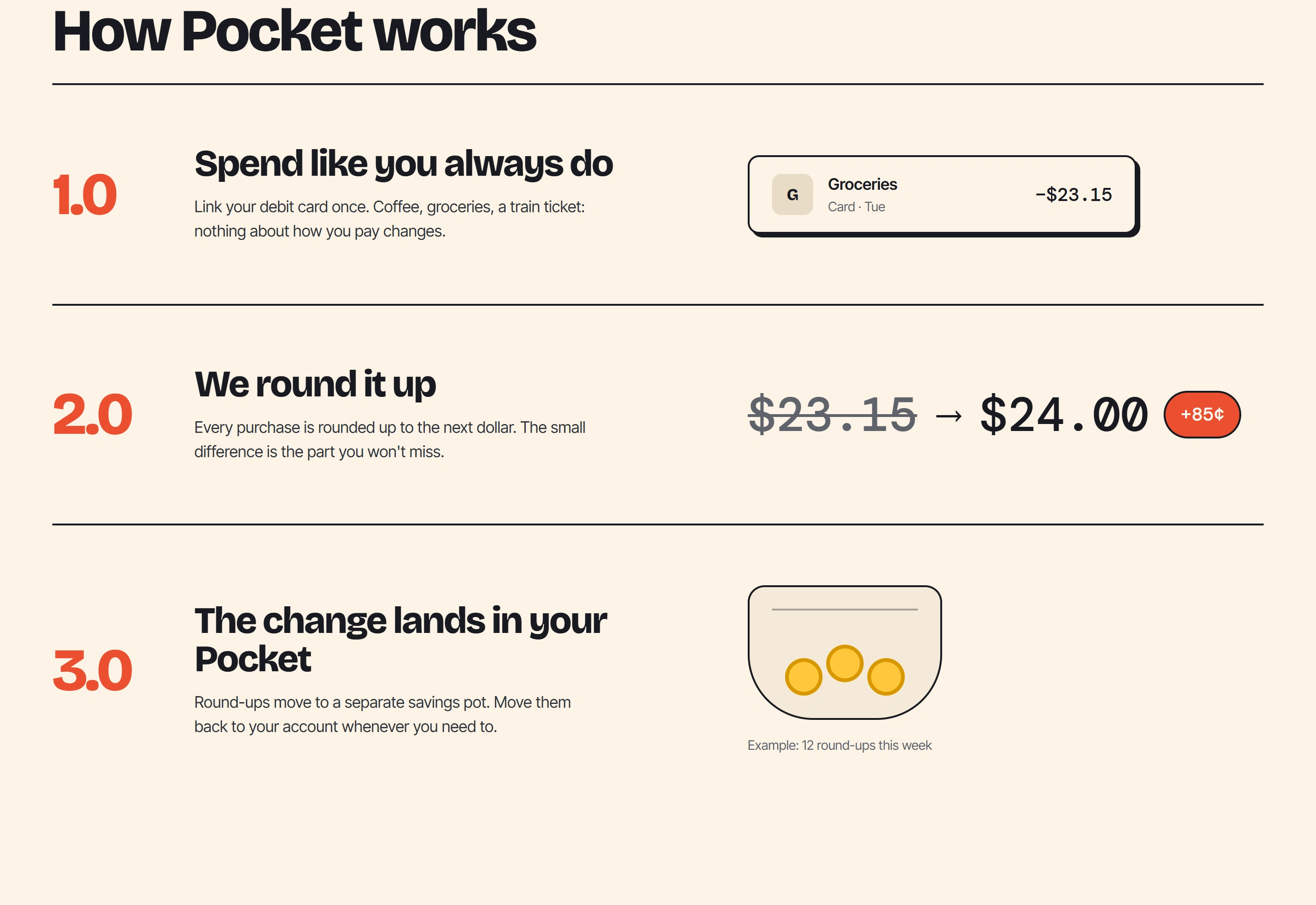
How it works, told in four steps, from a normal purchase to a weekly recap.
Design decisions
Bold type and a warm, poster-like palette, carried over from the Pocket launch video
The coin appears everywhere: in the logo, the hero and the savings pocket
One dark section to slow the scroll down right at the payoff: your weekly savings
Every number in the interface is labelled as an example, with no made-up claims
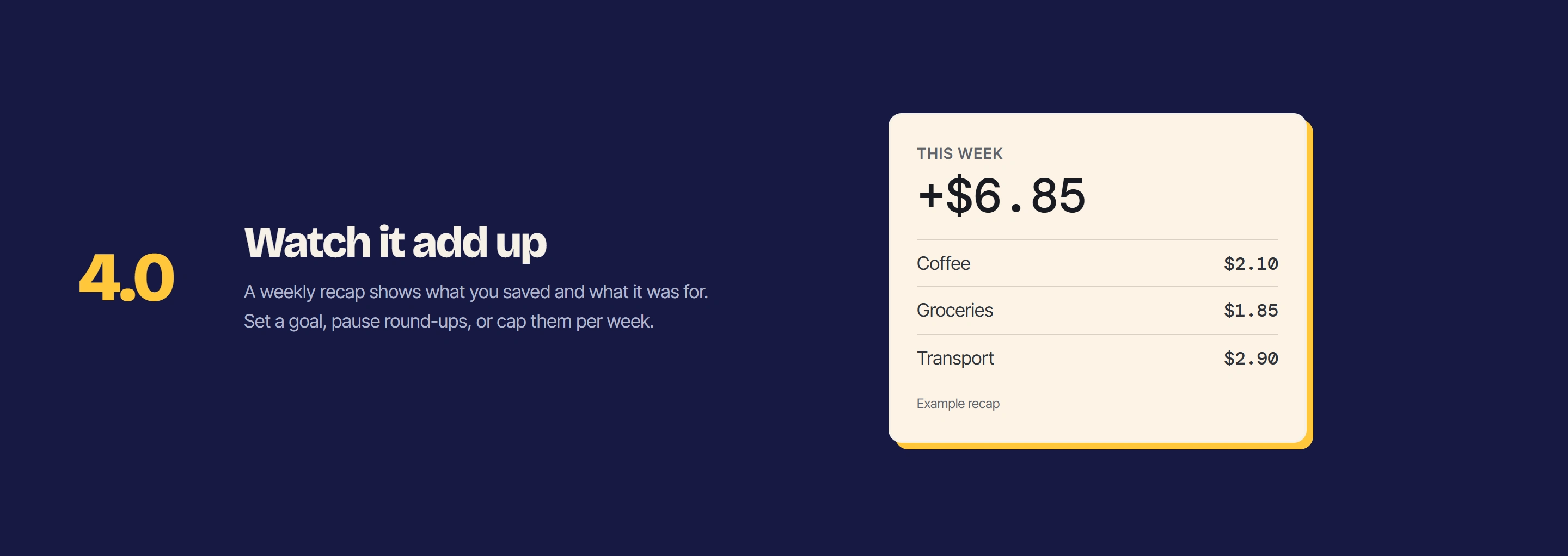
The payoff: a weekly recap of what you saved and where it came from.
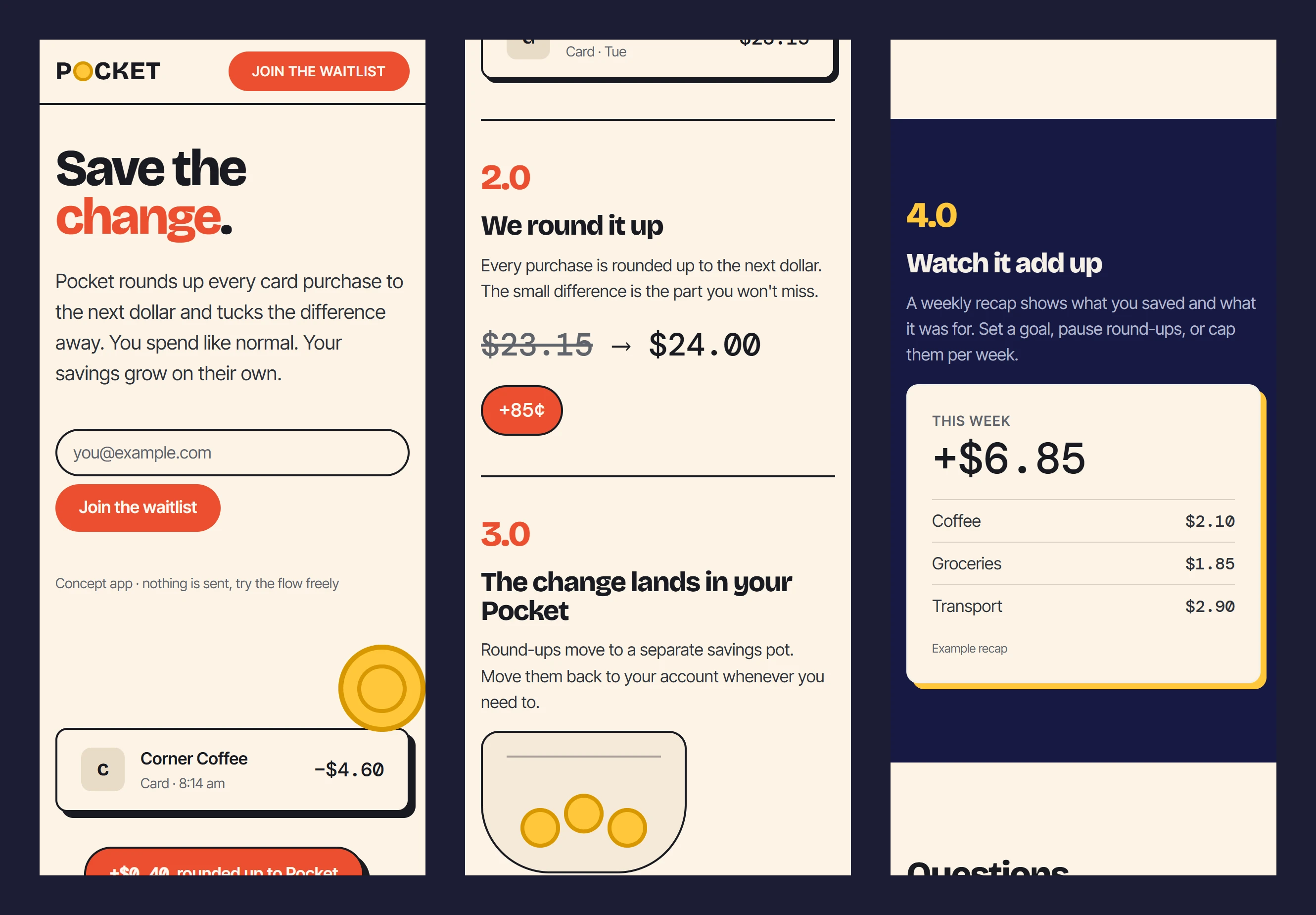
Designed mobile-first: the whole story works on a phone.
What I delivered
Brand-matched visual design and copywriting
A fast, responsive landing page that works without any framework
A waitlist form with clear error, loading and success states
Accessible to keyboard and screen-reader users, with reduced motion respected
Live: pocket.virlabs.my.id · Pocket is a concept brand created for this project.
Need a landing page that turns visitors into sign-ups? Let's talk →
Like this project
Posted Sep 28, 2026
A bold, playful landing page for a round-up savings app: waitlist sign-up, a four-step story and a mobile-first layout.
Likes
0
Views
3
Clients
Pocket