WAREHOUSE INTELLIGENCE (WIM)

Forrest Tindall
WAREHOUSE INTELLIGENCE
WIM


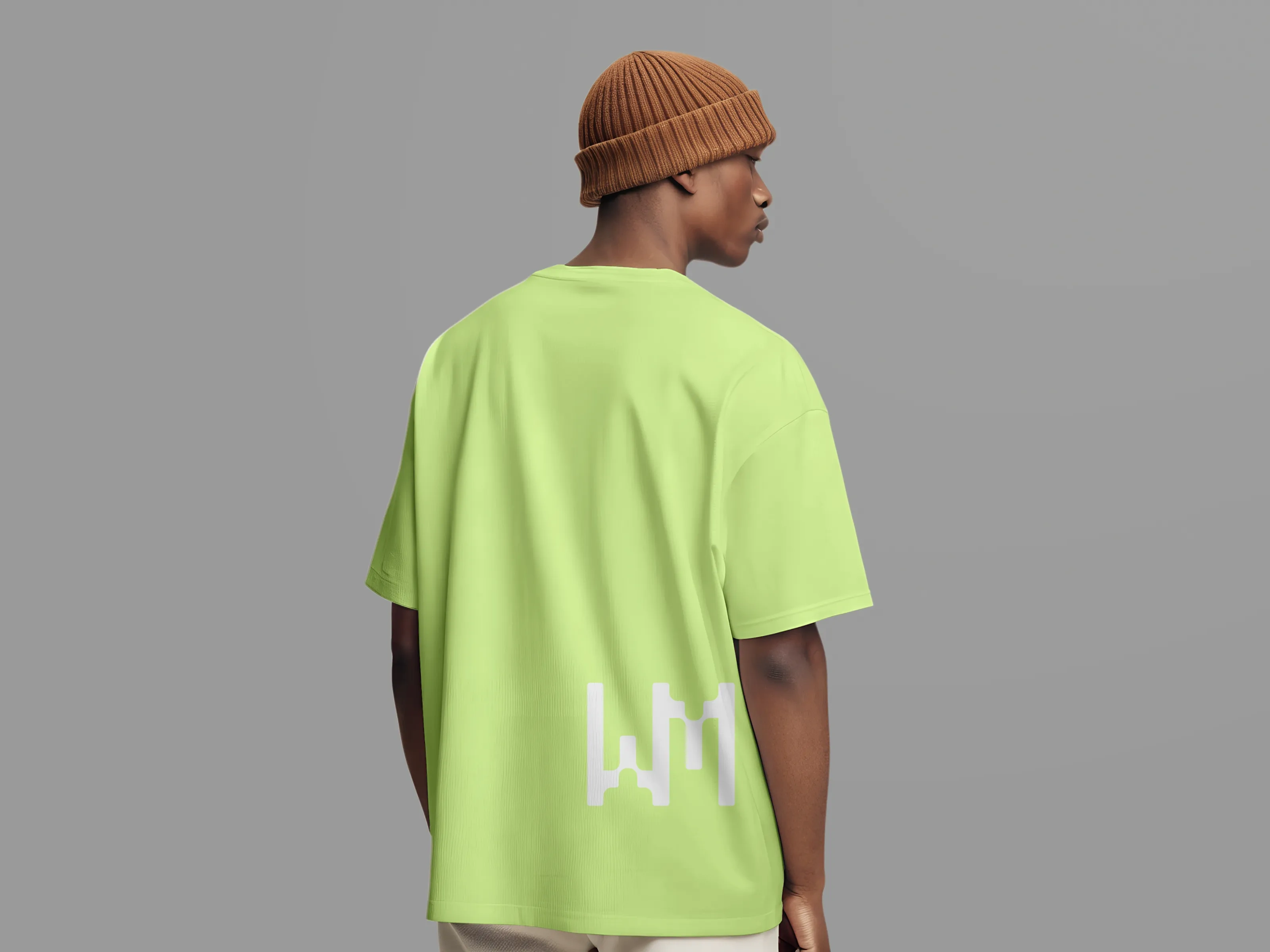
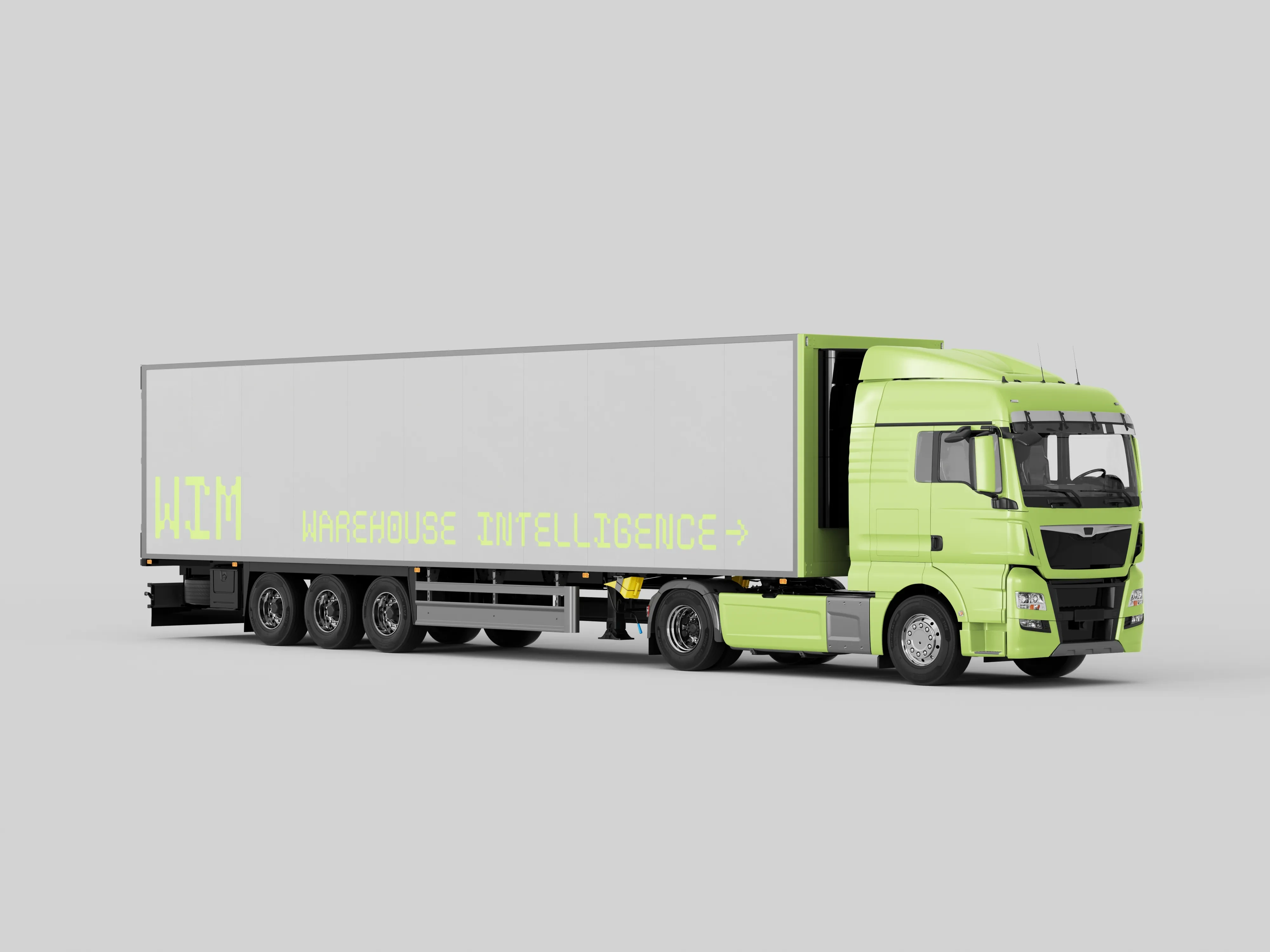
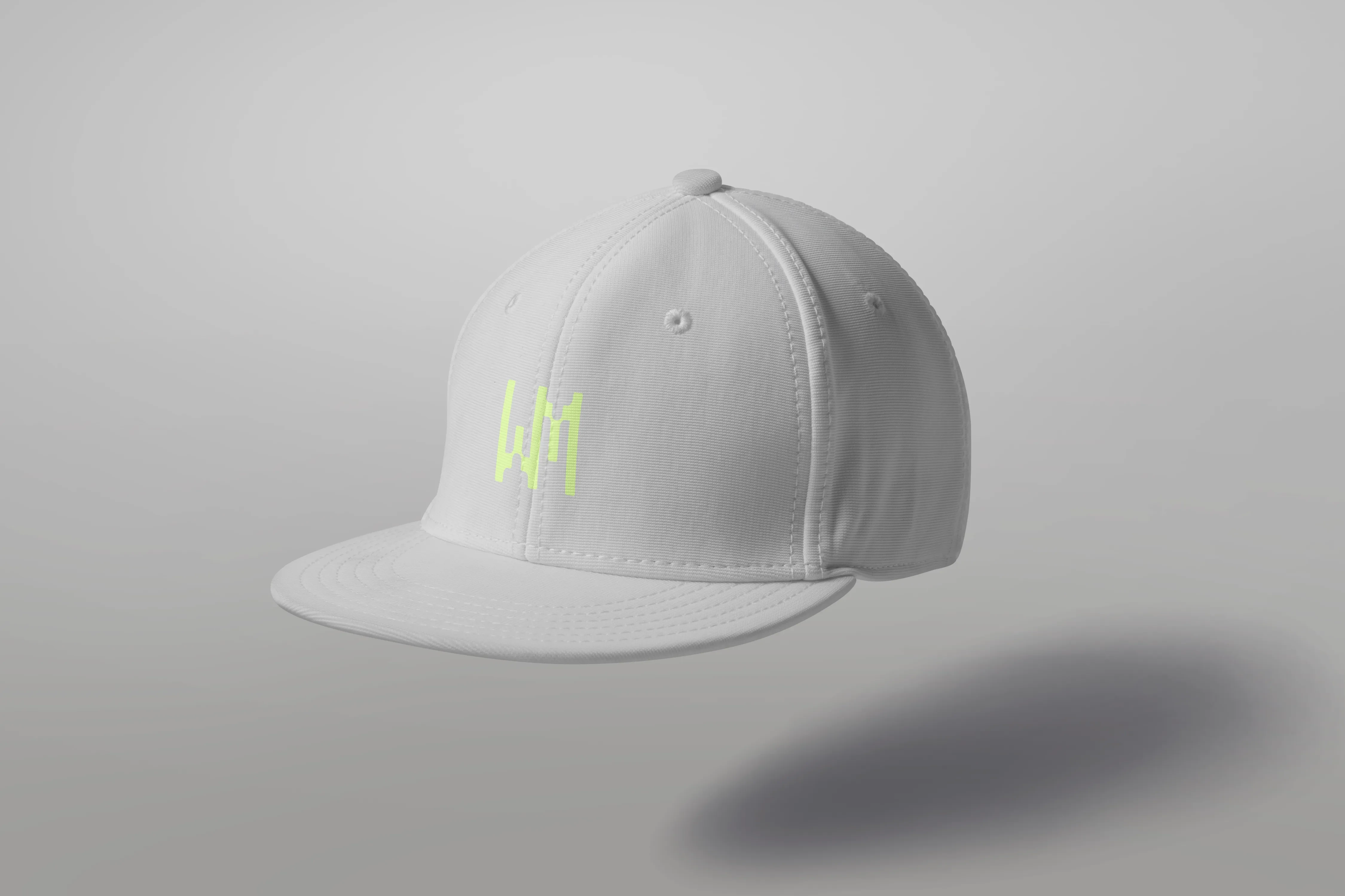
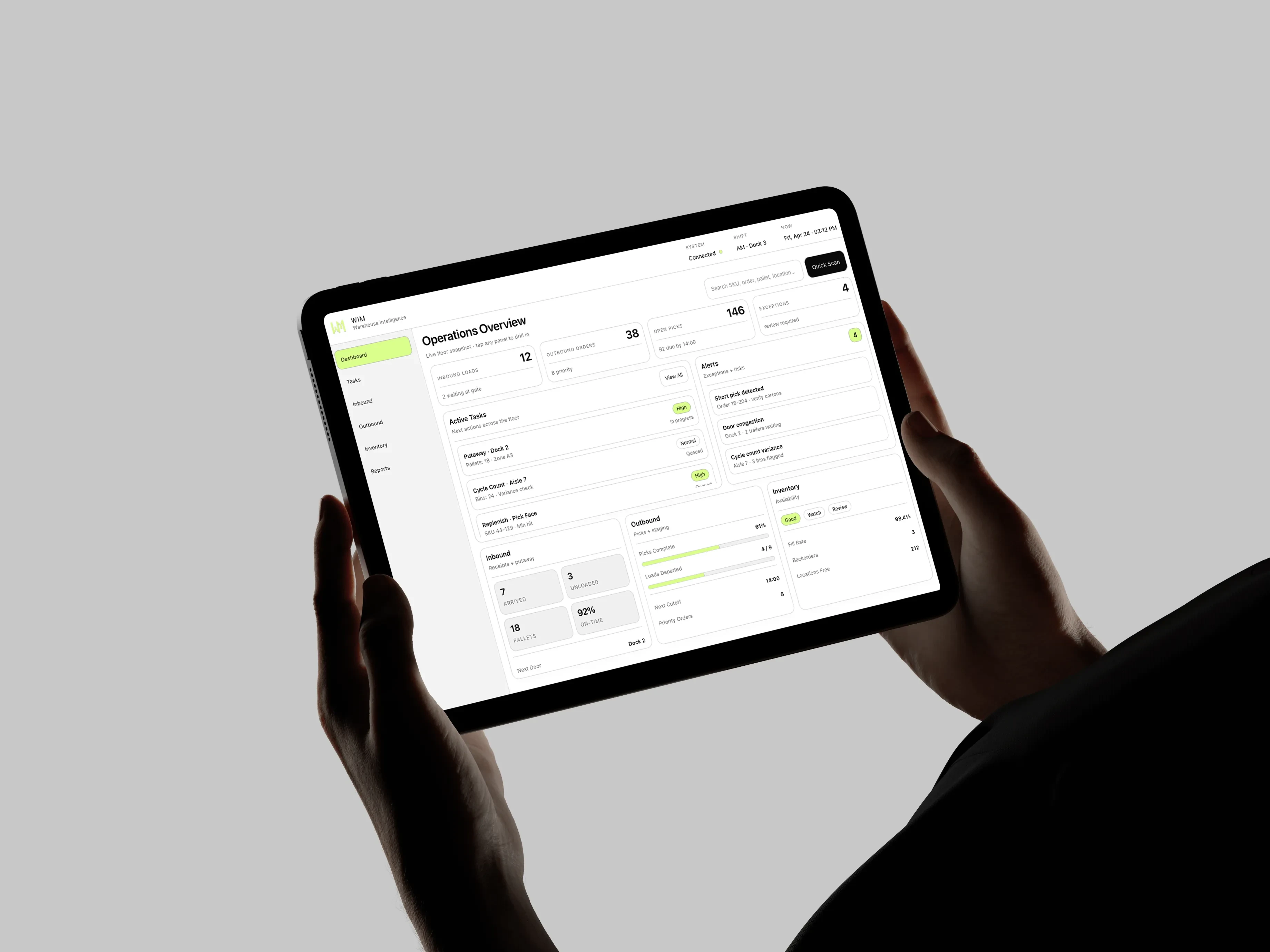
WAREHOUSE INTELLIGENCEROLE( Product Designer + Brand Designer )SCOPE( Identity System, Software App UI/UX Design )
Context
WIM needed a brand and product experience that could feel as precise and efficient as the warehouse software behind it.
Problem
The system had to stay legible in high-intensity field conditions while still presenting the company as a credible logistics technology leader.
Process
I built the direction around the idea of clarity in chaos, refining the identity, testing recognition across apparel and fleet graphics, and shaping the UI for rugged mobile use.
Proposal
The solution centered on a bold geometric brand system paired with high-contrast interface patterns that made key interactions easier to read and faster to act on.
Result
The final system unified identity and software into one visual language that scales from small digital icons to uniforms and large-format applications.
Like this project
Posted Sep 9, 2026
Built a bold geometric identity and high-contrast interface patterns for WIM, applied across apparel, fleet graphics, and rugged mobile UI.
Likes
0
Views
0