Optimizing User Experience for a Virtual Assistant Saas Platform
Introduction
OVERVIEW
Wishup is a web-based software solution that offers virtual assistant, provides remote administrative and personal support services to clients through a team of skilled and trained professionals. Wishup offers a variety of virtual assistant plans that vary in hours and tasks performed to accommodate different budgets and needs.
PROBLEM STATEMENT
Wishup's website was experiencing a high bounce rate and low lead generation, resulting in a low conversion rate. Despite having a user-friendly website, visitors weren’t staying on the site for long and weren’t converting into leads. The website's traffic is high, but the bounce rate is significantly high, indicating that visitors are leaving the site without taking any action. Upon further investigation, it was discovered that the website's content was not relevant to the target audience, and the website's design was not optimized for lead generation. Additionally, the website's navigation was not user-friendly, making it difficult for visitors to find what they were looking for.
GOAL
The goal is to make the website more engaging, informative, and user-friendly to increase the time visitors spend on the site and encourage them to take the desired action, ultimately leading to a higher conversion rate and analyzing UX data to measure the effectiveness of the redesign. The ultimate objective is to provide top talent to the recruiters by providing a positive user experience that reflects Wishup’s brand and values while streamlining the hiring process and increasing the conversion rate.
Research
USER INTERVIEW
Sales Team provided me with insights into the needs and wants of potential customers, their motivations for seeking virtual assistant services, and their expectations when it comes to website navigation, services offered, and pricing.
The Product Development Team was able to provide me with information about the features and capabilities of the company's virtual assistant services, which helped me understand how to best present these services on the website.
The Marketing Team provided me with insights into the company's branding, messaging, and marketing campaigns, which helped me align the website design with the company's overall marketing strategy.
UX DATA ANALYSIS
To monitor the website's performance, I used Microsoft Clarity to analyze user behavior, including scroll depth, heatmaps, and clicks. Through this tool, I was able to identify the pages on the website that were most frequently visited and which sections of each page were the most engaging. I also identified areas where users tended to lose interest or abandon the website, providing me with valuable insights into how to optimize the website's design for better engagement and user experience.
KEY FINDINGS & SOLUTIONS
Key findings from the UX research included:
The pain points of the audience include a lack of time and resources, limited budgets, and difficulty finding reliable professionals.
The company's unique value proposition is its ability to provide high-quality professionals at affordable rates with a quick turnaround time.
Users had difficulty navigating the website and finding the information they needed.
Call-to-action buttons were not prominent enough, resulting in low click-through rates.
The website had a high bounce rate, indicating that users were leaving the website without taking any action.
The use of visual elements such as images and videos was prominent on the competitors' websites.
Based on the key findings, we recommended the following changes for the website redesign:
Simplify the navigation and filter structure to make it easier for users to find information.
Increase the prominence of call-to-action buttons to improve click-through rates.
Use visual elements such as images and videos to make the website more engaging.
Incorporate customer testimonials and social proof to build trust and credibility with the target audience.
Testing
A/B TESTING
We used Microsoft Clarity to conduct A/B testing on different variations of the website design. We tracked user behavior such as click-through rates, time spent on each page, and bounce rates to determine which design elements were working and which ones needed improvement.
HEATMAPS
We used Microsoft Clarity to generate heatmaps that showed where users were clicking and where they were not. This helped us understand which parts of the website were getting the most attention and which ones were being overlooked.
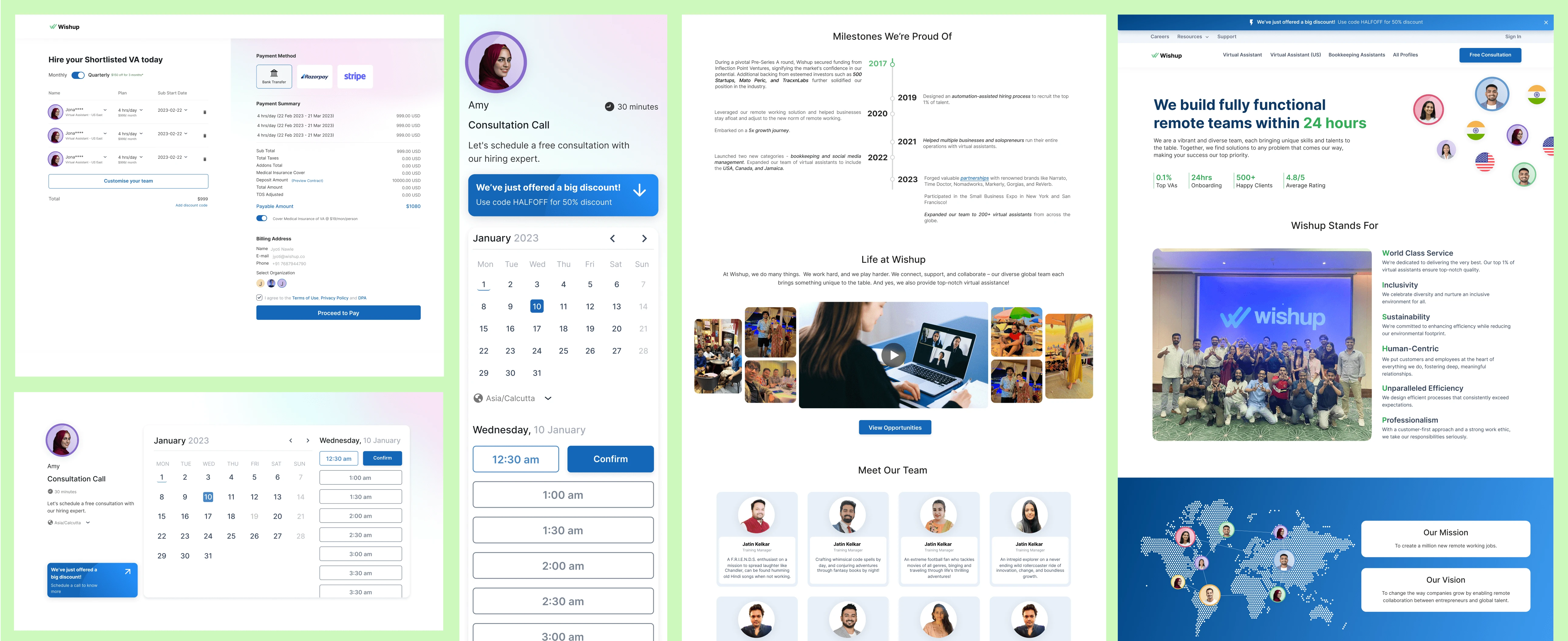
Based on the feedback we received from these testing methods, we made several design changes to improve the user experience, such as simplifying the navigation, making calls to action more prominent, and reorganizing content to create a clearer visual hierarchy.
Conclusion
IMPACT
After the new website was launched, we tracked several key metrics to measure its success.
Saw a significant increase in website traffic, with a 25% increase in page views and a 15% decrease in bounce rate.
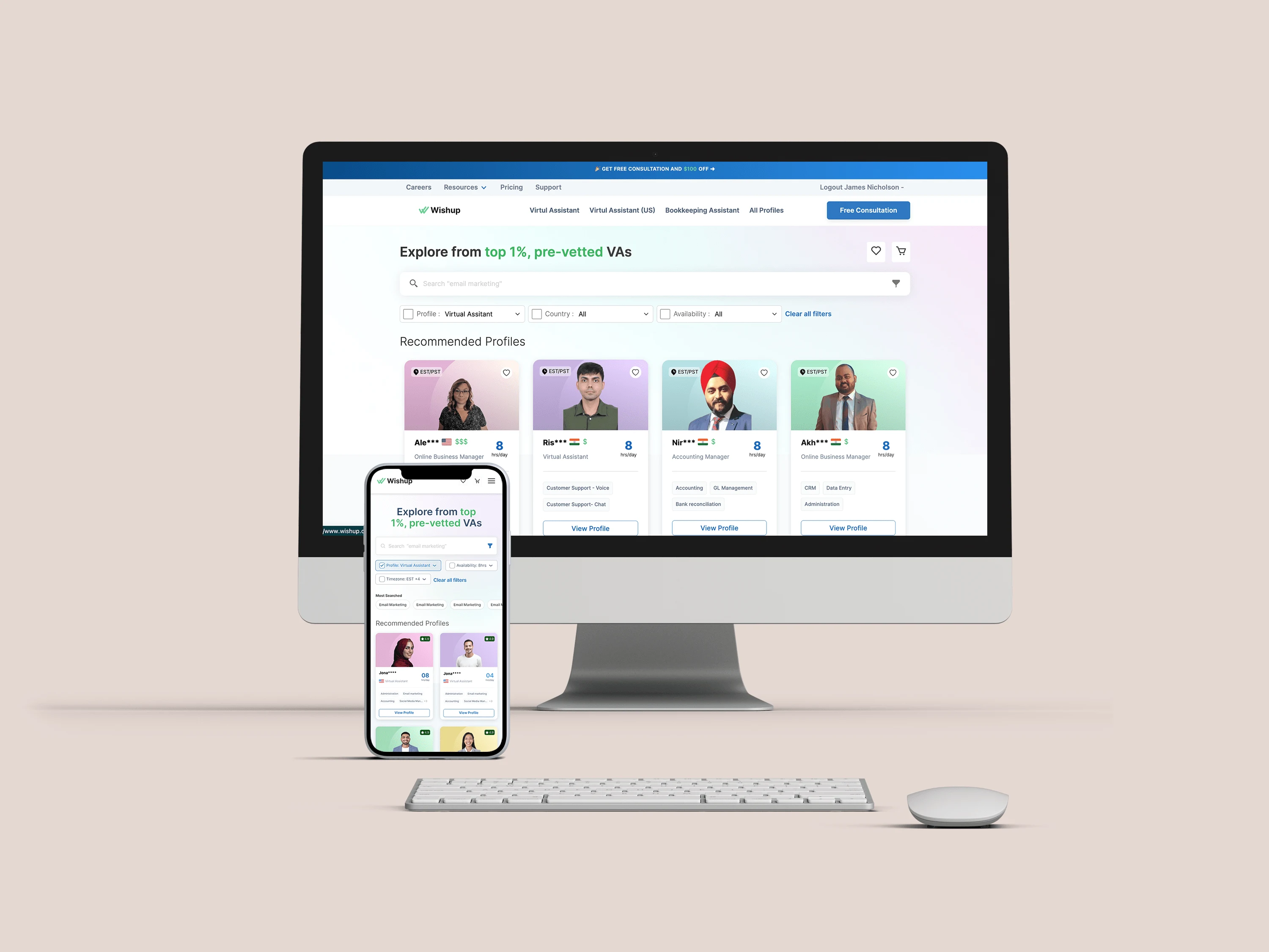
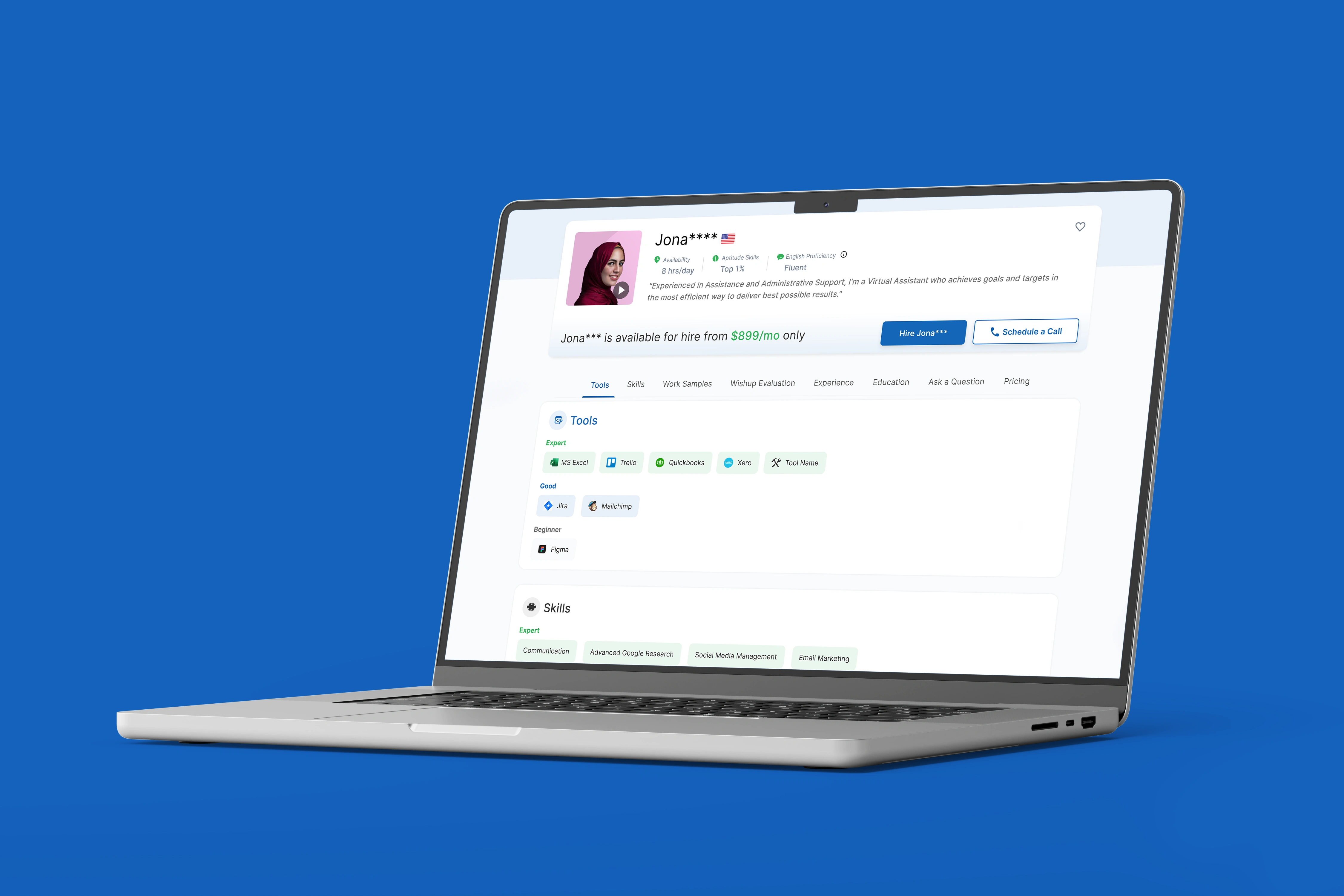
The new profile and hiring page also led to an increase in leads, a 10% conversion rate compared to the previous pages.
The user interface was justifying the value of the product making it sophisticated and interactive.
Like this project
Posted Dec 25, 2023
Worked closely with stakeholders to enhance the user experience of a Virtual Assistant Saas Platform, resulting in improved customer retention & increased leads

