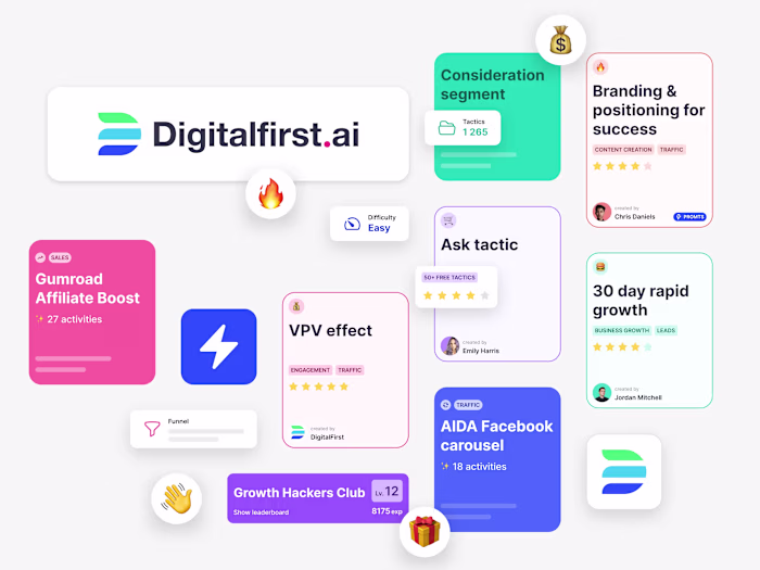
21st.ai
Michael Kulesza
21st.ai — Governance SaaS for Board Management
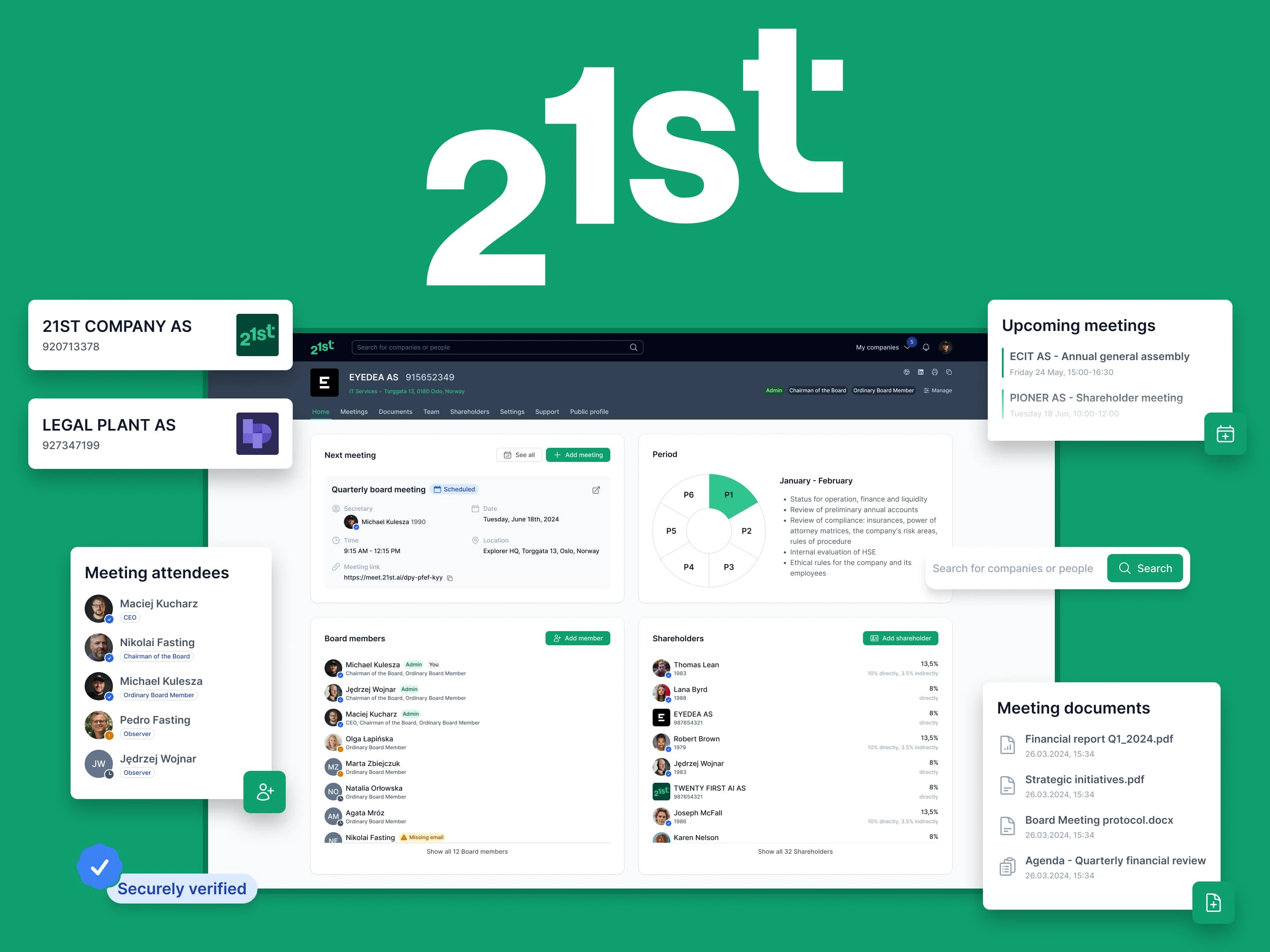
21st.ai corporate governance platform dashboard showing meeting management and document library interface
Product Design for a B2B governance SaaS — from design system cleanup to new features, user testing, and mobile optimization before public launch.
Project snapshot
Client: Norwegian governance-tech startup (B2B SaaS)
Timeline: Sep 2023 – Jun 2024 (9 months)
My role: Solo Product Designer — UX research, prototyping, UI, design system, dev handoff
Stack: Figma, ClickUp, Google Meet (user interviews)
🌱 Discovery
The problem
The product addressed a clear gap: ineffective corporate governance increases overhead, delays decisions, and harms shareholder value. Financial data, strategic documents, and meeting follow-ups were scattered and hard to access.
When I joined, 21st was in private beta with MVP features, tested by a focus group from the founders' network. We refined the UVP around governance efficiency and meeting best practices. Goals: reduce onboarding friction, improve collaboration, and prepare for mobile (the product was desktop-only).
💡Ideation
Design System audit
The existing Figma files had critical issues:
❌ Inconsistent styling — hard for devs to follow
❌ Scattered contextual elements with no clear structure
❌ Detached component instances, poor naming
I recommended the global refinement for design files:
✅ Fixed and rebuilt components with atomic design methodology
✅ Introduced Figma variables and design tokens
✅ Refined styles (colors, typography, spacing)
✅ Reviewed and fixed all major pages
Delivered the new structure in two weeks, with ongoing expansion throughout the project.
Design files structure after refinement showing component library with buttons, inputs, and UI elements before refactoring
Feature improvements
Refined 4 existing feature areas based on focus group feedback:
↗ Meetings (key feature) — custom agendas, invitation management, layout improvements
↗ User Acquisition — streamlined verification to reduce bounce rate
↗ Company Dashboard — consistency fixes, layout and UX refinements
↗ Website — general refinement aligned with business requirements
Designing new features
↗ Personal Dashboard — a new starting space for users, driven by expanded information architecture
↗ My Documents — centralized library for all user documents and assets
↗ Onboarding — product tour for new users
↗ AI Web Scraper + Industry Catalog — enhanced search, industry registry, AI-generated company profiles
↗ Mobile Version — full mobile optimization and missing pages
⚡️Execution process
Low-fidelity prototyping
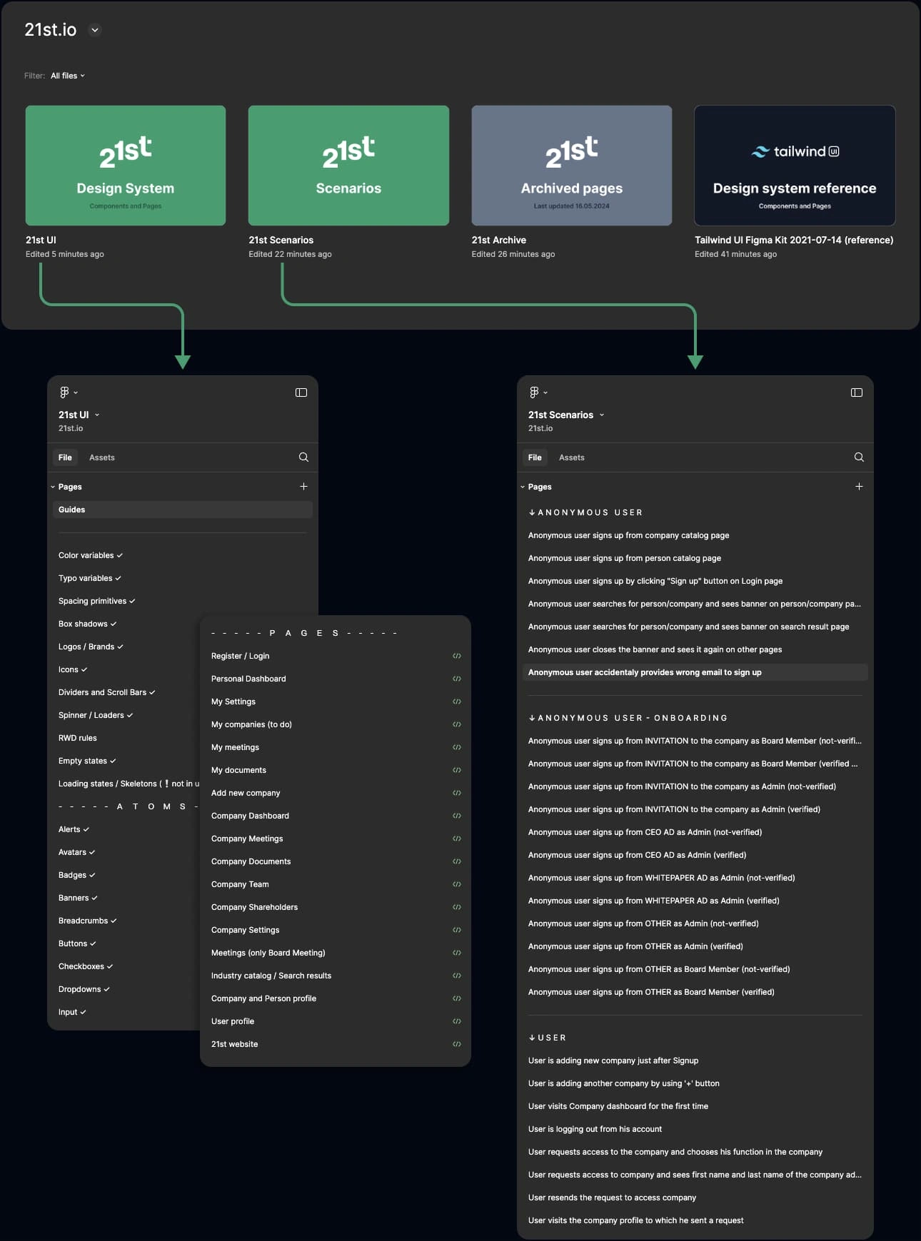
Low-fidelity prototypes (sketches, wireframes, flowcharts) served as rapid validation tools within the product team.
↓ Here are three examples of low-fidelity prototypes in Figma
High-fidelity prototyping
High-fidelity prototypes were organized into 200+ distinct scenarios — comprehensive user flows covering all possible actions per feature, maintained as an evolving source of truth.
↓ Below are three examples of prepared scenarios ready for user testing.
Each includes both desktop and mobile screens.
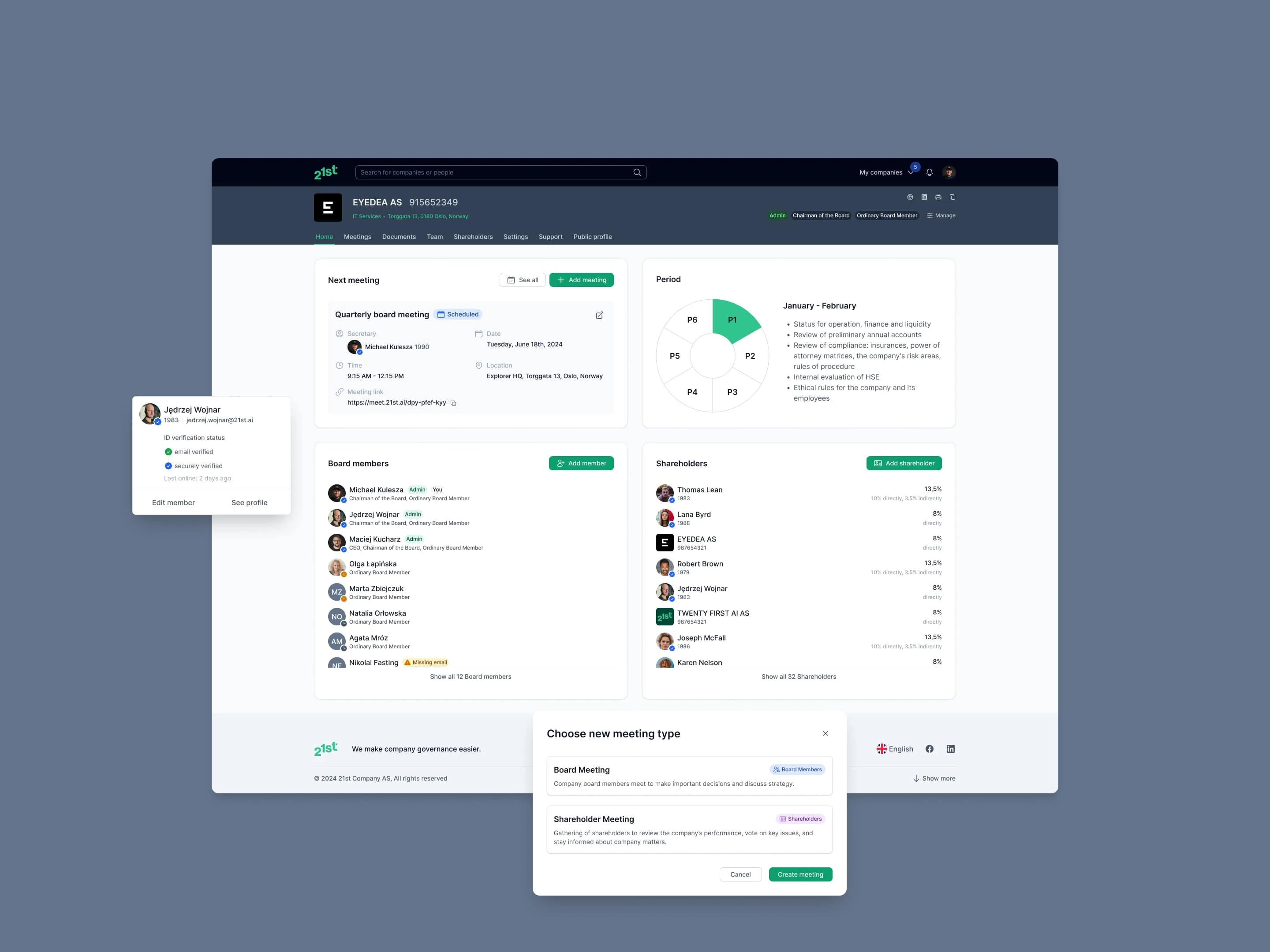
Designs
A showcase of the 21st interface, highlighting its key features and overall aesthetic.
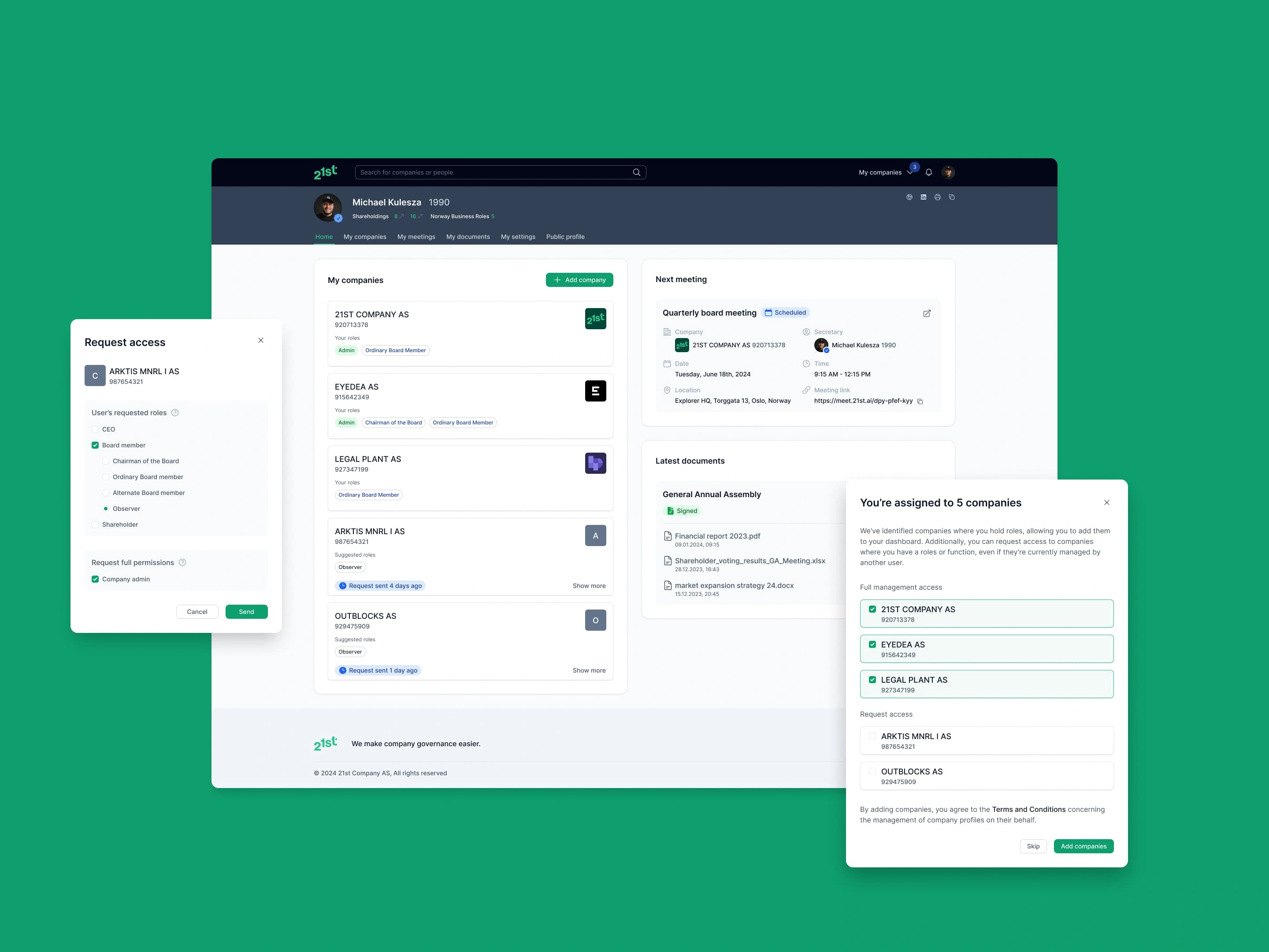
21st.ai Personal Dashboard showing upcoming meetings, recent documents, and task overview
21st.ai Company Dashboard displaying key metrics, recent activity, and quick actions
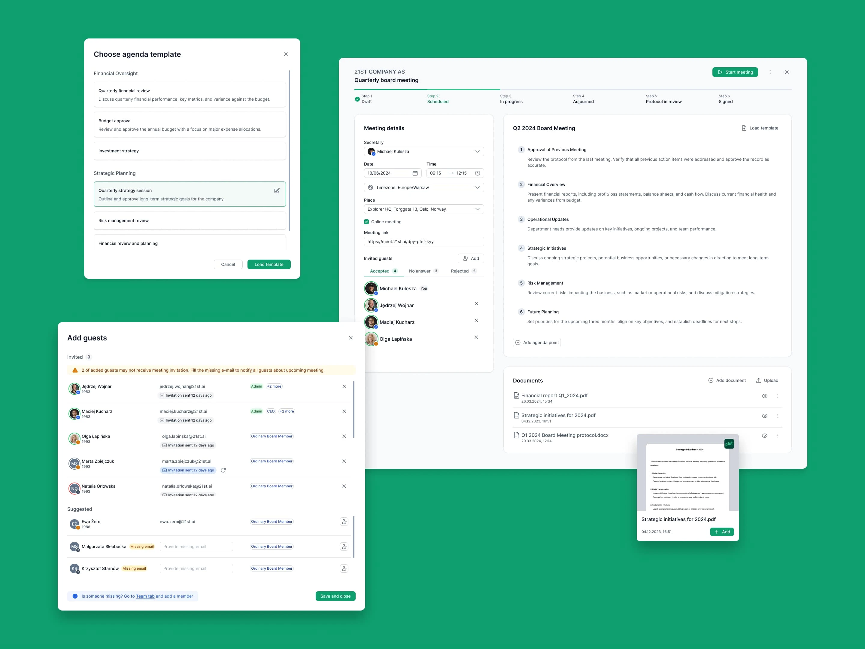
21st.ai Meeting view with agenda items, attendees list, and document attachments panel
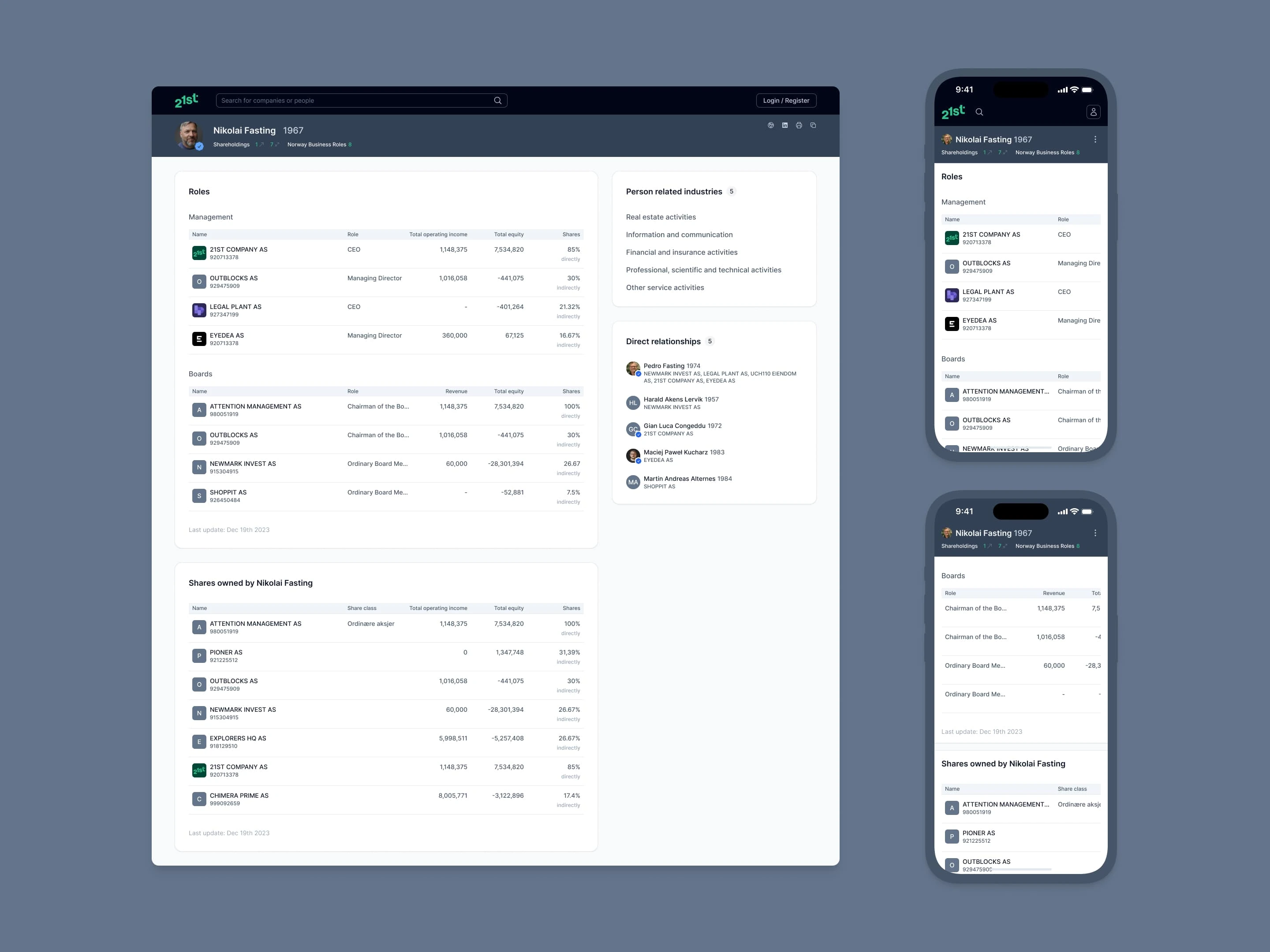
Person profile in 21st.ai — individual stakeholder page with role details, contact/context sections, and related items
✅ Validating stage
I ran remote usability tests using the Wizard of Oz method. I shared scenarios on screen without describing flows — participants told me what they'd do next at each step. This yielded richer qualitative feedback than surveys and gave us early signals before committing dev resources.
Failed tests triggered refined scenario versions, validated internally, then retested. Iterative process continued until all major usability issues were resolved.
📐 Handoff
Dev-ready designs
Design system maintained with atomic structure, semantic variables, and dev-ready labeling. Every component, page, and scenario was marked and linked to its ticket with annotations where needed.
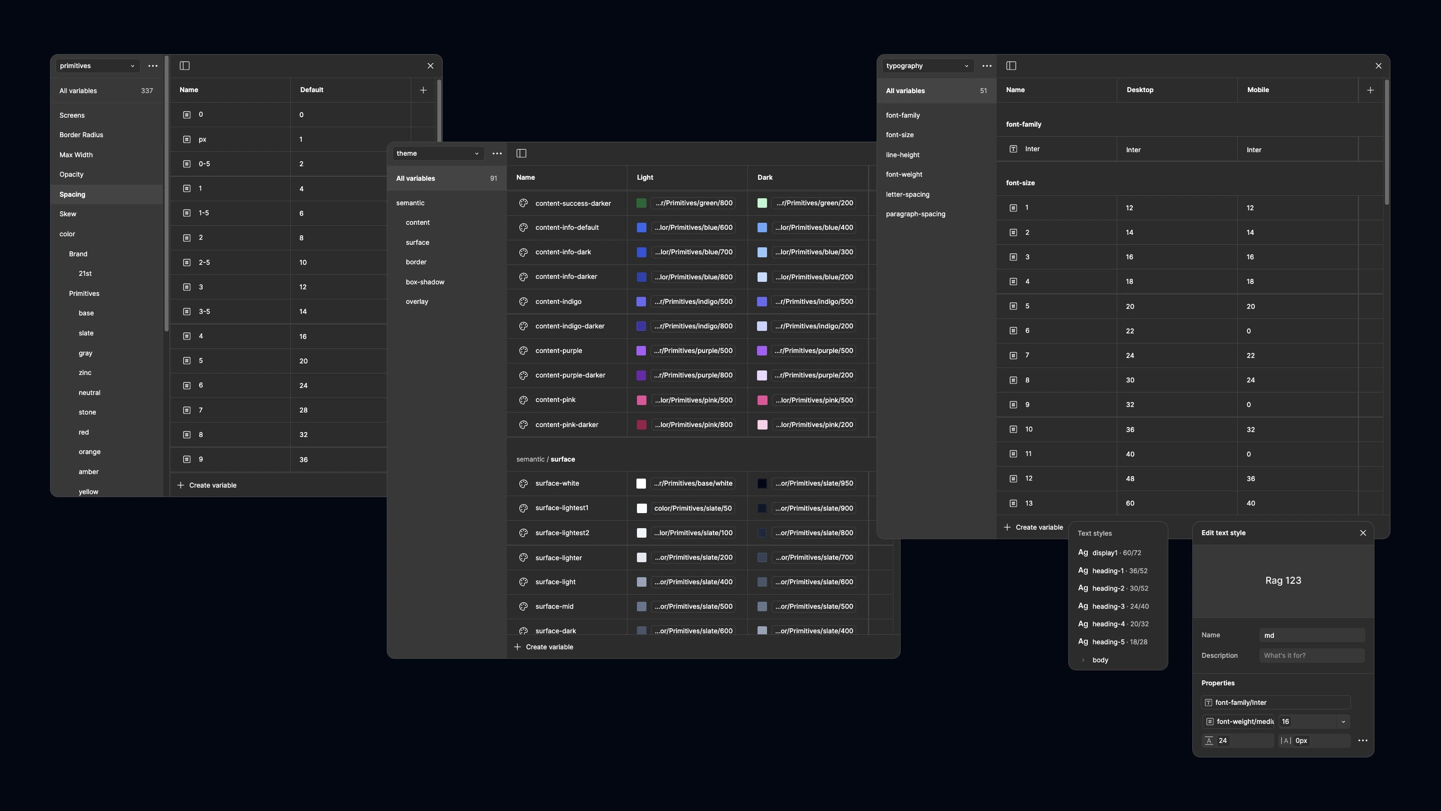
Figma design tokens showing primitives and semantic color variables structure for 21st.ai design system
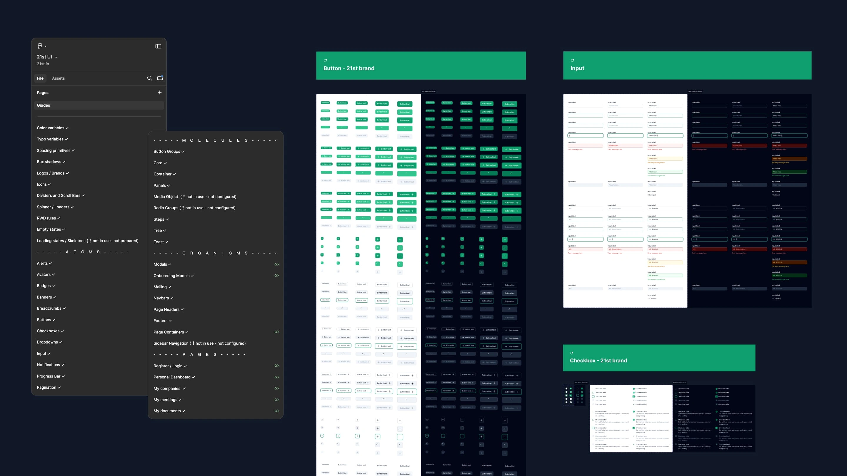
Figma component organization following atomic design methodology with atoms, molecules, and organisms
Full case study
Like this project
Posted Nov 13, 2024
Product Design for a B2B governance SaaS — from design system cleanup to new features, user testing, and mobile optimization before public launch.
Likes
0
Views
11
Timeline
Sep 1, 2023 - Jun 3, 2024
Clients
21st