Recipé – AI-Powered Recipe Generator
James Otemolu
Project Overview
Recipé is a smart, AI-powered recipe generation app designed to help users discover what they can cook based on the ingredients they already have at home. By simply listing available ingredients, either by typing or using voice input, users receive instant recipe suggestions complete with clear, step-by-step instructions and relevant video references powered by YouTube.
As the sole Product Designer, I led the end-to-end design of the product, shaping a seamless and intuitive experience that bridges convenience, creativity, and AI-driven utility. The project aimed to eliminate the everyday question of “What can I cook tonight?” while making the experience feel intelligent, fast, and engaging.
My Responsibilities
I was responsible for defining the product strategy and core experience, conducting user research, designing intuitive flows, wireframing key user interactions, and delivering high-fidelity UI across all core screens. I also created interactive prototypes to validate early concepts and collaborated with the development team to ensure accurate implementation of complex design features like the voice input and AI recipe suggestions. The design system I developed ensured scalability, accessibility, and consistency across future product iterations.
Design Approach
Discovery & User Research
The design process began with targeted user interviews, particularly with students, busy professionals, and parents. The recurring pain points were clear: people often had ingredients but no meal inspiration, and they lacked time or energy to browse complex recipe sites. Users desired a tool that could offer instant suggestions with minimal effort, without needing a perfect grocery list. These insights informed our product’s core principle: fast, frictionless recipe discovery powered by real-time AI.
UX Strategy & User Flows
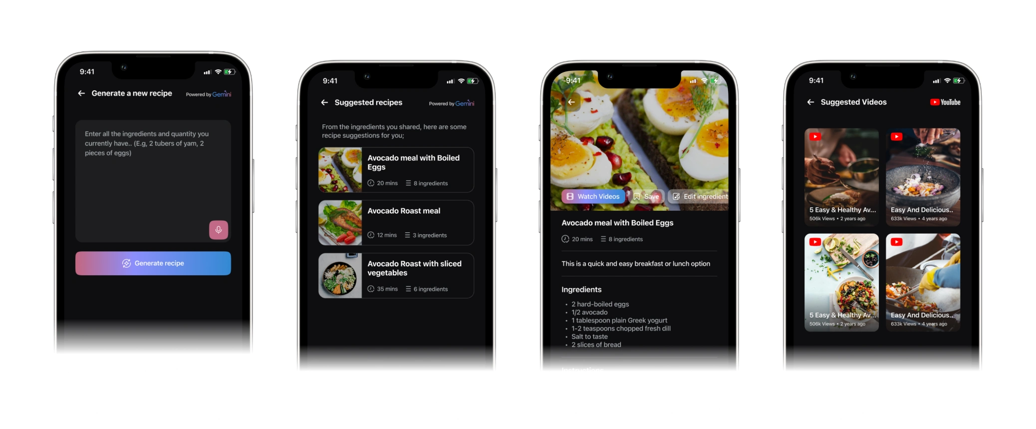
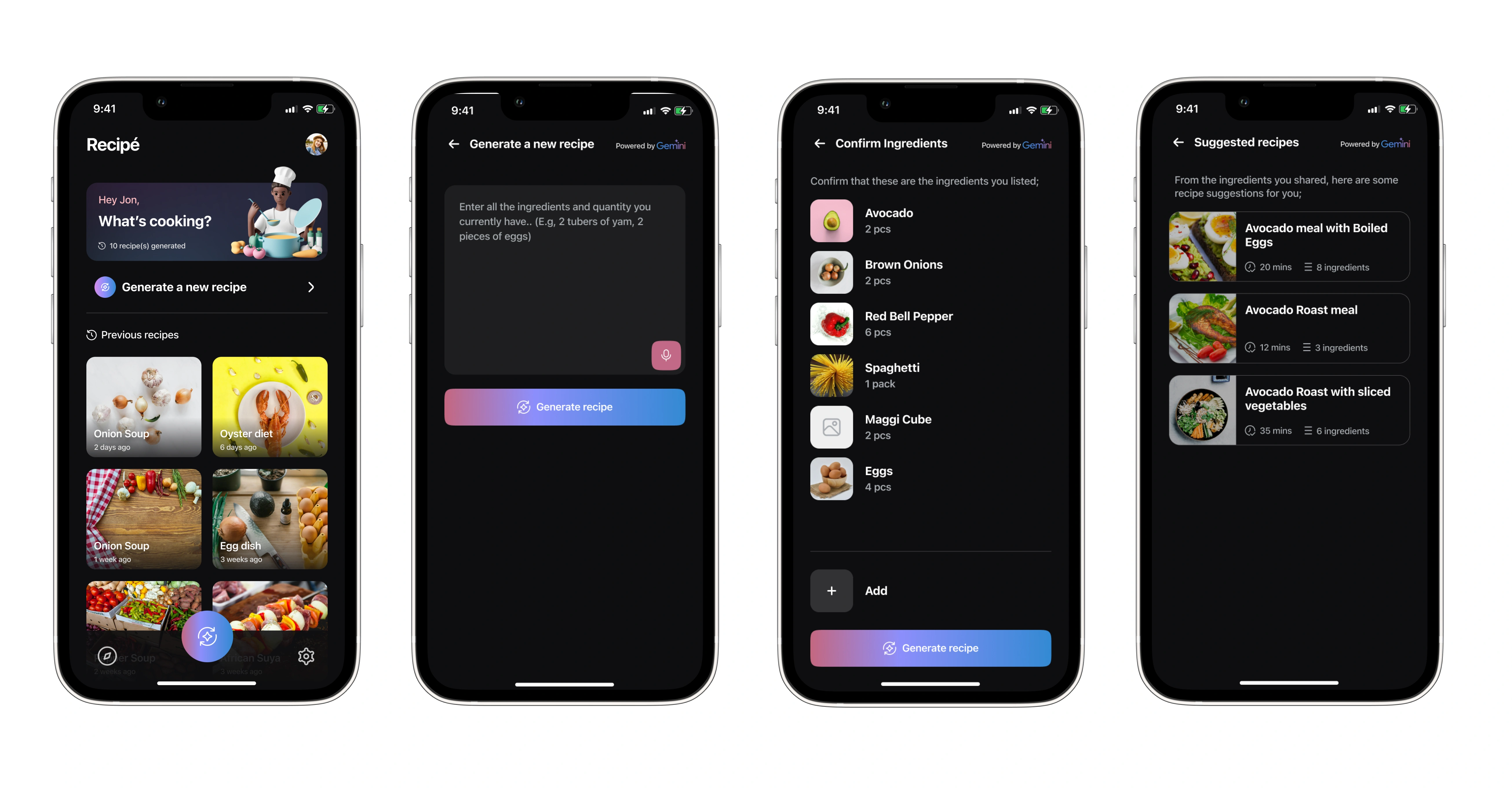
The experience was intentionally designed to be lightweight and dynamic. The primary user flow revolved around a single input screen where users could list ingredients manually or via speech. The AI engine then returned multiple tailored recipe options. Each recipe included a visual overview, cooking time, difficulty level, and a full breakdown of steps, along with video walkthroughs embedded from YouTube. I designed focused micro-flows to ensure users could transition smoothly between input, exploration, and preparation, even while multitasking in the kitchen.
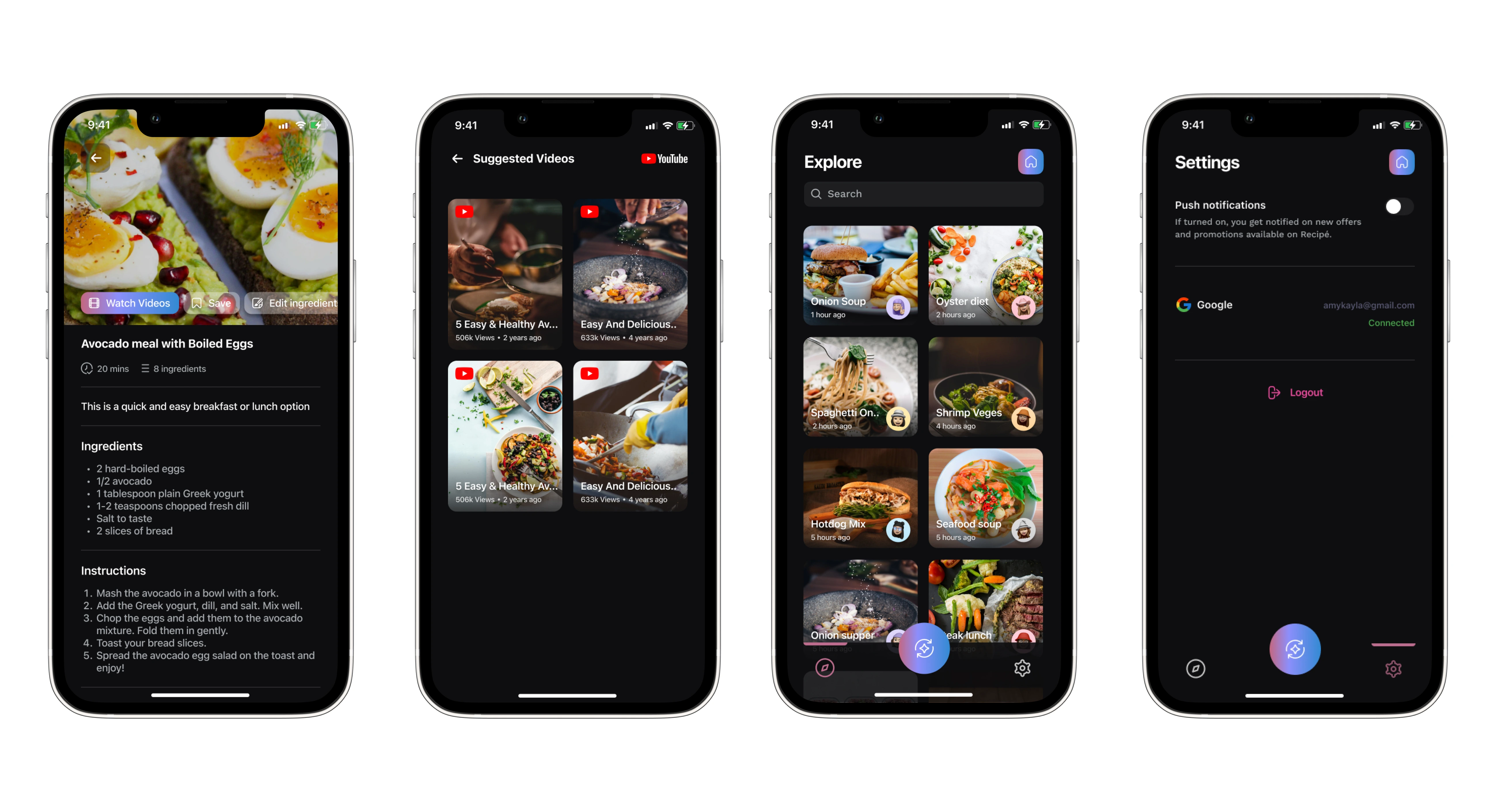
Key Features & Design Highlights
At the heart of the app was the ingredient input screen, featuring a clean text field and a built-in speech-to-text microphone, allowing users to quickly speak the ingredients they had on hand. Once submitted, the app generated multiple AI-curated recipe options, each clearly presented with a visual preview, tags for dietary categories, and an AI-generated title. Users could tap into any suggestion to access step-by-step cooking instructions, each paired with an optional video reference via YouTube, enabling visual learners to follow along with ease.
The interface was designed to be simple yet elegant, using visual hierarchy to focus user attention on key actions like “Generate Recipes,” “Watch Video,” or “Start Cooking.” I also included options for users to save favourite recipes, share them, and flag results for future refinement of the AI model.
UI Design & Visual System
I crafted a light, intuitive UI with rounded cards, clear visual cues, and generous use of whitespace to avoid overwhelming users, especially during multitasking scenarios like cooking. The app’s visual identity leaned on warmth and accessibility, using soft colours, clear iconography, and large, tappable elements for usability. I designed a modular, scalable component system in Figma to support flexible content layouts and rapid iteration of new features such as filters (e.g., vegetarian, under 30 mins, pantry-only).
Prototyping & Testing
I built functional prototypes to test the app’s flow from ingredient input to final recipe interaction. Users praised the voice input for convenience, especially when their hands were occupied. Testing also revealed the importance of surfacing video content early, which led me to integrate previews directly into the recipe card results. Usability testing helped simplify language, improve screen transitions, and optimise loading states during AI processing. These insights helped me enhance the real-world usability of the product and reduce drop-off across key flows.
Results & Impact
Recipé resonated strongly with users during testing. The AI-generated suggestions were seen as both novel and practical, and the speech-to-text input added a layer of convenience that set the app apart. Users appreciated the pairing of text-based steps with video references, noting it helped them feel more confident in the kitchen. The design successfully balanced function and delight, resulting in a product concept that users described as “like having a smart sous-chef in your pocket.” The app earned high usability scores across all flows and laid the groundwork for future integration of user accounts, meal planning, and pantry tracking features.
Takeaways
Designing Recipé pushed me to think beyond traditional recipe apps and reimagine what cooking assistance could look like in a smart, AI-first world. It was an exercise in reducing user effort, designing with context in mind (especially for multitasking scenarios), and creating a utility that genuinely helps people solve a daily challenge. The experience reinforced my passion for building intelligent, user-focused tools that are both practical and delightful.
Like this project
Posted Jun 5, 2025
Designed an AI-powered recipe app for easy meal inspiration using available ingredients.
Likes
1
Views
21