Ecodrive User Portal UX Design
Nidhi Jampana
Project Overview
Ecodrive helps brands take climate action through nature based sustainability projects such as reforestation, coral reef restoration, and plastic waste recycling, while turning impact into meaningful customer engagement.
The goal of this project was to design UX enhancements for Ecodrive’s User Portal, giving eCommerce teams a clear and intuitive way to understand their impact and quickly access the tools they need to activate Ecodrive messaging.
At its core, the dashboard needed to:
Communicate impact quickly
Highlight the most useful tools to reduce confusion and surface the exact information users need
To support this, I identified the four most used features and organized them into a clear, tile based layout on the dashboard, allowing users to take action without second guessing where to go.
Design Highlights
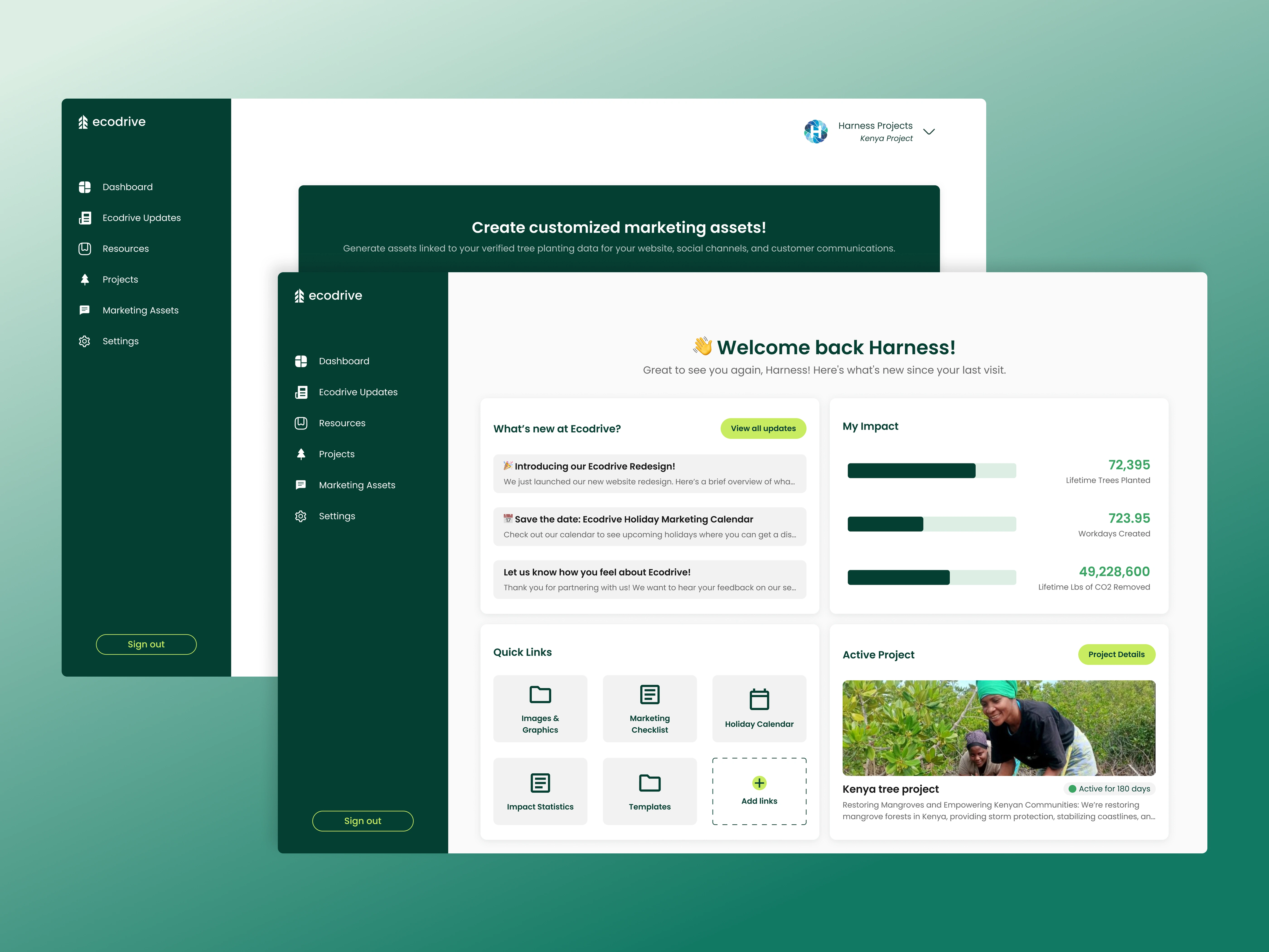
1. Impact First Dashboard
The dashboard leads with what matters most: impact.
Key sustainability metrics such as trees planted, workdays created, and CO₂ removed are displayed front and center using progress bars and clear numerical summaries. This turns abstract climate action into something measurable, shareable, and easy to understand at a glance.
Rather than hiding impact behind reports, the design frames it as an ongoing story brands can track over time.
2. What’s New Without the Noise
Sustainability platforms evolve quickly, so the dashboard includes a lightweight Updates panel that highlights new launches, upcoming campaigns, and feedback prompts.
Updates are visible without overwhelming the interface, helping users stay informed while keeping their focus on day to day tasks.
3. Quick Links Built Around Real Usage
Instead of presenting every possible tool at once, the dashboard prioritizes what users actually rely on.
The Quick Links section surfaces the four most used features in a simple tile layout, making them easy to scan and even easier to access:
Marketing graphics
Templates
Holiday calendars
Impact statistics
This approach reduces cognitive load and helps users move faster by putting the most relevant tools front and center.
4. Active Project Visibility
Sustainability feels more meaningful when tied to real outcomes.
The Active Project card highlights the project a brand is currently contributing to, pairing visuals with concise project details. This reinforces transparency and helps users connect their metrics to real world initiatives rather than abstract numbers.
Designed for Clarity and Momentum
The interface is clean, modern, and optimized for speed. Clear hierarchy, thoughtful spacing, and intentional grouping ensure users can:
Understand their impact in seconds
Find the right tools without searching
Confidently share sustainability efforts externally
Every element on the dashboard is designed to reduce friction and keep teams moving.
Outcome
This dashboard design turns sustainability from an abstract promise into a clear, actionable experience. By prioritizing impact visibility and organizing tools around real usage, the User Portal helps Ecodrive partners engage with sustainability more confidently and consistently.
Like this project
Posted Jan 9, 2026
UX design for Ecodrive's User Portal focusing on impact visibility and user-friendly tool access.