Jiraaf Brand Identity Design System | Brand Manual
Shubham Aggarwal
Jiraaf — Designing Trust in FinTech Through Visual Systems
Jiraaf was creating something bold—curated, high-yield investment opportunities for everyday investors. But FinTech, especially in India, is a saturated space where trust is hard to earn and harder to maintain.
They needed a brand that felt clean, professional, and credible—without looking like every other finance startup. The goal was simple: make people feel confident in an unfamiliar investment landscape.
The Challenge
Jiraaf was solving a complex problem: making alternative investments accessible.
But the design problem was even sharper:
How do you signal authority without becoming rigid or boring?
How do you maintain clarity while introducing financial nuance?
And how do you appeal to both first-time and experienced investors, without alienating either?
What I Did
I was brought on to create Jiraaf’s visual identity system and marketing collaterals that could scale—across digital, print, and internal teams.
My scope included:
Identity design: logo, typography, color palette
Brand manual and systemization
Stationery and sales collateral
Social media visual templates
Collaboration on copy tone and CTA design logic
Identity Design Strategy
The Logo
The giraffe mark was more than a visual pun. It represented clarity, foresight, and perspective—everything Jiraaf wanted investors to feel.
I designed a minimalist giraffe head using geometric, interconnected lines to signal stability and structured intelligence. It was simple enough to be iconic, and flexible enough to scale across formats.
The Wordmark
A custom geometric sans-serif wordmark complemented the giraffe symbol. Balanced, confident, and clean—it gave the brand a strong visual anchor across every asset, from mobile apps to investor decks.
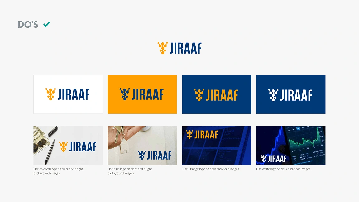
Brand System & Guidelines
I created a comprehensive brand manual to document and systematize the design direction. This included:
Color theory and contrast ratios
Typography hierarchy for web and print
Logo usage and clearspace guides
Iconography set and usage patterns
Do’s and don’ts to protect brand integrity
Moodboards and creative direction for content teams
The result was a plug-and-play design framework that internal teams could use to create consistent visuals—without slowing down.
Marketing & Collateral
I extended the brand across Jiraaf’s key customer touchpoints:
Business cards and stationery
Presentation decks and investment pitch kits
Social post templates for educational content
Banner ads and display creatives
Website UI references for product consistency
Each piece was designed to reduce friction in understanding and increase user trust at every stage.
The Outcome
Jiraaf launched with a brand system that felt modern, scalable, and clear
Internal teams could produce content without reinventing the wheel
The visual identity built trust with early users and investors
Product marketing and growth became simpler, faster, and more effective
Most importantly, the brand looked and felt like what it was trying to become: a reliable, premium-yet-accessible alternative investment platform for India’s upwardly mobile generation.
Why This Matters
FinTech brands don’t sell products. They sell certainty.
My role wasn’t to make Jiraaf look pretty. It was to make it look like a platform users could trust with their money.
And in this space, design is trust. Systems are not optional. Emotional clarity is everything.
Like this project
Posted Mar 28, 2025
Designed Jiraaf’s brand identity, logo, and collateral system to build trust in FinTech—balancing clarity, credibility, and scalability across all touchpoints.
Likes
0
Views
18
Timeline
Dec 20, 2021 - Ongoing