





Presentation Design for Brands That Need to Communicate Clearly
A strong presentation is more than a collection of good-looking slides. It needs to guide the audience, simplify the message, and make the brand feel credible from the first slide to the last.
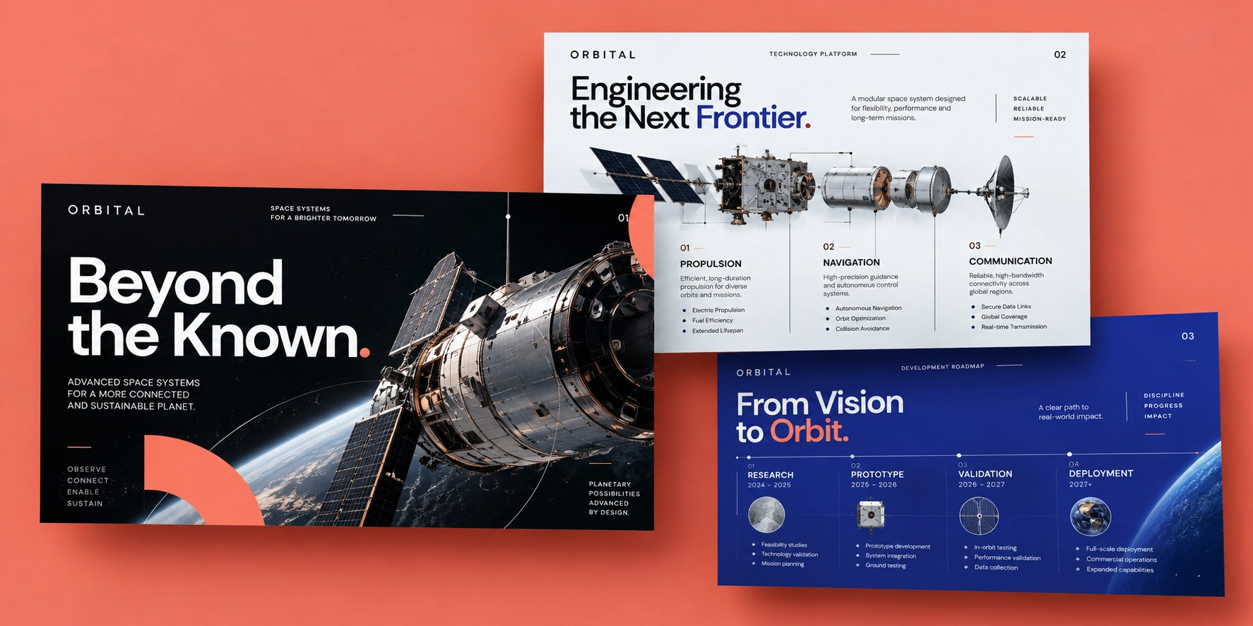
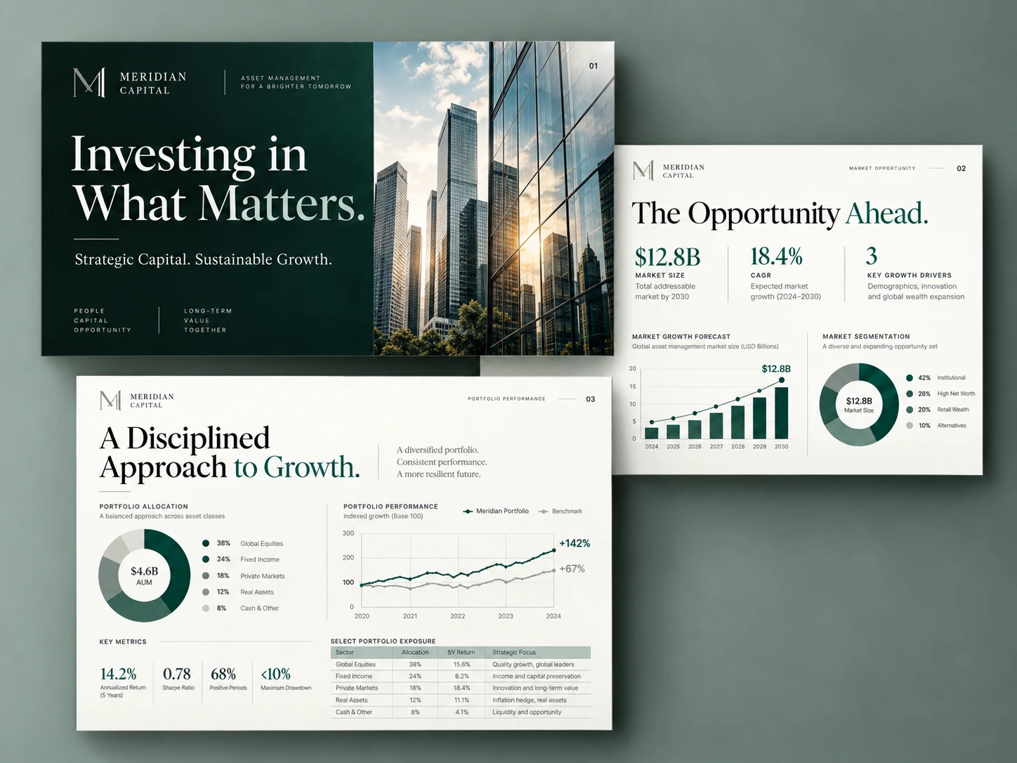
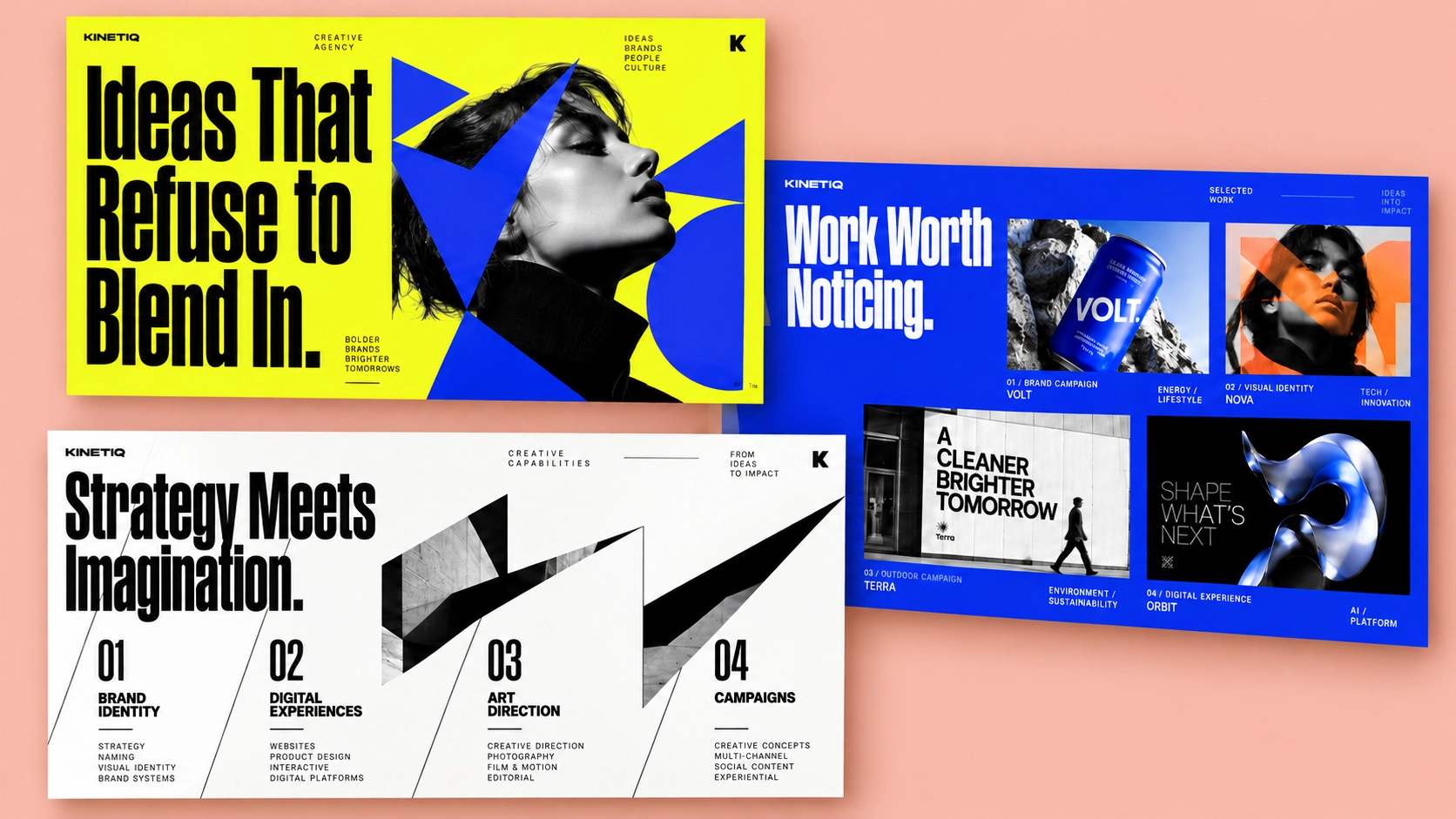
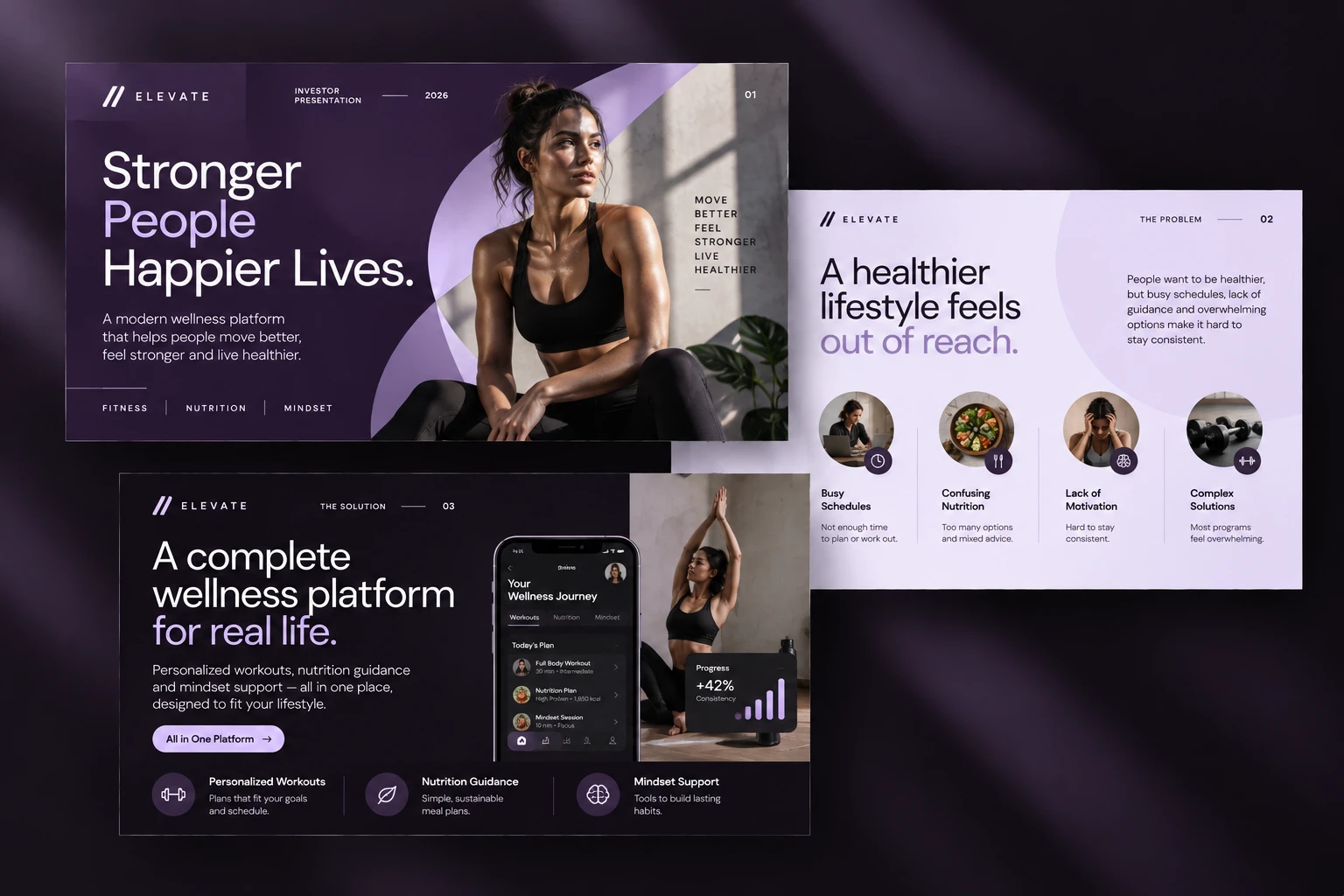
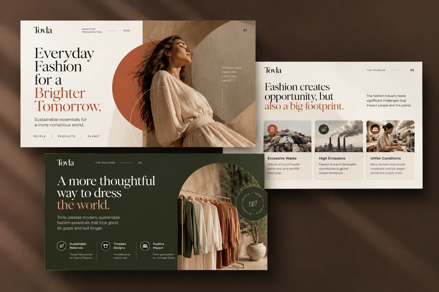
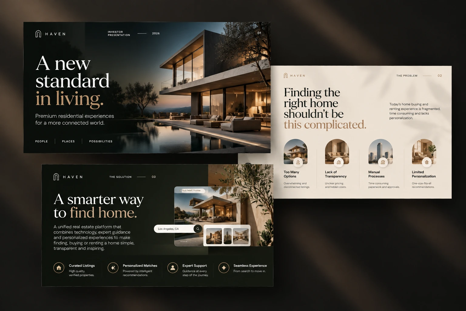
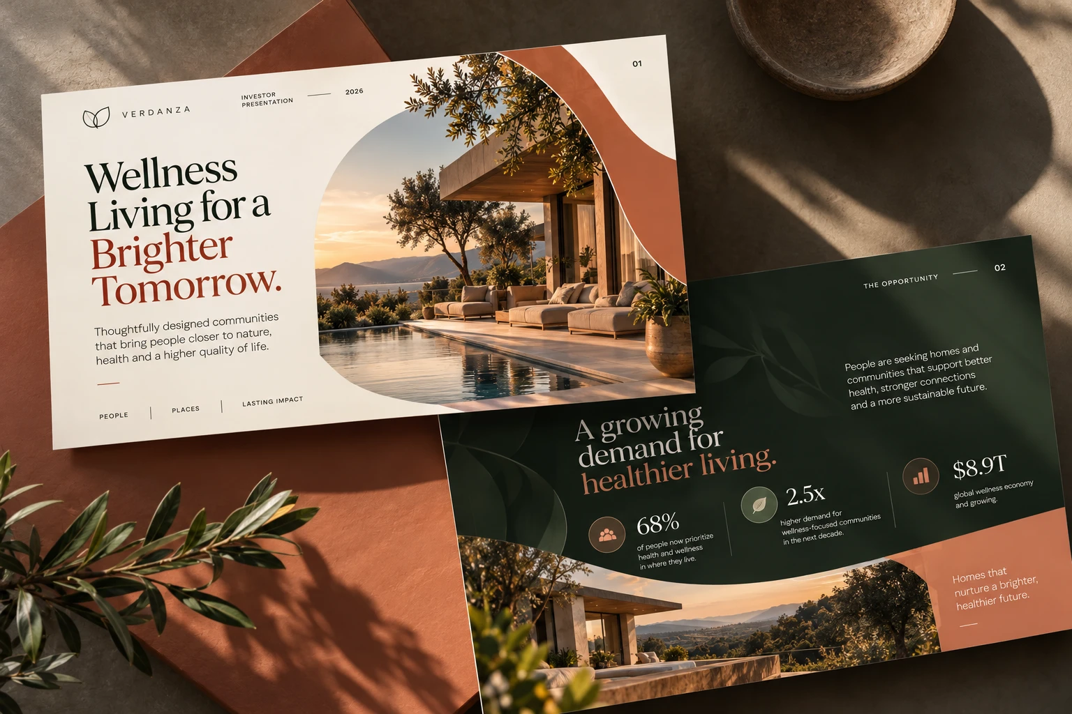
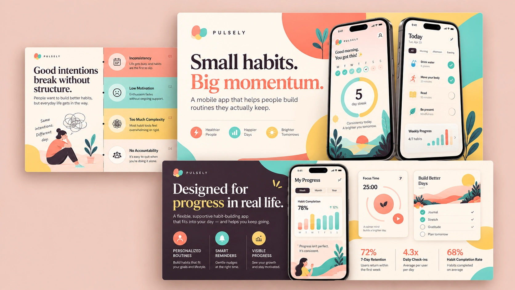
This project showcases a selection of presentation design work created for brands across technology, SaaS, business, consulting, and creative industries.
The Challenge
Many presentations start with the same problem: too much information, inconsistent layouts, weak hierarchy, and slides that feel disconnected from the brand.
The goal was to transform raw content, rough structures, and existing brand materials into presentations that feel clear, polished, and easy to follow.
Each deck needed its own visual personality while still being practical enough for real presentations, investor conversations, internal meetings, sales pitches, and client-facing use.
The Approach
I focused first on the story and information hierarchy before styling the slides.
Content was broken into clear sections, key messages were prioritized, and dense information was simplified wherever possible. From there, I built a consistent visual system around typography, spacing, grids, imagery, charts, diagrams, and reusable slide layouts.
Rather than making every slide look completely different, I created enough visual variety to keep the presentation engaging while maintaining a strong rhythm across the full deck.
Depending on the project, the design direction ranged from minimal and corporate to bold, editorial, premium, or technology-focused.
What I Designed
The work included:
Pitch decks
Sales and business presentations
Company profiles
Investor presentations
Marketing decks
Product and SaaS presentations
Data and infographic slides
Case study layouts
Process and timeline slides
Branded presentation systems
Each presentation was designed to work as a complete system, not just as individual slides.
Design Principles
The visual direction across these projects was built around clarity, hierarchy, and consistency.
Strong typography made the key message immediately visible.
Whitespace helped dense slides feel easier to understand.
Charts and diagrams were simplified so the audience could understand the point quickly.
Photography and graphic elements were used intentionally rather than decoratively.
Reusable layouts made it easier for clients to expand the presentation later without losing consistency.
The Result
The final presentations feel more confident, cohesive, and professional while remaining practical for everyday use.
Instead of overwhelming the audience with information, each deck creates a clear visual path through the content and helps the presenter communicate the story more effectively.
The result is a presentation system that not only looks polished, but also strengthens the way the brand communicates.
Services Included
Presentation design
Pitch deck design
Slide redesign
Visual storytelling
Data visualization
Infographics
Custom charts and diagrams
Brand-aligned presentation systems
Editable PowerPoint, Google Slides, or Figma files
0 likes · 24 views · Apr 14, 2026
Designing impactful presentations and pitch decks that blend clarity, creativity, and strategy, helping brands inform, inspire, and win attention.


