Branding Design Collection'24
Yusra Shoaib
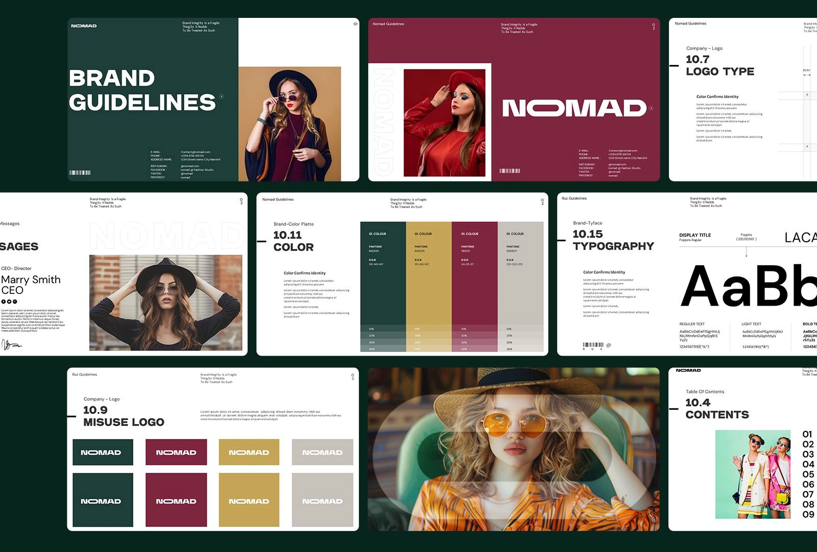
Nomad – Brand Identity Design
### Brand Identity Design
For Nomad, a contemporary fashion company, I was tasked with creating a complete brand identity that captured the essence of their vision: effortless sophistication, versatility, and a modern nomadic spirit. The goal was to design a visual identity that would resonate with fashion-forward consumers while reflecting the brand’s values of freedom, individuality, and global inspiration.
I developed a minimal yet striking logo system that embodies Nomad’s refined aesthetic, using clean typography paired with subtle geometric elements to symbolize movement and exploration. The chosen color palette balances neutral tones with bold accents, allowing flexibility across both digital and print applications while reinforcing the brand’s premium feel.
To ensure consistency, I designed a full set of brand guidelines, covering logo usage, color systems, typography hierarchy, photography direction, and applications across packaging, social media, and marketing assets. The design approach emphasized adaptability, enabling Nomad’s identity to seamlessly translate across collections, campaigns, and retail experiences without losing its core essence.
The outcome is a cohesive and timeless identity that positions Nomad as a distinctive player in the fashion industry, giving them a strong foundation for building long-term brand recognition and emotional connection with their audience.
Unite – Brand Identity Design
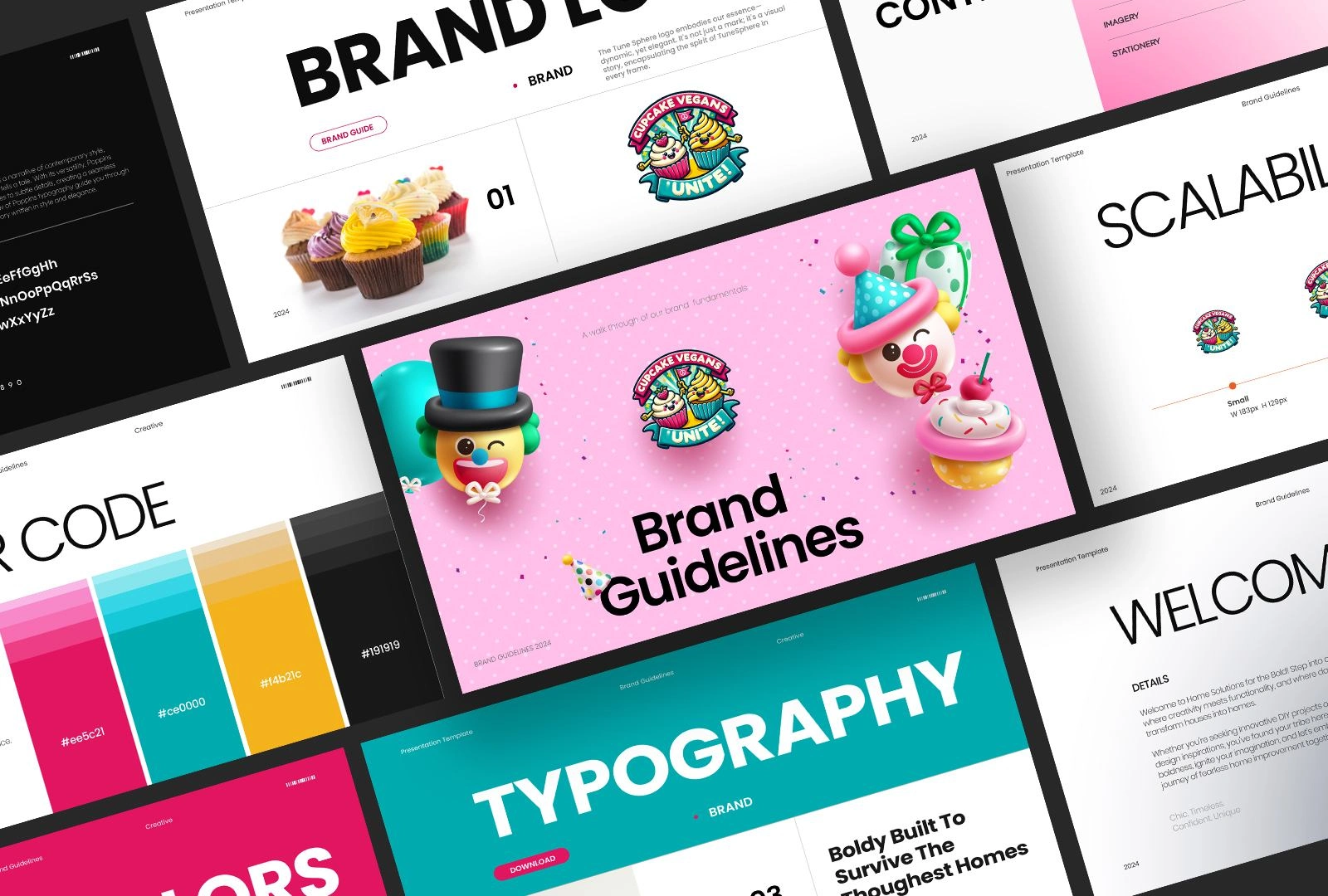
### Brand Identity Design
For Unite, a vegan cupcake company, I created a brand identity that reflects both the indulgence of cupcakes and the values of conscious, plant-based living. The challenge was to design visuals that feel playful, approachable, and joyful, while also communicating the brand’s commitment to sustainability and inclusivity.
The logo design combines soft, rounded forms and a friendly typeface to evoke warmth and community, with subtle cues inspired by cupcakes and natural ingredients. The color palette features pastel tones paired with vibrant accents, symbolizing freshness, creativity, and positivity. This balance ensures that the brand stands out in both packaging and digital platforms, while appealing to a wide audience of dessert lovers.
I developed a comprehensive set of brand guidelines, covering logo applications, typography systems, color usage, packaging design direction, and social media aesthetics. Special attention was given to packaging mockups and marketing materials, ensuring that the brand identity communicates fun and delight while maintaining a professional and cohesive visual language.
The final identity positions Unite as a modern, feel-good vegan brand that celebrates taste, community, and conscious living, giving it a strong presence in both retail and online markets.
Lightmoon Studio – Brand Identity Design
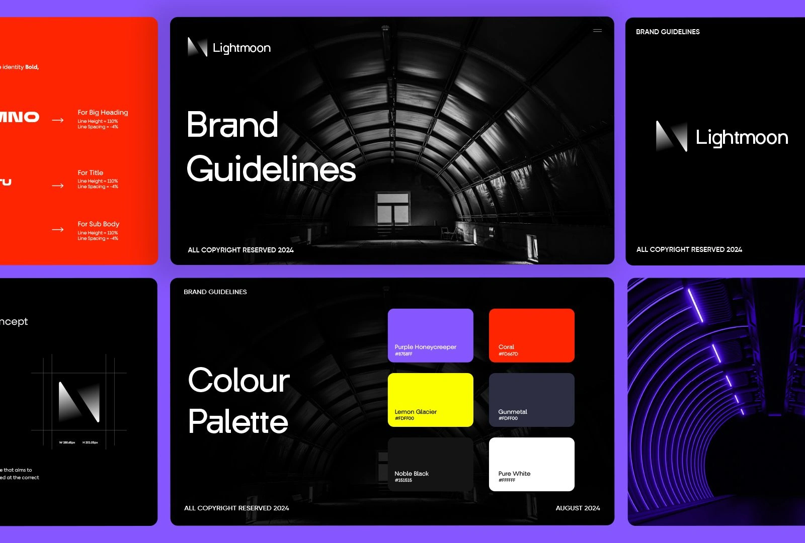
For Lightmoon Studio, a creative studio specializing in visual storytelling and design, I developed a brand identity that embodies elegance, imagination, and artistic depth. The goal was to create a visual system that feels modern and aspirational while capturing the essence of creativity that thrives under inspiration, much like the glow of the moon.
The logo design is a refined blend of minimalism and symbolism, incorporating lunar-inspired elements that suggest illumination, creativity, and cycles of growth. The color palette combines deep midnight tones with soft gradients of silver and pale blue, evoking a sense of sophistication and dreamlike quality. Typography choices were carefully curated to balance clean professionalism with subtle artistic flair.
To ensure consistency across all touchpoints, I created a full set of brand guidelines, including logo applications, typography hierarchy, color systems, and directions for digital and print collateral. The identity extends seamlessly to website layouts, social media, and studio stationery, creating a professional yet emotive presence that reflects Lightmoon Studio’s philosophy of bringing ideas to light.
The result is a timeless and evocative identity that positions Lightmoon Studio as a forward-thinking creative partner, leaving a lasting impression on clients and collaborators alike.
Apex Realty Company – Brand Identity Design
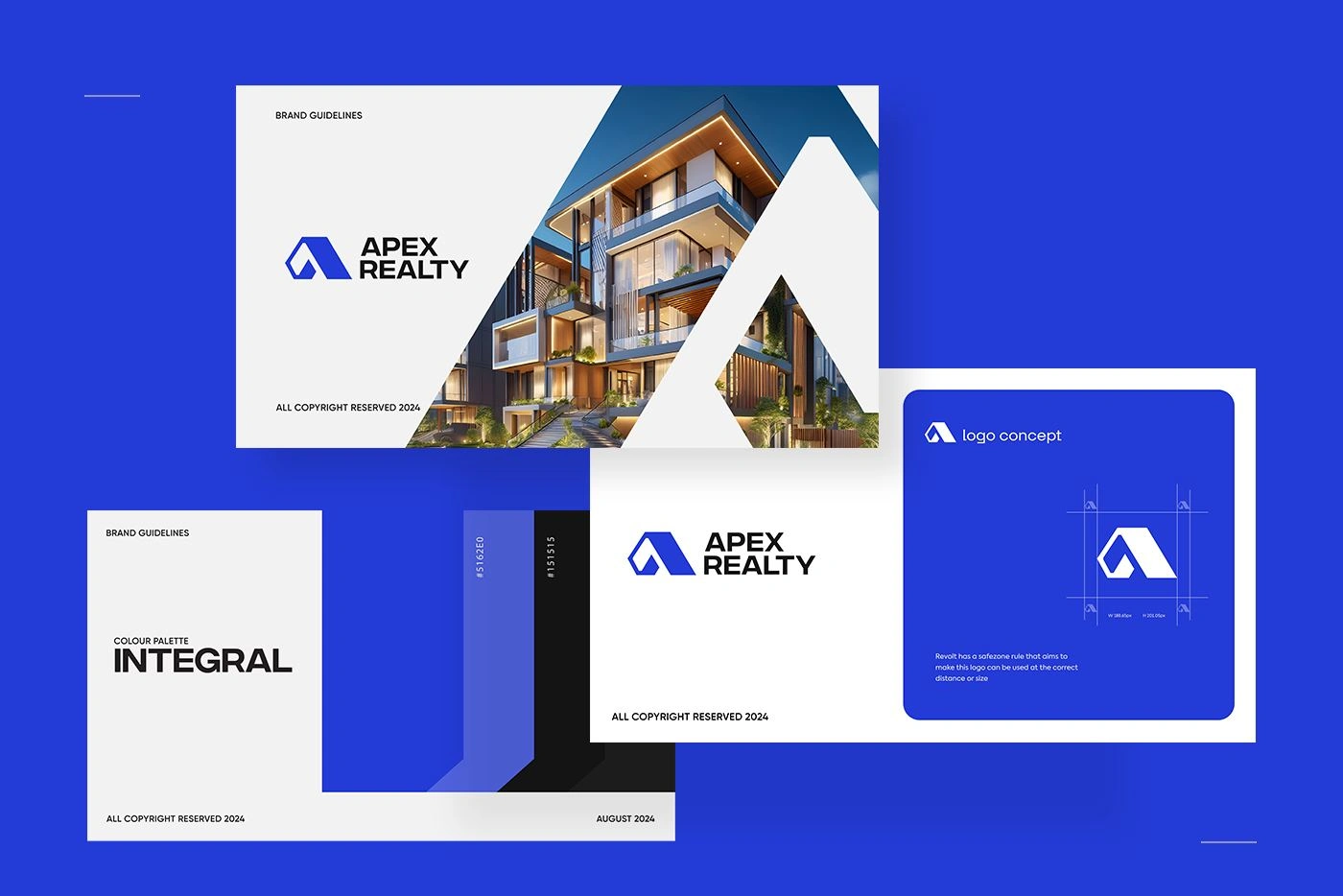
For Apex Realty Company, I designed a brand identity that reflects trust, sophistication, and growth, positioning the company as a reliable and modern player in the competitive real estate market. The vision was to create an identity that balances professionalism with approachability, making clients feel confident in choosing Apex for one of their most important investments.
The logo design incorporates strong geometric lines and an upward-pointing motif to symbolize stability, progress, and reaching new heights, perfectly aligned with the name Apex. The color palette was crafted with deep blues and neutral accents to communicate trust, reliability, and authority, while subtle metallic tones add a premium touch. Typography choices emphasize clarity and confidence, ensuring a polished and professional look across all brand applications.
I developed comprehensive brand guidelines that cover logo usage, color systems, typography hierarchy, and applications across signage, stationery, marketing collateral, and digital platforms. The branding was also designed with scalability in mind, allowing seamless adaptation for property listings, promotional campaigns, and online presence.
The outcome is a strong, timeless identity that positions Apex Realty as a trusted and aspirational brand in real estate, instilling confidence in clients while standing out with a clear, memorable presence.
Fluxbyte – Brand Identity Design
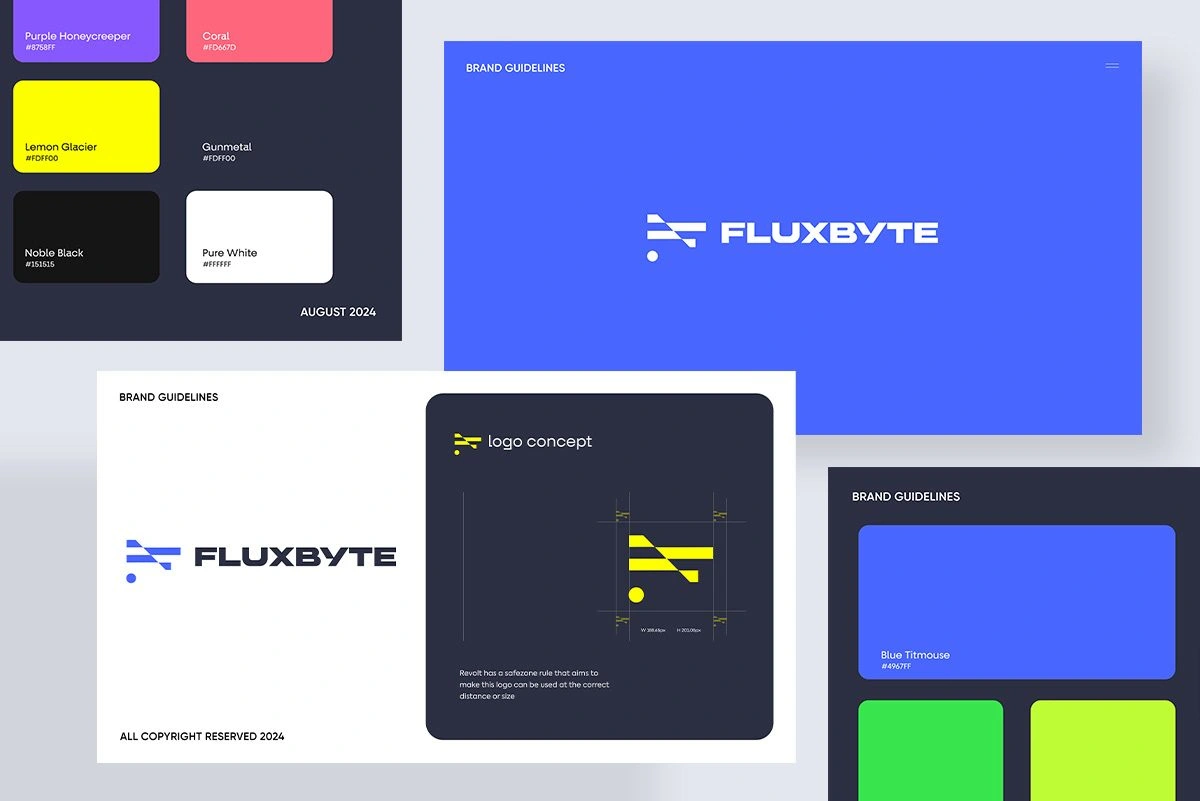
For Fluxbyte, a software company specializing in innovative digital solutions, I crafted a brand identity that reflects technology, agility, and forward-thinking creativity. The aim was to design a modern and adaptable identity system that communicates both technical expertise and a progressive mindset, helping Fluxbyte stand out in the fast-paced software industry.
The logo design integrates sleek geometric elements with dynamic forms to symbolize movement, adaptability, and the constant evolution of technology. The name Fluxbyte inspired a design language rooted in the concepts of data, flow, and innovation. The color palette combines bold, energetic tones with professional neutrals, striking a balance between creativity and trustworthiness. Typography was carefully chosen to project clarity, precision, and modernity across all digital and print applications.
I created a comprehensive set of brand guidelines, detailing logo usage, color schemes, typography hierarchy, iconography, and applications across web, software interfaces, and marketing assets. The identity was built to scale across platforms, ensuring consistency from the company’s website and product dashboards to pitch decks, presentations, and social media presence.
The final result is a versatile, future-ready identity that positions Fluxbyte as an innovative software partner, empowering the brand to connect with clients through a strong, professional, and memorable visual presence.
Like this project
Posted Sep 23, 2024
Crafting timeless brand identities that blend strategy, creativity, and design, helping companies stand out with visuals that inspire and connect.
Likes
5
Views
136