Plately Visual Identity and Packaging Design
Kenny Hartono
PLATELY (MEAL-KIT SUBSCRIPTION)
VISUAL IDENTITY / ILLUSTRATION / PACKAGING / ART DIRECTION
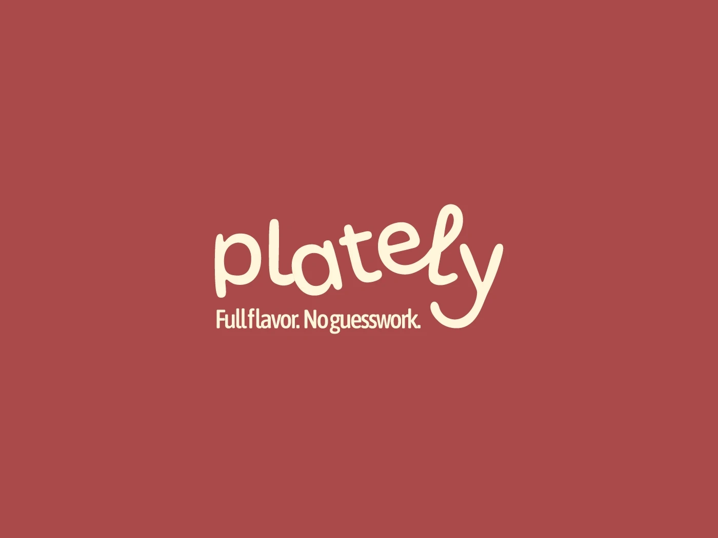
FULL FLAVOR. NO GUESSWORK
Plately comes in, with one simple idea: Make home cooking easier without giving up its freshness, flavor, or joy. When life’s packed between tight-scheduled meetings, errands and everyday-chores, cooking something healthy and actually tasty can feel like an impossible tasks. Using easy-to-follow recipes, flexible options, and ingredients that actually nourish your body, Plately helps you skip the stress and savor the good stuff. Nothing better than the feeling of cozy warm dinner meal you dreamt finally came true!
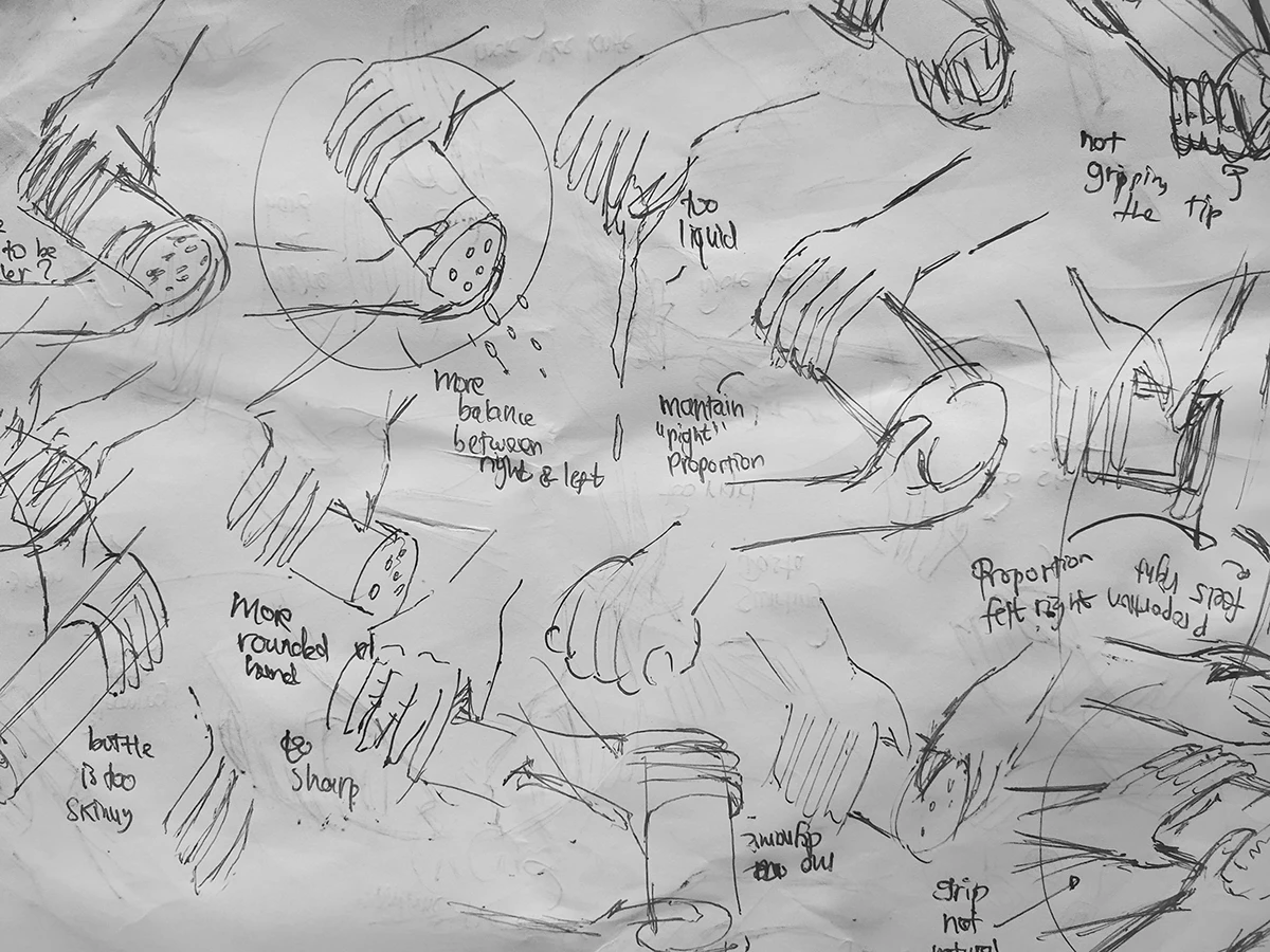
THE INITIAL SKETCH CONCEPTING OF ILLUSTRATIONS
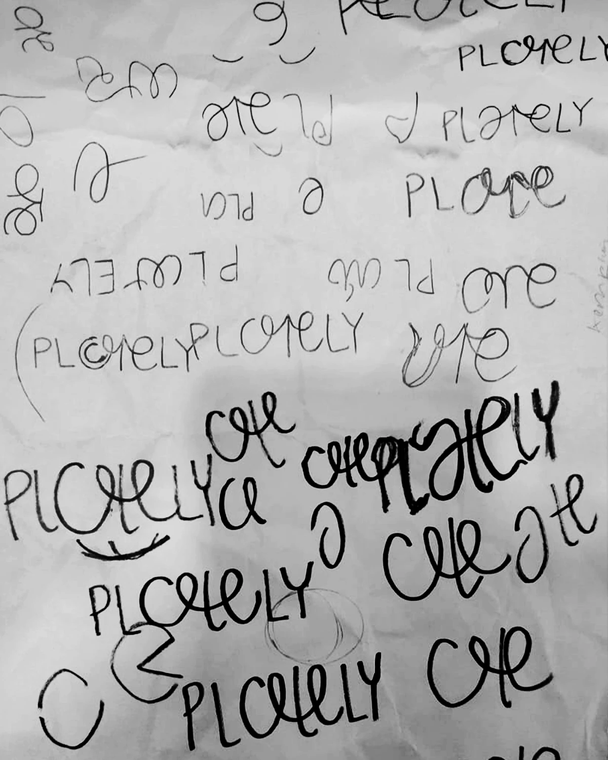
THE INITIAL SKETCH CONCEPTING OF LOGO
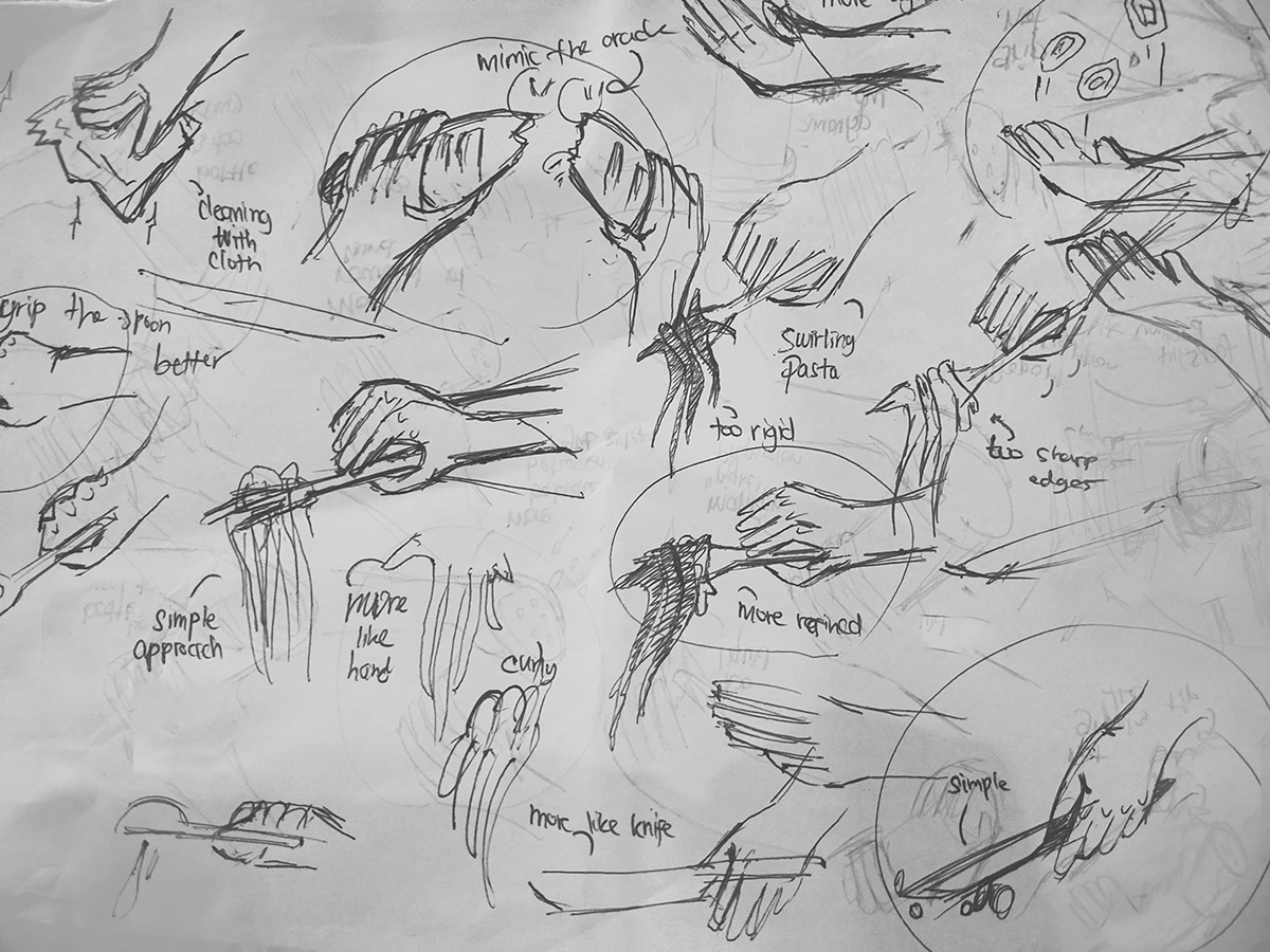
THE INITIAL SKETCH CONCEPTING OF ILLUSTRATIONS
THE PROCESS
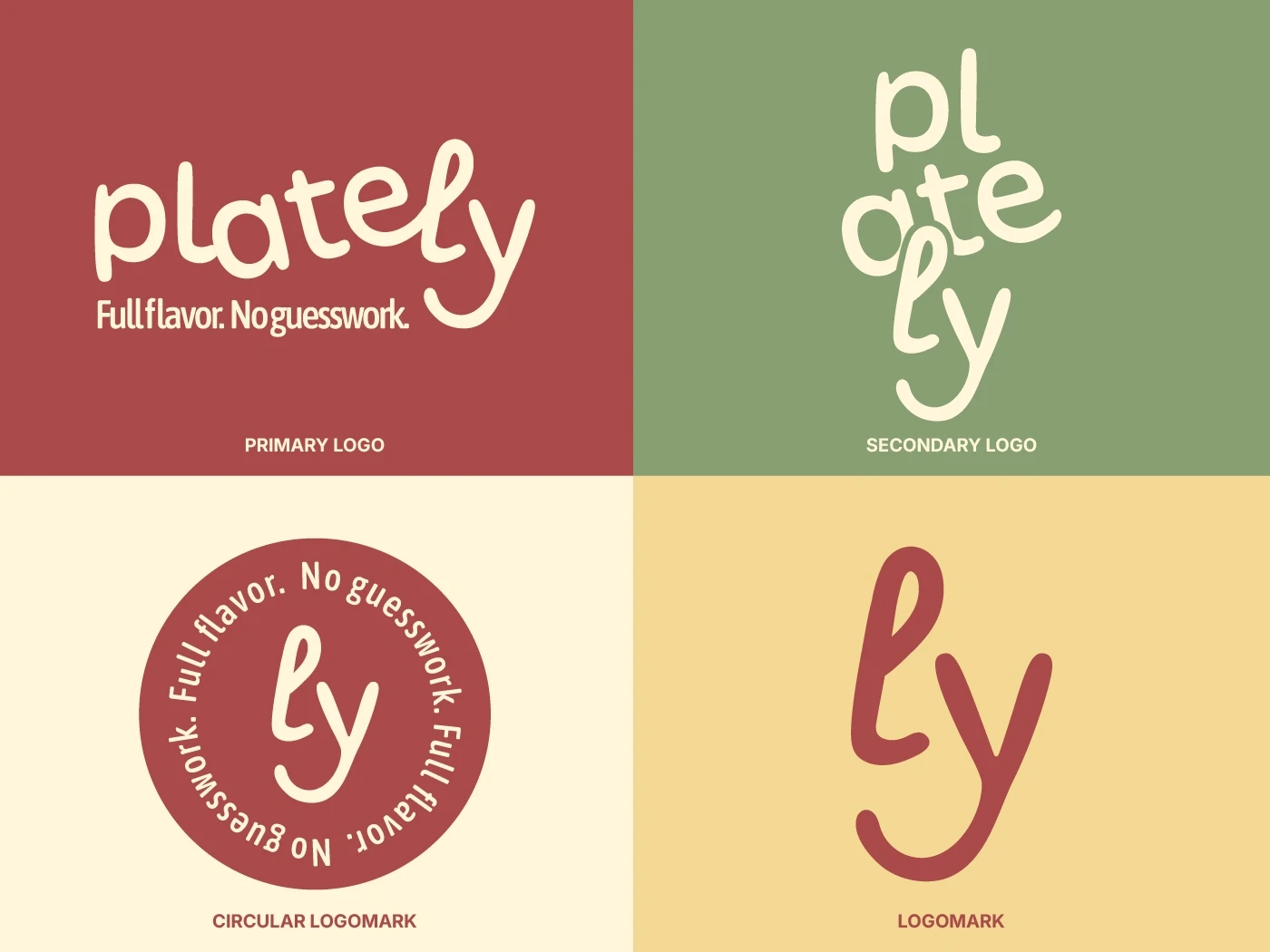
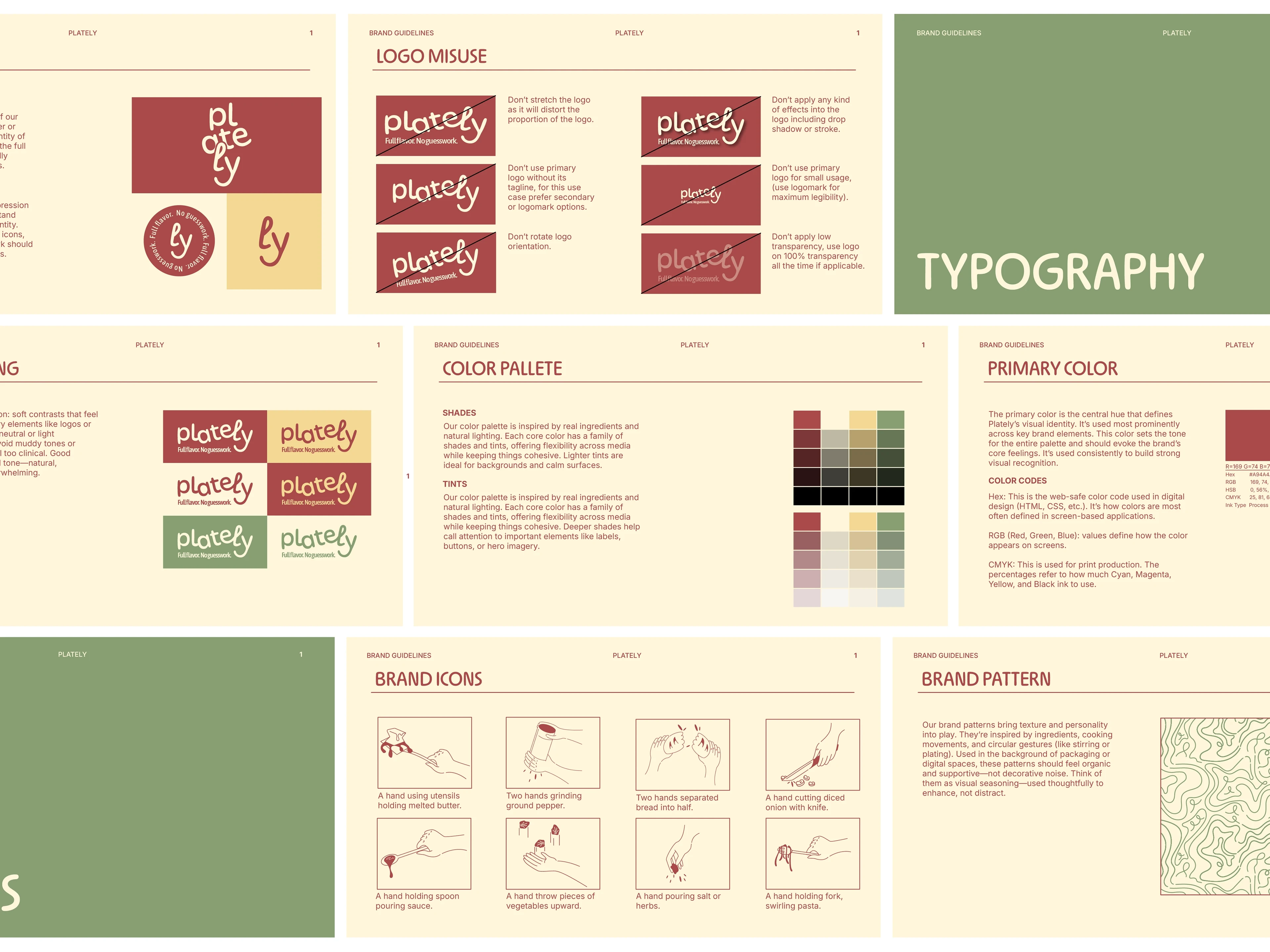
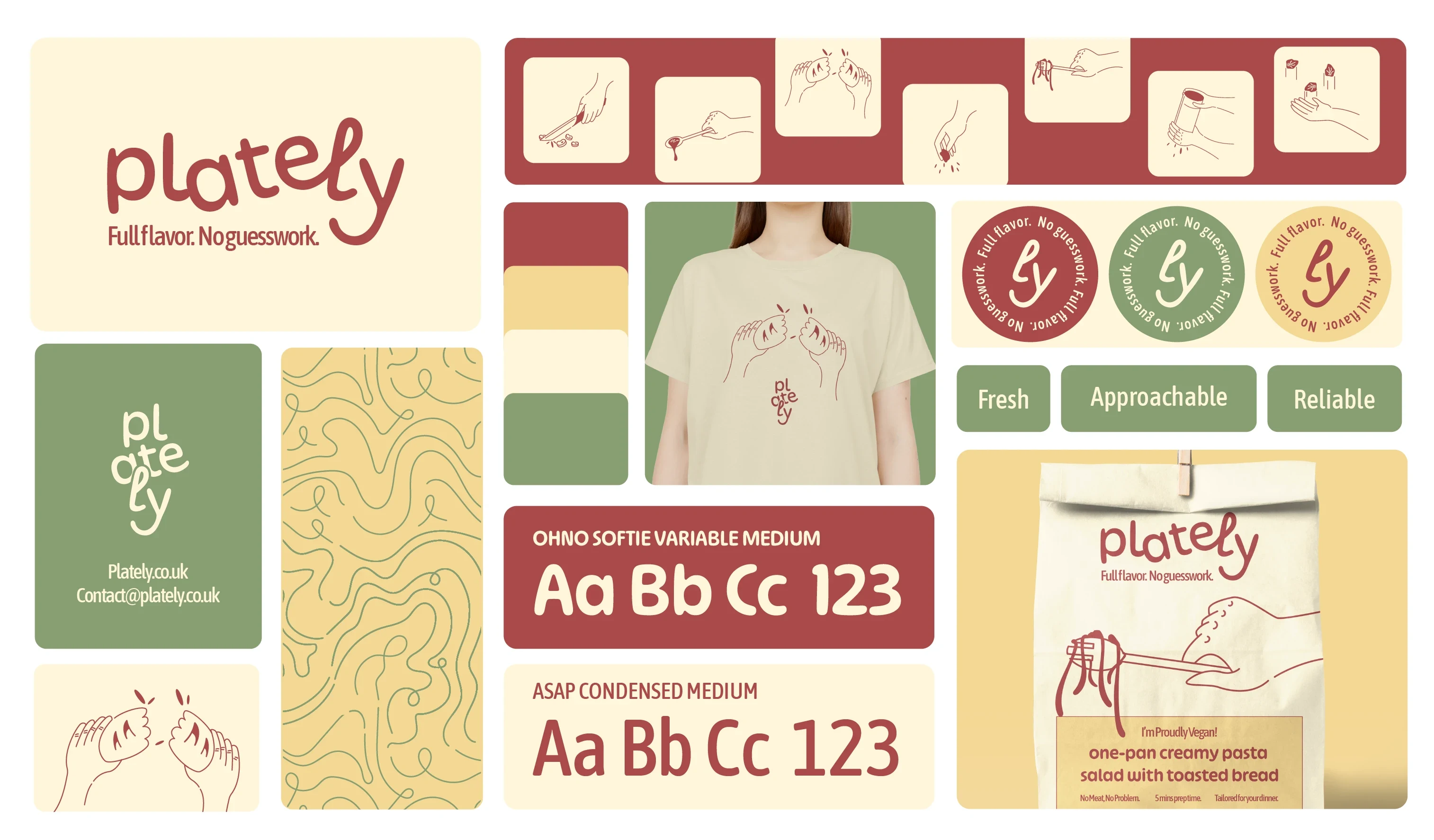
The logo features interwoven curved line, with rounded sans-serif to ensure it’s alignment to brand’s approachableness. Plus, the word “Ly” intentionally-shaped as a grinning knowledgeable-friend in your kitchen.
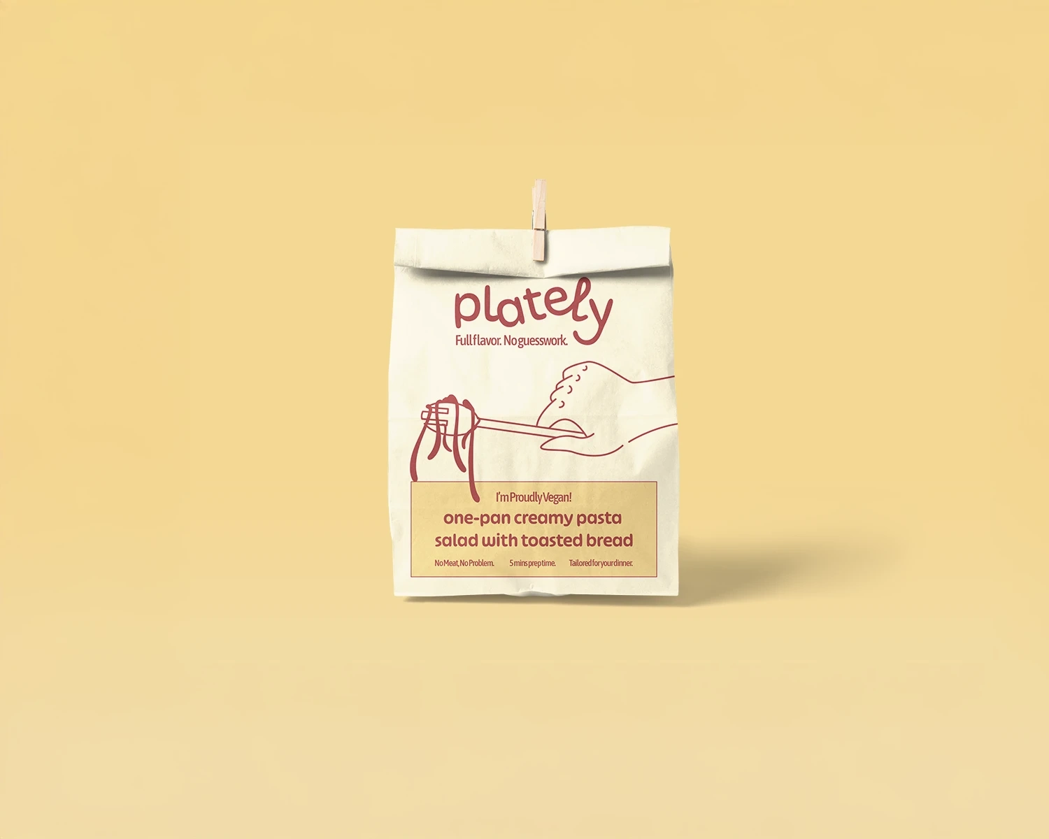
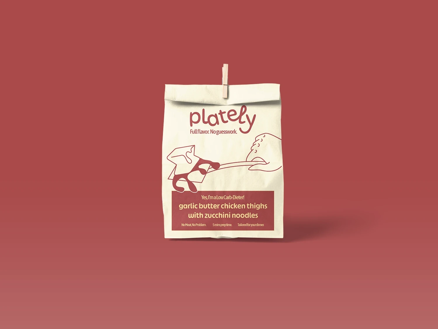
Next, is choosing the right combination of pastel colors that's not being too washed out or seen bold was another mission to accomplish. The result are set of pastel colors paired with primary color to make brand feel fresh, inviting and alive. The primary color functioned as a highlighter to easily distinguish type of meals (e.g., vegetarian or low-carb dieter).
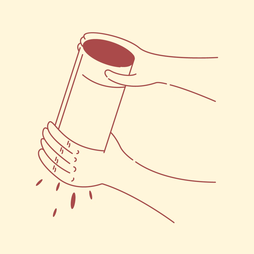
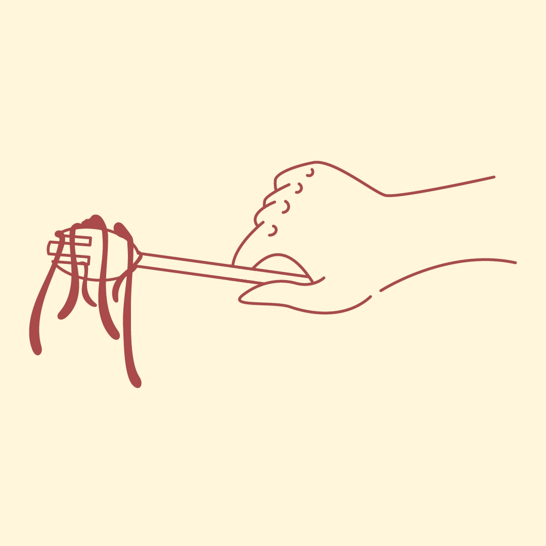
The challenges for making the Illustrations were visualizing human gestures and tactileness concurrently, whilst still keeping the brand grounded. It's rather more challenging than creating a mascot though, because being able to visualize hands proportionately yet keeping it organic takes another level of passion and skills. To avoid adding more cluterness of reading lines of recipe, sets of hand-drawn are ready to help make your life easier. When you are following pasta recipe, a hand-drawn illustration of “hand swirling pasta” is far more engaging and informative than reading a sentence saying “next, swirl hot pasta in a bowl with a splash of olive oil to keep it from sticking”.


THE RESULTS
Listed beforehand are the deliverables for this project, consisting of visual identity along with its packaging designs. The results came out as a cohesive friendly and supportive identity, with emphasis on being fresh with all their ingredients.
To reassure Plately's fresh ingredients, inspiration of its pattern was taken from natural appearance of freshly cut vegetables. Think about lettuce that's just harvested from your grandmother's crops, with its leftover tiny droplets after being washed - that's the level of freshness they emphasize of. Whilst bringing out sustainability to every part of brand experience using Eco-conscious packaging materials, reflecting their serious no-green washing ethos.
Throughout the consumer experience are supportive, clear and casual tone of voice, just like your reliable partner on kitchen. No corporate styled or too sterile, they speak like a human not some logistic company, phrases like "your dinner deserves better!" or "we're here just to spice you up!" are ways to make consumer felt comfortable and confident enough with their own "Full flavor. No guesswork" approach.
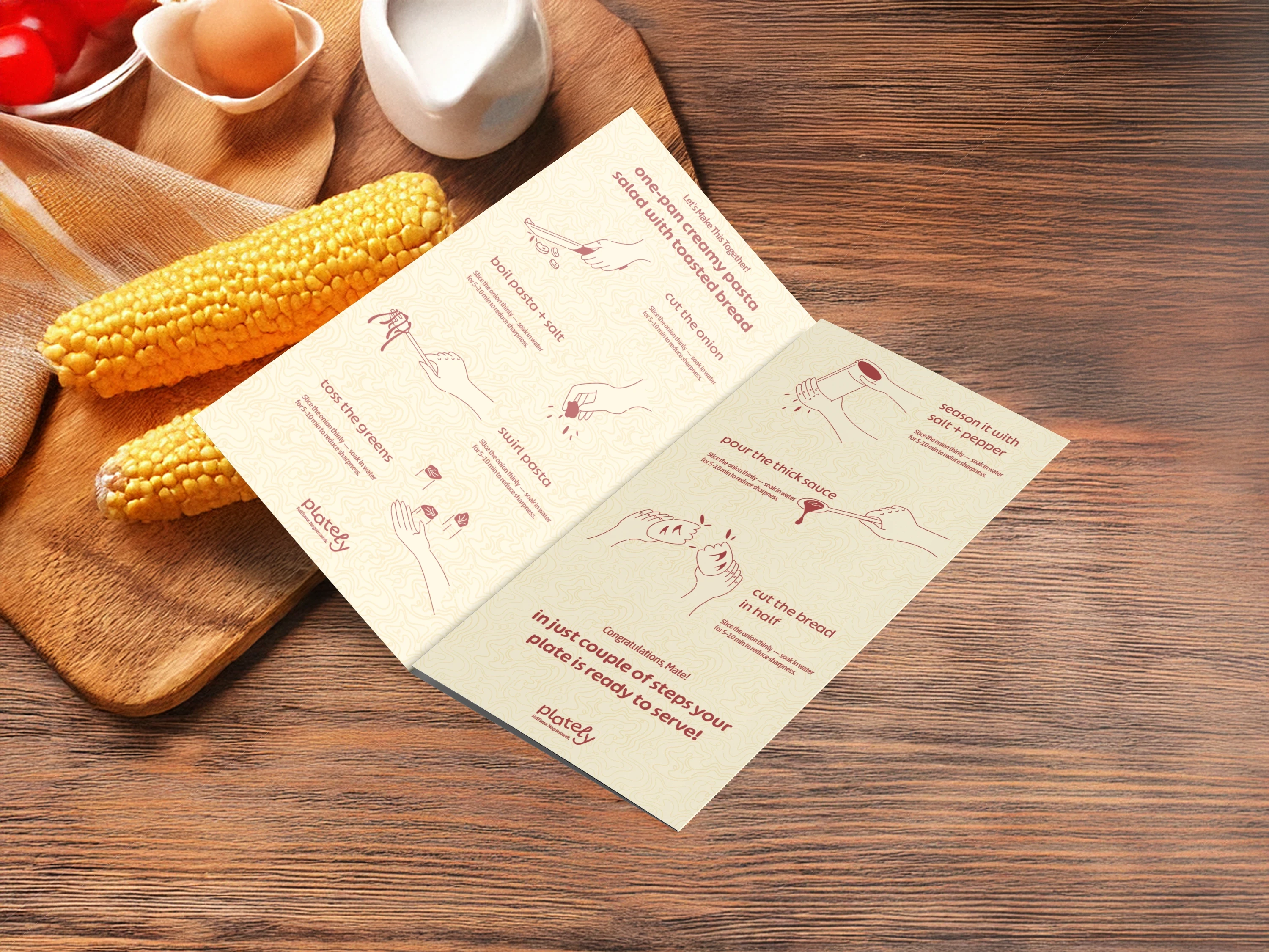
MENU CARD
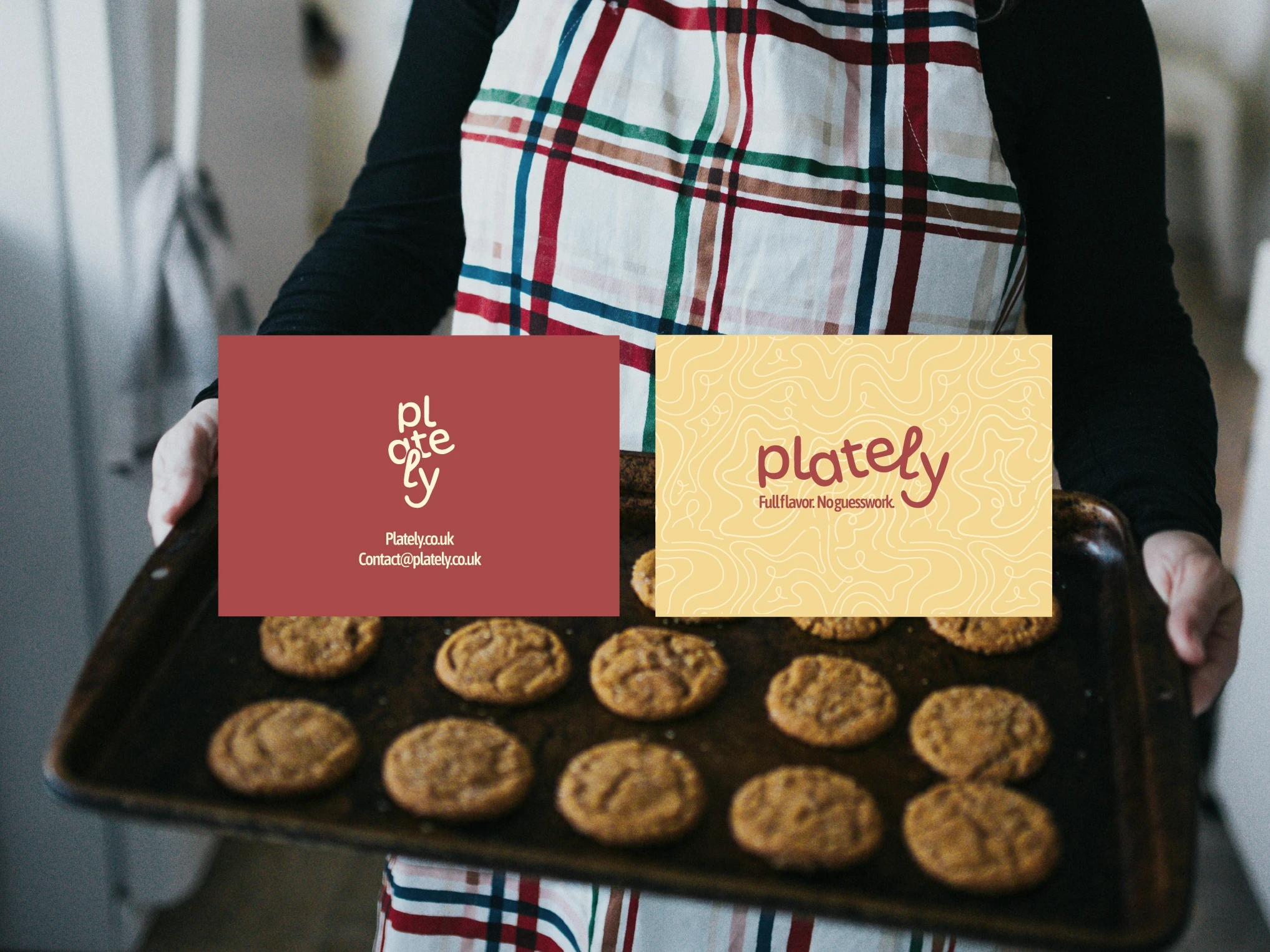
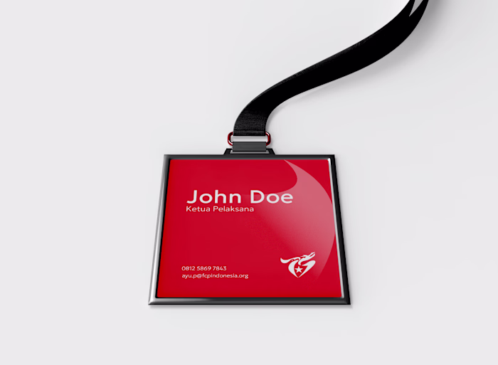
IDENTITY CARD
MAIN INGREDIENTS PACKAGING (VER. 1 AND VER. 2)
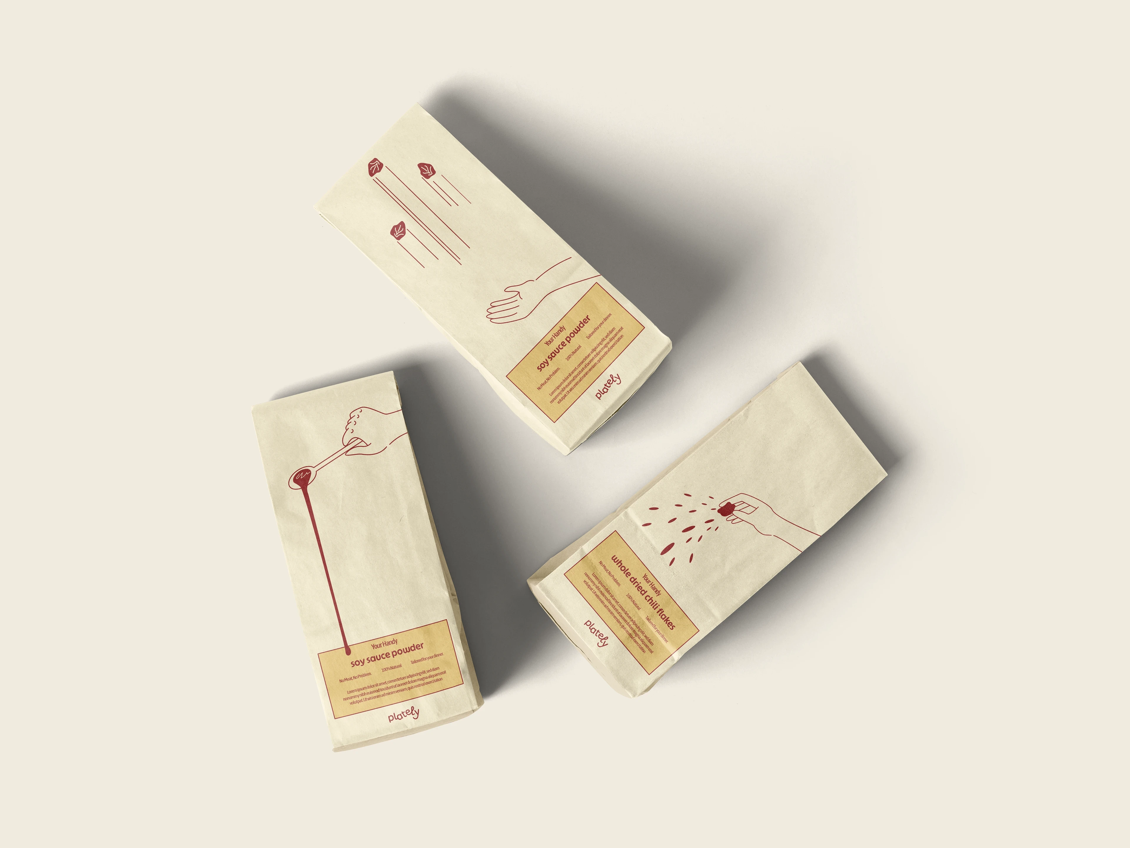
LARGE SINGLE-INGREDIENT PACKAGING
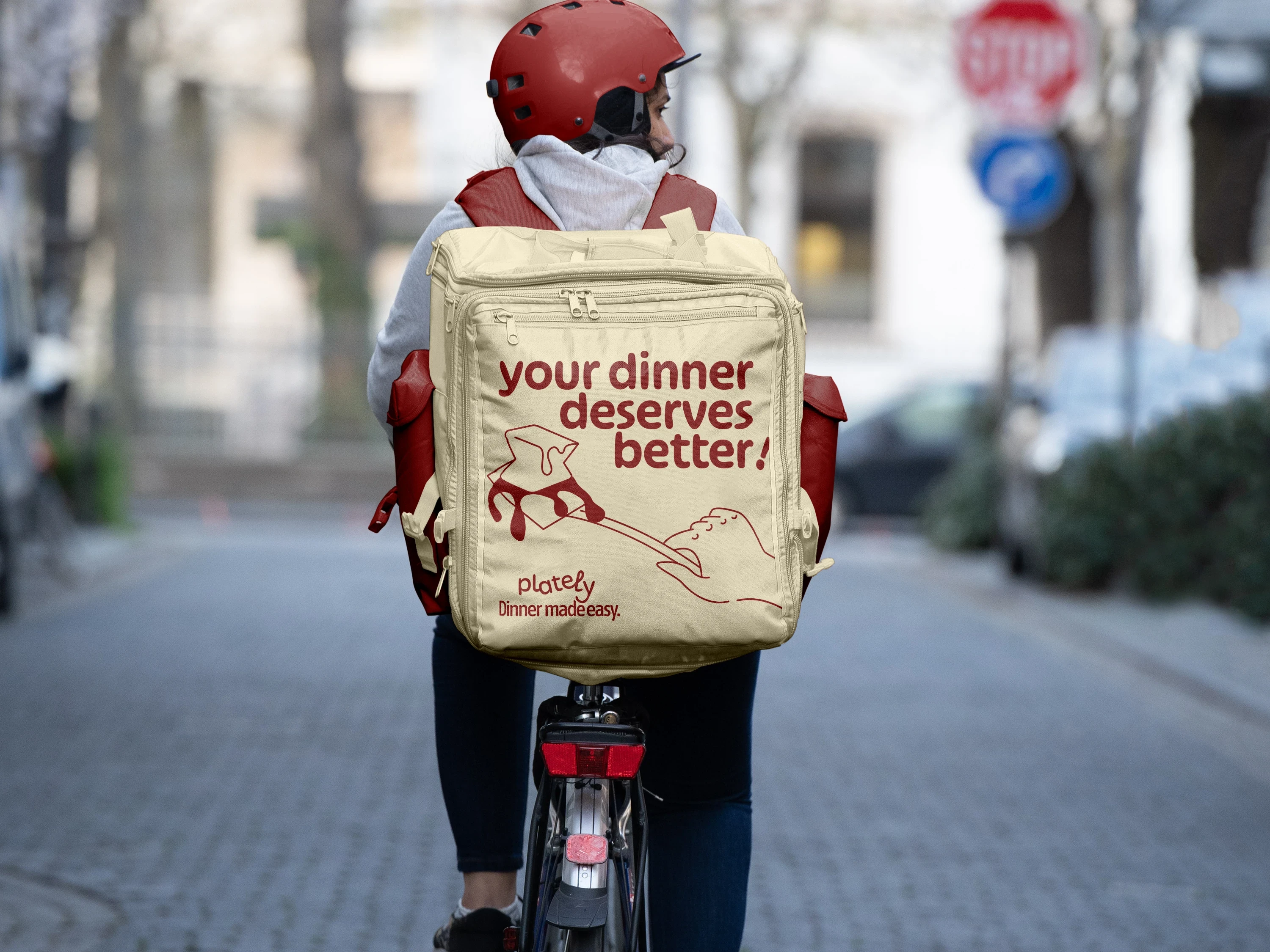
DELIVERY BACKPACK CLOSE-UP SHOT
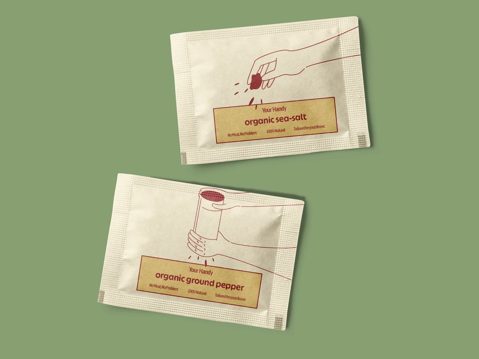
SMALL SINGLE-INGREDIENT PACKAGING
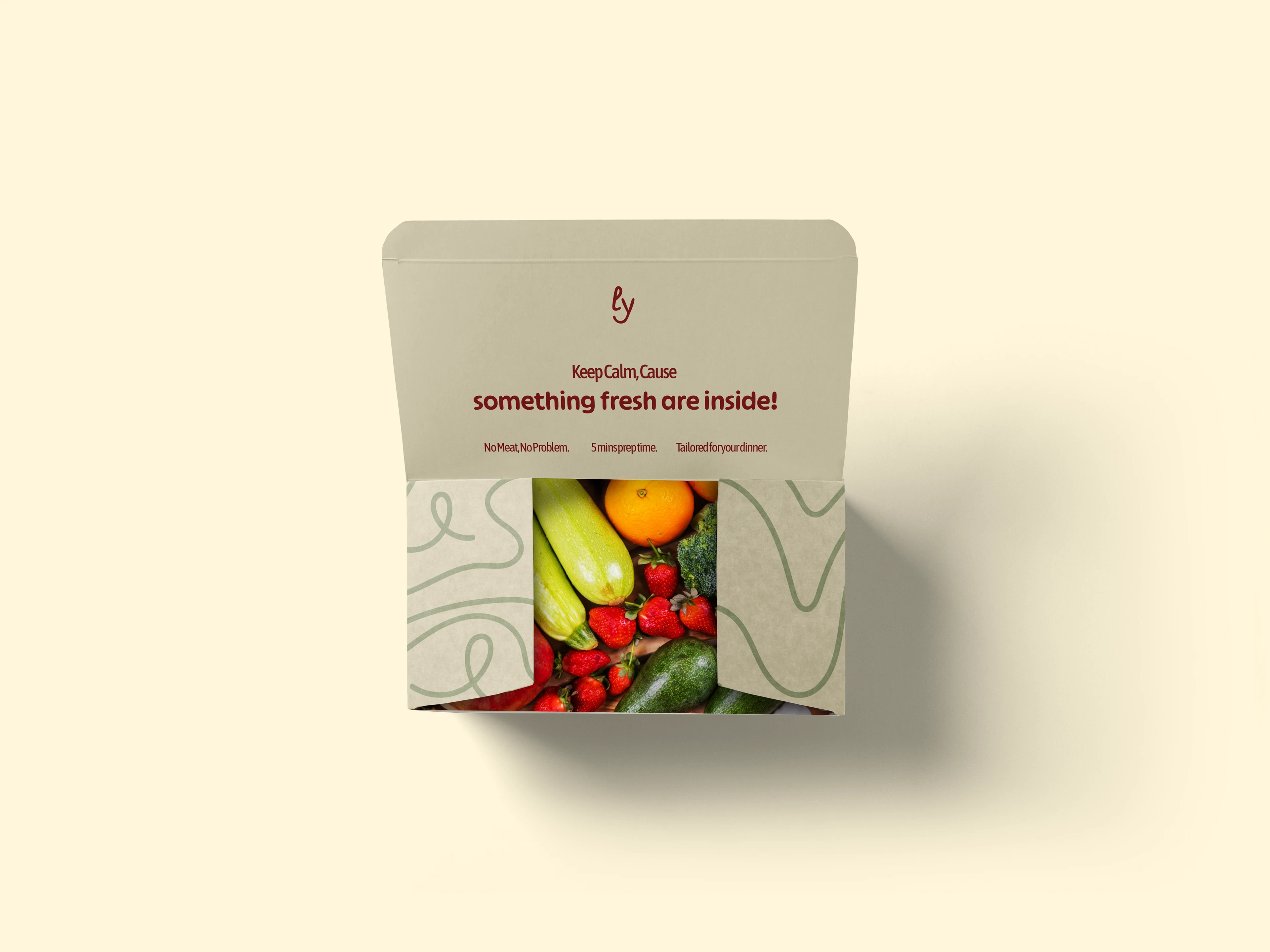
INGREDIENTS BOX PACKAGING
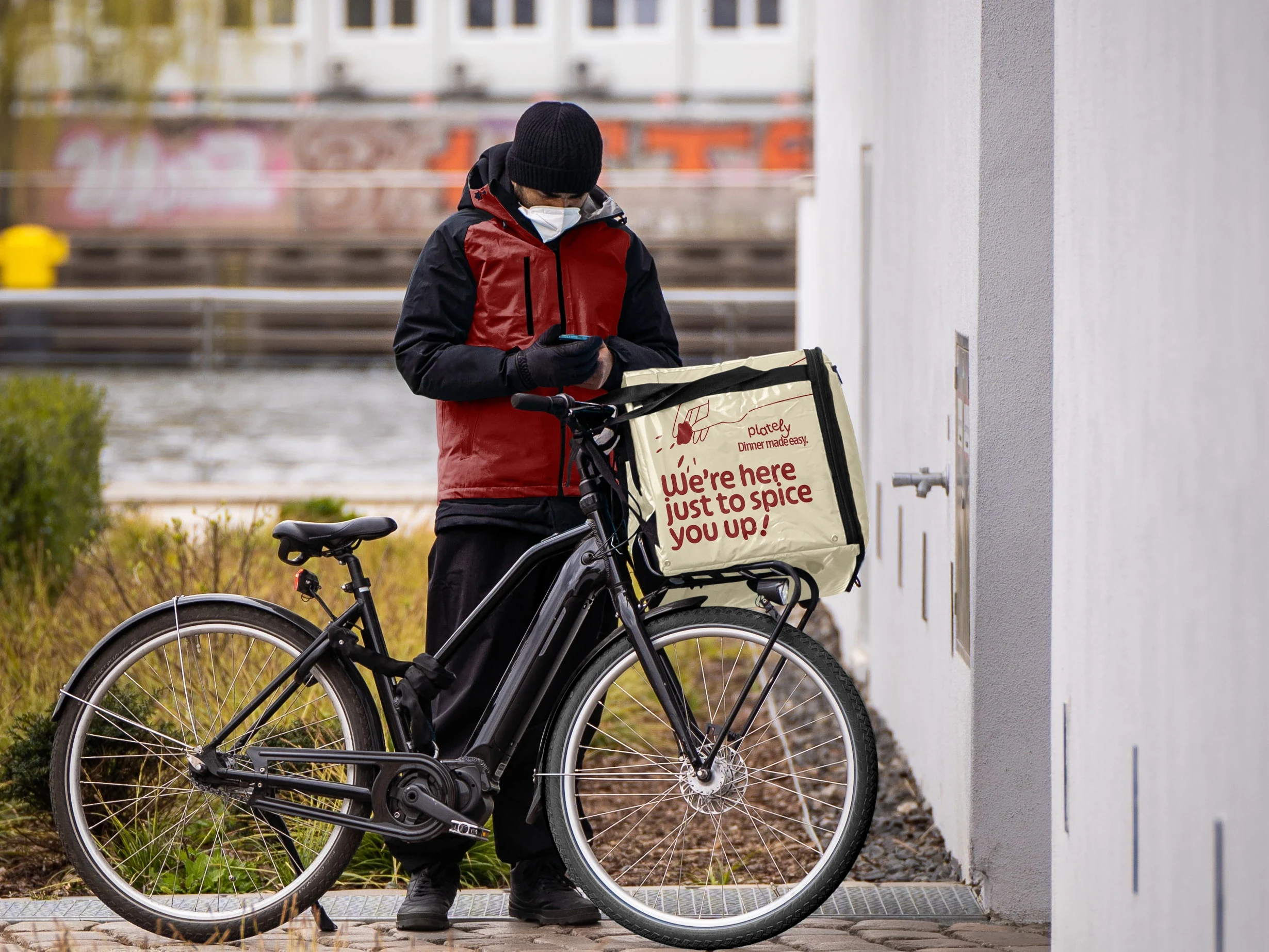
DELIVERY BACKPACK FULL-BODY SHOT
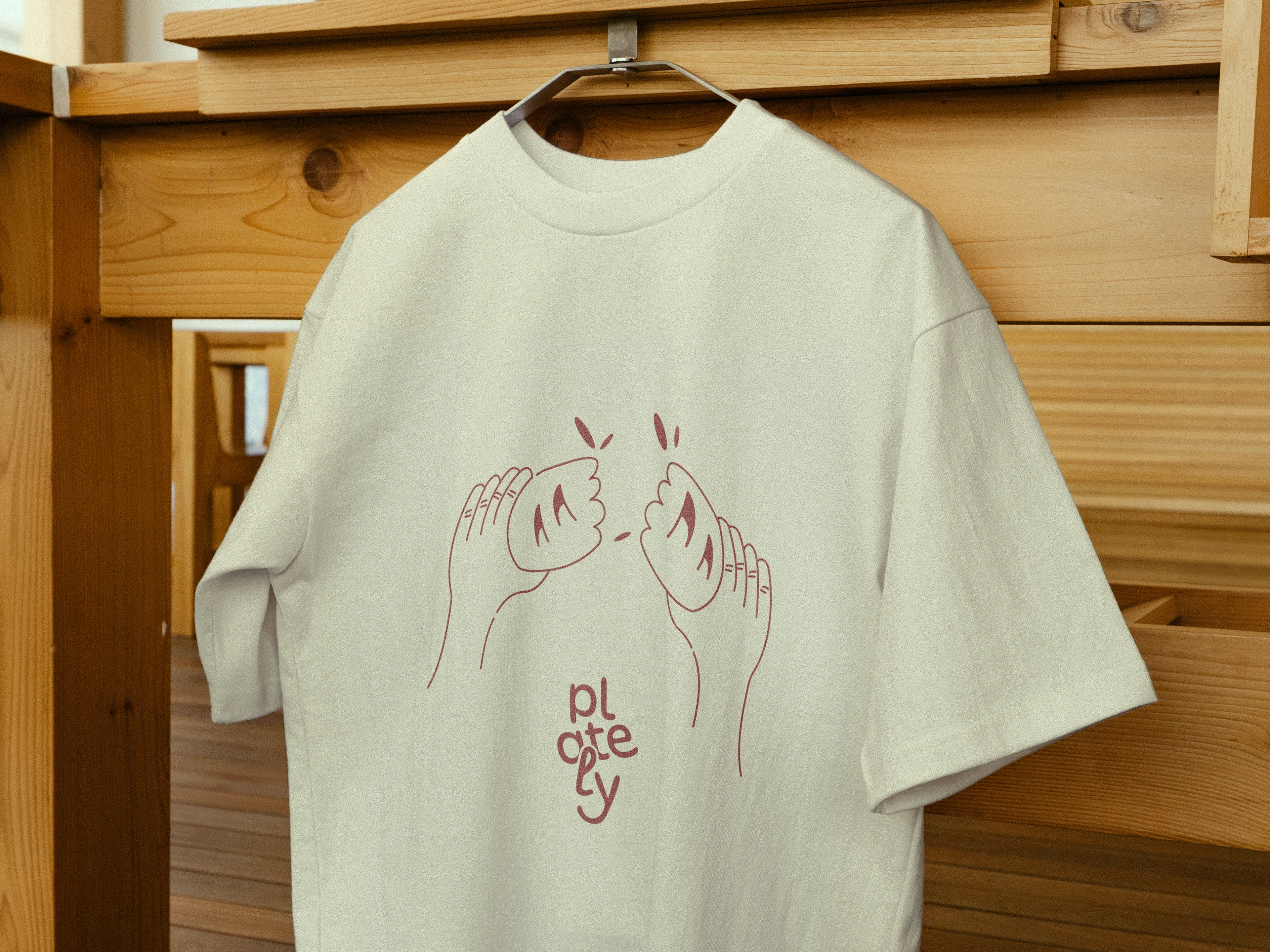
APPAREL DESIGN
BENTO-STYLED DESIGN MOODBOARD
PLATELY
BRAND DESIGN & CREATIVE DIRECTION
Kenny Hartono
CLIENT
Designer Briefs
PROJECT YEAR
2025
PROJECT SCOPE
Visual Identity, Illustration, Packaging, Art Direction
Like this project
Posted Jul 8, 2025
Developed visual identity and packaging for Plately, emphasizing freshness and sustainability.
Likes
0
Views
4
Timeline
Jun 10, 2025 - Jul 5, 2025