RASTRO
Kenny Hartono
RASTRO
BRAND DEVELOPMENT / VISUAL IDENTITY / PACKAGING / ART DIRECTION
(EN)
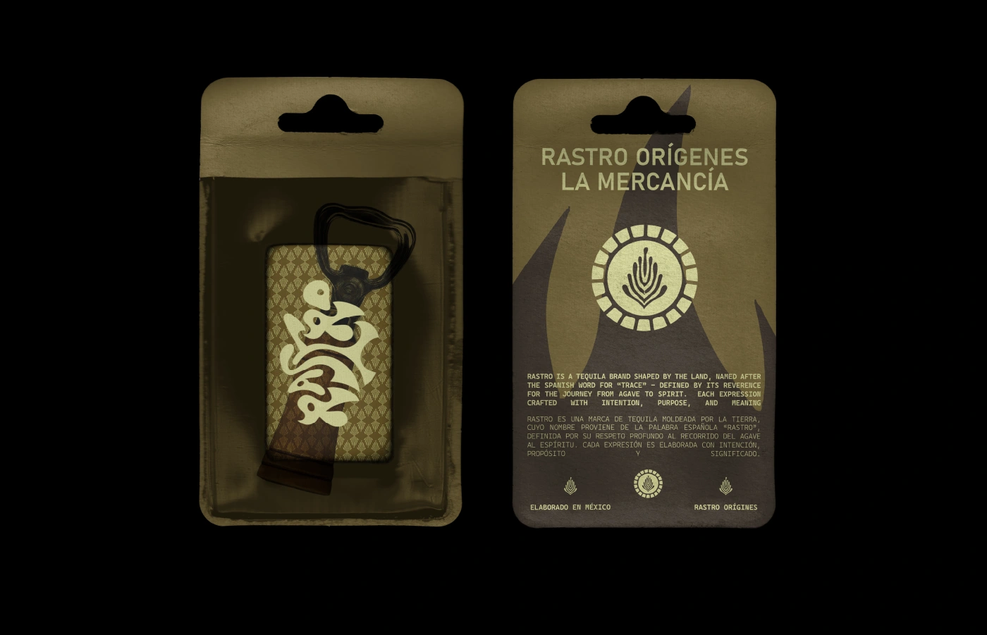
Rastro is a tequila brand shaped by the land, named after the Spanish word for “trace” - defined by its reverence for the journey from agave to spirit. Each expression crafted with intention, purpose, and meaning - embodying its signature smoky notes and bold identity. However, as Rastro steps on the global market, it faces a unique challenge: staying relevant on emerging markets - where tequila often seen as a recreational consumption - while still remaining true to its traditionally crafted heritage. Rastro invites whole new generation drinkers into redefining the true spirit of tequila artistry.
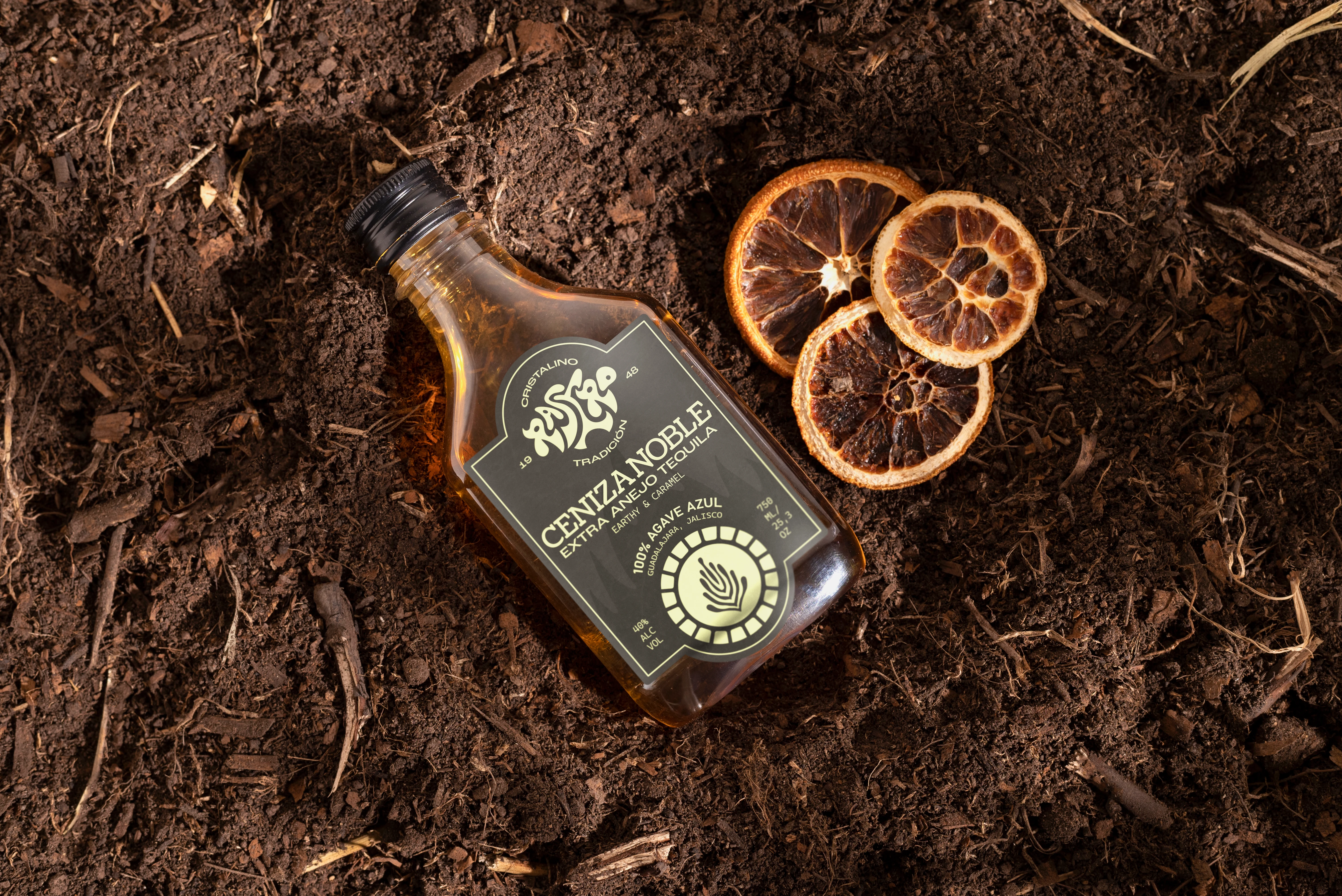
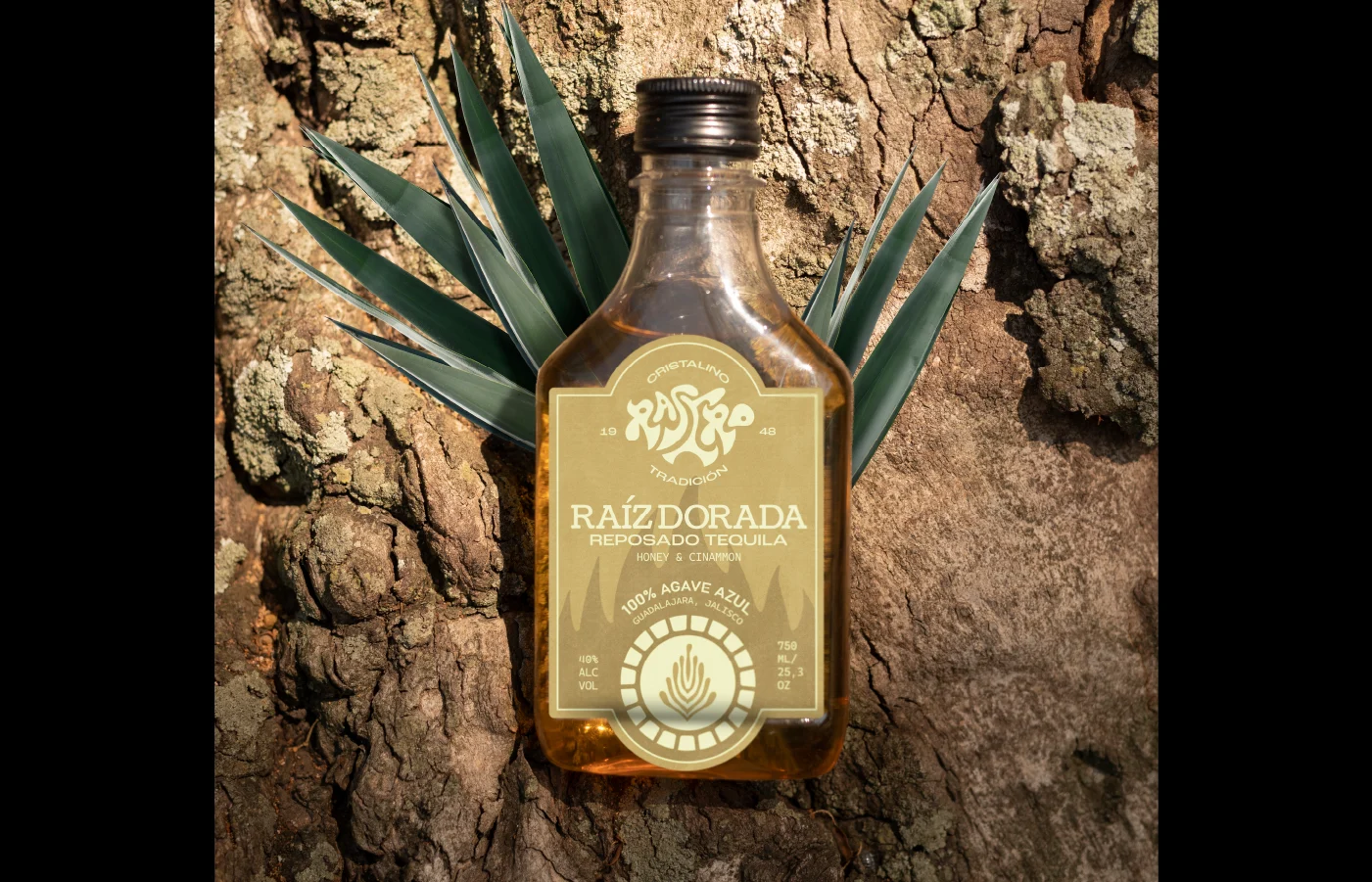
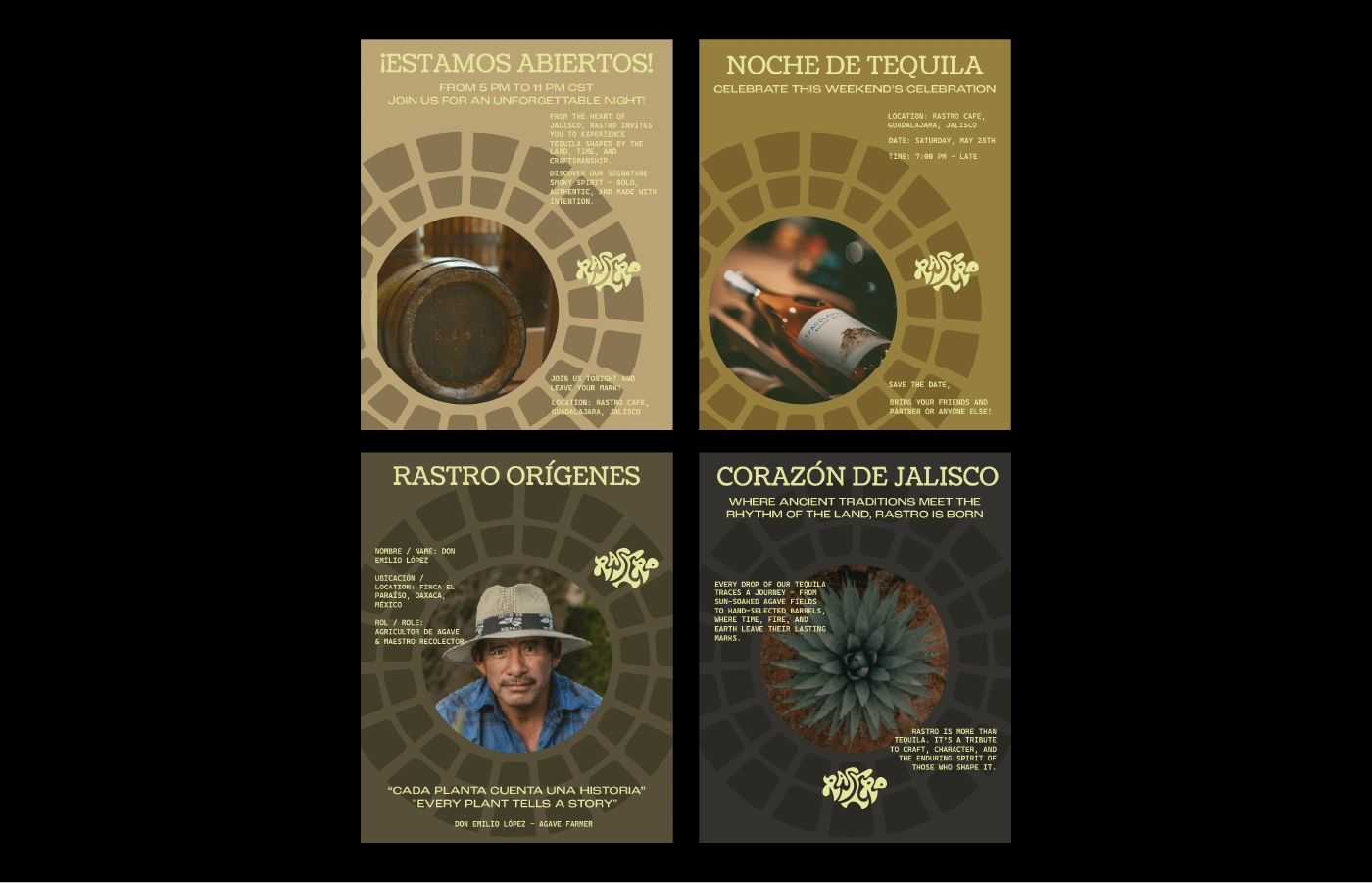
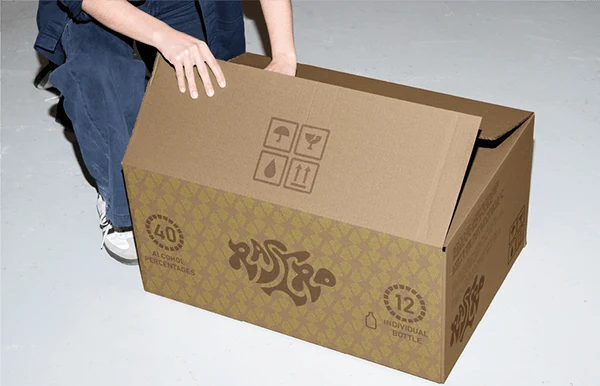
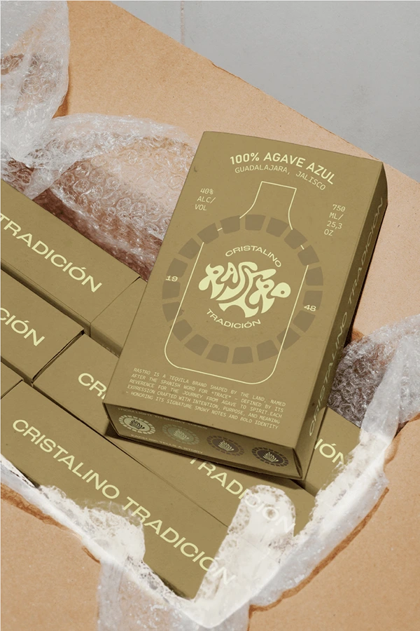
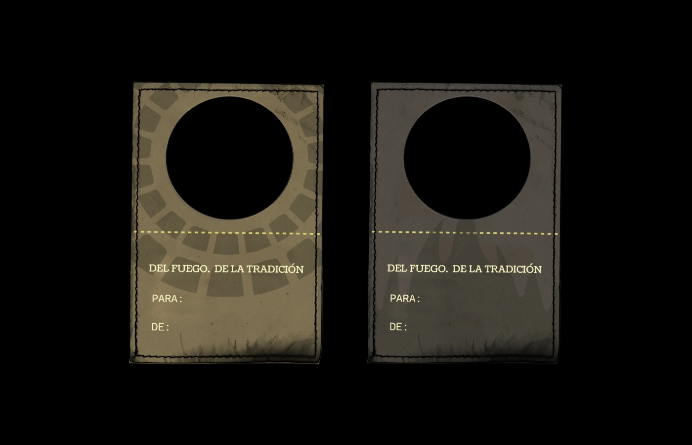
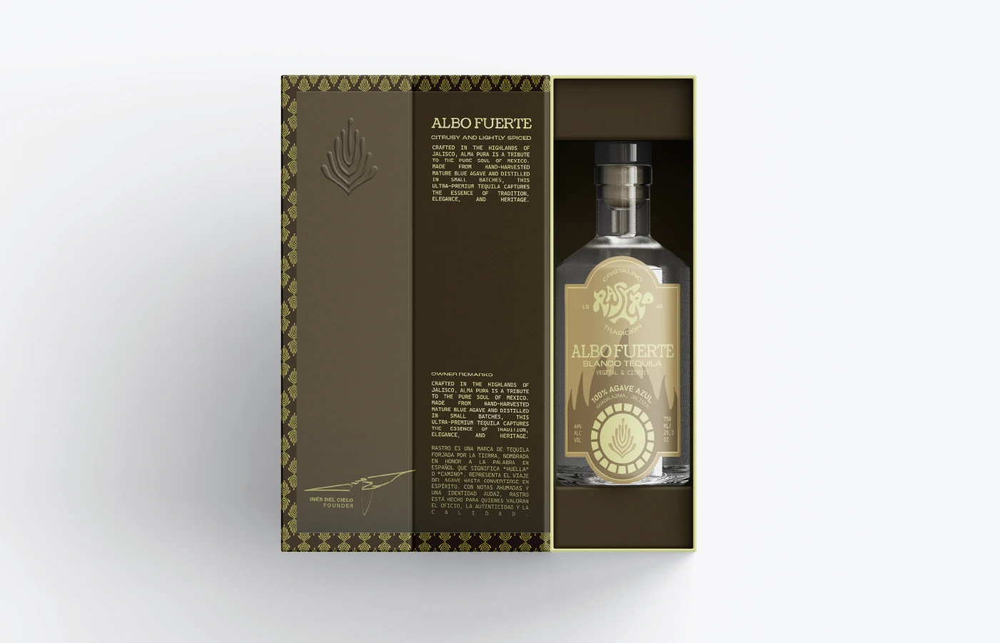
Led by the complexity of elemental process that intentionally craft each tequila, the visual identity emerges as a reflection of its renowned signature smoky notes. Showcasing custom logo mark shaped as a flowing smoke form bold craftsmanship, rich heritage, and everlasting marks - a direct reflection of Rastro, Spanish word meaning ‘marks left by something or someone right when passing a place’ encapsulates the voyage of flavors that crafted distinctive expression of each tequila.
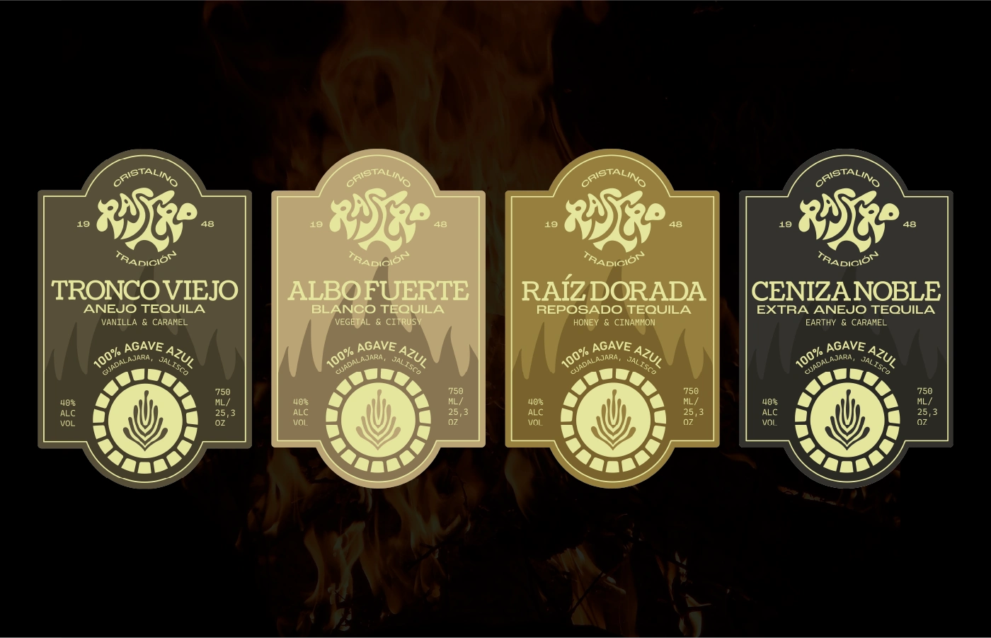
At the heart of identity is barrel - a living vessel that plays key role on shaping the soul of Rastro. The interplay of cask types, toasting levels, and aging duration profoundly impacts tequila’s tonality, smoky depths, hence adding richer-fiery flavors. This legacy is translated to cohesive interwoven visual elements of casks with various hues and tones, reflecting its emphasis on shaping Rastro in the first place.
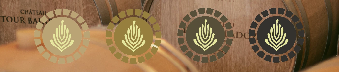
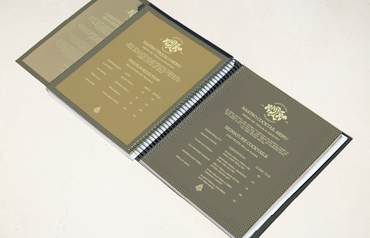
The design system honors the legacy of the brand itself through bold custom logo mark inspired by classic-modernism, paired with a balance mix of sans-serif and serif typefaces, reinforces Rastro’s timeless hereditary heritage yet still embracing contemporary aspects. The uses of circular elements strongly reference the ritual of spirits, full-bodied richness, and cyclical pattern of nature - anchoring in a timeless visual that reflects both endless traverse of time and intentional artistry of tequila-making.
(ES)
Rastro es una marca de tequila moldeada por la tierra, cuyo nombre proviene de la palabra española “rastro”, en alusión al respeto profundo por el recorrido que realiza el agave hasta convertirse en espíritu. Cada expresión se elabora con intención, propósito y significado, encarnando sus distintivas notas ahumadas y una identidad audaz. Sin embargo, al entrar en el mercado global, Rastro se enfrenta a un desafío único: mantenerse relevante en mercados emergentes — donde el tequila suele percibirse como una bebida para el consumo recreativo — sin perder la esencia de su herencia artesanal. Rastro invita a una nueva generación de consumidores a redescubrir y redefinir el verdadero espíritu del arte tequilero.
Guiada por la complejidad de los procesos elementales que dan forma a cada tequila, la identidad visual surge como un reflejo de sus reconocidas notas ahumadas. El logotipo, diseñado a medida, adopta la forma fluida del humo, simbolizando el carácter artesanal, la rica herencia y la huella perdurable de Rastro. Este símbolo conecta directamente con el significado de “rastro”: las marcas que deja algo o alguien al pasar, encapsulando el viaje de sabores que da vida a la expresión única de cada tequila.
En el corazón de la identidad se encuentra la barrica: un recipiente vivo que desempeña un papel esencial en la creación del alma de Rastro. La combinación de tipos de madera, niveles de tostado y tiempos de maduración influye de manera decisiva en la tonalidad del tequila, en la profundidad de su carácter ahumado y en la intensidad de sus notas cálidas y especiadas. Este legado se traduce en un sistema visual cohesionado, donde las formas y tonos evocan el papel fundamental de las barricas en la esencia misma de Rastro.
El sistema de diseño rinde homenaje a la herencia de la marca mediante un logotipo audaz inspirado en el modernismo clásico, acompañado de una cuidada combinación de tipografías serif y sans-serif que refuerzan el carácter atemporal de Rastro, sin dejar de abrazar lo contemporáneo. El uso de elementos circulares hace referencia al ritual de los espirituosos, a la riqueza de un cuerpo pleno y al ciclo infinito de la naturaleza, anclando la identidad en un lenguaje visual que refleja tanto el paso eterno del tiempo como la maestría intencionada en el arte de hacer tequila.
RASTRO
BRAND DESIGN & CREATIVE DIRECTION
Kenny Hartono
CLIENT
Designer Briefs
PROJECT YEAR
2025
PROJECT SCOPE
Brand Development, Visual Identity, Packaging, Art Direction
FOR INQUIRIES VISIT US! Website: www.knvndr.site Instagram: @knvndr.design
Like this project
Posted Jul 7, 2025
BRAND: RASTRO DELIVERABLES: VISUAL IDENTITY & PACKAGING DESIGN PROJECT TYPE: PASSION PROJECT YEAR: 2025
Likes
0
Views
4
Timeline
Apr 28, 2025 - May 7, 2025