Built with LottieFiles
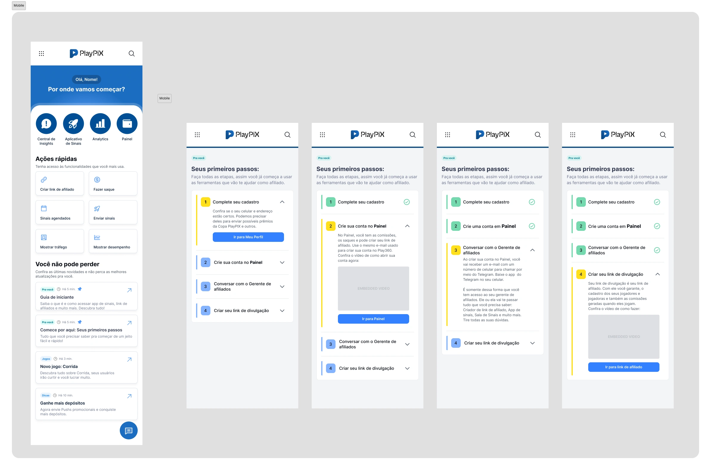
Hub - Affiliate Dashboard
Yuri Tavares

The Hub is a platform that intelligently centralizes the main tools and data used by PlayPIX affiliates, such as the Insights Center and the Signals App.
As a UX Motion Designer, I collaborated with the product team to enhance the user experience by creating animations that guide navigation, highlight key features, improve time perception, and humanize the interface.
Here, I present some of the animations I developed throughout this project. These solutions contributed to increasing new user adoption, improving affiliate retention, and boosting conversions within the platform.
The Hub Welcome Banner uses motion as a communication layer to introduce the platform from the first interaction.
Based on UX research indicating a preference for video over text, the animation was designed to quickly convey value, capture attention, and guide users into the onboarding flow — increasing engagement with the platform tour.
Onboarding
The Hub onboarding is part of a Motion Thinking System, where motion acts as a functional layer to support understanding.
Through a guided experience with educational animations, complex data is introduced progressively, reducing cognitive load and directing attention to what matters. From the first interaction, users quickly understand the value of the Hub and how to use it to improve their performance.
In "Welcome to your Hub!", the animation sets the tone for the experience — creating a strong first impression and reinforcing a sense of discovery. It introduces the Hub as a valuable space, encouraging users to explore it from the start.
In "Track your progress", the focus shifts to clarity and control. Motion is used to simplify complex data and reinforce that users have the tools and support to understand their performance with confidence.
In "Watch yourself grow", the animation emphasizes continuous improvement. It visually reinforces progress over time, helping users connect their actions to results and encouraging ongoing engagement.
Hub Home Microinteractions
Here I focused on the Hub’s main screen, designing microinteractions that respond instantly to user input.
The goal was to make the interface feel alive and reliable — using motion to guide attention, clarify interactions, and reinforce the system’s consistency.
Small details, but essential to improve usability and elevate the overall product experience.
Activate your Signals App
Answer a few quick questions to unlock all features and start sending signals.
The Signals App allows affiliates to build and customize their own application, defining branding and monetization while engaging their audience through signals. I designed responsive, high-performance animations to support the experience across devices.
The activation flow is guided by a lock-opening animation that represents feature access being unlocked. This motion reinforces progression, clarifies a mandatory step, and creates a more intuitive and rewarding onboarding experience.
Affiliate Quiz
Users were dropping off during a key onboarding step.
By introducing motion to guide the flow and reduce friction, we increased completion rates by +33%. Microloader maintained pacing between steps, while a macroloader with clear progress feedback reduced perceived waiting time and improved overall flow comprehension.
Micro Loader Animation
A custom microloader was introduced between steps and scaled as part of the Motion System across the app. By standardizing this pattern, we ensured consistent feedback, smoother pacing, and a cohesive interaction language throughout the product.
Satisfaction Index
A rating system was introduced to capture user feedback and increase engagement. Microinteractions provide immediate input feedback, reinforcing user participation. Ratings are translated into a visual satisfaction indicator, using color and motion to simplify interpretation and support faster decision-making.
These scores feed a visible satisfaction thermometer for the affiliate, with colors that facilitate reading: red (poor), yellow (fair), green (great), and blue (excellent). I also created animations for these modals, highlighting the current satisfaction state, which was periodically updated. This quick visualization aids in decision-making and monitoring user perception.
Beyond the visual average on the thermometer, the affiliate can access all comments left by users, filtering by star count. This allows for a deeper understanding of opinions, facilitating adjustments, improvements, and strengthening the relationship with their player base.
Tutorial Videos
I developed a series of content aimed at guiding affiliates on how to use the platform in a practical and didactic manner. I was responsible for defining and implementing the visual standard of the tutorials, ensuring consistency and quality throughout the audiovisual communication.
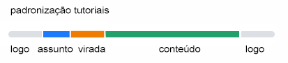
I created a standardized 3D animation opening to give identity and reinforce the professional tone of the series, in addition to directly working on video editing, audio processing, and the inclusion of subtitles, promoting accessibility and expanding the content's reach. My work was essential in transforming complex information into a clear, engaging, and accessible experience for all user profiles.
Thanks for watching!
Like this project
Posted May 14, 2025
Introducing HUB. Turning a complex dashboard into a simple, guided experience through motion and interaction, focused on clarity, usability, and real user needs
Likes
3
Views
110
Timeline
May 1, 2024 - Nov 1, 2024