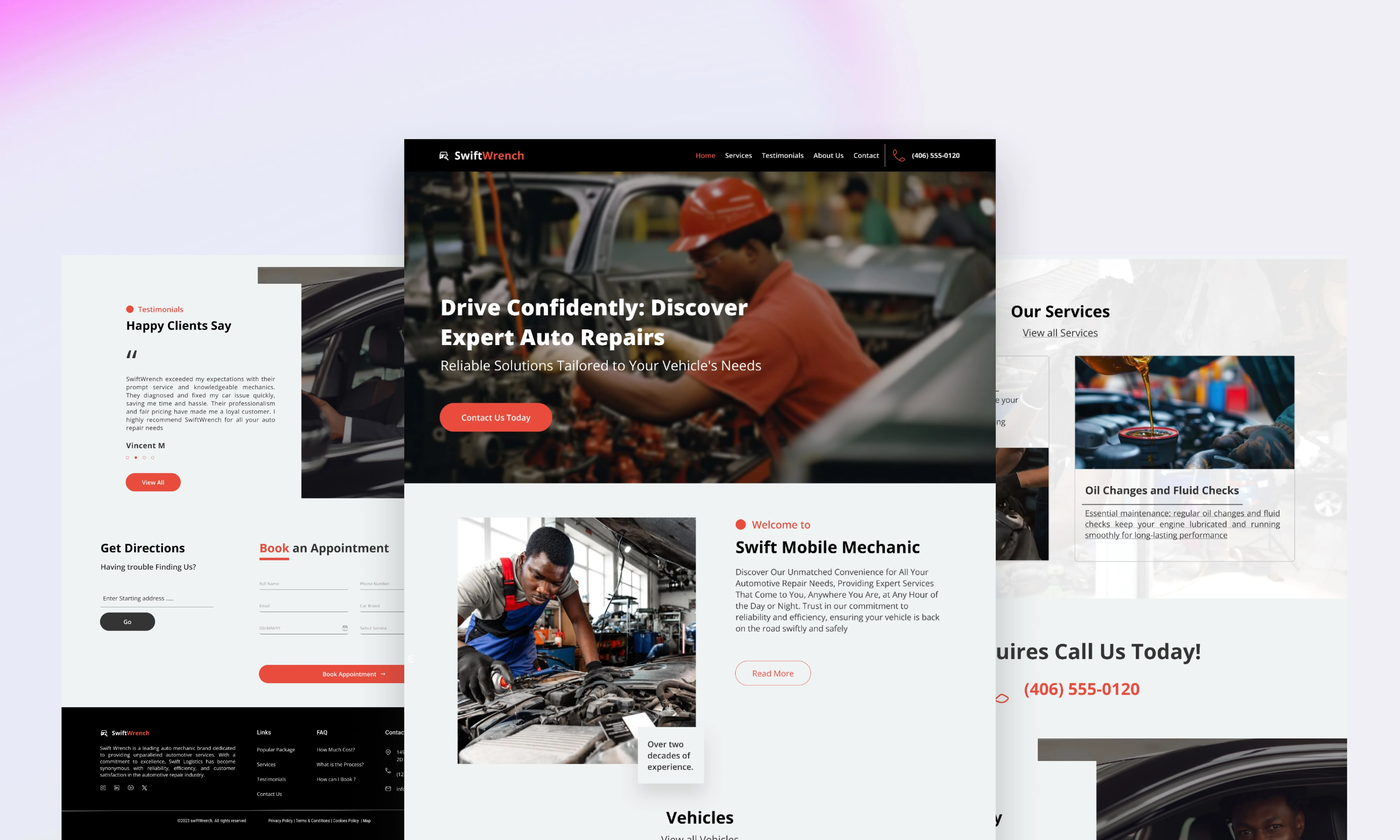
SwiftWrench’s Website Homepage UIUX Redesign
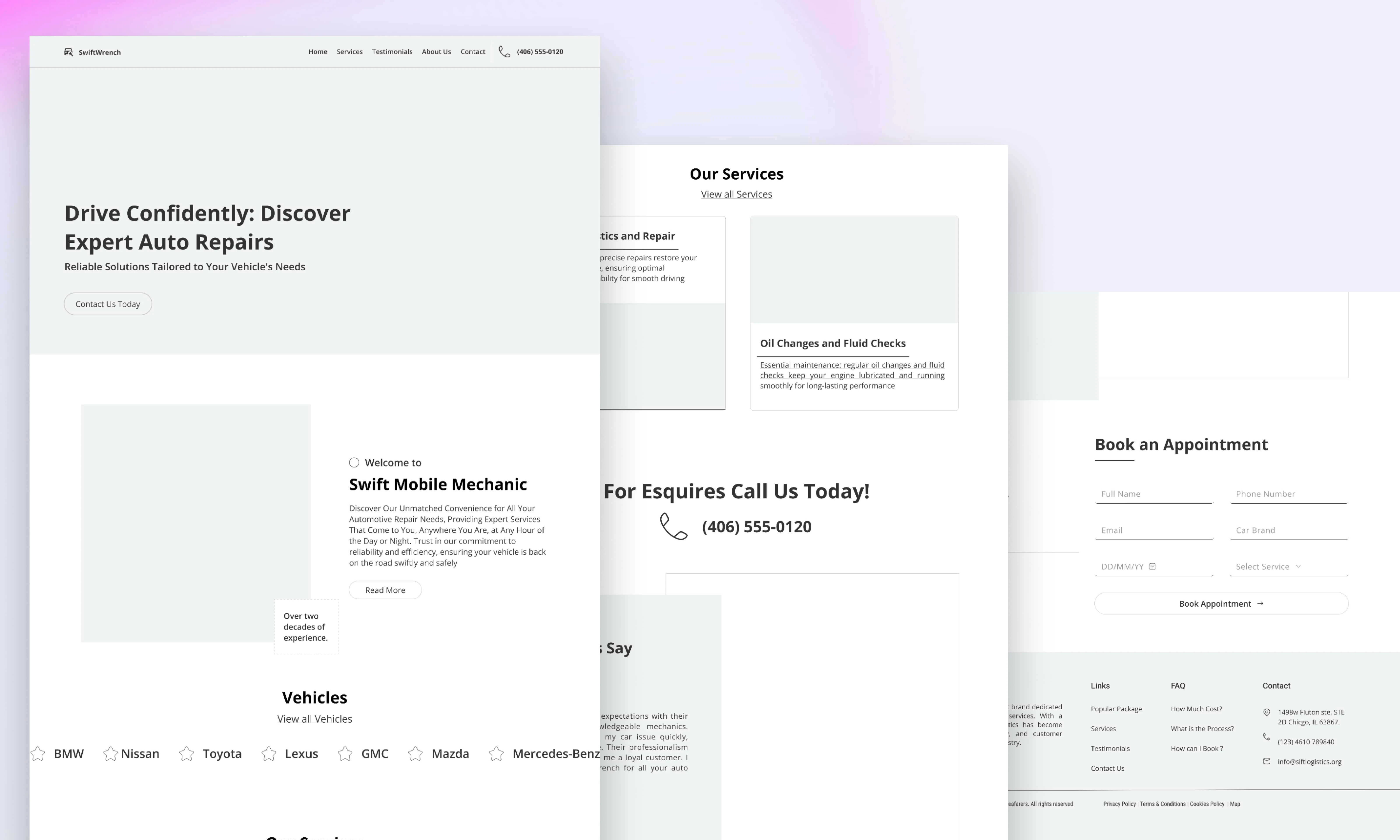
Low Fidelity Overview of Home Page
Introduction
As a UI/UX Designer with experience in creating user-friendly and conversion-driven digital experiences, I had the opportunity to work on the homepage redesign of SwiftWrench, an automobile brand. Before my involvement, the homepage suffered from several usability and branding issues, which negatively impacted user engagement and conversions.
The key challenges included:
A cluttered layout that overwhelmed users.
Navigation issues that made it difficult for visitors to find important information.
Ineffective CTAs that failed to drive user actions.
A lack of brand consistency, making the homepage feel disconnected from SwiftWrench’s identity.
Poor visual hierarchy, causing confusion about where users should focus their attention.
Given that SwiftWrench operates in a Black neighborhood, I also wanted to ensure that the language, tone, and aesthetics resonated with the target audience while maintaining a sleek, professional automotive brand presence.
This case study outlines my approach to refining the homepage, solving these issues, and creating a more intuitive and brand-aligned experience.
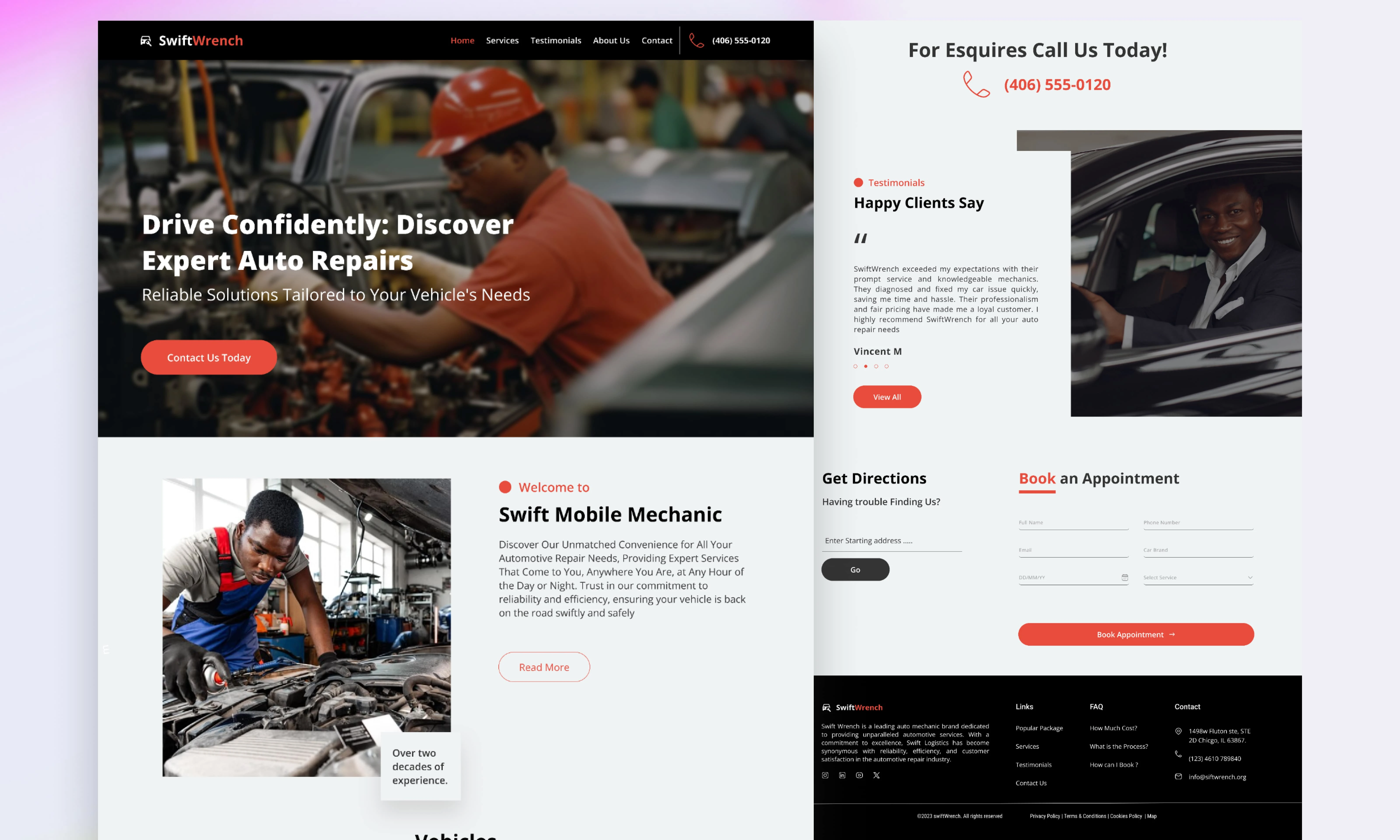
Approach & Solution
1. Research & Analysis
Before jumping into the design phase, I conducted a thorough UX audit of the existing homepage, identifying pain points in usability and visual presentation. I also:
Reviewed SwiftWrench’s branding guidelines to ensure alignment with their identity.
Conducted competitor research to analyze best practices in the automobile industry.
Ran user tests to gather insights on navigation difficulties and CTA engagement.
2. Streamlining the Layout
To declutter the homepage, I simplified the structure, ensuring that key content stood out without overwhelming the user. I introduced:
A well-defined grid layout to organize content neatly.
White space and visual breathing room to improve readability.
Consistent typography and structured sections to guide users smoothly.
3. Enhancing Navigation & User Flow
The previous navigation was confusing, so I:
Redesigned the menu to include only the most relevant categories.
Added a sticky header to ensure quick access to important pages.
Implemented breadcrumb navigation to help users track their location.
4. Improving CTA Effectiveness
CTAs were redesigned to be bold, action-oriented, and visually distinct by:
Using high-contrast buttons with clear, direct language such as "Book a Service" and "Explore Our Vehicles."
Placing CTAs above the fold and throughout the page for better visibility.
Testing button placements and colors for maximum conversions.
5. Aligning Design with Brand Identity
To reflect SwiftWrench’s identity and cultural relevance, I:
Used a modern, urban-inspired color palette that resonates with the Black neighborhood market.
Incorporated bold typography and high-quality automotive imagery.
Ensured the tone and messaging connected with the target audience.
6. Visual Hierarchy & Content Strategy
I refined the content flow to ensure users could easily scan and absorb information, by:
Prioritizing key information such as services, featured cars, and special offers.
Using size, color, and contrast to draw attention to important elements.
Breaking up text with icons, illustrations, and multimedia for better engagement.
7. Testing & Iteration
Once the new design was implemented, I conducted:
Usability tests to check how users interacted with the improved layout.
A/B testing on CTA placements and button colors to optimize conversions.
Mobile responsiveness checks to ensure a seamless experience across all devices.
Final Outcome
The redesigned SwiftWrench homepage now provides:
✅ A clean, modern layout that enhances readability and navigation.
✅ Seamless user flow with intuitive navigation and clear CTAs.
✅ Higher conversion rates, thanks to strategic CTA placement and design.
✅ A visually appealing experience aligned with SwiftWrench’s brand and cultural identity.
By implementing these design improvements, I transformed the homepage from a cluttered, ineffective space into a high-performing, user-centric platform that successfully engages visitors and drives business results. 🚀
Like this project
Posted Mar 30, 2025
Redesigned SwiftWrench’s homepage, boosting conversions, improving navigation, enhancing brand identity, and creating a seamless, user-friendly experience.
Likes
1
Views
10
Timeline
May 9, 2024 - May 29, 2024

