Built with Framer
Cravings & Craft
Habeebah Owojori
Overview
The goal was to rethink how users discover and order food by shifting the experience from “scrolling menus” to intent-driven, personalized recommendations.
Instead of presenting users with overwhelming choices, the platform adapts to individual preferences like taste, allergies, and dietary goals.
I led the end-to-end design of the ecosystem, working across product, admin, and marketing surfaces while collaborating closely with engineering during implementation.
The Problem
Most food delivery platforms are built around choice, not clarity.
Users are often faced with long menus, repetitive options, and little guidance. This leads to decision fatigue, slow ordering, and in many cases, abandoned sessions.
At the same time, modern users increasingly need food experiences that adapt to:
Dietary restrictions and allergies
Personal health goals
Family or group ordering needs
The gap was clear — there was no system designed to simplify food decisions through personalization.
My Role
I was the sole Product Designer on the project, responsible for:
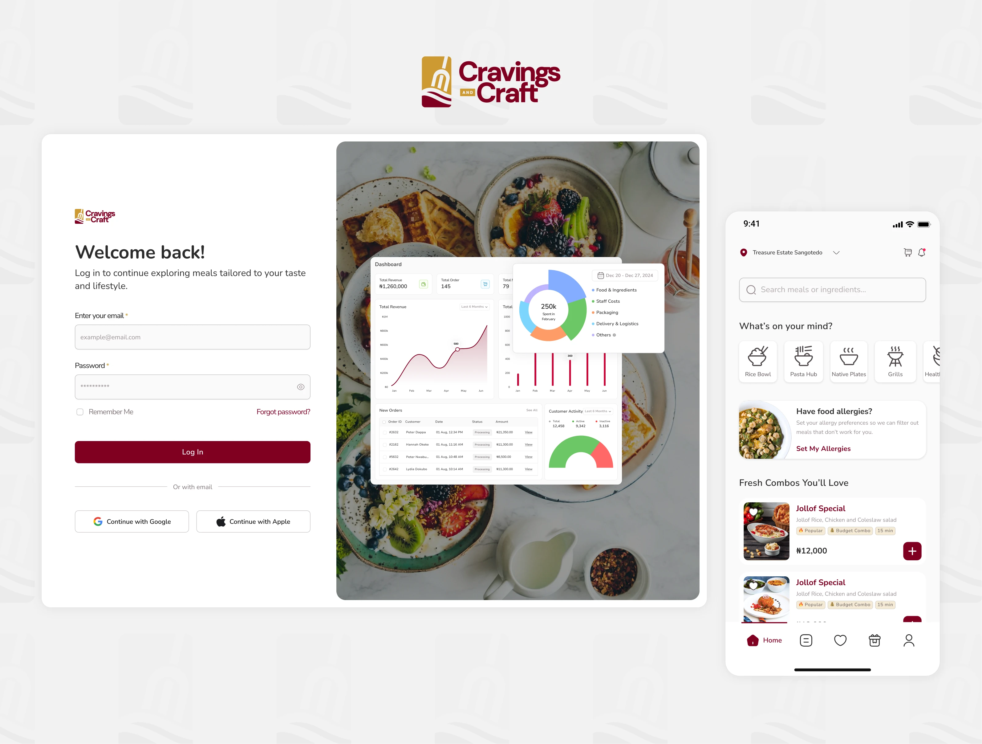
Customer mobile app design
Admin dashboard design
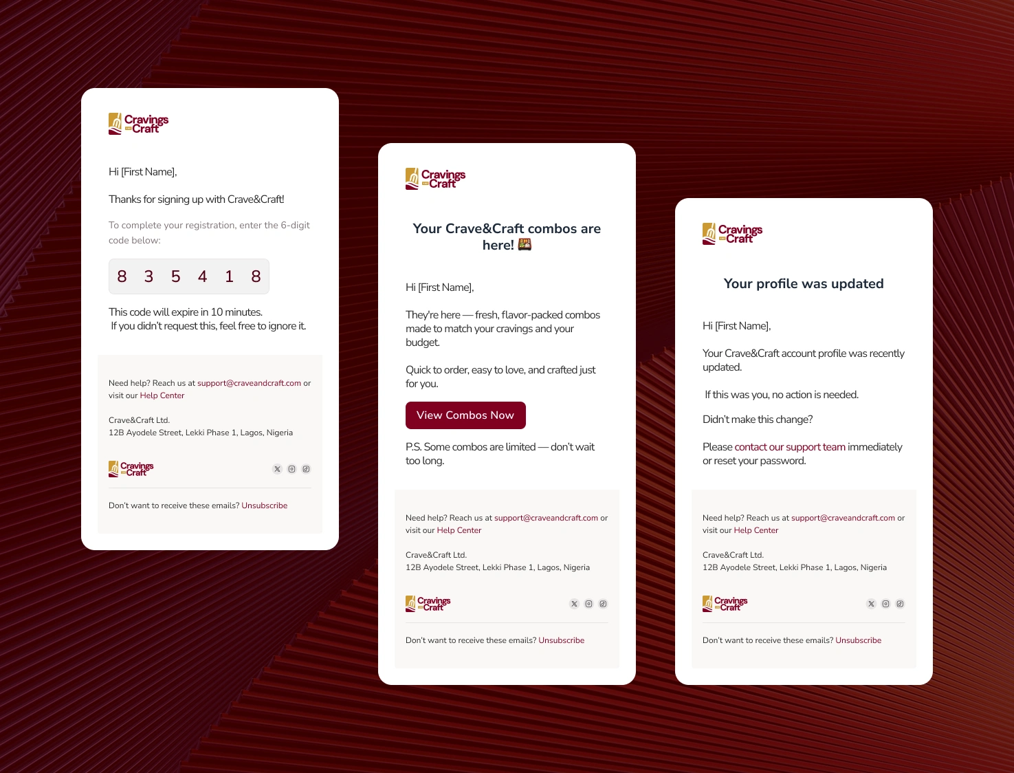
Transactional email experience
Marketing website (designed and built in Framer)
I also worked closely with engineers throughout development, supporting feature scoping, UX decisions, and iteration under technical constraints.
A group of people dinning together
Constraints
The project was built under typical MVP constraints:
Limited budget and small team
Tight delivery timelines
Evolving product direction
Technical limitations during implementation
Because of this, the focus was not feature completeness, but core experience clarity and speed to value.
Approach
The MVP was centered around one key outcome:
Helping users quickly discover and order meals that match their preferences.
To support this, the experience was simplified into three core layers.
Preference-Based Onboarding
Users set dietary signals such as taste preferences, allergies, and goals. The goal was to keep this lightweight and progressive to avoid drop-off.
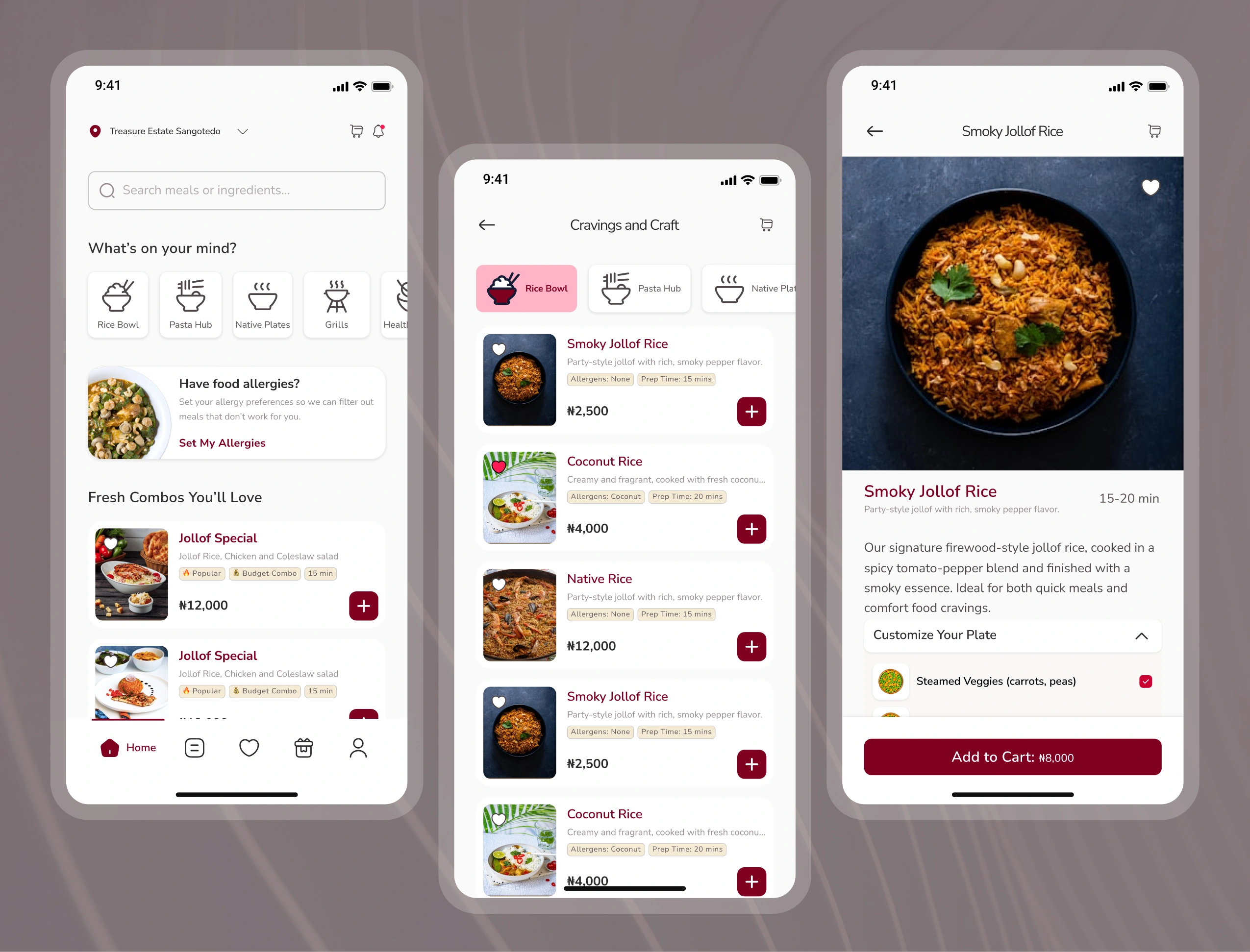
Simplified Discovery
Instead of exposing full menus, meals are filtered and prioritized based on user profiles, reducing cognitive load and improving decision speed.
System Feedback
To maintain clarity, the experience includes clear feedback moments like toasts, success states, and transactional emails so users always understand what’s happening.
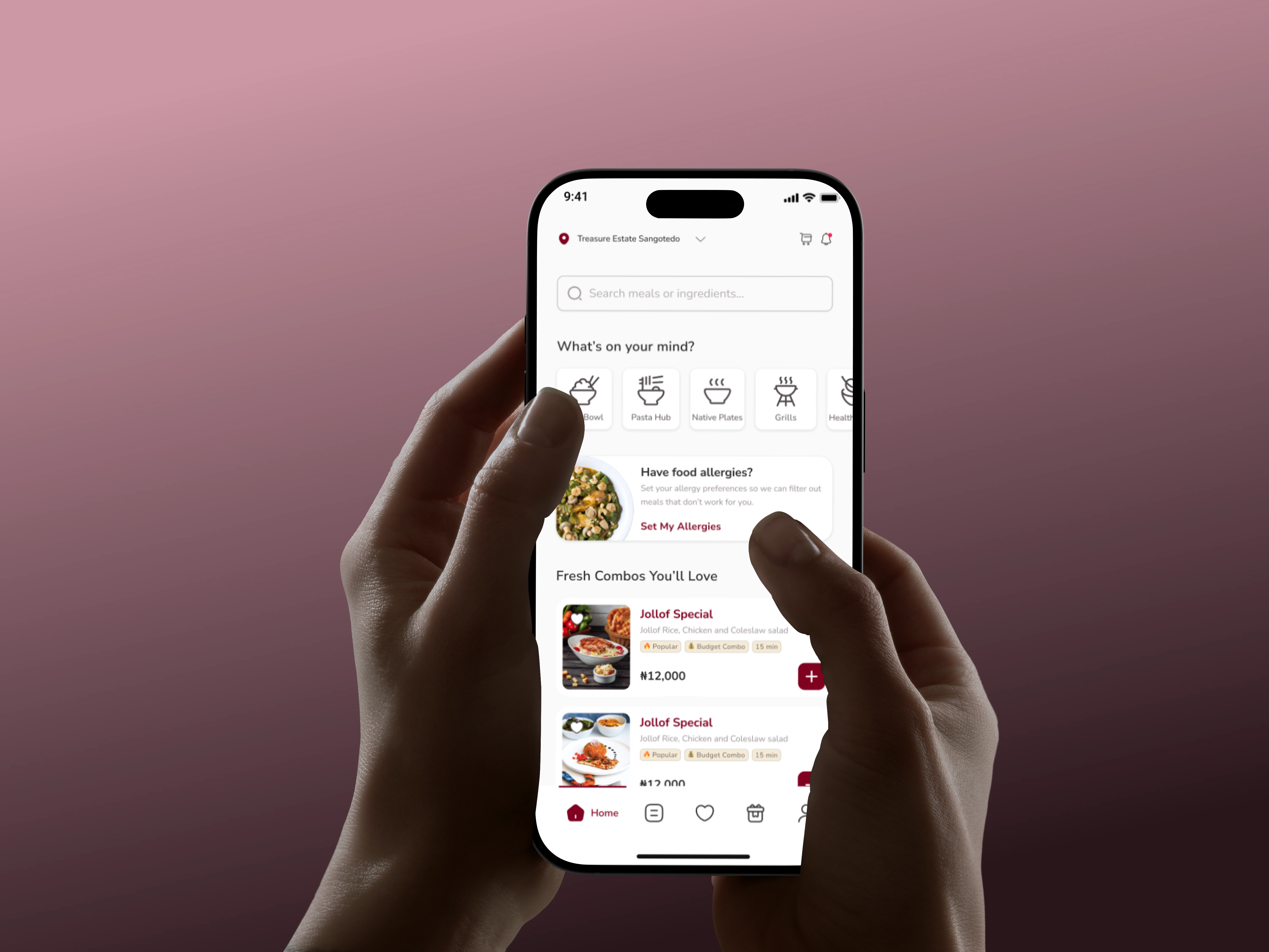
Mockup of a hand holding phone
Key Features
Preference System
A guided onboarding flow that captures user taste and dietary information in a simple, structured way.
Beneficiary Ordering
Users can place orders for others, expanding the product beyond individual use into family and group contexts.
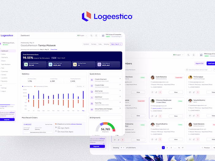
Admin Dashboard
A lightweight operational system focused on clarity and essential workflows rather than complex enterprise features.
Consistent Design System
A unified visual language across app, dashboard, emails, and website to ensure consistency and trust across all touchpoints.
Key Trade-offs
Several intentional trade-offs were made to support the MVP direction.
We prioritized rule-based personalization over advanced recommendation systems to ship faster and validate behavior.
We reduced feature complexity in favor of usability, ensuring the core experience remained simple and intuitive.
On the admin side, we focused only on essential workflows instead of building a full-scale enterprise system.
Even visually, we prioritized clarity and function over polish in early iterations.
Collaboration
I worked closely with engineers throughout the build process rather than handing off static designs.
This included aligning on feasibility early, adjusting flows based on technical constraints, and iterating on UX during development.
In several cases, complex interactions were simplified to match backend limitations while preserving the core user experience.
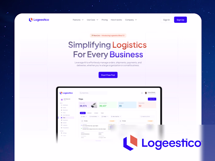
Marketing Website
I designed and developed the marketing website in Framer.
The goal was not aggressive conversion, but clear communication of the product’s value and positioning.
The structure followed a simple narrative flow: problem, solution, and product ecosystem.
Building in Framer allowed for faster iteration and ensured visual consistency with the product.
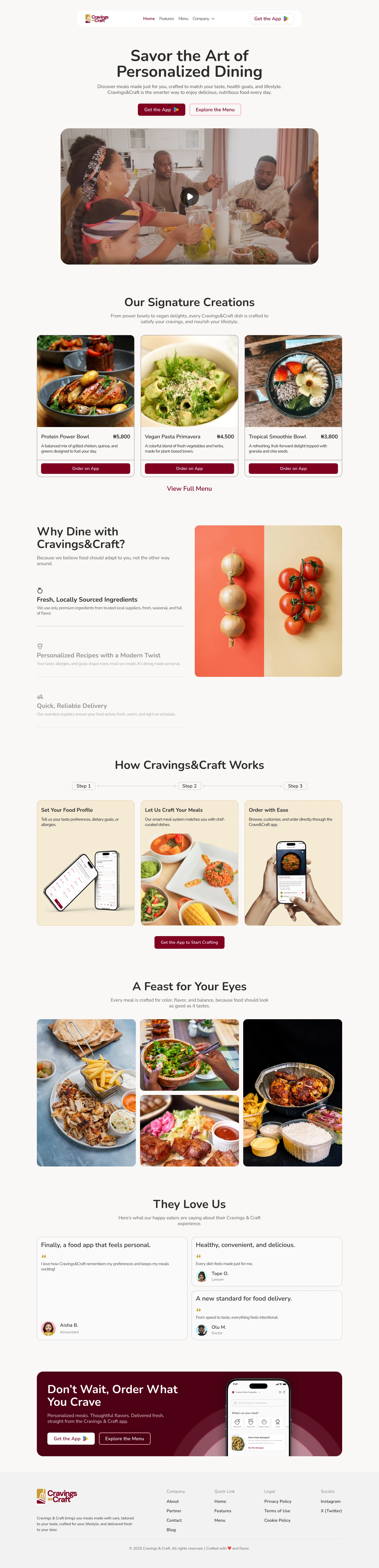
Home Page
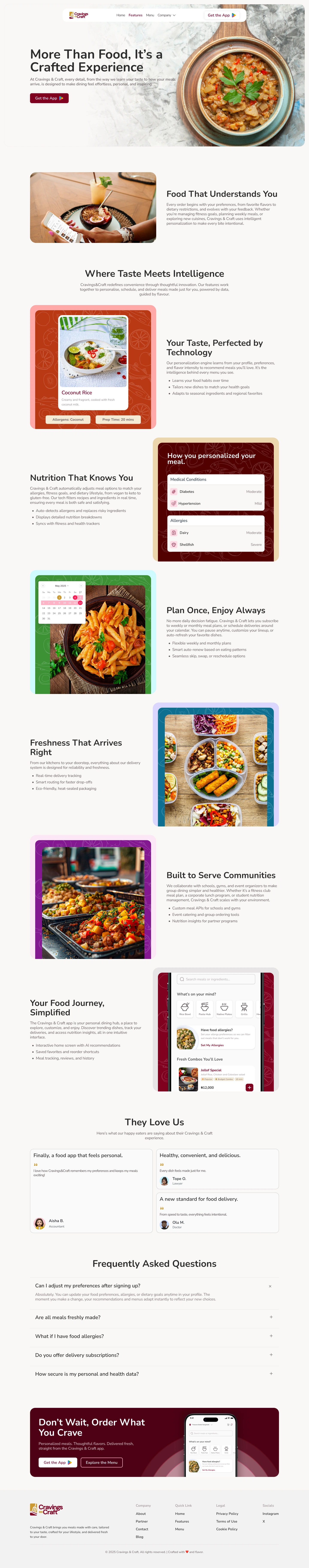
Features Page
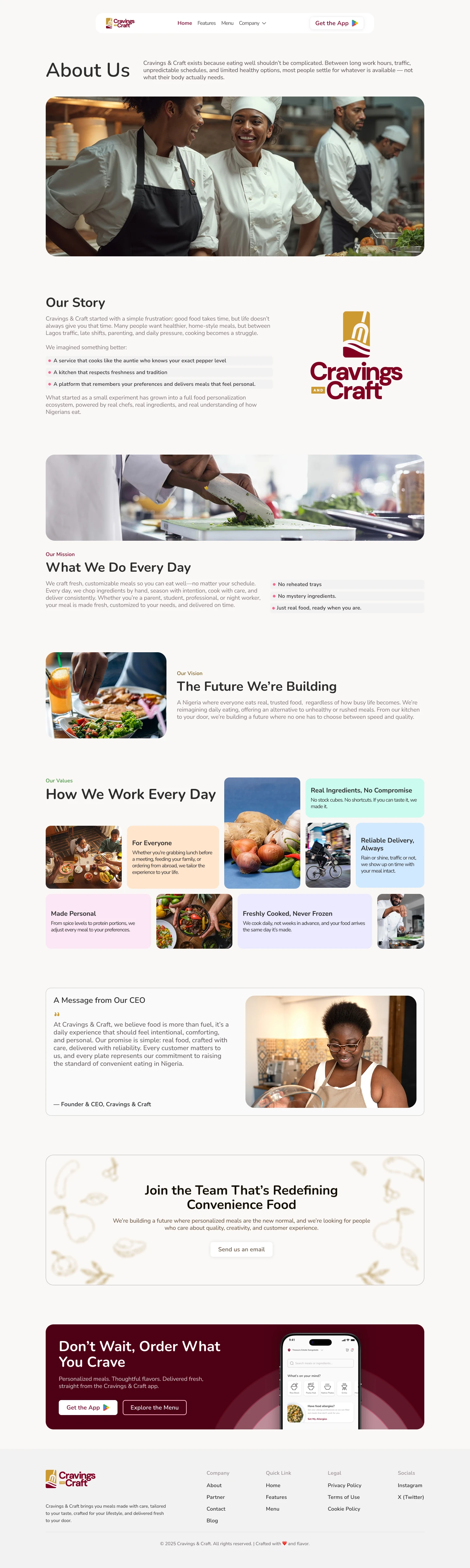
About Page
Outcome
The final experience created a more focused and guided food ordering system.
Users are able to move from onboarding to ordering with reduced friction, while the system provides enough context and feedback to eliminate uncertainty.
The foundation also supports future expansion into subscriptions, personalization at scale, and institutional partnerships.
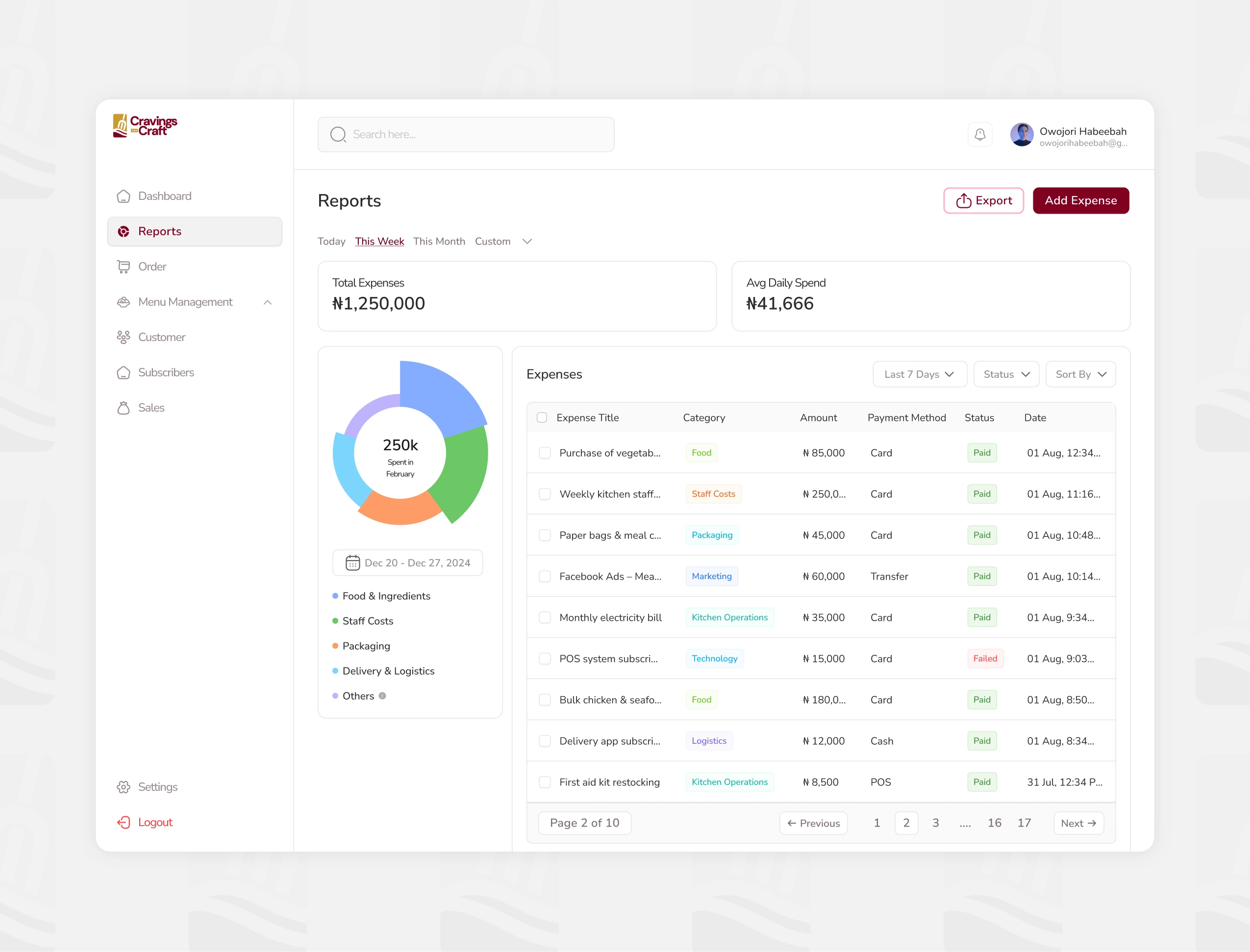
Report
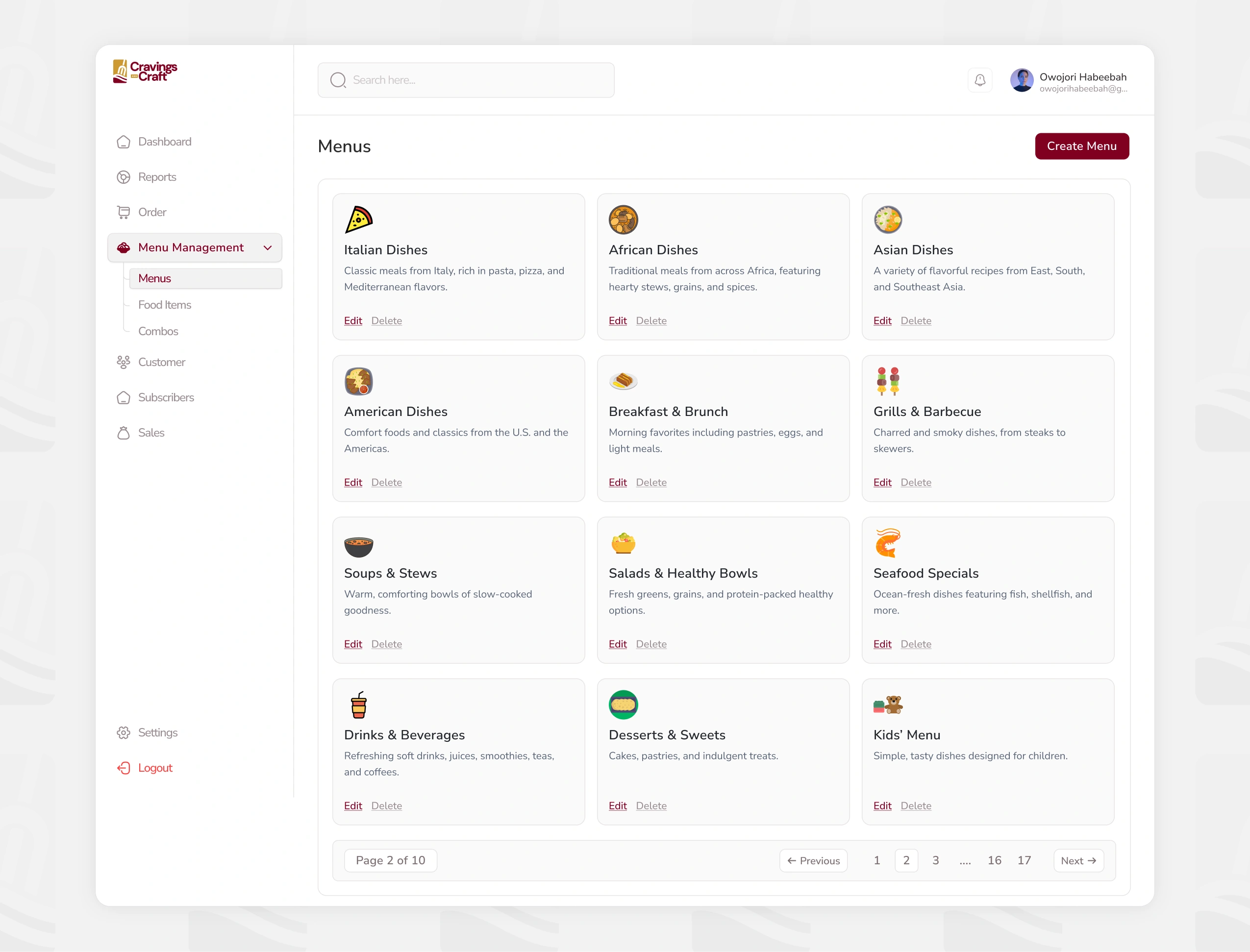
Menu Management - Menu
Impact
Reduced decision complexity in meal selection
Clearer onboarding and ordering flow
Unified product experience across all surfaces
Scalable foundation for future personalization features
What I Learned
This project reinforced a key principle: good product design is not about adding more, but removing friction.
Working under constraints made prioritization sharper, and collaboration with engineering ensured decisions were grounded in real implementation realities.
Most importantly, consistency across the system played a major role in building trust and usability.
Like this project
Posted Jun 6, 2026
Personalized Food Ordering Platform (Mobile App + Admin Dashboard + Marketing Website)