Using UX research to redesign a complex reporting platform
Polina Egorova
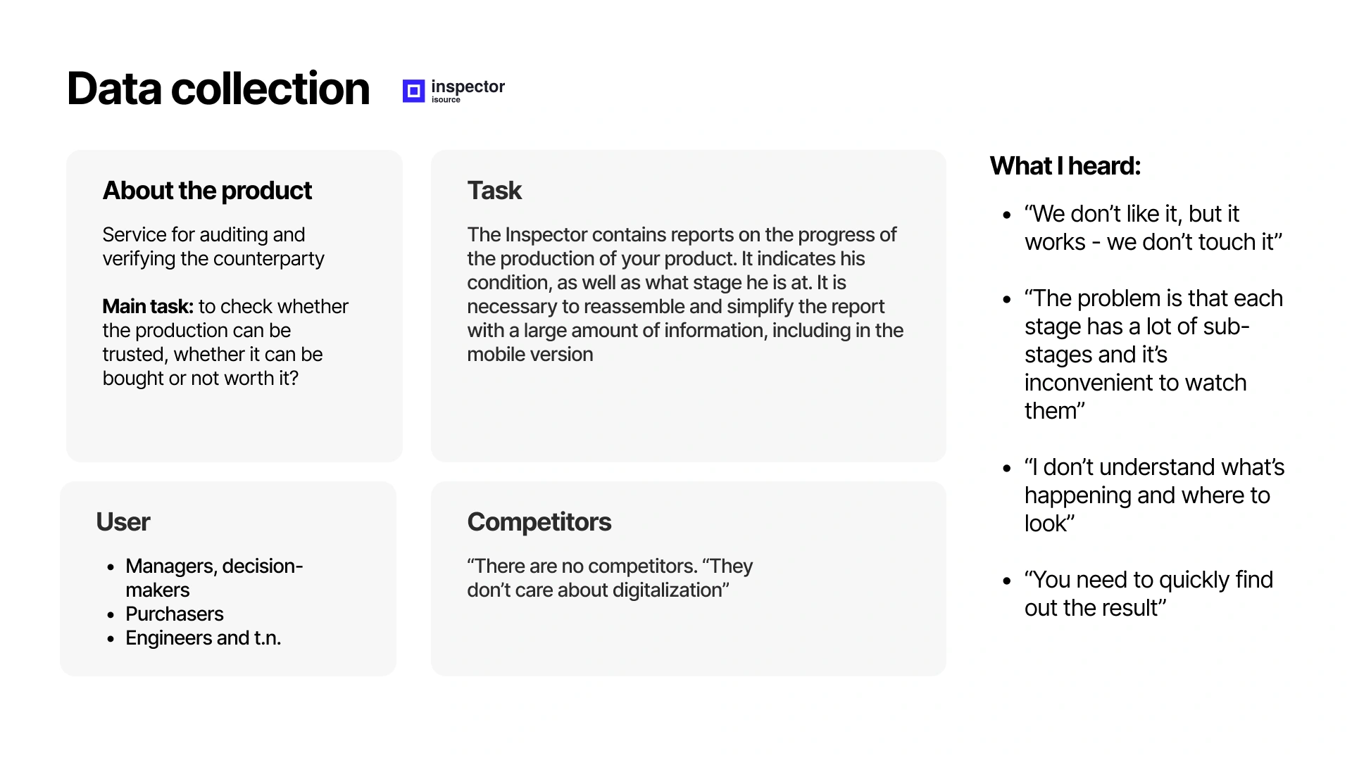
About product
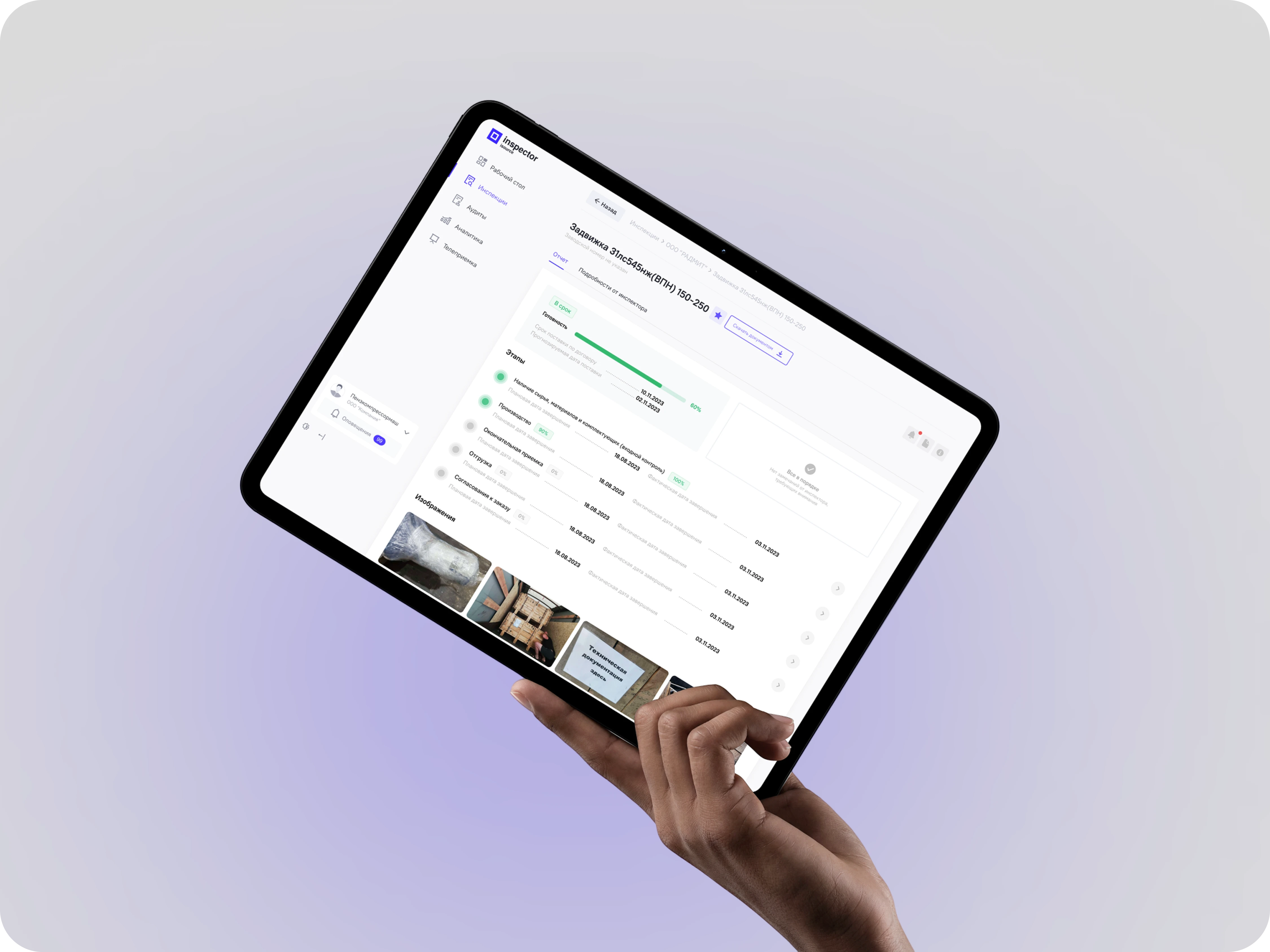
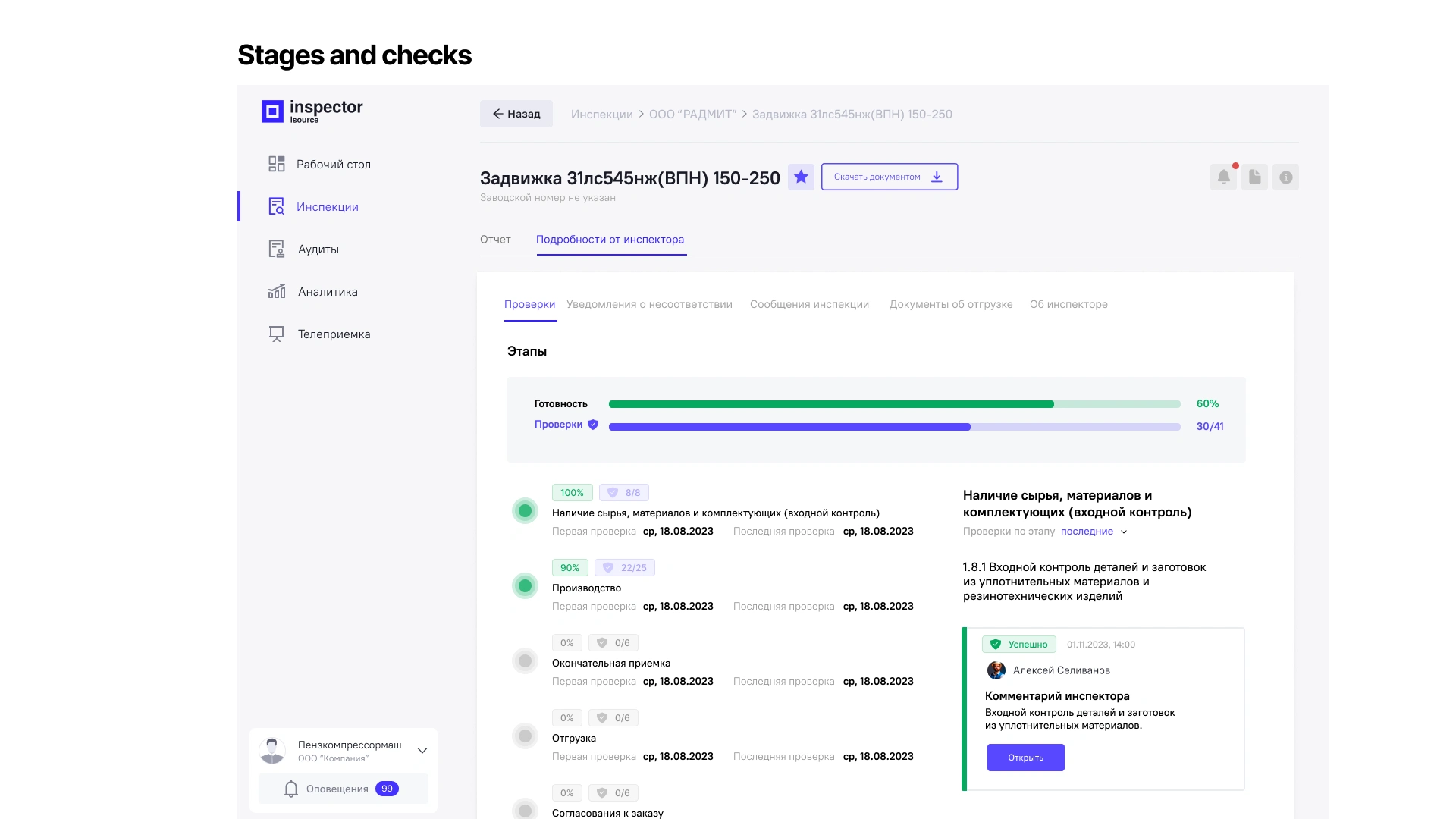
Digital Inspector is a B2B platform used for managing inspections, reports and operational project data. The product helps teams track project progress, document findings and access critical information across different stages of work.
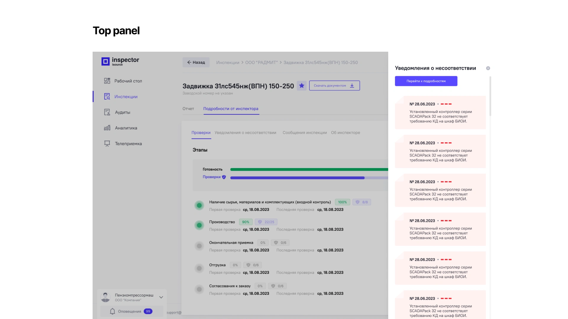
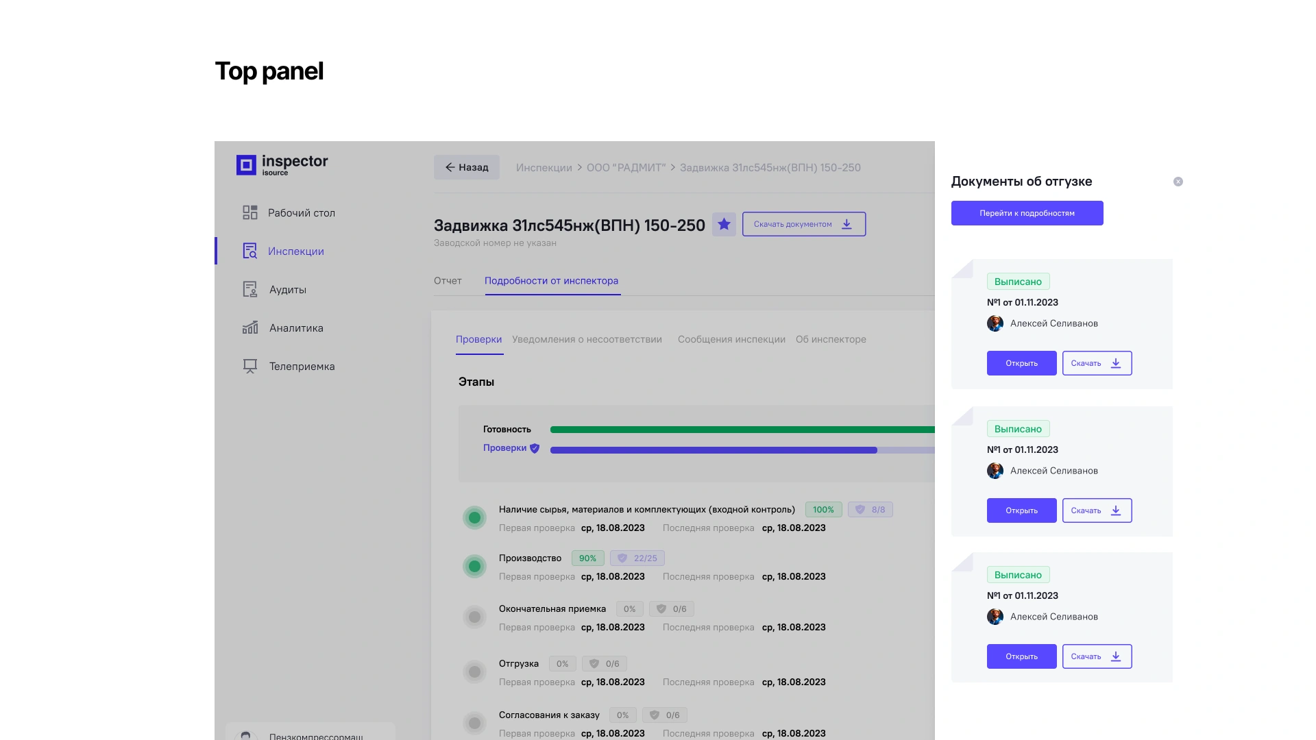
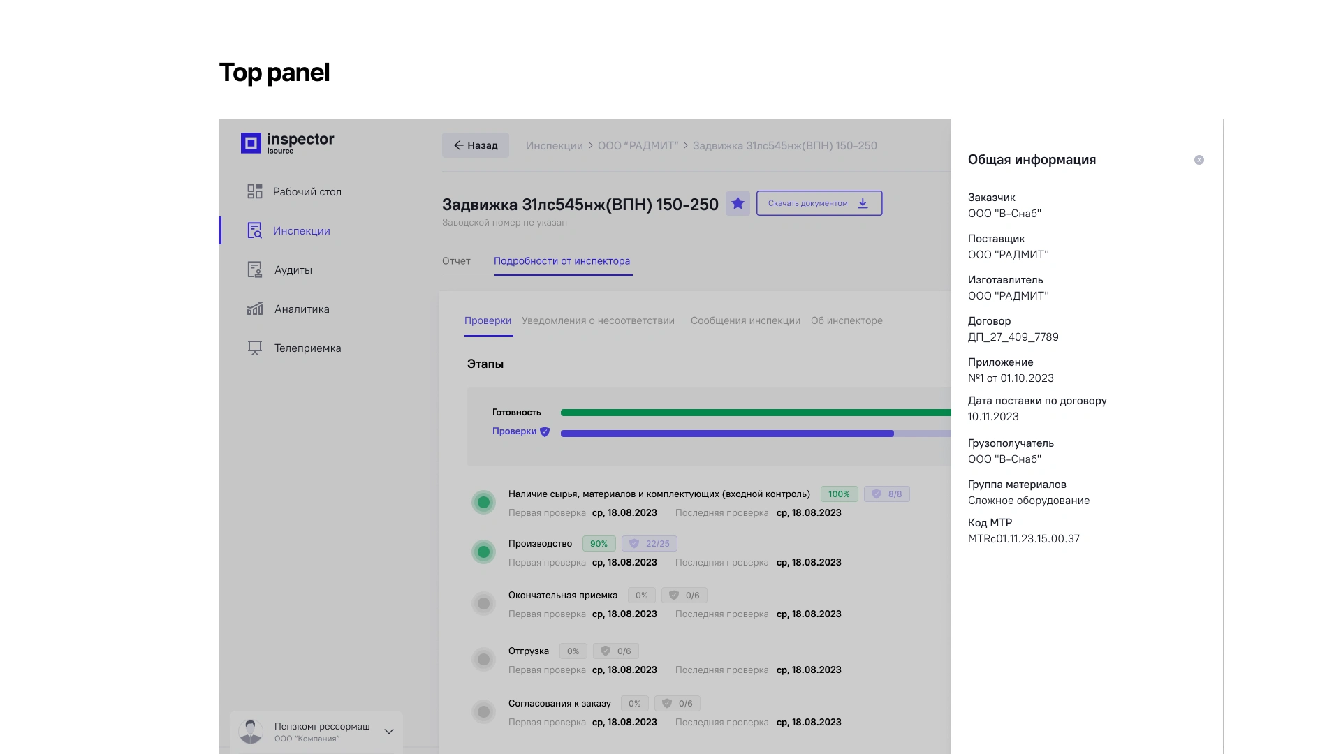
The system stores large amounts of data, including project documentation, reports, inspection results and status updates. As the platform evolved, the information architecture became increasingly complex, making it harder for users to locate critical information and navigate between sections efficiently.
The goal of the project was not simply to redesign the interface, but to understand how users interacted with the product, identify structural issues and improve information accessibility without disrupting existing workflows.
The problem
Despite the platform's rich functionality, users frequently struggled with finding information quickly. During initial interviews and audits, several recurring issues emerged:
information was difficult to locate;
navigation did not match user expectations;
reports created cognitive overload;
important actions were hidden inside complex structures;
users often relied on experience rather than interface clarity.
Researches approach
The research process included:
stakeholder interviews
competitor analysis
card sorting
tree testing
information architecture audits
usability sessions
Market
One of the first discoveries was that direct competitors were almost non-existent. Instead of copying patterns from similar products, I had to understand how users interacted with large amounts of operational information and reporting systems.
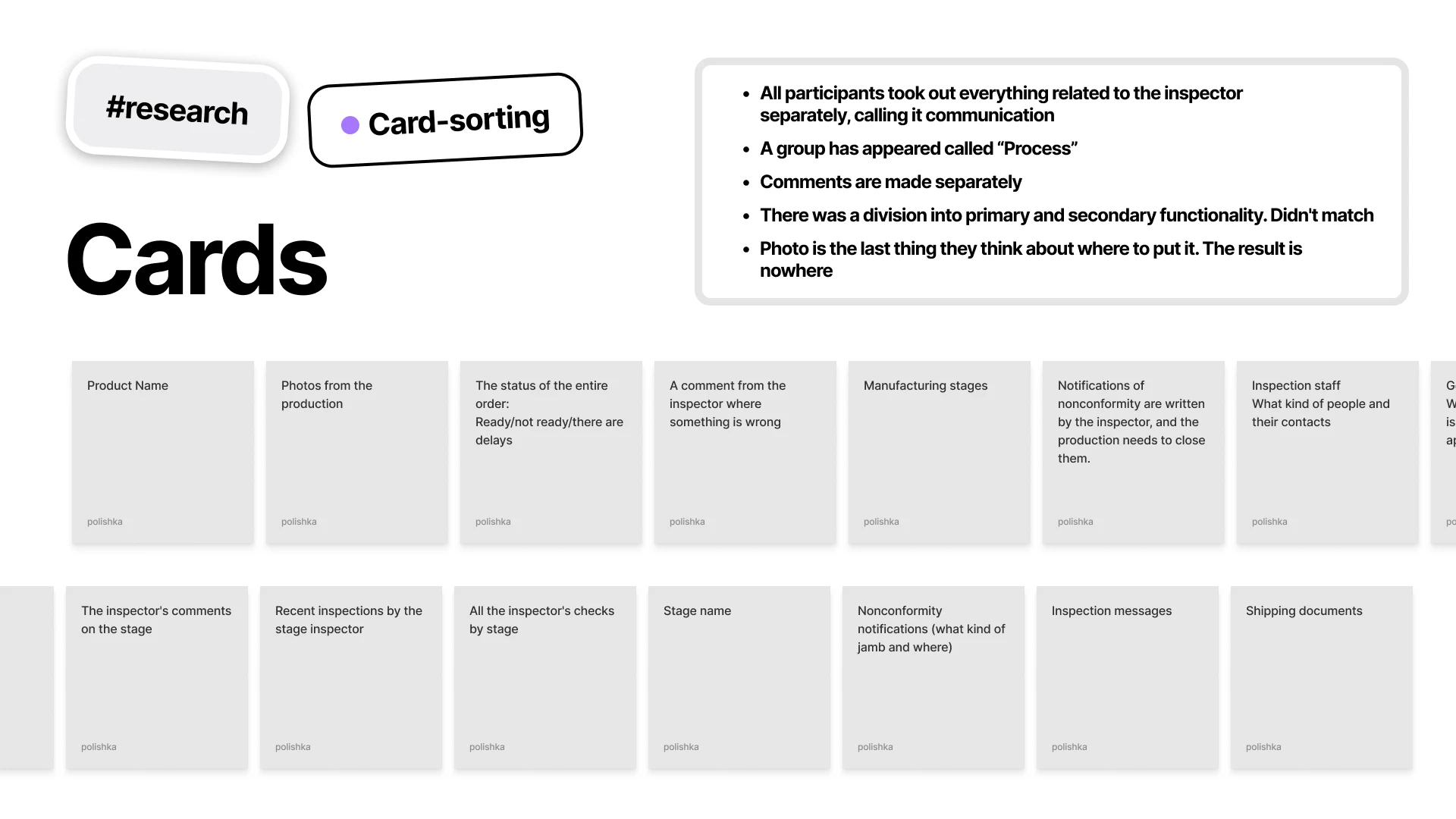
Card sorting
To understand how people naturally categorize information, I conducted card sorting sessions. Participants organized content into groups that felt logical to them. This helped reveal where user expectations differed from the existing platform structure. Several categories users consistently created were missing or buried inside the current navigation hierarchy.
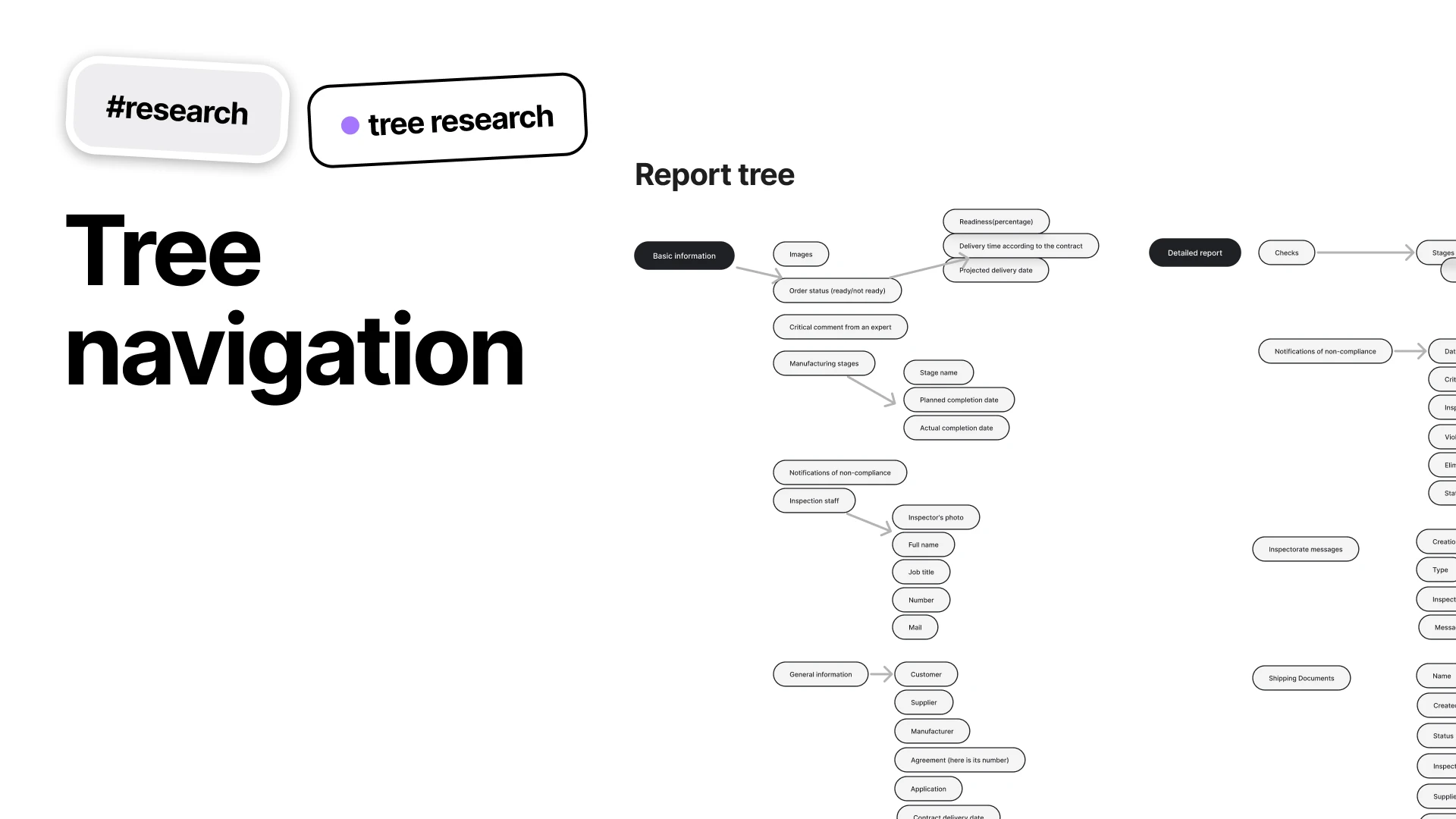
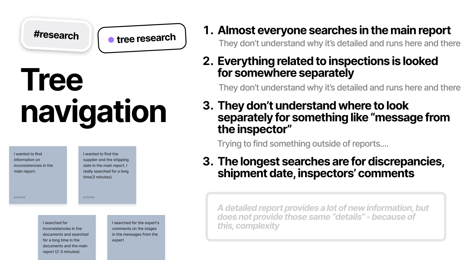
Tree navigation
After mapping the platform structure, I conducted tree testing sessions. Instead of evaluating interface visuals, users were asked to locate information using only the navigation hierarch. The results revealed recurring navigation failures and highlighted sections where users consistently searched in the wrong places. These findings exposed gaps between the product structure and users' mental models.
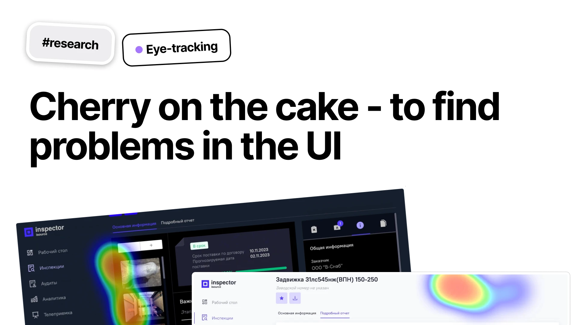
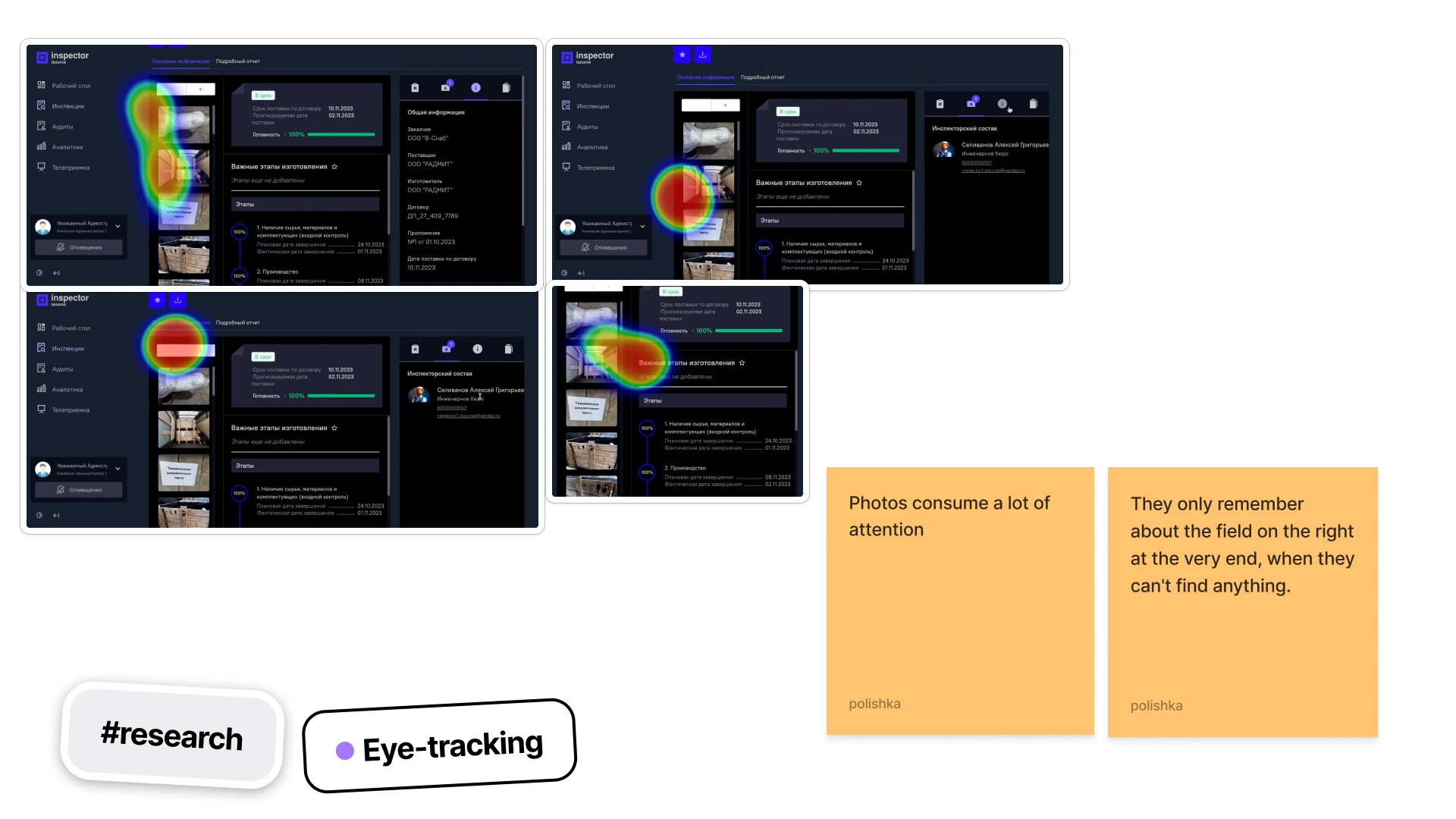
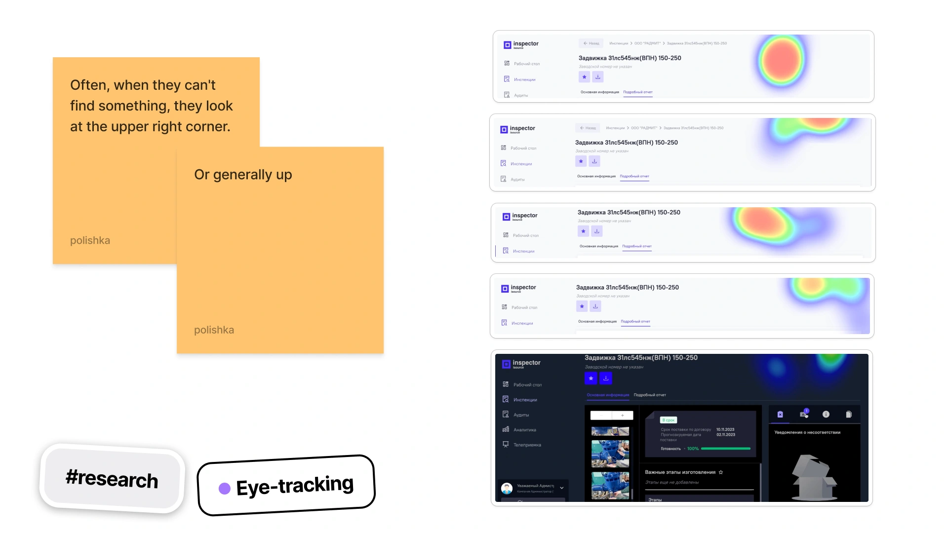
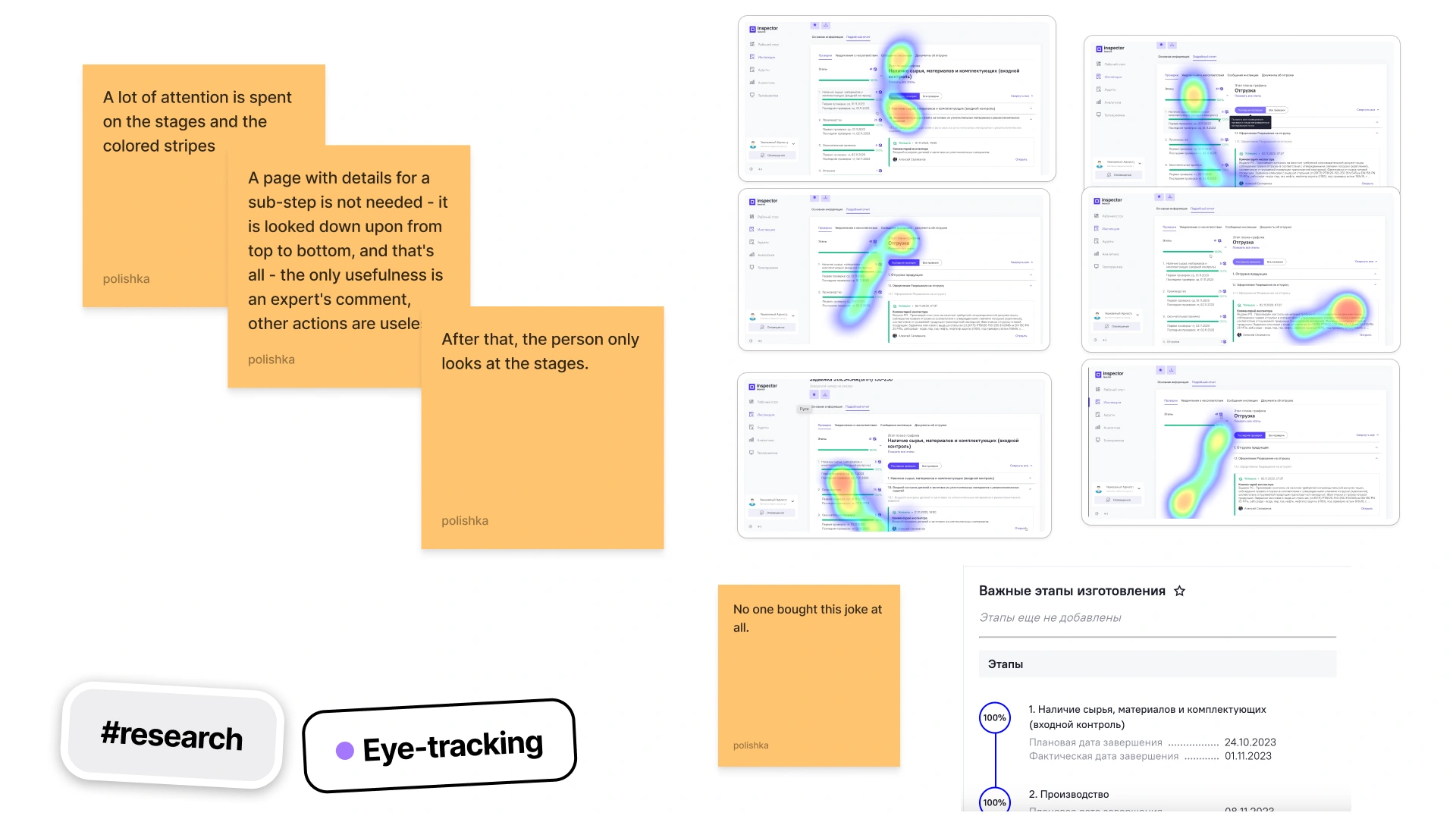
Eye-tracking
To validate assumptions, I conducted usability sessions with real users.
Rather than focusing on preferences, the sessions concentrated on behavior:
where users hesitated
where they got lost
what information they expected to find
which tasks required unnecessary effort
These sessions uncovered several navigation bottlenecks and confirmed issues identified during tree testing.
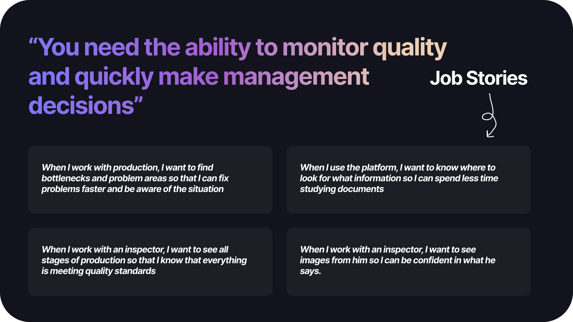
Key Insights
After synthesizing research findings, several patterns emerged.
Users struggled not because information was missing, but because:
information was difficult to locate
terminology was inconsistent
hierarchy did not match expectations
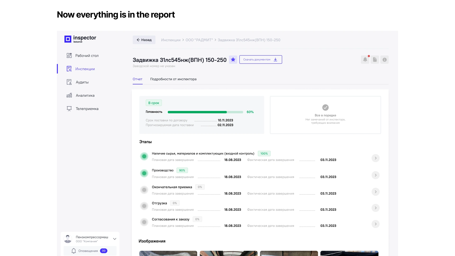
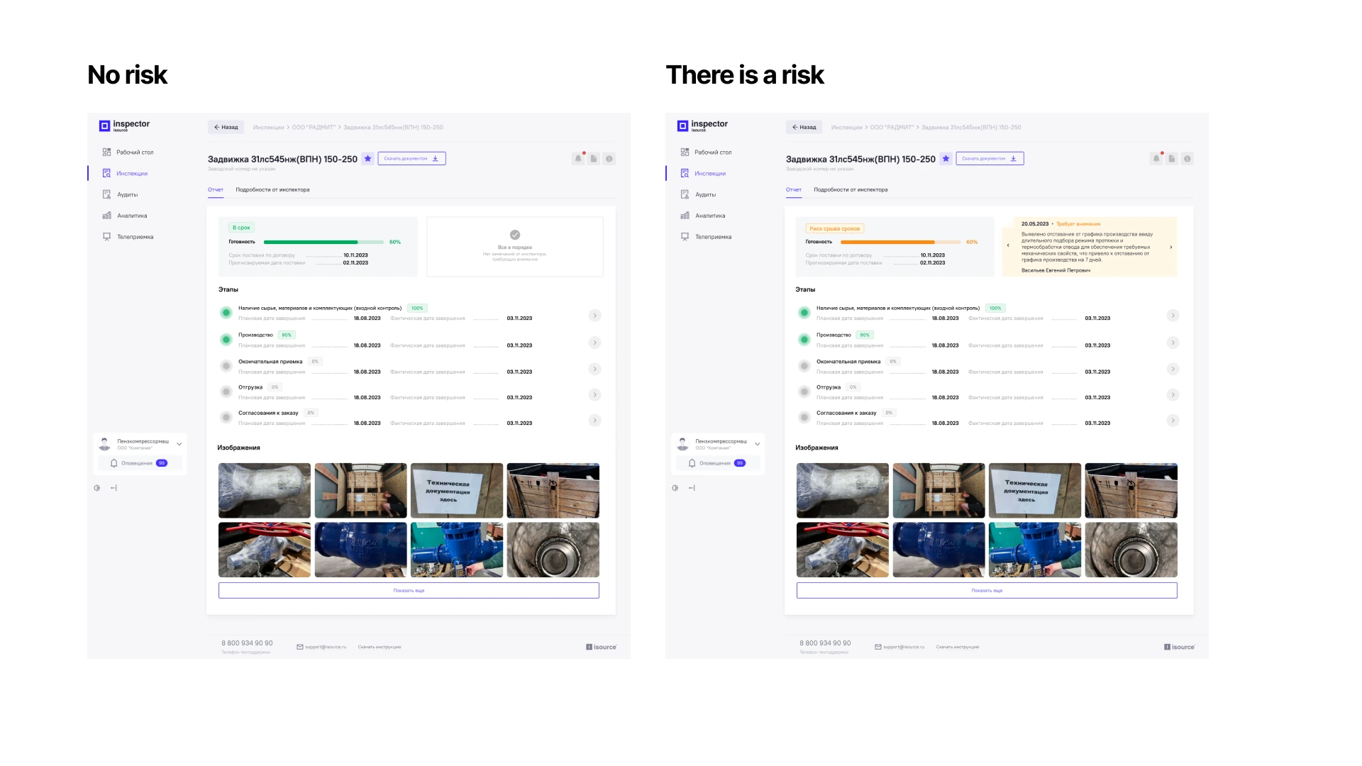
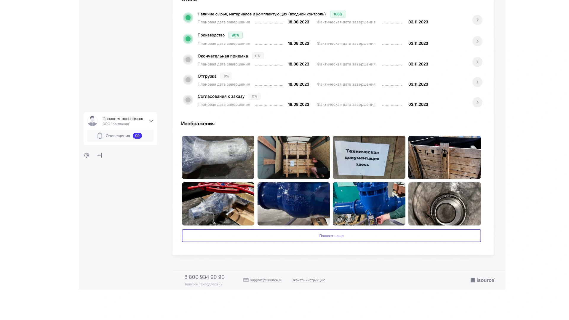
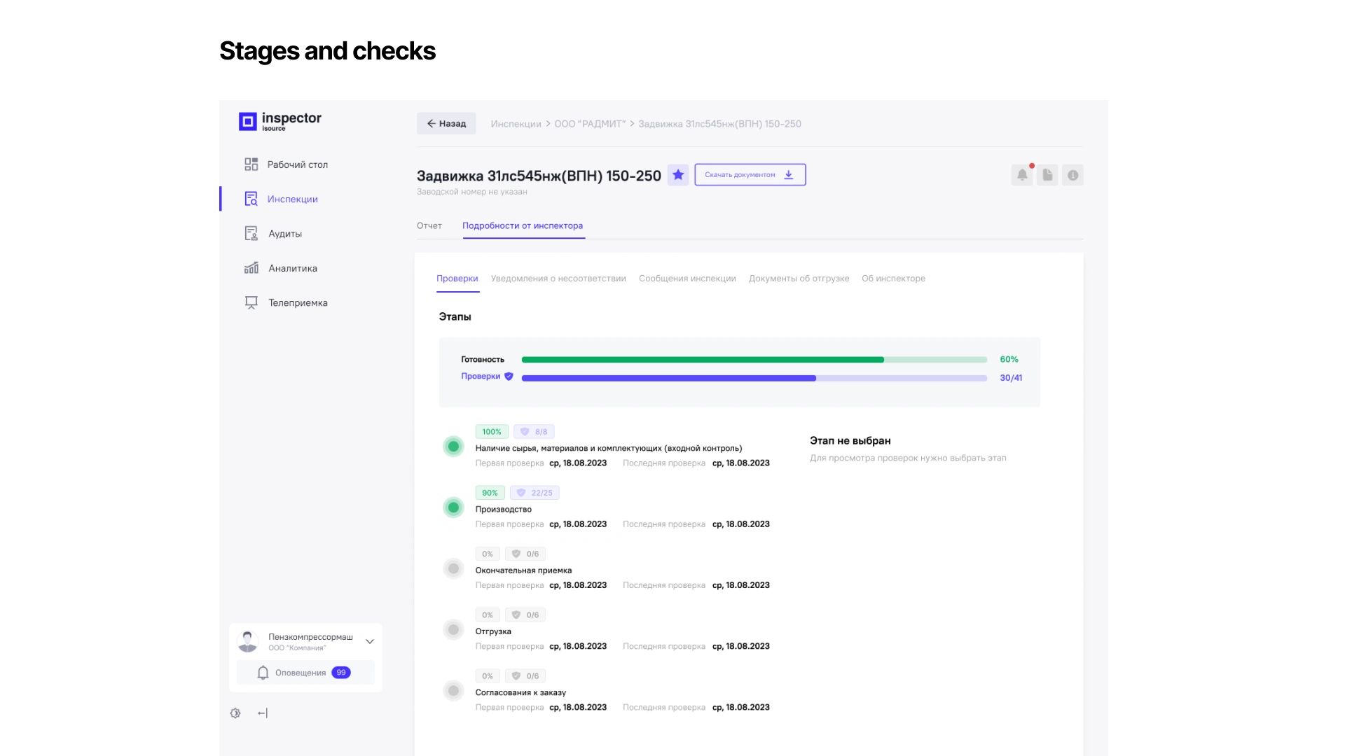
reports introduced cognitive overload
important actions were hidden among secondary content
The problem was structural rather than visual.
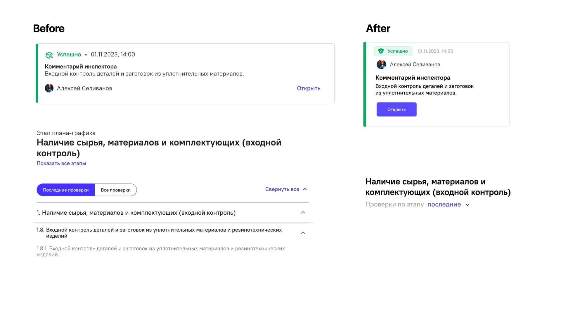
Results
After synthesizing research findings, several patterns emerged.
Users struggled not because information was missing, but because:
information was difficult to locate
terminology was inconsistent
hierarchy did not match expectations
reports introduced cognitive overload
important actions were hidden among secondary content
The problem was structural rather than visual.
That's all! Thanks for reading! =)
Like this project
Posted May 30, 2026
Conducted UX research to improve Digital Inspector's information architecture.