Logo & Packaging - Gardens Harvest
BACKGROUND
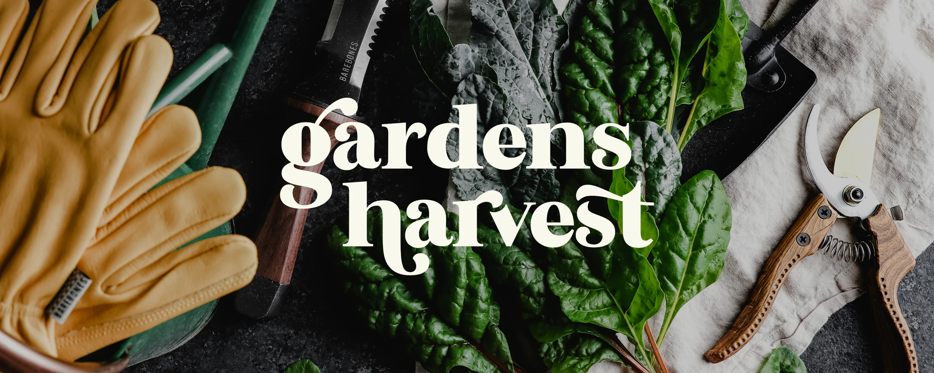
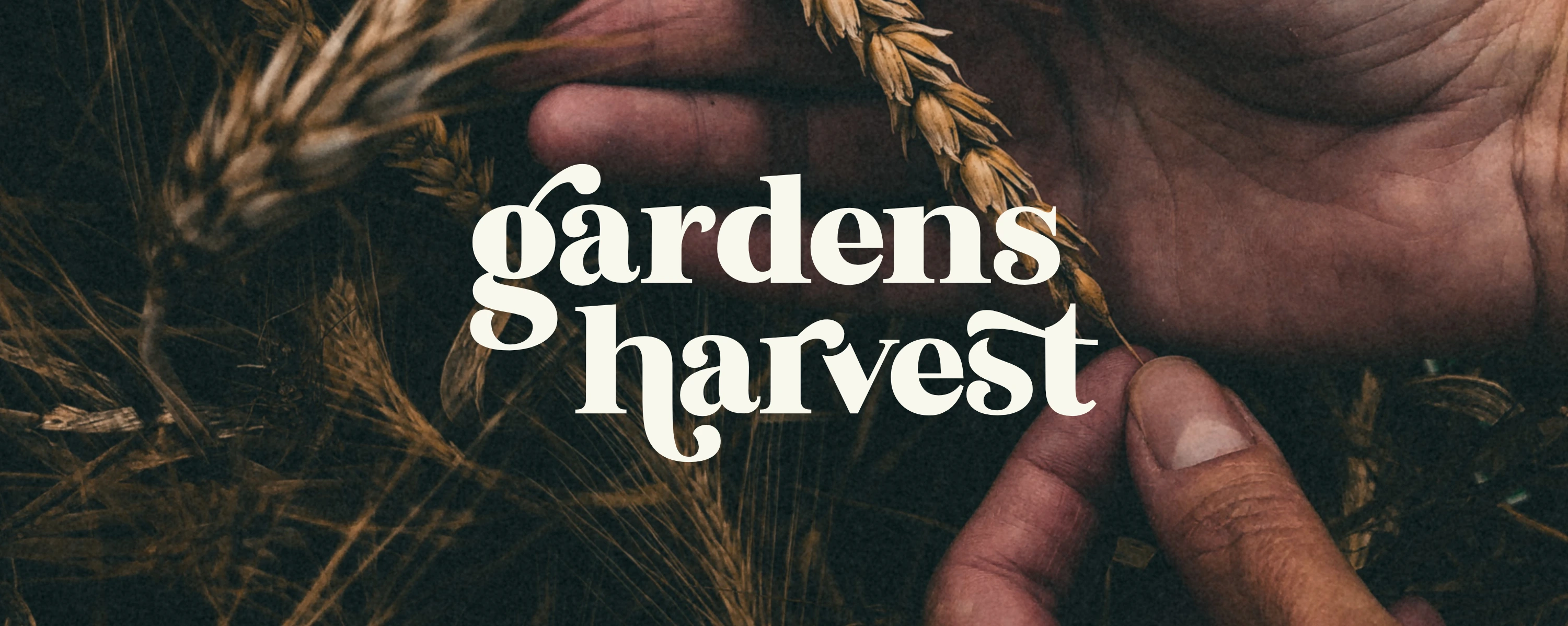
In this project, I developed a logo and packaging for an organic salad ready-meal company called Gardens Harvest. This was a conceptual project and inspired by a personal interest in health and wellness, and organic vegetables.
ABOUT GARDEN HARVEST
Gardens Harvest is a company that specializes in producing and selling organic salad-ready meals. They are committed to providing customers with high-quality, sustainably sourced ingredients to make healthy and delicious salads on the go. Their brand is centred around health and wellness, playfulness, and sustainability.
PROCESS
Research & moodboard development > concept development > design exploration > packaging design > testing (mockups)
RESEARCH & MOODBOARD
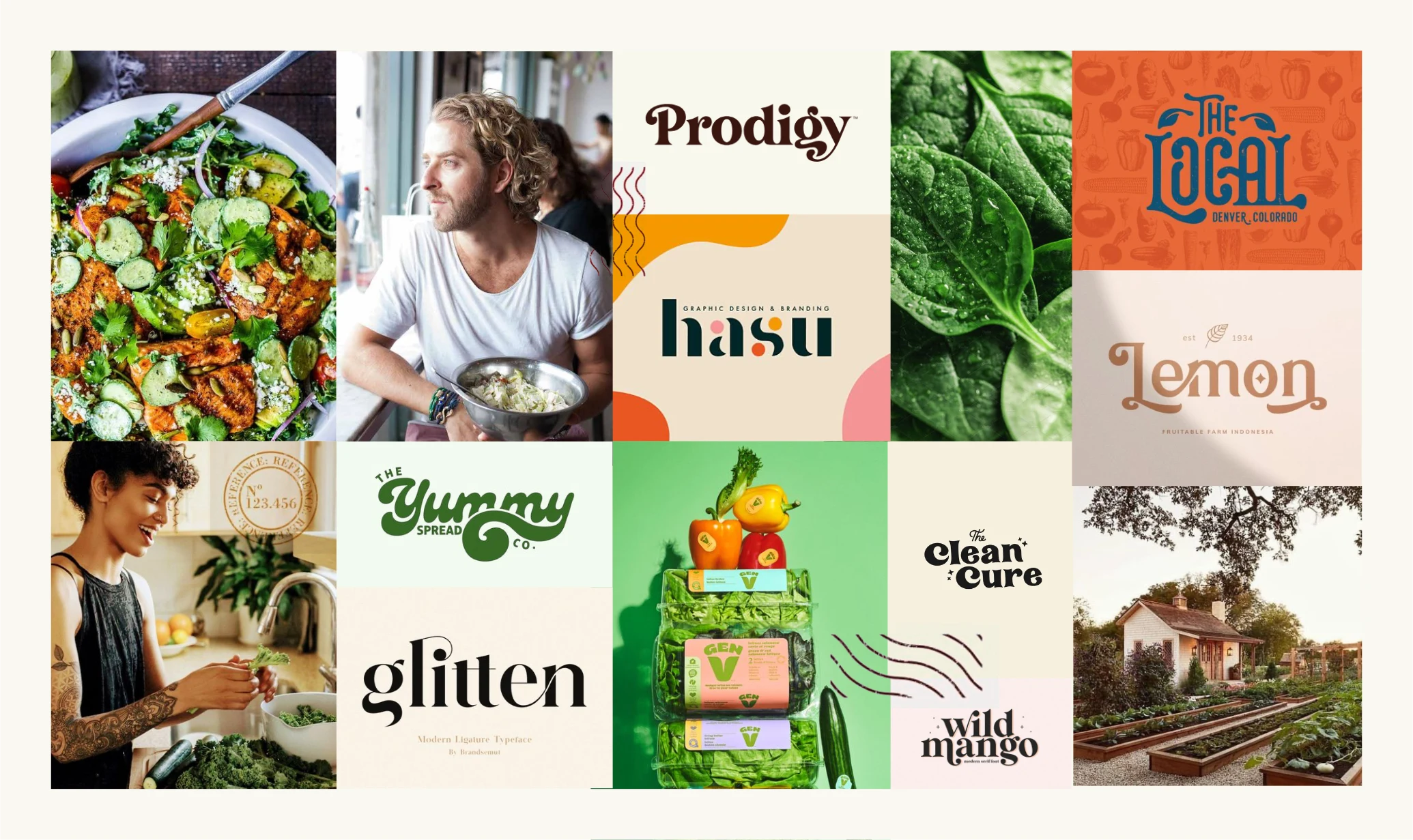
In my exploration of the organic and on-the-go fresh food market, I discovered an aesthetic characterised by free-flowing, playful, and minimalistic styling. I observed that serif fonts are frequently used and are often accompanied by curved shapes, which I found brought a sense of dynamism and energy. To enhance a feeling of vitality, I noticed that warm and rich color palettes are commonly utilized. I incorporated audience images that reflect a health-conscious and sustainability-focused demographic to further reinforce my design direction.
CONCEPT DEVELOPMENT
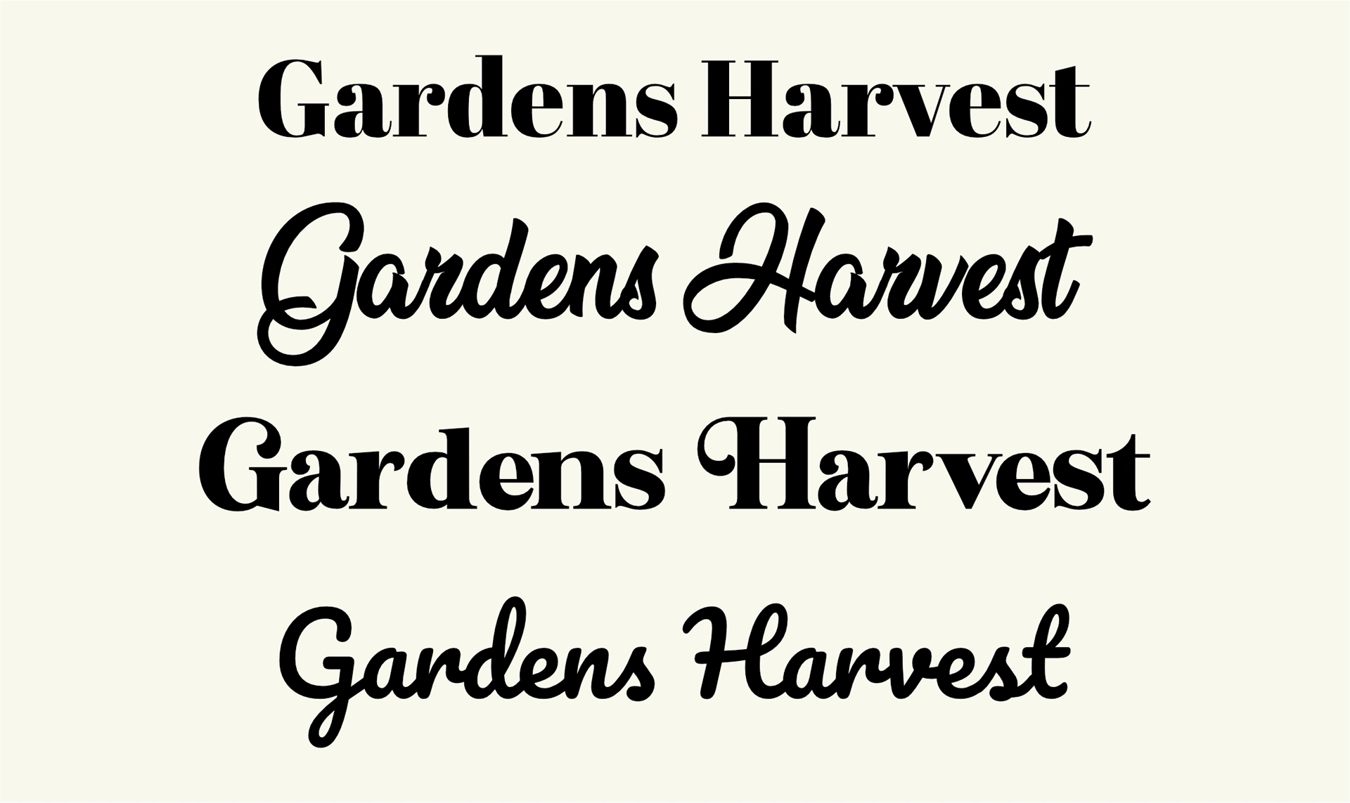
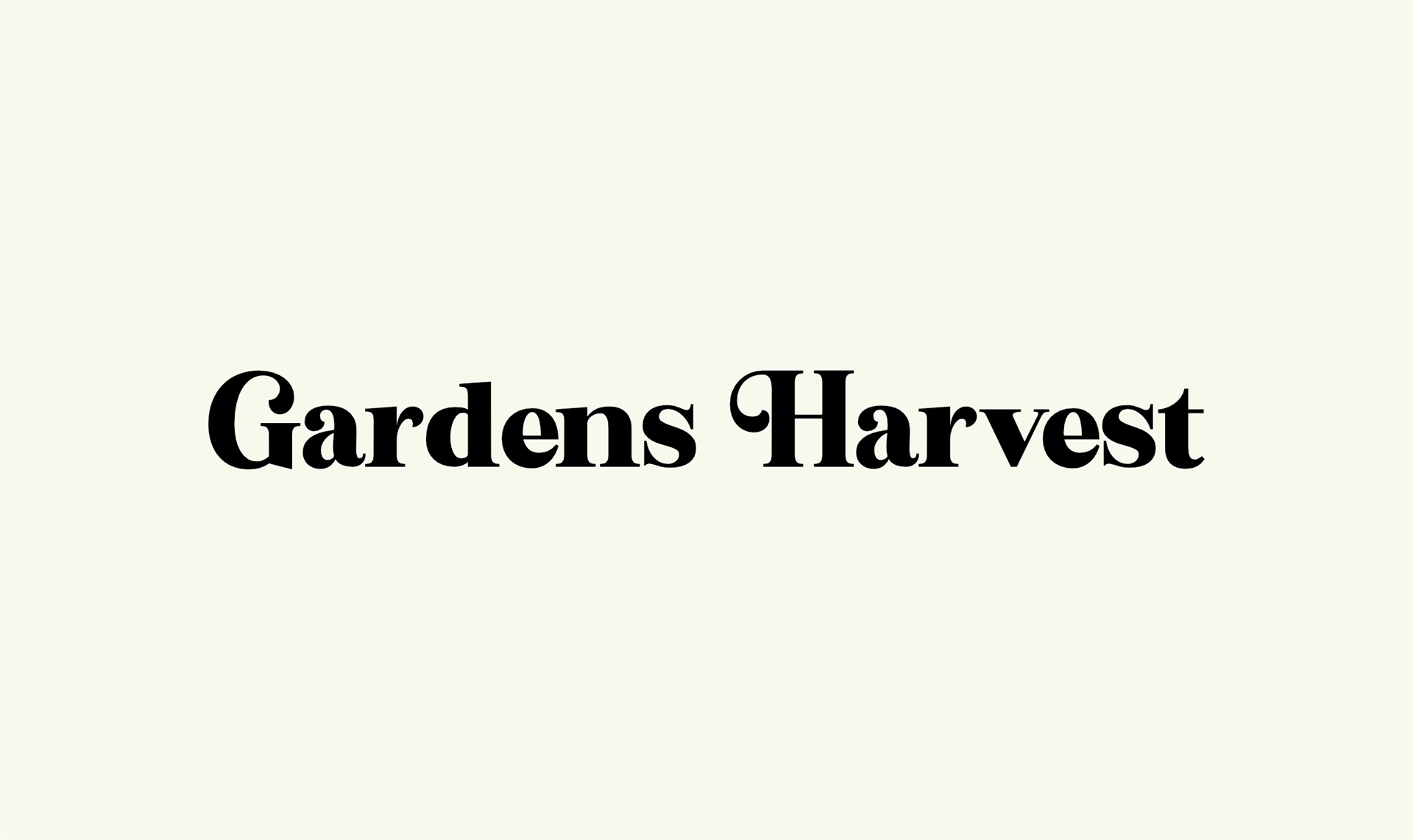
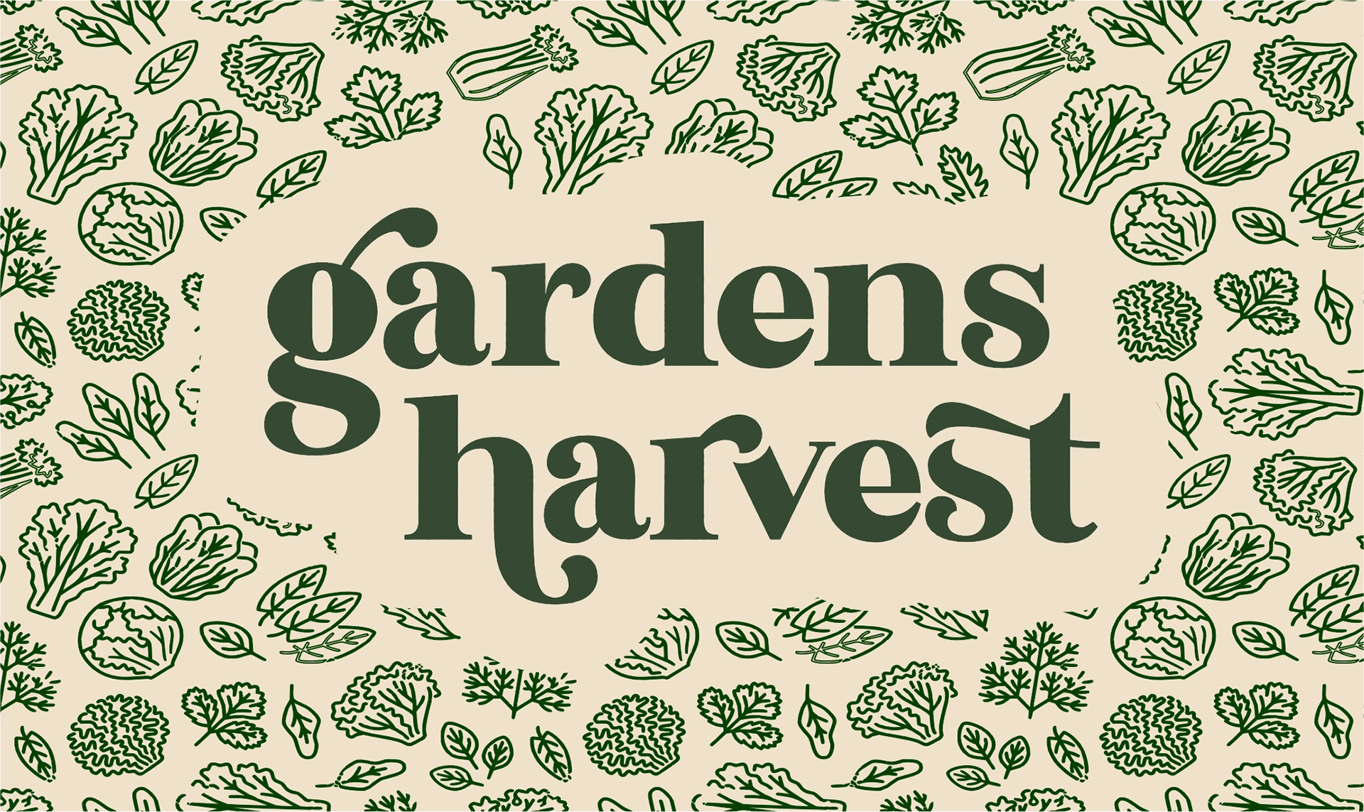
When delving into the concept for the logo, I aimed to find serif fonts that exude a sense of playfulness and motion (on the left). Afterwards, I chose my preferred font due to its potential for cohesive linkage, as exemplified in the mood board references. Additionally, I appreciated its inviting and warm aura, courtesy of the curved shapes and forms it embodies.

DESIGN EXPLORATION
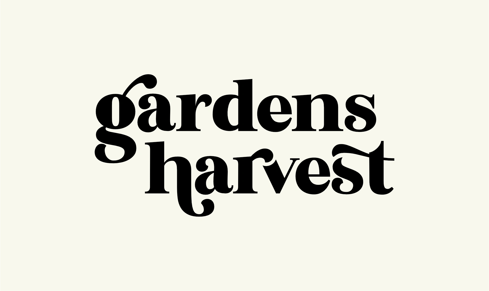
This is the part I enjoy the most – becoming playful and creative when exploring how to bring a design together. I chose to use lowercase letters as they bring a softer and more inviting look and feel to the logo. Next, I sought ways to bring movement into the design by connecting the letterforms, drawing inspiration from the moodboard examples. In essence, this logo prioritizes a sense of friendliness, flow, and simplicity.


PACKAGING DESIGN
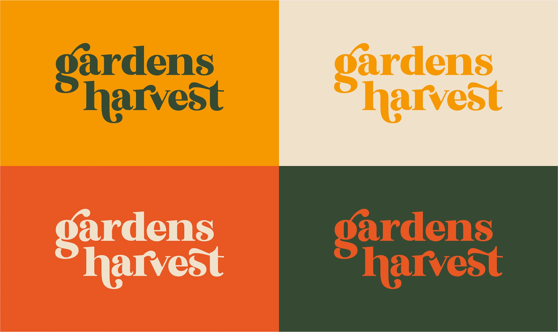
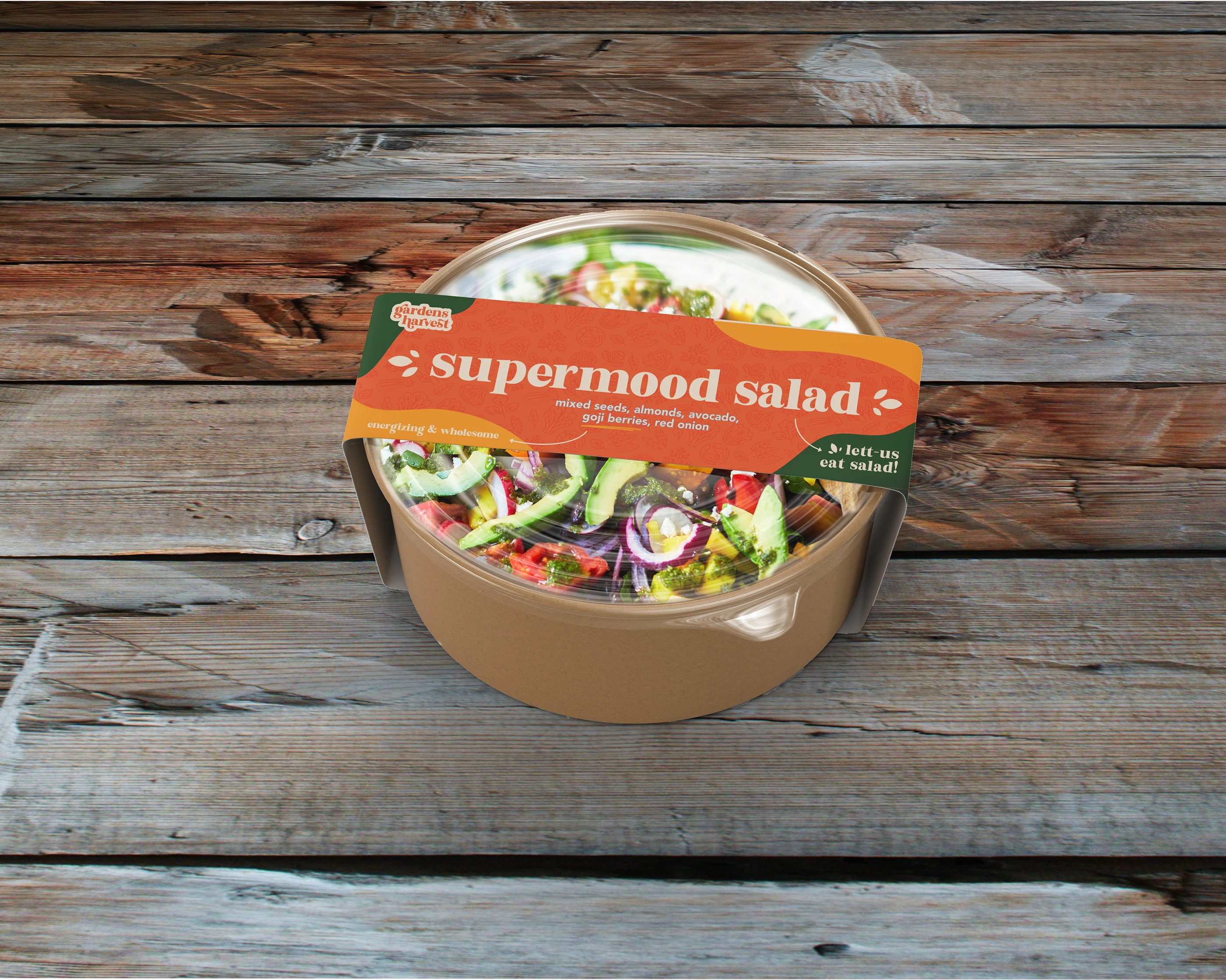
Now with a distinct logo and a vibrant colour palette, I began developing packaging for the on-the-go salads. My process evolved from a straightforward approach to a more free-flowing and energetic design that mirrors the company's values of wellness, playfulness, and sustainability. Including some lighthearted messaging enhances a sense of play and warmth.
TESTING
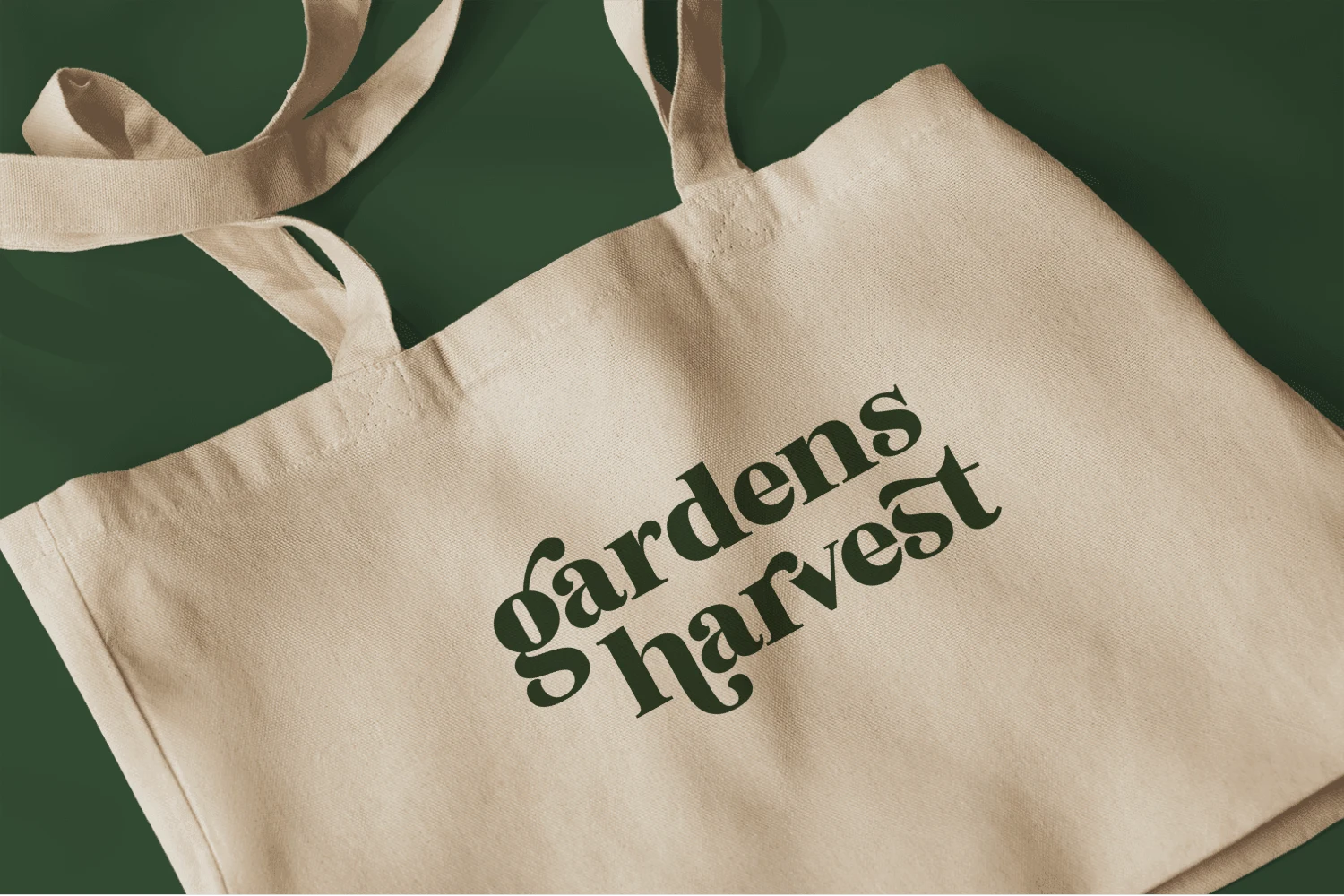
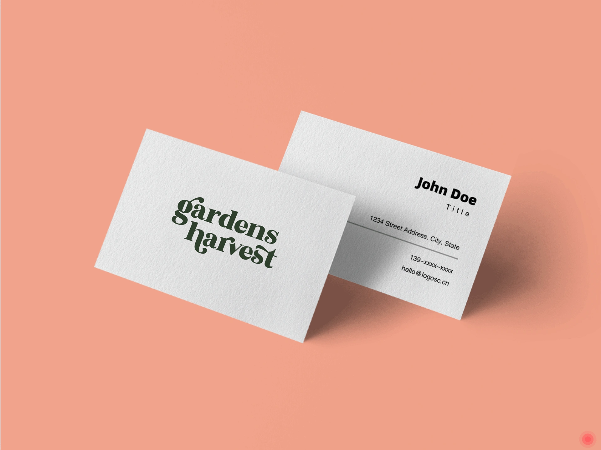
Visualizing the design in context is always crucial. In the images above, I've placed the Gardens Harvest logo and colours into various scenarios to assess their effectiveness at both small and large scales. Overall, the logo design maintains its readability across digital and print settings, making it well-suited for modern applications.
CONCLUSION
The Gardens Harvest logo and packaging project involved visual research, creative exploration, and testing. The final design reflects the company's values of wellness, playfulness, and sustainability, offering a versatile and friendly brand identity for the organic food market.
This was a fun and playful project for me to explore. If you would like to learn more about me and my work I'd love to hear from you.
Like this project
Posted Sep 20, 2023
In this project, I developed a logo and packaging for an organic salad ready-meal company called Gardens Harvest.

