Building Biostem Health
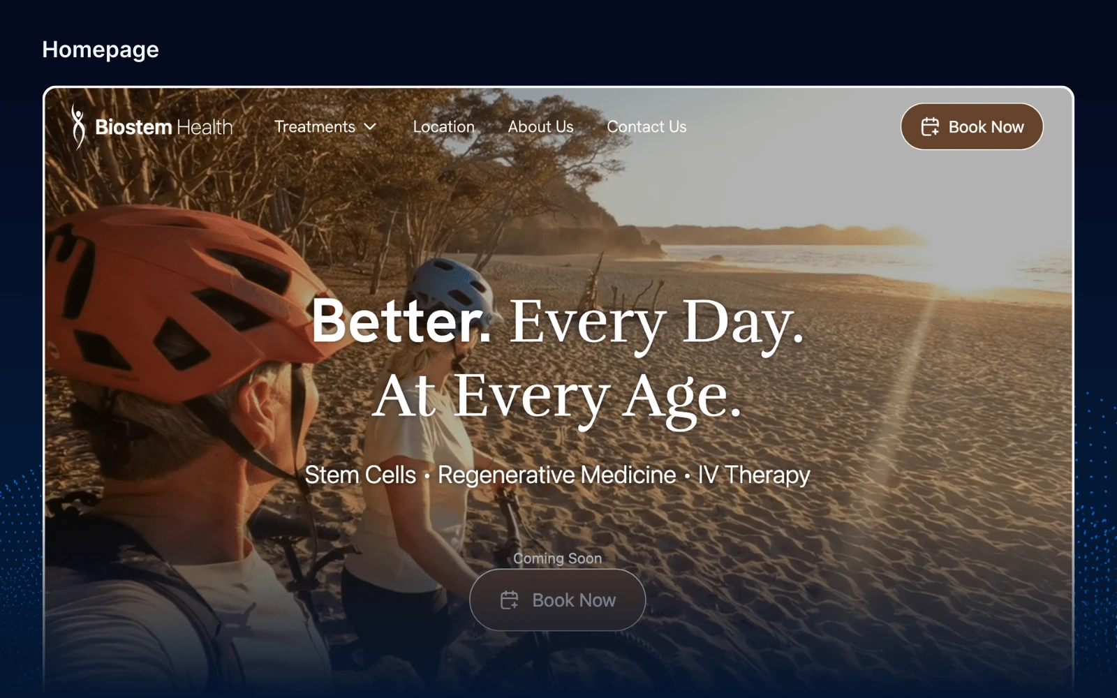
Introduction
Creating an impactful online presence is crucial for healthcare professionals. Our recent project with Dr. Maria Quiroz’s clinic aimed to reflect her dedication to personalized care and streamline patient interactions.
Why
Our project had two main objectives:
Credentializing the Clinic and Dr. Maria Quiroz: Highlight Dr. Quiroz’s expertise and the clinic’s credibility through qualifications, patient testimonials, and her personalized approach to build trust.
Streamlining the Booking Process: Enable patients to quickly find and book the right treatment or consultation, focusing on a seamless scheduling system.
Our goal was to combine aesthetic appeal with functional excellence, ensuring the website is both attractive and user-friendly. The following sections will detail our design process, from concept to final product.
Process
Content
Treatment Content
To ensure the website effectively communicated the clinic’s offerings, we started with a detailed Word document outlining each treatment, complete with descriptions and key details. This document served as the foundation for all treatment content.
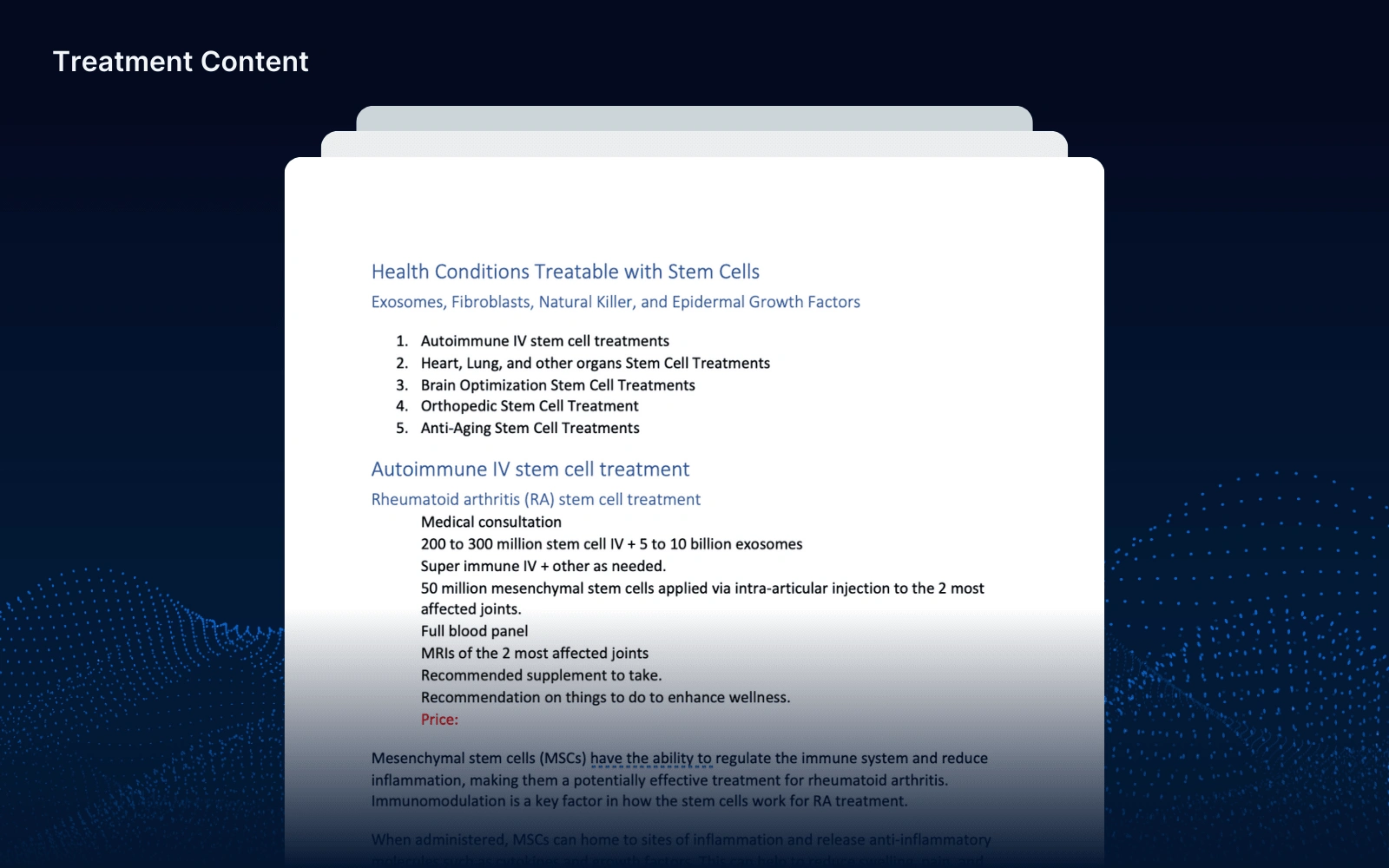
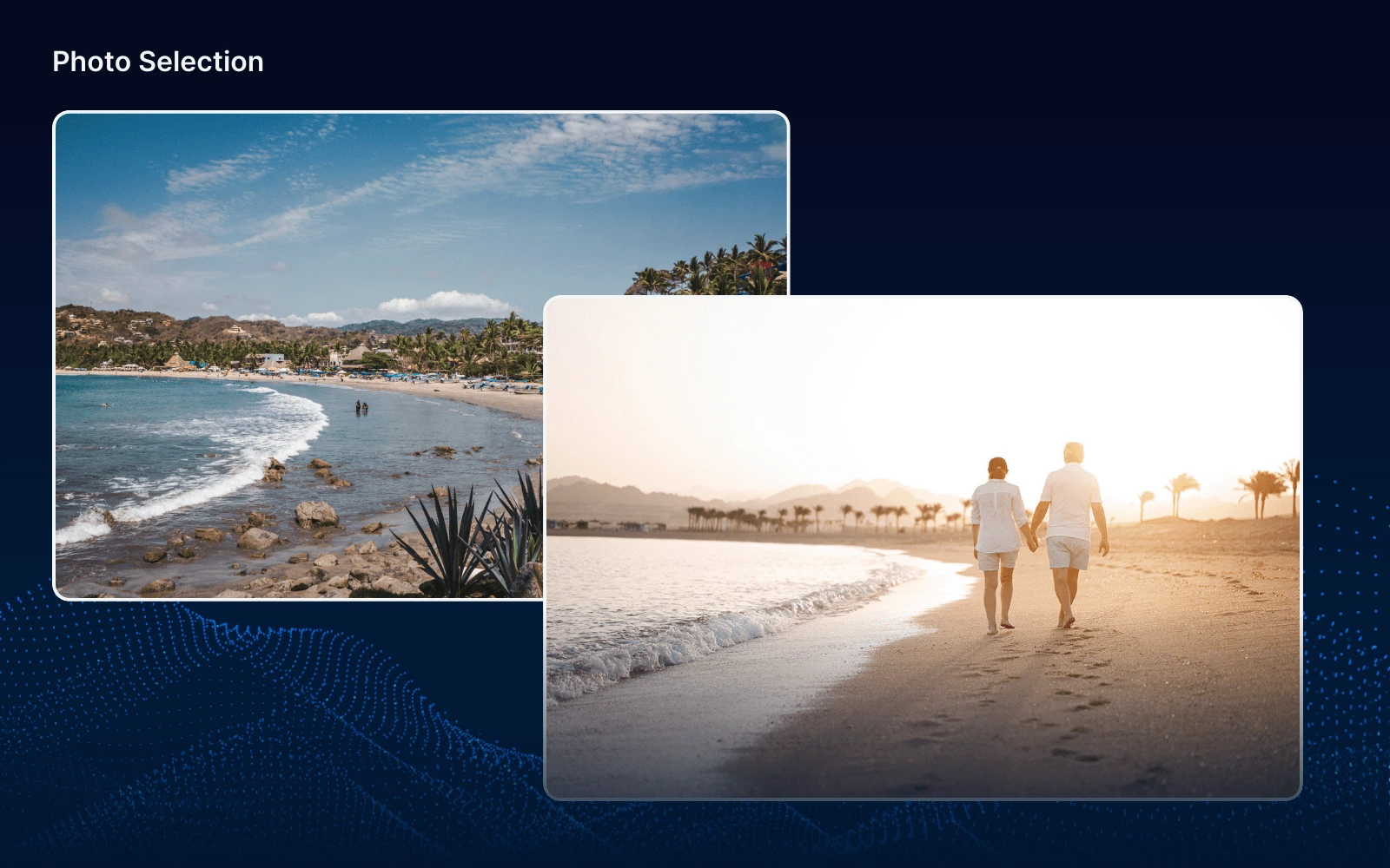
Photo Selection
We sourced photos online that conveyed concepts of well-being and healthy lifestyles across all age groups. These images were chosen to visually support the clinic’s commitment to personal care and holistic health.
Crafting Language
We carefully crafted the website’s language to highlight Dr. Quiroz’s expertise and the clinic’s credibility while guiding users smoothly through the site to find and schedule the right treatments.
UX
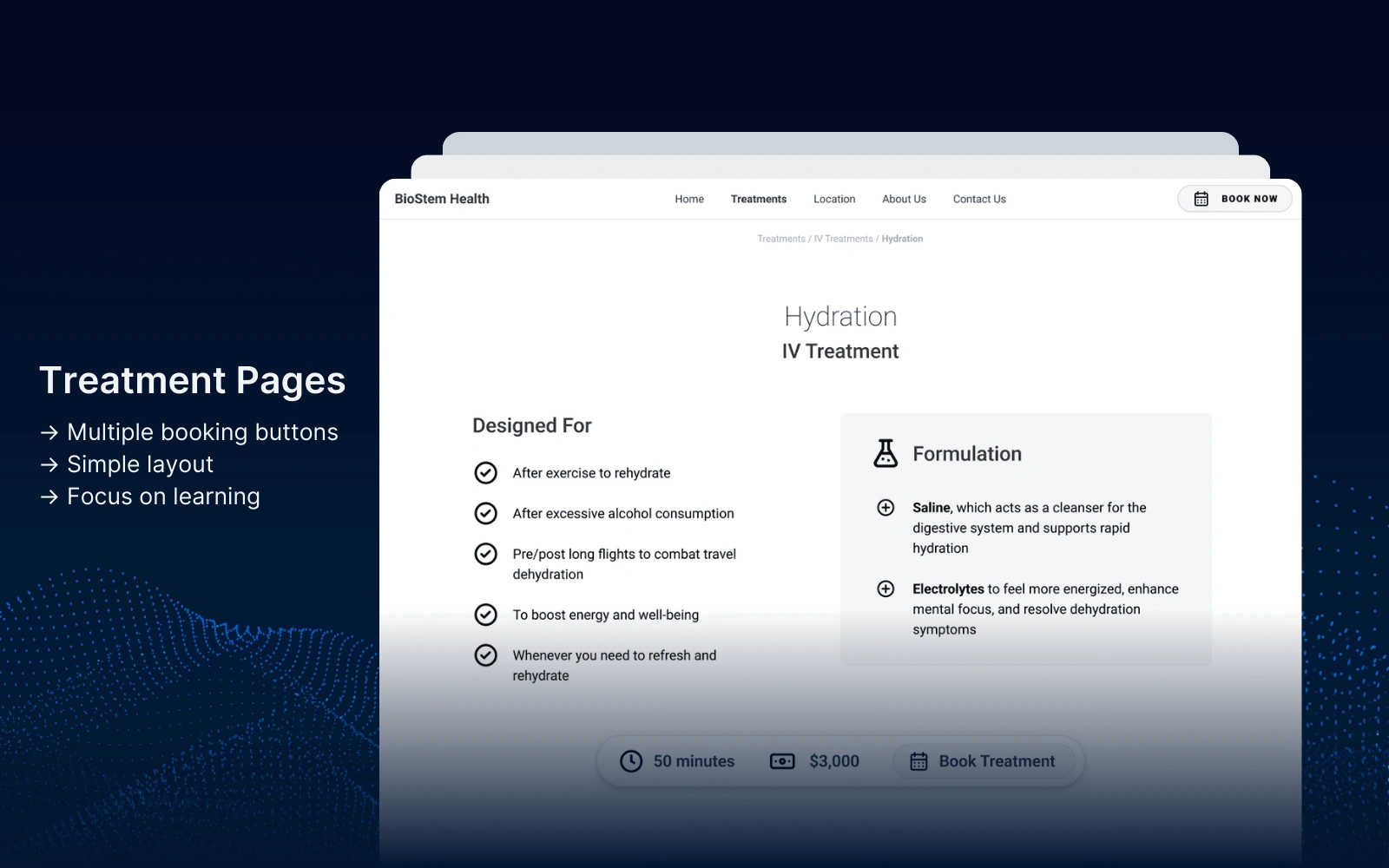
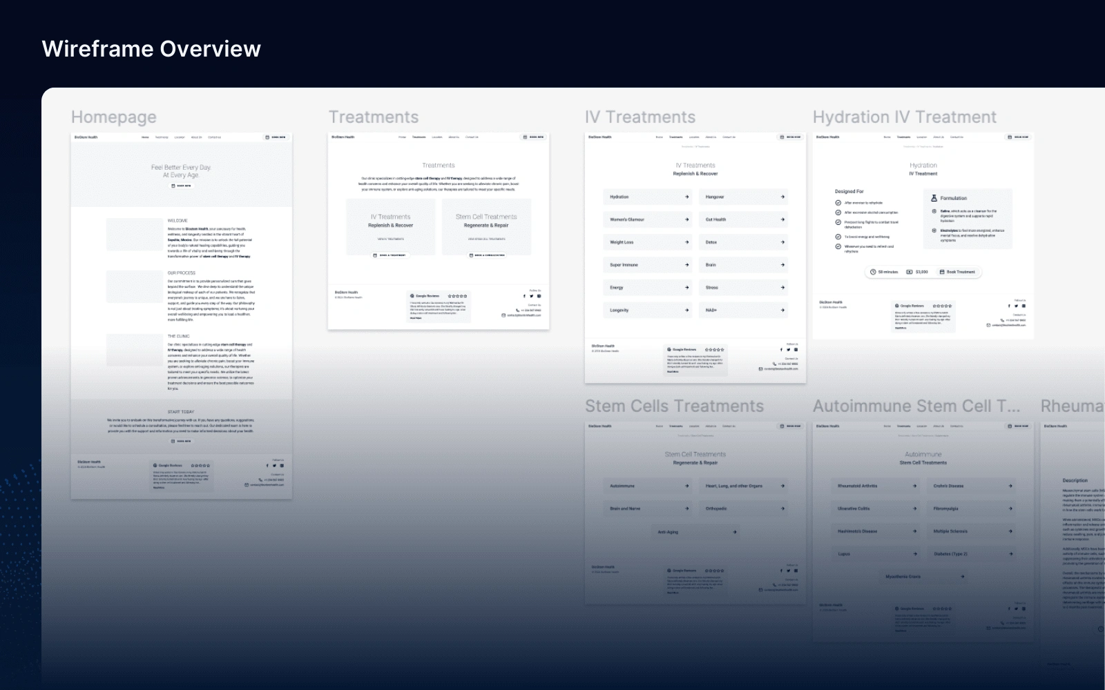
Using Figma, we wireframe’d the website to create simple, intuitive page layouts. Our focus was on ensuring a user-friendly experience:
Simple Page Layouts: Clear and clean designs to enhance readability and navigation.
Treatment Navigation: Easy-to-follow navigation paths to help users quickly find the right treatments.
Pervasive Booking Options: Accessible booking options available throughout the site to encourage easy appointment scheduling.
This approach ensured a seamless and efficient user experience, aligning with our objectives of enhancing credibility and facilitating bookings.
Design
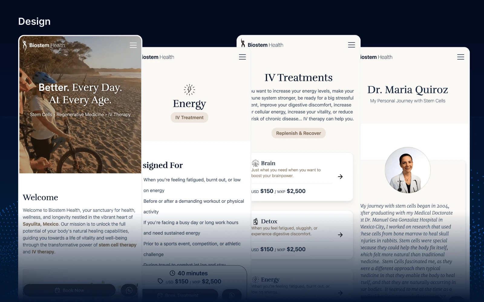
For the clinic’s website design, we chose a palette of soft beiges and browns. This decision was influenced by several factors:
Connection to Well-Being: These colours evoke a sense of calm and natural wellness.
Local Inspiration: Reflecting the beaches of Sayulita, where the clinic is located.
Aesthetic Goals: Aiming for a calm, warm, natural, sophisticated, and safe atmosphere.
This colour scheme helped create a visually appealing and emotionally comforting online environment, perfectly aligning with the clinic’s brand and location.
Development
Using Webflow Designer and CMS, we meticulously built out the website pages to ensure they were both visually appealing and highly functional:
Page Construction: We utilized Webflow’s design tools to create consistent, user-friendly layouts for each page. This ensured a cohesive visual experience and intuitive navigation.
CMS: Employed Webflow CMS to easily manage over 50 treatments. This included organizing treatments by categories, displaying prices in both USD and MXP, providing detailed descriptions, and linking to Calendly for booking.
Calendly Integration: Implemented Calendly for booking and scheduling treatments. This allowed patients to easily view availability and book appointments directly through the site, streamlining the scheduling process.
Google Maps Integration: Embedded Google Maps to provide a clear, interactive map of the clinic’s location. This feature helped patients easily find and navigate to the clinic.
WhatsApp Integration: Added a WhatsApp link to enable direct communication with Dr. Quiroz. This facilitated personalized interaction and immediate support for patients.
These integrations enhanced the site’s functionality, making it convenient for patients to access services, find the clinic, and communicate directly with Dr. Quiroz.
Deploy & Iterate
Deployment and Client Review
We deployed the website on a preview link, allowing Dr. Quiroz to review the site in a live environment. This step was crucial for ensuring the site met her expectations and provided the desired user experience.
Iterative Improvements
Through regular conversations with Dr. Quiroz, we gathered feedback and made necessary adjustments. This collaborative process allowed us to:
Refine the content and visual elements based on her insights.
Optimize the booking process to ensure it was as user-friendly as possible.
Tailor the user experience to better meet the needs of her patients.
These iterations ensured the final product was perfectly aligned with Dr. Quiroz’s vision and provided an optimal experience for her patients.
Feedback
"Looking at the site, it’s a beautiful piece of work." "Looks freaking amazing." "I love it. It’s beautiful." "I love how simple it is to absorb and navigate." "So easy to use. So clean." "This is a really nice site. Clean, functional, simple."
Like this project
Posted Jul 25, 2024
This project with Dr. Maria Quiroz’s clinic aimed to create an online presence that reflects her dedication to personalized care and streamline patient booking.
Likes
0
Views
15

