Balanced8 • DTC Supplement Brand Website
Yves Vonsaata
Introduction
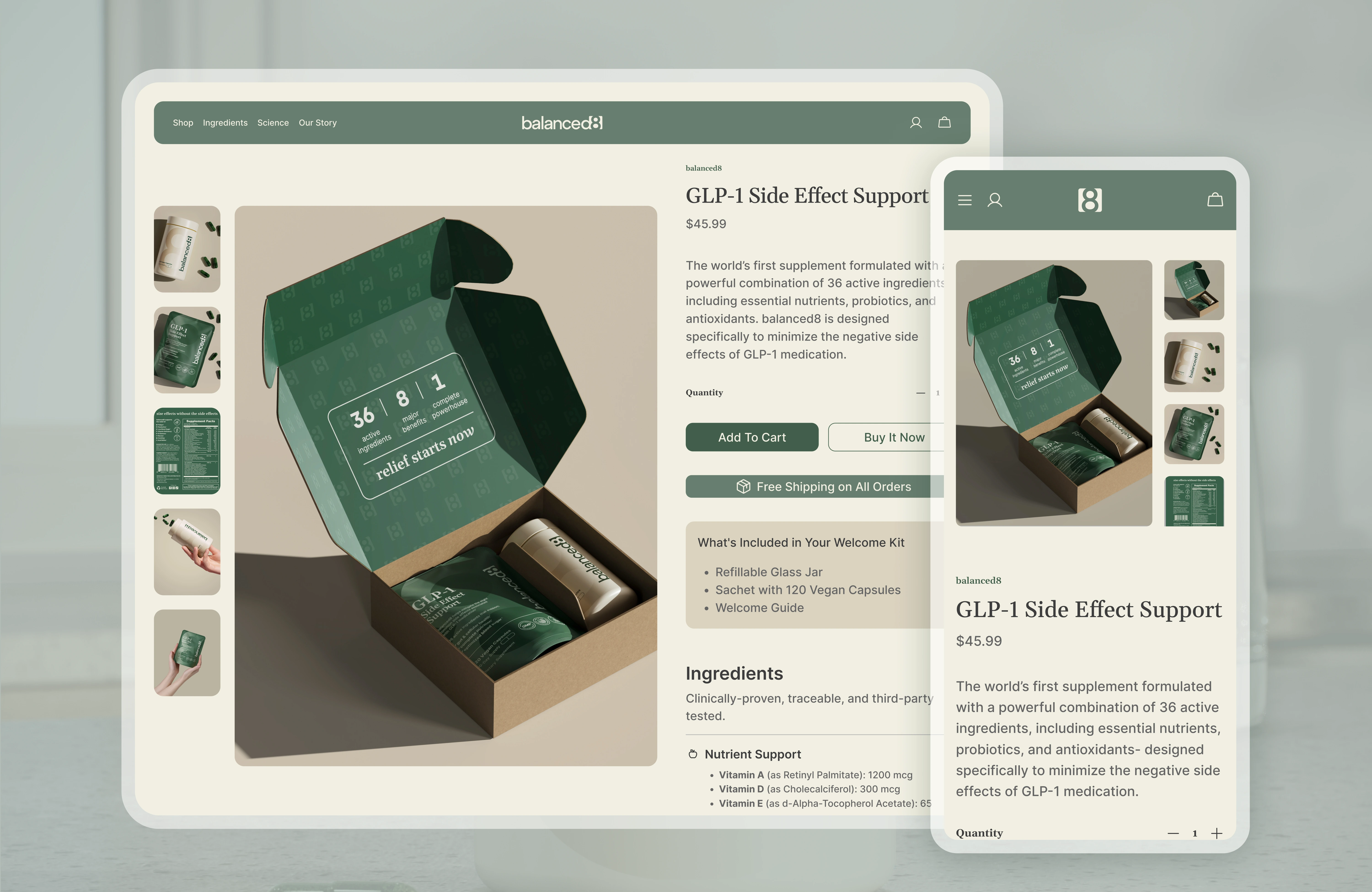
Matt tapped me to lead the web experience for Balanced8, the first supplement crafted to ease the eight most common GLP-1 side effects. With a Q4 launch looming, our site had to inspire trust, educate fast, and convert on day one.
3 Main Project Goals
Explain the science in plain language.
Showcase Premium Product Quality (packaging) and photo-real product renders.
Guide users smoothly from curiosity to checkout.
balanced8 Brand Board Animation
My Scope
Prepared site map and draft low-fidelity wireframes for Home, Ingredients, Product, Science, and About pages.
Built high-fidelity mockups in Figma, aligned with the new brand style guide.
Collaborated with branding and packaging teams to keep visuals and copy seamless across bottle, box, and screen.
Key Decisions
Trust first: Lead with third-party studies and transparent ingredient sourcing.
Conversion-oriented layout: Sticky “Add to Cart” and FAQ blocks placed where bounce risk peaked during test sessions.
Mobile priority: 70% of our target audience shops from phones, so every section was thumb-tested.
Home Page - Low-Fidelity vs High Fideity
Product Page - Low-Fidelity vs High Fideity
Mobile responsive
What I Learned
Designing for a health-conscious audience means balancing regulation, empathy, and clarity. Clear microcopy plus science-backed visuals wins trust faster than flashy effects.
Like this project
Posted May 22, 2025
Led web experience for Balanced8's supplement launch, focusing on trust, education, and conversion.
Likes
0
Views
7
Timeline
Jun 6, 2024 - Jul 21, 2024