VitaliQ Shopify Store Redesign: Building Credibility and Trust

Samson Bojesomo



VitaliQ: Redesigning a Supplement Store to Sell on Trust, Not Hype
Client: VitaliQ — Shopify store for science-backed cellular nutrition supplements and skincare (NMN, collagen, anti-wrinkle treatments)
Role: Shopify Website Redesign & CRO Strategy Result: Newly redesigned — performance data pending
The Challenge
The supplement and skincare space is saturated with bold claims and thin proof — which means shoppers arrive at a store like VitaliQ already skeptical. The redesign needed to do something harder than just look premium: it had to make an evidence-based, credible case for "science-backed cellular nutrition" in a category where most competitors lean on hype instead of substance. At the same time, the site still needed the visual warmth and emotional appeal that gets someone to actually click "Shop Now."
Research & Discovery
Supplement shoppers are typically running two conflicting instincts at once: hope that a product will genuinely help, and hard-earned skepticism from products that didn't. The redesign was built to resolve that tension in a deliberate sequence — lead with the emotional promise, then immediately back it up with real numbers, certifications, and verified customer proof, before ever asking for the sale.
The Design Process, Section by Section
Hero — An Emotional Promise, Immediately Backed by Specifics The hero leads with "Your Body Deserves Pure, Potent Ingredients," a bold, benefit-led headline in a soft pink/cream palette that feels premium and approachable rather than clinical. Directly beneath it, the copy pivots to specifics — "science-backed cellular nutrition" — so the emotional hook doesn't feel like empty marketing language. A single, clear "Shop Now" CTA keeps the hero focused on one action rather than competing choices.
Guarantee & Shipping Bar — Removing Purchase Risk Immediately Right below the hero, a high-contrast band states the 90-day moneyback guarantee and 5-7 day shipping. Placing this immediately after the hero — before any product or pricing is shown — was deliberate: it neutralizes the "what if this doesn't work" hesitation before the shopper has even started evaluating products, lowering the perceived risk of everything that follows.
Multi-Benefit Stats — Quantifying the Vague Promise Rather than generic claims like "customers love it," this section uses specific percentages (90% report a "healthy glow," 85% notice less dullness, 88% notice physical performance improvements) paired with Non-GMO, Gluten-Free, and Sugar-Free certification icons. Numbers and certification marks read as more credible than adjectives in a category full of unverified claims — this section exists specifically to out-credibility the competition.
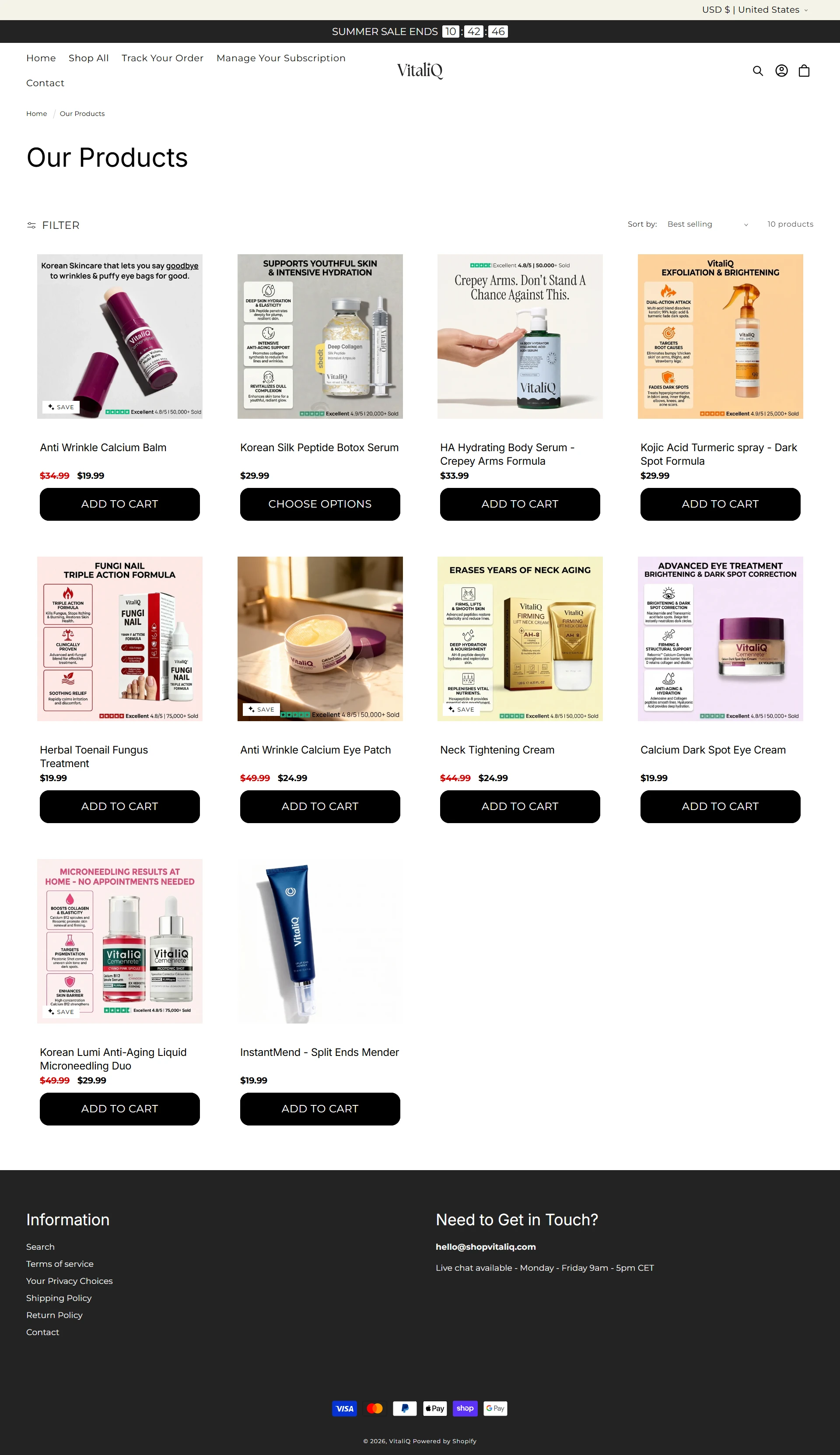
Bestsellers — Letting Product Choice Do the Convincing The bestsellers section surfaces four flagship products (hydrating body serum, Pure NMN, Anti-Wrinkle Calcium Balm, Korean Silk Peptide Botox Serum) with clean product photography against a soft gradient background. Leading with "bestsellers" rather than the full catalog reduces decision fatigue for new visitors and implicitly signals social proof — these are the products other customers already chose.
"What Makes Us Different" — Directly Naming the Competitor Weakness This section explicitly calls out "No mystery ingredients. No underdosed formulas," directly addressing the exact concerns that make supplement shoppers hesitant elsewhere — dosing transparency and ingredient sourcing. Pairing this copy with real lifestyle photography of the product lineup (rather than lab imagery) keeps the tone premium and human rather than overly clinical, even while making a technical credibility argument.
Verified Reviews — Proof at the Point of Highest Consideration The "100,000+ Sensational Reviews" section uses real customer photos alongside specific, detailed testimonials (naming exact experiences like reduced dry patches, energy levels, and fine lines fading) rather than generic star ratings alone. Every review carries a "Verified Purchase" badge — critical in a category where fake reviews are common, this single detail does a lot of trust-building work. Placing this after the product and differentiation sections — right when a shopper is deciding whether to believe the pitch — maximizes its impact.
Guarantee Repeat Bar — Reinforcing Risk Removal Before the FAQ The moneyback guarantee and shipping messaging reappear in a second banner just before the FAQ section. Repeating this reassurance at a second decision point (rather than relying on the shopper to remember it from the top of the page) keeps risk-reversal messaging present right as remaining doubts are being resolved.
FAQ — Closing Out Remaining Objections The FAQ section addresses the exact questions a first-time supplement buyer would have — what VitaliQ is, third-party testing, time to see results, dosing instructions, safety, and stacking multiple products. Placing this at the very end, after every trust-building section above, means only genuinely undecided shoppers reach it, and by then most of their concerns have already been addressed elsewhere on the page.
Visual & Brand Direction The soft cream-and-pink palette paired with bold serif headlines gives VitaliQ a premium, feminine-leaning wellness aesthetic that stands apart from the colder, more clinical look of typical supplement brands — while the specific stats, certifications, and verified reviews keep the page grounded in substance rather than relying on aesthetics alone.
The Outcome
The redesigned site has just launched, so performance data isn't available yet. Structurally, the new design gives VitaliQ a page that leads with emotional appeal but backs every claim with a specific, verifiable form of proof — stats, certifications, verified reviews, and a strong guarantee — sequenced to build belief before ever asking for the sale.
What the Client Said
"Samson completely re-coded our outdated WooCommerce layout. Our checkouts are now blazingly fast, loading in 300ms on mobile. We saw our transaction volume surge by 112% in the very first month." — VitaliQ
Tools & Skills Used
Shopify Redesign · CRO Strategy · UX/UI Design · Brand & Visual Design · Trust & Social Proof Optimization
Want a store that earns belief before asking for the sale? Let's talk.
Like this project
Posted Sep 4, 2026
Shopify website redesign for VitaliQ to build credibility and trust in supplements.