Generatin' Wealth Streetwear Site Concept

Samson Bojesomo


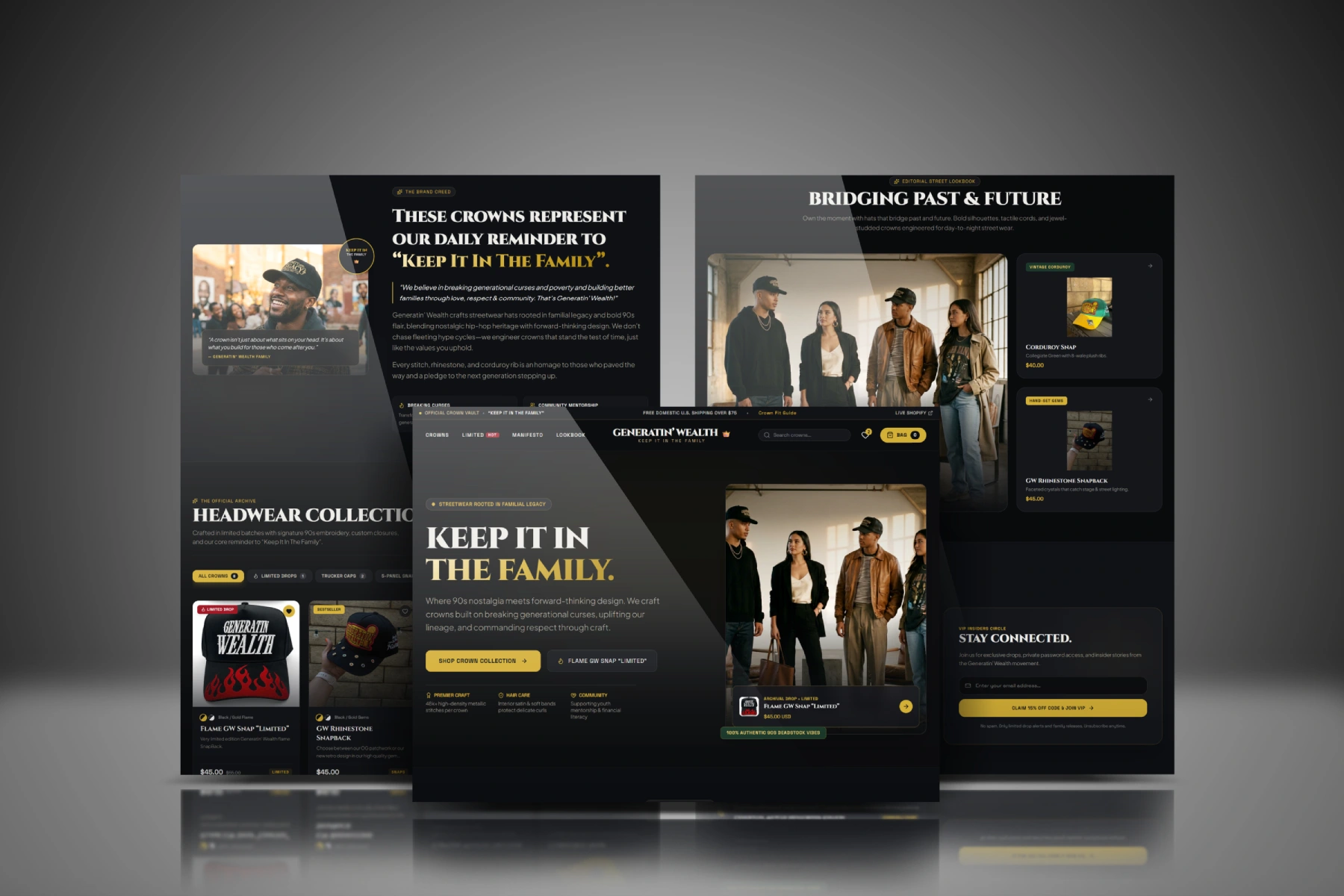
Generatin' Wealth: Designing a Streetwear Site Built Around Legacy, Not Just Product
Brand: Generatin' Wealth — streetwear headwear rooted in 90s hip-hop heritage and familial legacy ("Keep It In The Family")
Role: Speculative Concept Design & Build (self-initiated sample project)
Result: Concept sample — not yet a live client engagement
The Challenge
Streetwear headwear is a crowded, hype-driven category where most brands compete purely on drop scarcity and aesthetic. Generatin' Wealth's actual message — breaking generational curses, building family legacy, "Keep It In The Family" — is far deeper than a typical streetwear pitch, and I wanted to see if a site could carry that weight without losing the bold, premium streetwear feel the category demands. I built this as a speculative concept to show what a site could look like if the brand's mission was treated as central to the design, not just a tagline.
Research & Discovery
Streetwear buyers respond to two things at once: cultural credibility (does this brand feel real and rooted in something) and product desirability (do I want to own this). The concept was built to layer both — using bold, editorial visual language to satisfy the streetwear instinct, while giving the brand's actual mission (family, legacy, mentorship) real space to be felt rather than just mentioned once in an About page.
The Design Process, Section by Section
Hero — Leading With the Slogan as a Statement, Not a Tagline The homepage opens with "KEEP IT IN THE FAMILY" in bold, oversized type over an editorial lookbook photo of a mixed-generation group. This isn't treated as a marketing tagline sitting quietly under a logo — it's the literal headline, given the same visual weight a hype streetwear drop would get. The subheading — "90s nostalgia meets forward-thinking design" — immediately roots the brand's aesthetic (90s hip-hop heritage) without needing a separate section to explain it.
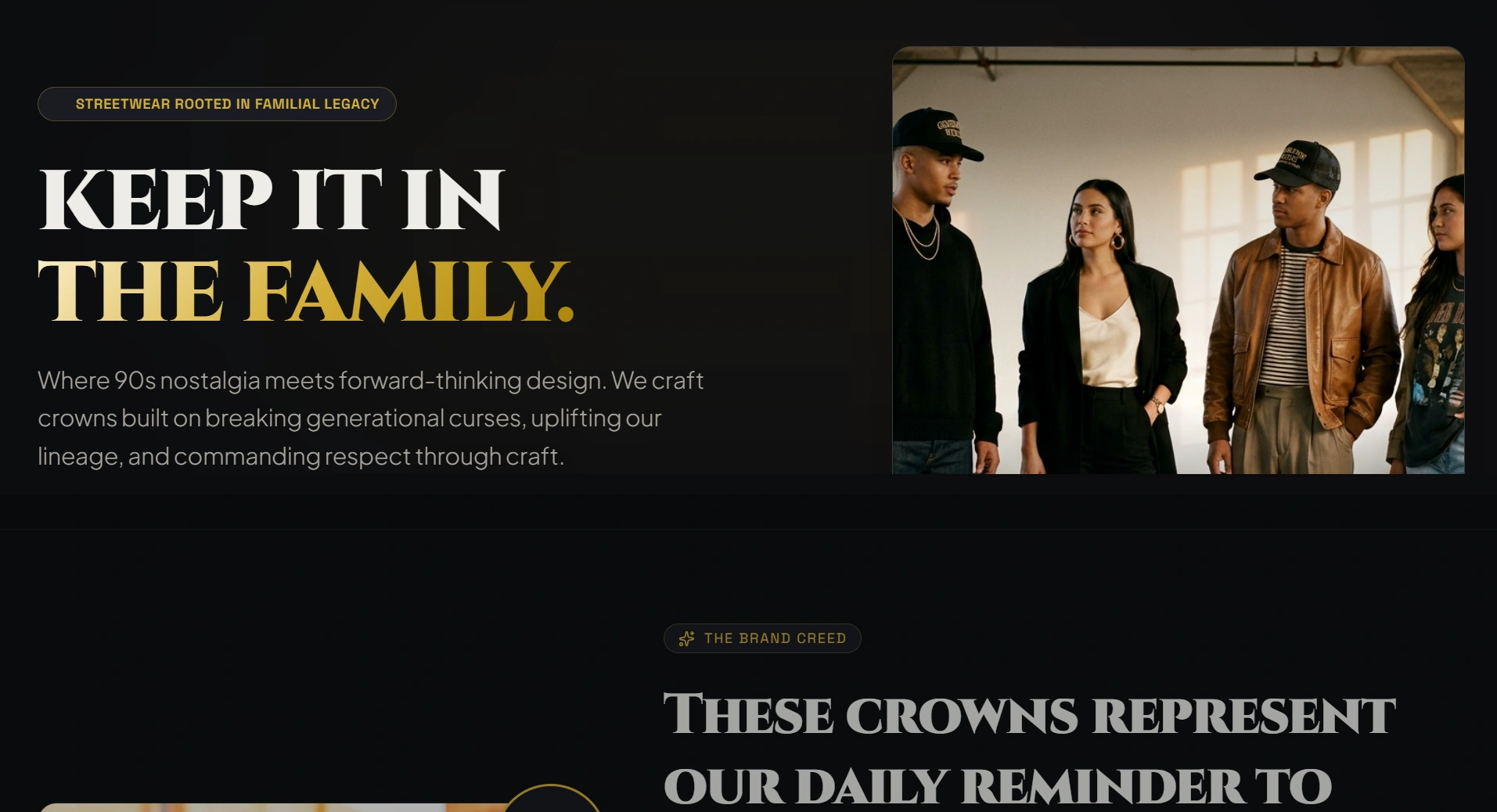
Dual CTAs — Serving Both Buyer Types at Once Beneath the hero sits both "Shop Crown Collection" (the primary commercial CTA) and "Flame GW Snap 'Limited'" (a specific, scarcity-driven product CTA). This dual-CTA structure reflects how streetwear actually converts: some visitors want to browse the collection, others come in already chasing one specific hyped item — the site meets both without forcing either down a single path.
Trust & Craft Bar — Streetwear Credibility Signals A row beneath the hero highlights "Premier Craft" (48x+ high-density stitching), "Hair Care" (interior satin lining), and "Community" (youth mentorship & financial literacy support). This does double duty: the craft claims justify a premium price point the way material specs do for any premium product, while the community line quietly reinforces the brand's actual mission without derailing the streetwear tone.
"The Brand Creed" — Giving the Mission Real Space Rather than compressing the brand's values into a single About paragraph, this section is given a full, dedicated treatment: a founder quote, an explanation of "Keep It In The Family," and a description of what "breaking generational curses and poverty" means in practice for the brand. Pairing this with a genuine, warm photo (rather than staged studio product shots) signals this isn't performative — it's core to what the brand is asking customers to buy into, not just a hat.
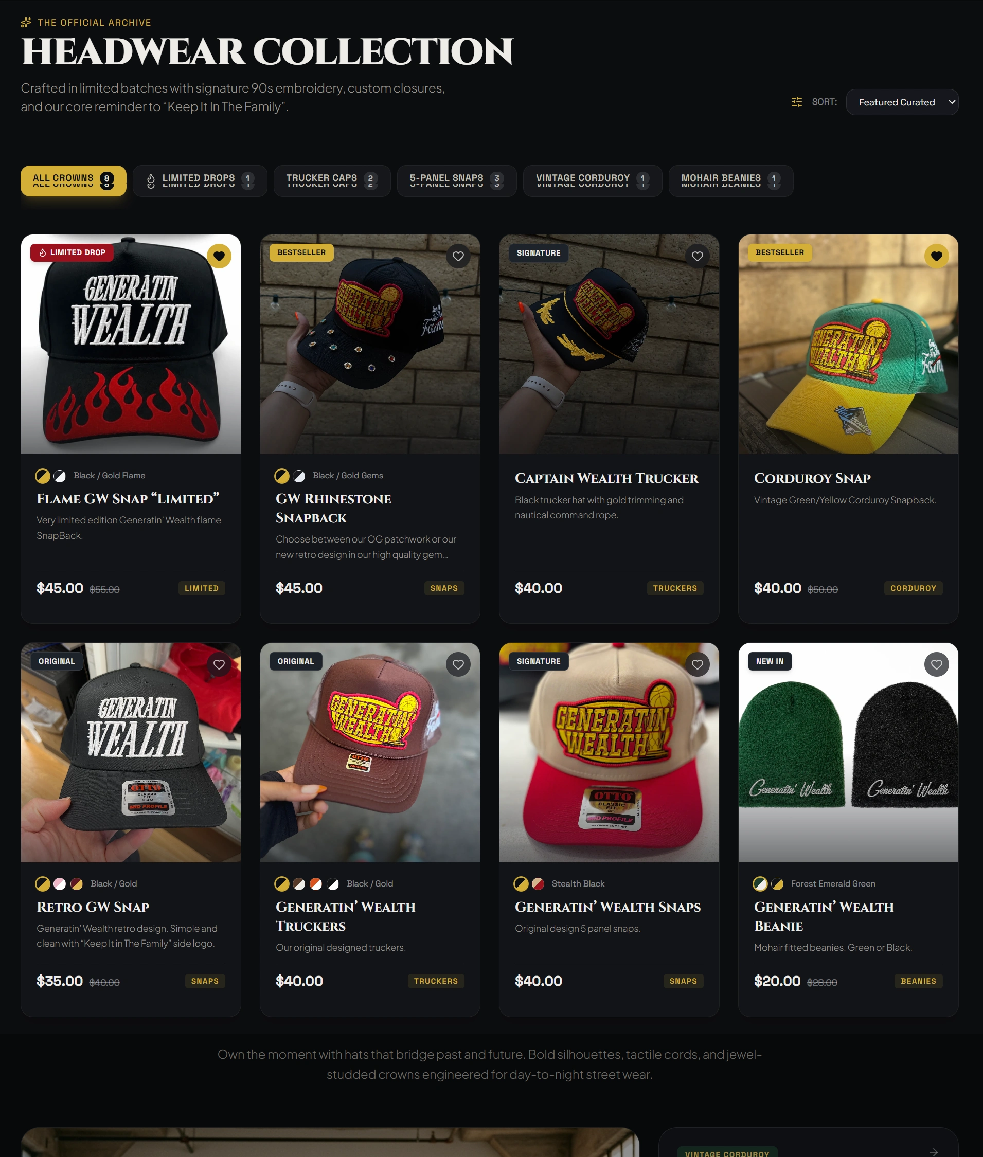
Headwear Collection — Merchandising With Identity Intact The product grid (Flame GW Snap "Limited," GW Rhinestone Snapback) keeps the bold black-and-gold visual identity consistent across every card, with drop-status badges (Limited Drop, Bestseller) doing the scarcity-marketing work streetwear buyers respond to, without breaking from the brand's premium, legacy-driven tone established above.
"Bridging Past & Future" Editorial Lookbook A full editorial section, styled like a fashion lookbook rather than a product page, reinforces the brand's identity as culture-first, not just commerce-first — an approach borrowed from premium streetwear brands that sell a worldview alongside a product.
VIP Insiders Circle — Building a List, Not Just a Sale The email capture at the bottom ("Stay Connected," 15% off for joining) is framed around "exclusive drops, private password access, and insider stories" — matching the language of a streetwear community rather than a generic newsletter signup, which matters for a brand built on belonging and legacy rather than one-off purchases.
Visual & Brand Direction The black-and-gold palette, bold serif/display type pairing, and crown iconography give the site a premium, almost regal feel — deliberately elevating "streetwear hats" into "crowns," which mirrors the brand's own legacy-and-respect positioning rather than a purely trend-driven aesthetic.

The Outcome
This is a speculative concept build, not yet an active client engagement created to demonstrate what a site for Generatin' Wealth could look like if built specifically around its actual mission and audience, rather than a generic streetwear template.
Tools & Skills Used
Website Design & Build · Brand Strategy · UX/UI Design · E-commerce Merchandising · Editorial/Lookbook Design
Want a site built around what your brand actually stands for, not just what it sells? Let's talk.
Like this project
Posted Sep 14, 2026
Designed a concept streetwear site emphasizing Generatin' Wealth's mission and aesthetic.