Tembo Health Landing page Redesign (med-tech)
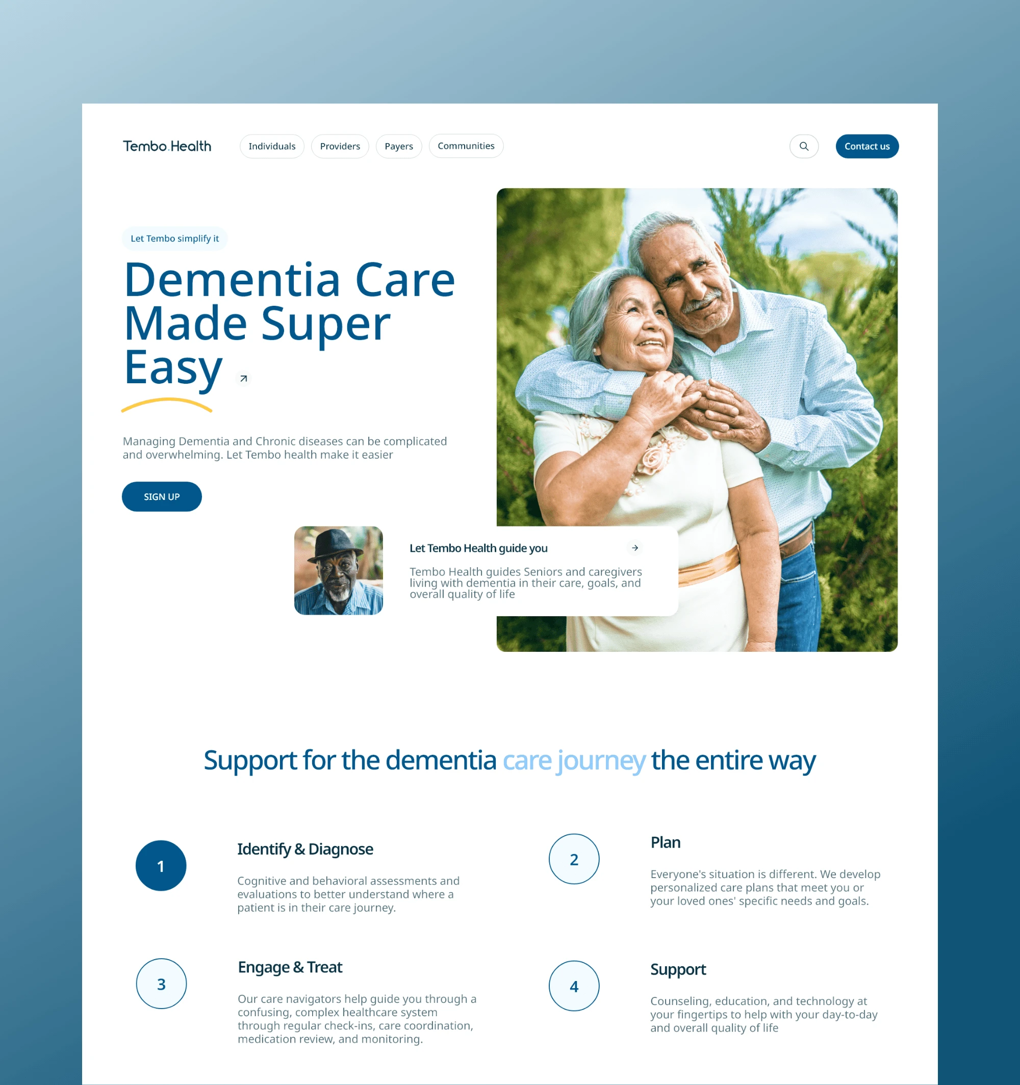
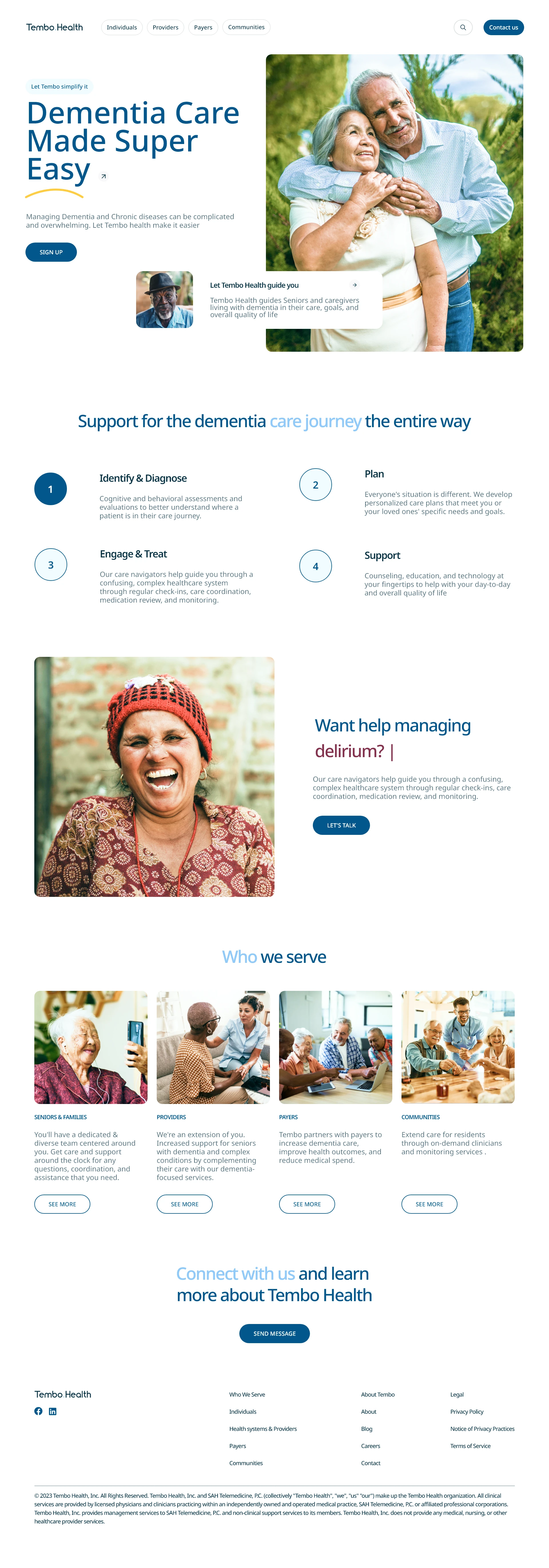
Revamped design

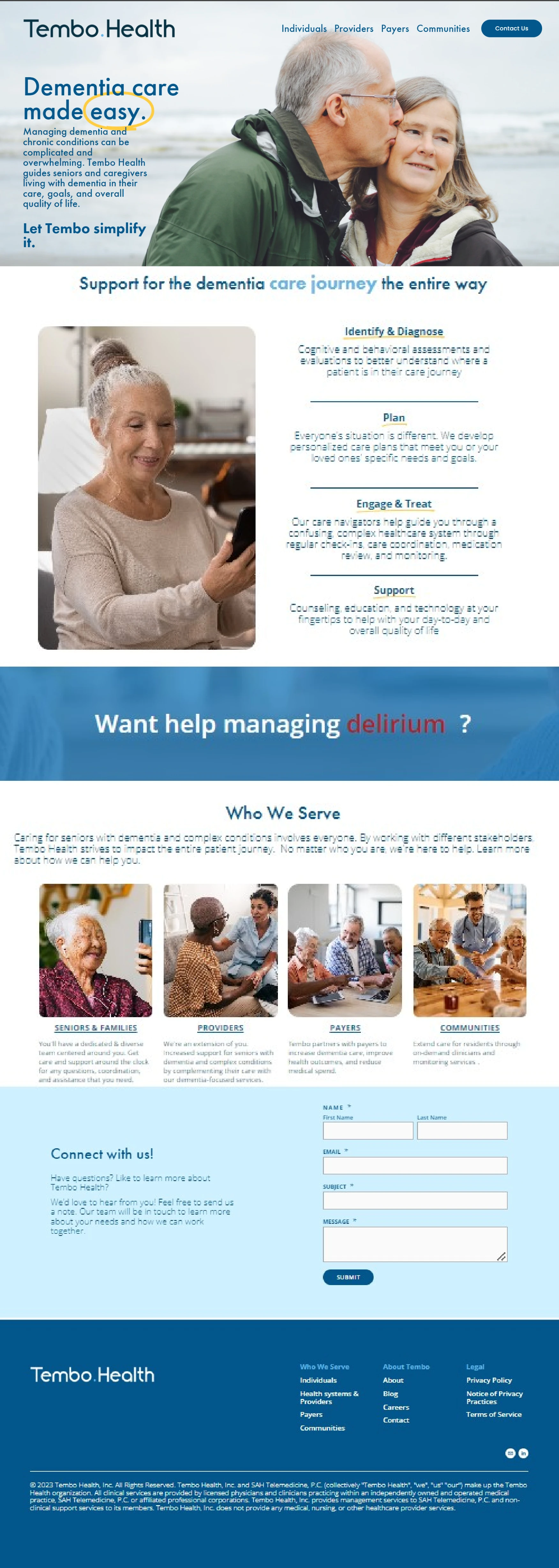
Old design

Summary
This project is purely a design exploration
I redesigned the Tembo Health landing page into something more modern and clean.
Here are are 4️⃣ things I made sure of while redesigning.
1) I drew more focus to the hero images which I color graded to be warmer given the nature of the industry (med-tech for the elderly)
2) I broke the copy texts down, to make the UI less clustered
3) I utilized more white space in the design
4) I removed unnecessary elements and made the design cleaner
Design Process
I started out with extensive research about the med-tech industry to make sure that my design was up to industry standard. I then took a deep delve into the product I was redesigning and its functionality and core users. After extensive research, I drew out a mood board and began sketching. I then transferred this sketch to a digital wireframe.
Now with the already existing brand identity, I started fleshing out the design into a high fidelity design. I went through 2 revisions with the design
Wireframe

Final Design

New improved design
Like this project
Posted Dec 19, 2023
Redesigned Tembo Health’s landing page with a cleaner layout, better hierarchy, and a more trustworthy feel for families exploring dementia care.


