minibox - Visual Identity
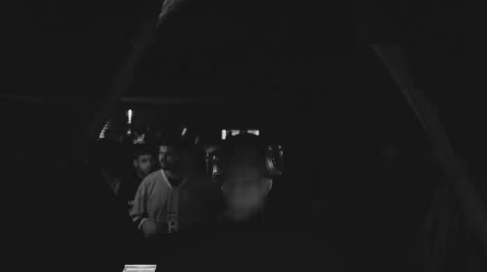
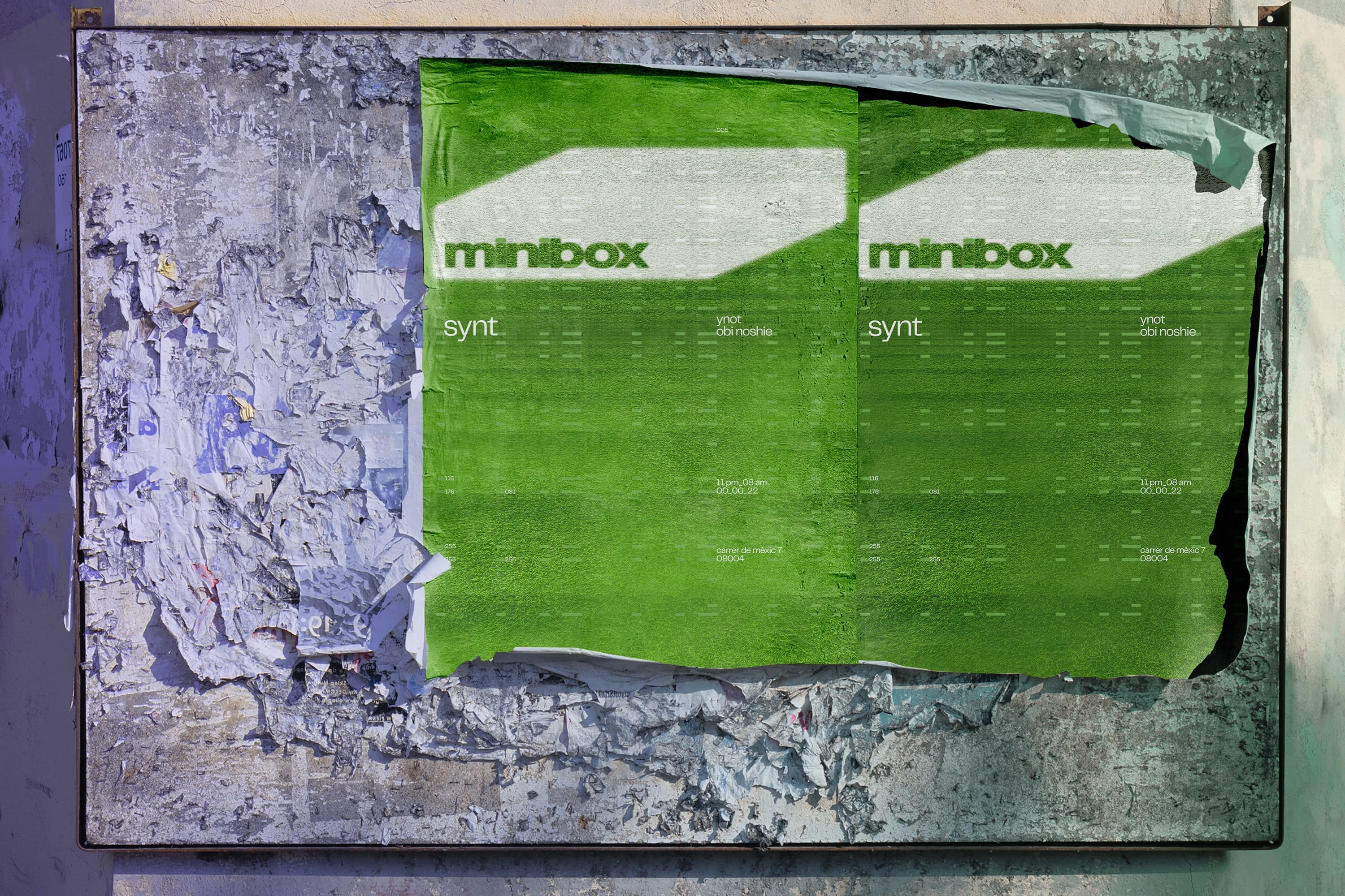
minibox is an innovative collective and record label that combines electronic and minimal music events with a diverse array of visual arts and design, aiming to promote and showcase the works of both audio and visual artists. While currently based in Barcelona, our ambition is to expand internationally, forging connections with artists and enthusiasts worldwide. As the art/creative director and designer, I have lead minibox's visual identity across its sub-brands. With a strategic approach, I ensuredthe brand's versatility and easy recognition across diverse mediums. From digital to physical artworks, street art, photography, videography, and more, minibox's logo, typography, and grid patterns grant creative freedom and maximize visibility.
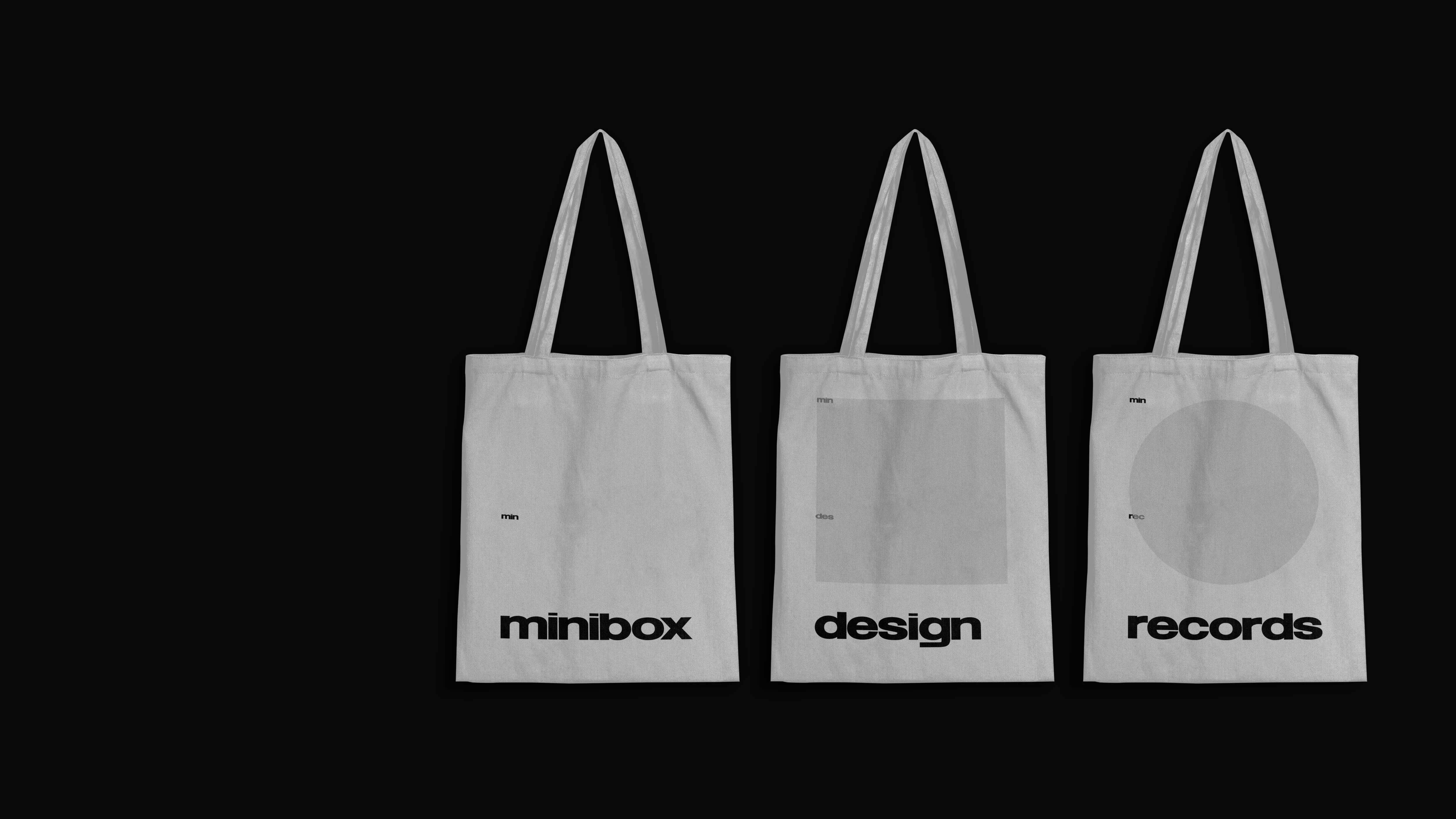
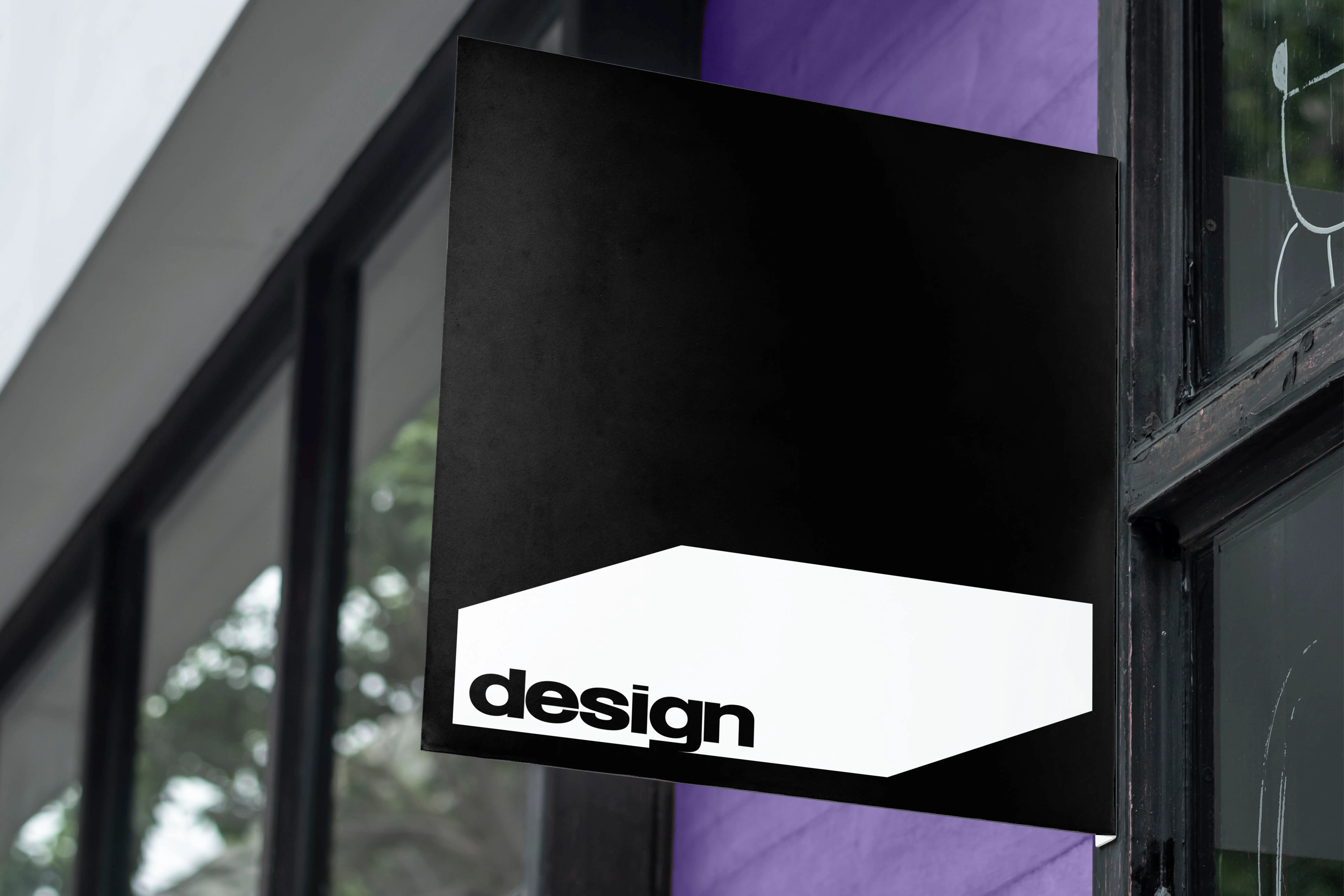
The logo, a simple yet powerful representation, features a box. This box symbolizes community and serves as a gathering place. It is versatile, moving across various locations and settings, accommodating different elements within its space.

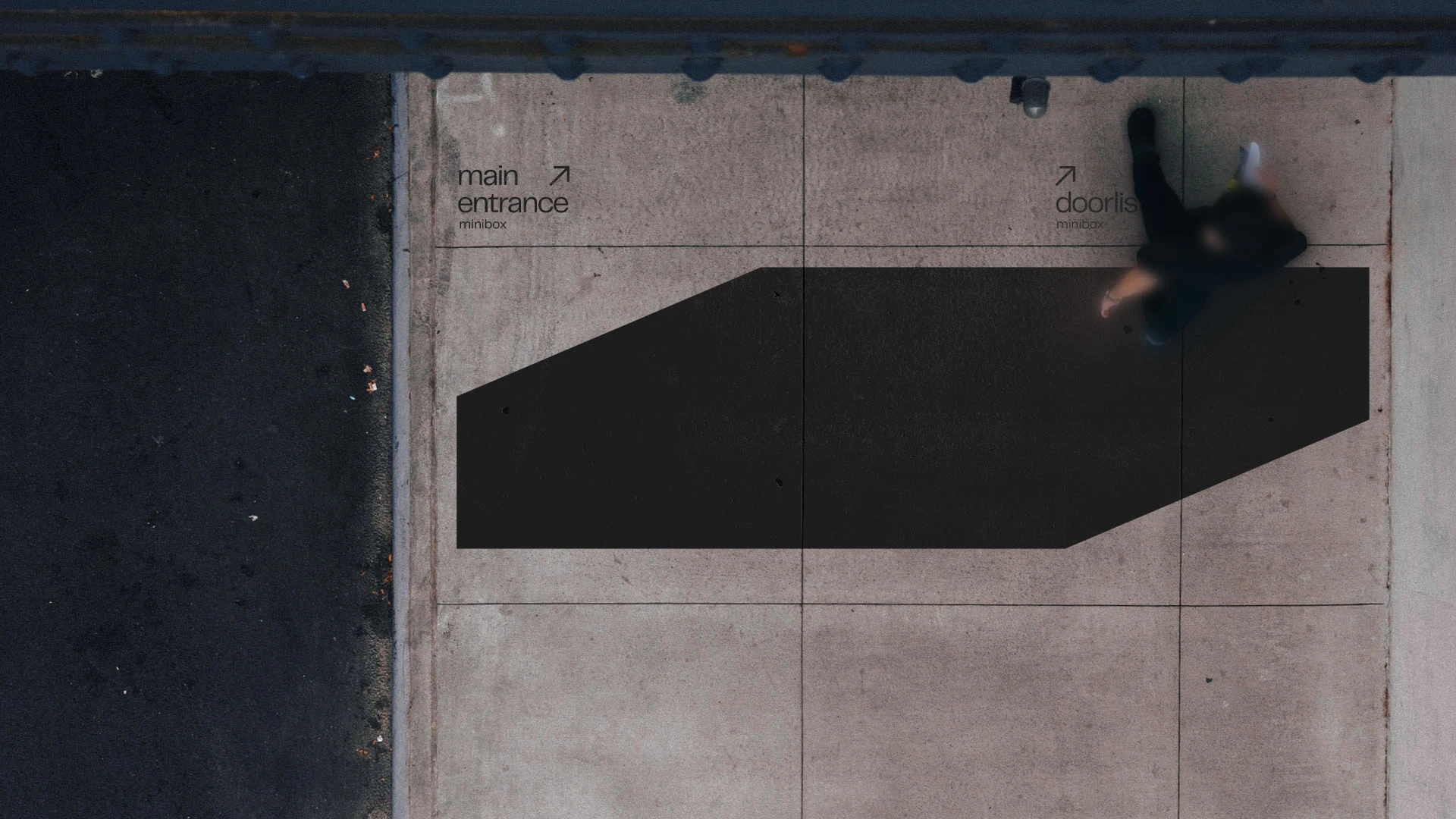
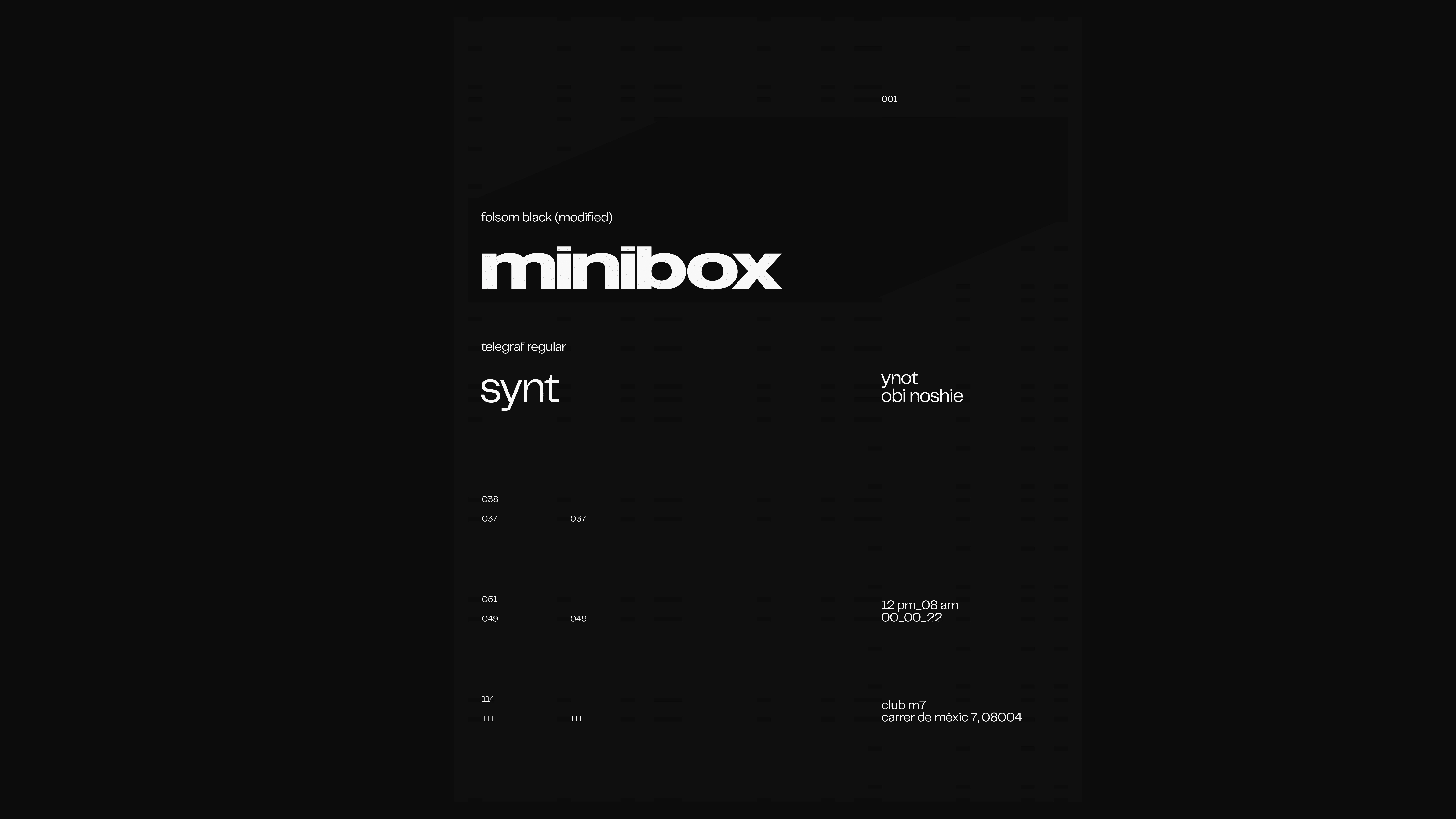
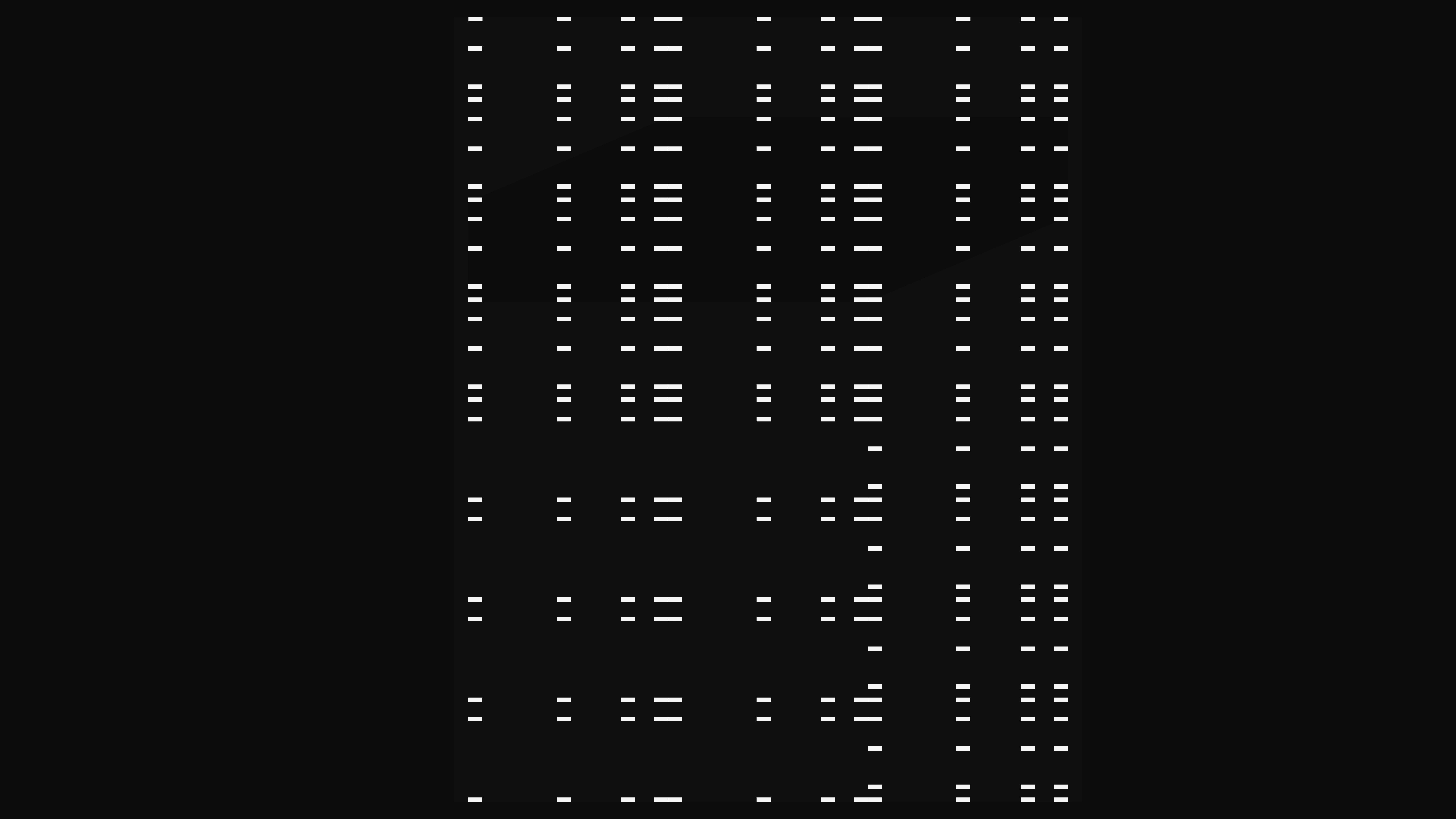
The grid, derived from the logo, maintains a proportional size in relation to the dot on the letter 'i', ensuring visual cohesion. The spacing determines the placement of the logotype within one side of the box, forming a pattern used as guidelines for positioning text.
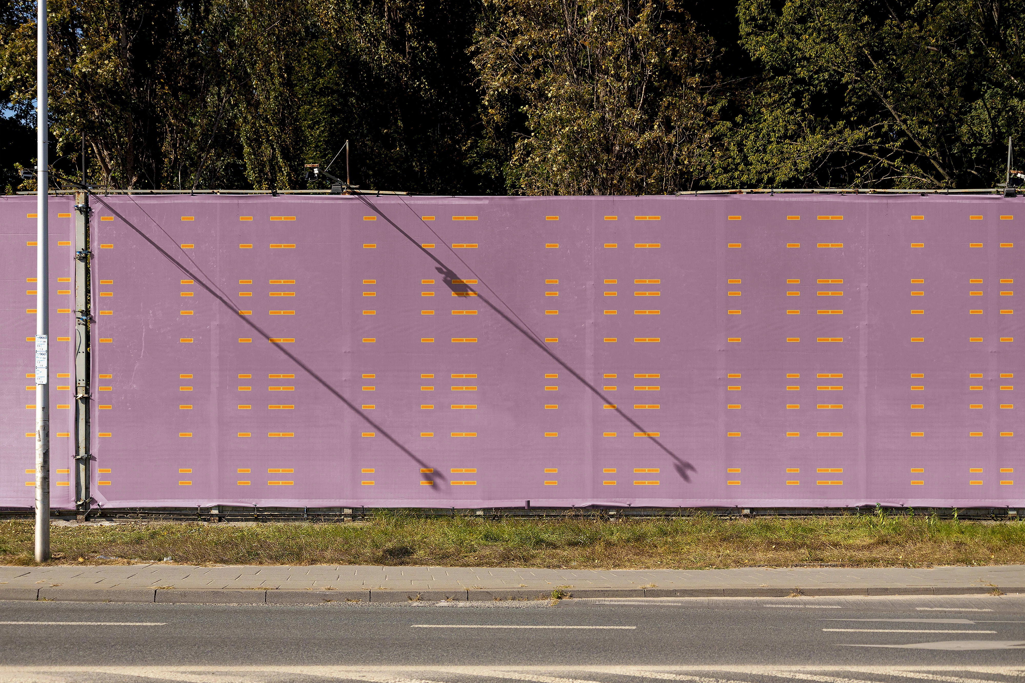
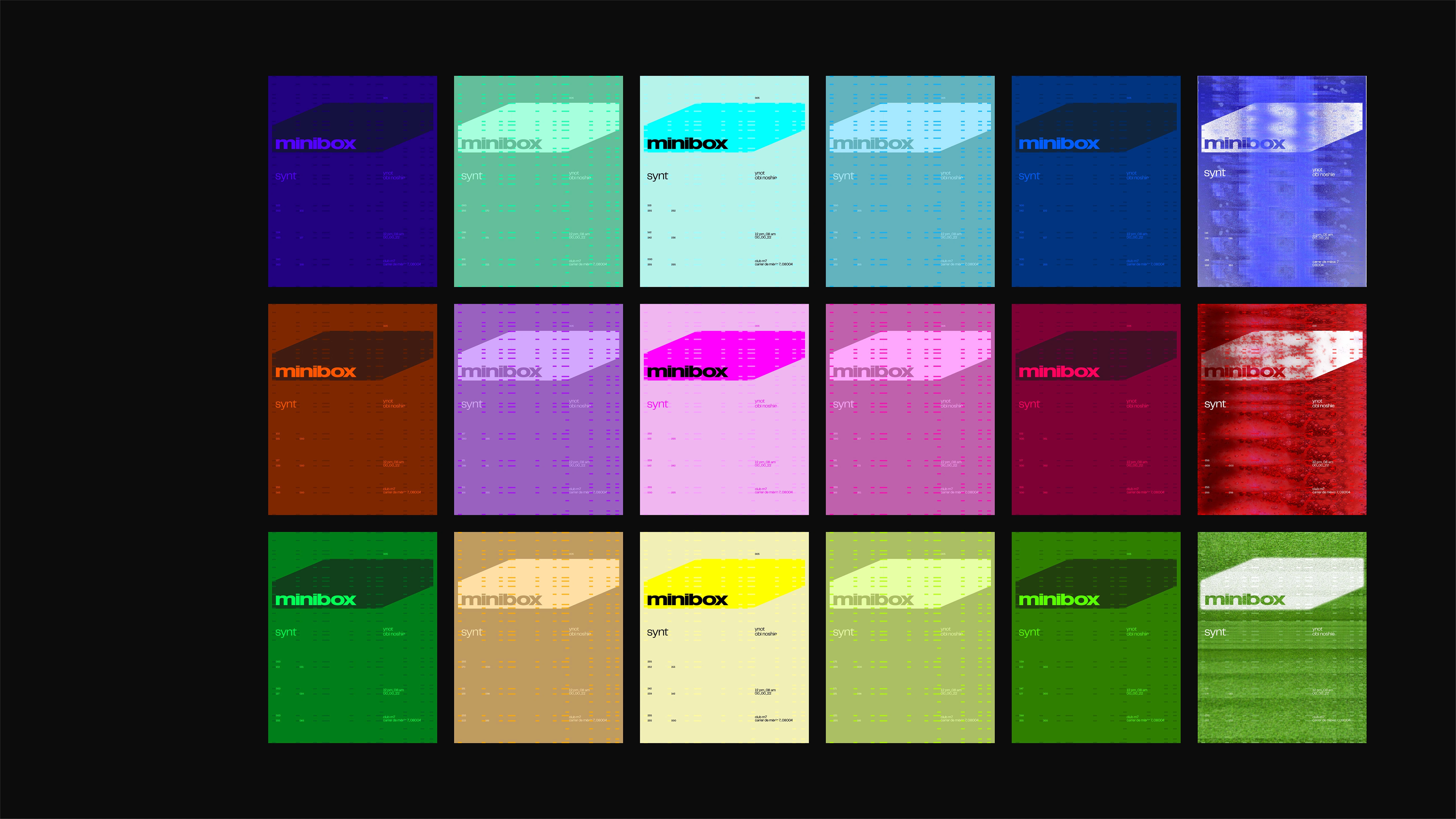
No specific color palette allows for unlimited artistic freedom when incorporating the brand identity. This offers endless opportunities for exploration and advertising. For instance, colors can be chosen to convey the mood of events to attendees.
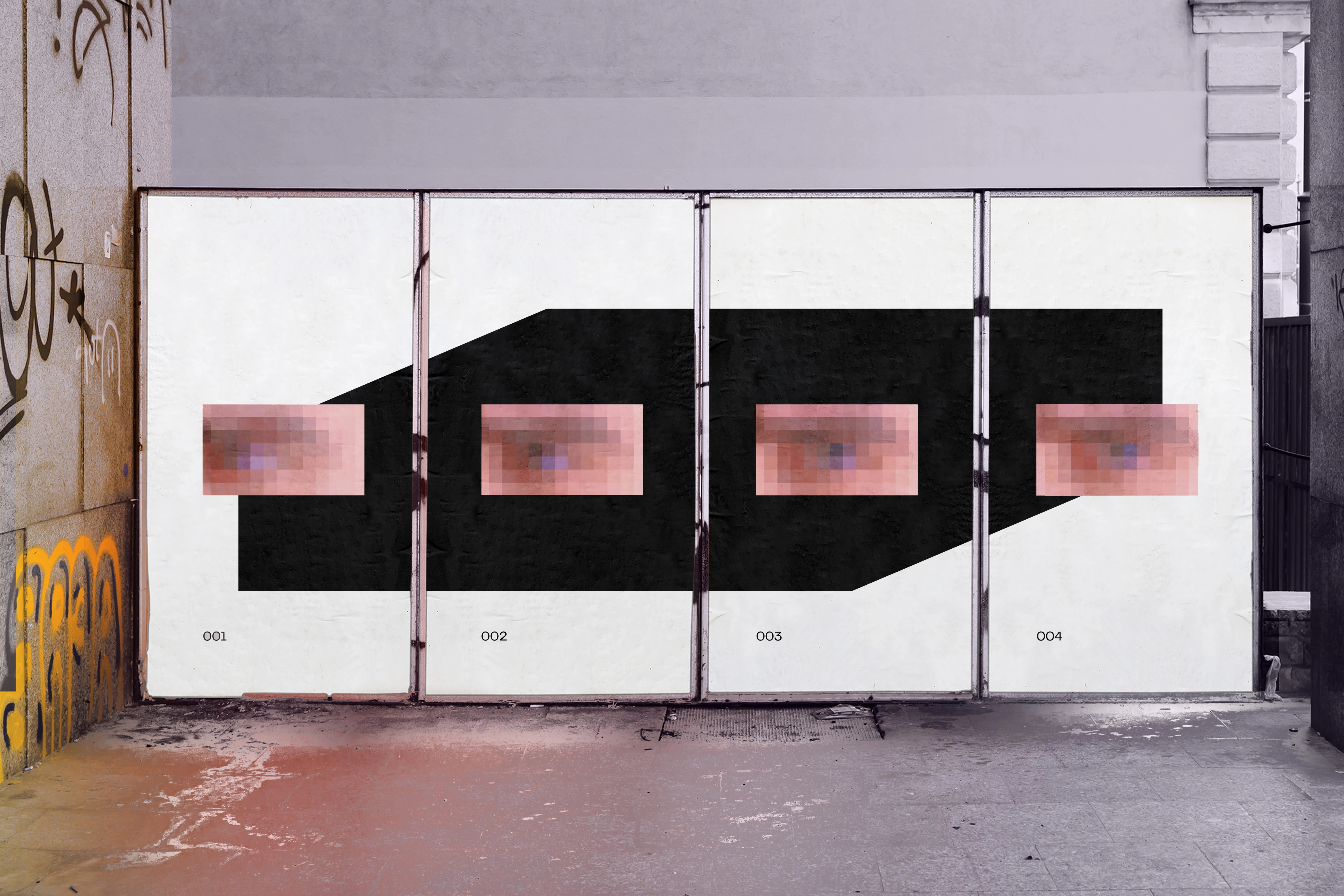
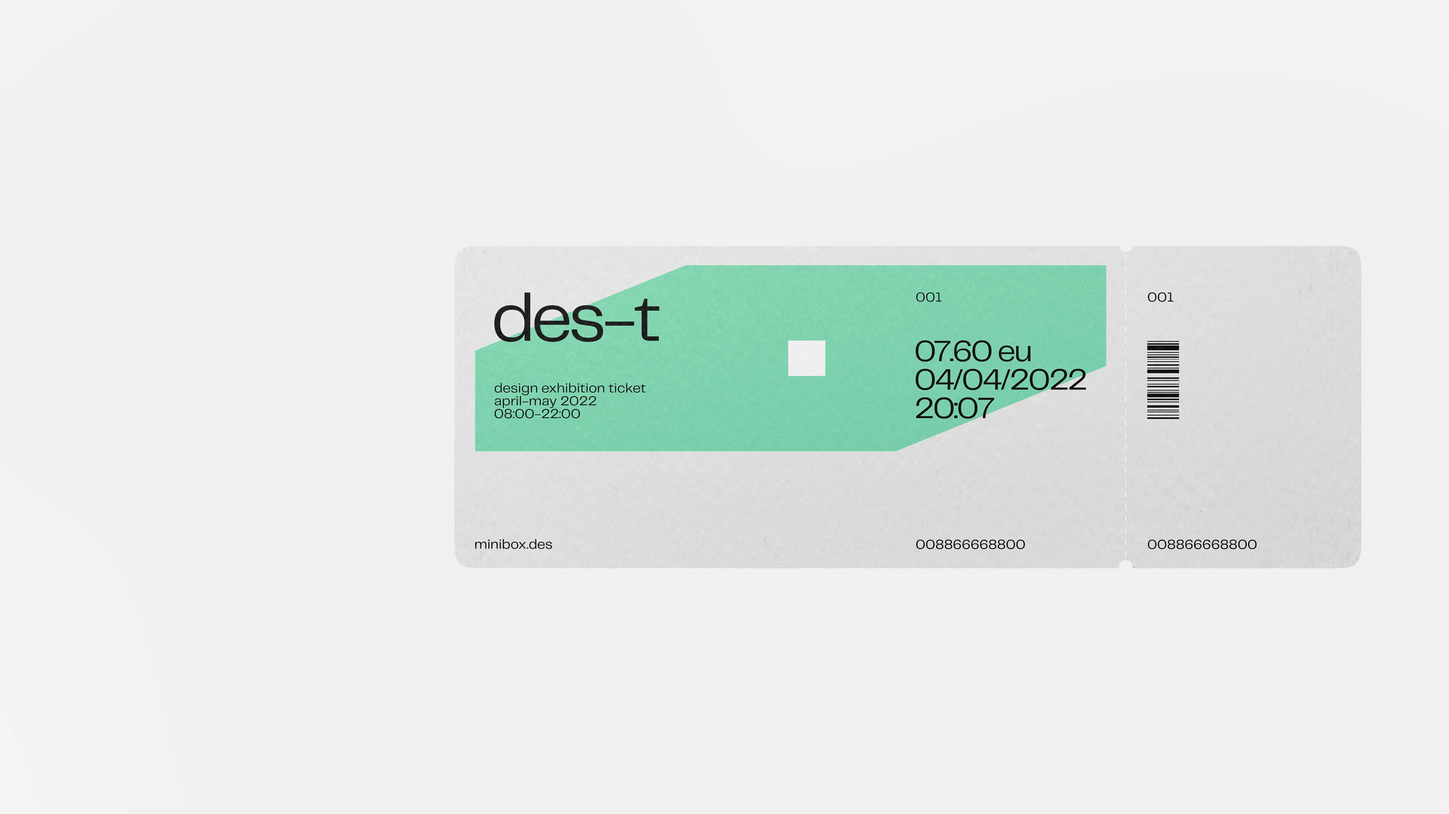
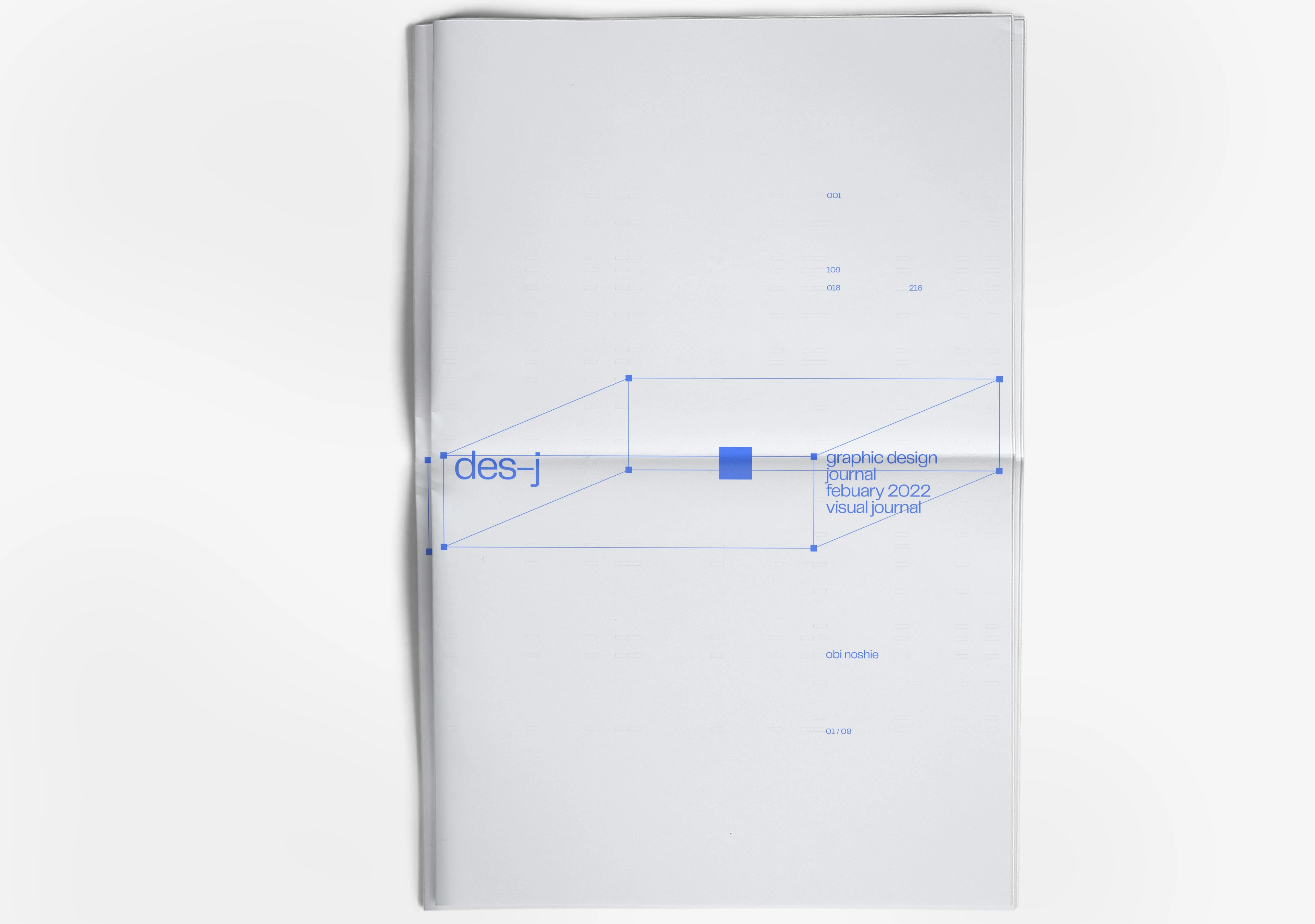
minibox design's logo features a square that represents pixels in different colors and forms or can be interpreted as an eye.
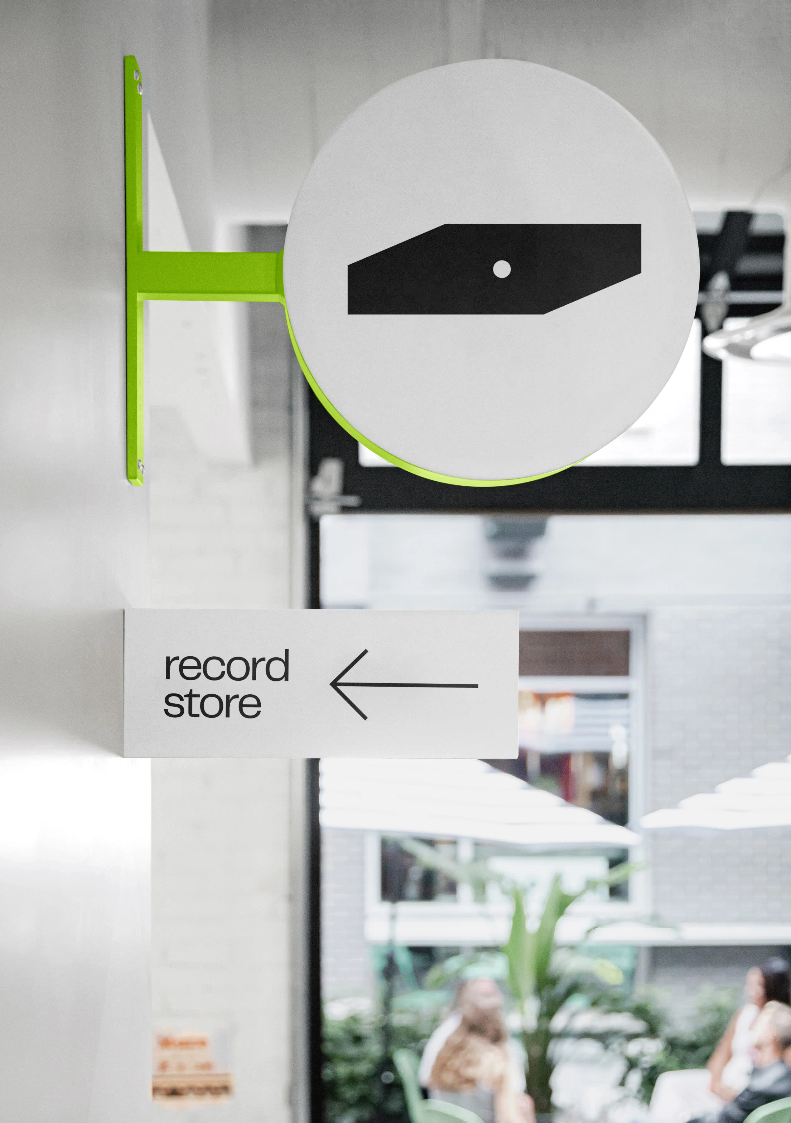
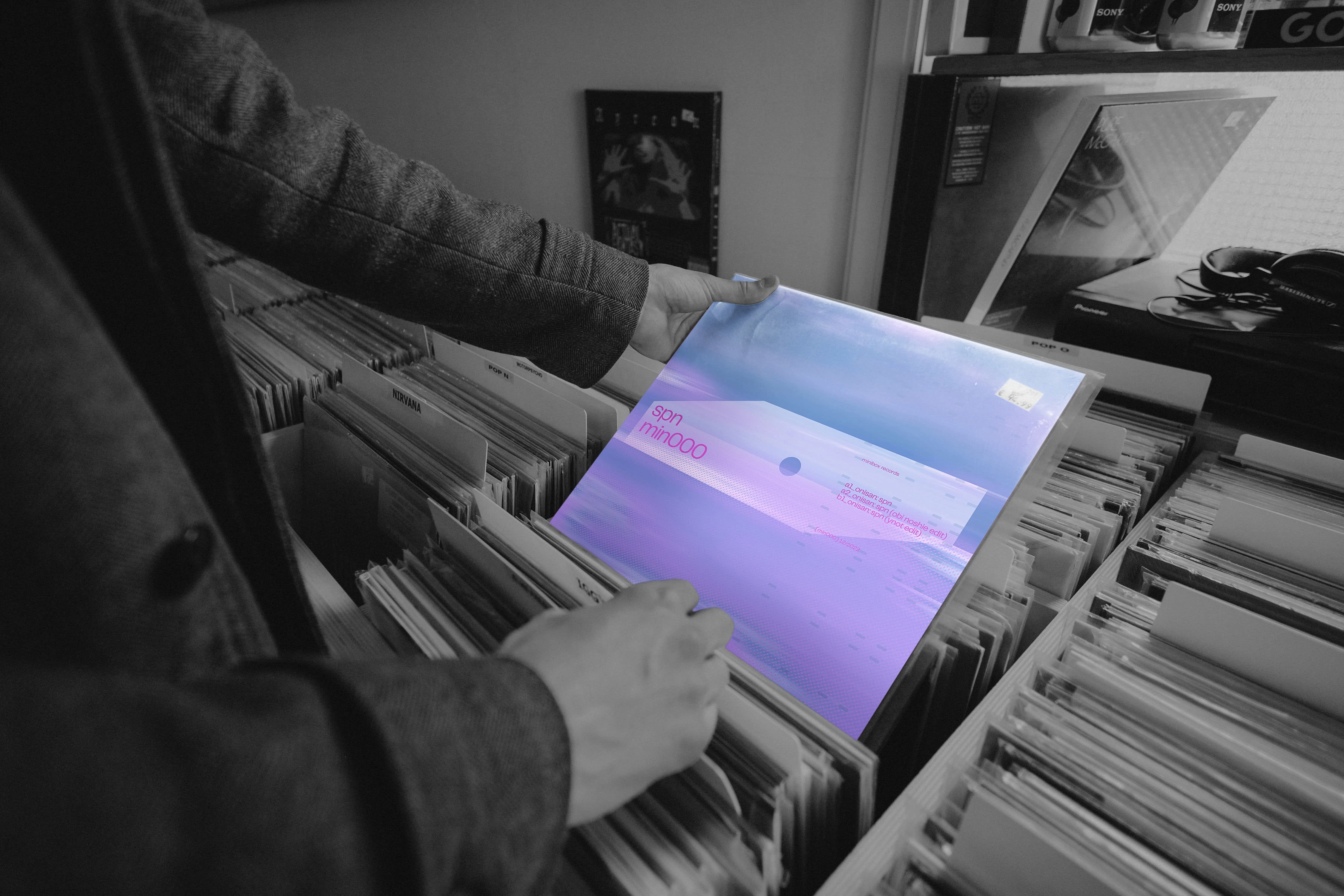
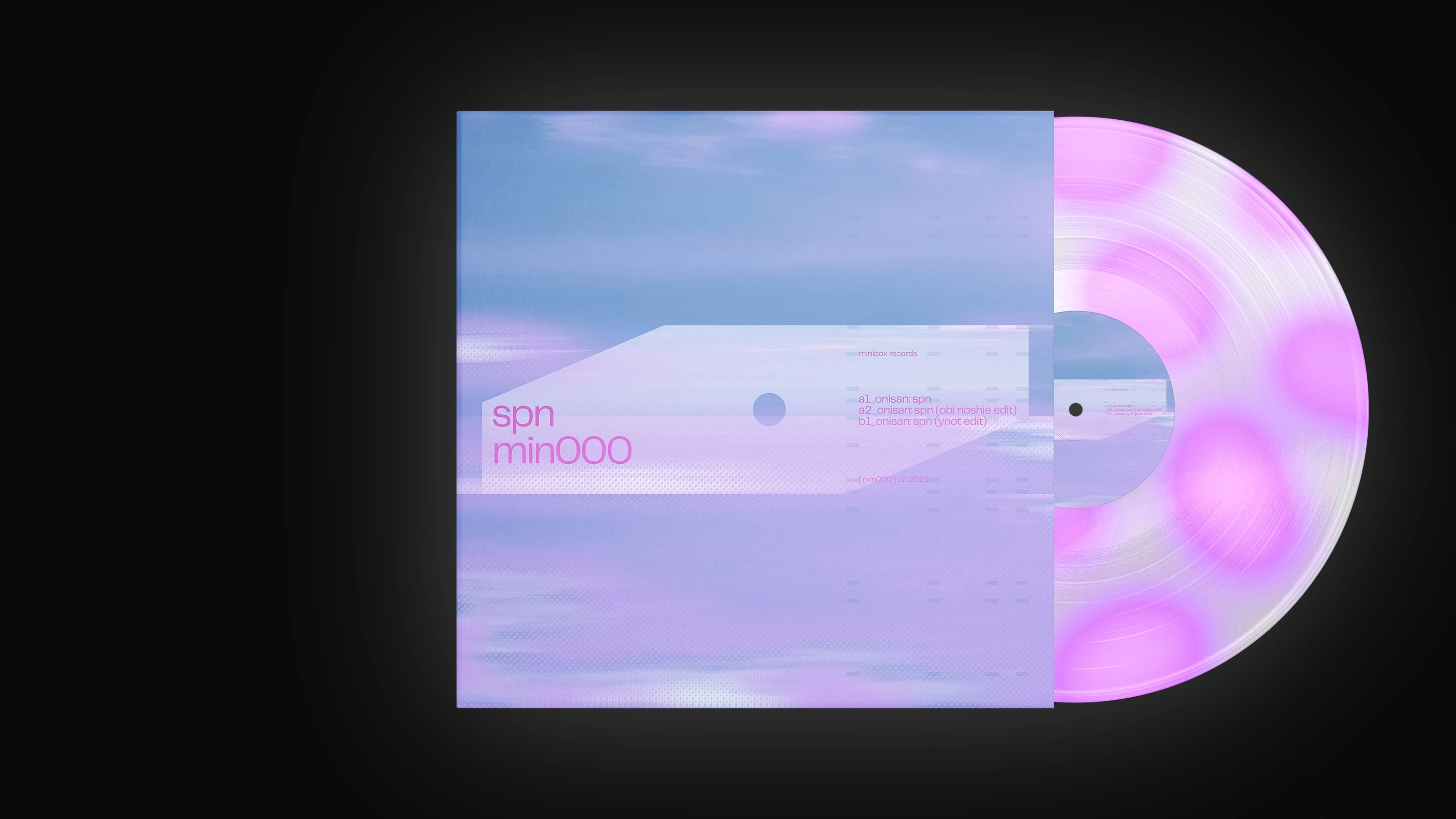
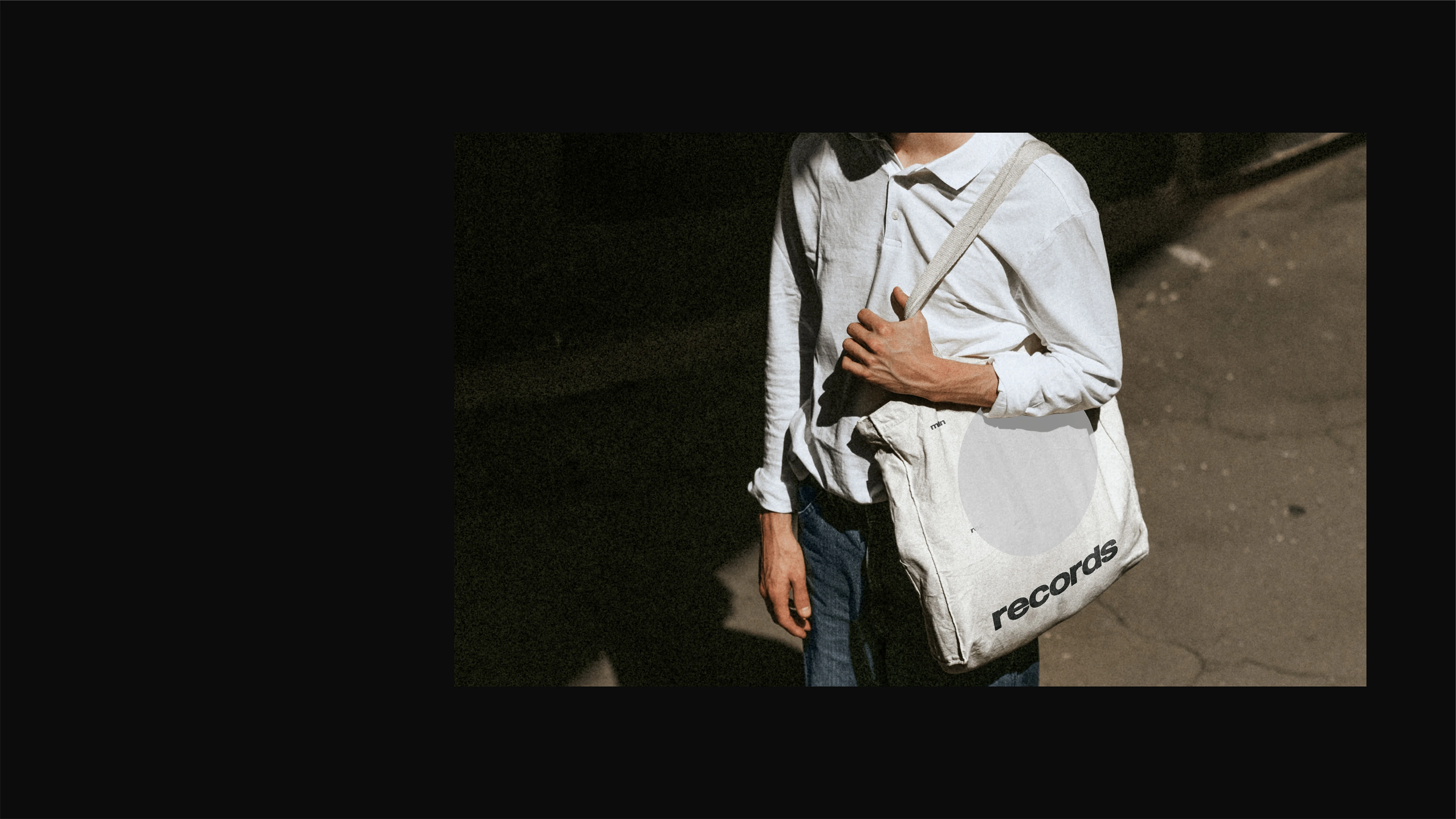
As for minibox records, the dot variation represents the spindle hole found in a record.
Like this project
Posted Aug 19, 2023
Innovative collective uniting music, visual arts, and design. Elevate your brand's identity with this versatile and impactful approach.
