rr station - Visual Identity
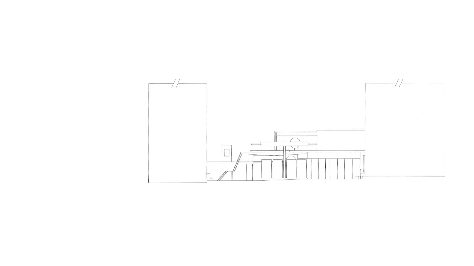
rr station is a gas station originally operated by Mobil during the 1950s located in the heart of Beirut. It became independent and was named "Rolls-Royce Station" as a tribute to the luxurious British car maker, symbolizing its dedication to providing high-quality services. With the world moving towards sustainable energies and new technologies, the business believed it was necessary to update its visual identity to something more modern yet timeless, to complement its retro architecture.
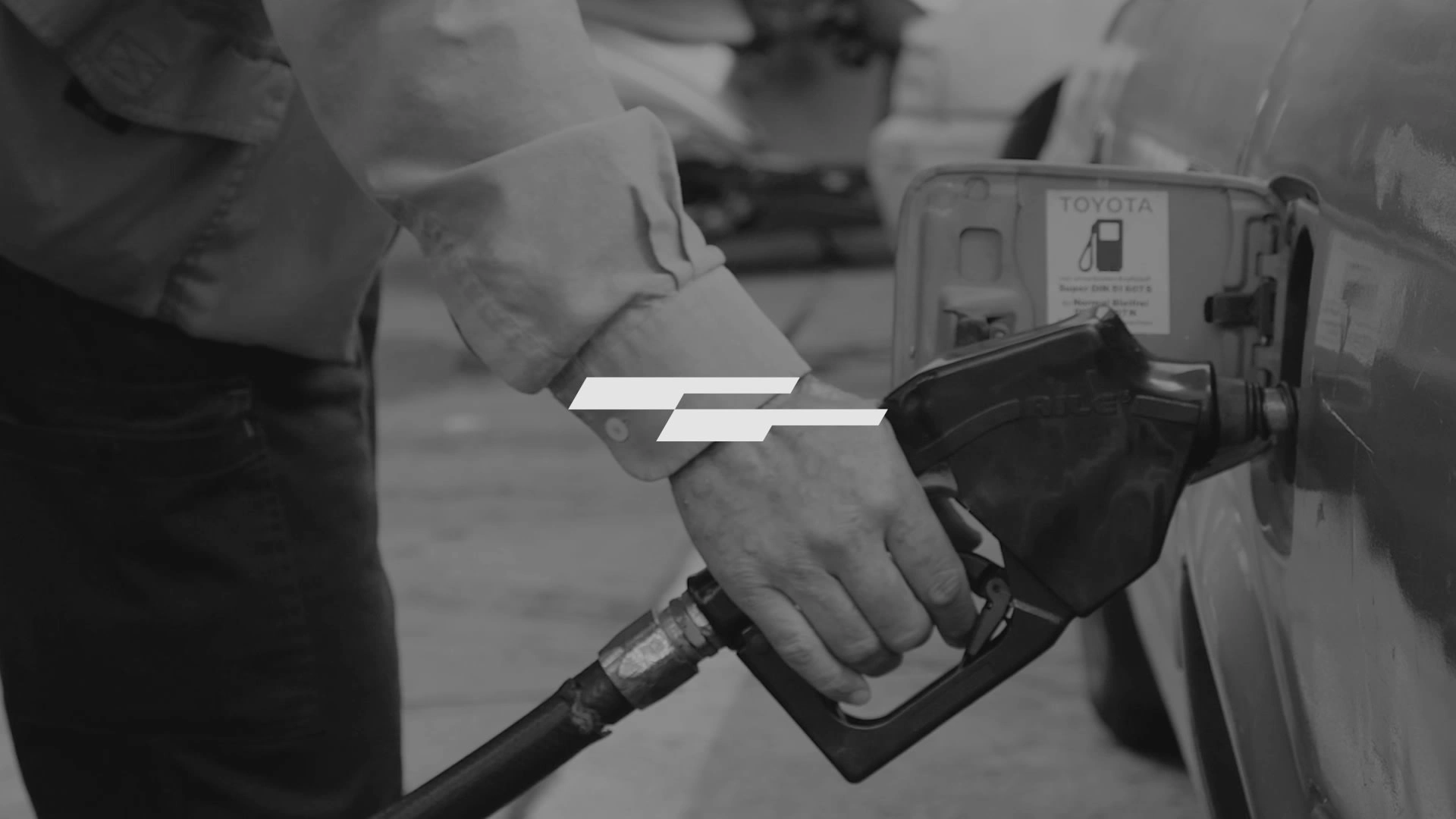
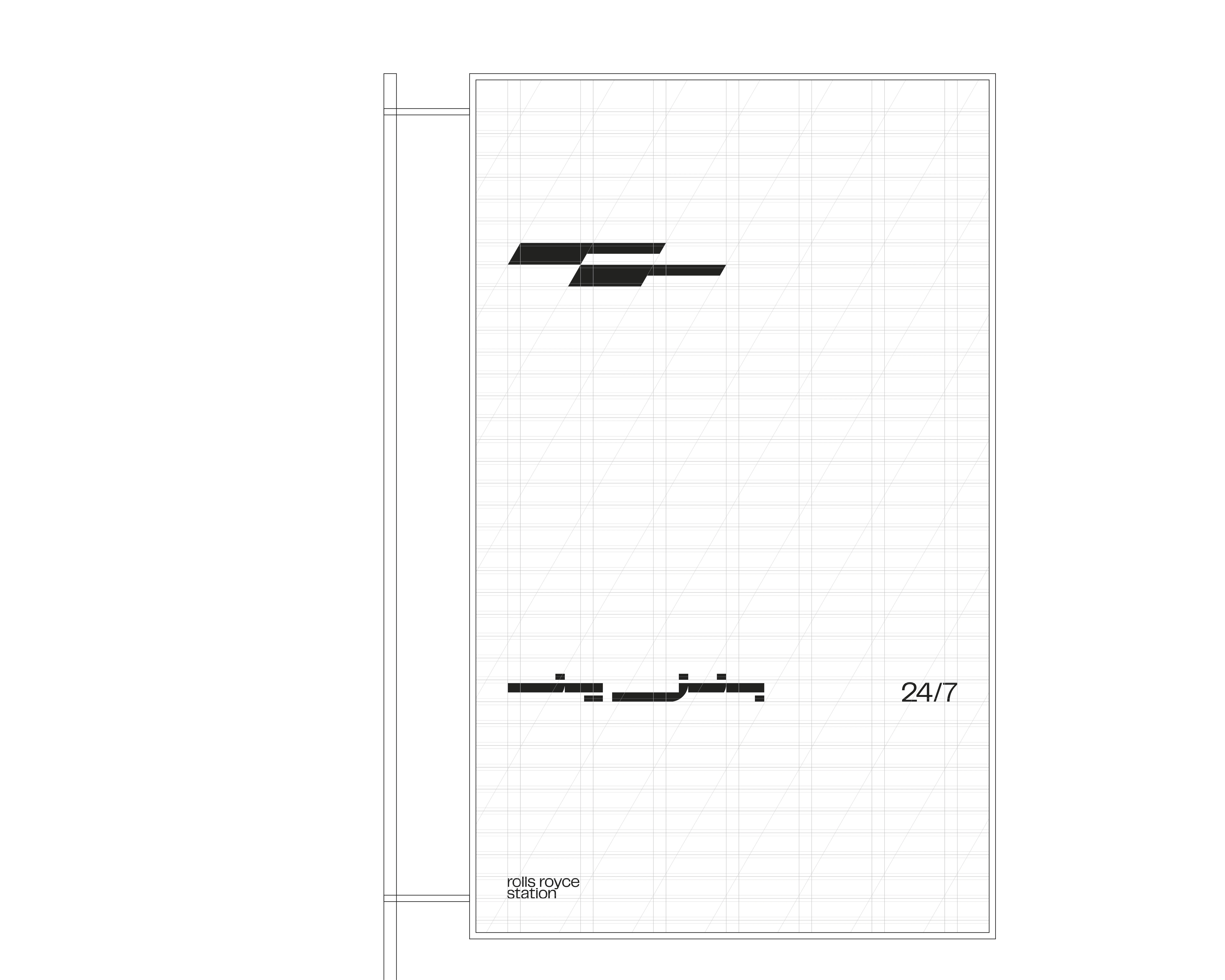
The logo features the letters "rr" in a minimalistic and sharp-edged design that complements the circular canopy of the station. Its forward lean symbolizes progress and dynamism.
minimal, industrial and modern typography, modified to look more compact.
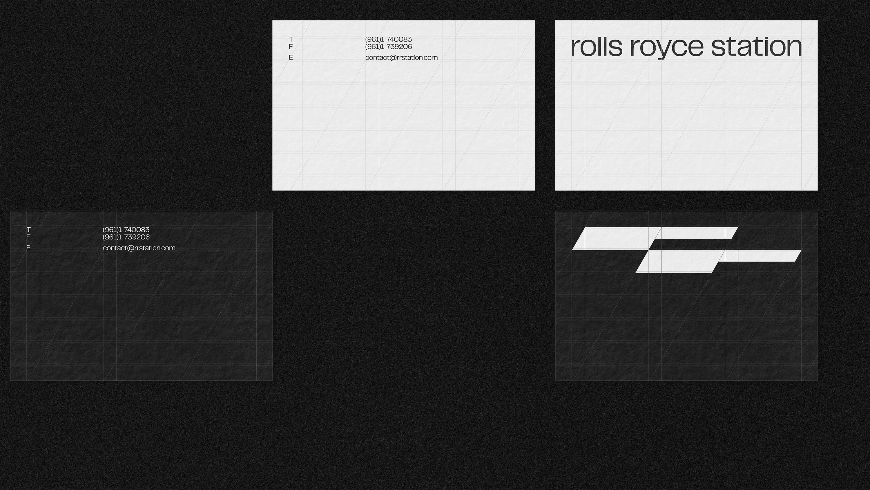
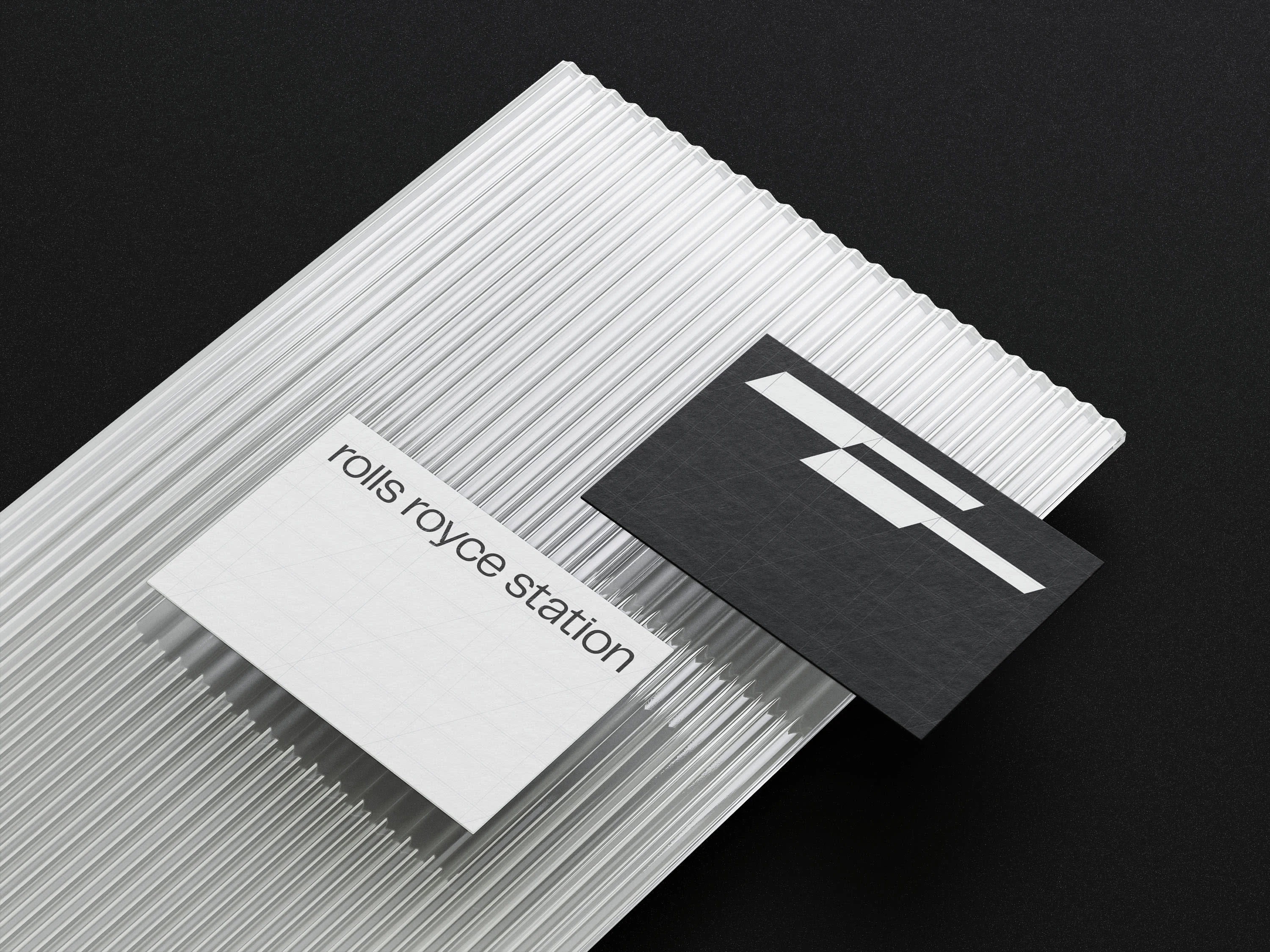
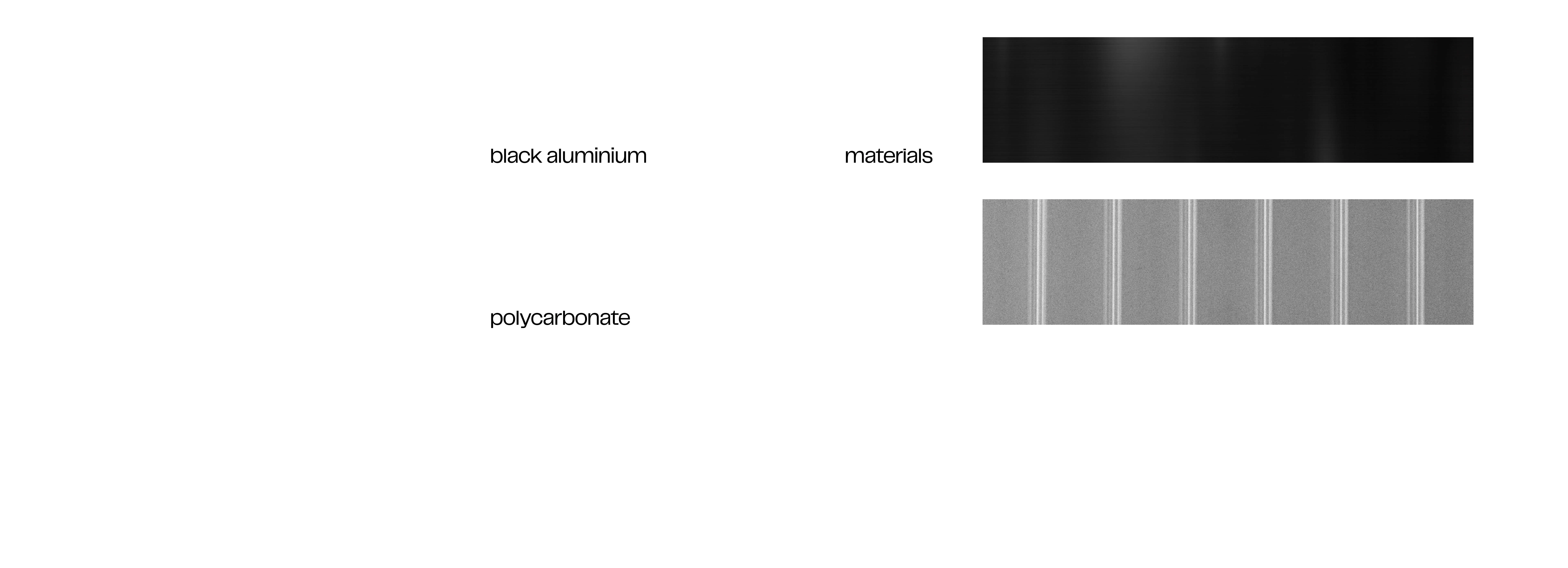
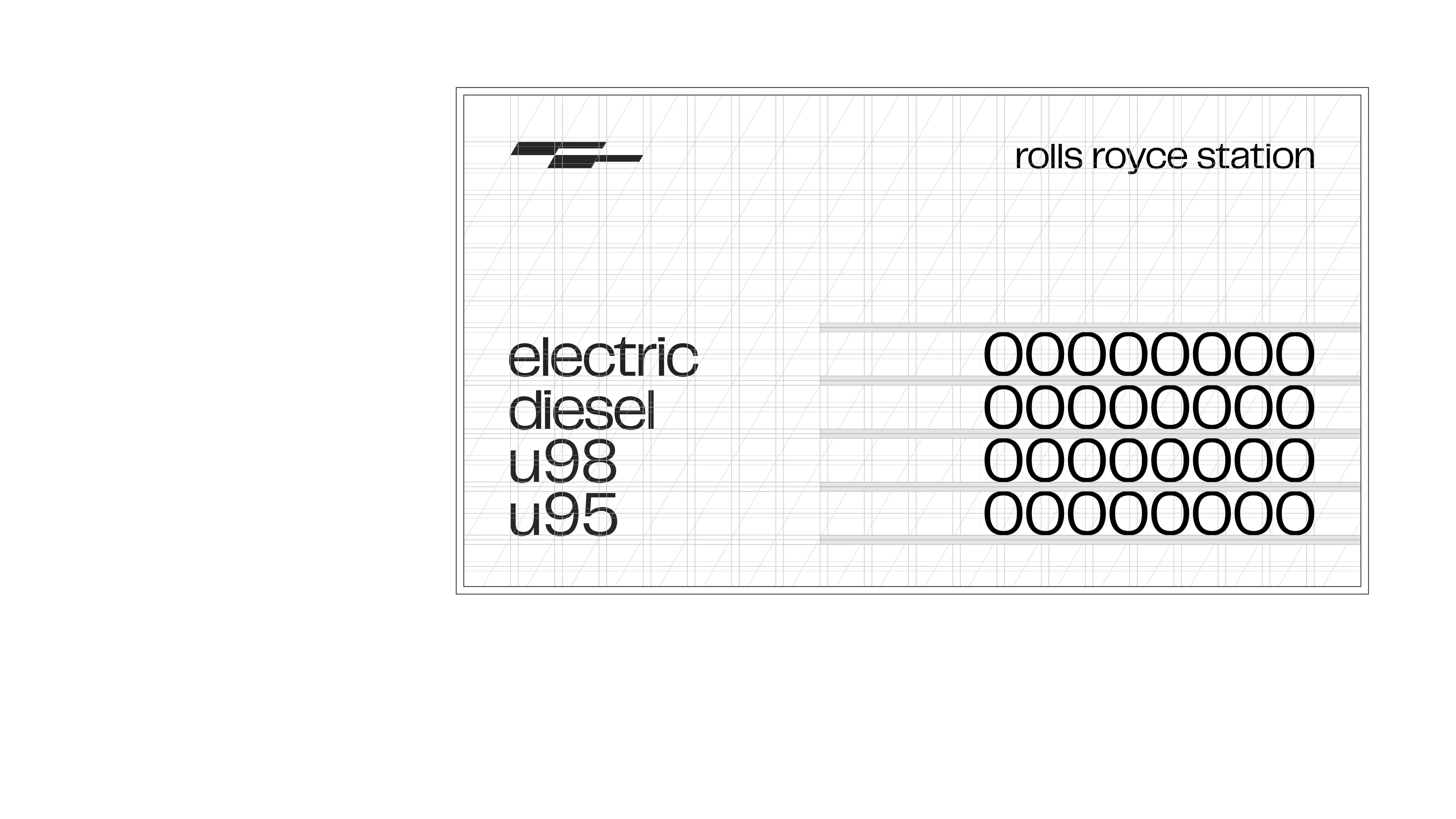
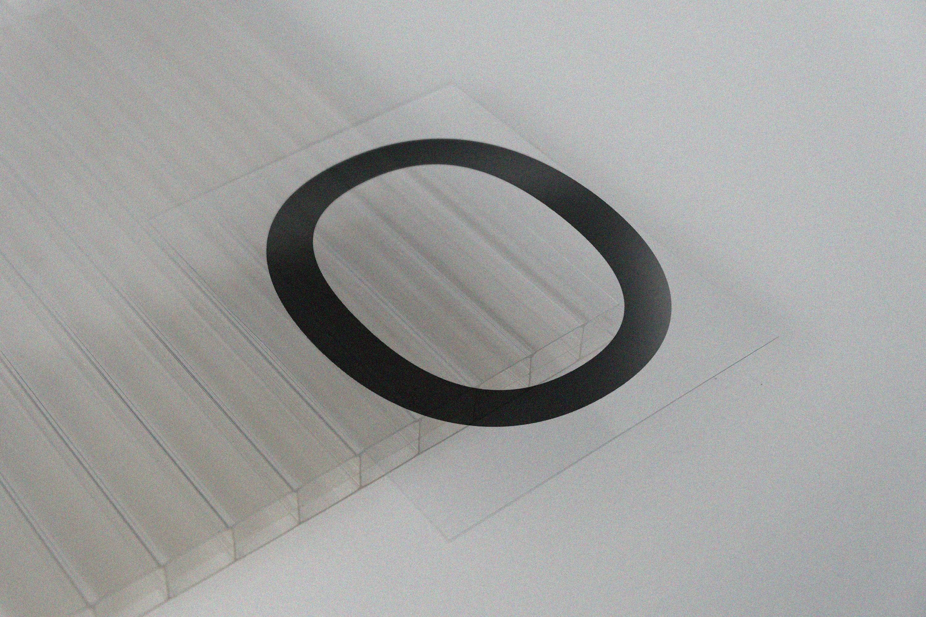
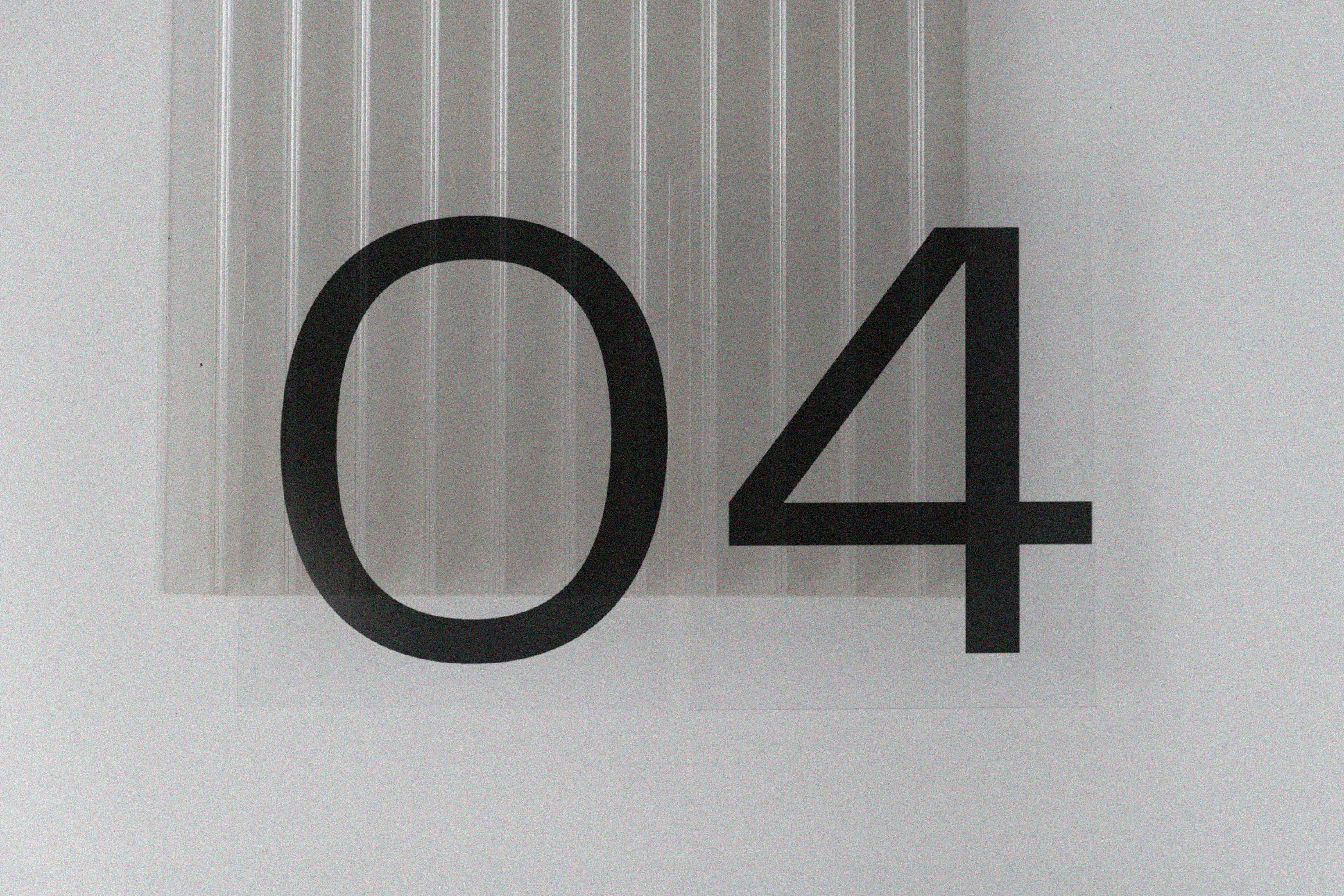
The grid design, inspired by the ribs found in polycarbonate, harmonizes with the employed materials to create a refined and understated appearance.
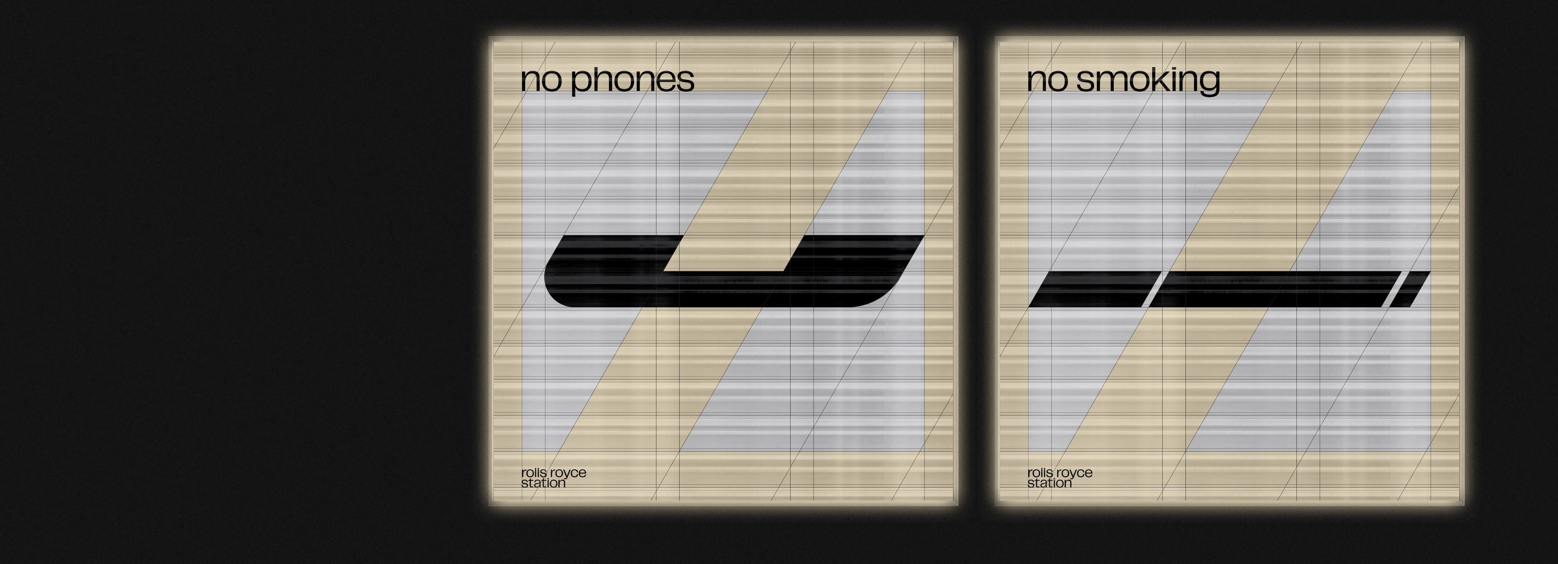
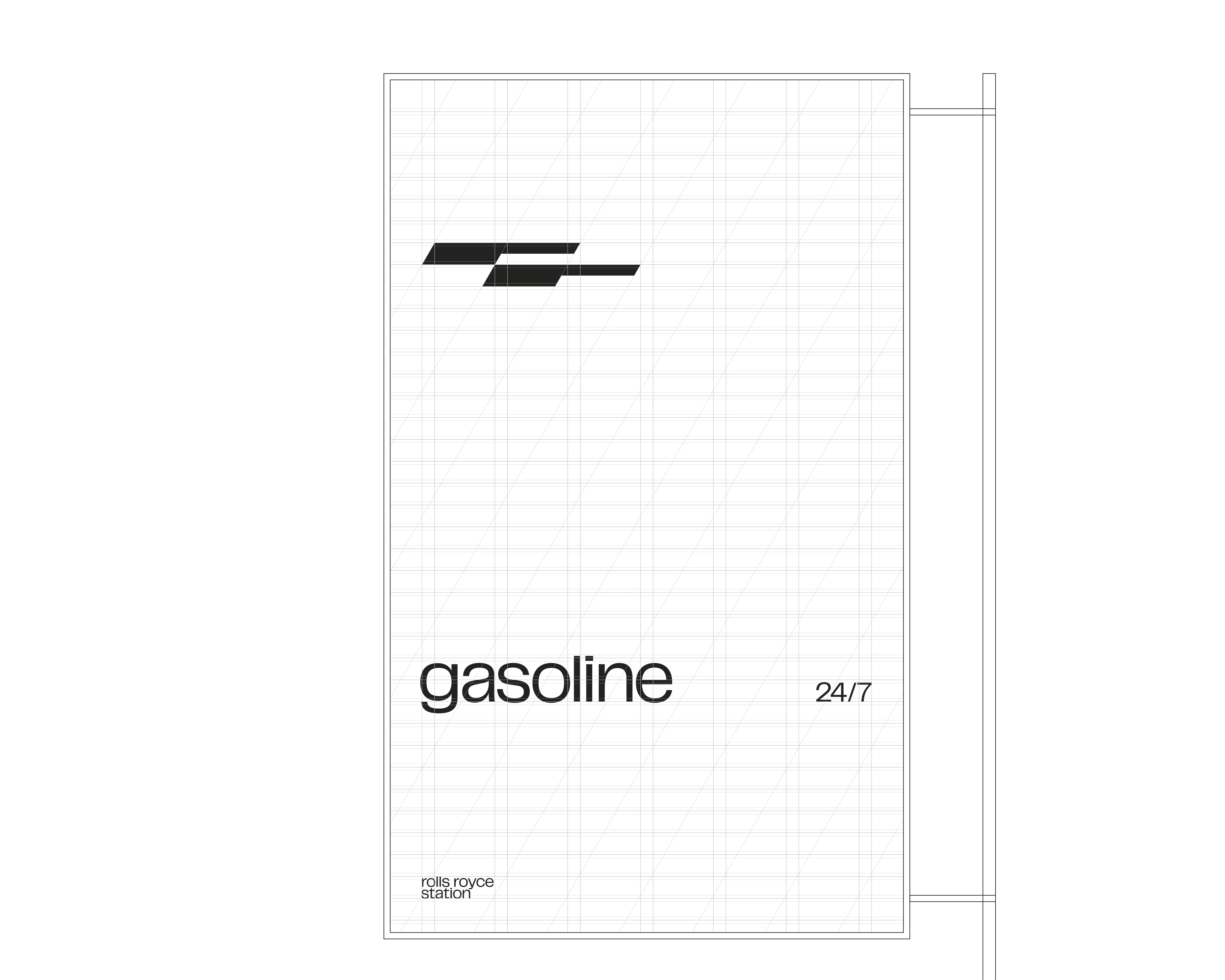
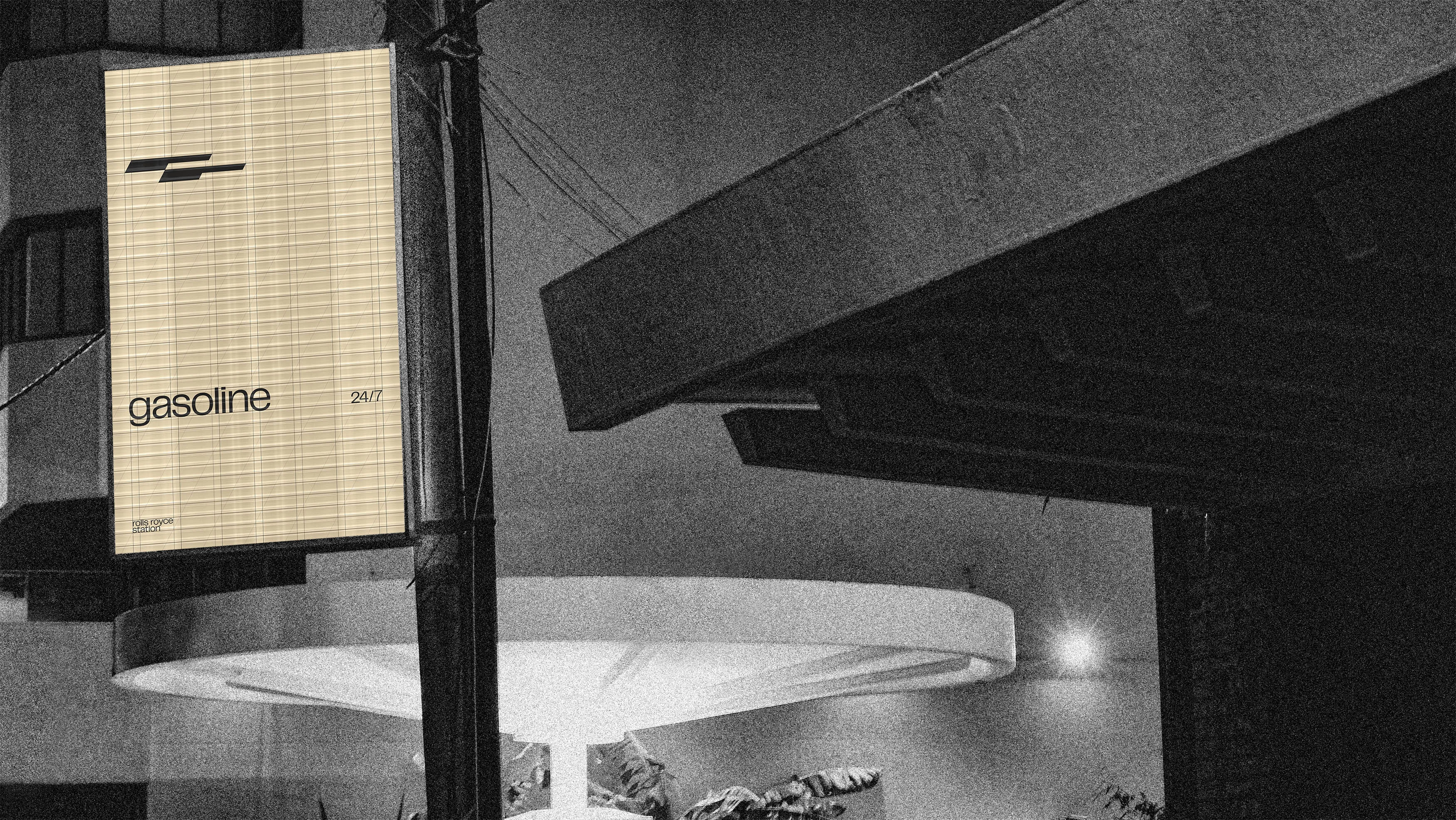
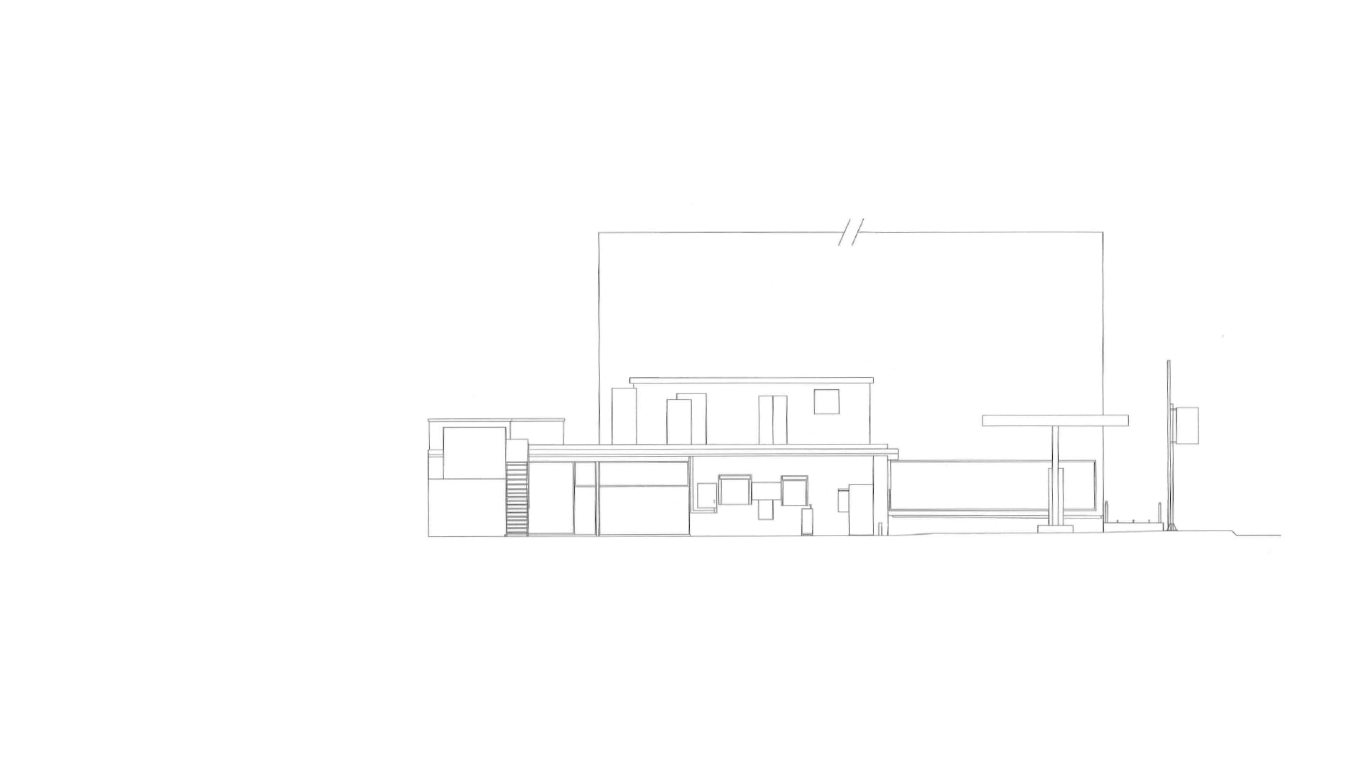
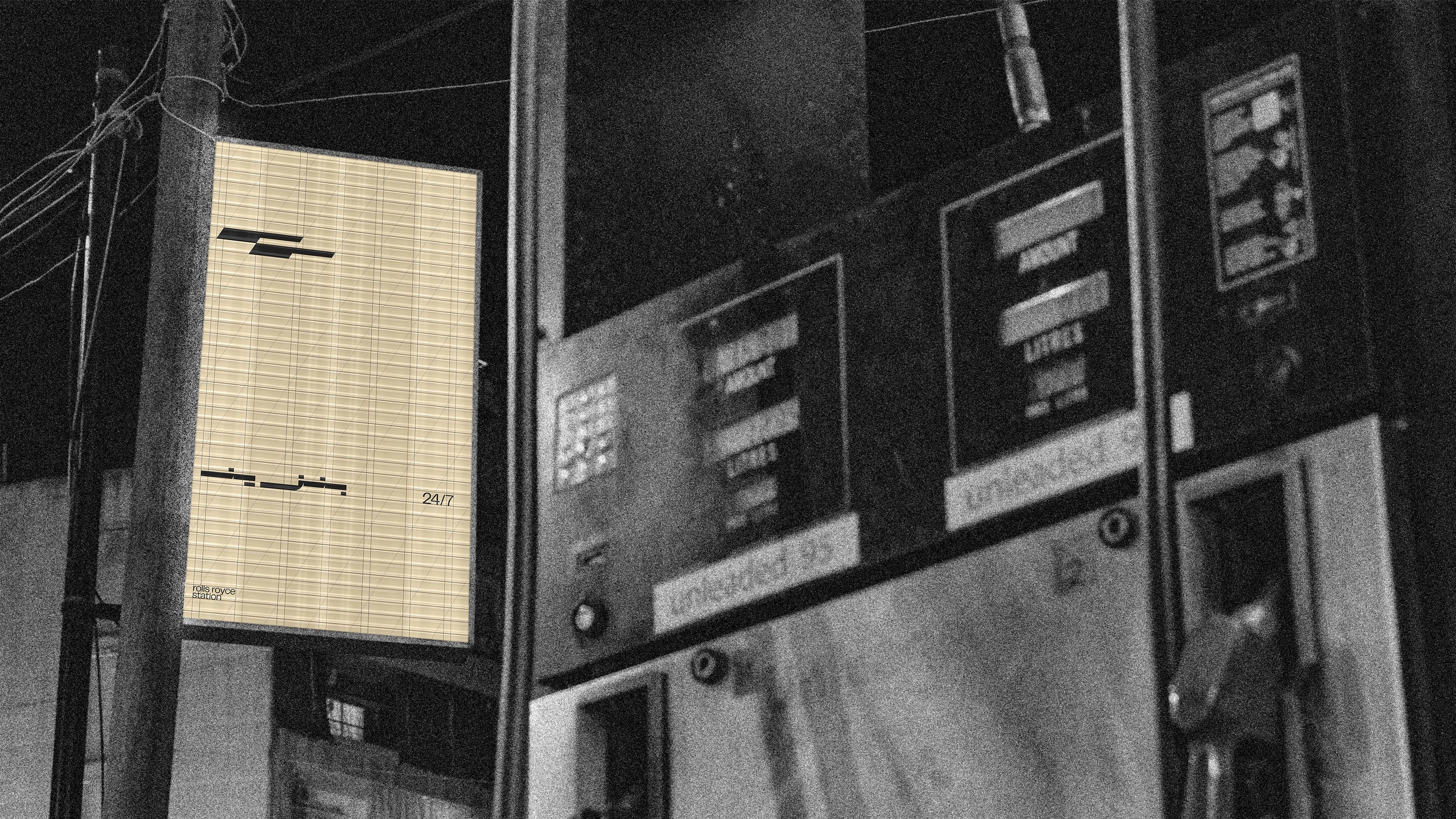
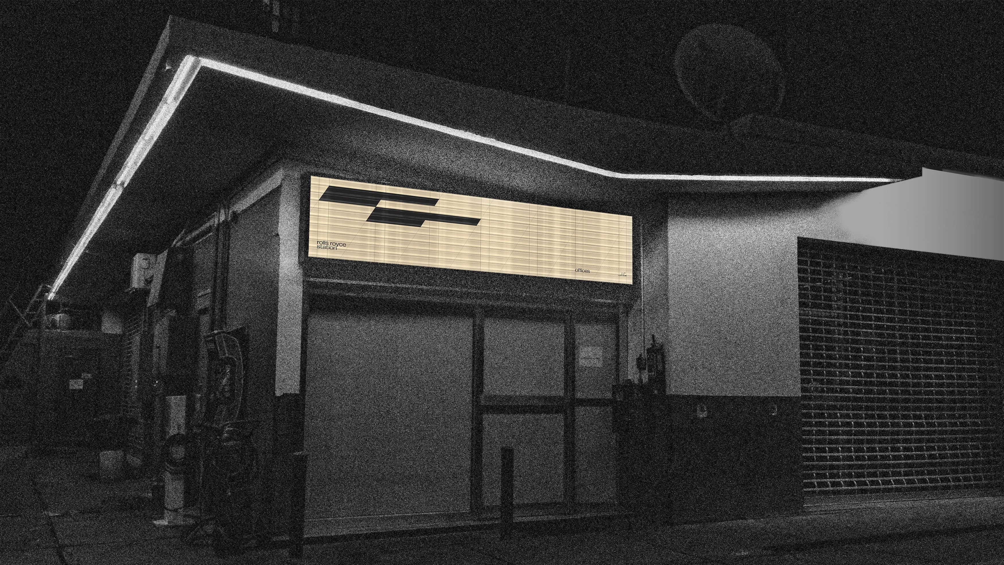
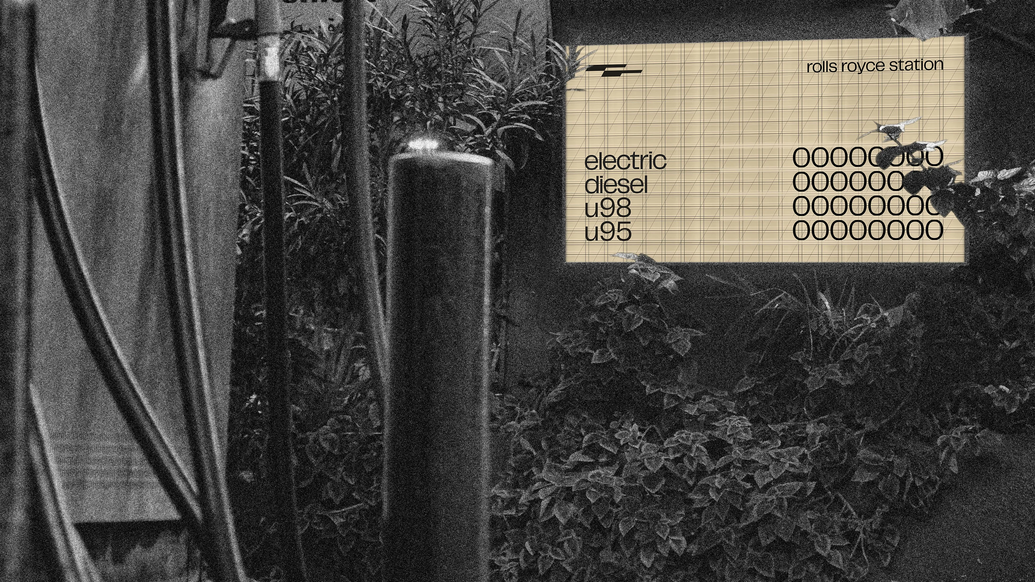
The price board has a retro style that draws inspiration from cinemas of the 1950's, aiming to evoke a sense of nostalgia and vintage charm from the station's epoch.

Like this project
Posted Aug 19, 2023
Revamped a retro gas station in Beirut, modernized while preserving its vintage charm.

