PHEED Nutritional Capsules • Brand Design
Kirraley Hardiman
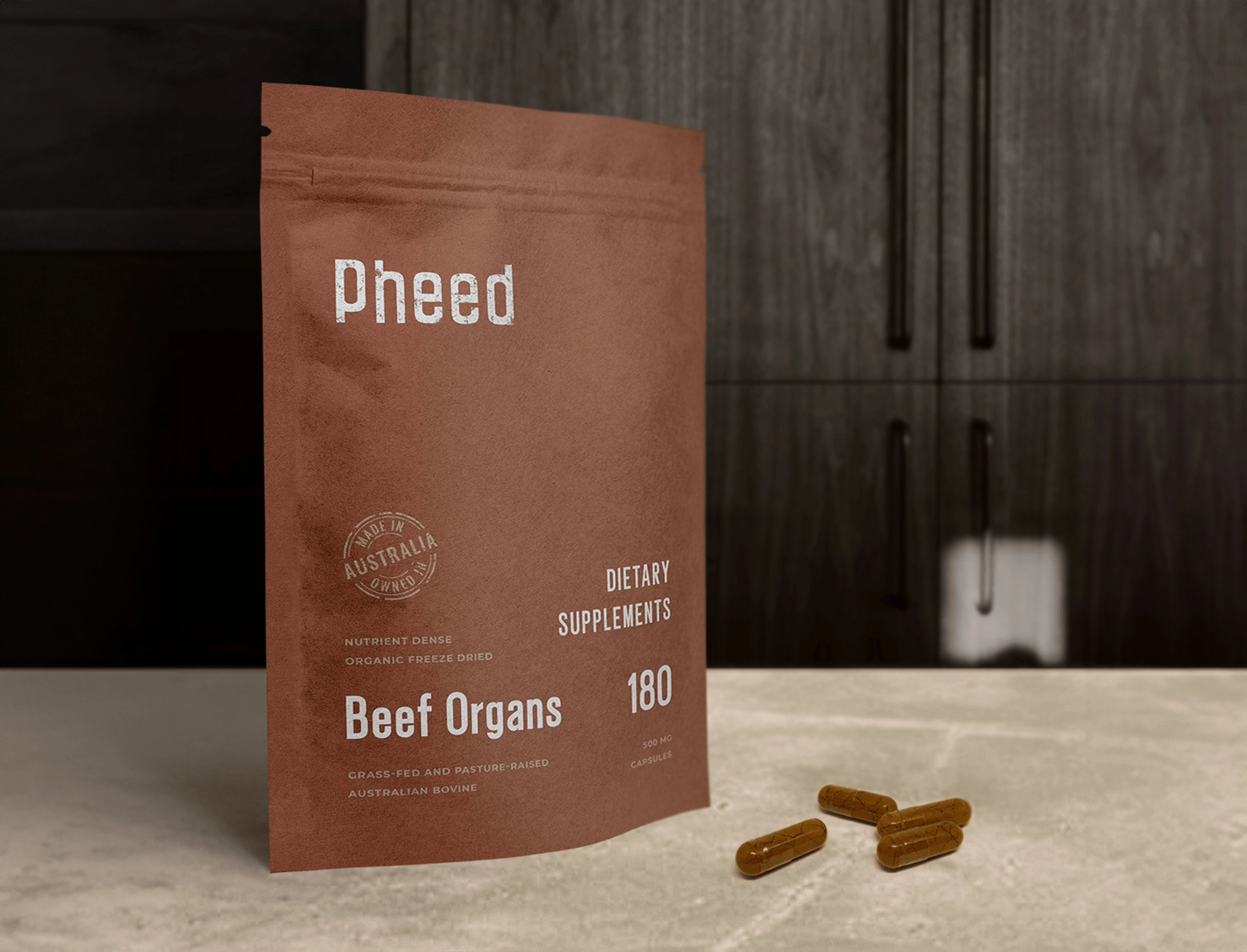
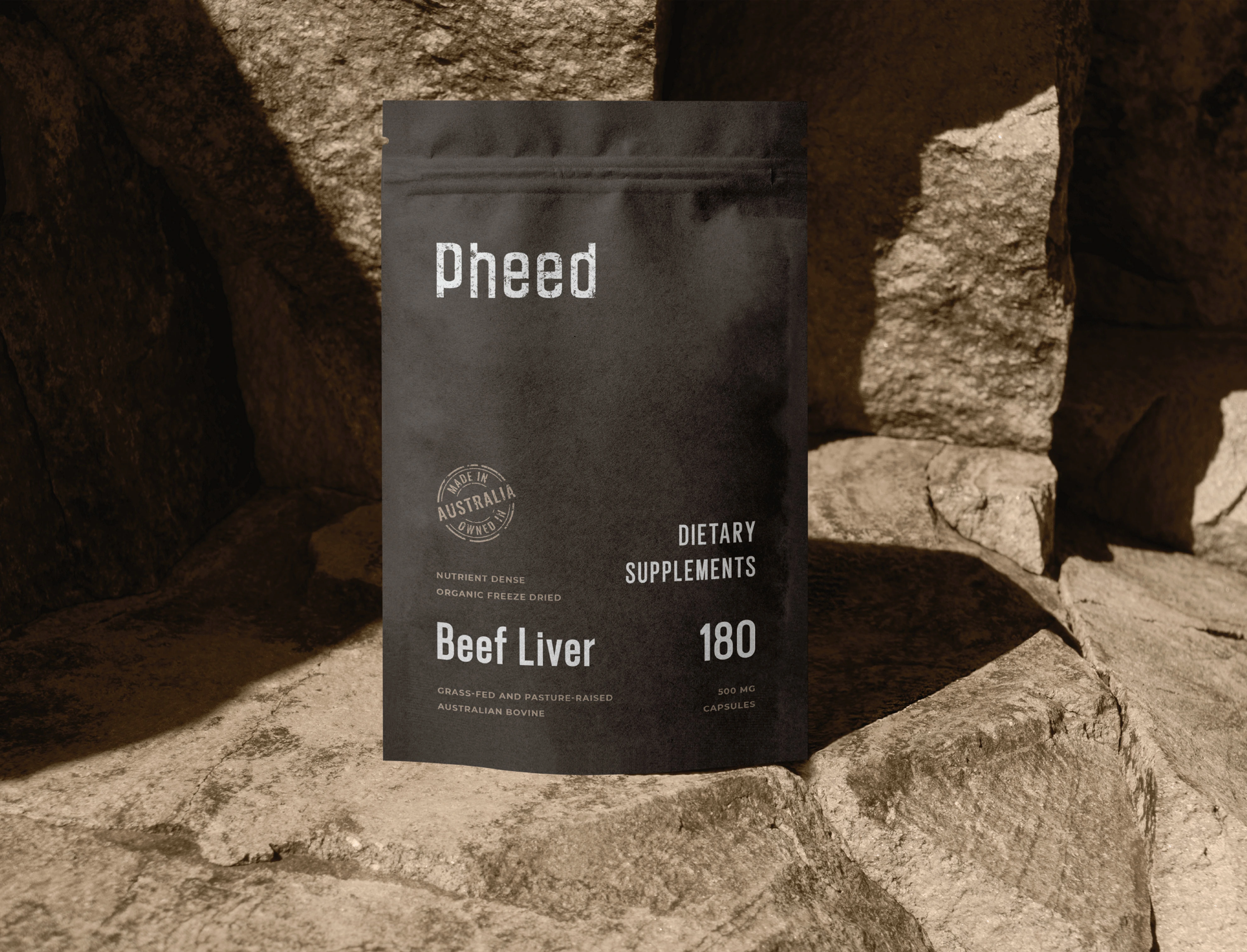
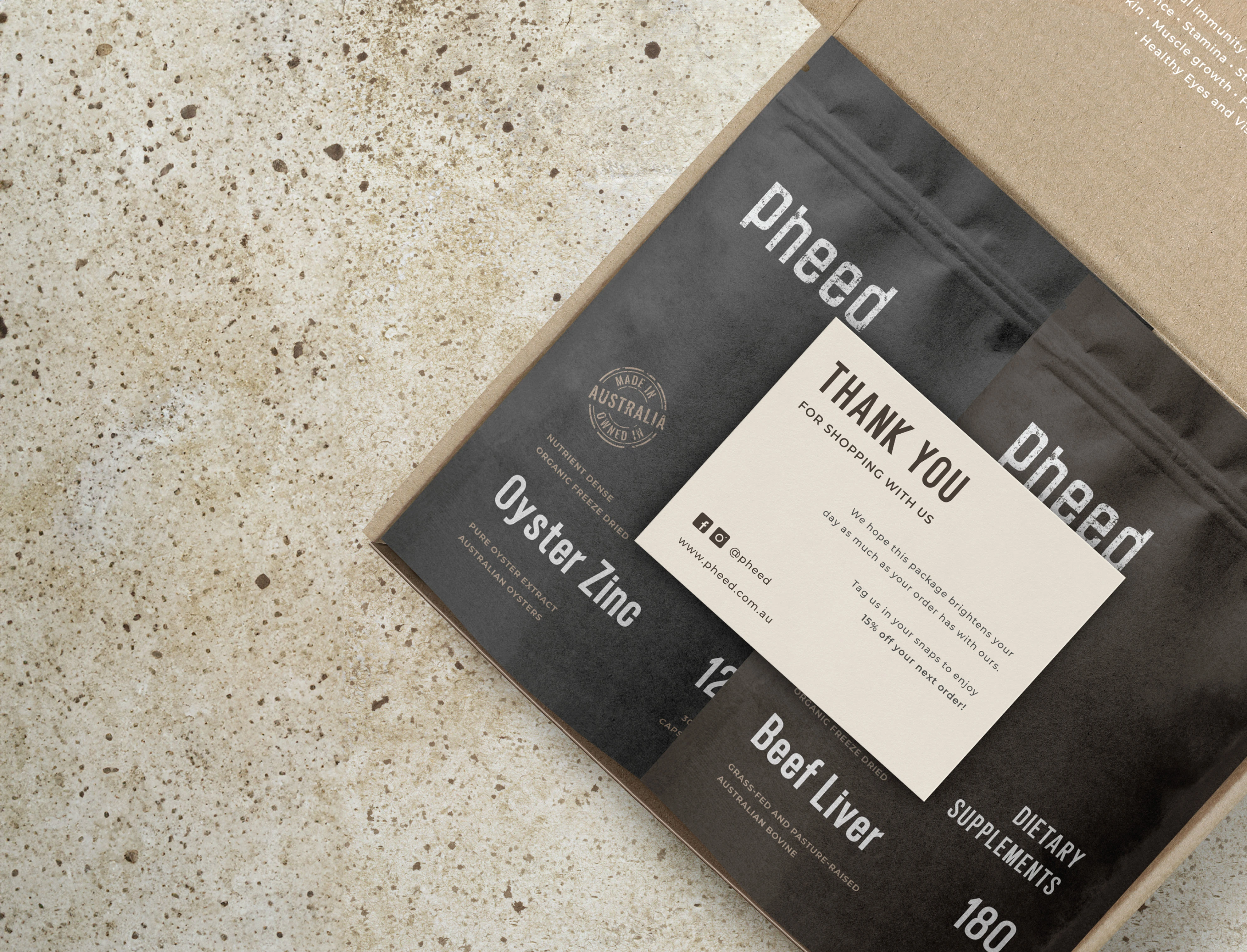
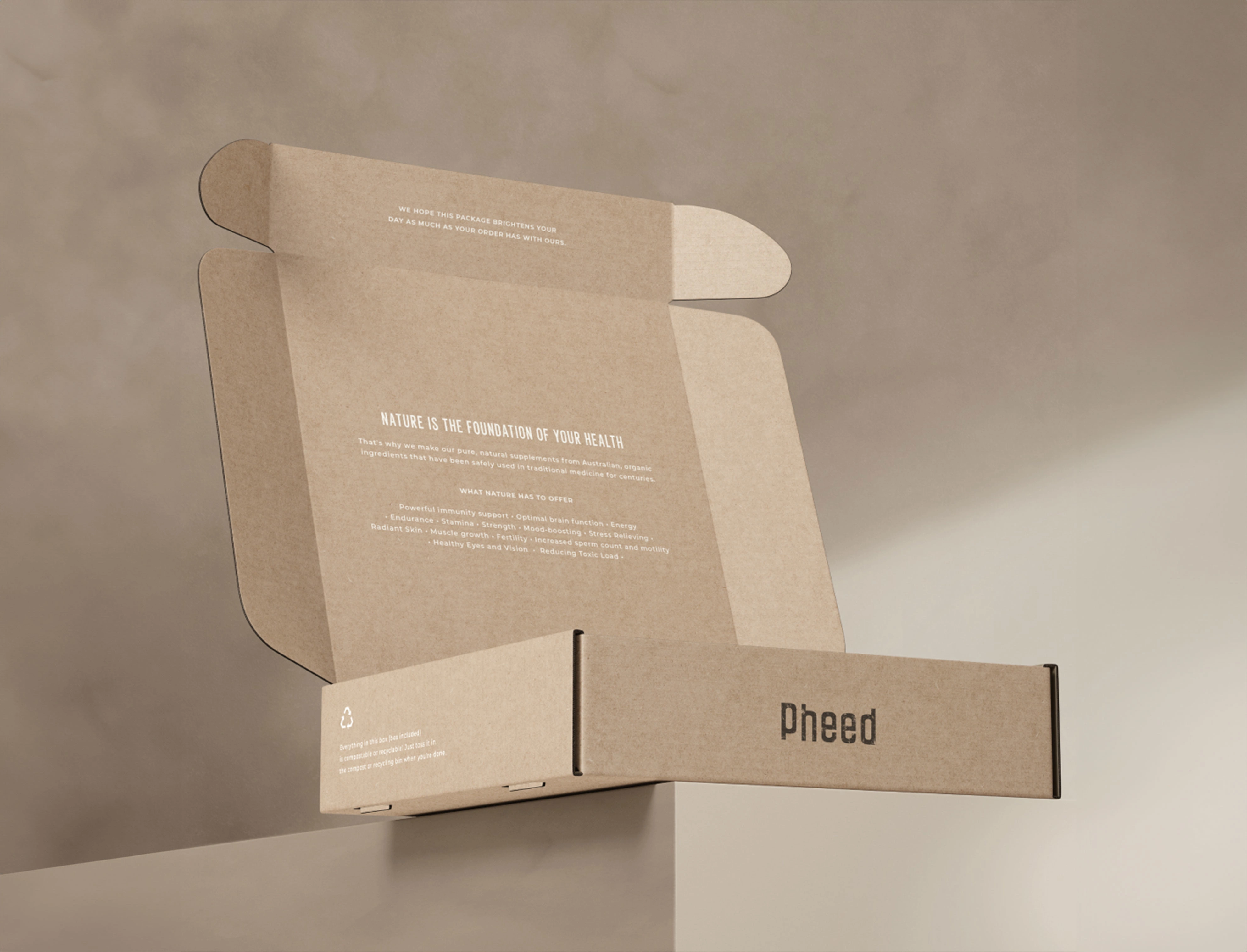
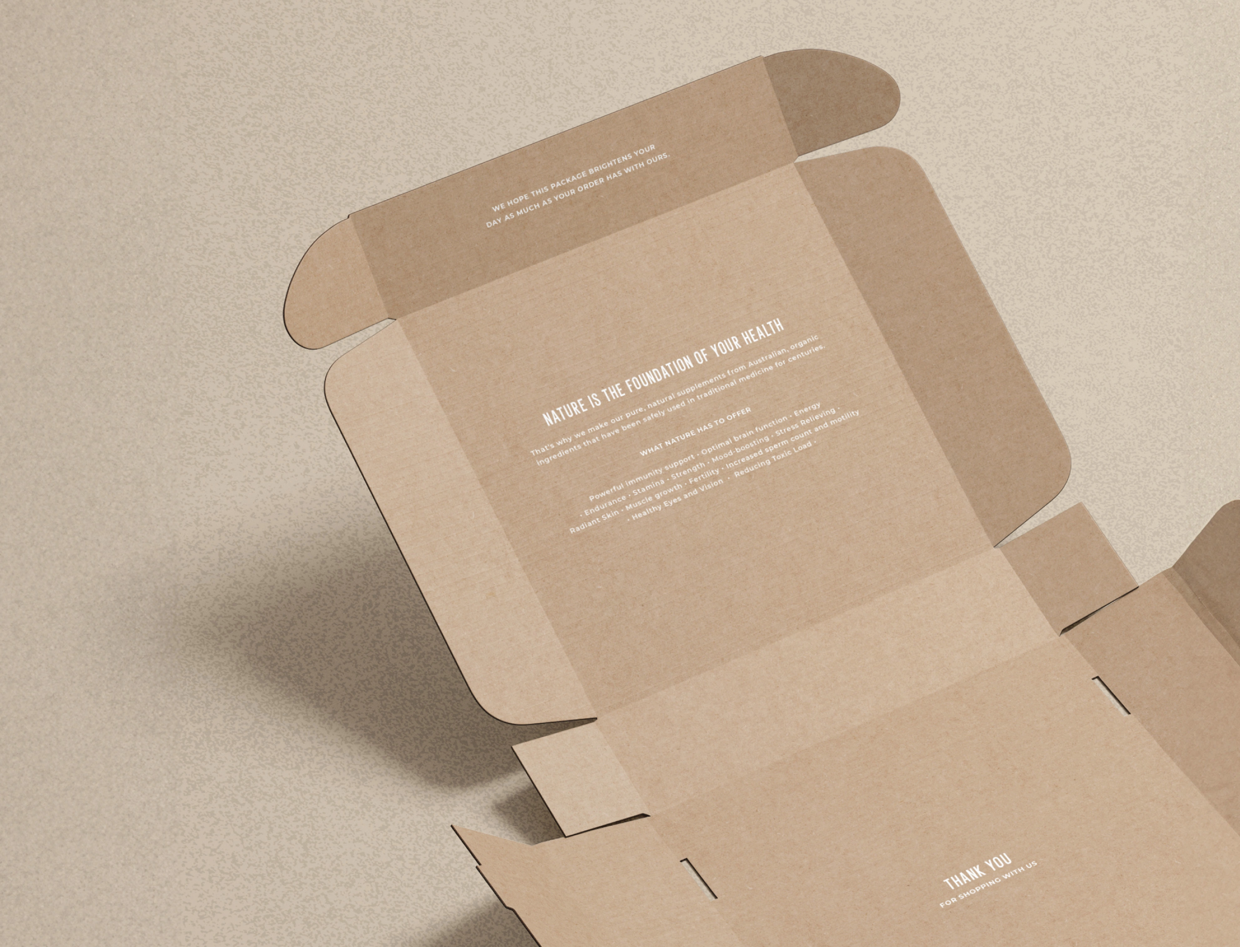
With a mindful approach, this brand thoughtfully selects and crafts a lineup of dietary supplements in capsule & powder form, sourced from natural origins. Their products, renowned for complete nose-to-tail nourishment, proudly bear the distinction of being both Australian made and owned. Brand name “PHEED” comes from “Feed,” emphasising its focus on nourishing the body. The substitution of “F” with “Ph” is because the founders’ last name begins with those letters.
Project Brief:
• Earthy
• Organic
• Humble
• Minimalistic
Deliverables:
• Logo
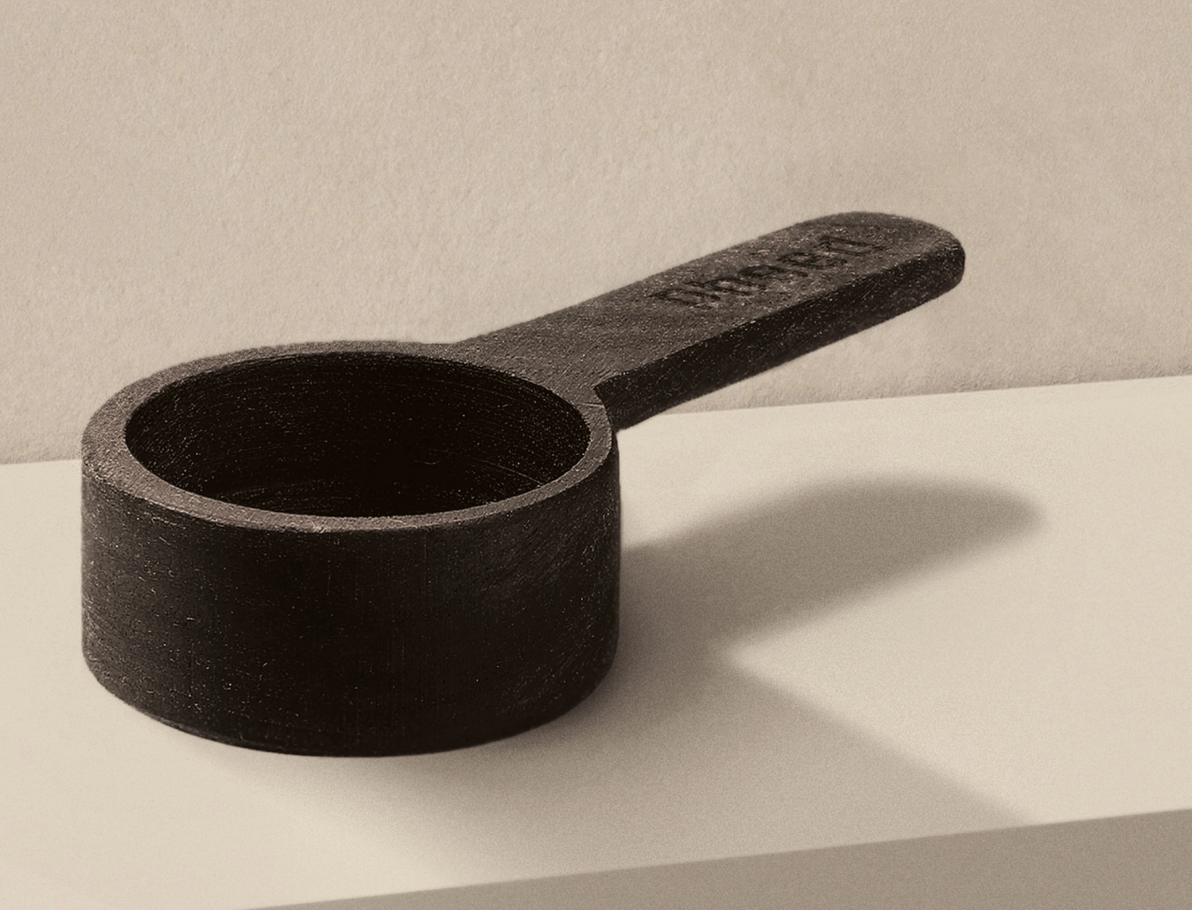
• Icon
• Typography Suite
• Colour Scheme
• Custom Brand Textures
• Packaging
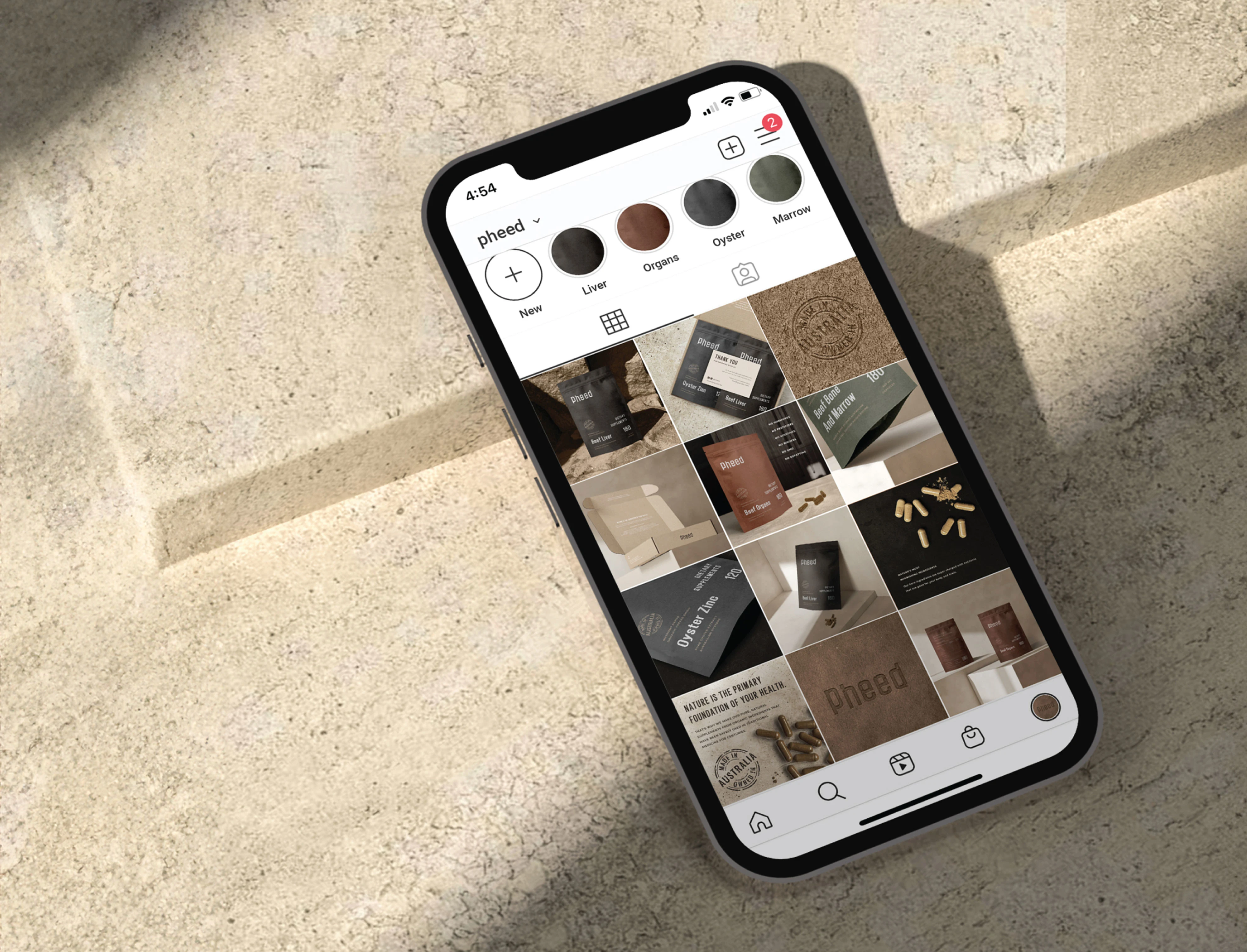
• Social Media Proposal
• Thank-You Cards
Design Notes:
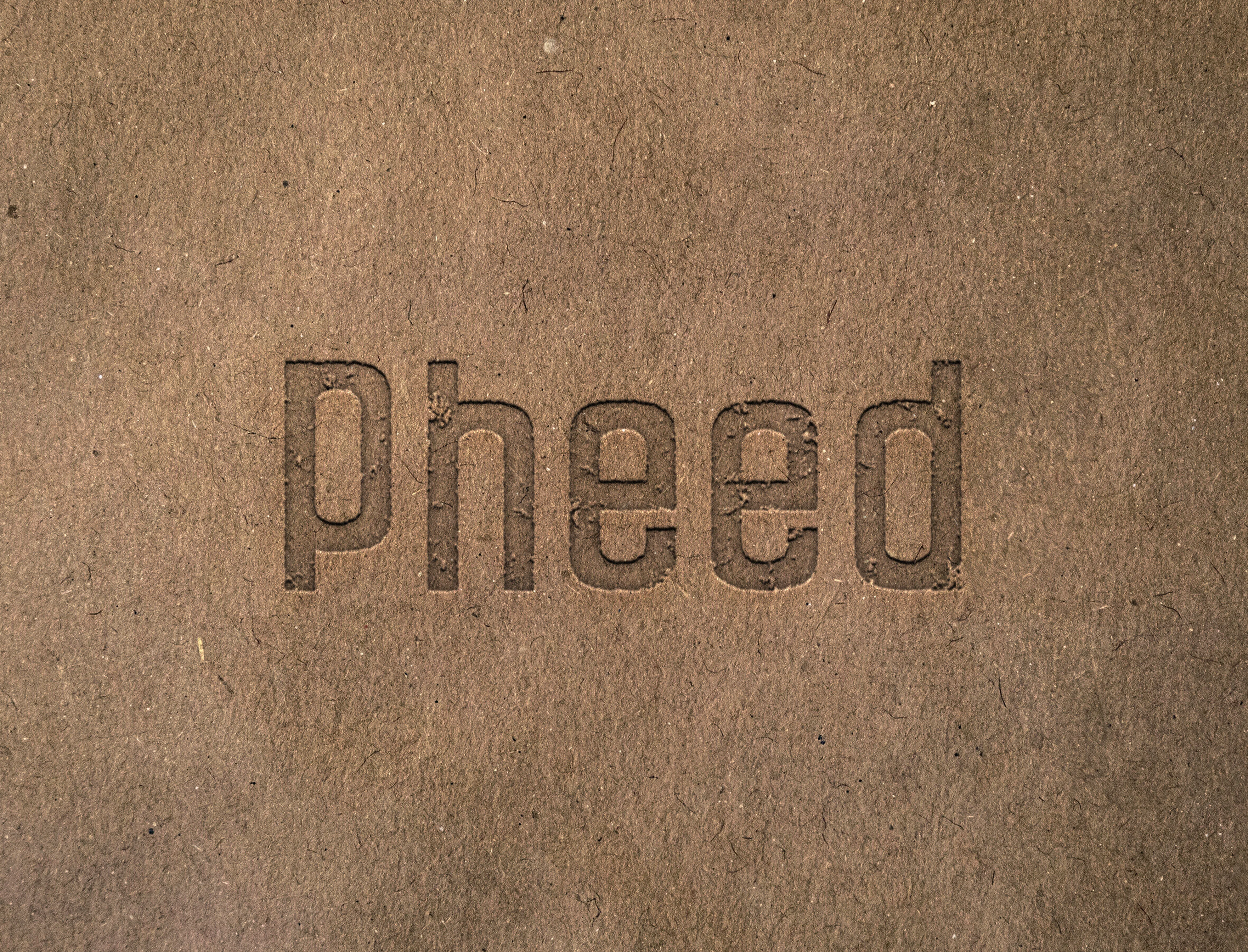
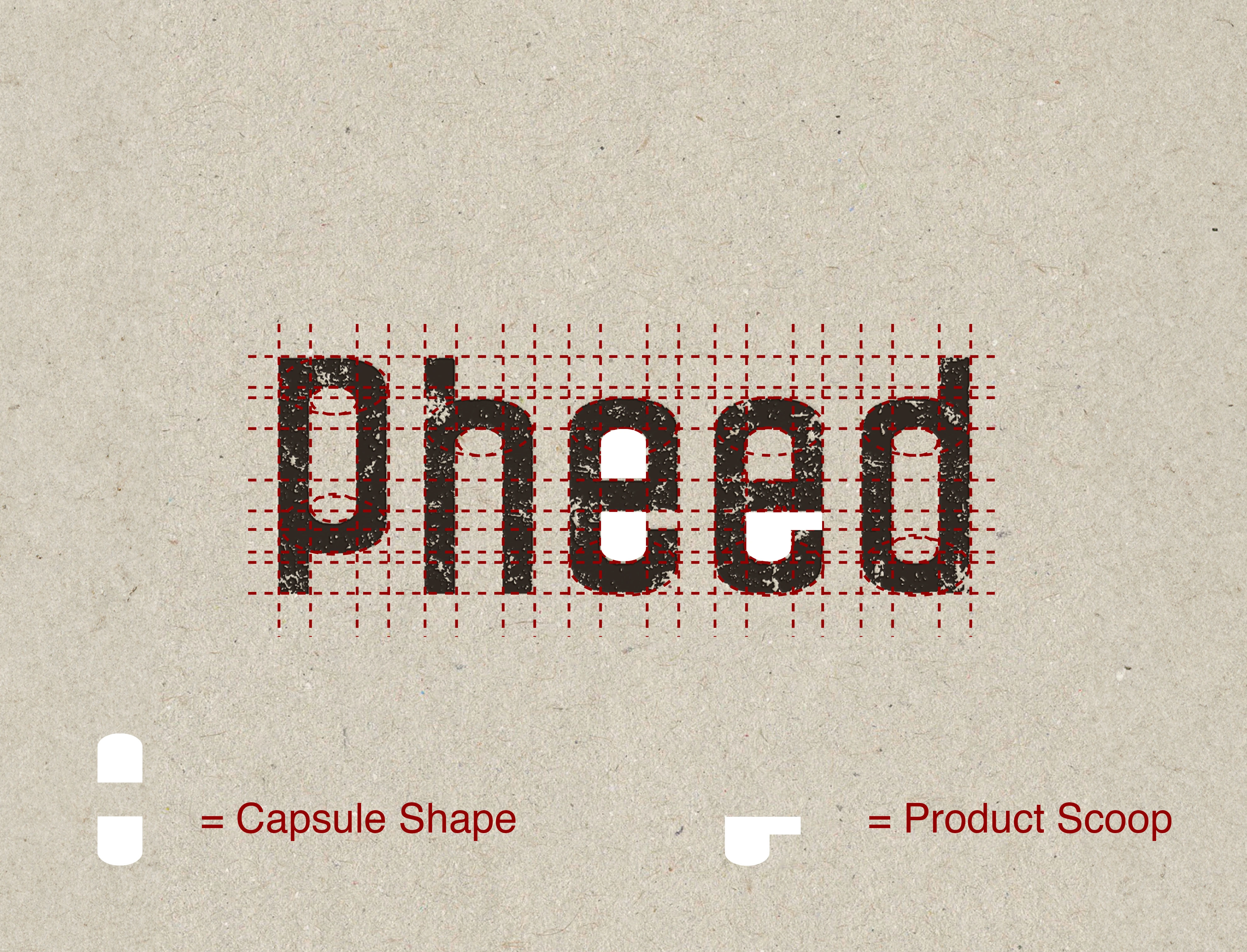
• The Logo’s letters were individually moulded to resemble an open Capsule, and a Powder Scoop nestled inside the E’s.
• The incorporation of a texture within the shapes, represents their powder products.
• Despite the lowercase format, the symmetry of ‘P’ & ‘D’ introduced a masculine touch, aligning with PHEED’s overall brand image.
• Considering its daily use and potential display on kitchen counters. Extensive demographic research revealed that showcased household items typically feature restrained visuals, influencing our design approach. The organic, GMO-free nature of PHEED’s brand further justified minimalist packaging.
Like this project
Posted Jul 31, 2025
Designed branding elements for PHEED, focusing on minimalistic and organic aesthetics.
Likes
0
Views
3
Timeline
Jan 2, 2023 - Jan 9, 2023