Built with Framer
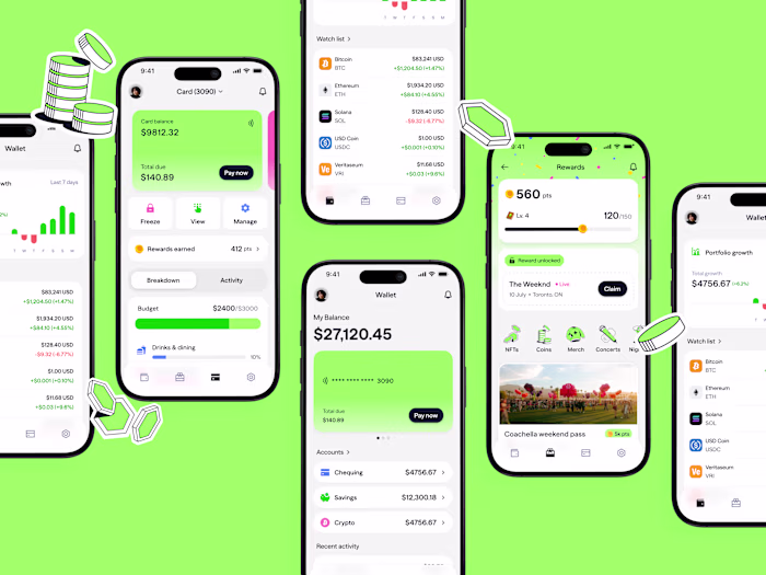
AI Services CRM | B2B UI/UX | Augment
Pixel One Design
Brand
The logo took longer than most projects to get right. We went through several rounds before settling on a direction because the logo had to do three things at once and none of them could be compromised:
1/ Communicate what Augment is about at a glance
2/ Work as a loading state for an AI system, since AI responses come with a thinking delay software has not dealt with before
3/ Tie back to logistics without becoming a literal truck or package icon
Symmetrical, geometric shapes are easier to animate and can shift without losing their identity, close to how Augie itself operates across many surfaces while staying one coherent agent. The wheel of a truck became the reference for the logistics tie-in. The name shaped the rest. Augment means making something better, expanding on what already exists, and the shape needed to carry that idea visually.
The final mark carries all three constraints. Motion through the gradient, the industry tie through the truck rim at the center, and a sense of complexity through layered overlaps that emerged during the process and ended up expressing augmentation more directly than anything we planned. The mark is the loading state for Augie across every touchpoint, the thing a logistics team sees while the AI is thinking.
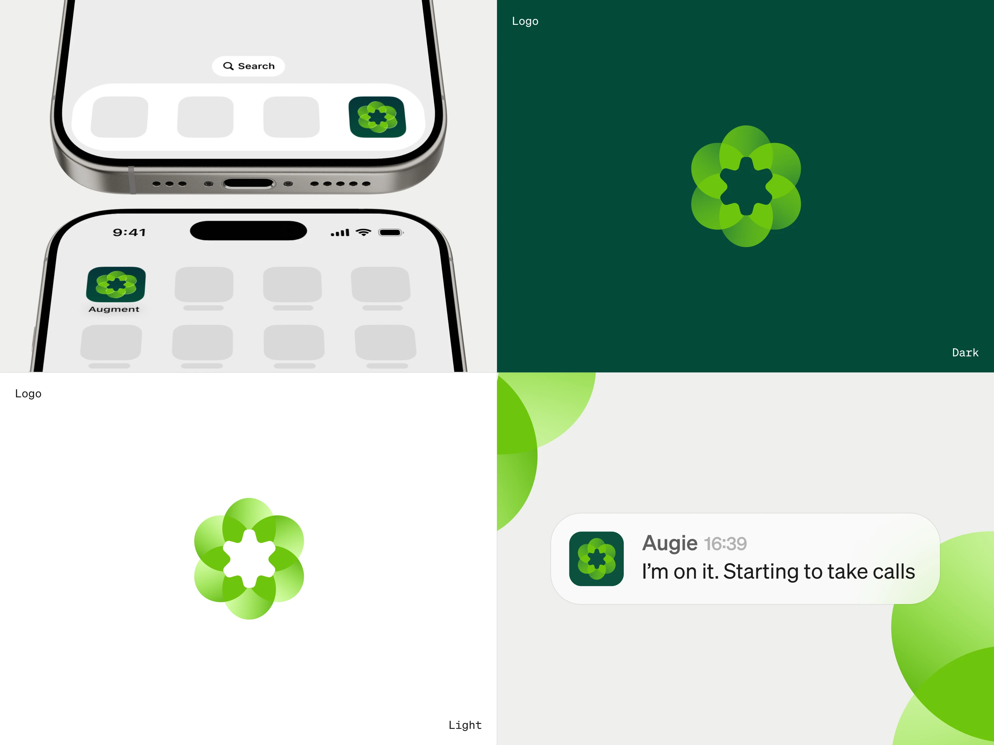
The petals overlap and create a third shape where two shapes meet. The overlap gave the logo a sense of two things combining into something new, close to what augmentation means. We leaned into it once we saw it working.
The mark works the same way on light and dark backgrounds without modification. The translucency means it feels slightly different depending on where it sits, which is the point. Augie shows up inside whatever environment it is already in.
A brand mark for an AI agent has to work as a teammate avatar as much as a logo. The key test was whether it held its own inside a chat interface, next to a message from Augie. It does.
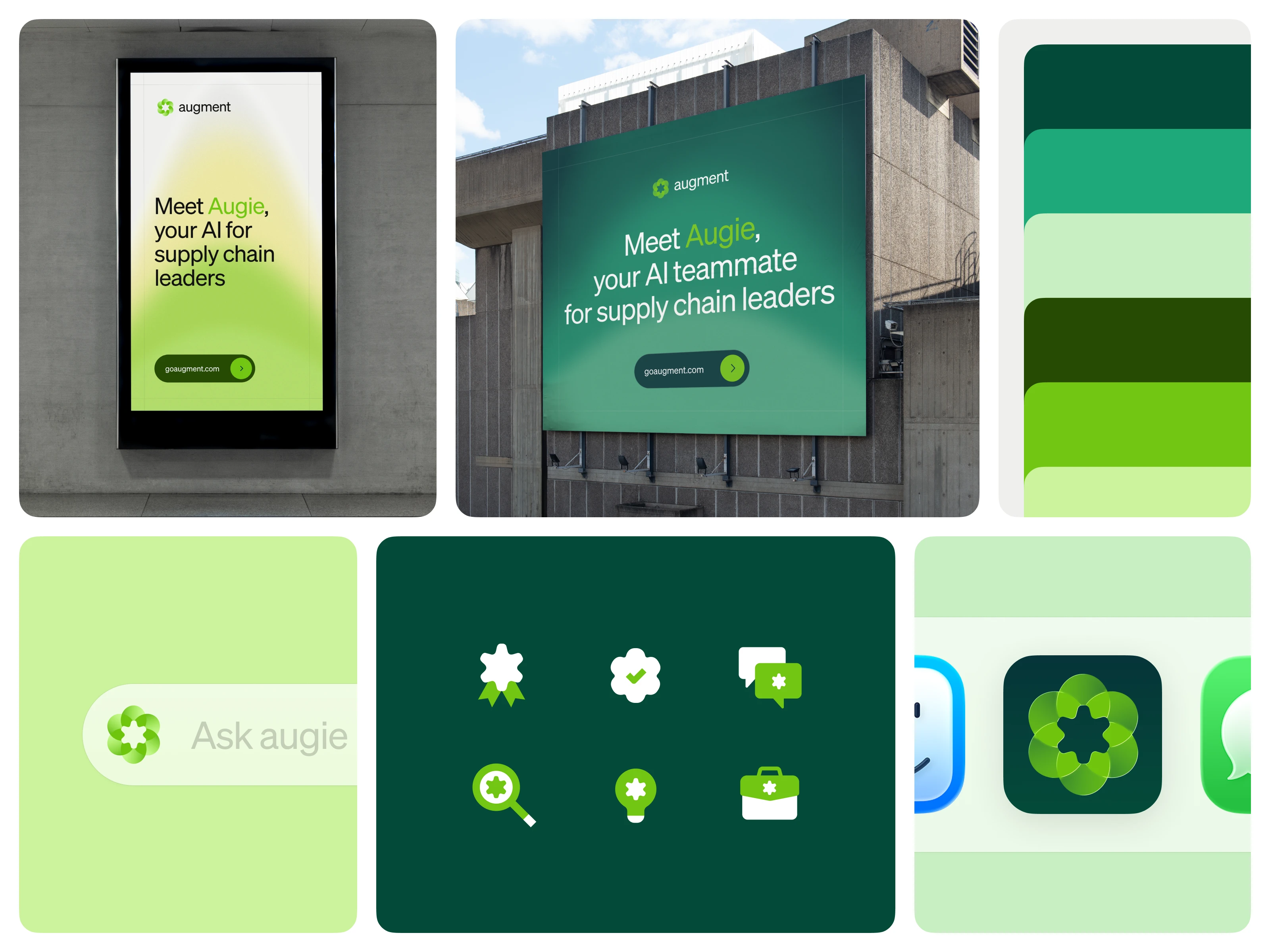
Logistics companies default to darker colors, black, yellow, red, and blue, particularly in the trade show environment where a lot of Augment's audience spends time. Green was a deliberate break from that, chosen to stand out in both digital and in-person contexts while making the brand feel more organic and approachable.
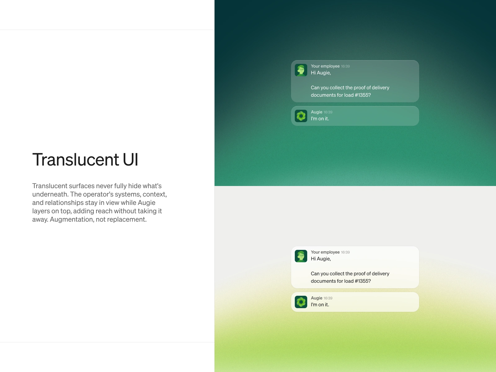
The translucent UI is where the brand strategy becomes a product strategy. Surfaces that never fully hide what is underneath express exactly what Augie does: it layers on top of existing systems without replacing them. The visual language and the product promise are the same idea.
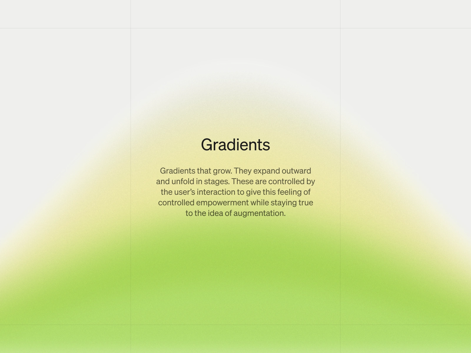
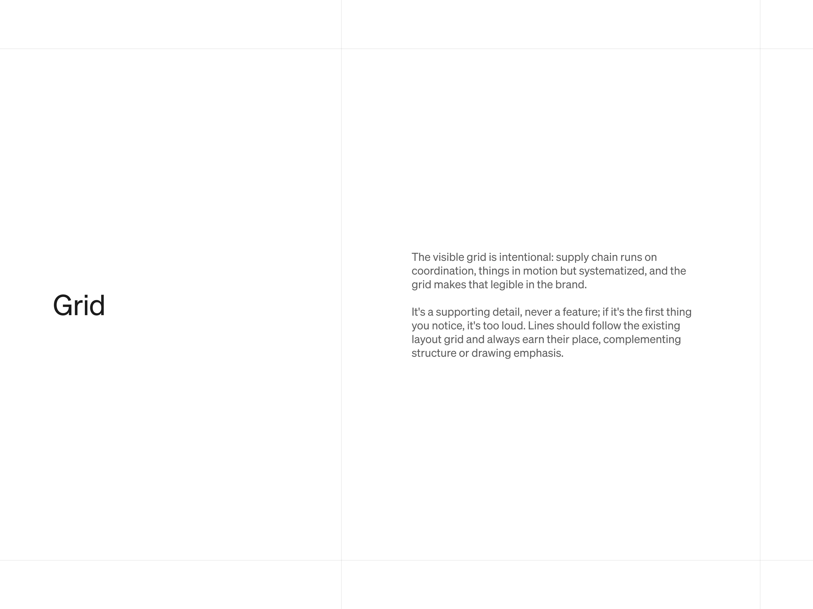
The gradient carries the augmentation concept further. One color gradually takes over the space, expressing how Augie expands into a system and takes over a task. The grid ties back to the structured, process-driven nature of logistics itself, present but never the loudest thing on the page.
The grid ties back to the structure of logistics. Everything moves through defined paths, things getting shipped and transported, and the grid lines show that.
Website
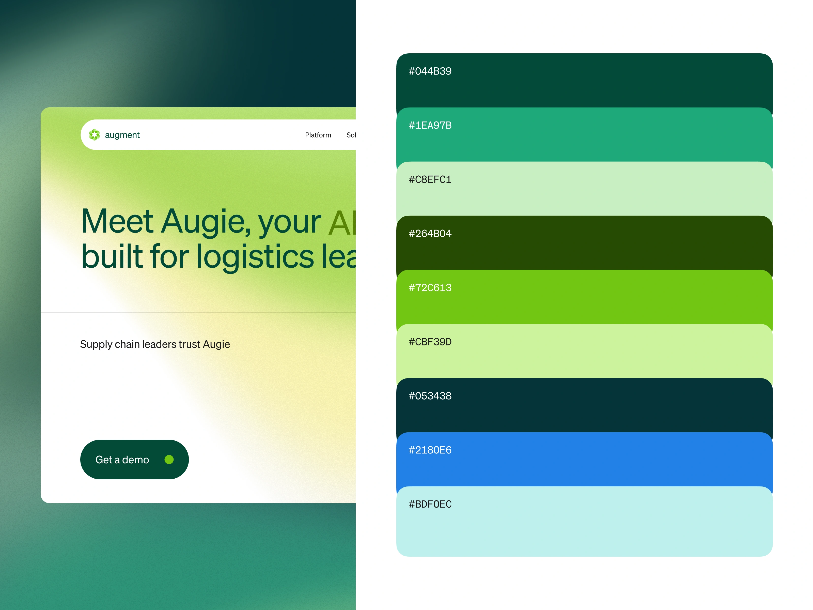
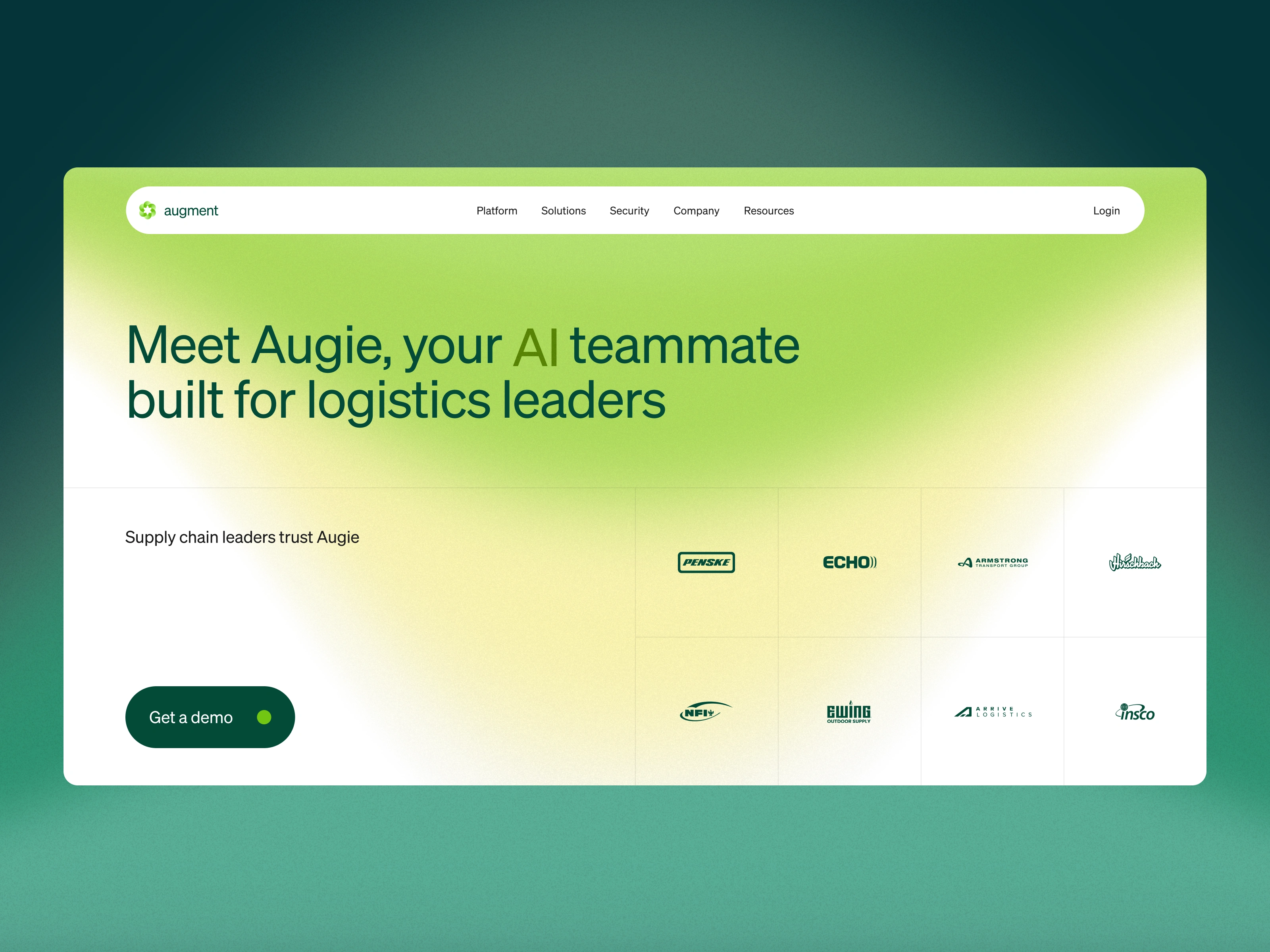
The goal for hero section is to make a founder or logistics leader who has never seen this kind of AI before feel like they understand it within seconds of landing on the page.
The hero puts everything on the typography. The tagline is the main message and nothing competes with it.
AI is still new for most logistics teams, and did not want to overwhelm the readers with lot of information. So, we went the other direction. The hero stays clean in a large type on a gradient background, a line of trust from recognized names in the industry, and one CTA.
As the visitor scrolls, the hero animates. Augie's capabilities reveal in plain language, one idea at a time, making sure the visitor feels comfortable with what the AI does before they go any deeper into the page.
After the hero, each section answers a specific question a logistics leader would have. What does Augie actually do day to day? Does it work with the tools we already use? Is it built for our specific type of operation?
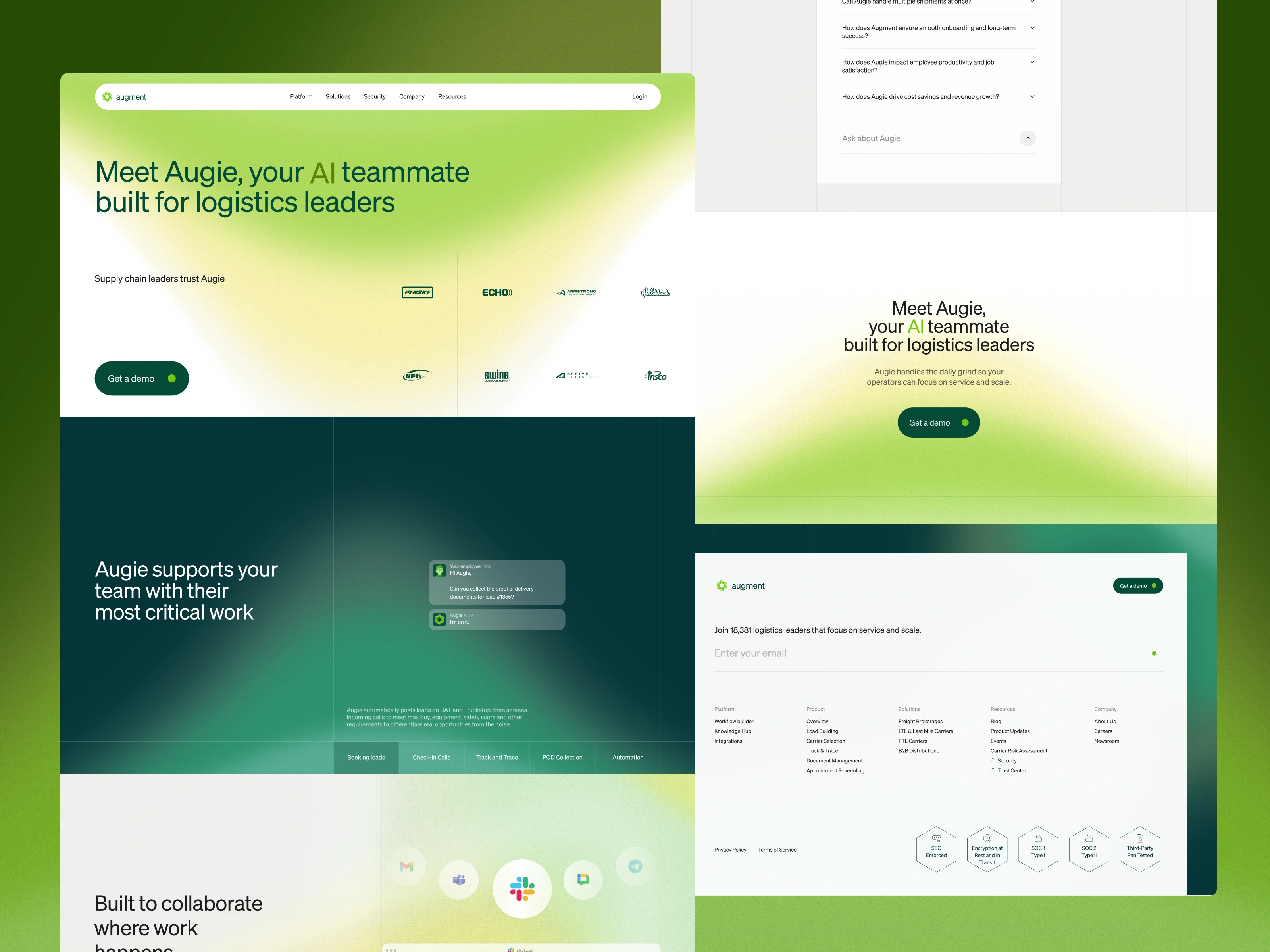
The design strategy was to show answers rather than state them. Green runs through the page consistently, carrying the same brand language from trade show booth to digital, so the brand feels the same wherever the audience encounters it.
The use case section was built entirely on the principle of show rather than tell. Each workflow Augie handles gets its own animated video, demonstrating the AI solving a real problem rather than describing it. A founder watching these does not need to imagine what the product does. It gives a real feel for the product vs booking loads, check in calls etc.
The integration section had to communicate a core part of Augment's business strategy: Augie shows up inside the tools a logistics team already uses. The design decision was to demonstrate this by putting Augie inside recognizable platforms rather than listing them, showing a real conversation happening inside a tool the visitor already opens every morning.
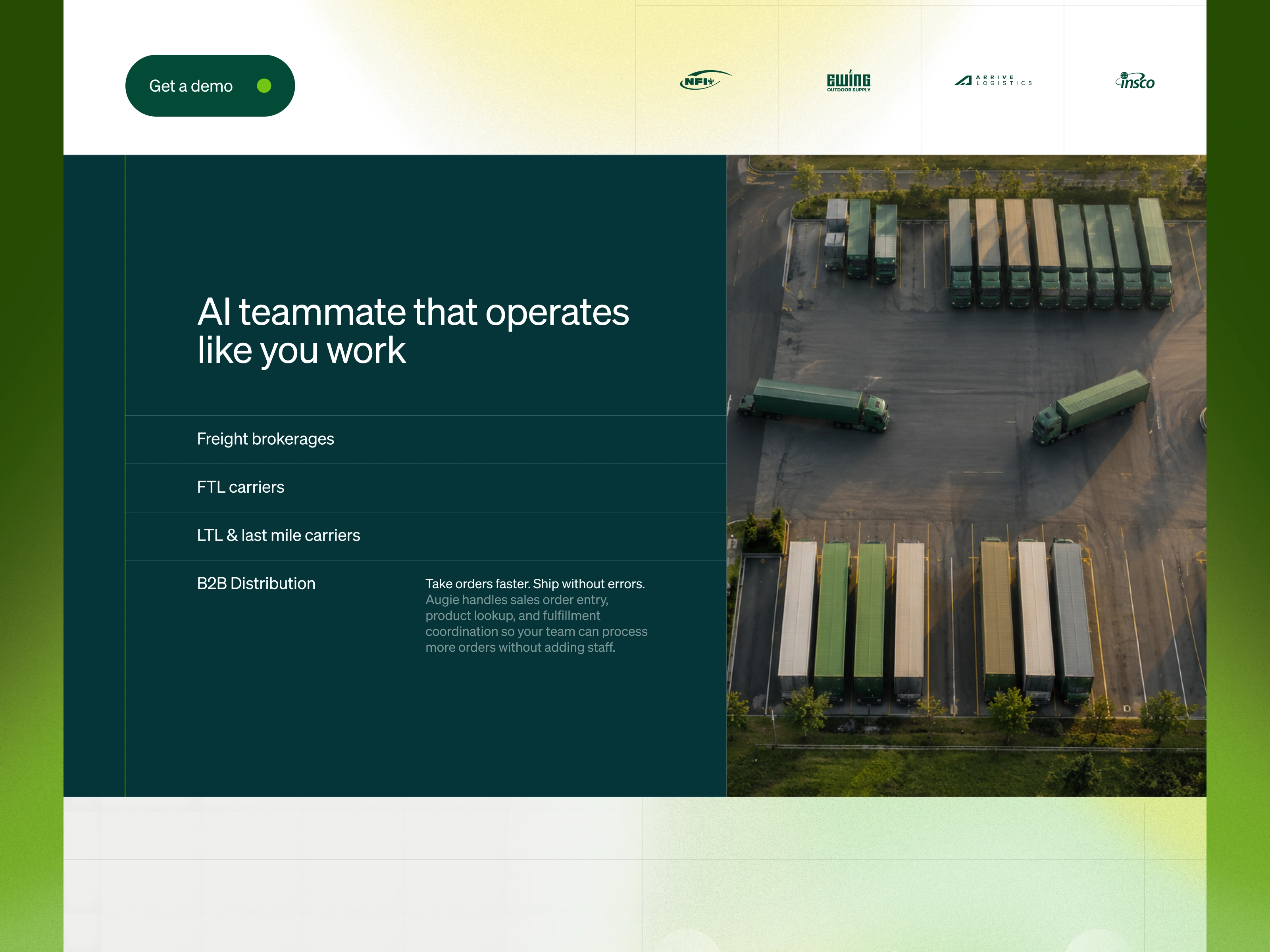
Logistics is not one industry. The persona section was built around the reality that a freight broker and a B2B distributor have fundamentally different daily operations. Each type of logistics company gets its own clear callout showing what Augie handles for them specifically. Every visitor should feel like the product was built for their operation.
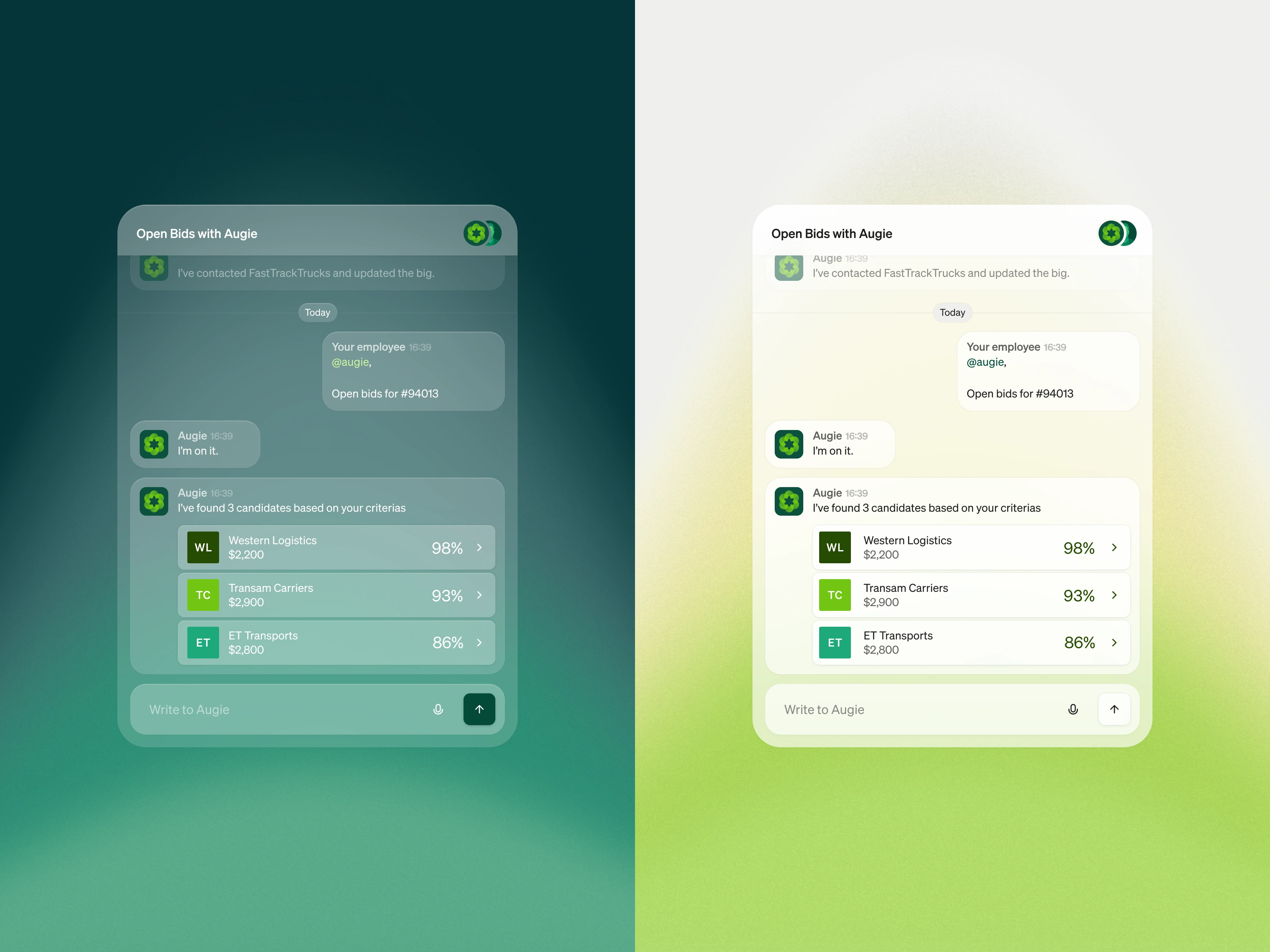
Augie has no fixed UI of its own because it lives inside whatever system a logistics team already runs. The design challenge was making that visible. We built abstracted UI that puts the brand guidelines into practice as a working chat interface, showing the AI responding to a real request with ranked options and actionable output.
Both light and dark versions are shown side by side, and the visual language defined here became the foundation for every use case animation across the product.
Sign off
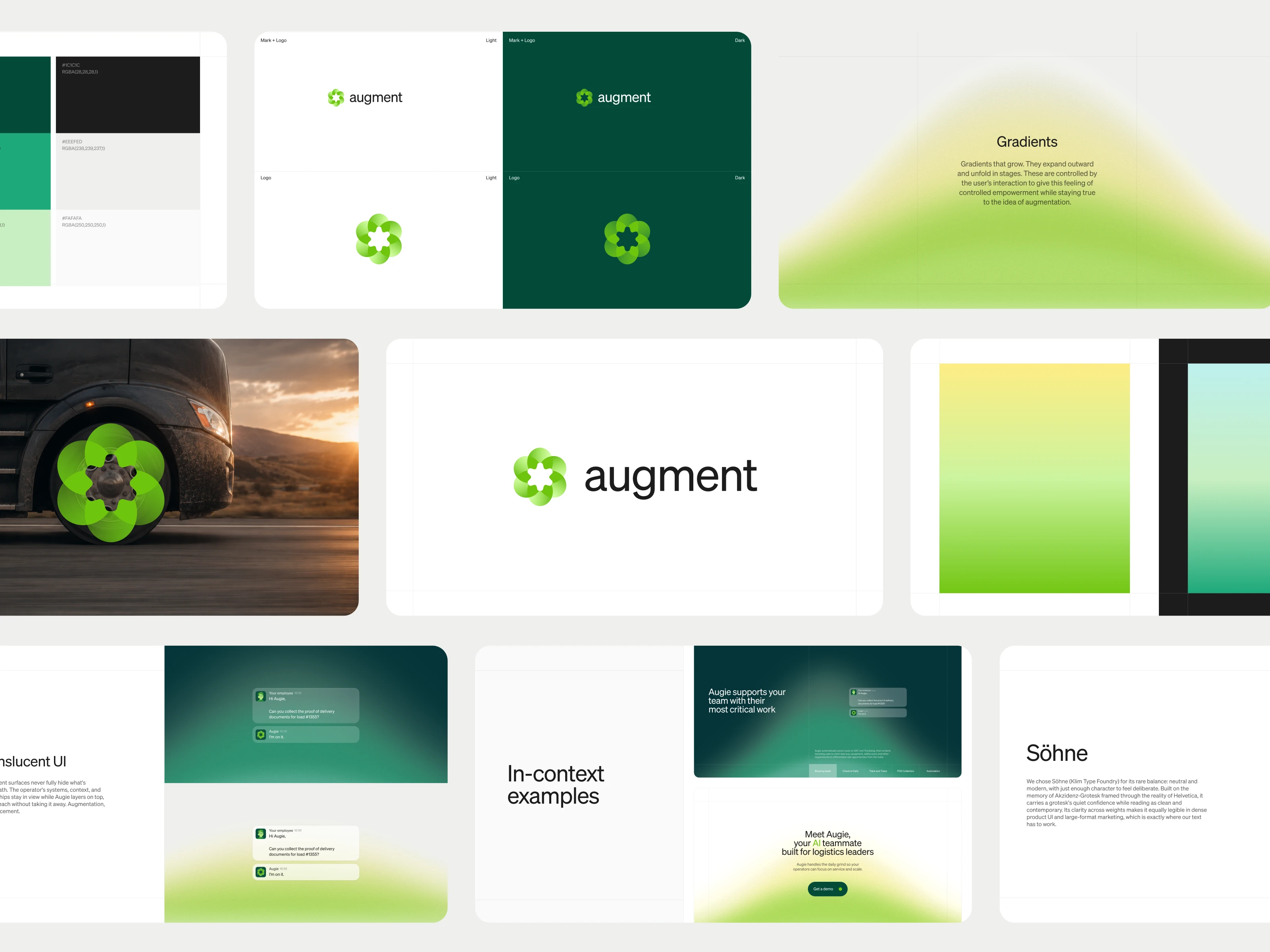
Pixel One delivered the full brand identity and product website for Augment across two scopes of work.
1/ On the brand side: Included the mark, color system, gradient language, translucent UI, and grid system that became the foundation for Augie's three core agents: the carrier agent, the track and trace agent, and the onboarding agent.
2/ On the website side: Included the hero section, use case animations, integration showcase, persona sections, and the abstracted UI and chat interface that defined the visual language across the entire product.
Augment went from $0 to $XXM ARR. They raised a $25M seed round followed by an $85M Series A five months later, bringing total funding to $110M. Augie now supports over $35 billion in freight under management across dozens of shippers and brokerages.
Like this project
Posted Jun 25, 2026
Augment raised $110M for Augie, its AI product for logistics workflows. Pixel One designed the brand identity + website.
Likes
1
Views
7
Timeline
Oct 16, 2024 - Ongoing