Brand Identity Design for VE ABOGADOS
Lorenzo Rocco

Client Overview
VE ABOGADOS is a law firm that specializes in dispute resolution, corporate advisory in labor and employment law, and insolvency law. Its partners are highly trained professionals who received their education from some of the most prestigious law schools in both Chile and abroad. They began their careers in distinguished national firms and have gained experience as litigators in complex and high-profile cases.
What makes VE ABOGADOS unique is their ability to balance a strong legal tradition with a forward-thinking perspective. The firm observes closely how new technologies and social shifts are transforming the business landscape and the legal field. This adaptability allows them to serve as a bridge between the conservative roots of law and the innovative demands of modern society.
The Challenge
The Chilean legal market is known for being both highly competitive and deeply influenced by conservative values. Within this environment, VE ABOGADOS needed to stand out with a brand identity that would highlight the strength of its foundations, while also communicating its commitment to innovation and its modern approach to legal services.
The challenge was to design an identity that reflected the prestige, professionalism, and training of its partners, while differentiating the firm from traditional law firms. It was essential to convey solidity and reliability, but also to showcase the firm’s youthful and innovative spirit in a market where most competitors rely on conventional and conservative imagery.
Elle Visual’s Solution
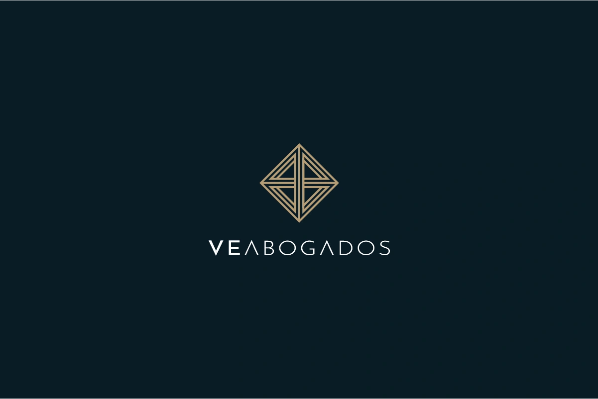
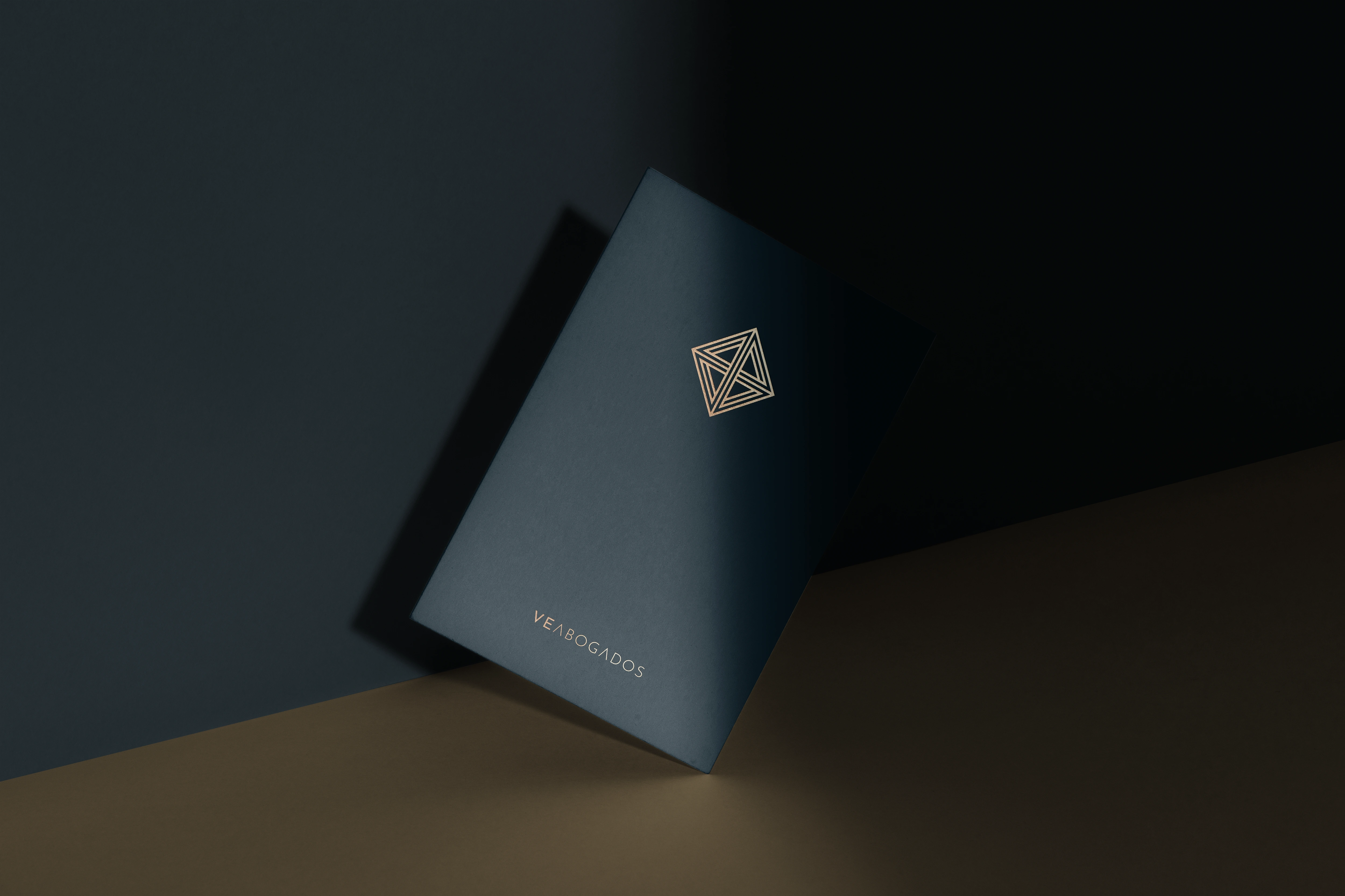
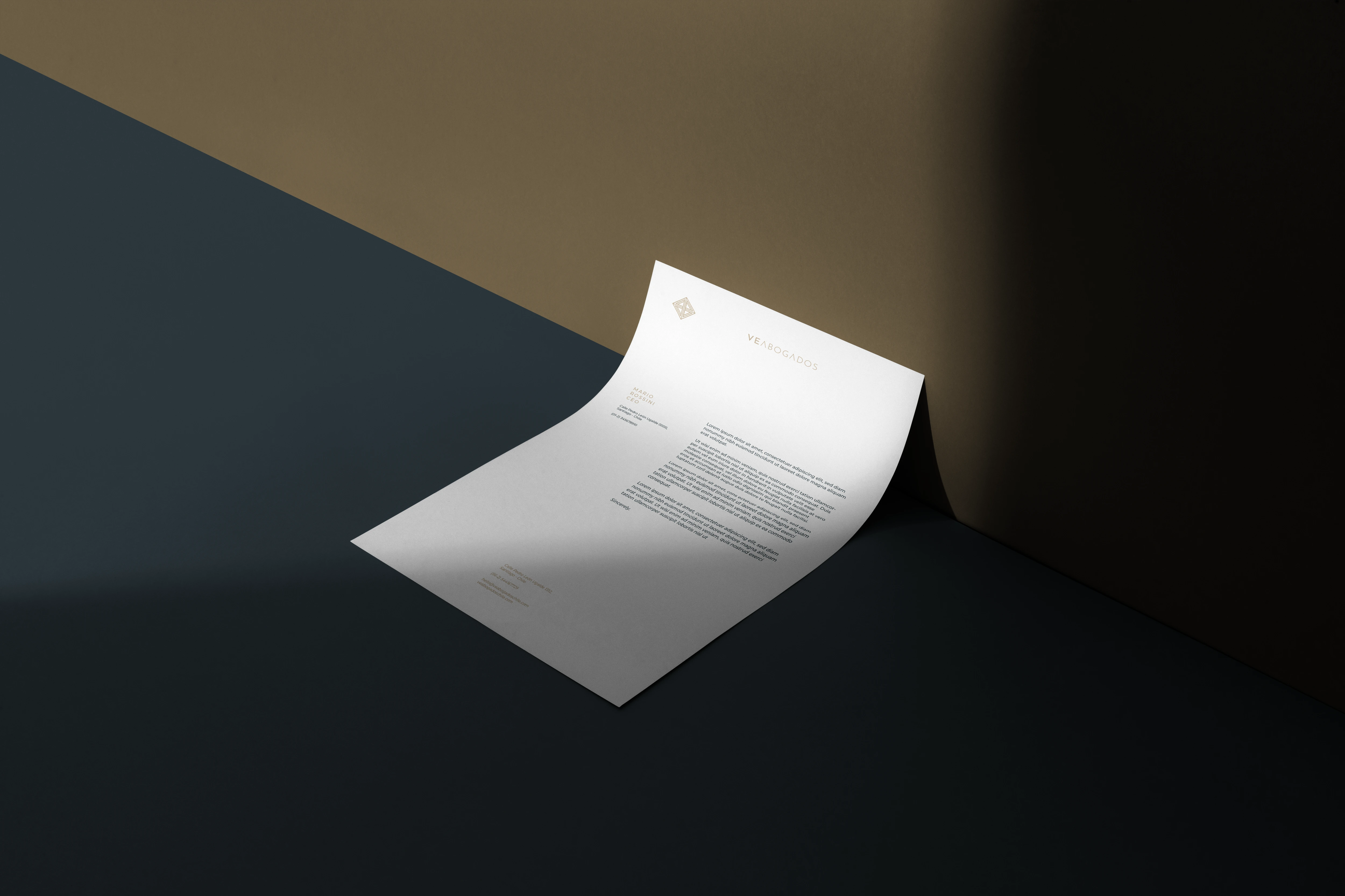
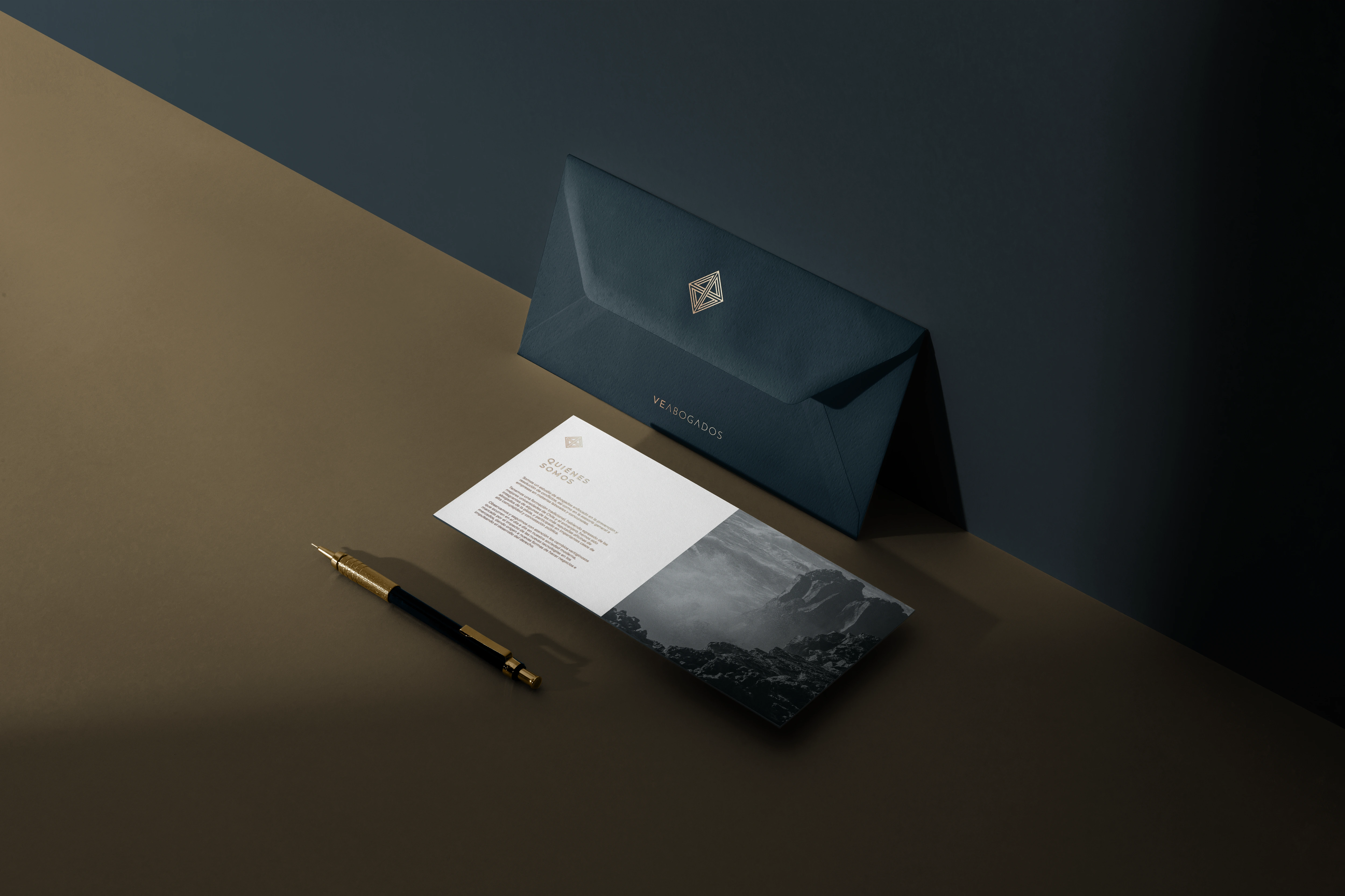
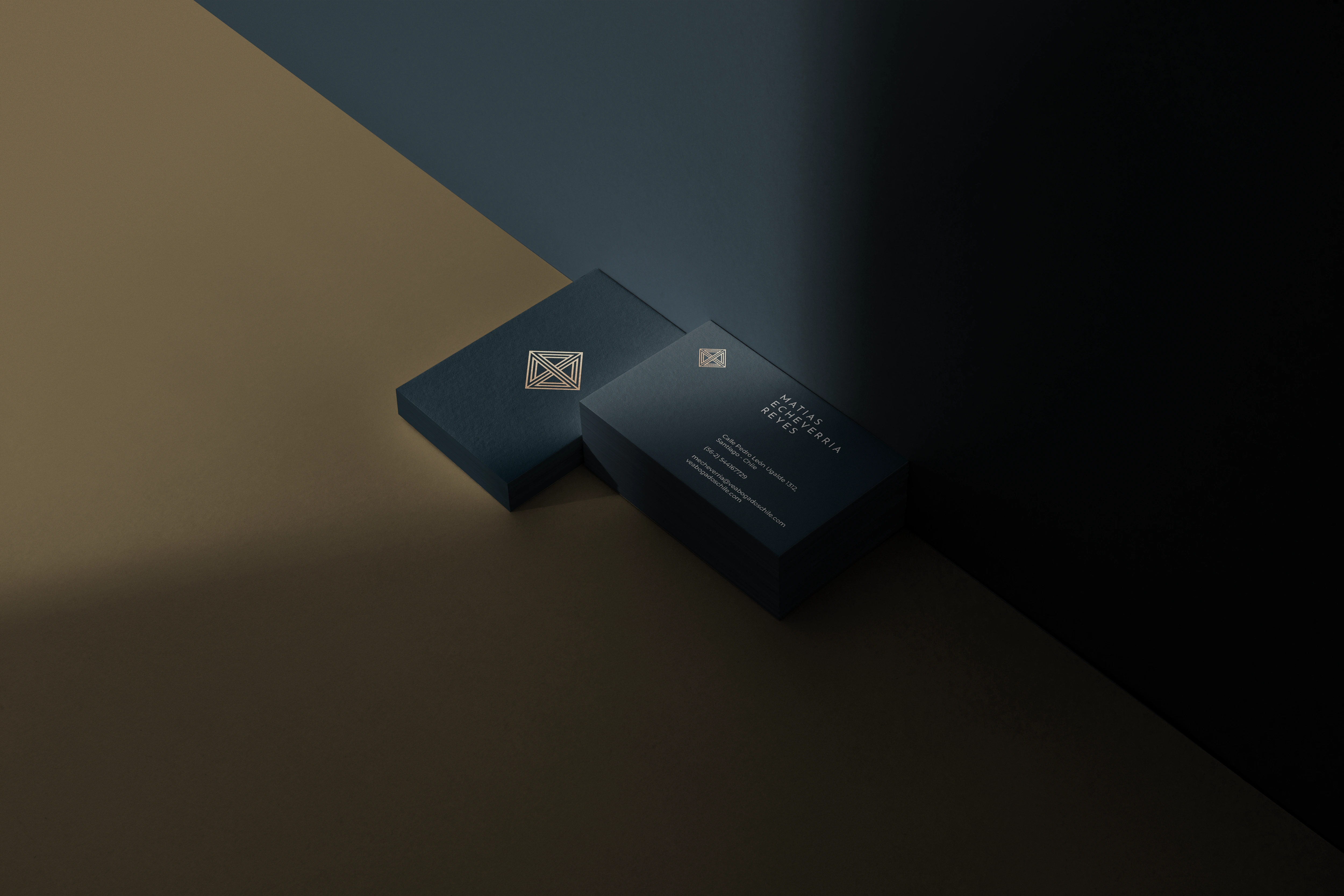
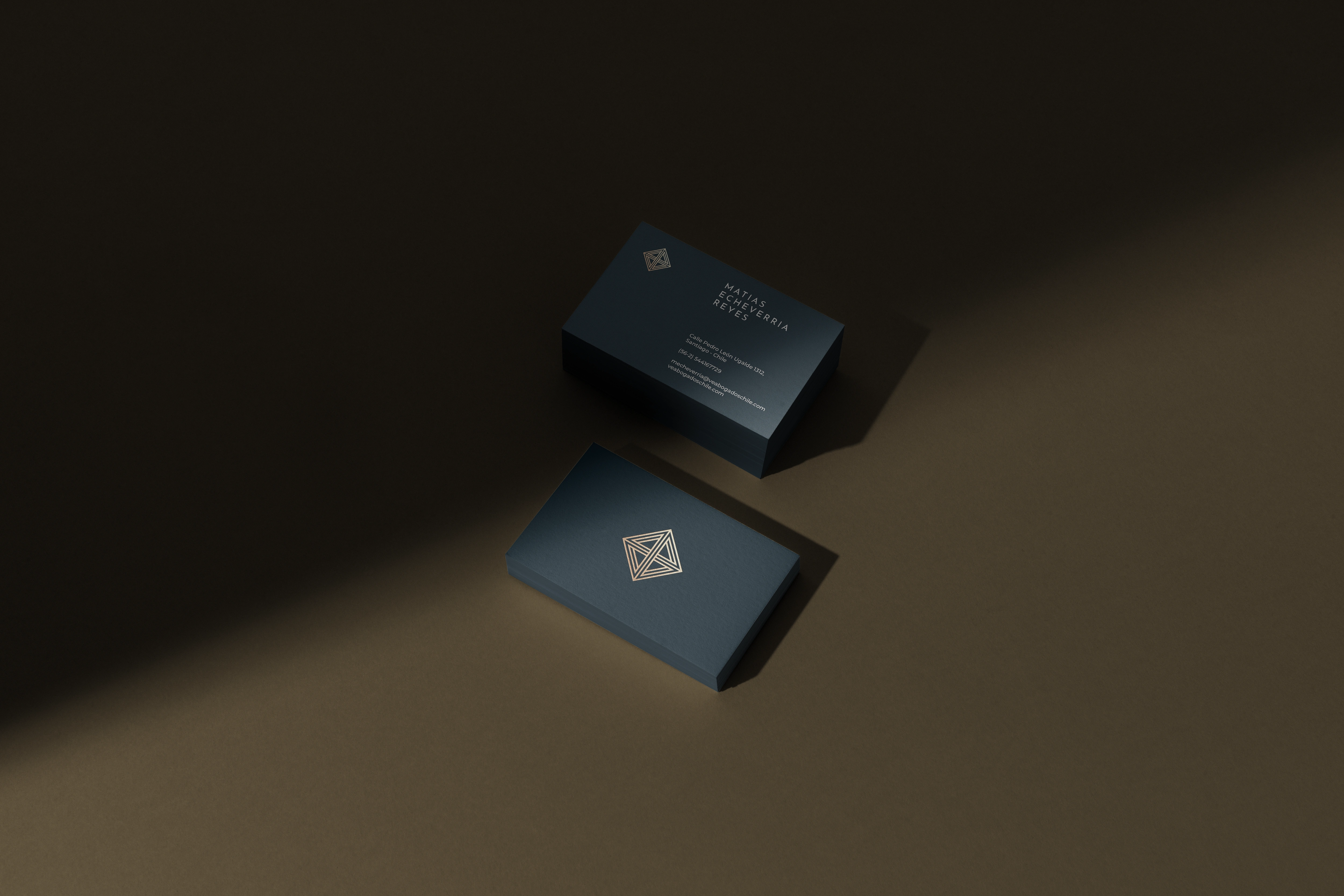
Our solution was to design an identity that embodied the dual nature of VE ABOGADOS: the weight of tradition and the energy of innovation. We created a logo that merges Chile’s decisive and conservative character with the firm’s youthful and progressive vision.
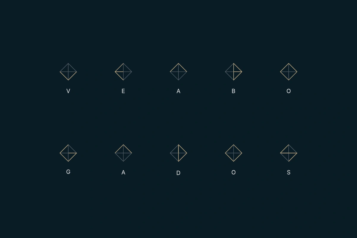
At the heart of the identity is a pictogram built from impossible geometries, within which each letter of VE ABOGADOS is subtly integrated. This approach symbolizes the idea that the firm was built from the ground up, representing resilience, structure, and strength.
The chosen form, a rhombus, was not accidental. It draws from Hermetic philosophy and the principle, “As above, so below; as below, so above.” The rhombus represents balance and unification, bringing together opposites such as tradition and innovation, logic and creativity. It also symbolizes synchronization and harmony, a metaphor for the way VE ABOGADOS resolves conflicts and brings coherence to complex legal cases.
The Challenge
The Chilean legal market is known for being both highly competitive and deeply influenced by conservative values. Within this environment, VE ABOGADOS needed to stand out with a brand identity that would highlight the strength of its foundations, while also communicating its commitment to innovation and its modern approach to legal services.
The challenge was to design an identity that reflected the prestige, professionalism, and training of its partners, while differentiating the firm from traditional law firms. It was essential to convey solidity and reliability, but also to showcase the firm’s youthful and innovative spirit in a market where most competitors rely on conventional and conservative imagery.
Elle Visual’s Solution
Our solution was to design an identity that embodied the dual nature of VE ABOGADOS: the weight of tradition and the energy of innovation. We created a logo that merges Chile’s decisive and conservative character with the firm’s youthful and progressive vision.
At the heart of the identity is a pictogram built from impossible geometries, within which each letter of VE ABOGADOS is subtly integrated. This approach symbolizes the idea that the firm was built from the ground up, representing resilience, structure, and strength.
The chosen form, a rhombus, was not accidental. It draws from Hermetic philosophy and the principle, “As above, so below; as below, so above.” The rhombus represents balance and unification, bringing together opposites such as tradition and innovation, logic and creativity. It also symbolizes synchronization and harmony, a metaphor for the way VE ABOGADOS resolves conflicts and brings coherence to complex legal cases.
This balance between tradition and modernity has been emphasized by a modern and simplified typography, creating a visual language that reflects both the seriousness of the legal profession and the adaptability of a firm that embraces change.


Like this project
Posted Aug 29, 2025
Designed a brand identity for VE ABOGADOS, balancing tradition and innovation.
Likes
0
Views
14
Timeline
Jun 1, 2014 - Jul 30, 2024