Fitness Equipment eCommerce Store Website Design

Akil Ashraful


Martial Arts Equipment Store Website Design
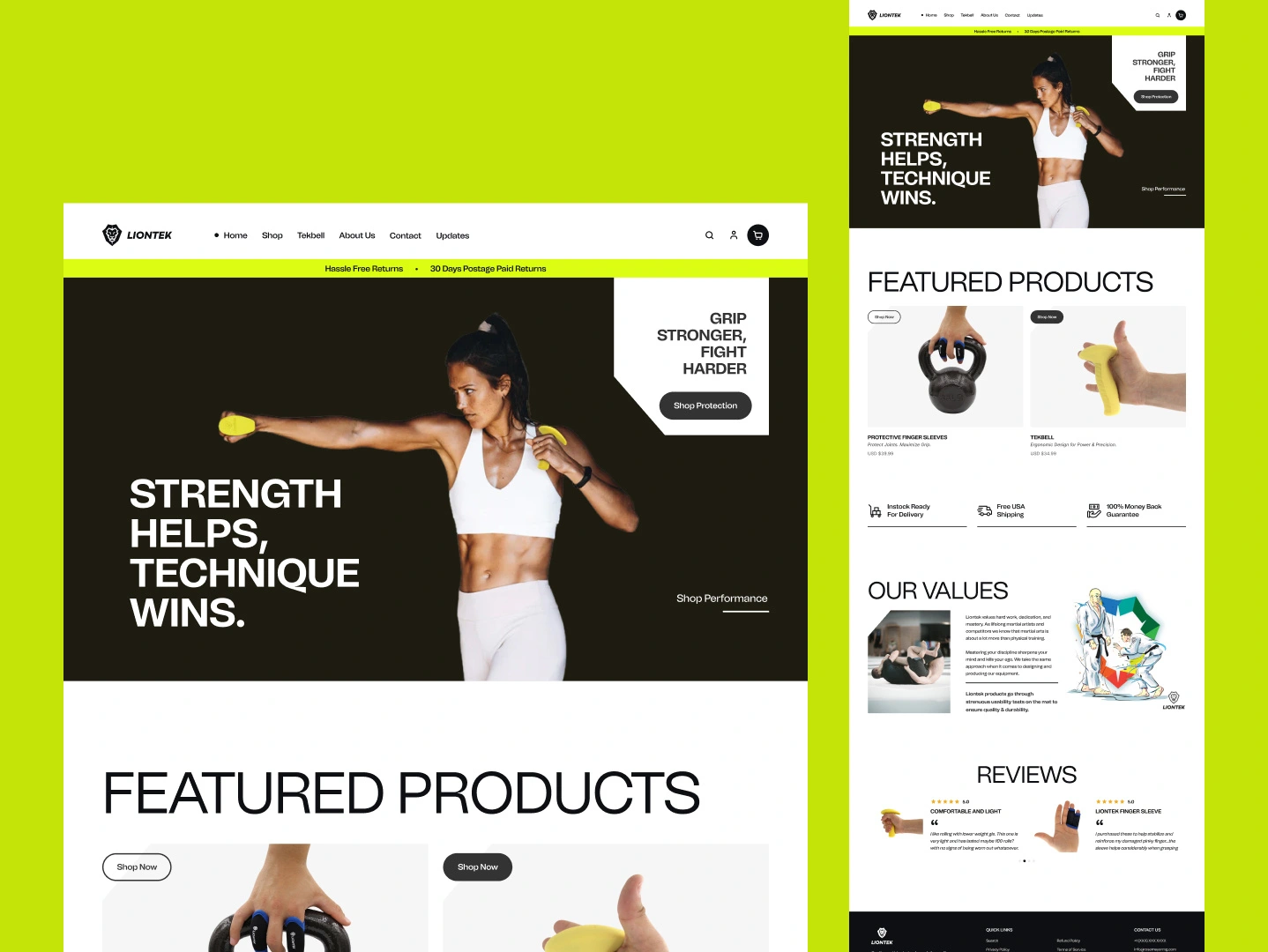
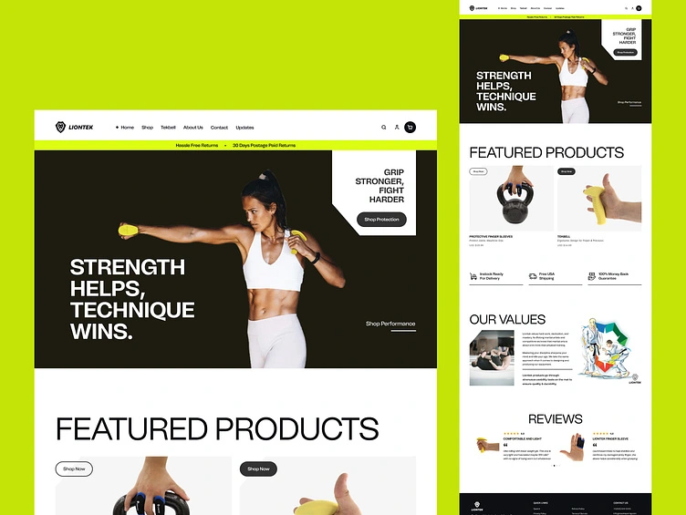
Most martial arts brands look like they are still fighting. Liontek was designed to match the precision of its products with a digital experience that converts with the same discipline athletes train with.
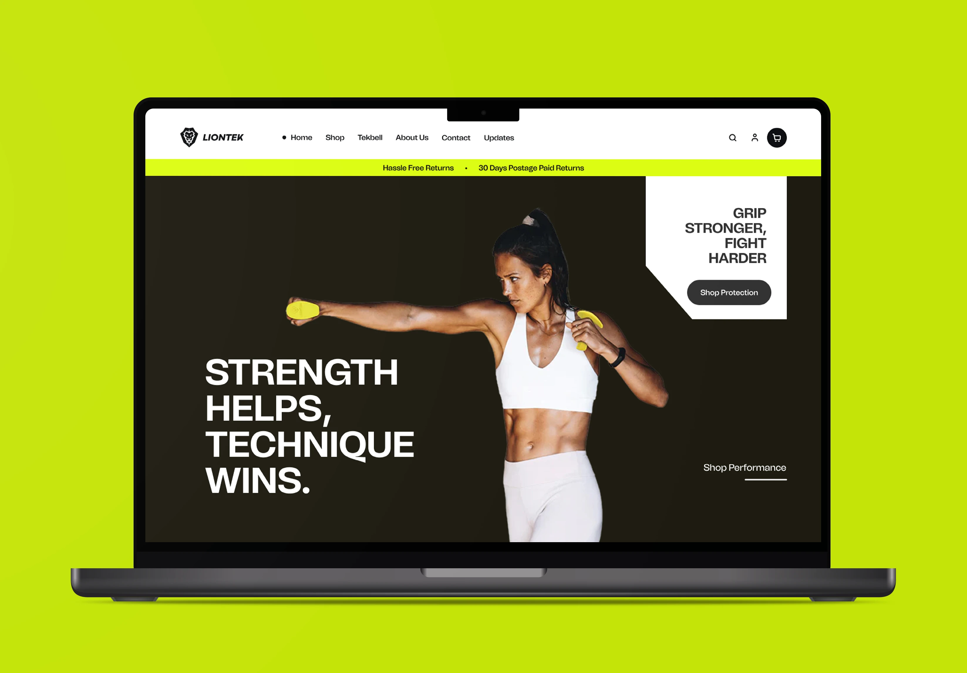
✔ Dominance-first hero uses a dark, high-contrast layout to establish brand authority before a single word is read
✔ Yellow accent color mirrors product branding, creating a unified visual language that builds subconscious familiarity
✔ Announcement bar front-loads shipping and return policies, eliminating purchase hesitation at the very first touchpoint
✔ Whitespace-led product section lets photography do the selling, reducing cognitive load on buying decisions
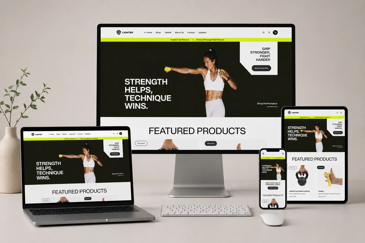
✔ Trust trio block directly targets the three most common objections a first-time buyer carries into any store
✔ Editorial values section humanizes the brand through storytelling, transforming a product company into a community
✔ Customer review layout pairs star ratings with real product photography, making social proof visually undeniable
✔ Structured footer gives every hesitant visitor a clear path to policies, contact, and reassurance


Every section was sequenced with one goal: remove doubt before it becomes a reason to leave. The result is a storefront that feels as sharp, intentional, & battle-tested as the athletes wearing the gear.

fitness equipment ecommerce
fitness product showcase
modern fitness store
athletic product store
combat sports accessories shop
home gym equipment ecommerce
sportswear brand website
modern sport shop website
Like this project