Qntamax Branding and Packaging Design Project

Artur Mikhov


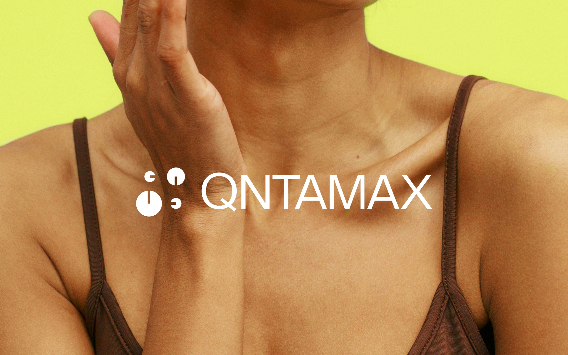
Qntamax — precision-driven branding for a modern wellness brand
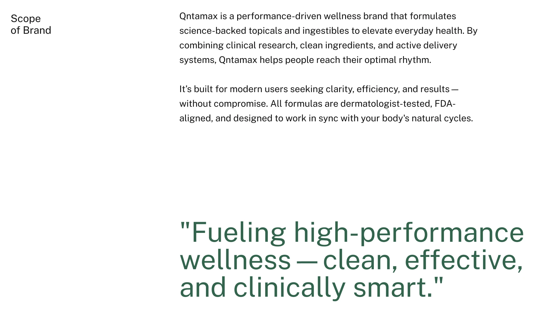
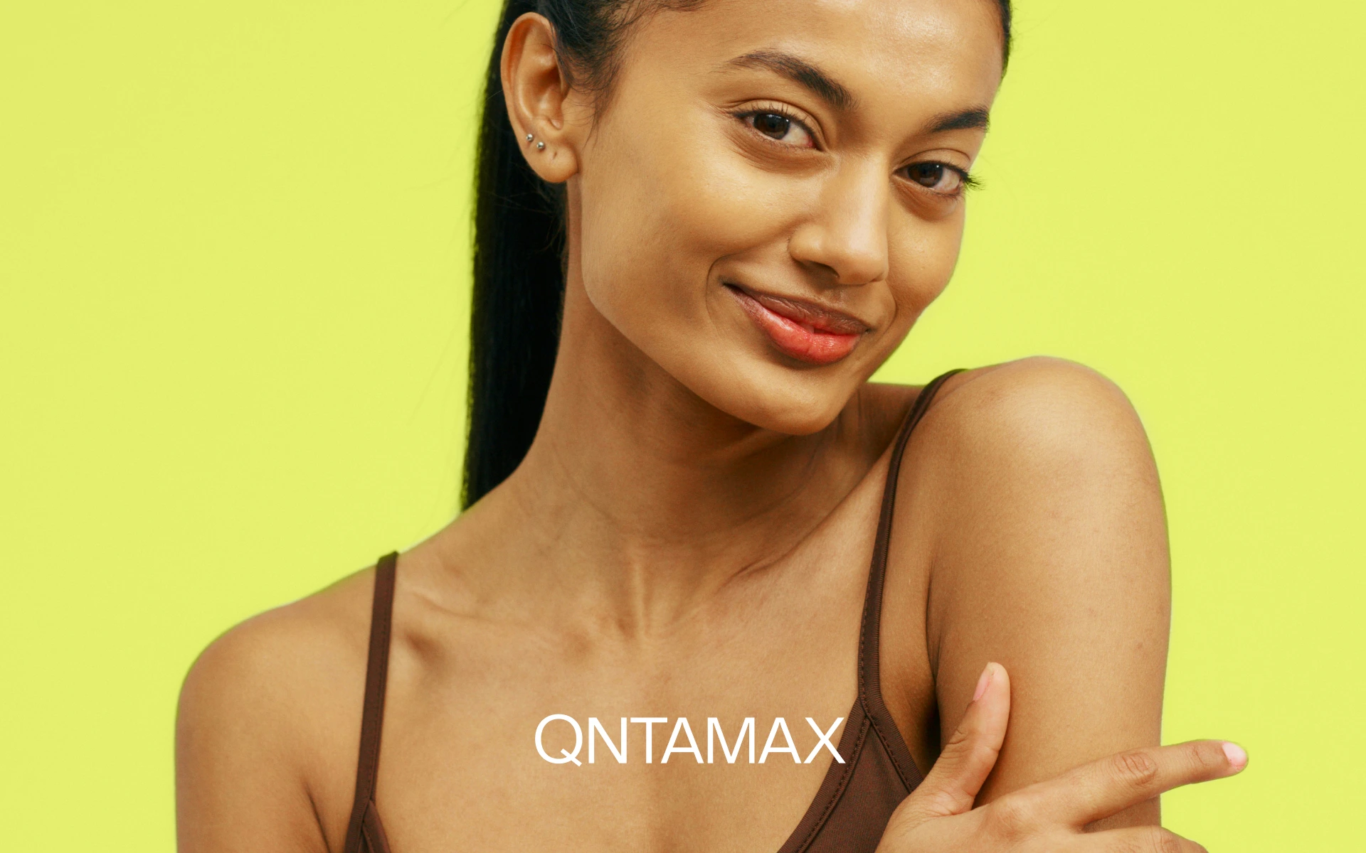
Qntamax is a performance-driven wellness brand developing science-backed topicals and ingestibles designed to elevate everyday health and performance.
The project focused on creating a premium brand identity, visual identity, and packaging design that balances scientific credibility with energy, vitality, and modern wellness culture.
Brand strategy. Logo design. Brand identity. Visual identity. Wellness branding. Health branding. Supplement branding. Packaging design. Product branding. Beauty & wellness design. Typography. Graphic design. Art direction.
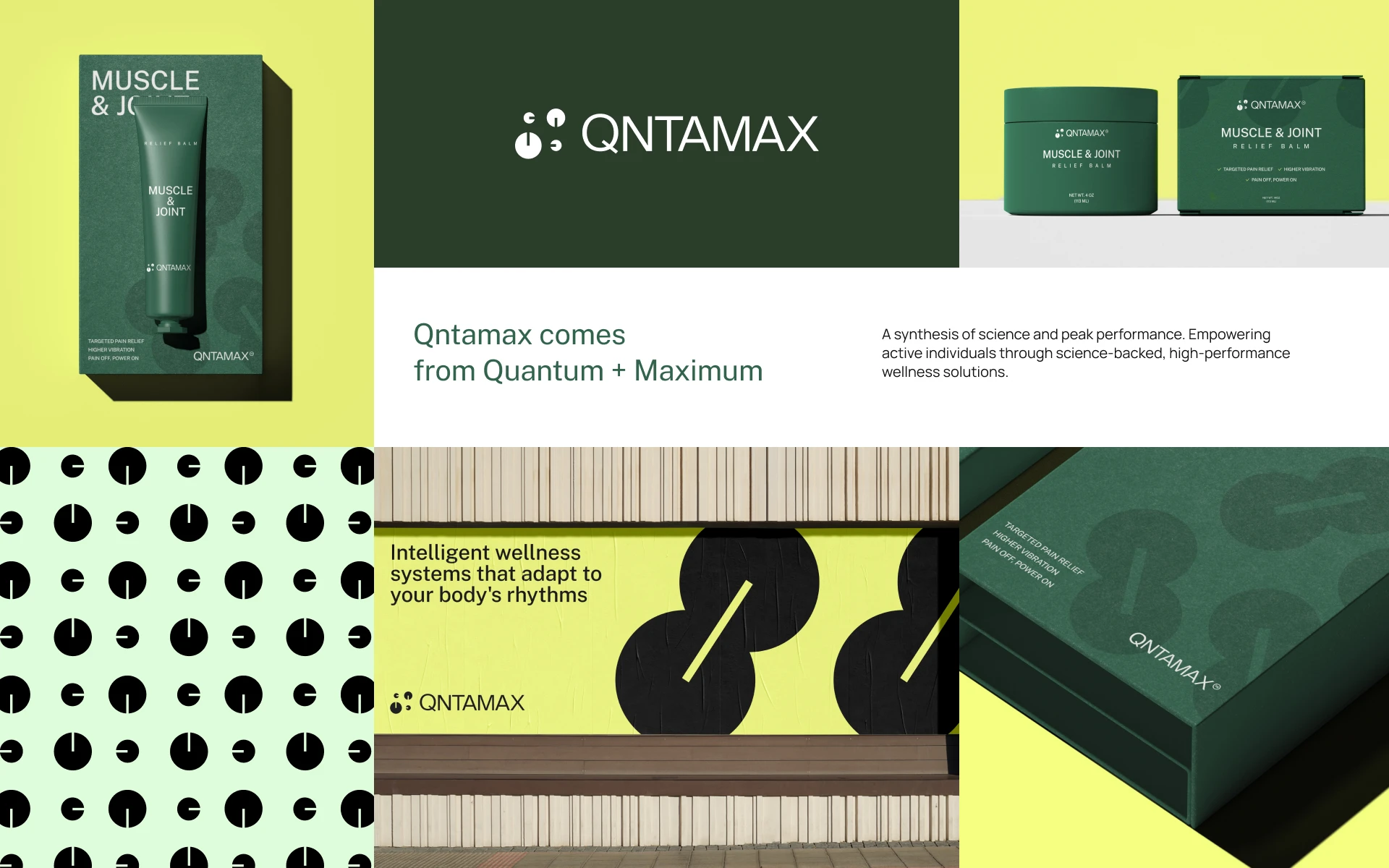
The Concept
Qntamax sits between science and vitality.
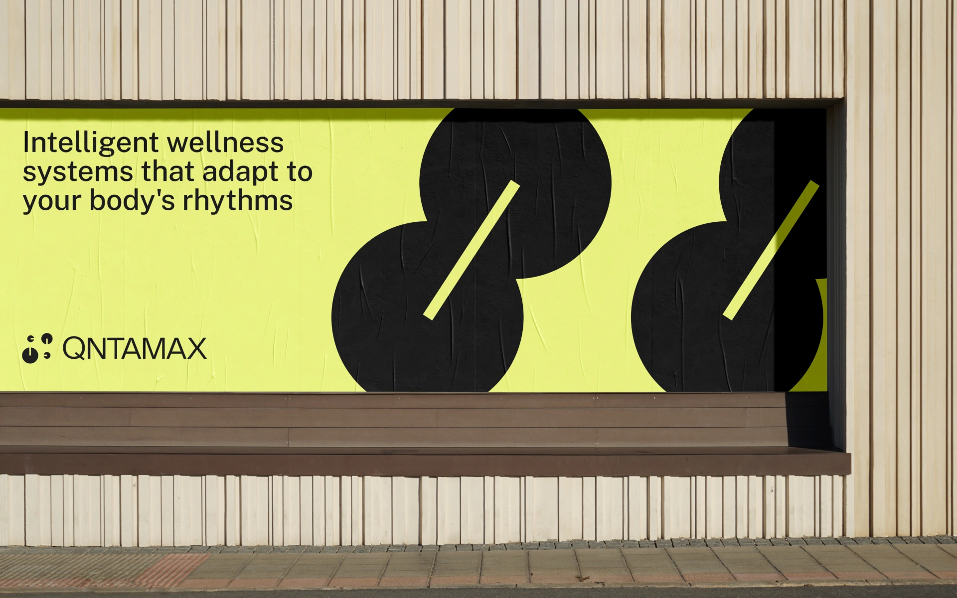
The identity translates this positioning through bold contrasts, geometric motifs, and minimal typography. The visual language feels precise and structured, communicating performance and scientific credibility without becoming clinical or overly technical.
The design follows one principle:
No distractions. Only what matters.
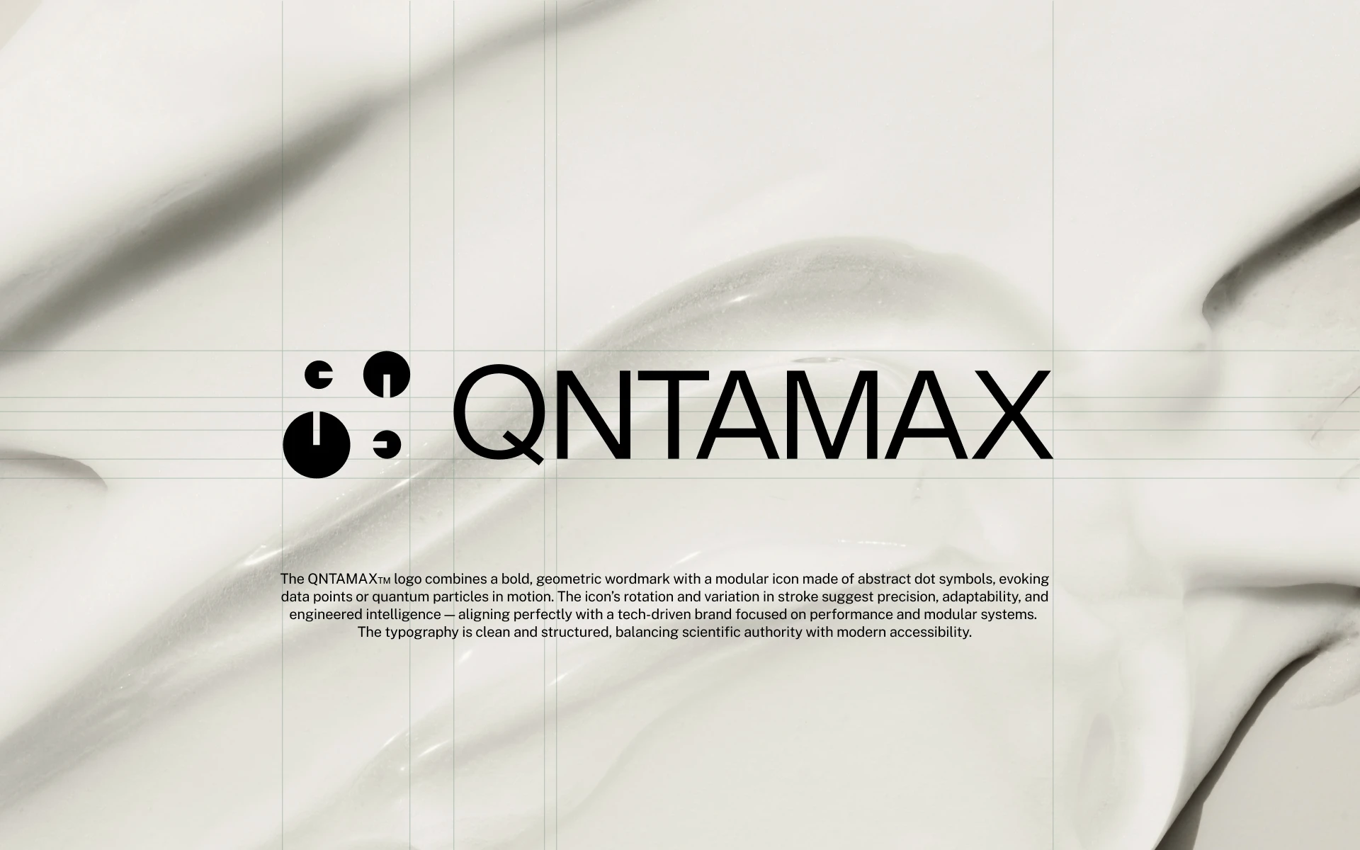
The Visual System
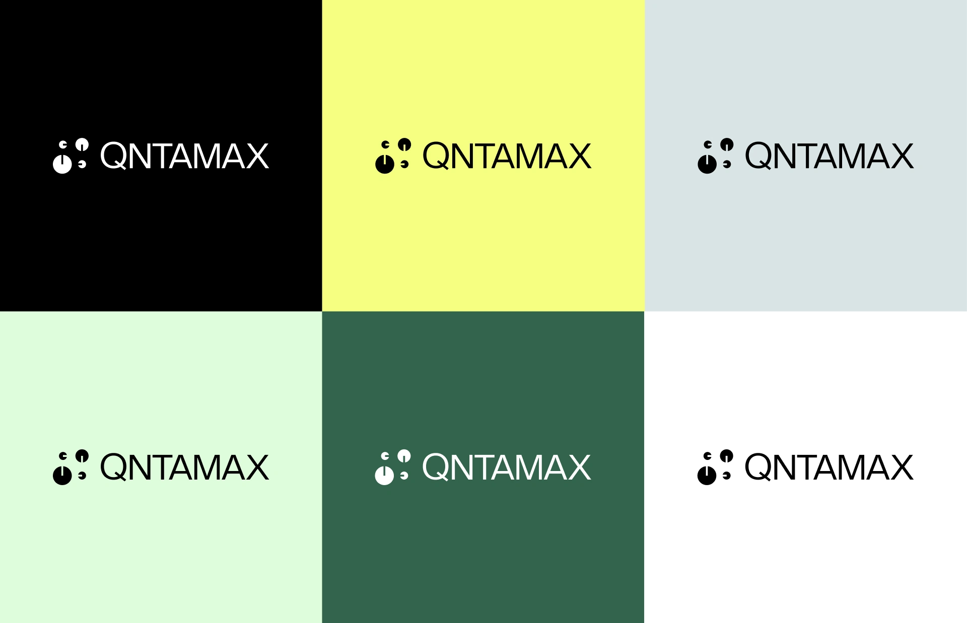
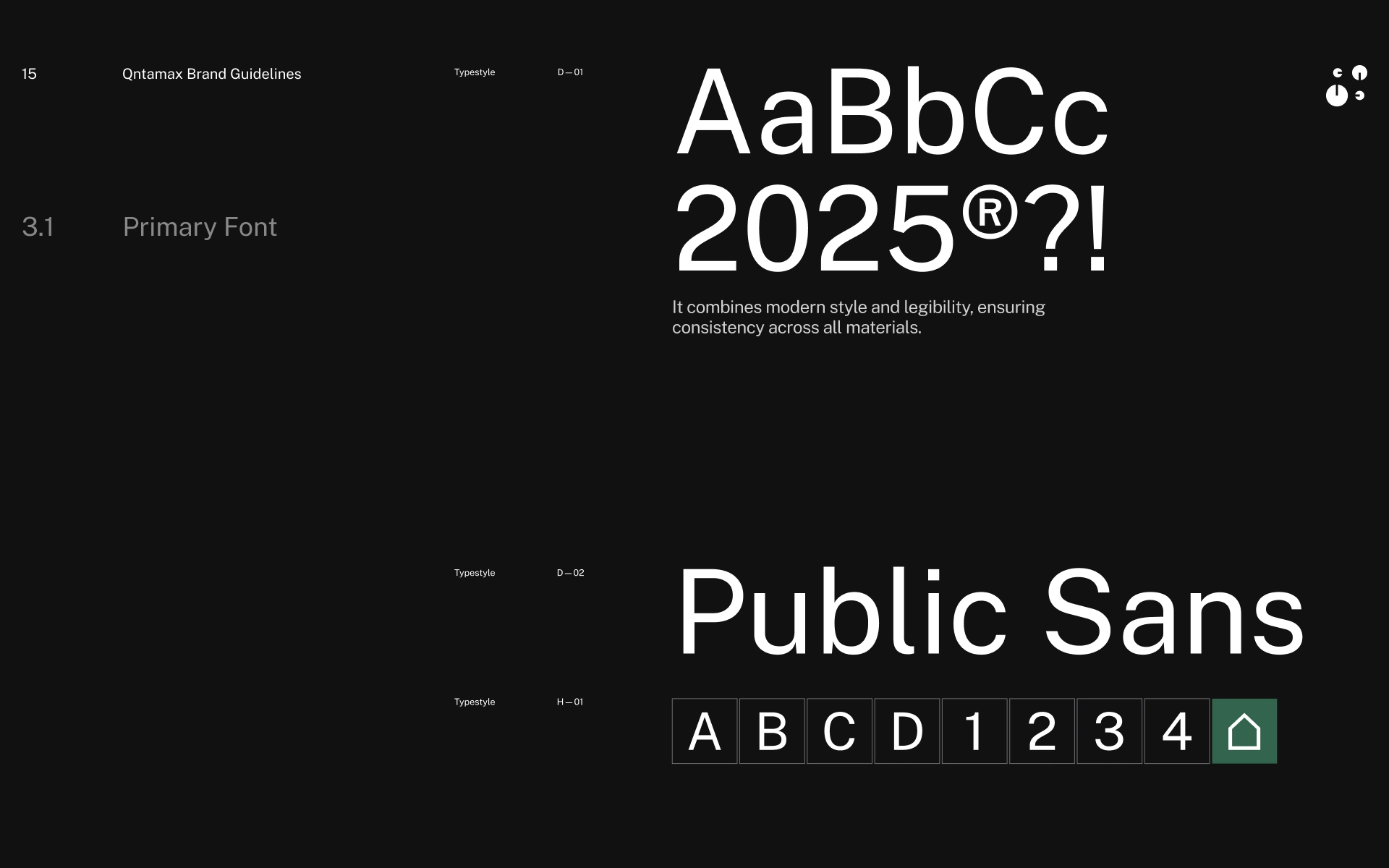
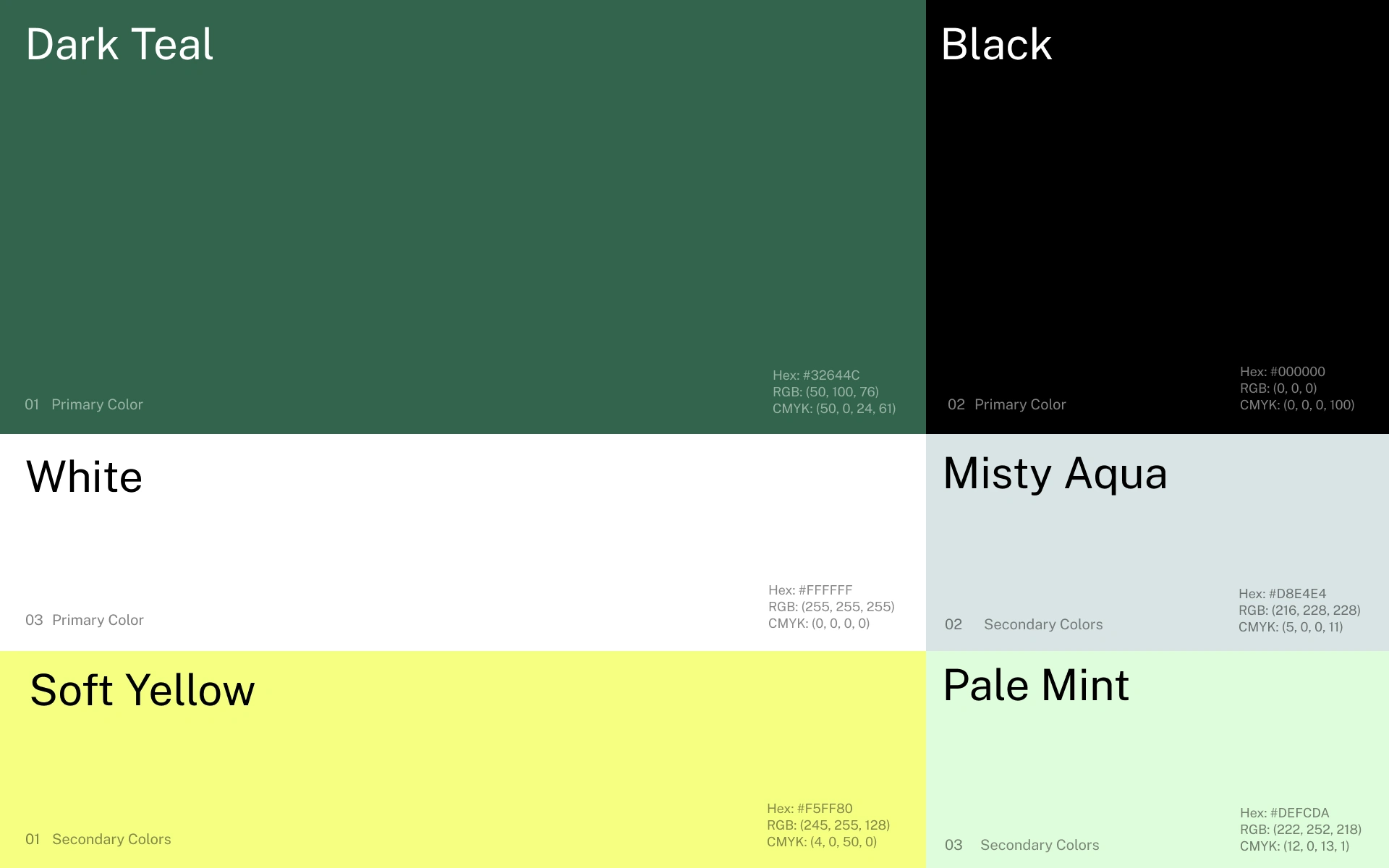
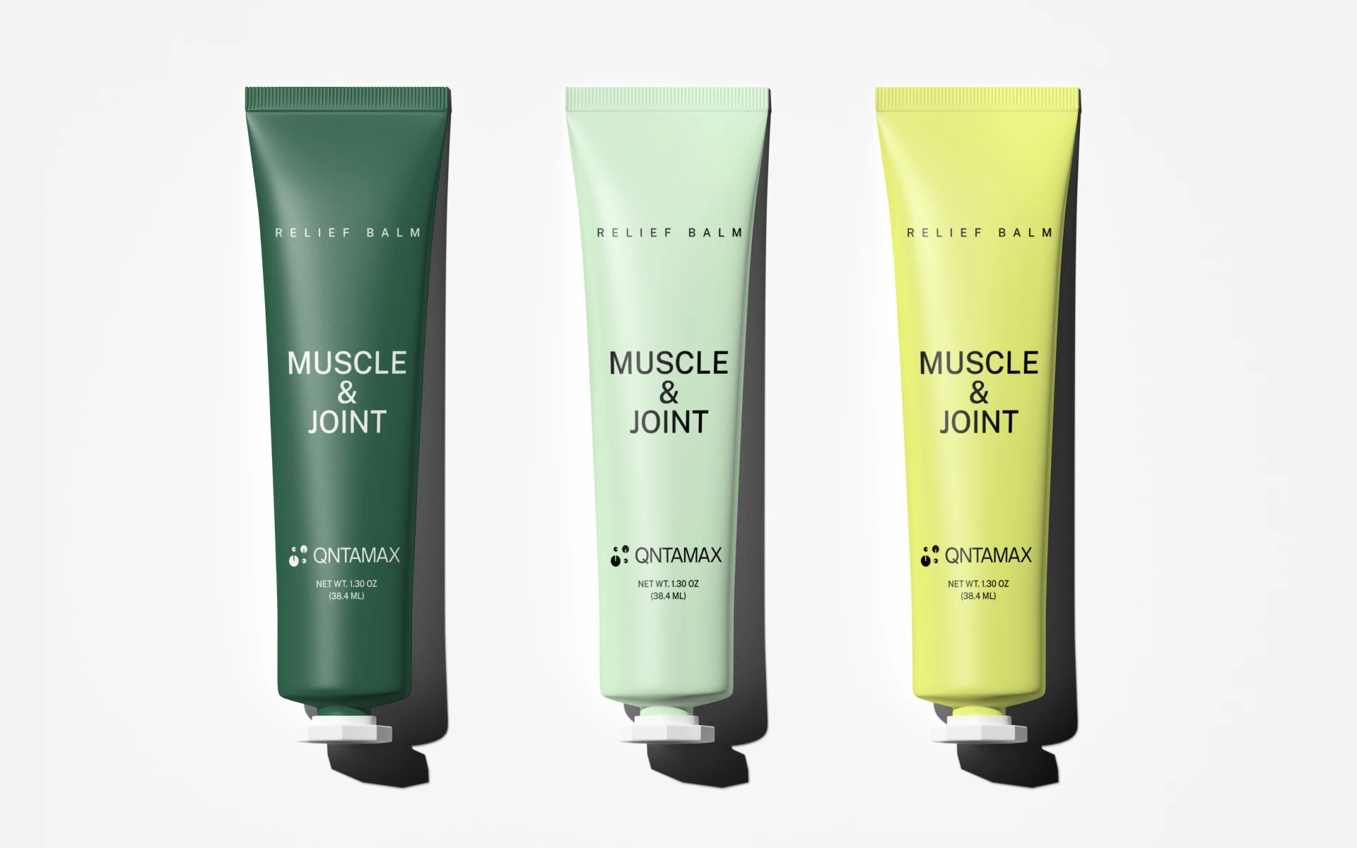
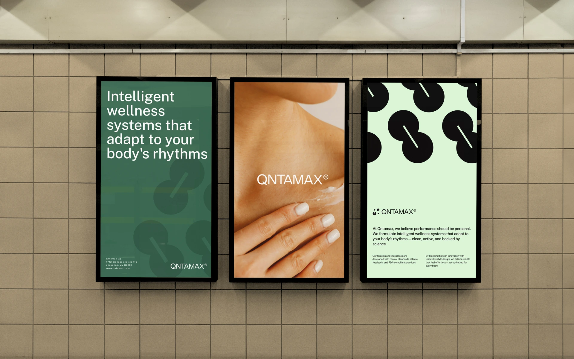
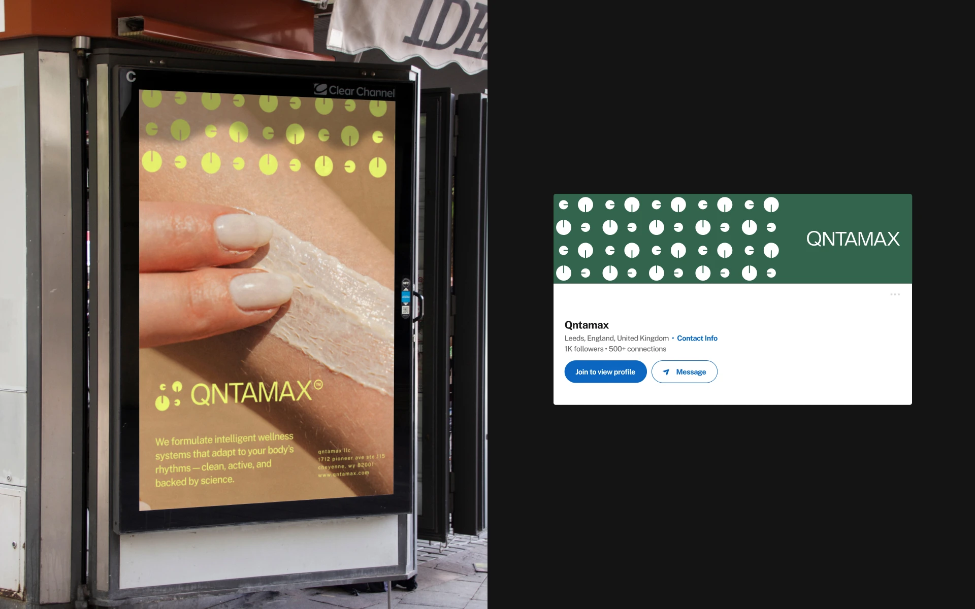
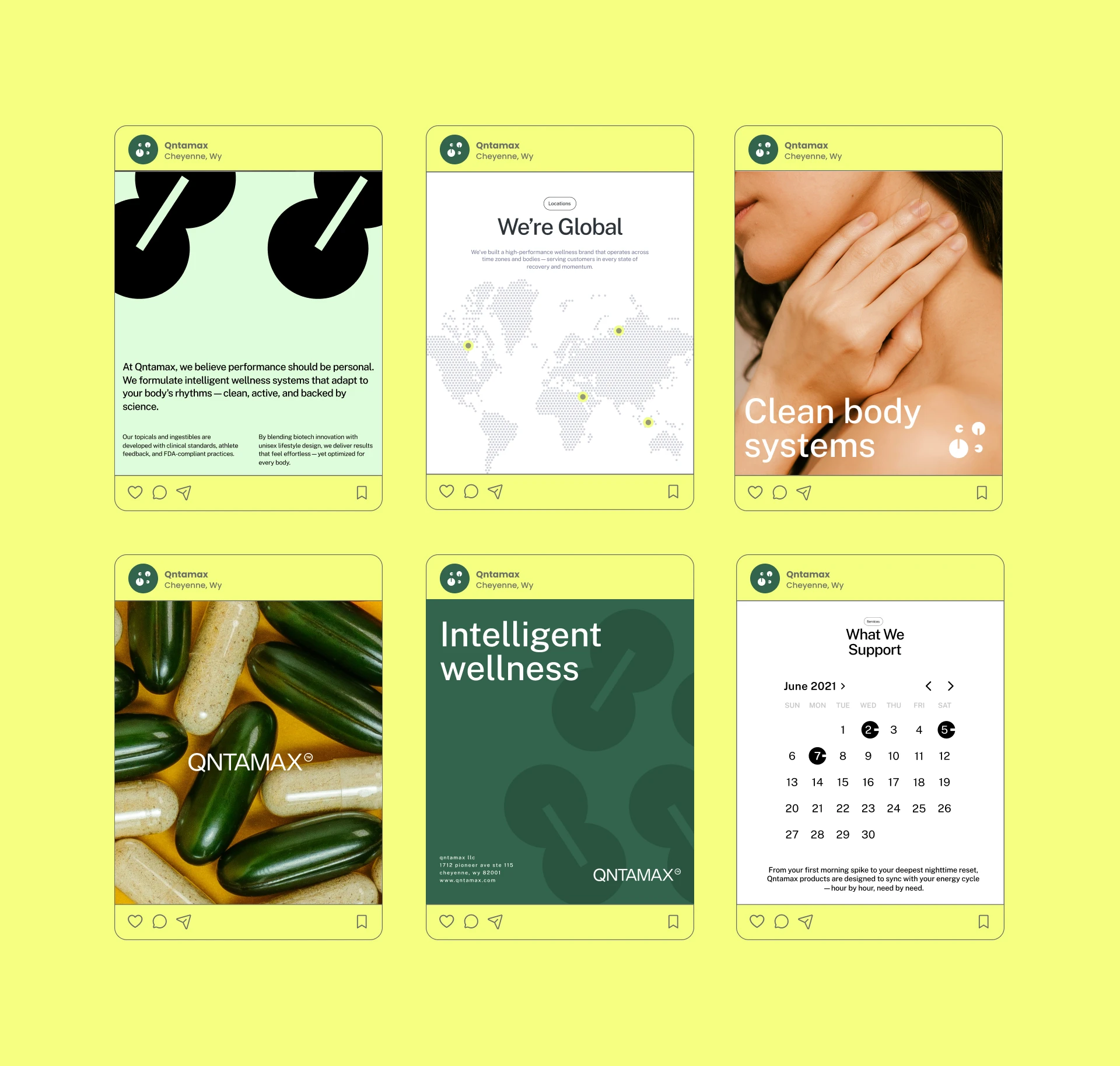
The Qntamax visual identity uses strong geometric forms, clean typography, and sophisticated minimal layouts to create a confident and premium brand presence.
Structured compositions reinforce ideas of precision, performance, trust, and clarity, while subtle graphic details add depth without compromising the minimal aesthetic.
The system is designed to work consistently across product packaging, digital communication, marketing materials, and future product extensions.
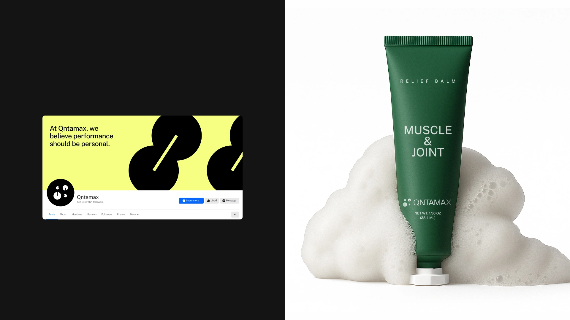
The Packaging
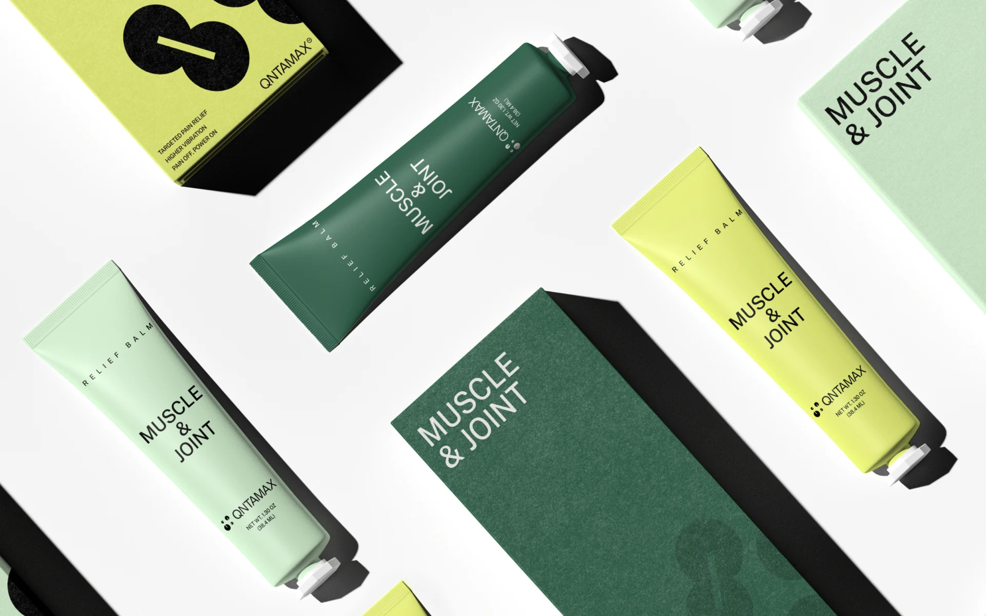
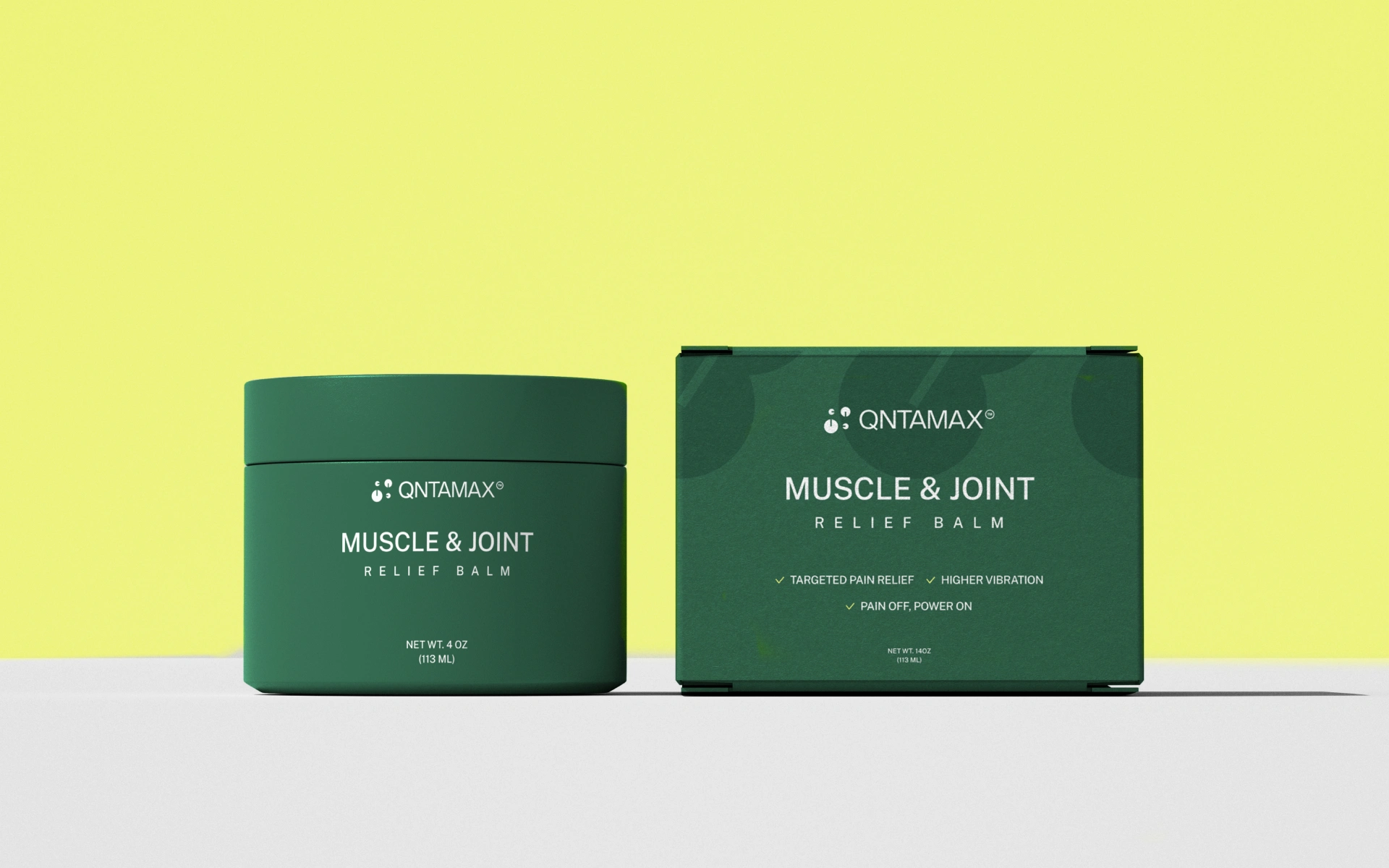
The packaging design combines premium aesthetics with functional clarity.
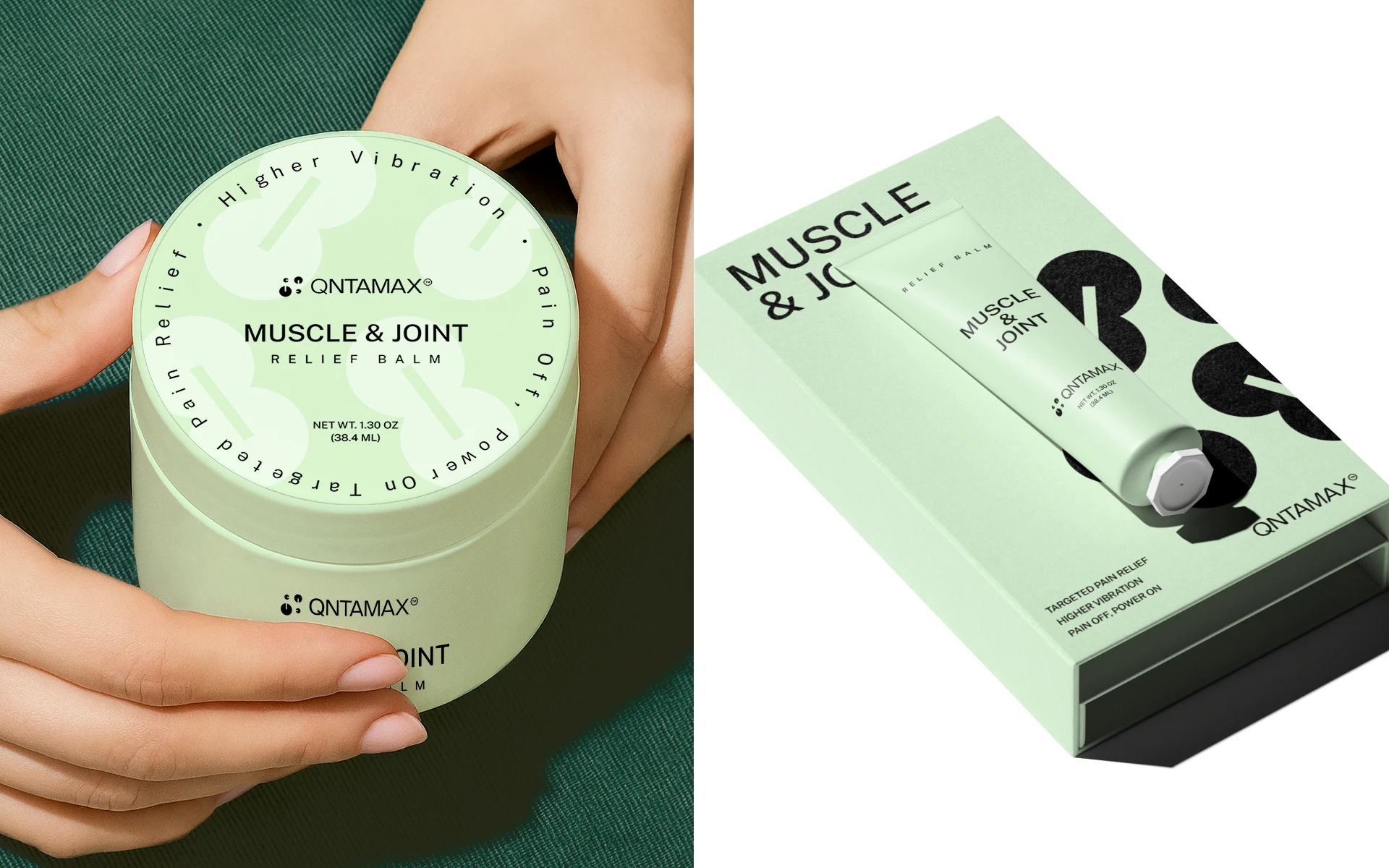
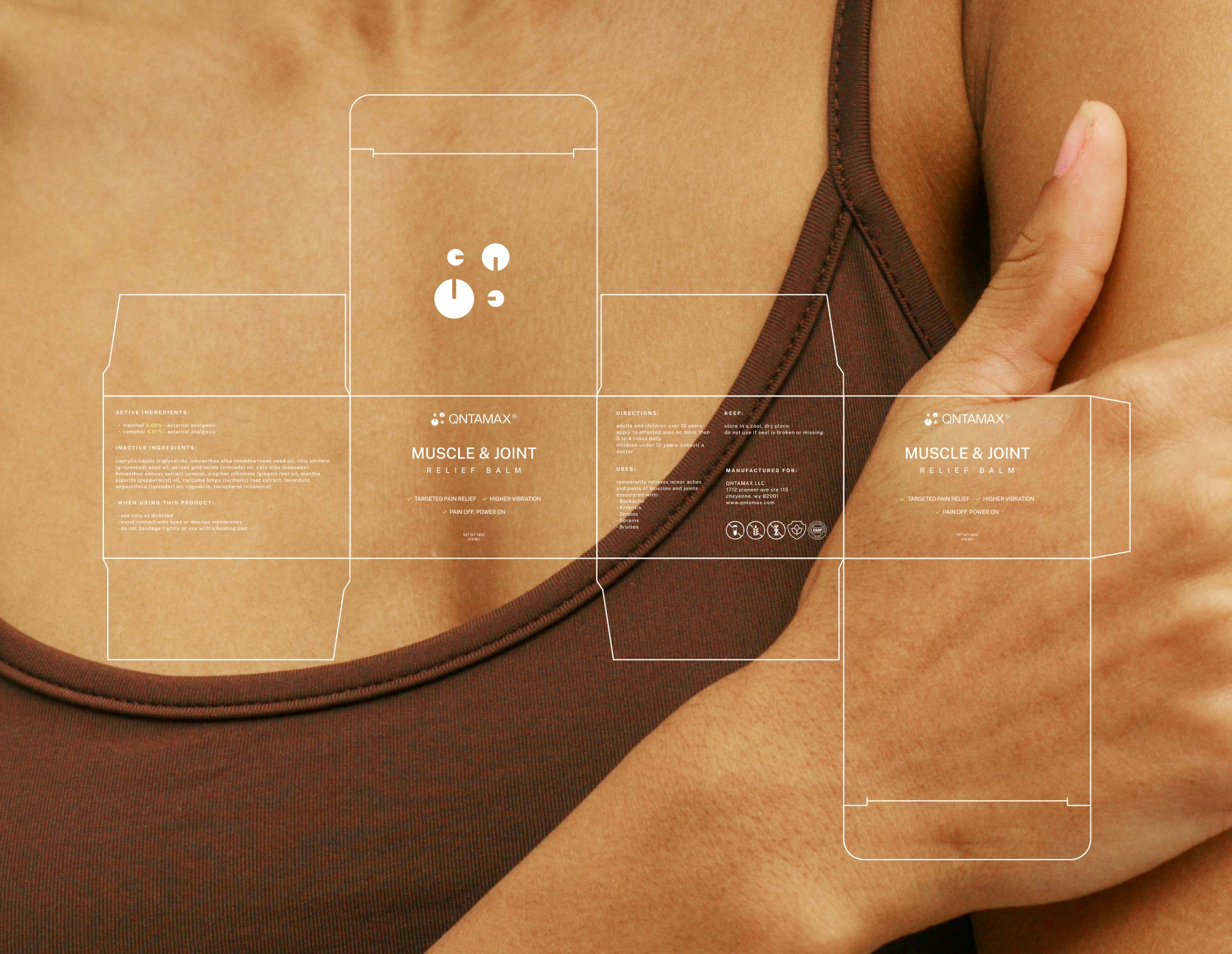
Minimal layouts, controlled typography, and subtle embossed patterns create a tactile experience that communicates quality and sophistication.
The packaging system is designed to make product information easy to navigate while maintaining a strong visual presence across different formats.
The result is a premium wellness packaging system that feels credible, modern, and performance-focused.
The Impact
Qntamax has a distinctive wellness brand identity that brings together science, performance, and modern premium design.
The project combines branding, logo design, visual identity, packaging design, product branding, wellness branding, health branding, supplement branding, typography, graphic design, and art direction into one cohesive system.
The Takeaway.
Science builds the formula. Design makes the promise visible.

Like this project
Posted Aug 17, 2026
Wellness brand identity and packaging design for Qntamax, combining science-backed branding, supplement packaging, product design and visual identity.