Exploor Travel App Brand Identity
Step into the driver's seat of adventure with the narrated tour App!
This fresh out-of-the-box app is about to change the way you explore a new region. Step into an adventure through breathtaking landscapes and hidden gems, all at your own pace with Exploor.
From Name Creation to a Vibrant Brand Identity
I got involved with Exploor right from the beginning of their app's journey. The client's goal was to create a brand name and a complete visual identity for Exploor, which is designed for travelers and adventurers seeking the freedom to explore foreign countries at their own pace.
My initial task was to come up with a suitable brand name. We kicked off with a brand strategy phase, during which we developed the brand name and the initial version of the logo.
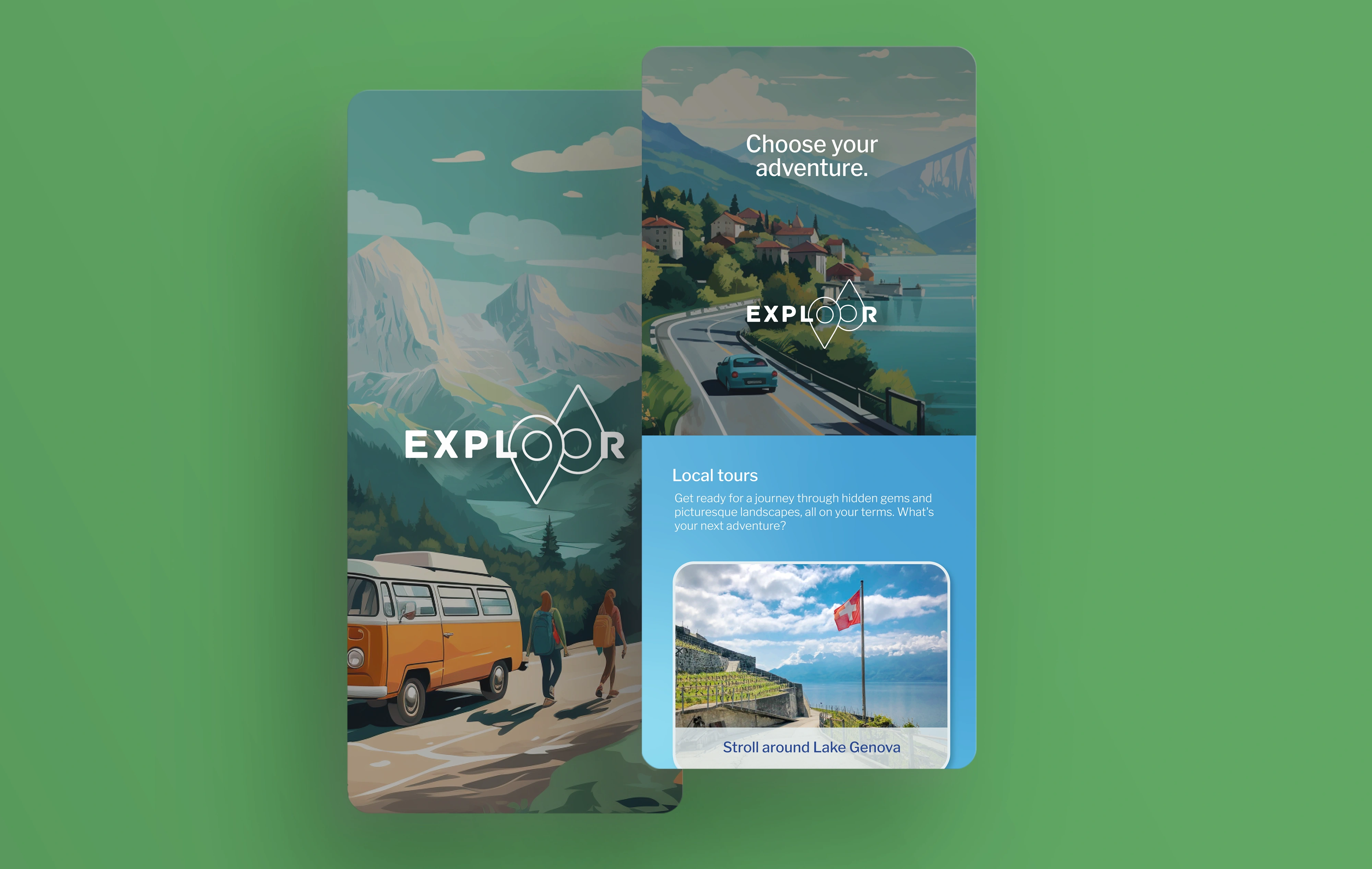
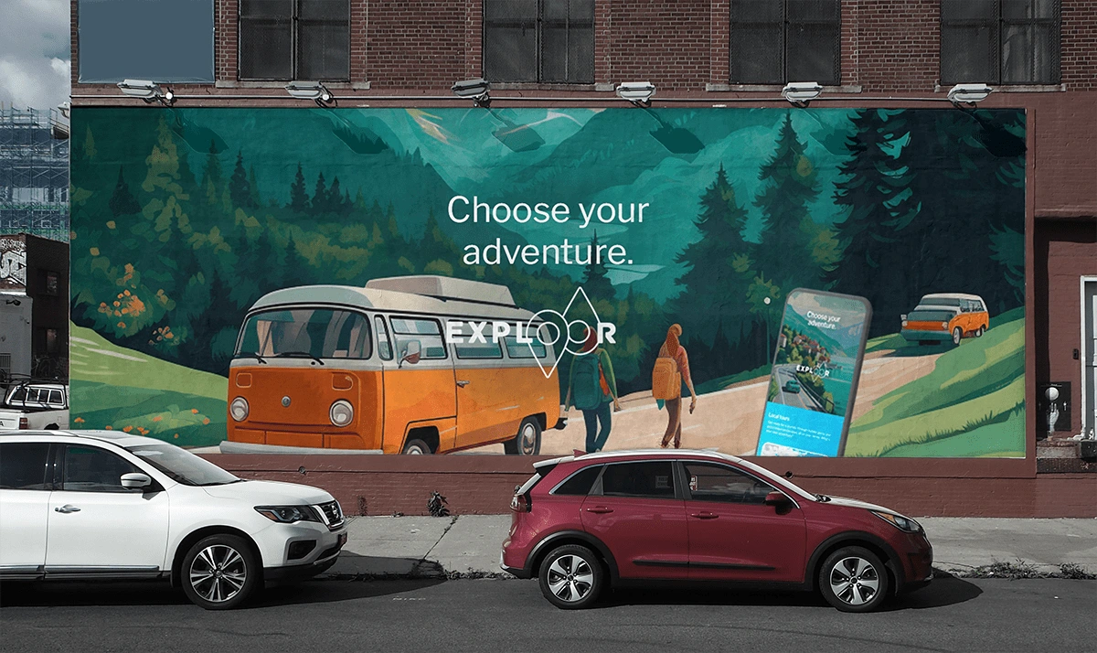
Once we had the brand name and core strategy in place, I proceeded to craft the full 360-degree brand identity. This encompassed creating vibrant and engaging illustrations, selecting the right typography, and designing a fresh palette of blue and green gradients.
Inspiring adventure
The logo was meticulously designed to embody the essence of adventure, travel, and globetrotting. Within the logo, map pins point to both the northern and southern hemispheres, symbolizing a world ready for exploration.
To complement this, we crafted a vibrant and captivating brand identity, complete with unique illustrations that capture the spirit of adventure and carefree exploration.
The choice of blue and green as the primary colors was deliberate, representing the clear, fresh waters, the endless blue skies, and the lush green landscapes that travelers encounter on their global journeys. In alignment with this rich and playful brand identity, I envisioned an app that exudes fun, distinctiveness, and visual appeal. The illustrated visuals are not only memorable but also visually striking, ensuring that the brand truly stands out.
Visualizing the App
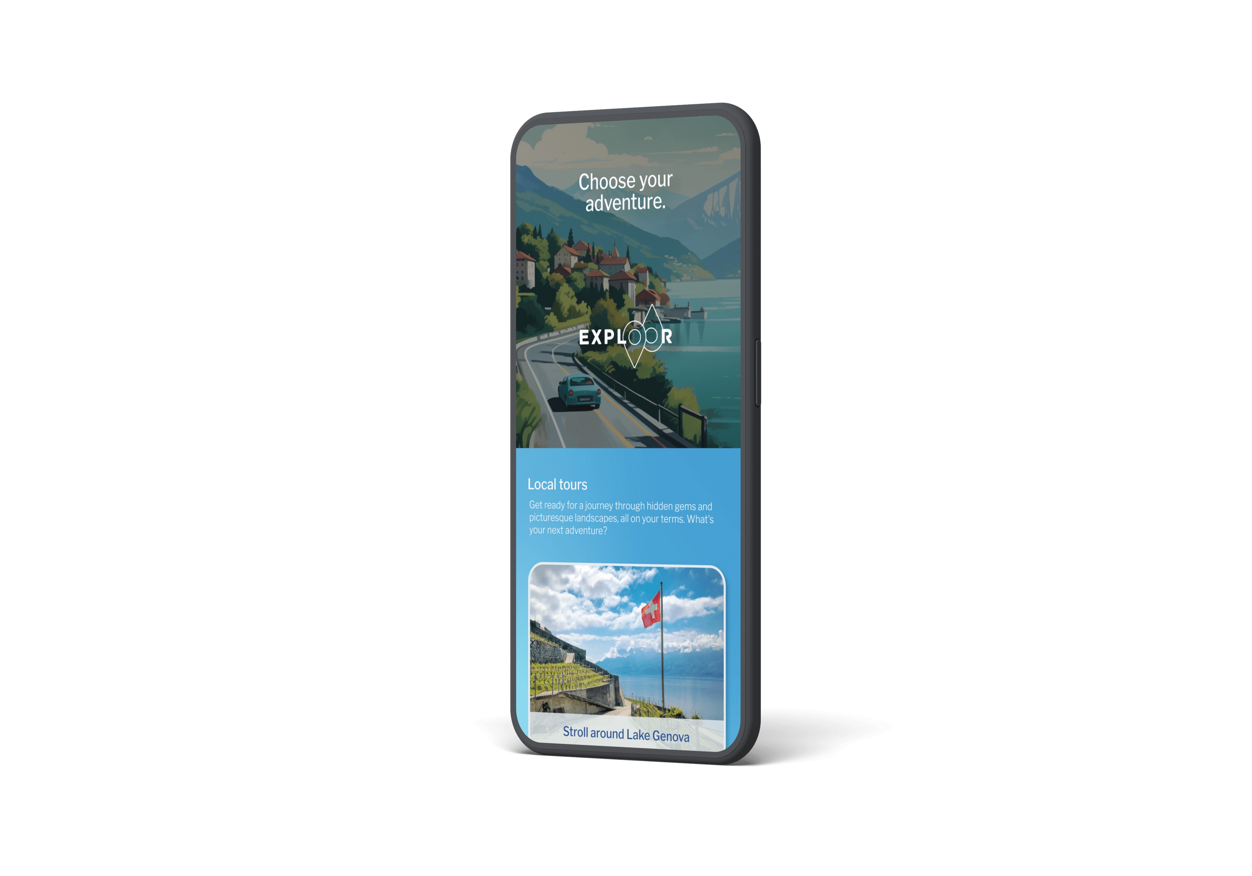
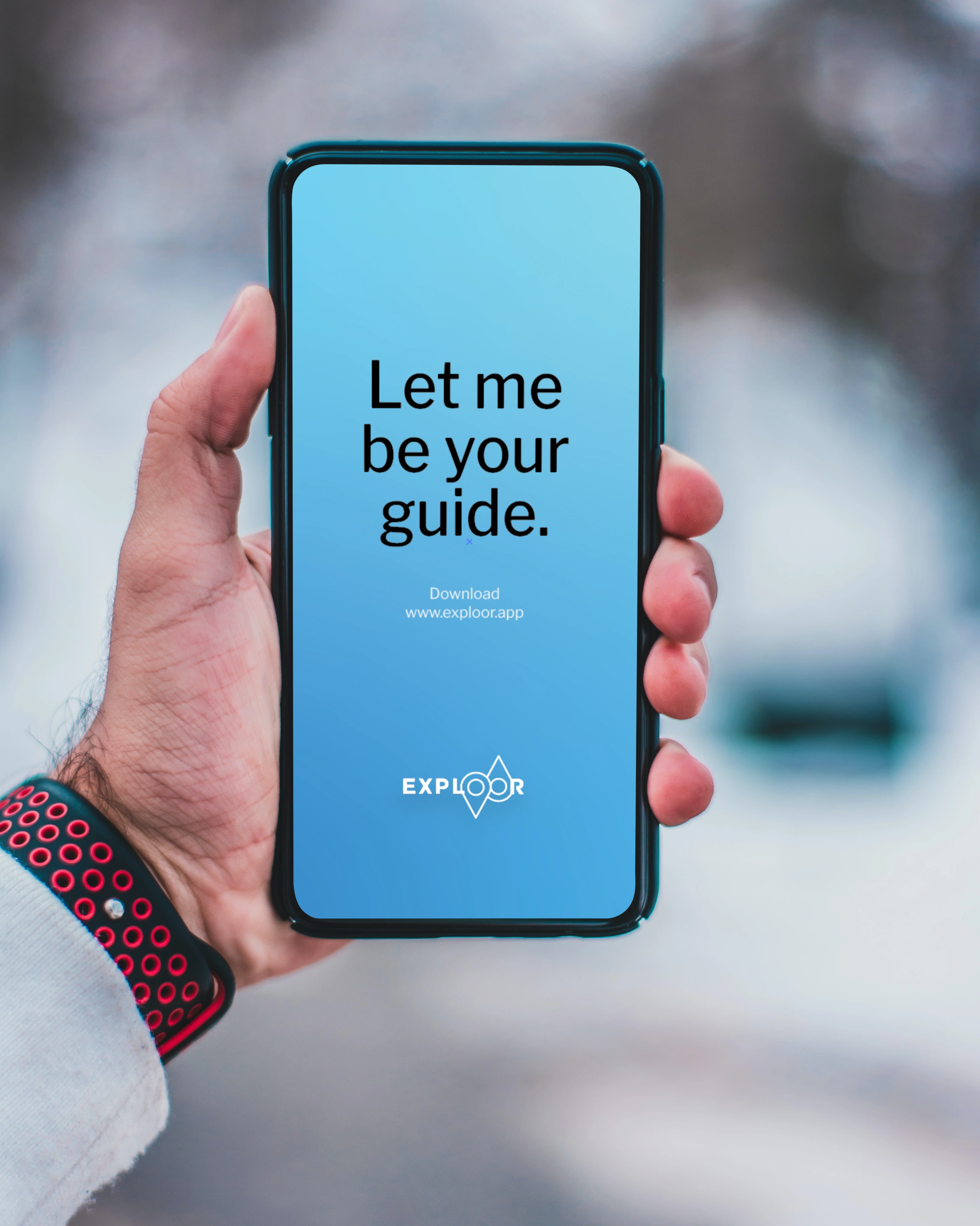
With the completion of the brand identity elements, the next step was to transition into designing the visuals for the app. Collaborating closely with the developer, we brought the brand's identity to life across various touchpoints and within the app itself.
Like this project
Posted Sep 12, 2023
I created a standout travel app brand identity with captivating illustrations and a unique visual style.

