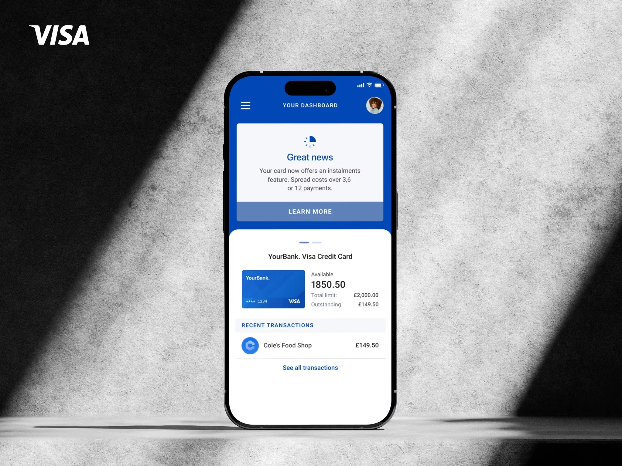
Increasing feature opt-in for Visa Instalments
Chris Godby
3 words, 1 icon. How we optimised mobile feature adoption for Visa instalments
Visa wanted to launch payment instalments—a new feature that could change how cardholders manage purchases.
But they had a problem: Which flow would people actually understand and use?
Four different approaches to the same moment. No data to decide which would win. We used Figjam to align on best approaches and share knowledge.
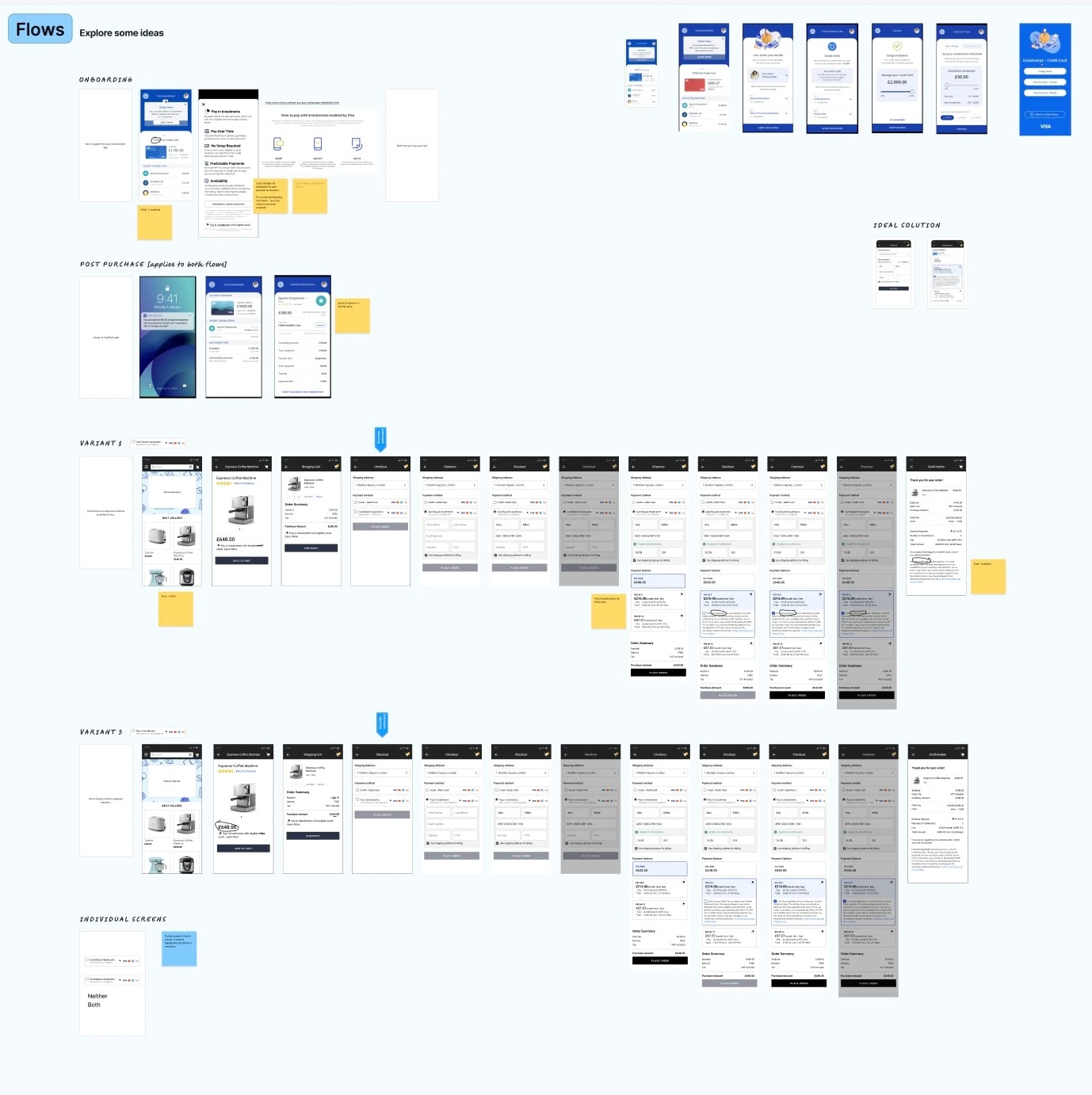
We used Figjam to map out the variants, including unhappy paths
The Challenge
Instead of launching with best guesses, Visa wanted to test which approach resonated with real cardholders.
My role:
Design 4 variants of the key instalment decision screen
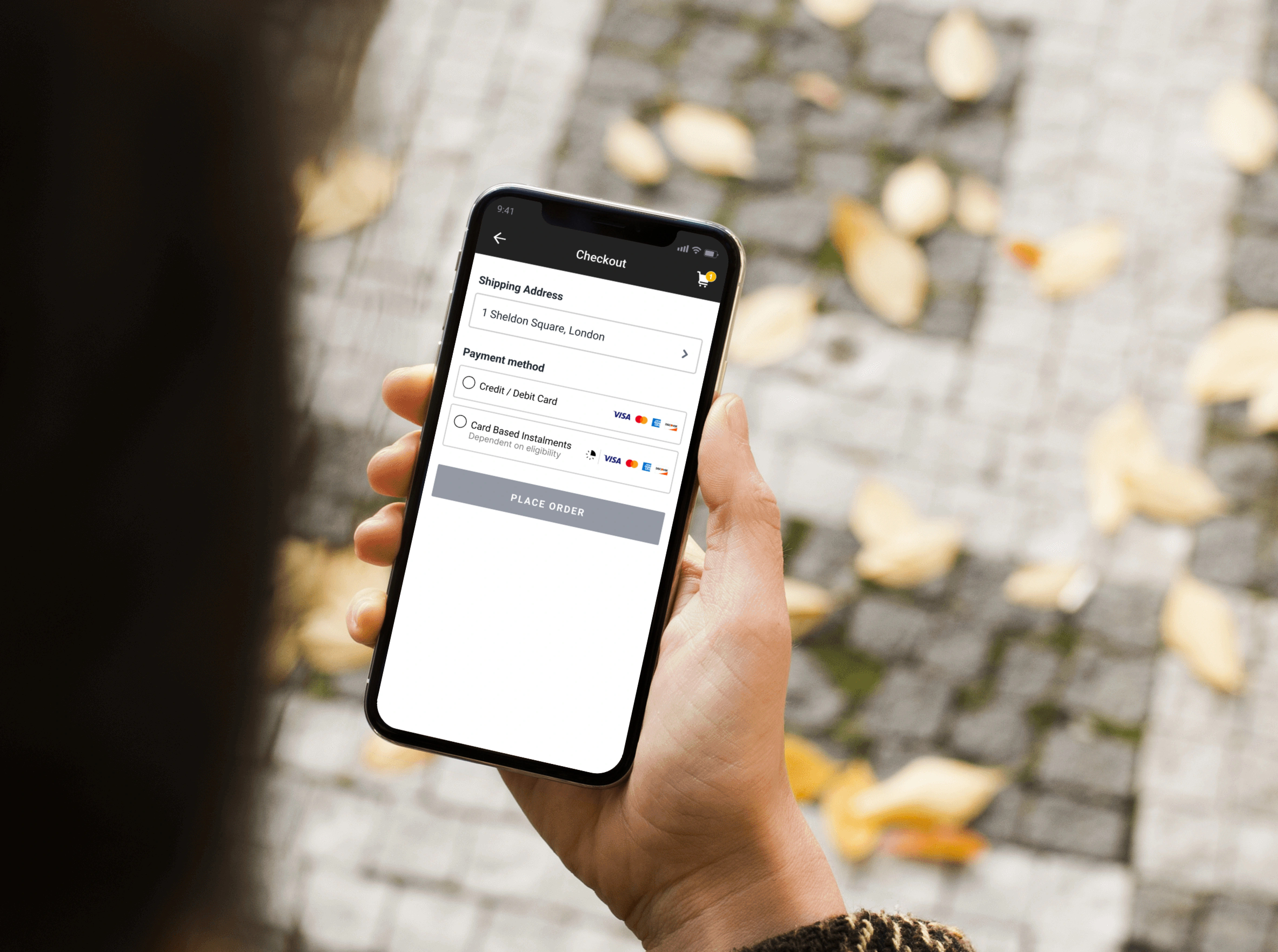
Prototype a realistic purchase flow (coffee machine checkout)
Embed strategic test points to measure comprehension and opt-in intent
Collaborate with Ipsos Research for unmoderated testing
The Process
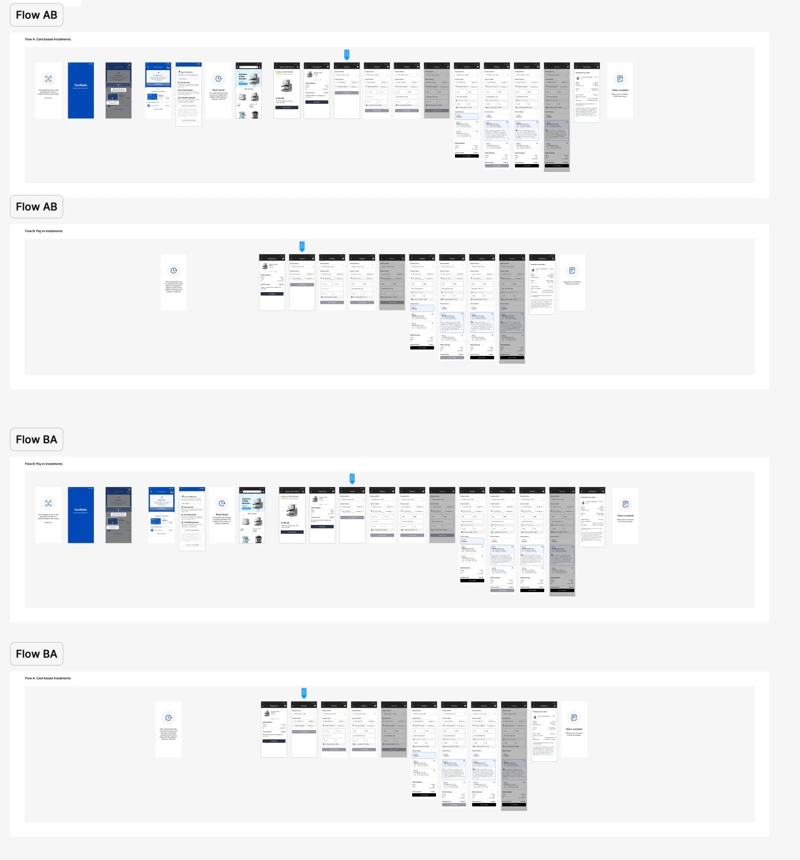
1. Design & Prototype
Created four versions of the critical instalment offer screen, each presenting the option in a different way within an identical coffee machine purchase flow.
2. Strategic Test Points
Built measurement into key moments:
Did people understand what instalments meant?
Where did confusion happen?
Which presentation made them most likely to opt-in?
What questions arose at the decision point?
3. Research Partnership
Ipsos ran the testing with real cardholders, capturing behaviour and comprehension across all four variants.
The Outcome
Ipsos delivered insights to Visa showing which variant performed best and where the other approaches created friction.
Result:
Visa gained data-backed confidence in which approach would maximise feature adoption at launch.
Project Details
Client: Visa
Research Partner: Ipsos
Role: UX Design, Prototyping, Test Framework Design
Context: Coffee machine purchase flow with instalment decision variants
Deliverables: 4 interactive prototypes with embedded test points
Like this project
Posted Oct 31, 2025
Working with Ipsos and Visa to test 4 variants. Our goal? Increase mobile feature adoption for Visa's global payments platform.
Likes
1
Views
6
Timeline
Jan 23, 2025 - Feb 28, 2025
Clients
Visa