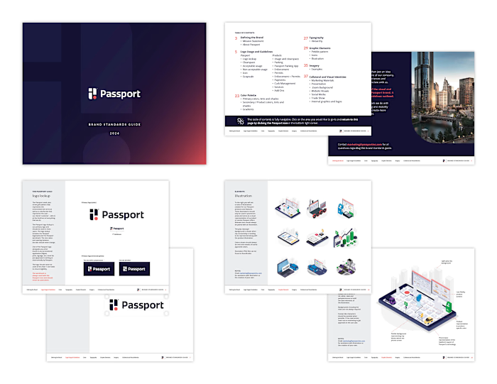
Greater Jasper Consolidated Schools Brand Guidelines
GJCS would highly recommend Shayna Reinbold for graphic design and branding needs. Through her design process, she was able to glean information that represented our background, beliefs and mission. She was readily able to transform that knowledge into branding options, as well as to align the elements of our new brand to the tenets we hold dear in education. All deliverables were professionally packaged, timely and easily applied to our operations. Shayna's follow-up was impeccable. – Tracy L. View More Recommendations here: https://www.linkedin.com/in/shaynareinbold/
Request
Develop a brand that speaks to a tradition and expectation of excellence in everything we do from academics to sports. Keep known brand colors of black and gold, but freshen them up and add in a tertiary color.
Greater Jasper Consolidated School District (GJCS) rebrand:
Research and analysis
We took examples from school districts around Indiana and compared the successes and needs for improvement across the entire brand experience for GJCS.
Development
Create multiple logo selections and two different color options. Once an option is chosen, create assets based off of that choice.
Development
Black and gold; GJCS’s staple colors and main brand recognition factor, has been carried through both color explorations with an updated gold gradient. This gradient is a step between the old gold on GJCS’s website and the gold on the Jasper High School wildcat.
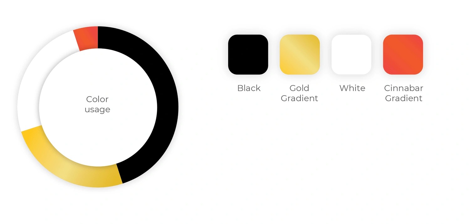
Color exploration 1 - Black, gold, white and cinnabar
Cinnabar hits the note of history and tradition. By pairing cinnabar with the gold and black, it can be representative of Jasper’s German roots.
Avoiding the same tonality of red that Southridge (a school near the GJCS district) uses, this red (cinnabar) sits between orange and red. When the tertiary color is used sparingly, it’ll shine bright and can be used to bring attention to specific elements and add visual interest.
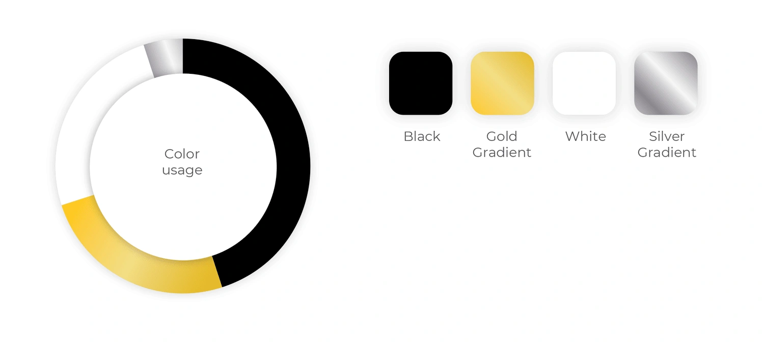
Color exploration 2 - Black, gold, white and silver
Silver hits the note of the expectation of excellence when paired with gold. The silver is a tertiary and should be used sparingly.
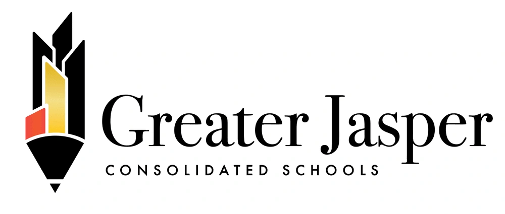
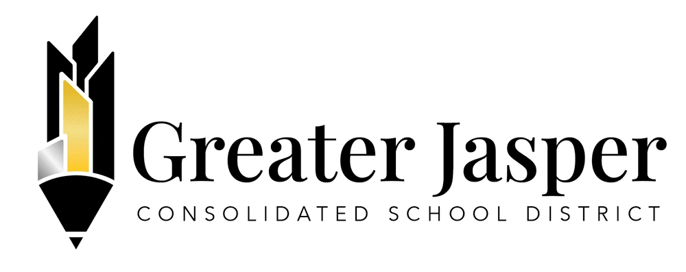
Logo exploration A - Pencil Torch
The symbol on the left of the wordmark is representative of a torch and also forms the shape of a pencil.
The five elements making up the pencil torch were intended to represent each word for Jasper G.R.E.A.T growing resilience, engagement and academics together.
The pencil can represent academics
The torch is representative of the Light that represents knowledge and wisdom and is seen to illuminate the dark world through learning, scholarship, teaching, invention, observation, and study.
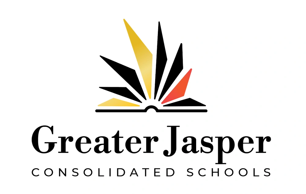
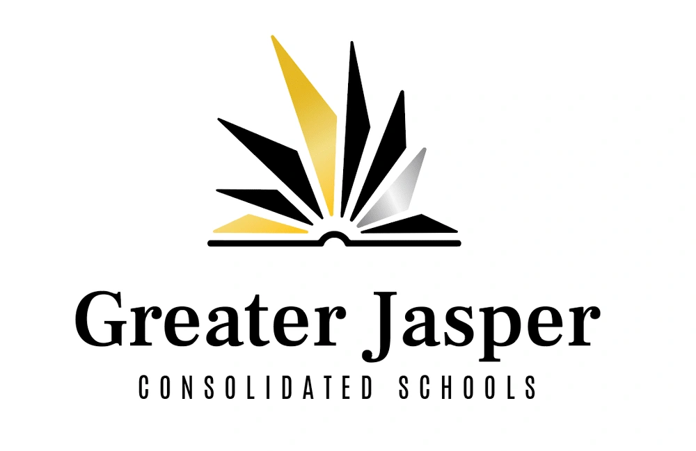
Logo exploration B - Open Book Sunburst
Open book is representative of academics, and is abstract enough to be viewed as a sunburst representing positivity and strength
The centeredness of the book shows that academics above all else is the overall focus
The final choice
The GJCS board of directors gathered and decided on a final color and logo option.
An alternate typeface was selected during this time as well.
The logo below is the GJCS primary logo, and the centered option on the feature image is a secondary option when horizontal space is limited.

To view the full case study, pleave view my website at vividlybold.com
Like this project
Posted Sep 30, 2022
Logo design and brand strategy for GJCS. Creative logo design, brand guidelines, marketing collateral, business cards, social media images & more!
Likes
1
Views
21
Clients
Greater Jasper Consolidated Schools


