Built with Webflow
OnlyOnce: Designing a Sacred Memory Ritual
Carol Loiola
Verified
1 collaborator
OnlyOnce: Designing a Sacred Memory Ritual
A voice-first app for preserving life's fleeting moments through photo + voice
Currently focused on families with young children, but designed for anyone wanting to preserve memories of loved ones, special moments, or meaningful chapters of their life.
Overview
My Role: Lead Product Designer
I led the complete product design for OnlyOnce. From user research and strategy to high-fidelity UI for the web app. I also designed and implemented two landing pages (customer + influencer) in Webflow, which will be showcased in a separate post.
Team:
Carol (that's me!) — Lead Product Designer
Ross — Founder & Product Vision
Nicholas — Backend Developer
Sofia — Visual Design & Brand Identity
Timeline: 5 months (May - October 2025)
Platform: Mobile-first PWA (Progressive Web App + Webflow)
(Once I convince them to enter Contra I will edit this to be a contribution work 😂)
The real problem
Parents want to preserve fleeting moments with their kids. But nothing sticks.
They've tried scrapbooks (too time-consuming), email threads (forgotten), photo dumps (never revisited). Existing tools demand too much or feel too public.
"I take hundreds of photos but never look at them again." — Michelle, mother of 5
The real challenge: Not lack of desire. Lack of a solution that fits real life.
How might we create a ritual that feels sacred, not like another task?
My Process
Research & Synthesis
What I did:
Competitive analysis (1Second Everyday, Qeepsake, Tinybeans) + Reddit deep-dive
Storyboard concept testing to showcase during interviews (with my partner's help)
6 in-depth interviews (mothers, kids 0-12, US + Brazil)
Affinity mapping → How Might We questions → Feature prioritization
Key insights:
6/6: Voice > photos for emotional connection
6/6: Weekly sustainable, daily overwhelming
6/6: SMS reminders critical for habits
100%: Preferred photo+voice combo (validated via storyboard testing)
User Flow Evolution
~I got to say: this one was though😮💨~
I designed and iterated the complete user journey 4 times, each version responding to feedback and rethinking the core experience:
V1 (June): Traditional app model
User signs up → Receives SMS prompt → Opens app → Creates memory
❌ Problem: Too many steps before experiencing value
❌ Friction: Payment timing unclear, onboarding felt heavy
V2 (July): Experience-first approach
Create first memory → Then signup → Paywall after value demonstration
✅ Breakthrough: Users feel emotional connection before commitment
✅ Added: 48-hour grace period, mandatory notifications
V3 (August): Contributor model pivot
Rethought entire collaboration flow based on technical constraints
✅ Major change: Share individual memories (not vault collaboration)
✅ New pattern: Contributors leave voice responses on specific shared memories
✅ Threading system: Multiple people can respond to one memory, creating family dialogue
V4 (September - Final): Mobile-first optimization
Refined all three core flows: Main, Contributor, Influencer
✅ Platform decision: Memory capture mobile-only (QR bridge for desktop)
✅ Smart features: Existing user detection, optimized push notifications
✅ Polish: Contributions page with expandable threads, cross-device vault browsing
Visual Identity Journey
Collaborated with Sofia through 3 color iterations:
V1: Lavender → Too feminine/"baby girl"
V2: Exploration phase → Neutral alternatives tested
V3: Earthy, warm tones ✅
Final system:
Colors: Navy-900, Amber-700, Linen-200 (warm, timeless, gender-neutral)
Type: Playfair Display + Figtree (selected by Sofia)
Icons: Phosphor Icons + custom illustrations by Sofia
Why it works: Feels like opening an old photo album. Warm, nostalgic, sacred.
Sofia's impact:
Beyond colors, she created custom illustrations for emotional moments and guided the overall art direction. Her clarity on visual storytelling transformed the project from "nice" to "meaningful."
From Wireframes to Final Design
Wireframing the complete system:
60+ screens covering every state, edge case, and user flow across mobile and desktop.
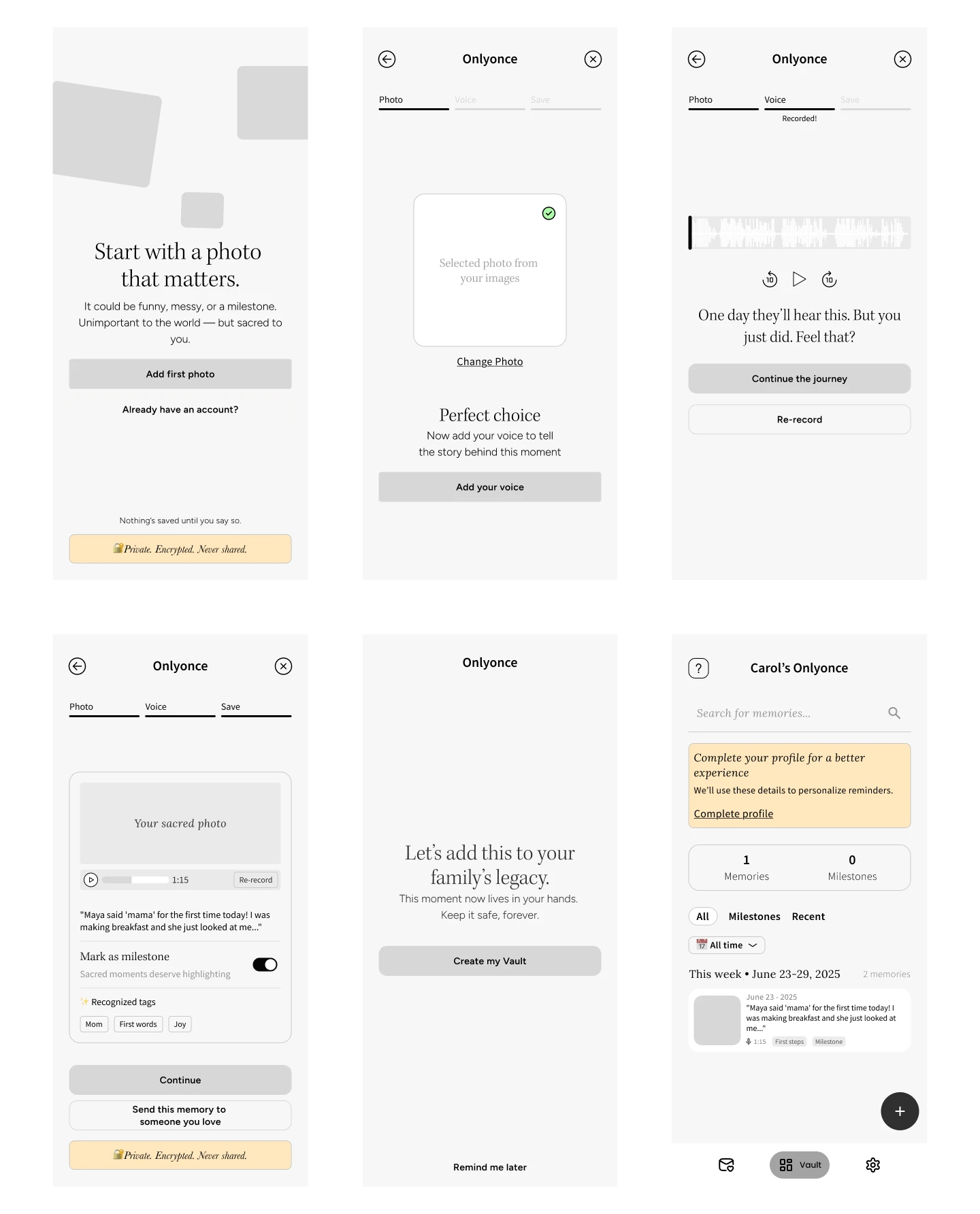
High-Fidelity Screens
I translated all wireframes into high-fidelity UI, collaborating with Sofia on key visual elements for specific screens (Vault layout, Contributions page structure). The final design balances modern aesthetics with nostalgic warmth.
Current status: The web app is in beta testing with friends and family. Once it's live, I'll update this case study with the link. In the meantime, you can explore the complete high-fidelity designs here
Design Handoff & Documentation
Instead of a clickable prototype, I created a comprehensive handoff system optimized for implementation clarity.
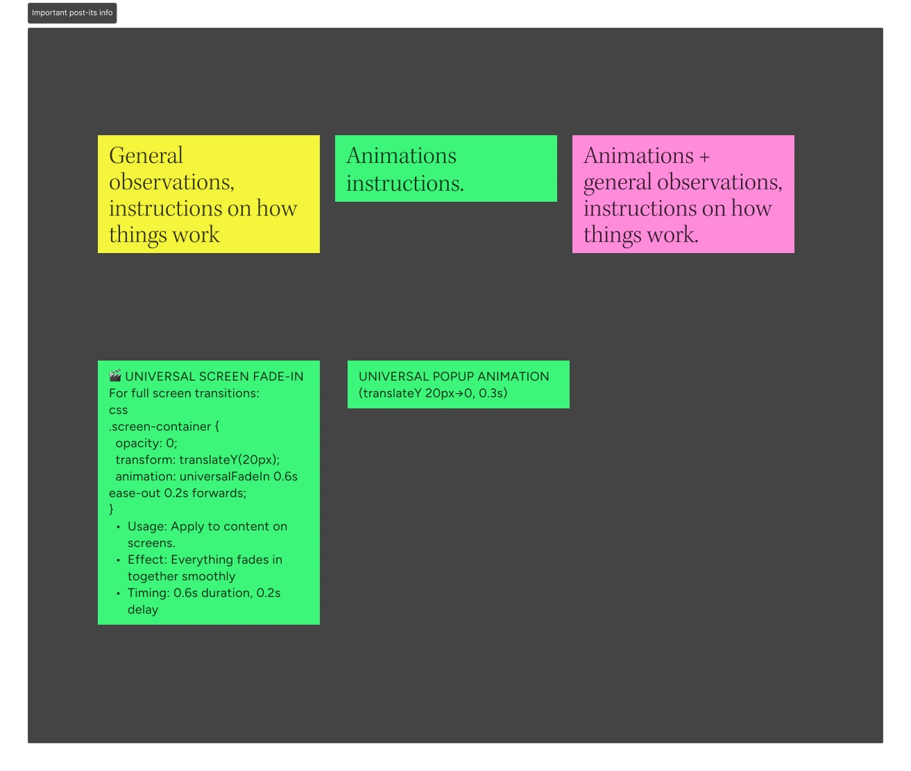
My documentation approach:
📌 Post-it System — Color-coded annotations explaining:
General observations and flow logic (yellow)
Animation instructions and timing specs (green)
Combined notes with interaction details (pink)
🎨 Figma Organization:
Design tokens & variables for colors, spacing, typography
Component variants with clear usage guidelines
Detailed animation specs (duration, easing, trigger points)
Edge case documentation for every user flow
⚙️ Technical Foundation:
Semantic tokens for scalable implementation
Reusable components with defined states
Variables for easy theme updates
Interaction patterns documented with rationale
Why this approach?
Clickable prototypes show "what" but not "why" or "how." My system gave Nicholas everything needed to build with context and intention. No guesswork, no back-and-forth. And of course, we always stay in touch and collaborate on the process.
Team Collaboration
How I kept us aligned:
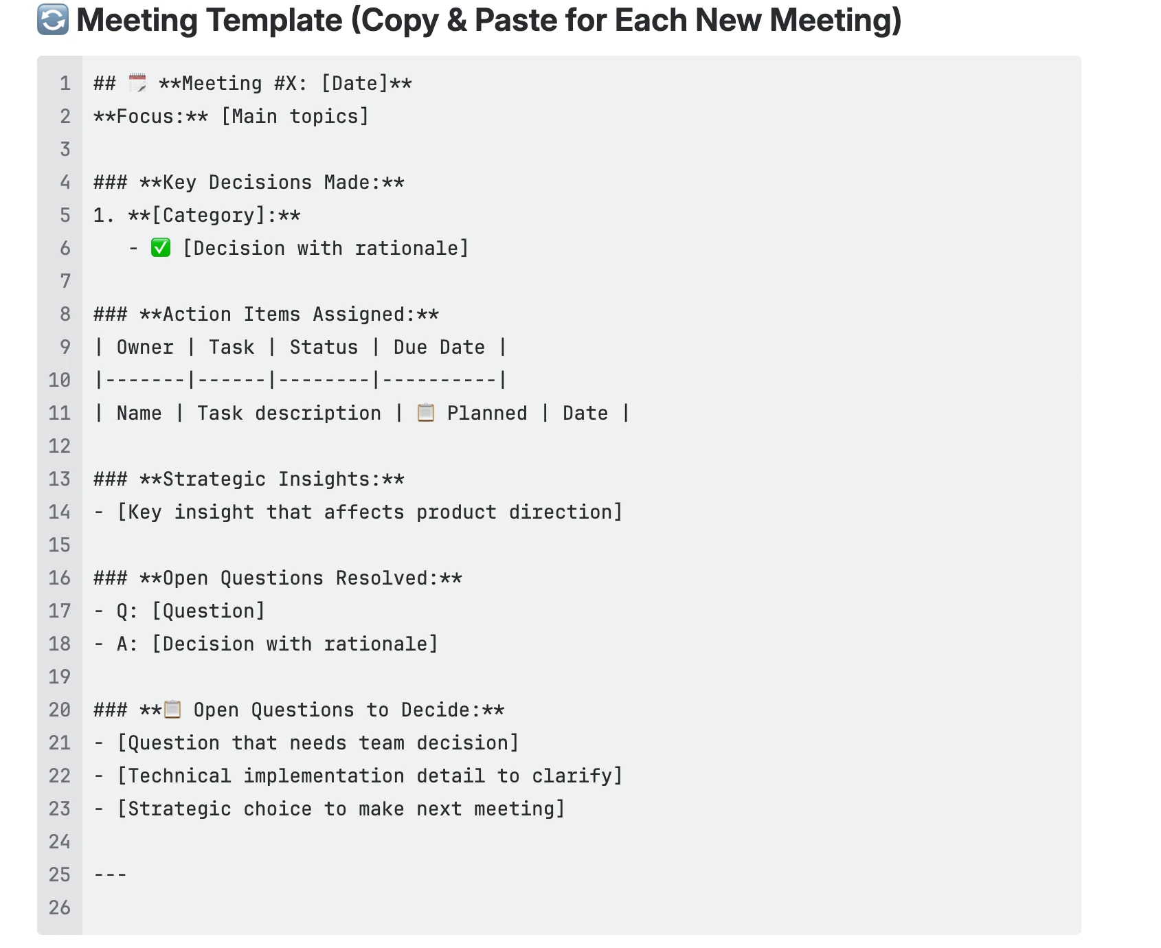
16+ weekly syncs documented in Confluence (structured templates)
Cross-functional validation with Nicholas on technical feasibility
Visual partnership with Sofia on brand identity
Decision tracking for every major choice with rationale
Like this project
What the client had to say
Carol was fantastic, went above and beyond expectations.
Ross Kaellner, Only Once
Oct 20, 2025, Client
Posted Oct 21, 2025
Lead designer for OnlyOnce, a voice-first web app for preserving life's fleeting moments. Currently focused on families, designed for any meaningful memory.
Likes
3
Views
136
Timeline
May 13, 2025 - Oct 20, 2025
Clients
Only Once
Collaborators