Defendify Cybersecurity
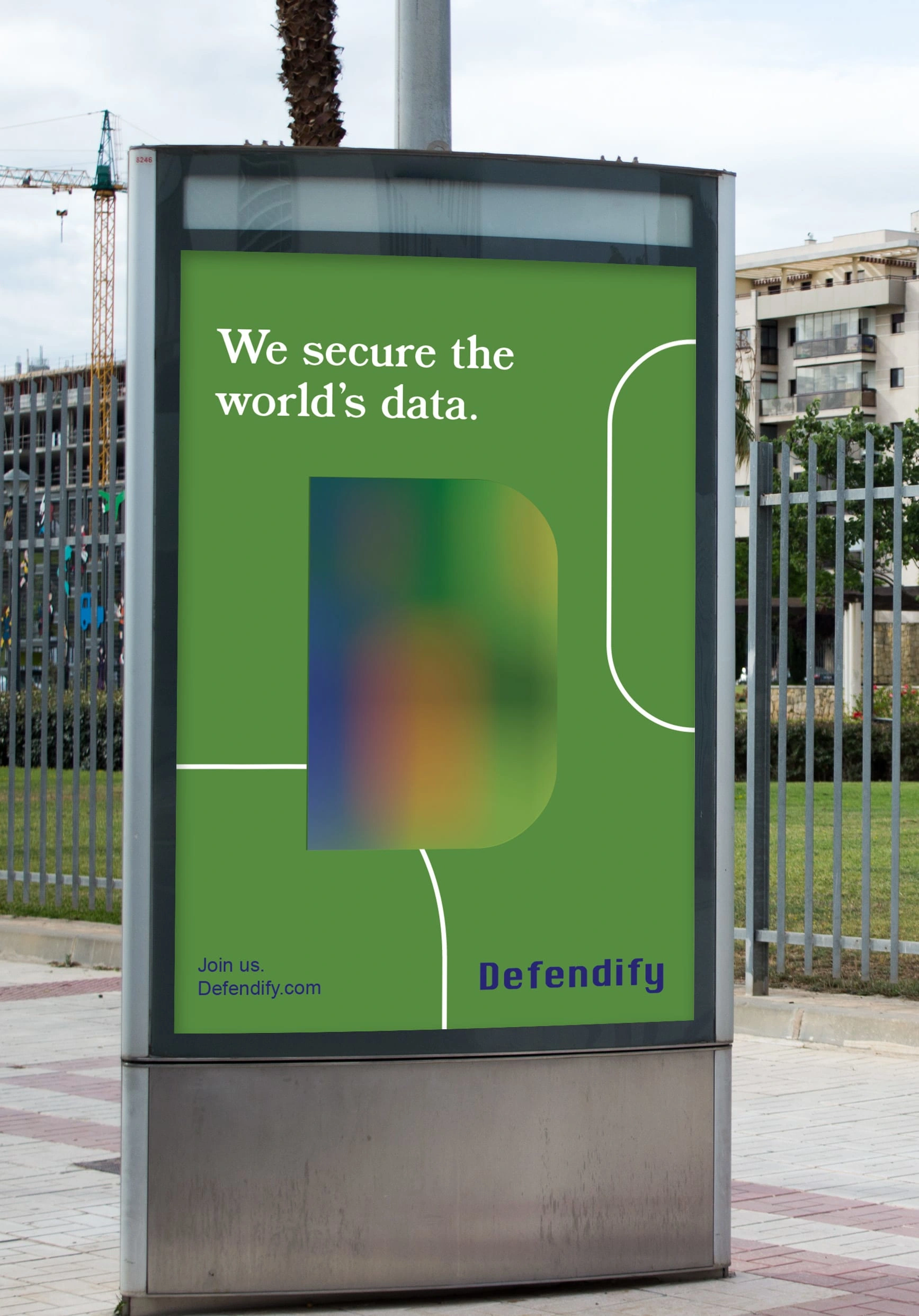
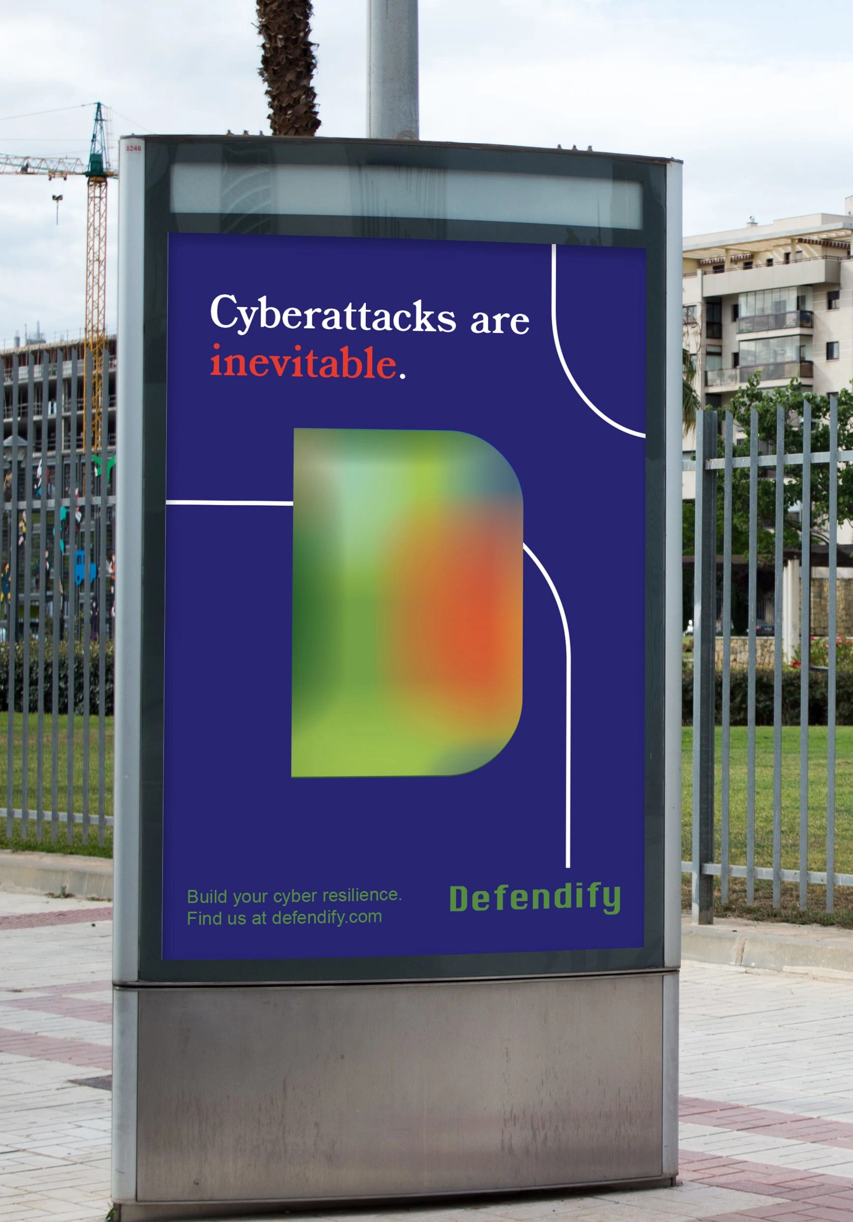
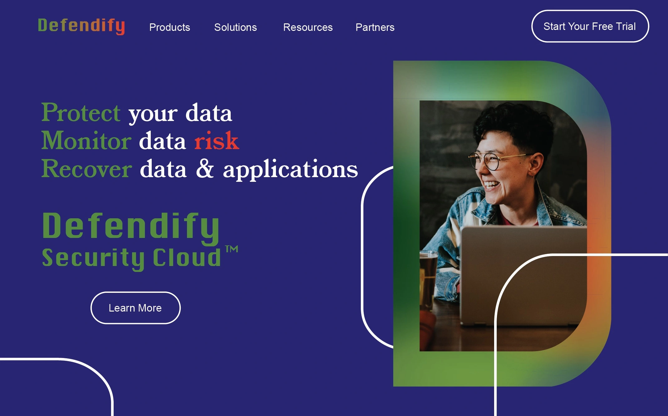
Defendify, a cybersecurity company seeking a new look, wanted their branding to convey a sense of protection and fortification while remaining welcoming and accessible, taking the intimidation out of the word “cybersecurity.”
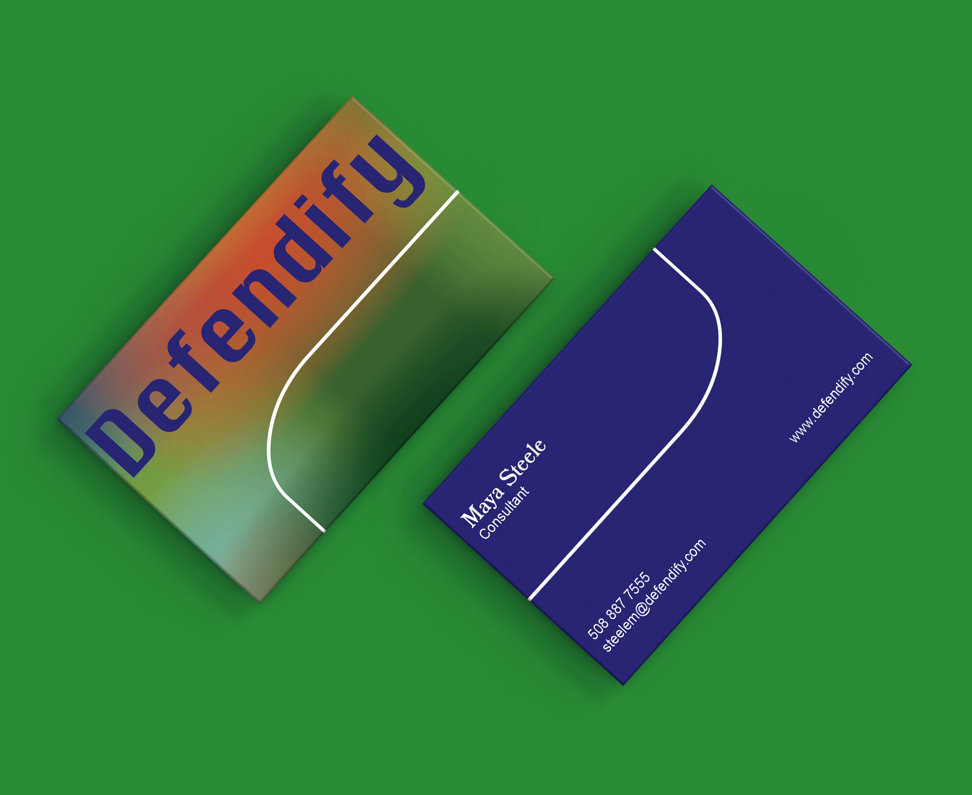
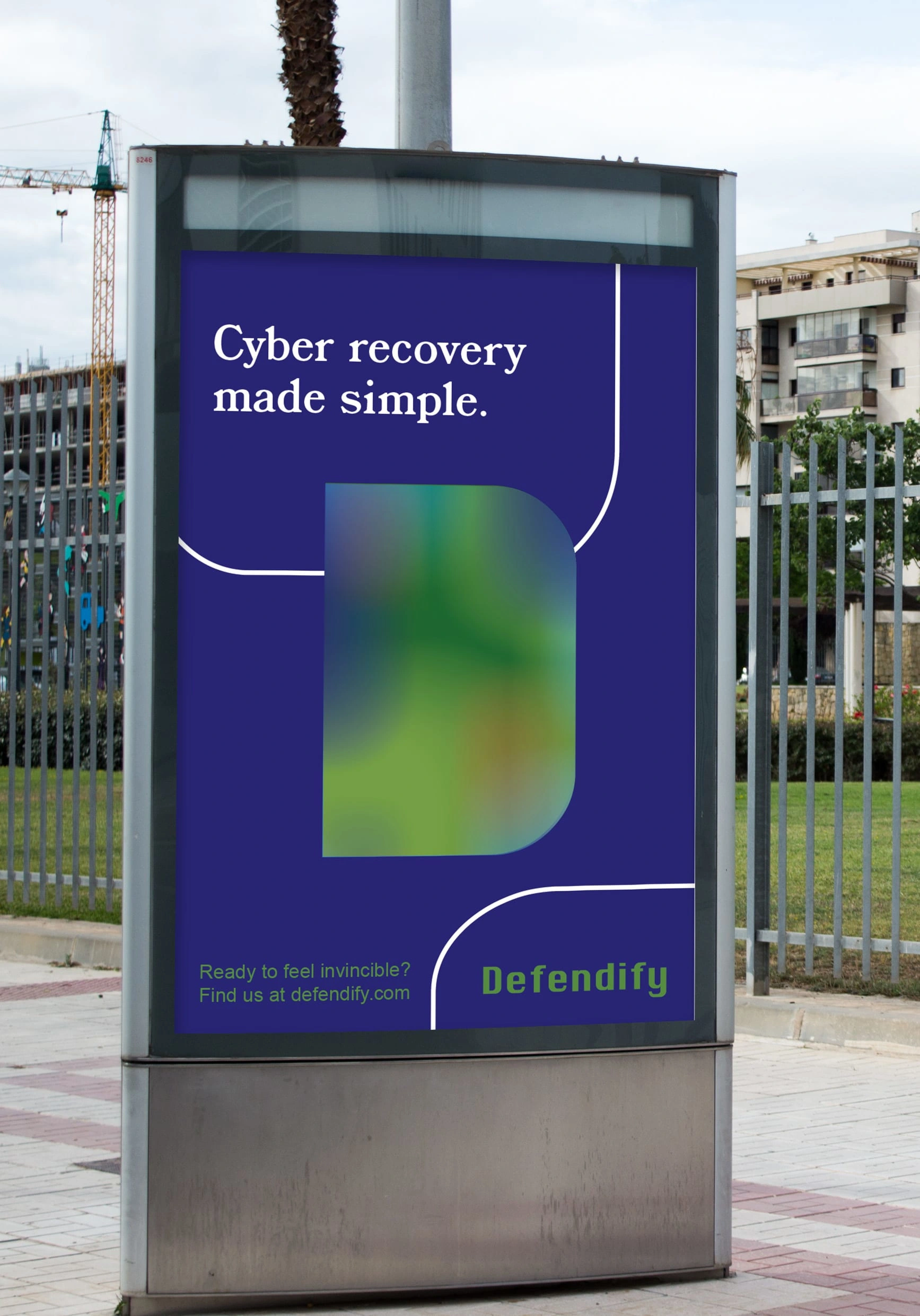
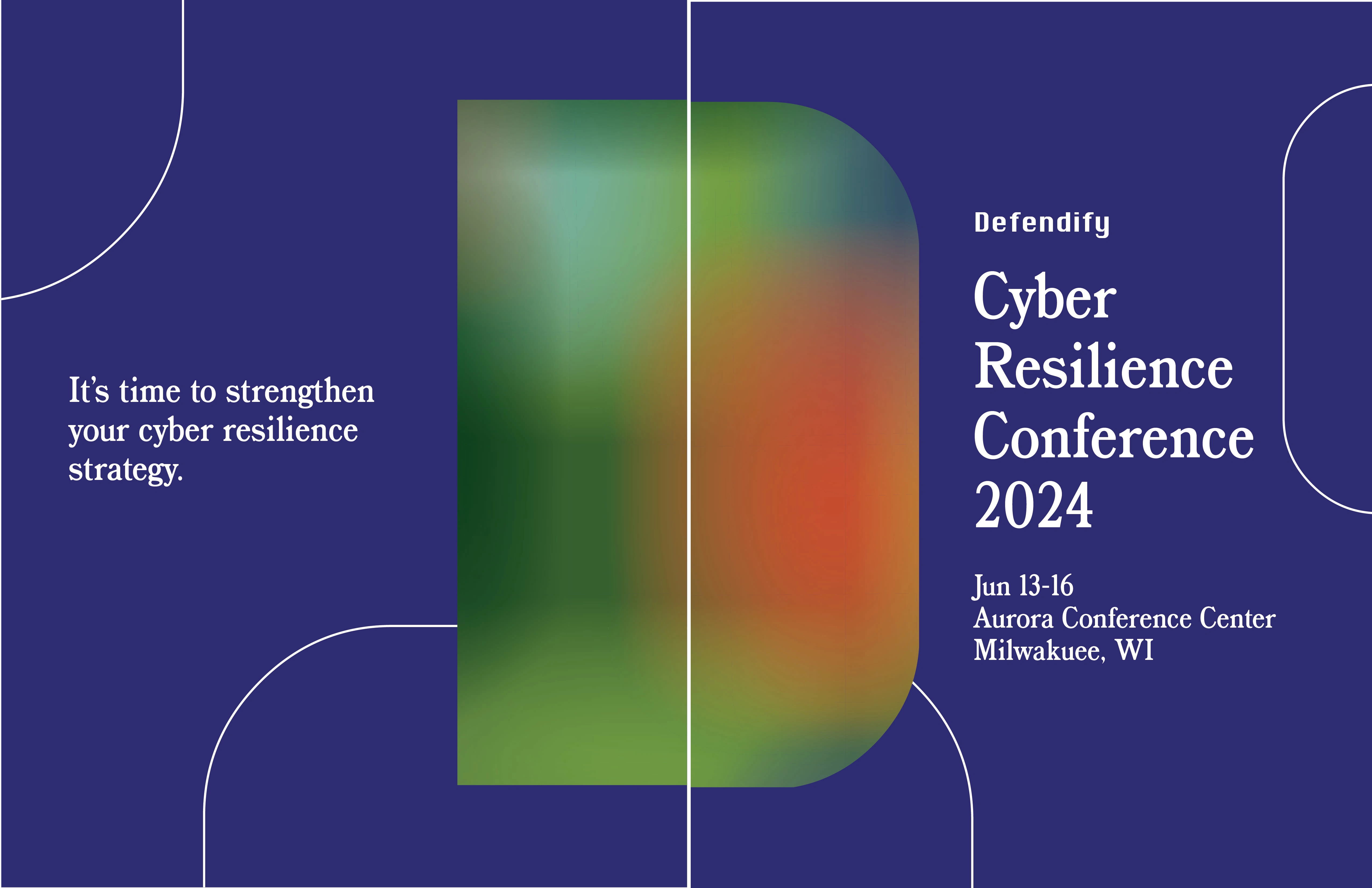
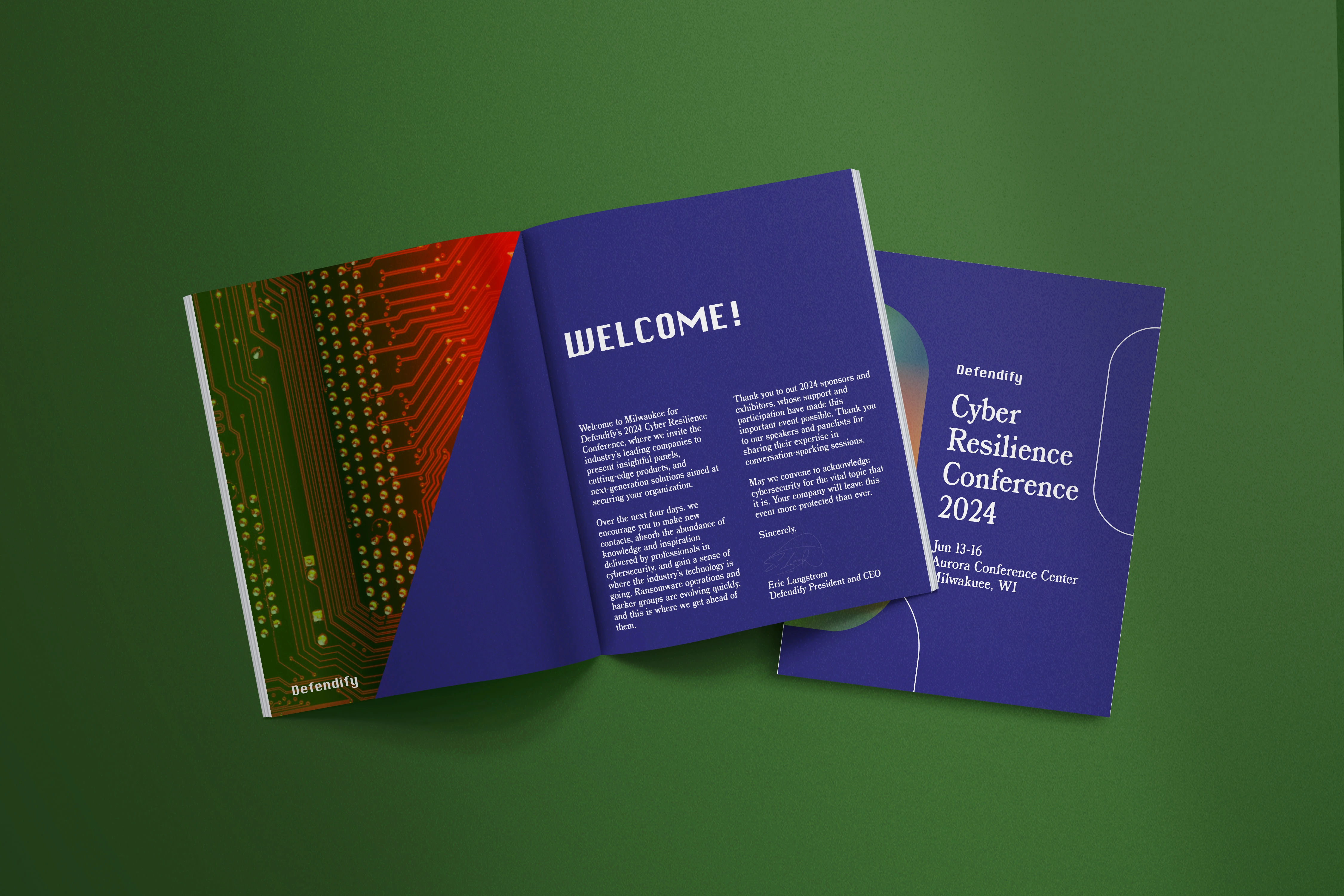
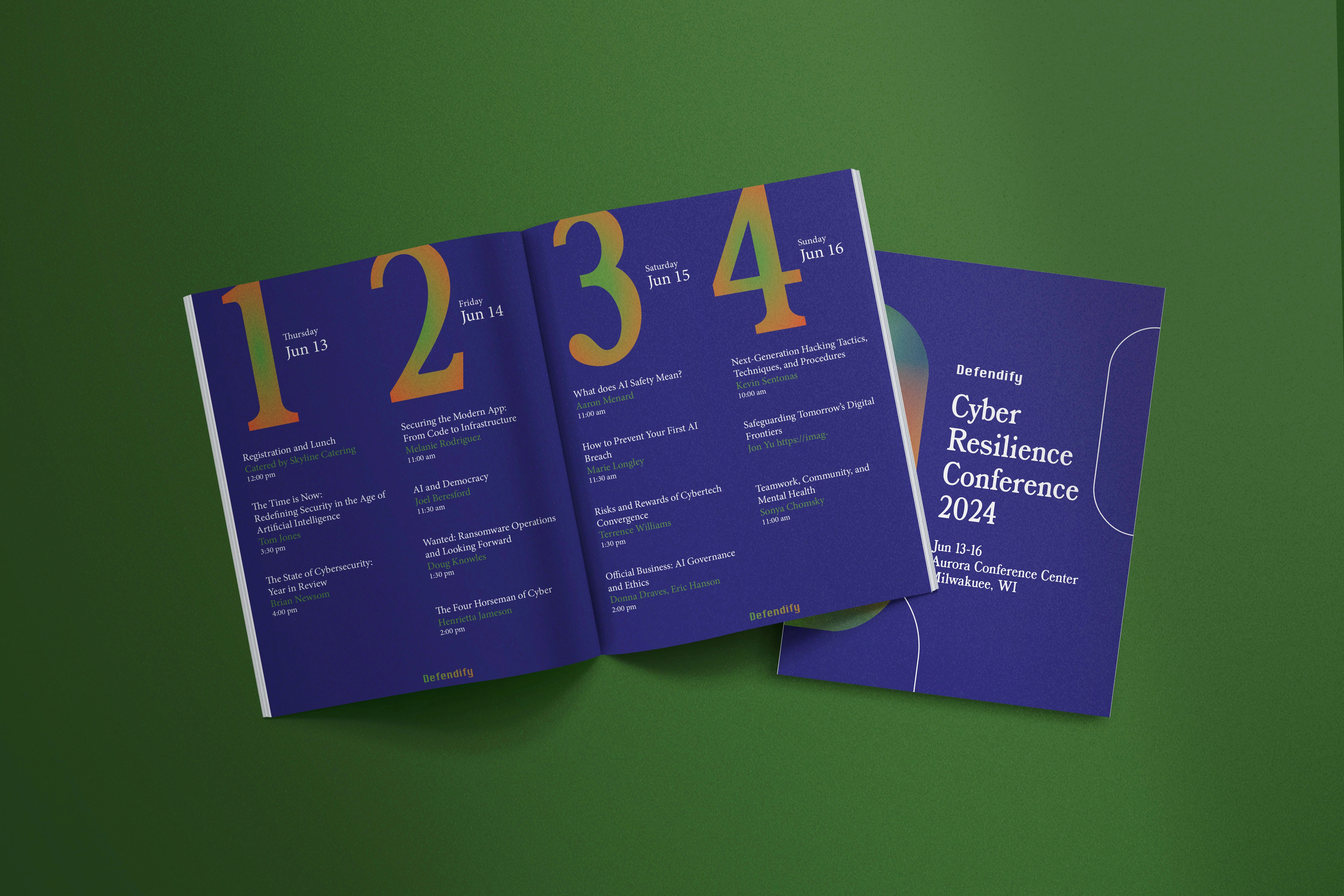
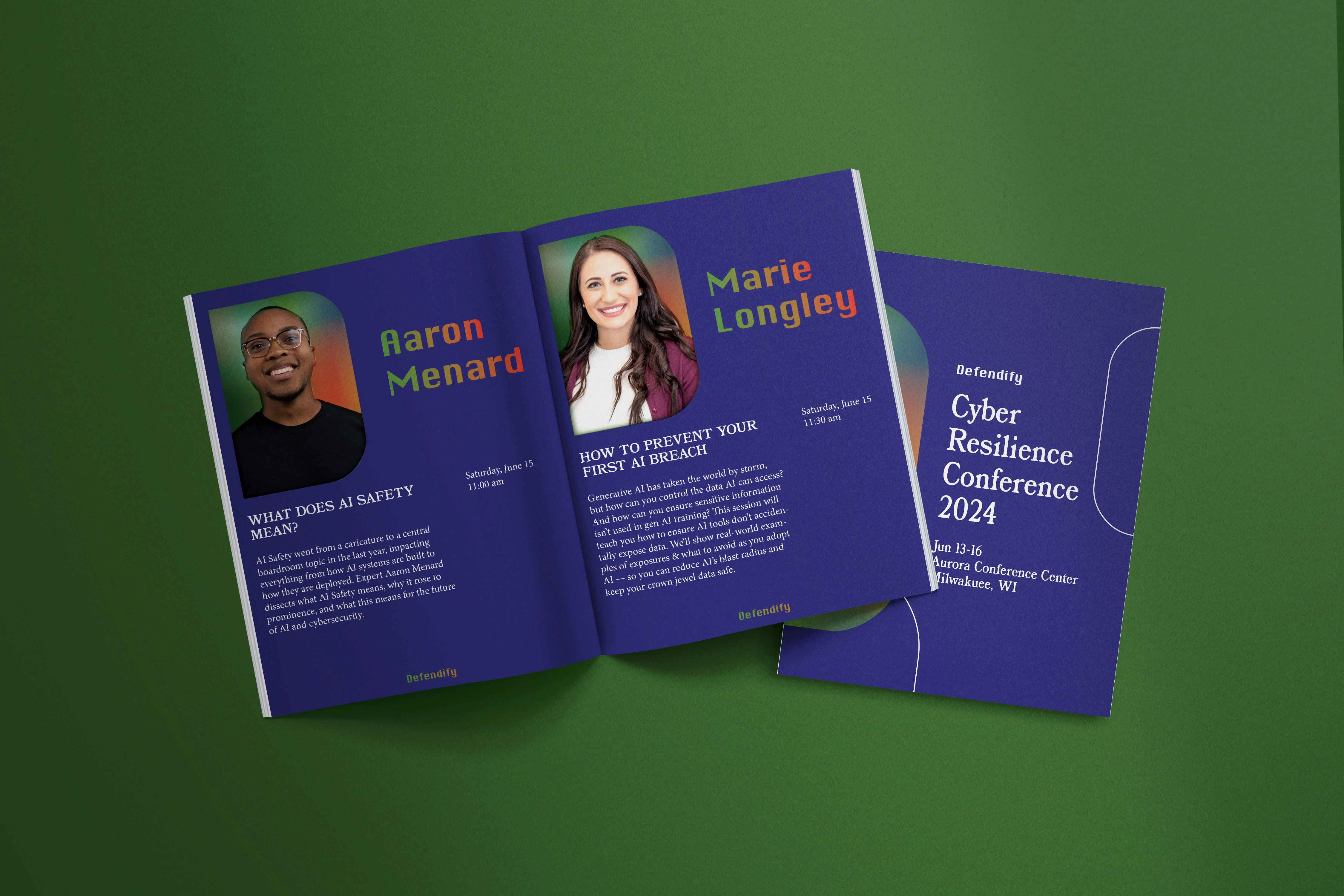
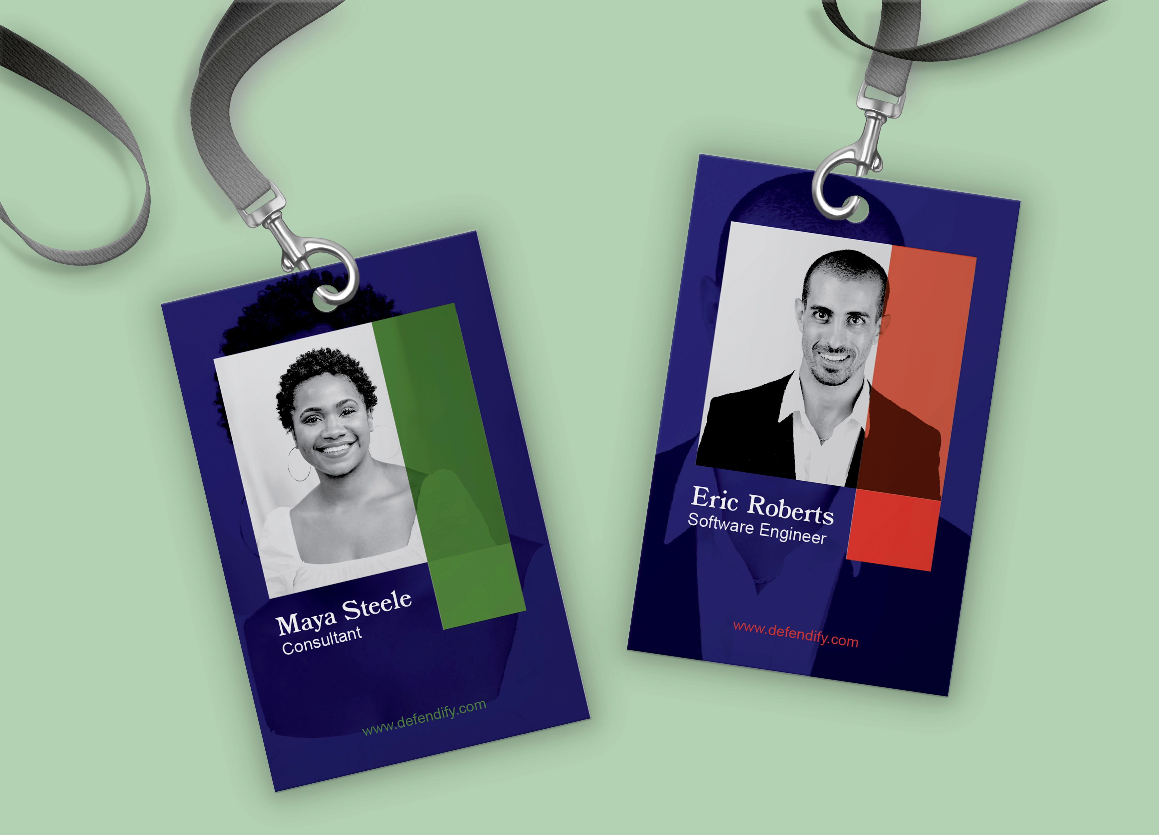
I built the color scheme around this goal. Deep blue acts as a neutral, inviting base color, and I relied on greens to create a sense of trust and protection. Pops of red contrast with the greens to further this effect. The blocky letters of the logo typography give the brand authority, and the supplementary serif font keeps things easy to read. The soft, green to red gradient used throughout the branding provide a cybersecurity-curious audience a sense of comfort, and design elements such as stark white lines and sharp edges maintain a technological feel, situating Defendify in the web and tech world.
I created a simple, straightforward logo, various forms of collateral, and a catalog for Defendify’s annual Cyber Resilience Conference.

Like this project
Posted Apr 7, 2024
Print Design - Web Design - Brand Identity - Logo - Adobe Illustrator - Adobe InDesign - Adobe Photoshop - Adobe After Effects
