
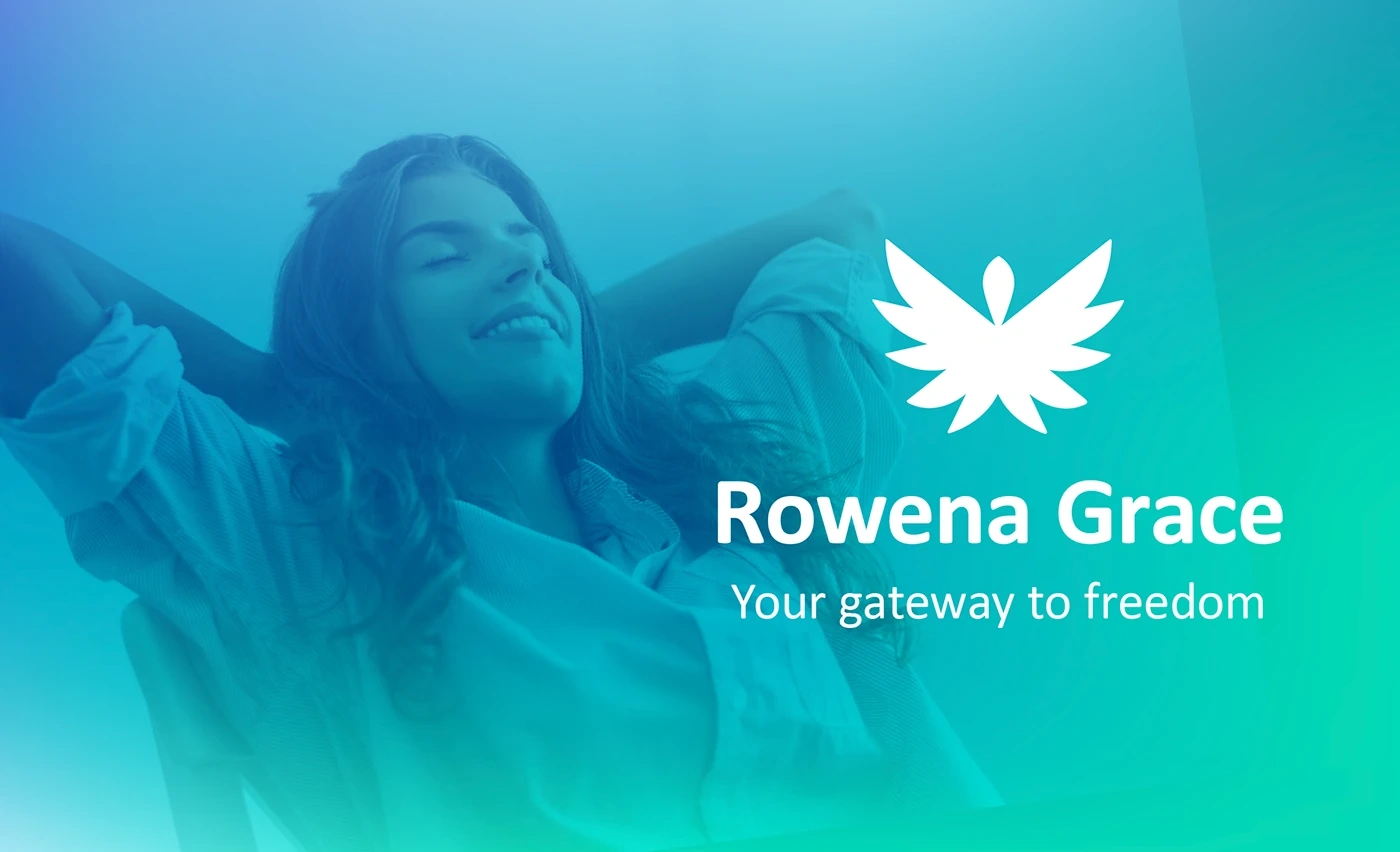
Rowena Grace | Strategic Brand Identity
Brian Bibi
Follow Following Unfollow
More Like This
Save
Permalink
Rowena Grace supports her clients back into energetic balance : physically, emotionally, mentally & spiritually.
We started at the beginning with Brand Strategy. We discovered that her vision of humanity is incredibly loving, playful, free & light. All forms of suffering have transformed into healed states of holistic well-being. With a diverse range of healing modalities at her disposal, she’s working with clients 1-on-1 & in group sessions. Her personal stake in this relates to her work with the armed forces veterans.
Client: Rowena Grace
Location: Ilse of Wight, UK
Disciplines: Strategy, Naming, Logo, Branding
Timeframe : Two weeks
Copyright: Studio3B
More Like This
Save
Permalink
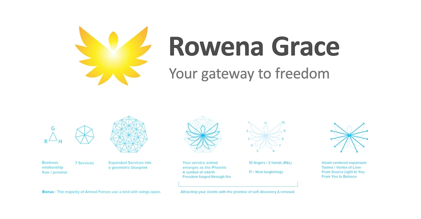
The Logo’s visual foundation is based on the relationship between the 3 core aspects : Rowena, Grace & Healing.
Rowena being the vehicle, Healing being the process / outcome & Grace being how it occurs. These three elements create harmony & balance. So we start there, with a triangle.
This grows into Rowena’s 7 service offerings, finally expanding out into a full grid to create the Symbol from. The Phoenix represents rebirth. A new lease on life. Freedom being forged through the intense fire of our experiences. The main yellow colour comes from visualising Grace. Its light, bright & shines through from the inside out.
More Like This
Save
Permalink
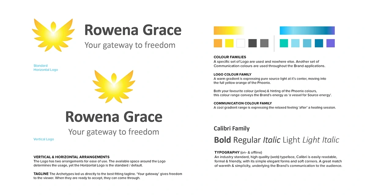
A Brand’s Identity needs to look, feel and communicate clearly at its core. These four Building Blocks : Logo, Tagline, Colour, & Typography work together to form the basis of all communication for the Brand.
Photography adds a realistic dimension to the Brand. Two different types of imagery are used. Images depicting services provide insight and transparency so expectations can be managed and the mystery unveiled. Images depicting ‘the feeling after’ receiving your services, connect with the viewer’s emotions, so they can feel the lightness of being and a possible renewed state.
More Like This
Save
Permalink
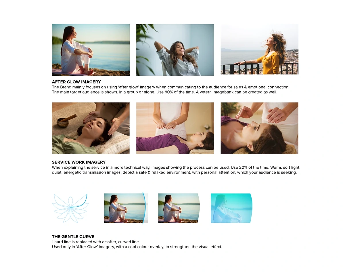
The Gentle Curve, a ‘4th (graphic) element’ gives the Brand a unique visual support in communication by mimicking the form of the hand, body & Logo itself. When combined with colour & imagery, It provides a cool, relaxed feeling that attracts the audience.
More Like This
Save
Permalink
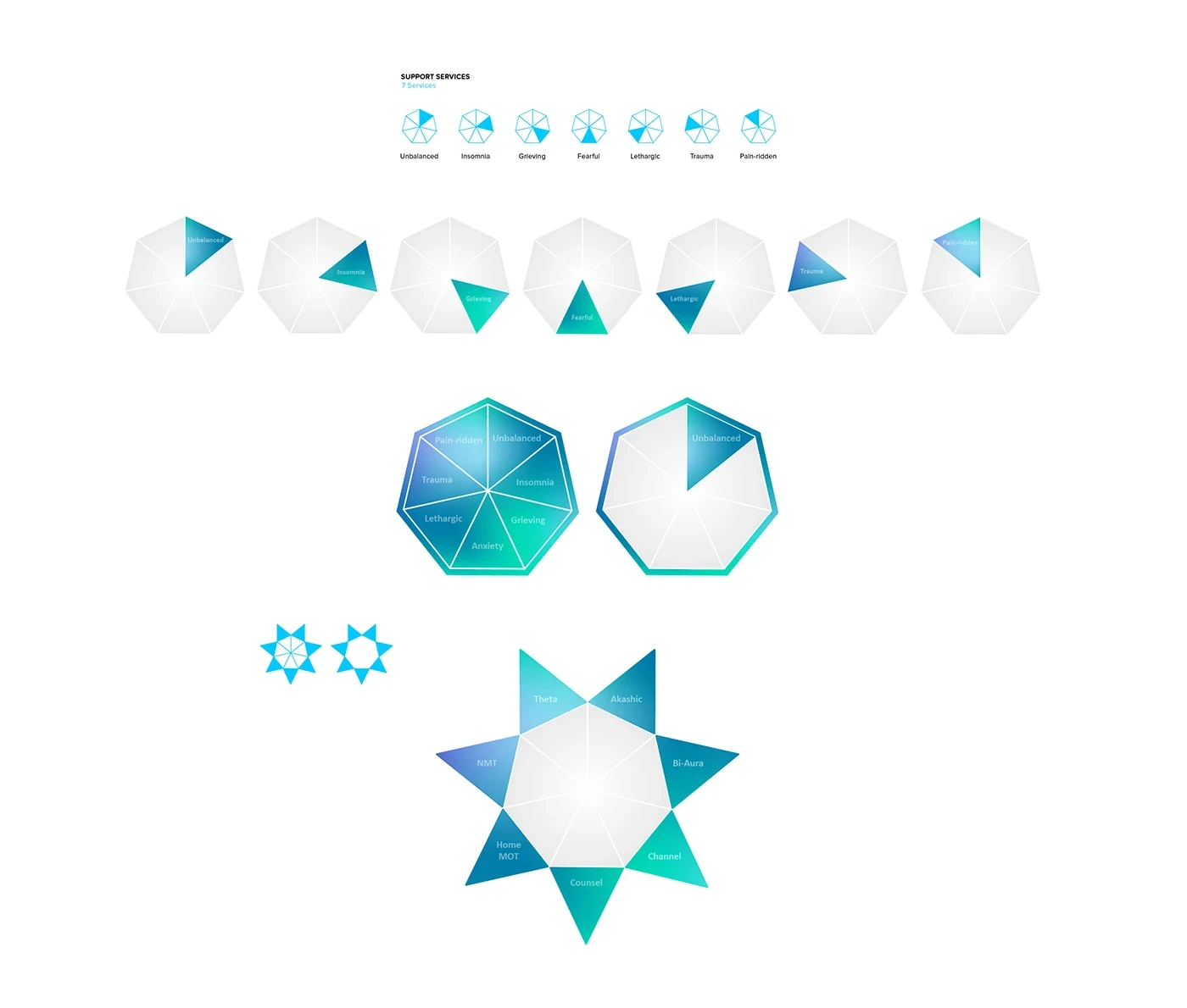
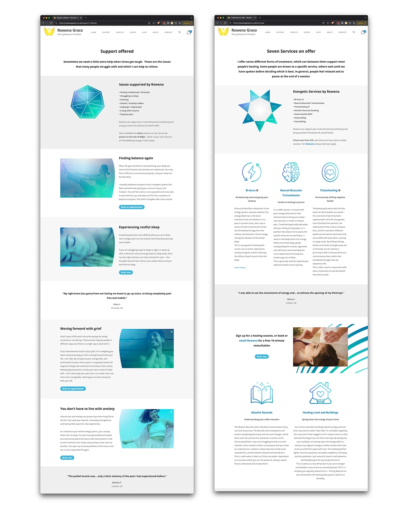
We strategically introduced 7 Support areas & 7 Service types. The support areas define where in life her clients feel heavy or not well, for healing focus there. Rowena also has 7 certified modalities from which she uses in her sessions.
Below we see the 7 Support areas as closed states. Those states open to the 7 Services. This infographic is used on her website so clients who cant pinpoint what is off or dont know what Theta is, can come in from either direction.
More Like This
Save
Permalink
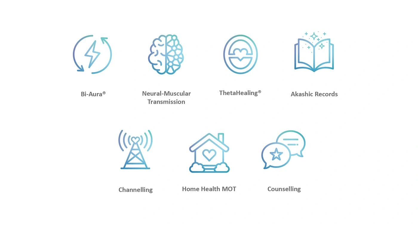
All 7 Certified Services were given icons to show the modalities essence clearly.
More Like This
Save
Permalink
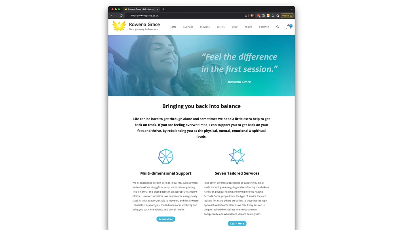
A Wordpress website was made to showcase Rowena’s services, along with an appointment calendar & payment gateway for an easy client checkout experience.
More Like This
Save
Permalink
More Like This
Save
Permalink
Thanks for appreciating my work INJOY!
Hire Me
Follow Me
Join Behance
Sign up or Sign in to view personalized recommendations, follow creatives, and more.
Sign InSign InorSuSiFacebook
Brian is available for hire
Hire Brian
Clipboard Magnifiedclipboard with a magnifierSave CandidateSave
Join Behance
Sign up or Sign in to view personalized recommendations, follow creatives, and more.
Sign InSign InorSuSiFacebook
Rowena Grace | Strategic Brand Identity
1
17
0
Published: March 31st 2025
0 likes · 0 views · Aug 2, 2026
Strategic brand identity for Rowena Grace: symbol, logotype, iconography and a multi-layered visual system for a holistic-healing practice.

