

JACQ Financial Services | Brand Identity
Brian Bibi
Follow Following Unfollow
More Like This
Save
Permalink
Jacqueline Thibault aspires to build a leading accountancy firm in her local, small- to medium-size business market.
So we started at the beginning with Brand Strategy. We discovered that accountants in general are seen as quiet, nerdy, robotic and thats general the opposite of Jacqueline. She cares. She innovates. She’s bubbly & alive. So we wanted to make sure the Brand had a professional look, with a feminine feel.
Client: Jacqueline Thibault
Location: Michigan, USA
Disciplines: Strategy, Naming, Logo, Branding
Timeframe : Two weeks
Copyright: Studio3B
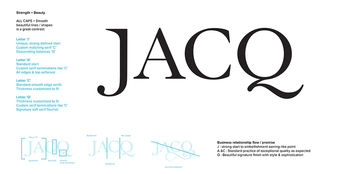
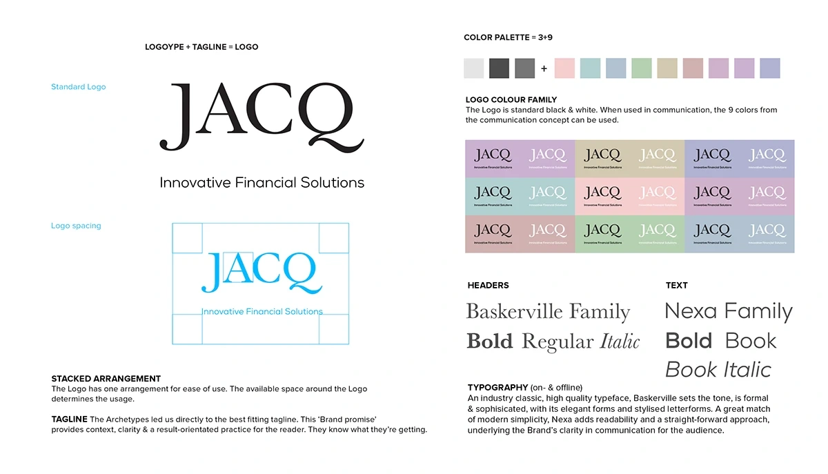
After an exhaustive Naming Study, we arrived at the Personal Brand Name: JACQ. Memorable. Simple. Like Oprah & Madonna, yet even better, since this adds that amazing personality to accounting. Time to shine.
Diving deep into the typography, many facts quickly became clear. A custom drawn 4-letter combination was necessary. The strength & professionalism starting off with the ‘J’, while the beauty & softness focus comes from the ‘Q’. This Custom Logotype gives a strong, sophisticated look, utilising an old style bookkeeping font, all CAPS with two descenders, which balance the feminine name and flourish, rounding it all out.
More Like This
Save
Permalink
Each business area wanted its own icon & colour. I knew this was a great place to start visualising.
More Like This
Save
Permalink
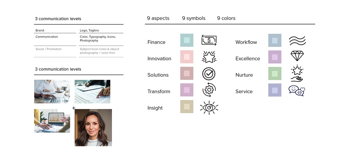
A ‘4th (graphic) element’ gives the Brand communication, a unique visual support by visualising the Brand’s core themes. When combined with colour, text & context, it gives the Brand a versatile system from which to communicate from. Photography can humanise the Brand by depicting services ‘on-the-go’ and by depicting Jacqueline to support the audience to connect with the Brand Leader emotionally, ‘from the heart’.
More Like This
Save
Permalink
More Like This
Save
Permalink

More Like This
Save
Permalink
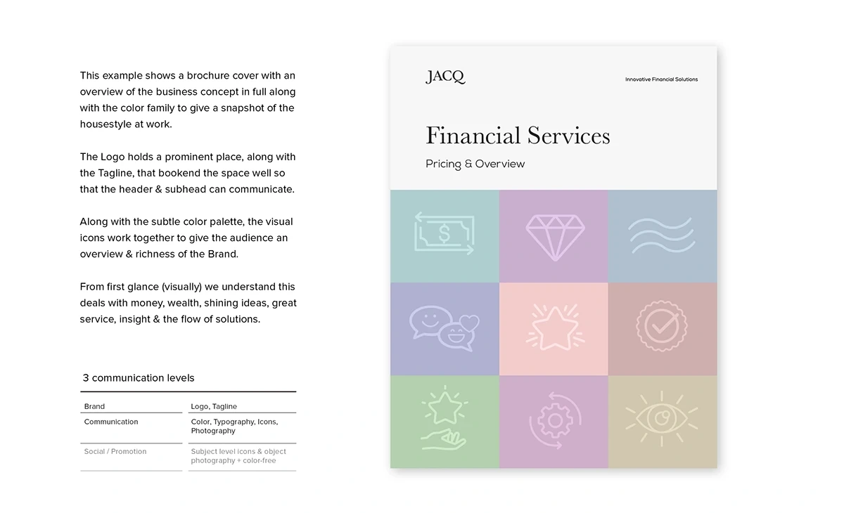
Moving into social communication we see how the 3rd layer of the Brand opens up: We use the colours, while the symbols can become physical photographed objects. Each symbol family can be connected to a specific promotional message, which creates an overall campaign.
More Like This
Save
Permalink
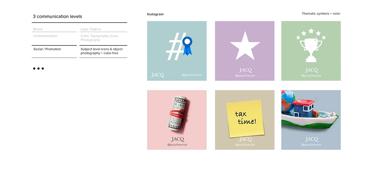
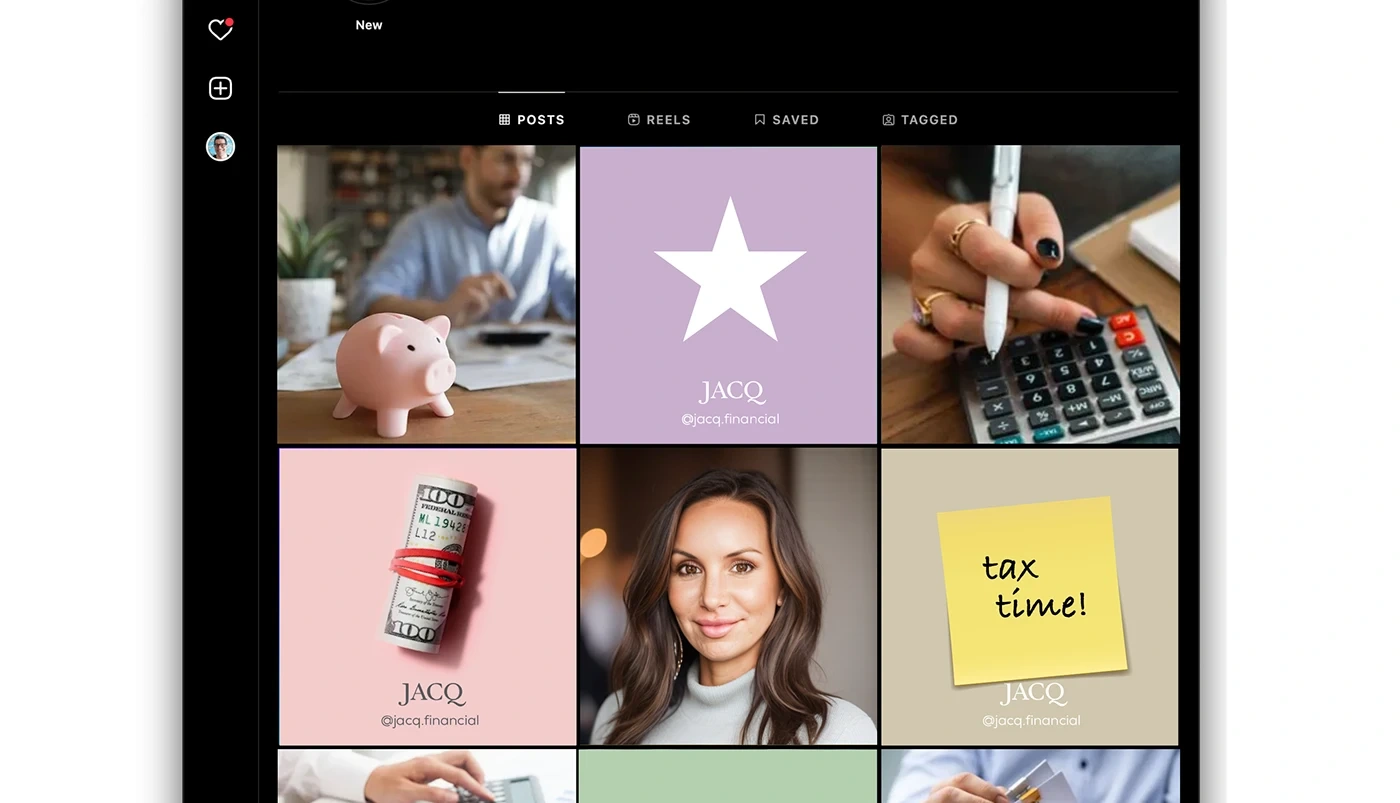
The profile image personalises the business. A diverse visual offering of ‘msg / img / msg / img’ works well for spacing & contrast. Communication symbols & objects can be used to embody messages that’re elaborated on, in the descriptions. This open visual system lends itself to all kinds of promotional offerings, both seasonal & thematic.
More Like This
Save
Permalink
Thanks for appreciating my work INJOY!
Hire Me
Follow Me
Join Behance
Sign up or Sign in to view personalized recommendations, follow creatives, and more.
Sign InSign InorSuSiFacebook
Join Behance
Sign up or Sign in to view personalized recommendations, follow creatives, and more.
Sign InSign InorSuSiFacebook
JACQ Financial Services | Brand Identity
1
21
0
Published: March 30th 2025
0 likes · 0 views · Aug 2, 2026
Brand identity for JACQ Financial Services: naming, custom logotype and a versatile visual system tailored for a boutique accountancy firm.


