Planetary X - Platform & App design

Mariel Villaveiran
3 collaborators



PlanetaryX - Product Design
PlanetaryX is a biodiversity finance protocol built as an alternative to conservation funding that gets promised but never verified.
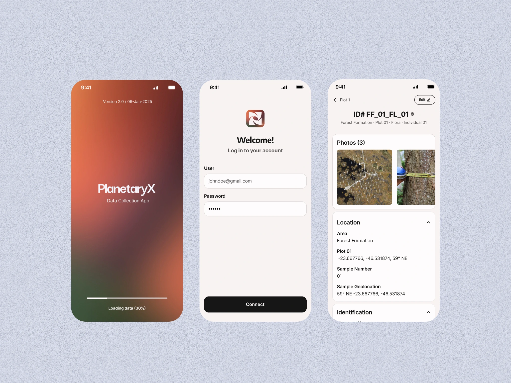
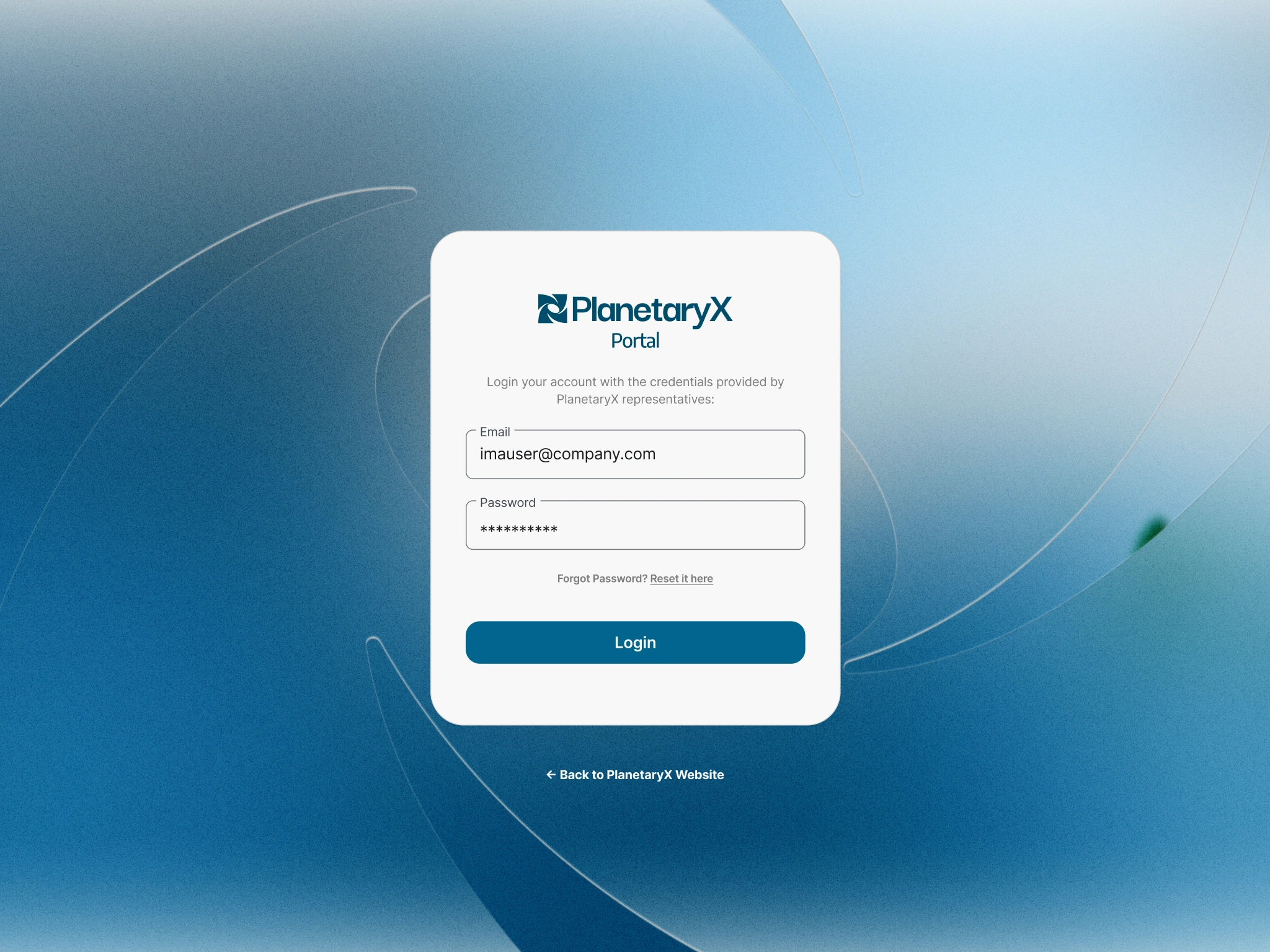
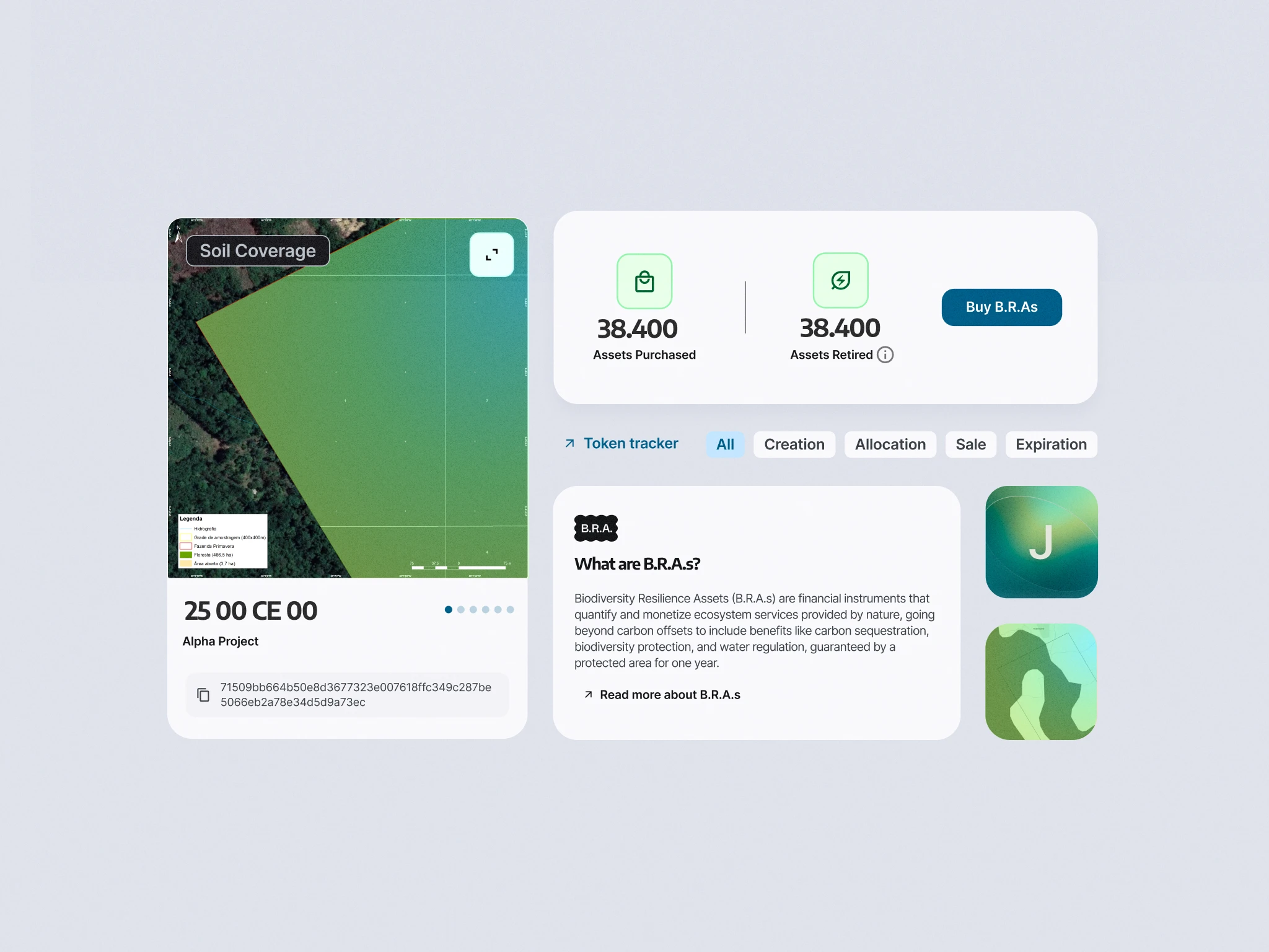
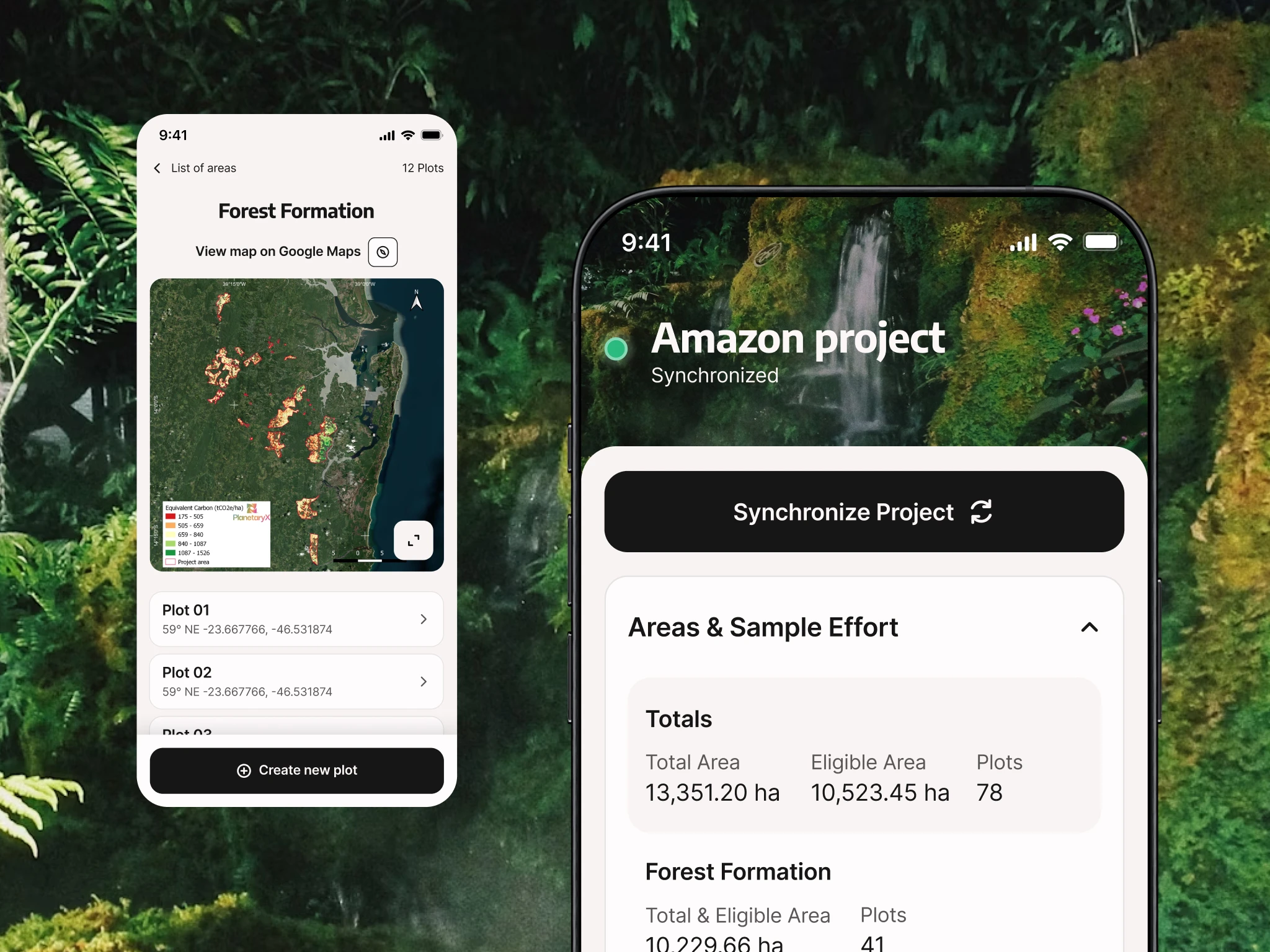
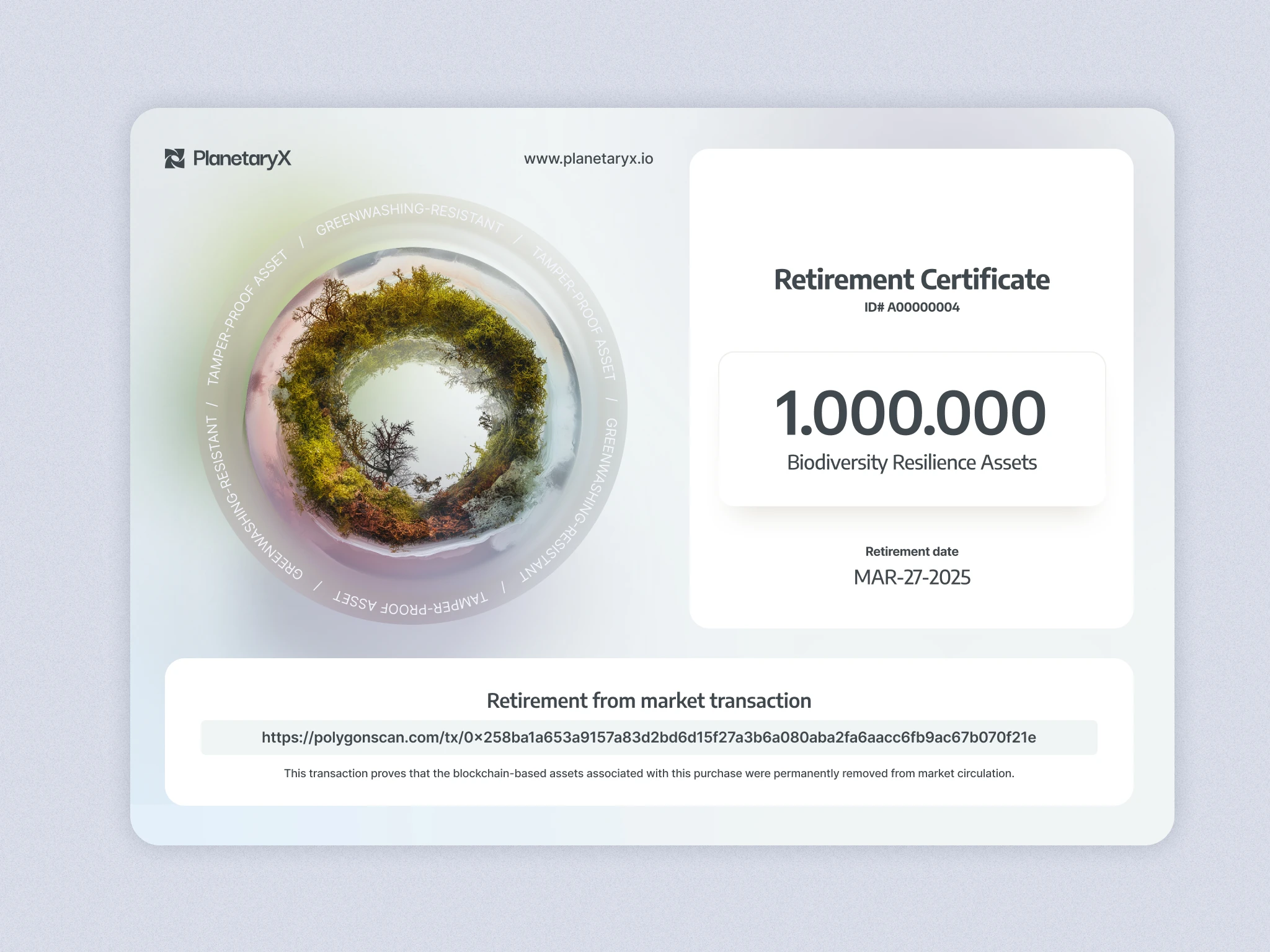
The platform splits into two tools: a field app lets scientists log real conditions on the ground and a web portal that lets buyers browse verified biodiversity data and trade the resulting assets.
That idea shapes both interfaces differently. The field app is designed for a scientist working outdoors, high sun exposure, dirt, long hours, so it strips down to large touch targets and fast, repetitive inputs. The portal is built for a buyer sitting far from the land itself, so the experience slows down and gets calm: clean tables, legible hierarchy, generous whitespace, closing the same distance the art direction opens with.
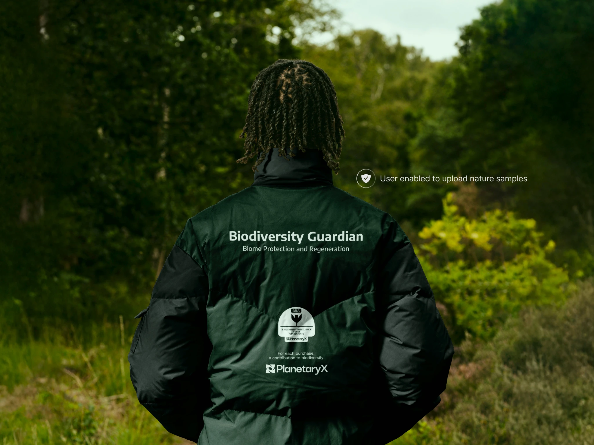
The art direction had to fuse financial precision and scientific rigor with an unmistakably natural feel. Real photography, actual forest, actual hands, actual grain, and true-to-life color pull the abstraction of a "biodiversity asset" back down to earth, so it never floats free from the biome it represents.
The distance between an asset on a screen and the land it stands for had to stay short, we take care of what we see.
Like this project
Posted Aug 6, 2026
PlanetaryX is a biodiversity finance protocol built as an alternative to conservation funding that gets promised but never verified.
Likes
4
Views
16
Clients
PlanetaryX