Lider Taxi Core Booking Flow Redesign
Artem Dibrovskyi
Lider Taxi — Redesign of the Core Booking Flow
Project Overview
Role: Product Designer
Scope: 12 screens, rebuilt component system
Tools: Figma
Lider Taxi is a regional ride-hailing app operating in Katowice and Kraków.
This project was created during a JTBD framework workshop and later developed into a full redesign of the core booking flow of the existing app. The goal was to improve how users book a ride in high-pressure situations: when they are late, caught in bad weather, or responsible for getting several people home.
The redesign focused on three areas:
making key information visible earlier;
reducing unnecessary steps in the booking flow;
helping users feel more confident before and after ordering a ride.
Problem
The booking flow created friction in moments where users needed quick and clear decisions.
Across the journey, users often struggled to understand how soon a car would arrive, whether they would reach the destination on time, how to find the driver at pickup, and how to build routes with multiple stops. These issues became more noticeable when users had limited time or attention, or when they were responsible for others. In those situations, unclear information and extra steps led to hesitation, mistakes, or cancellations.
The main challenge was to understand in which real-life situations these problems matter the most — and redesign the flow around them.
Research Approach
To find the most important user contexts, I used a context matrix based on four dimensions: emotional state, physical environment, social situation, and behavioral pattern.
Matrix of context
This helped show how different situations change what users need from the interface. For example, when users are in a hurry, they need clear timing. In bad weather, every extra step becomes harder. When planning a group ride, route structure becomes more important.
Based on this, I focused on three key contexts:
being late for an important meeting;
getting caught in heavy rain or in extreme weather conditions;
organizing a ride for a group after a party.
These contexts became the foundation for the job stories, UX requirements, design hypotheses, and success metrics.
Job Stories
Job stories helped translate each context into a clear design direction. Instead of starting from interface screens, I used them to focus on what users were trying to achieve, what pressure they were under, and what outcome would make the ride feel successful. These stories became the bridge between user motivation, UX requirements, and measurable product outcomes.
Job stories
Home Screen
Home screen
What changed
Added a pickup ETA badge directly on the map.
Added Home and Work shortcuts in the bottom sheet.
Added quick destination tiles for Airport, Train Station, Bus Station, and recent places.
Added estimated travel time to priority destination tiles.
Placed the “Later” booking option inside the destination input area.
Why it matters
The home screen now answers the first important question faster: “Is there a car nearby?” For users who are late or in bad weather, pickup time is one of the most important pieces of information. Showing it earlier helps users decide whether to continue with the booking instead of searching for alternatives.
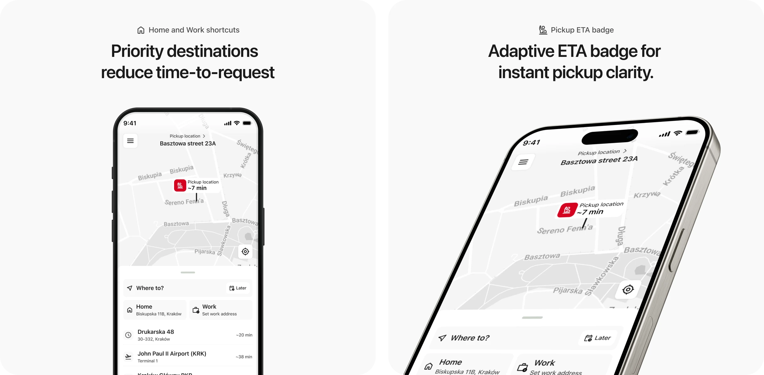
Added features
Hypothesis: Surfacing pickup ETA and priority destinations on the home screen reduces time-to-request for stress-context users and lowers bounce rate before any input is made.
Metrics: Time to Request (TTR) ↓ · Bounce Rate on home screen ↓ · Tap count to confirmed booking ↓
Address Input
What changed
Added semantic color coding for route points:
red for pickup;
yellow for intermediate stops;
green for destination.
Added inline controls for adding and removing stops.
Added quick destination badges for common places.
Kept Home, Work, and recent addresses at the top of suggestions.
Improved autocomplete with clearer active input state.
Why it matters
The address input screen now makes the route structure easier to scan. This is especially important for multi-stop rides. When users add several stops, they need to understand the order immediately and avoid mistakes. Color coding also connects the input fields with map pins, making the whole route easier to read.
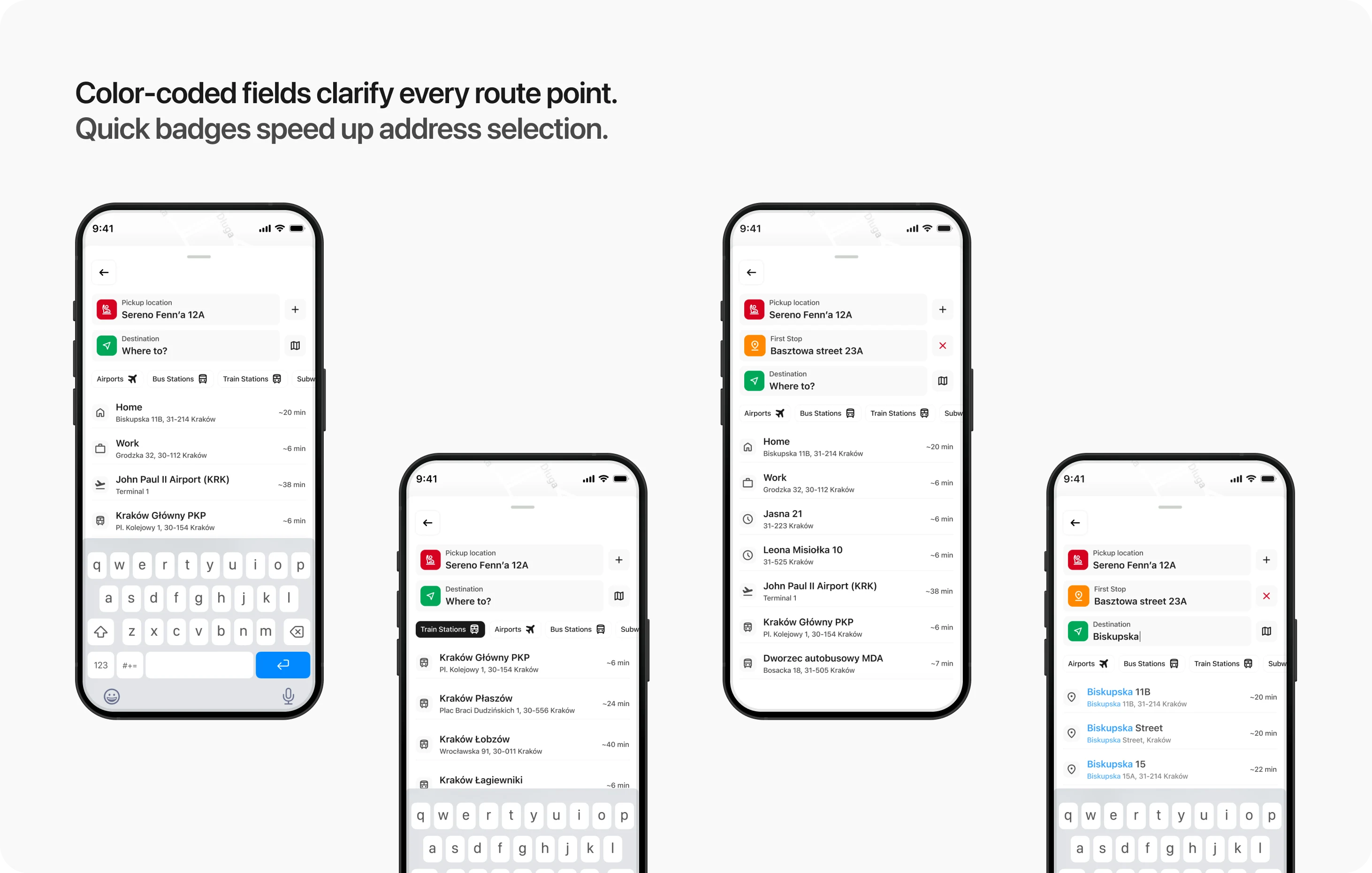
Hypothesis: Color-coded stop structure and one-tap badge selection reduce cognitive load for multi-stop route building and shorten address input time across all contexts.
Metrics: Task Completion Time for multi-stop routes ↓ · Dropout Rate on address input screen ↓ · Missed tap / wrong address selection rate ↓
Tariff Selection
What changed
Adaptive tariff moving to the top.
Added pickup time and arrival time directly to each tariff card.
Synced tariff time data with route pins on the map.
Added a traffic intensity indicator.
Made the selected payment method visible before confirmation.
Used a high-contrast CTA with a dynamic tariff label.
Why it matters
For time-sensitive users, tariff selection is not only about price. It is also about whether the ride solves their situation. Showing pickup and arrival time directly in the tariff cards helps users compare options faster. Pinning Priority at the top also supports a business goal: increasing premium tariff selection in contexts where users are more likely to pay for speed.
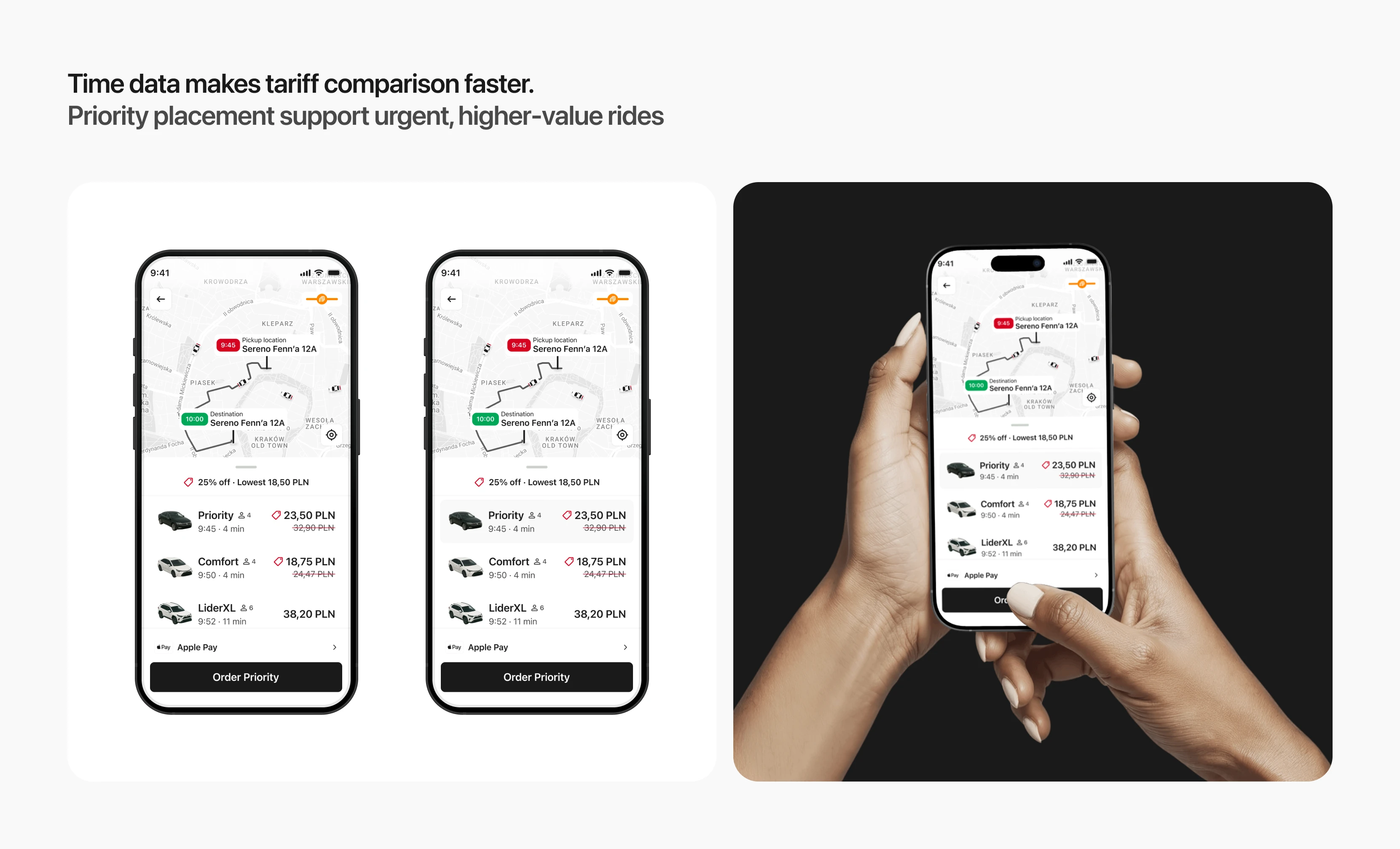
Tariff Selection
Hypothesis: Showing synchronized time data across tariff cards and map before the user taps anything removes the need for a "verification click" and reduces time-to-decision. Priority placement increases premium tariff selection among time-sensitive users.
Metrics: TTR on tariff screen ↓ · Share of Premium Orders ↑ · Dropout before order confirmation ↓
Driver Search — 3 States
What changed
Replaced one generic loading state with three clear search states:
Preparing your trip;
Looking for a driver;
Driver is reviewing your trip.
Added a progress bar.
Added a visible search timer.
Added animated search waves from the pickup point.
Kept route and payment details accessible in the bottom sheet.
Made the Cancel Ride button visible and easy to access.
Why it matters
Driver search is one of the most sensitive moments in the booking flow. When users do not understand what is happening, they may assume the app is stuck and cancel the ride. Clear progress states make the system feel more transparent. The user can see that the request is moving forward, even while waiting.
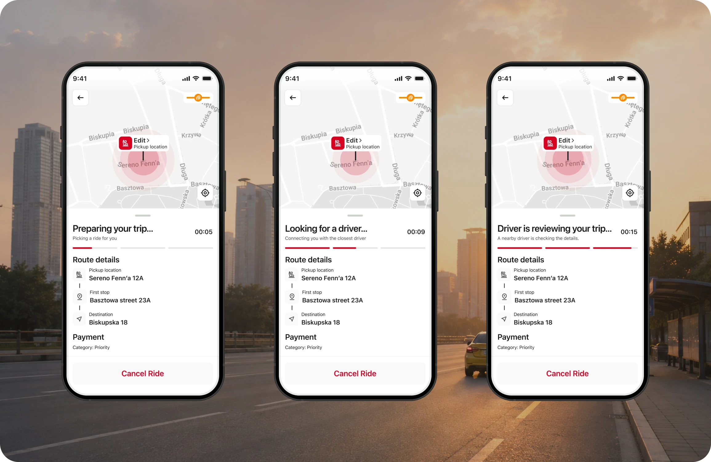
Driver Search States
Hypothesis: Breaking the search into three named states with a progress indicator reduces cancellations caused by perceived system failure or impatience during wait time.
Metrics: Cancellation Rate during driver search ↓ · Average wait time before cancellation ↑
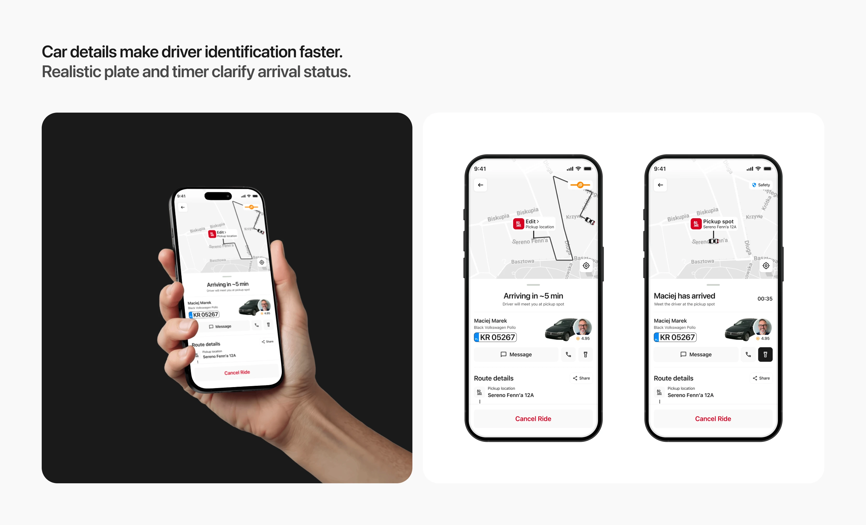
Driver En Route + Driver Arrived
What changed
Made the license plate larger and easier to recognize.
Styled the plate as a real registration plate.
Improved hierarchy for driver name, photo, rating, and car details.
Added a flashlight button to help the driver identify the passenger in low visibility.
Added a waiting timer on the arrived screen.
Added a Share Route button in the route details.
Changed the map indicator from traffic status to safety status after arrival.
Why it matters
The final part of the ride flow can create a lot of stress: the passenger and driver may be close to each other but still fail to find each other quickly. A clearer license plate, stronger driver identification, and flashlight action reduce the “last meters” problem. This can lower waiting time, reduce driver-passenger confusion, and prevent cancellations caused by failed pickup. Combined with proactive location tools (flashlight, clear plate) new features reduces the time both parties spend finding each other, cutting conflict cancellations and driver idle time.
Hypothesis
Improved driver identification and passenger signaling tools will reduce the time needed to find the car and lower pickup-related cancellations.
Metrics: Driver Waiting Time ↓ · Conflict Cancellation Rate ↓ · Flashlight feature adoption rate · Share feature adoption rate ↑
Results
A self-initiated project that ran the full product design loop: research framework → context mapping → job stories → UX requirements → hypotheses → 12 production-ready screens with a rebuilt design system.
What was delivered:
Context matrix across 4 trigger dimensions
3 job stories with derived interface requirements
6 design hypotheses with mapped success metrics
12 screens with rebuilt component system — color semantics, typography scale, iconography, variants
What I'd validate next:
Does the pickup ETA badge on the home screen actually reduce bounce — or does inaccuracy (no drivers nearby, long wait) make it worse than showing nothing?
Does the traffic indicator earn its place — or does it create anxiety without giving the user anything actionable to do with that information?
Do the three search states reduce cancellations, or does a visible timer make a 4-minute wait feel longer than a spinner with no reference point?
Like this project
Posted Jun 27, 2026
Redesigned Lider Taxi's booking flow for better user experience and adaptability to high-pressure contexts.
Likes
1
Views
6