ZAPORIZHZHIA STEEL | Corporate Website Design
Artem Dibrovskyi
ZAPORIZHZHIA STEEL — Corporate Website
UX/UI · Motion Design · Conceptual Project
Overview
ZPS is a conceptual project — a self-initiated exploration of what a proper digital presence could look like for a large-scale metalworks company operating in the B2B heavy industry space.Five pages, three breakpoints, motion design, a full UI kit, and applied brand identity.
Scope: UX/UI & Motion Design
Timeline: 6 weeks
Sector: Heavy Industry / B2B
Visual Mockup
My Role
End-to-end. Business analysis, competitive research, information architecture, wireframes, visual design, motion, UI kit, identity system. I set the brief myself, which meant no shortcuts — every decision had to be justified on its own merits.
The Problem
The heavy industry sector has a consistent digital blind spot. Companies that handle complex international supply chains and multi-million dollar contracts often have websites that communicate none of that credibility. The visual language of the industry has barely moved in fifteen years — dense, technical, and built around legacy CMS logic rather than how procurement decisions actually get made.
The question I set out to answer: what would a metalworks company's website look like if it was designed with the same rigor applied to the product itself?
Mockups Shot
The Process
Research came first. I analyzed the competitive landscape across both visual and business dimensions — a full SWOT breakdown, positioning gaps, and an audit of how leading industrial companies present themselves internationally. The goal wasn't to make something that looks good next to competitors. It was to understand where the category ceiling was, then exceed it.
Analytics Workflow
Sitemap and user flow came out of that research directly. The architecture was built around a specific user: an international procurement manager or industrial partner evaluating a new supplier. That context shaped every content decision — what gets surfaced on the main page, how services are structured, what the Steel Production section needs to communicate to someone who knows the industry.
Wireframes and functional prototypes were done before any visual work. Once the logic was solid, I moved into the visual concept.
Visual Concept & Identity
The central idea came from the material itself: molten metal. The accent orange running through the entire design isn't decorative — it's a deliberate high-temperature element inside an otherwise restrained, near-monochrome system. The contrast does the work. Strict grid, bold industrial typography, controlled negative space. No textures, no industrial clichés. The design communicates scale and precision through structure alone.
As part of building out the full brand world for this concept, I also developed applied identity — logo, brand video, business cards, badges — to validate that the visual system holds beyond the screen. It's not the core of my practice, but for a conceptual project it was important to prove the system works end-to-end.
Brand Showreel
Main Page
The homepage has one job: establish credibility in the first five seconds. For a B2B industrial company, that means scale, reliability, and a clear signal that this is a serious operation. The layout opens with a full-weight hero — company positioning statement, immediate access to key sections, no fluff. Motion design on this page adds depth without distraction: subtle, purposeful, timed to feel like the site breathes rather than performs.
Home Page Design
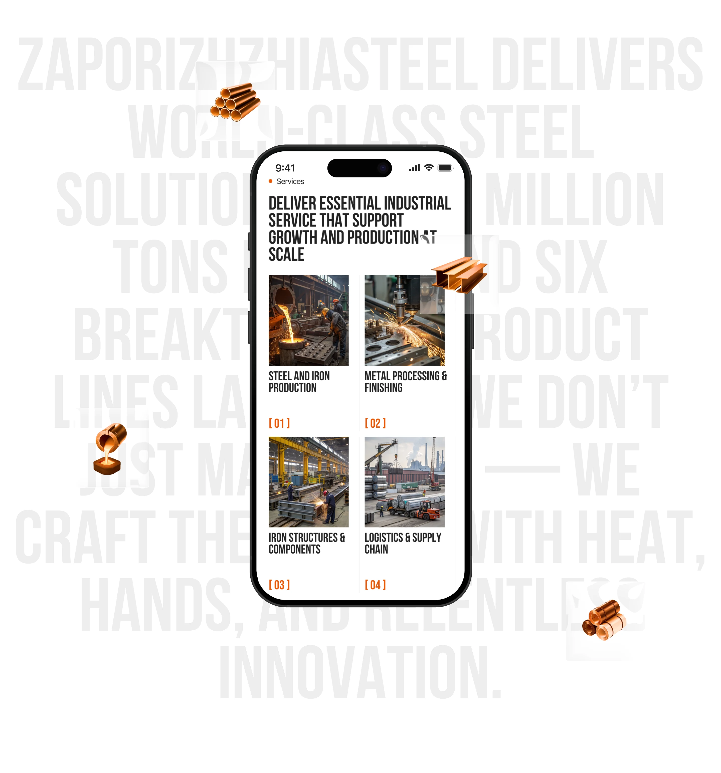
Services
The services page is where a procurement visitor decides whether to keep going or leave. The structure here follows a clear logic: category overview first, then depth. Each service block is designed to be scalable at speed but rewarding on closer read. The goal was to remove friction from the evaluation process — if a potential partner is looking for a specific capability, they should find it without effort.
Services Page Design
Steel Production
This is the most technically dense page on the site and the one that needed the most design discipline. The audience reading this page knows the industry — they're not looking for explanations, they're looking for proof. The design treats the production process as a visual system: structured, sequential, precise. Data and process information are presented with the same visual weight as the design itself, because for this audience, that information is the design.
Production Page Design
About Company
The about page carries the human weight of the site. After the product and production pages establish capability, this is where trust shifts from rational to relational. The layout balances company history, values, and scale in a way that feels grounded rather than corporate. No stock photography, no generic mission statements — the visual language stays consistent with the rest of the site, which itself becomes a trust signal.
About Company Page Design
Contacts
The contacts page is a conversion surface, not an afterthought. The layout is clean and direct — location, communication channels, a contact form that doesn't feel like a support ticket. For a B2B context, the goal is to make reaching out feel like the obvious next step rather than a commitment.
Contacts Page Design
The Result
A complete, production-grade design system for a conceptual B2B industrial client — structured, visually coherent, and built to function at real scale. The project demonstrates a full design pipeline from business analysis through to handoff, applied to a sector where that level of rigor is rarely seen.
If you have a project that needs both visual quality and real business thinking behind it — feel free to reach out.
Like this project
Posted Mar 30, 2026
Created a digital presence for a metalworks company with full UX/UI and motion design.
Likes
1
Views
8
Timeline
Jul 1, 2025 - Aug 31, 2025