

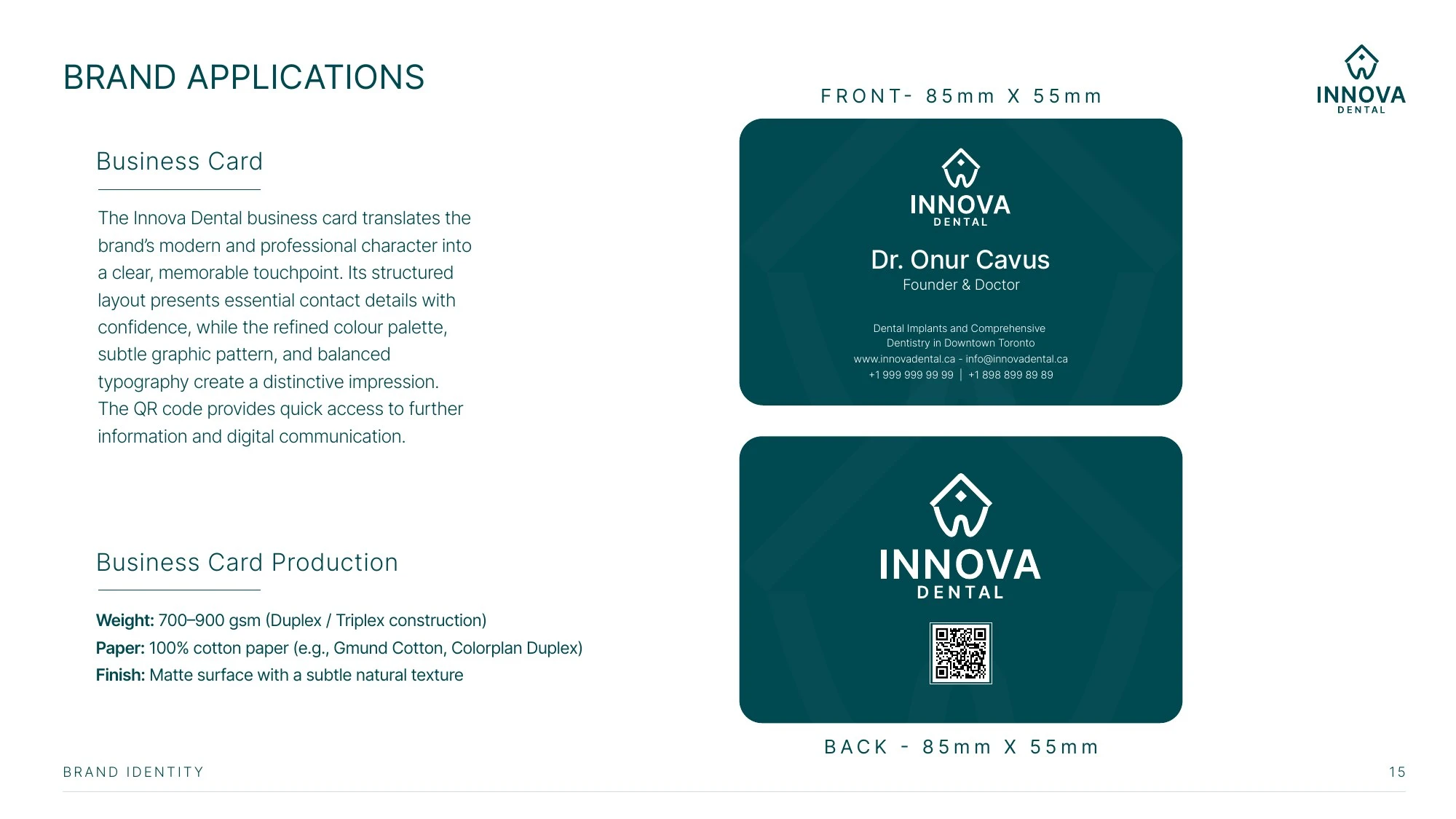
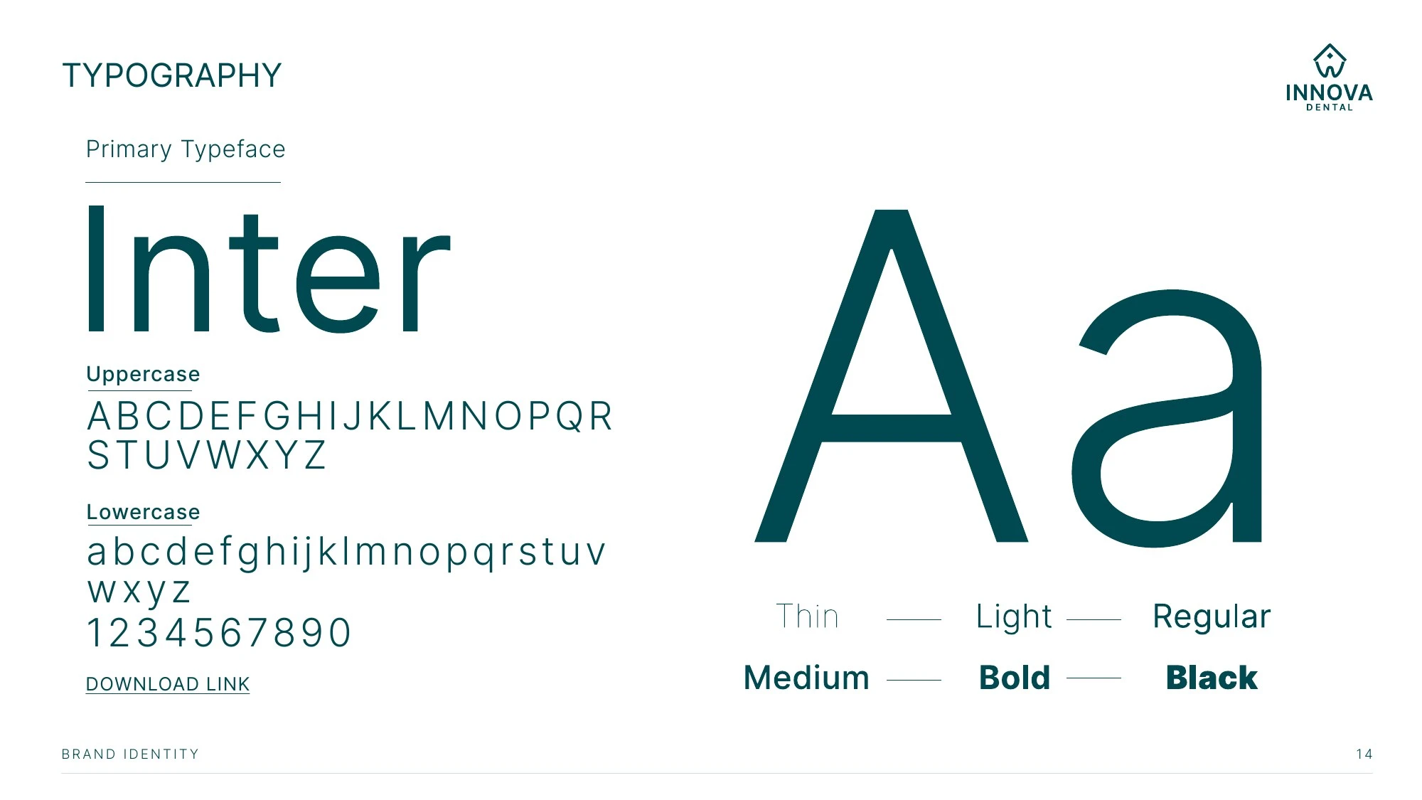
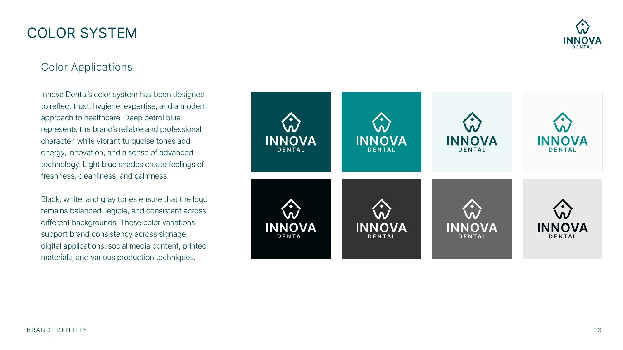
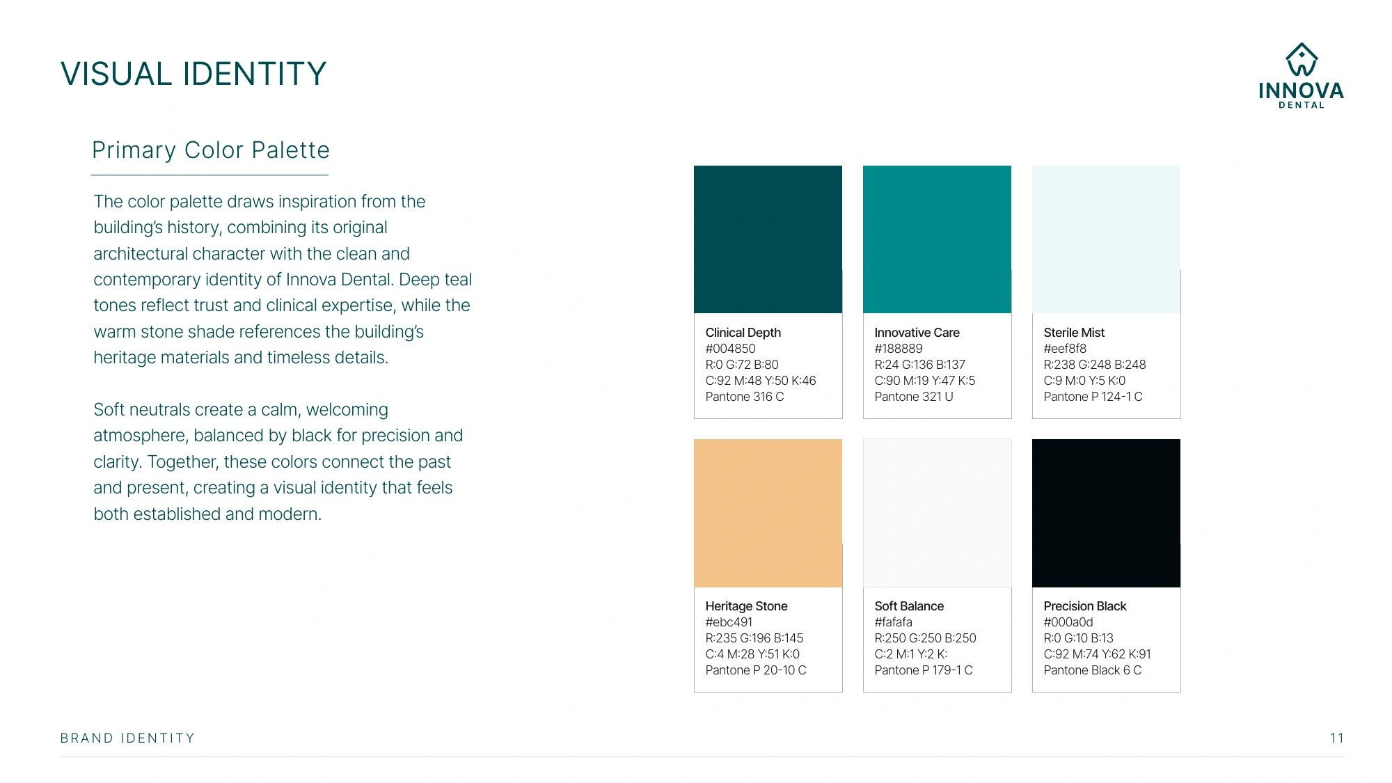
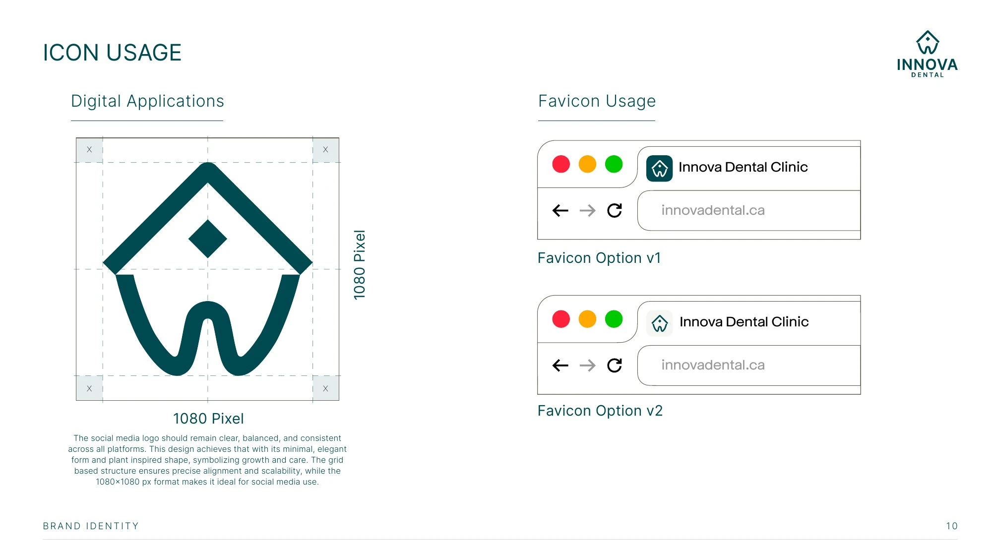
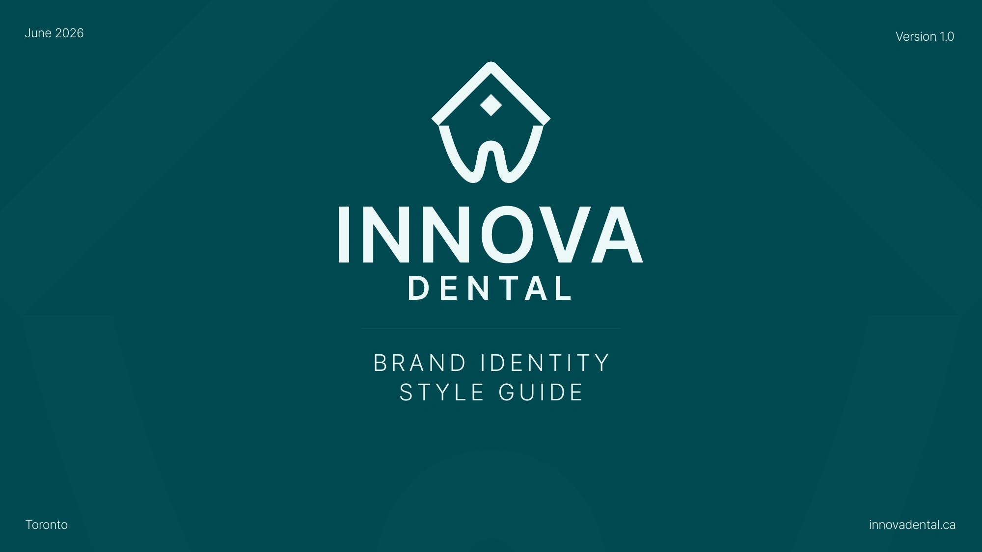
A 25-second brand film that tells the Innova Dental identity story, from logo construction to final applications.
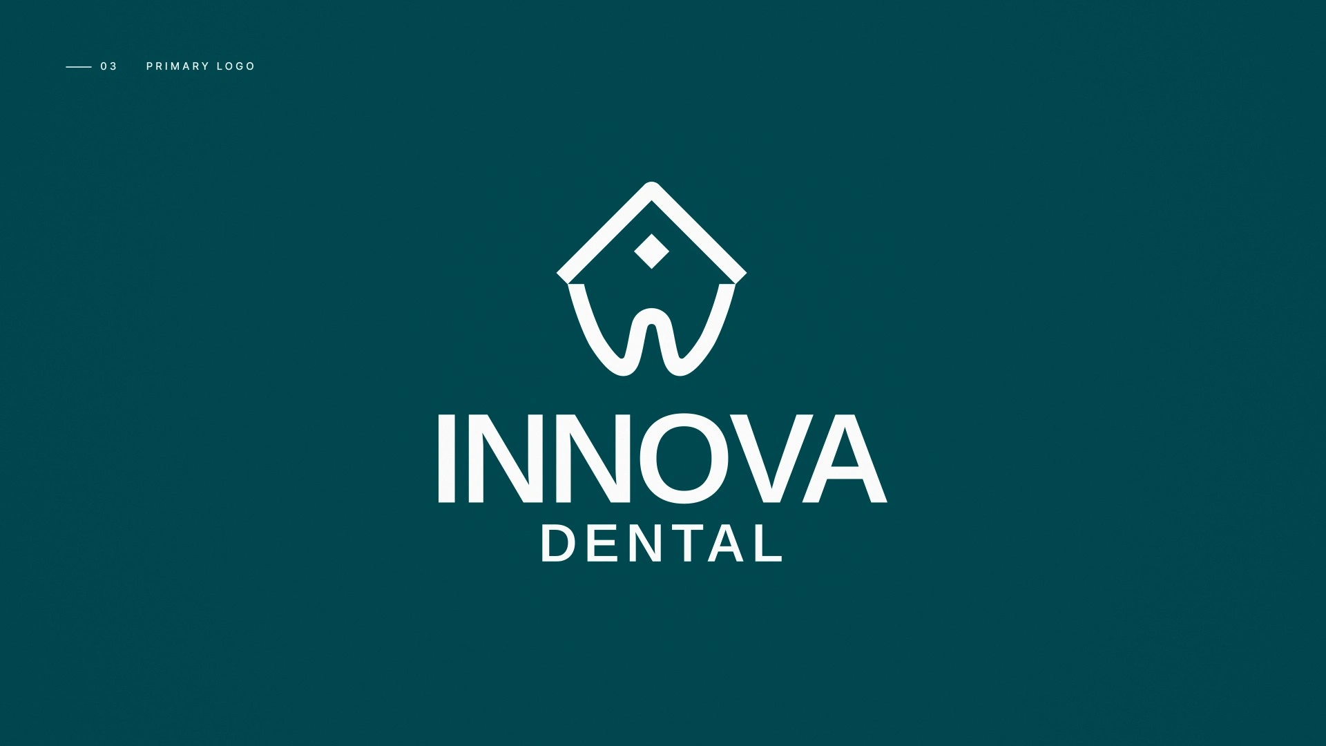
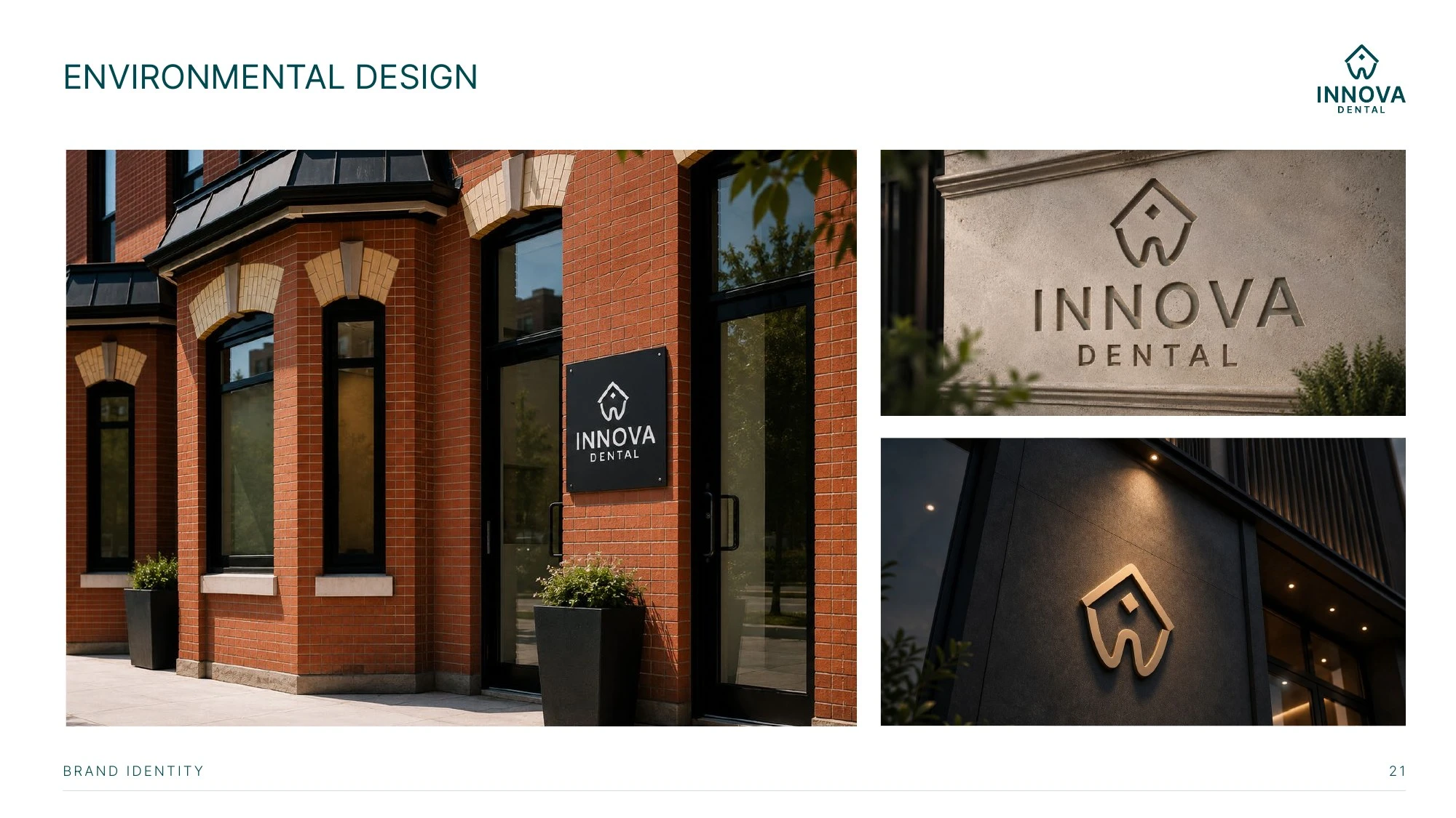
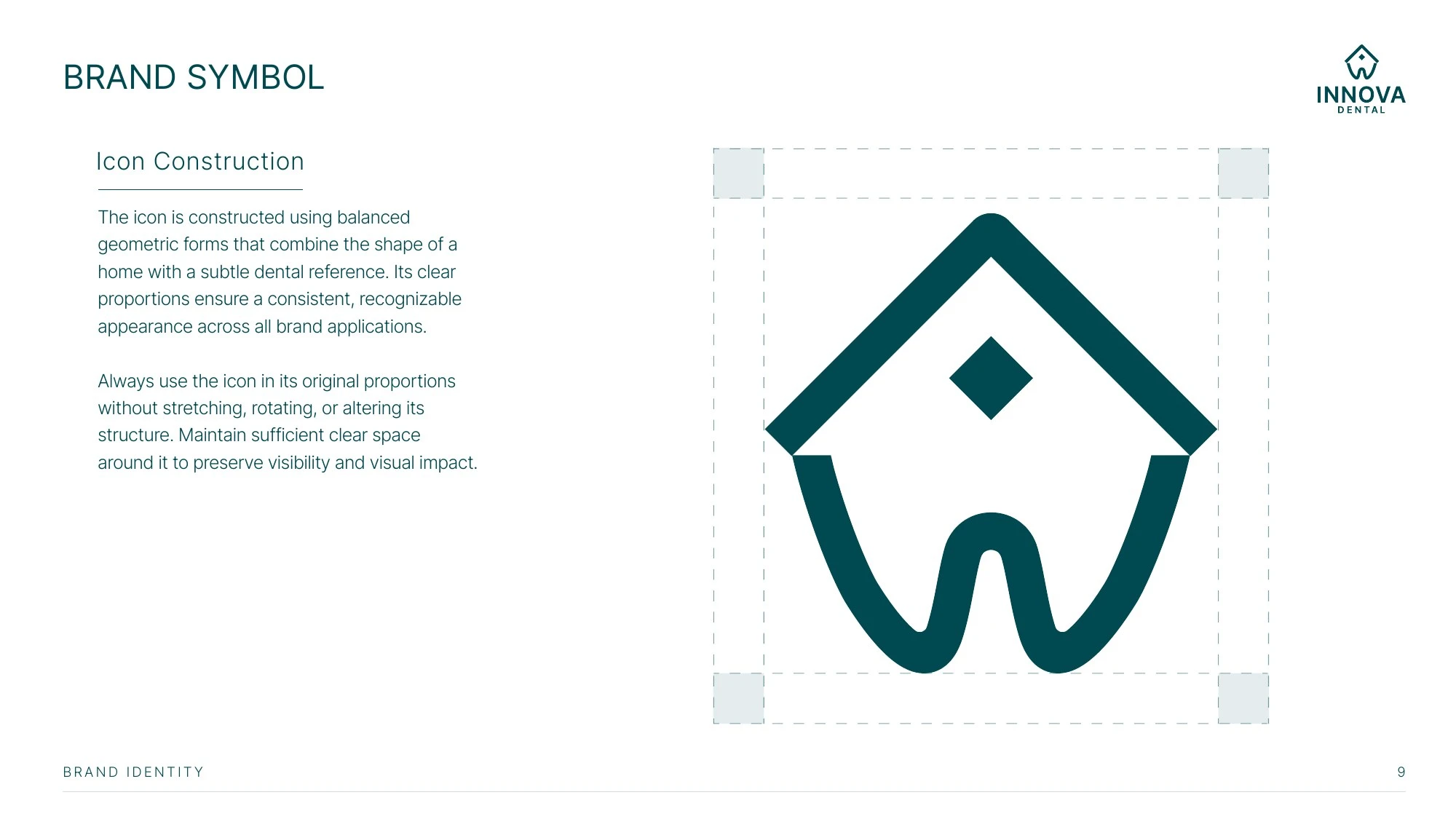
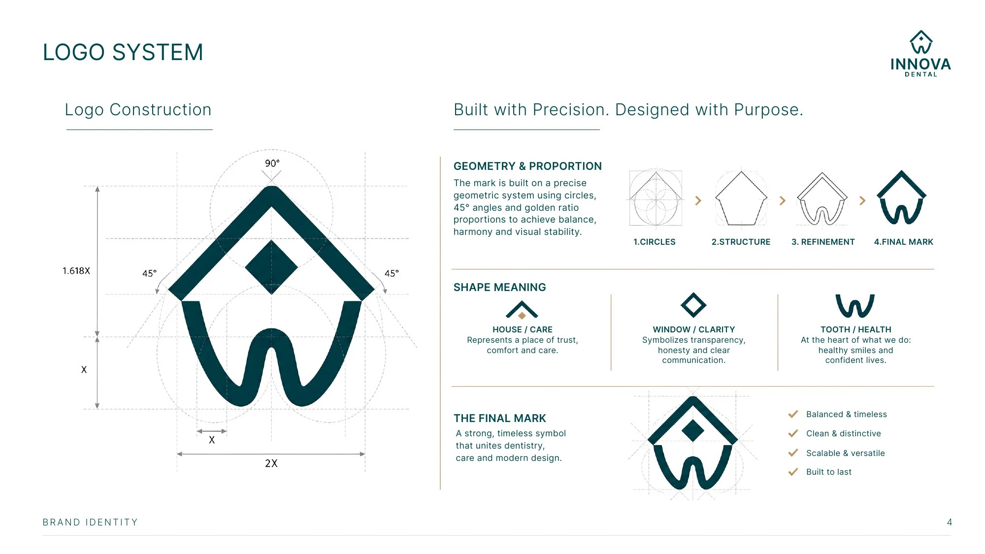
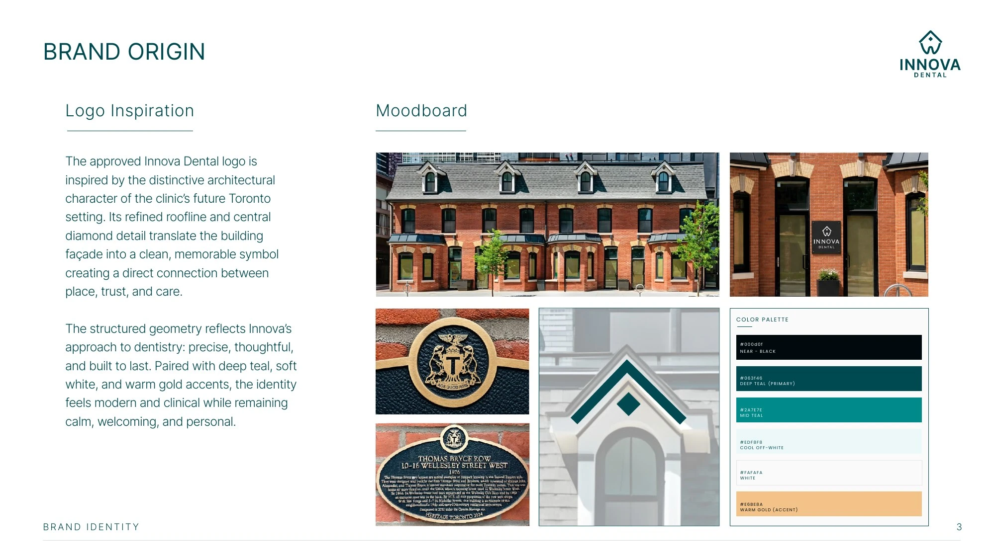
The symbol is drawn on a golden ratio and 45° grid and combines three ideas: a house for care, a window for clarity and a tooth for health. Its diamond window links the mark to the clinic's heritage building, Thomas Bryce Row on Wellesley St. West (1876), and the film moves from the logo straight into that facade.
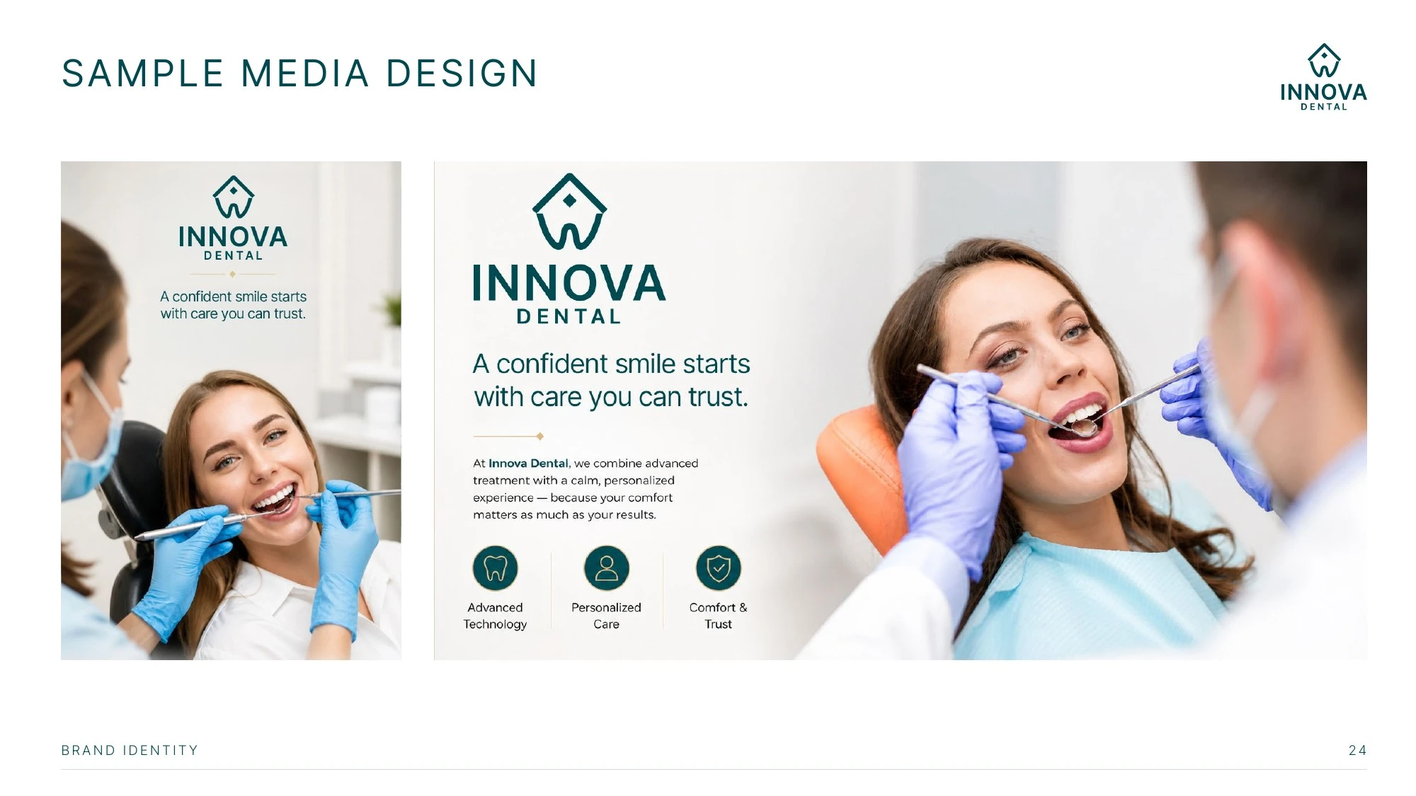
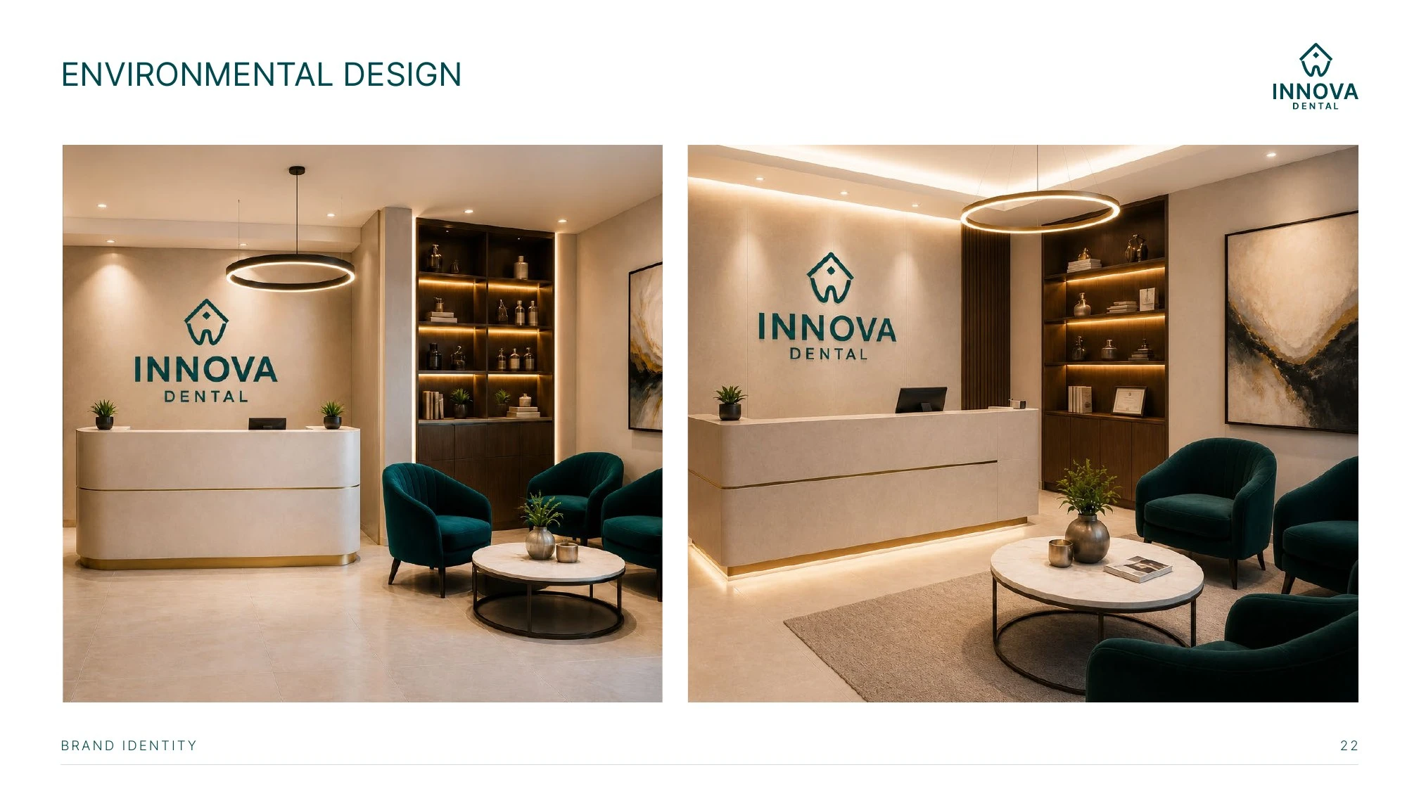
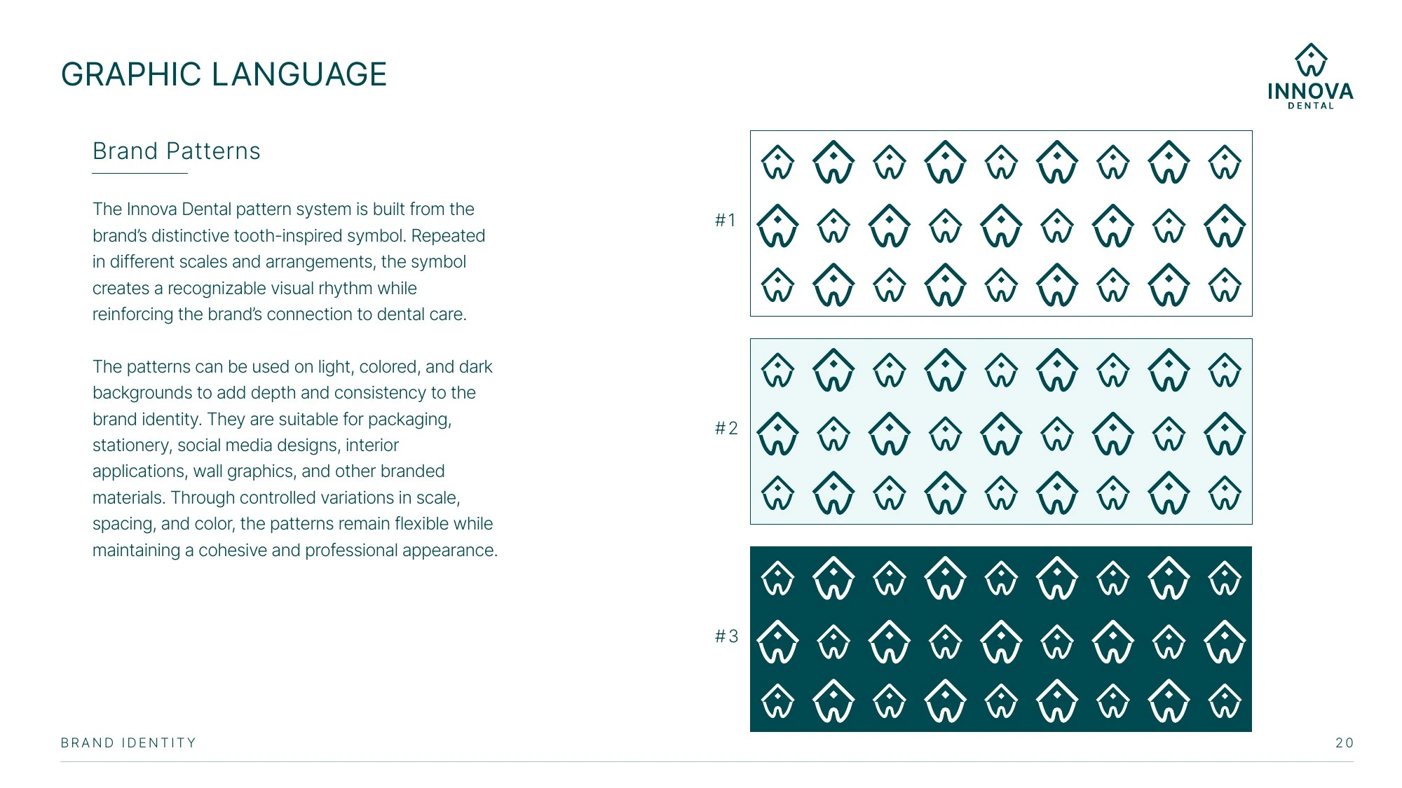
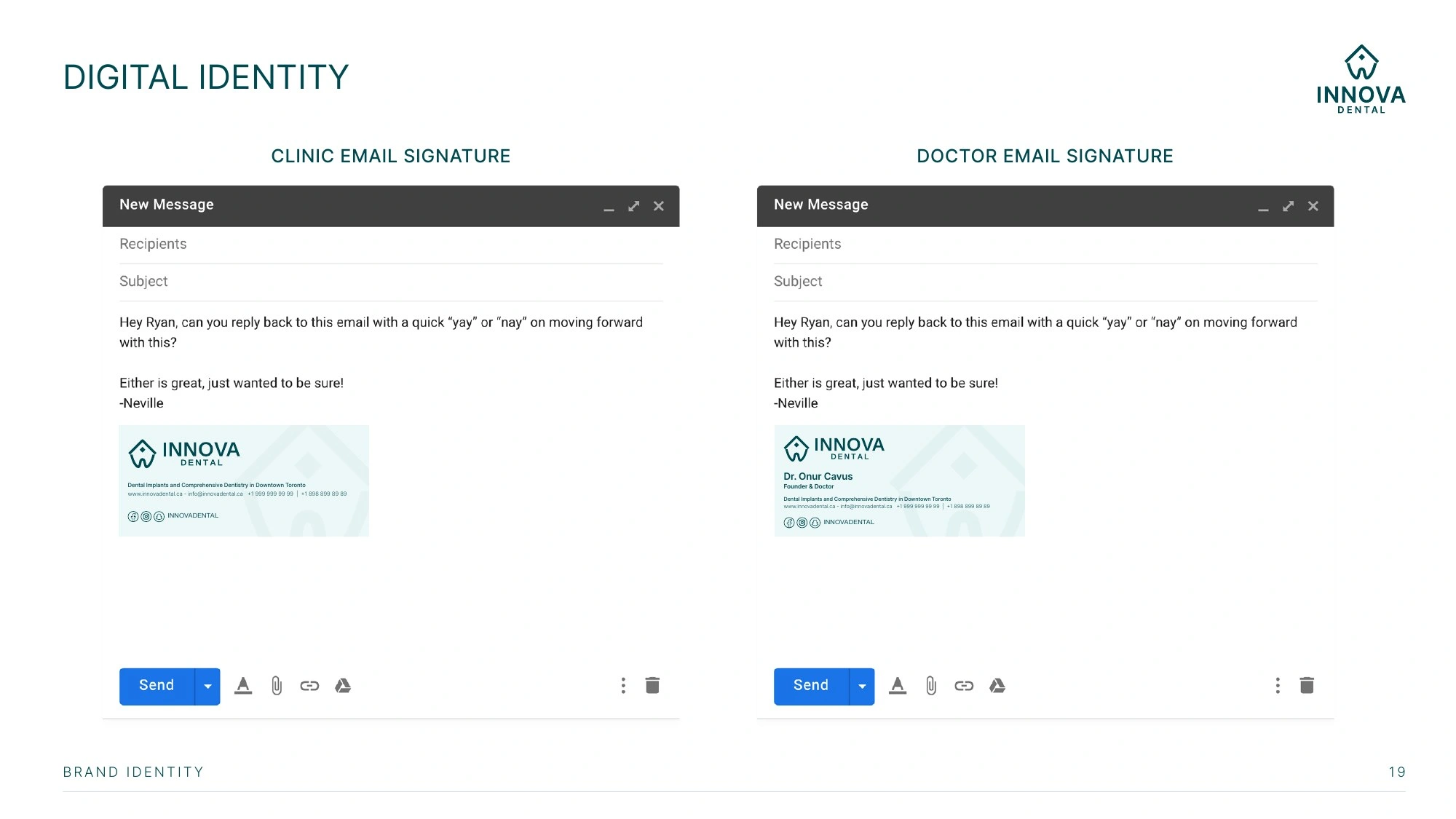
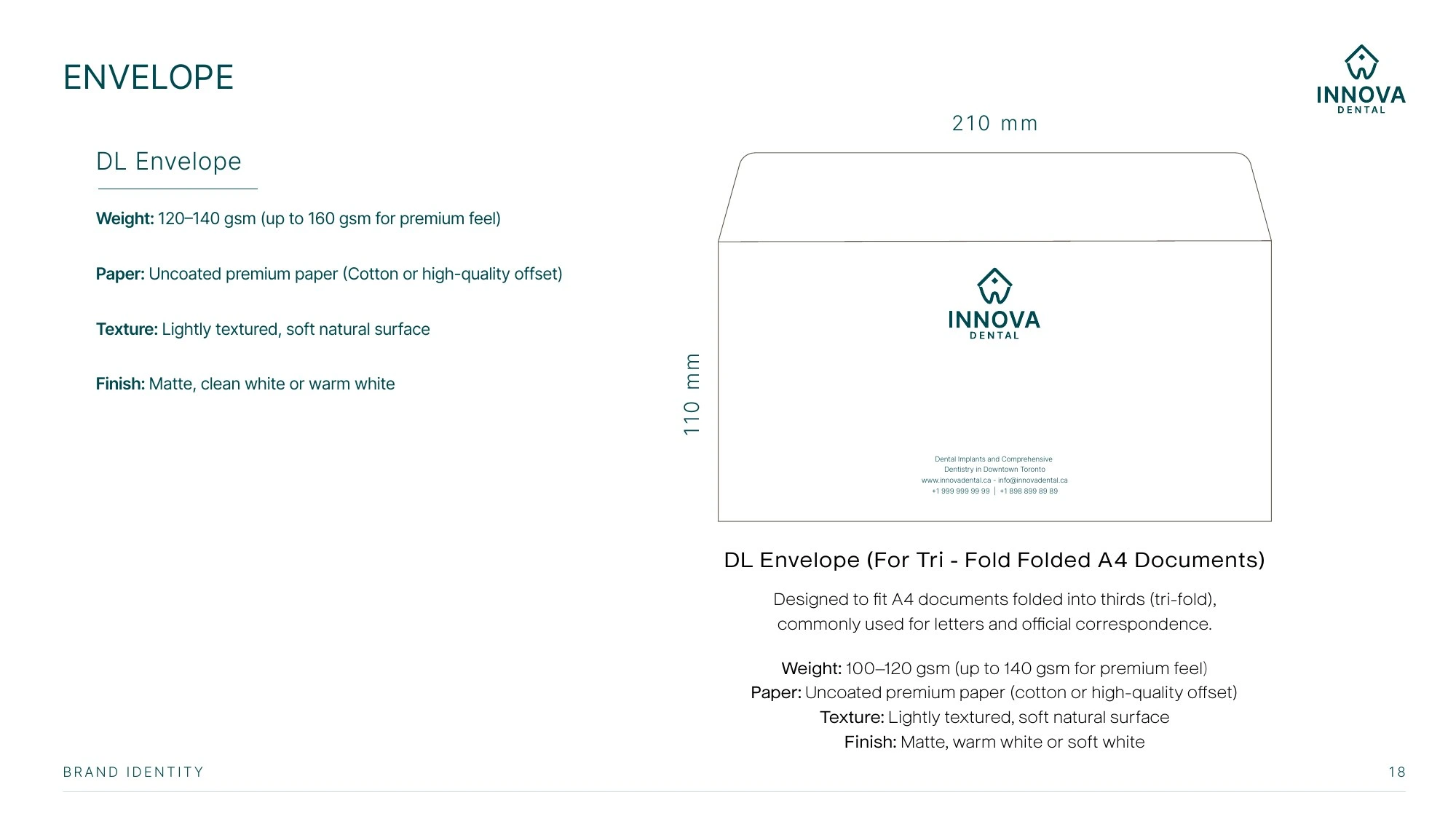
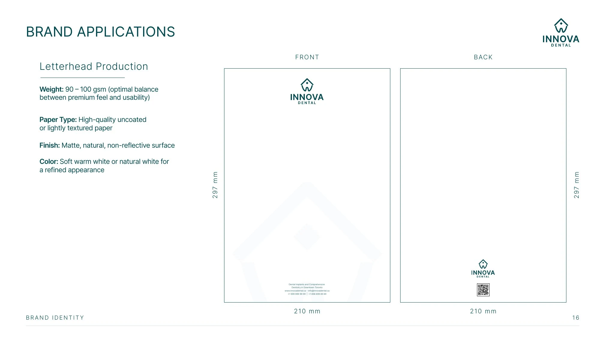
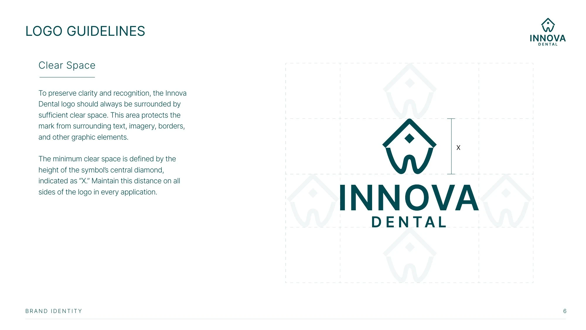
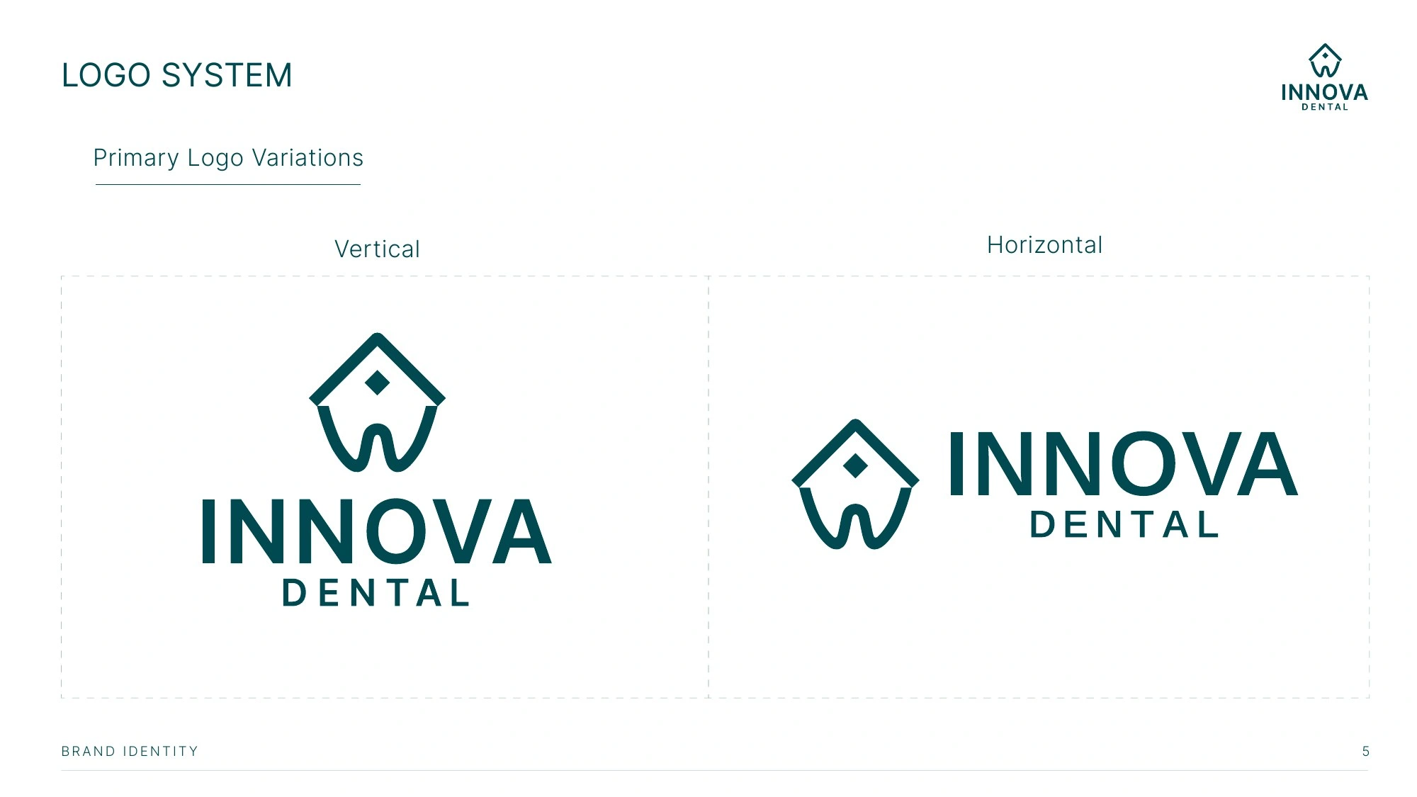
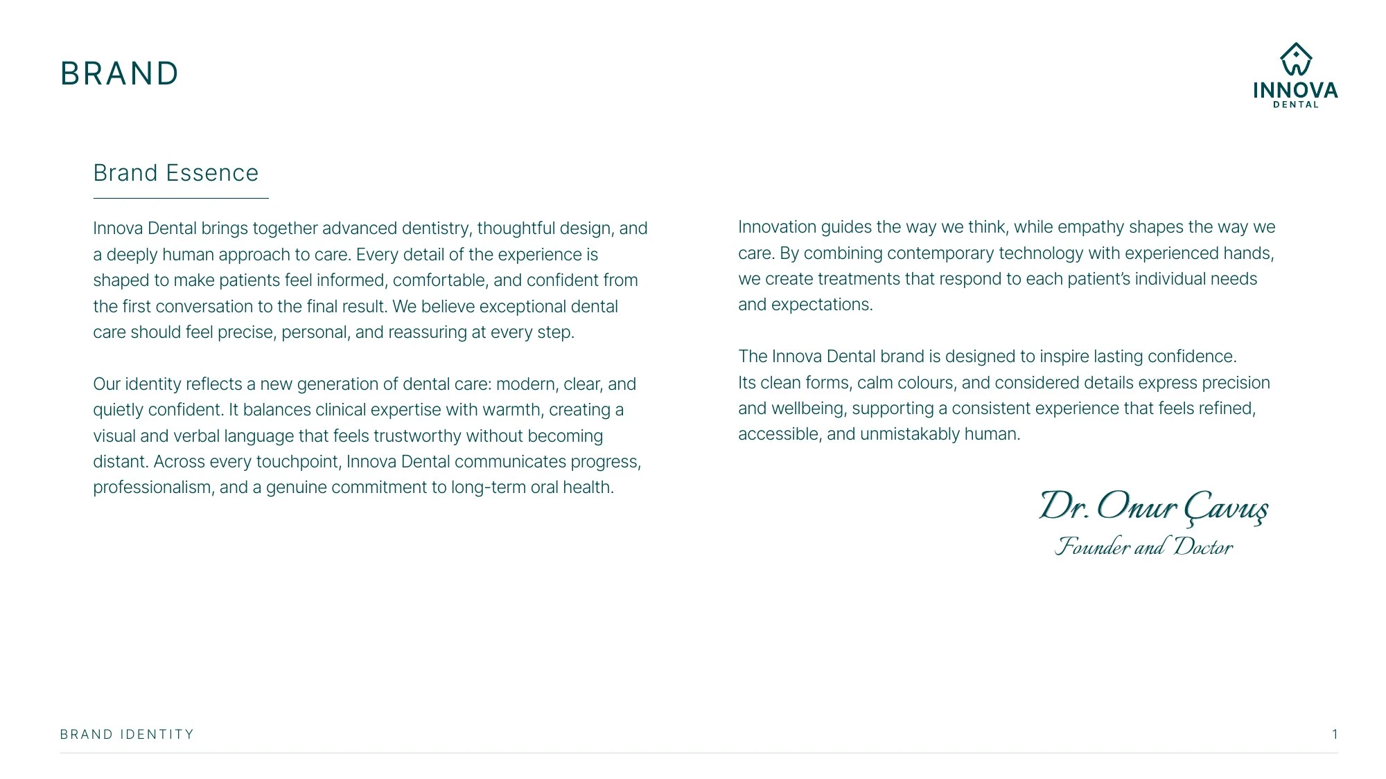
Inside the film: logo construction and shape meaning, the primary logo, the color palette (Clinical Depth, Innovative Care, Sterile Mist, Heritage Stone), typography in Inter, environment and photography style, and brand applications.
Delivered in 16:9 and 9:16 (Reels safe area) at 30 fps. Built in After Effects with every cut synced to a 96 BPM track.
My role: brand identity, art direction, motion design and editing.
Music: generated with Google Lyria 3.
0 likes · 1 view · Nov 16, 2026
Brand film for Innova Dental, a Toronto clinic: logo construction, color, type and applications from the identity I designed.


